What is Panamanian Pollera?
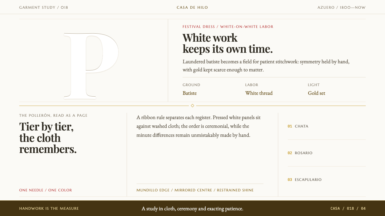
The Panamanian pollera is a national dress worked entirely by hand, and this style reads a page as laundered white cloth first and pattern second — ceremony lives in the stitch.
Panamanian Pollera in brief
Panamanian Pollera is a design style drawn from the pollera, the national dress of Panama. The garment is a tiered skirt, the pollerón, cut from fine, light cloths such as holán and batiste and worn over starched petticoats called enaguas. Every surface is worked by hand. In the gala version the embroidery is white thread on white cloth; the pollera de labor carries the same floral needlework in a single colour on the same ground. The style translates that garment into layout: washed white tiers, a high-contrast serif voice, and gold used so sparingly that it becomes the only bright thing on the page.
Unlike styles built on a palette or a typeface, this one is built on the construction of a garment. Pages are meant to read as laundered, pressed cloth before they read as pattern. Content stacks in horizontal tiers, the way a skirt falls in layers, and the tiers are separated by thin rules that behave like ribbon rather than like boxes or shadows. Ornament is mirrored across a centre axis, because the garment itself is cut that way.
Gold supplies the only brightness: the chains worn at the neck, the combs set in the hair, the buckles on the shoes. In the interface it appears in hairlines and small accents, never as a fill. One more rule gives the style its warmth. Handwork is never perfectly equal, so the symmetry is allowed a trace of irregularity. A page that mirrors itself with machine precision has missed what makes a pollera a pollera.

Where does Panamanian Pollera come from?
The pollera belongs to the Azuero peninsula, in particular to Las Tablas and Guararé in Los Santos province, and its story runs from the eighteenth century into the nineteenth. The record describes it as a criollo adaptation of Andalusian dress: the clothing that came with Spain's colonisation, remade over generations into something that belongs unmistakably to Panama. Through the 1800s it was formalised as festival dress, and it is still worn today at Corpus Christi, at patron-saint fiestas and at Carnival.
The construction explains the style. A pollerón is cut into tiers, and the tiers are held out by starched enaguas underneath, so the garment has a deliberate architecture of horizontal bands. The cloth, holán and batiste, is light and fine, suited to a hot climate and to close needlework. The embroidery then covers it surface by surface, with flowers worked in a pattern that mirrors from the centre line. This is why the design system speaks in tiers, rules and axes. It is describing how the skirt is made.
Wearing a pollera is also a matter of accumulation. The complete costume brings gold chains layered at the neck, combs set in the hair, buckles on the shoes and the trembling pearl-silk hair ornaments called tembleques. Each of these is a small bright note against a very large quiet field of white. That economy, a wide still ground with a few bright and deliberate points, is carried into the interface as the rule that gold is scarce and that the cloth does the talking.
The recent history of the dress runs through folklorismo, the movement to collect, document and present folk traditions as national heritage. The record ties that story to two names, Manuel F. Zárate and Dora Pérez de Zárate, and lists the Festival Nacional de la Pollera among the movements that matter. Together they point to something a designer should keep in mind: the pollera is at once a village craft, a ceremonial garment and a national symbol. Borrowing from it means borrowing from all three.
What defines the Panamanian Pollera look?
Laundered white
The ground is a matte, softly toned white that looks washed and pressed rather than glaring or clinical. It is not a screen white and it is not decorated with texture, since the point is that the page reads as cloth. Everything else on the layout sits on this ground as thread sits on fabric.
Horizontal tiers
Content stacks in horizontal bands, the way a pollerón falls in layers. Each tier holds one idea or one group of items, and the order from top to bottom is part of the meaning. Layouts built from free-floating cards in a scattered arrangement lose the garment's architecture.
Ribbon rules
Tiers are separated by fine rules that behave like ribbon sewn between layers. They are thin, they run the full width of the tier and they do the work that a box, a shadow or a background change would do in another system. Because they are so light, they keep the surface reading as one continuous cloth.
Mirror symmetry, with a hand's tolerance
Ornament mirrors across a centre axis, as the embroidery on the garment does. The symmetry is a structure, not an obsession: handwork is never perfectly equal, so a trace of irregularity between the two sides is welcome and a mechanically exact reflection reads as cold.
Scarce gold
Gold is the only bright thing on the page, and it stays in hairlines and small accents, echoing chains, combs and buckles. It is never a large fill and never a gradient. Its force comes from scarcity: a single fine line of gold against a wide field of white reads as ceremony, while a gold panel reads as a casino.
High-contrast serif voice
Type is set in a high-contrast display serif of the Playfair kind, whose hairline strokes echo fine thread and ribbon rules and whose heavier strokes carry the weight of the lettering. It is the voice of an invitation or a programme. Mixing in several other families dilutes it, because the garment too speaks in one language.
One colour of labour
When colour is wanted at all, the garment supplies its own logic. The pollera de labor carries the same floral needlework in a single colour on the same white ground. A layout can do likewise: choose one colour for the pattern and keep every ornament in it, instead of spreading several hues across the cloth.

Who shaped Panamanian Pollera?
Manuel F. Zárate is one of the two names the record gives for the pollera, and his name is tied to Panamanian folklorismo, the movement that gathered, documented and presented the traditions of the interior as national heritage. His place in the lineage is a reminder that the pollera's status as a national symbol was something people worked to establish, not simply an inherited fact.
Dora Pérez de Zárate is named alongside Manuel F. Zárate, and the two names belong together in the record. They stand for the work of recording and presenting the folk culture of the interior, in which dress was one thread among music, dance and festival. For a designer, her presence is a prompt to treat the pollera as part of a living culture and not as an isolated pattern.
The record lists the Festival Nacional de la Pollera among the movements behind the style. Its name makes its subject plain: the dress itself, brought onto a public stage as a national emblem. It is a useful reference for the tone of the system, which is ceremonial rather than casual, and in which every surface is expected to bear close looking.
The record places the style in Las Tablas and Guararé, in Los Santos province, and the true authors of the dress are the embroiderers and seamstresses there whose hands produced it. They are unnamed in the record, which is itself a point worth keeping in view. The design system's insistence on visible handwork, and on the tolerance that comes with it, is a way of respecting that labour.
How do you use Panamanian Pollera today?
Panamanian Pollera suits work in which the care taken in the making is the message: ceremony, heritage, hospitality, weddings, boutique commerce, cultural festivals and anything in textiles or fashion where craft is a selling point. It is a quiet, formal and warm style, and it asks for content that can be ordered into tiers. It is a poor fit for dense tools and data-heavy screens, where a ribbon rule between rows cannot do the work that structure needs.
In presentation slides, a cover can be a washed-white field divided into two or three horizontal tiers by hairline rules, with the title set in the serif on the centre axis and a single fine gold line beneath it. Content slides stack one idea per tier, and two-sided comparisons suit the mirrored layout well. Data slides stay in a single colour for the series, with gold reserved for the one value the audience must remember. Keep the ground white and let empty space do the ornamenting.
On the web, think of invitations, event and festival pages, wedding sites, restaurants and hotels, cultural institutions and shops selling textiles or apparel. Build sections as full-width tiers separated by ribbon rules, centre the hero on the axis, and arrange product or content cards in a symmetrical grid. Avoid drop shadows entirely, since depth comes from the order of the tiers. Calls to action work as plain serif text with a fine gold underline rather than as filled buttons.
For editorial and marketing work, the style fits catalogues, lookbooks, event programmes and annual reports of heritage organisations. Use the centre axis for headings and pull quotes, divide long articles into tiers with ribbon rules, and keep photographs of the real textile at the heart of the layout, since nothing communicates handwork like close-up cloth. A restrained introduction in the serif followed by generous white space does more than any decorative border.
The most common mistake is treating gold as the star: a gold panel, a gold gradient or gold fills on buttons turn ceremony into ostentation and break the scarcity rule. Other frequent errors are filling the white with grey boxes and shadows so that it stops reading as cloth, scattering stock floral motifs across a layout as if they were a pattern pack, and using perfectly mechanical mirroring with no trace of the hand. Finally, avoid collapsing the pollera into a generic Spanish or flamenco look. It is a specifically Panamanian dress.

Panamanian Pollera — FAQ
What is a pollera?
The pollera is the national dress of Panama. It is a tiered skirt, the pollerón, cut from fine, light cloths such as holán and batiste and worn over starched petticoats called enaguas, with every surface embroidered by hand. It is worn at occasions such as Corpus Christi, patron-saint fiestas and Carnival, and is associated above all with the Azuero peninsula, Las Tablas and Guararé.
What is the difference between the gala pollera and the pollera de labor?
In the gala version the embroidery is white thread on white cloth, so the whole garment is a study in tone and texture. The pollera de labor carries the same floral needlework in a single colour on the same ground. For design, the gala version is the model for the default look, and the labour version is the model for how to introduce colour: one hue, used consistently, never several at once.
Why is the layout symmetrical but not perfectly so?
The garment's ornament mirrors across a centre axis because the skirt is cut that way. But it is made by hand, and handwork is never perfectly equal from one side to the other. The system keeps the structure of symmetry and allows a trace of irregularity so that the page feels made and not generated. The difference should be subtle enough to notice only on close reading.
Why a high-contrast serif and such scarce gold?
The serif's hairline strokes echo thread and ribbon, and its heavier strokes give lettering the gravity of a ceremonial document. Gold is scarce because on the real costume it comes in small, deliberate pieces, chains, combs and buckles, set against a large field of white. Reproducing that proportion in a layout is what produces the sense of ceremony, and a larger quantity of gold would destroy it.
Can the style work on a dark background or in strong colours?
It is built on a light, cloth-like ground, and the idea of laundered white is its premise, so a dark inversion needs a different logic and is better served by another style. Within the light ground, colour has one sanctioned path: the single-colour pattern of the pollera de labor. Strong, multi-coloured palettes drift away from the garment altogether and should be left to other systems.
Related design styles
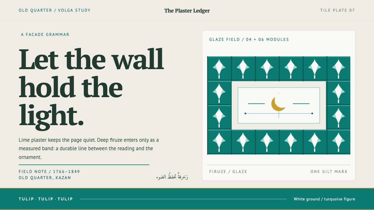 Kazan Tatar TileworkOrnament held to its proper place. Turquoise tulip bands cut across quiet lim…
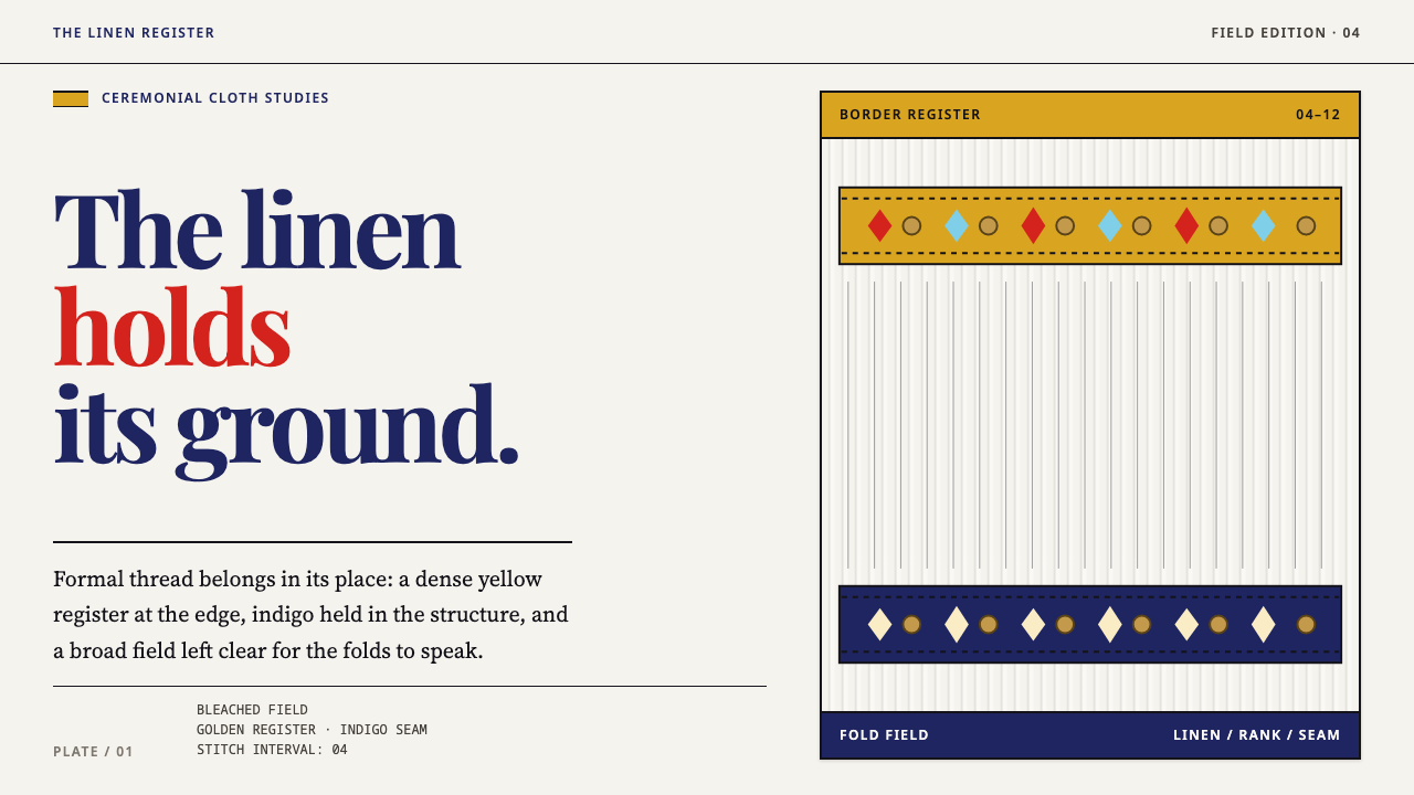 Slovacko KrojRank lives in the stitch. Golden bands and indigo seams order a pleated linen…
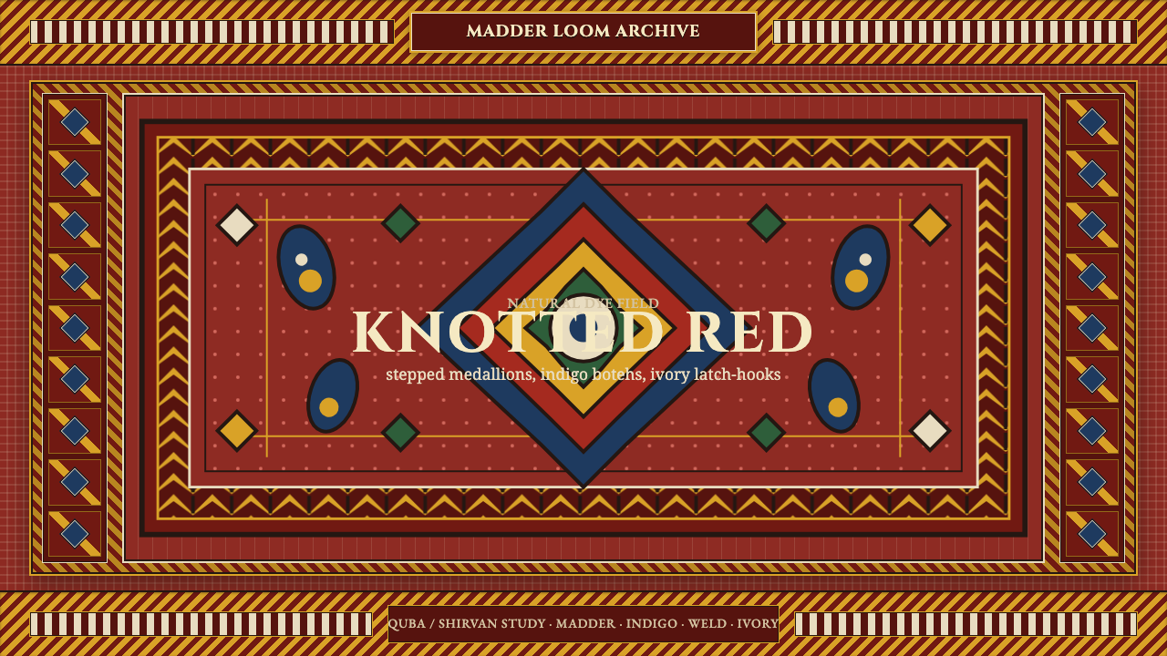 Azerbaijani Quba CarpetRed is the field. Indigo botehs and ivory latch-hooks orbit a stepped medalli…
 Bhutanese KushutharaPatience made visible. Lac pink and indigo bands shift across a warm silk gro…
 Bhutanese Yathra Wool WeaveHighland wool made digital. Brown-maroon bands carry cyan diamonds and spare…
 Kalash KupasDensity carries value. Ivory shell courses and orange braid are counted on wa…