What is Pahari Kangra Painting?
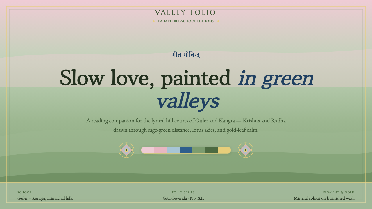
Pahari Kangra painting turns devotion into atmosphere — Krishna and Radha moving through cool green valleys beneath skies softened by lotus pink and blue.
Pahari Kangra Painting in brief
Pahari Kangra painting is the lyrical hill-school tradition of northern India before 1900, associated with Kangra and Guler in the Pahari hills of present-day Himachal Pradesh. Its visual world is pastoral and devotional: Krishna and Radha appear not against an abstract backdrop, but within tender valleys, softened hills, and spacious lotus-toned skies. The emotional register is intimate rather than monumental.
The tradition belongs to Pahari miniature painting and is defined here by Guler-Kangra lyrical naturalism. Its images do not depend on visual severity or dramatic contrast. Instead, they build feeling through gentle transitions: green land recedes into atmospheric distance, pink and blue open the sky, and human figures remain part of a larger, calm landscape.
Its physical character matters to its visual language. Mineral pigments and gold leaf are burnished onto wasli paper, producing an enamel-smooth surface and cool, naturalistic colour. A digital interpretation should retain that sense of composed refinement: surfaces feel considered and luminous, but never glossy in a contemporary luxury-brand sense.
Where does Pahari Kangra Painting come from?
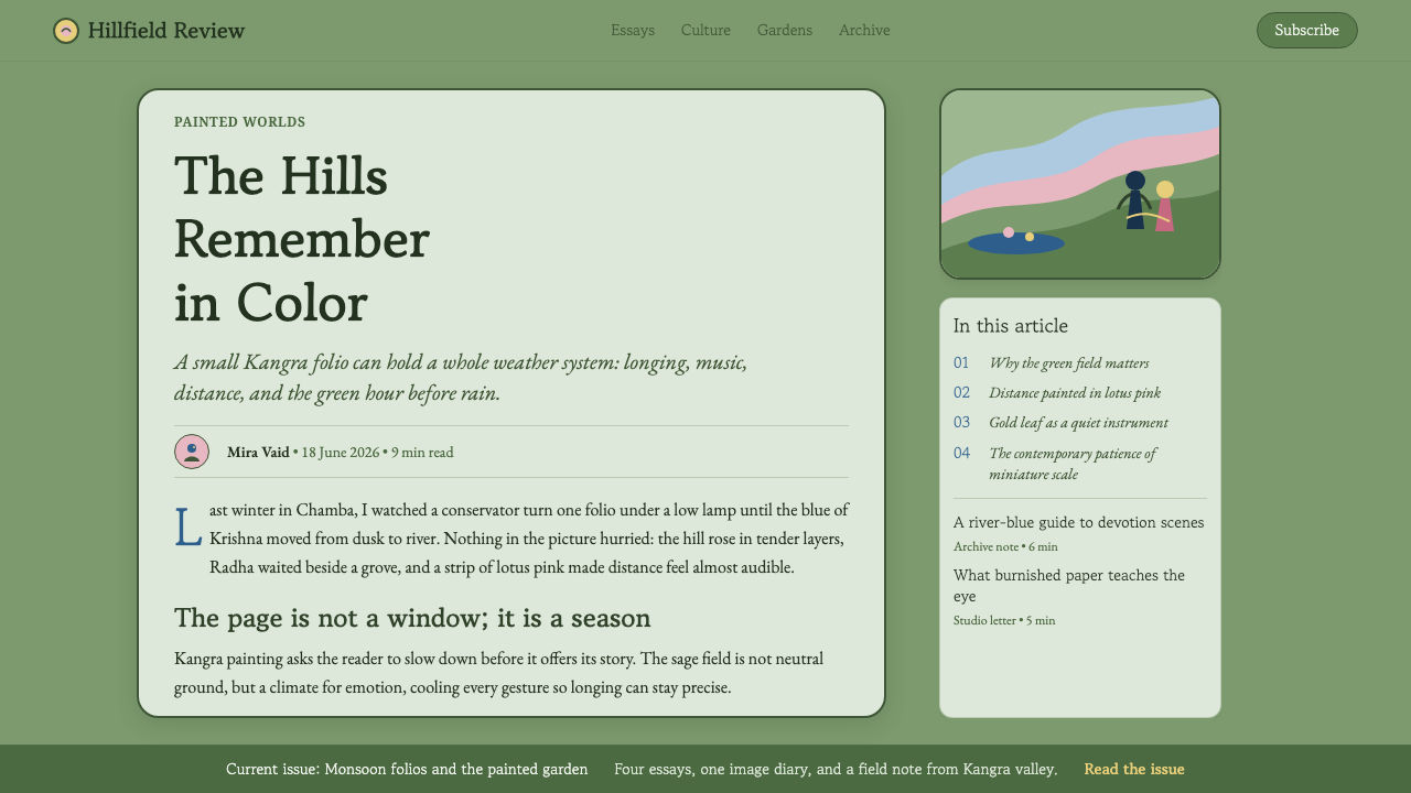
The flowering of the Guler-Kangra tradition belongs to the eighteenth and early nineteenth centuries, within the wider history of Pahari miniature painting. Its geographic setting is essential: Kangra and Guler lie in the Pahari hills, where landscape is not merely decorative scenery but the emotional field in which devotional narratives unfold.
The supplied tradition centers on Krishna and Radha. Their presence gives the style its devotional lyricism, but the feeling is carried as much by setting as by figure. Green valleys, softened distance, and pink-and-blue skies allow the narrative to move slowly, making longing, tenderness, and attention feel environmental rather than theatrical.
Nainsukh and Manaku are key figures associated with this world, alongside the Nainsukh-Manaku family workshop. Their inclusion points to a practice shaped through artists and an ongoing workshop tradition rather than an isolated personal style. For a contemporary designer, that matters: the system should feel coherent across pages and components, as if each piece belongs to the same cultivated visual climate.
Kangra court patrons also form part of the style’s stated origin. The courtly context helps explain its poise: refinement is present, but it is softened by pastoral space and devotional subject matter. The resulting design vocabulary is neither rustic nor ostentatious. It is courtly lyricism held in balance with natural calm.
What defines the Pahari Kangra Painting look?
Pastoral Ground
Sage green is the governing ground: a cool, muted field that recalls hill country rather than a decorative botanical trend. It should establish repose across broad surfaces, with lighter green distance suggesting air and terrain rather than a flat block of color.
Lotus Sky
Lotus pink and blue belong above the landscape as soft atmospheric accents. They should feel like a sky opening over the composition, not like competing interface signals. Pink brings tenderness; blue keeps that tenderness cool, spacious, and composed.
Lyrical Distance
Depth is atmospheric rather than dramatic. Hills, content blocks, and image fields should seem to ease away from the viewer with gentle tonal separation. Avoid harsh foreground-background opposition; the visual rhythm should feel gradual, contemplative, and unhurried.
Enamel-Smooth Surface
The burnished wasli surface suggests finely controlled smoothness. Digital surfaces should feel clean, quiet, and carefully finished, without noisy texture, aggressive gloss, or exaggerated depth. Gold may appear as a restrained note of ceremonial light, never as a dominant luxury effect.
Soft Serif Cadence
Typography should use serif forms with a gentle cadence, carrying the unhurried lyricism of the paintings rather than modern sharpness. Hierarchy comes through calm changes in scale, spacing, and emphasis. Headlines should invite reading, not command attention through force.
Devotional Intimacy
The style is devotional without becoming doctrinal. Figures, imagery, and calls to action should feel gently placed inside the composition, as Krishna and Radha do within the landscape. The result is emotional proximity: a viewer enters a scene rather than being confronted by a spectacle.

Who shaped Pahari Kangra Painting?
Nainsukh is named among the key figures of the Guler-Kangra flowering. Within this design system, his importance marks the tradition as an authored and cultivated artistic practice, not merely a regional palette or decorative theme.
Manaku is likewise identified as a key figure in the Pahari world from which this lyrical naturalism emerges. He anchors the style’s connection to a named artistic lineage rather than an anonymous pastoral mood.
The Nainsukh-Manaku family workshop represents continuity of practice. Its relevance to digital adaptation is systemic: repeated components should share a common visual discipline while still allowing scenes, content, and emphasis to vary.
Kangra court patrons situate the style within a courtly setting. Their association supports a tone of refinement and ceremonial care, tempered by the pastoral and devotional qualities that keep the work tender rather than ostentatious.
How do you use Pahari Kangra Painting today?
For presentation covers, treat the slide as a landscape of feeling. Let a sage-green field establish the ground, then allow a lotus-pink or blue sky-like region to open above it. A serif title should sit with generous calm, while any image of devotional or pastoral subject matter is placed as part of the scene rather than used as a loud promotional backdrop. Content slides should preserve this order through quiet section framing and spacious reading rhythm.
Data slides need particular restraint. Use the same atmospheric hierarchy to distinguish primary findings from supporting context: one calm field for the page, a gentle accent for the main series, and a cooler secondary note for comparison. Charts should remain legible and direct, but their surrounding composition can borrow the style’s sense of receding landscape, allowing annotations and sources to occupy quieter visual ground.
For web interfaces, this style works especially well in reflective dashboards, cultural collections, learning environments, and editorial products. Navigation and controls should be clear but softened by serif-led hierarchy, calm surfaces, and measured color accents. On pricing pages, each plan can feel like a carefully placed panel within one landscape, with emphasis created through atmospheric contrast and compositional prominence rather than urgency-driven visual noise.
For editorial and marketing pages, use a broad, breathable canvas that alternates narrative text with image fields, quotations, or short pieces of supporting information. The strongest compositions feel like passages through a painted valley: a heading emerges, a visual pause opens, then the next section arrives with a changed sky tone or a light ceremonial accent. Marketing should speak in the same register—inviting attention through lyricism and care, not through pressure.
A common mistake is reducing Pahari Kangra painting to pink, green, blue, and gold used all at once. The style depends on relationship, especially the slow movement from hill ground to open sky and the quiet placement of figures within it. Another mistake is pairing the palette with rigid modern typography, stark cards, or hard contrast. Preserve the soft serif cadence, atmospheric distance, and devotional intimacy together; the colors alone cannot carry the tradition.
Pahari Kangra Painting — FAQ
Is Pahari Kangra painting simply a decorative Indian miniature style?
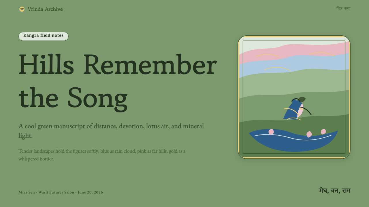
No. It is a lyrical tradition within Pahari miniature painting, rooted in Kangra and Guler and shaped by devotional subjects, courtly patronage, and naturalistic atmosphere. Its decorative refinement is inseparable from its emotional structure: Krishna and Radha, valleys, skies, and distance work together to create tenderness and contemplative attention. A faithful design application should therefore begin with mood, hierarchy, and pacing rather than surface ornament.
Why are sage green, lotus pink, and blue so central to this style?
They translate the source material’s landscape logic into a usable system. Sage green establishes the hill ground; lotus pink and blue create the softened sky above it; indigo can act as a cooler accent within that atmosphere. Their value lies less in individual symbolism than in sequence and balance. The page should feel as though land gradually gives way to air, not as though unrelated decorative colors were assembled together.
Can this style support dense dashboards and analytical content?
Yes, when its lyricism is used to organize rather than obscure information. Keep controls, labels, charts, and comparisons explicit; use the pastoral palette to establish layers of attention around them. Calm grounds can hold dense content, while pink, blue, indigo, and restrained gold identify emphasis without turning every signal into an alert. The goal is a dashboard that feels composed and readable, not a painted interface that sacrifices function.
What most quickly makes a Kangra-inspired interface feel inauthentic?
Aggressive contrast, generic luxury gloss, and typography with modern sharpness are the fastest ways to break the atmosphere. So is treating gold as a status signal or using every accent color at equal intensity. The source material calls for enamel-smooth restraint, cool naturalistic color, soft serif cadence, and gentle atmospheric distance. If an element feels forceful, noisy, or eager to dominate, it likely needs to be softened or removed.
Related design styles
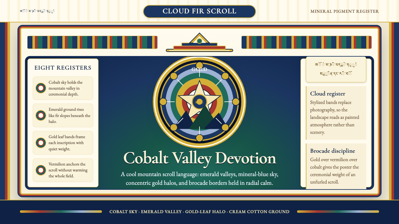 Bhutanese Thangka (Druk Style)Sacred cool-mountain clarity. Cobalt fields, emerald ground, and gold halos f…
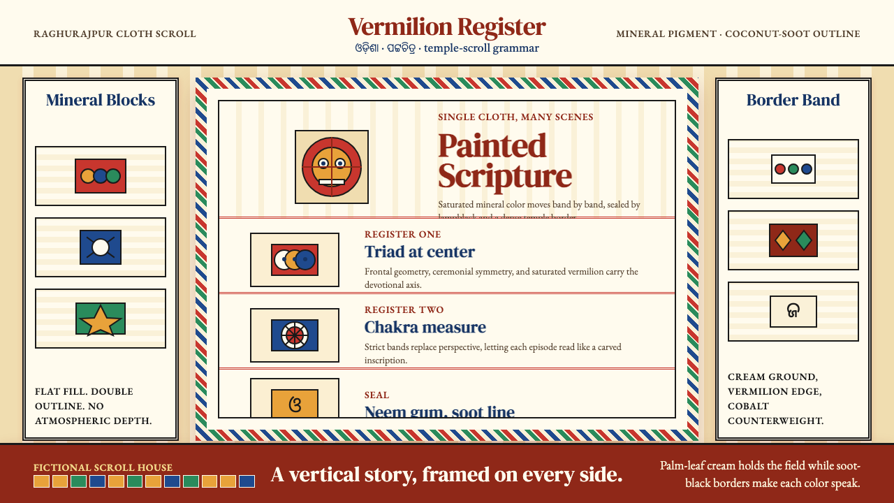 Pattachitra (Odisha Temple Scroll)Devotion as dense color. Vermilion bands and soot-black outlines stack like a…
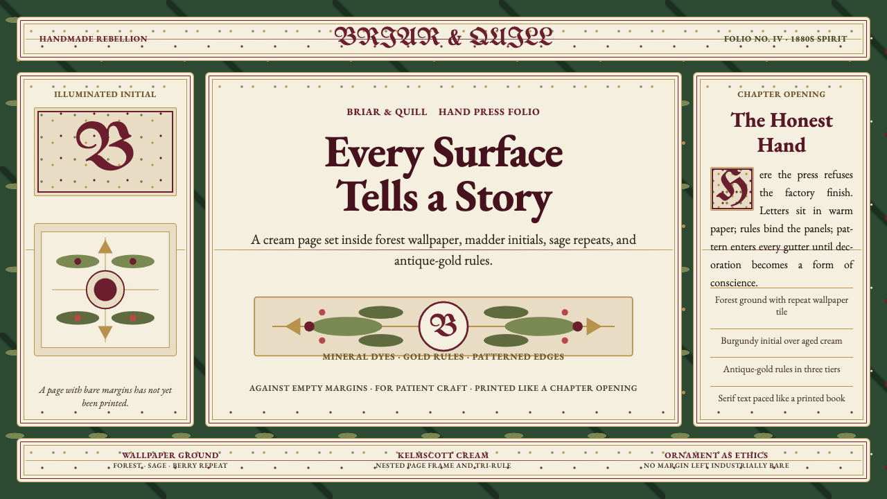 William Morris Arts & CraftsOrnament is the argument. Forest green wallpaper frames cream pages, gold rul…
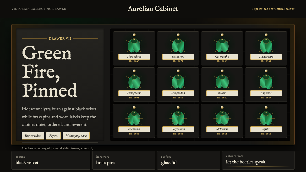 Beetle Specimen CabinetGreen burns in darkness. Emerald elytra grids glow under brass keylines and b…
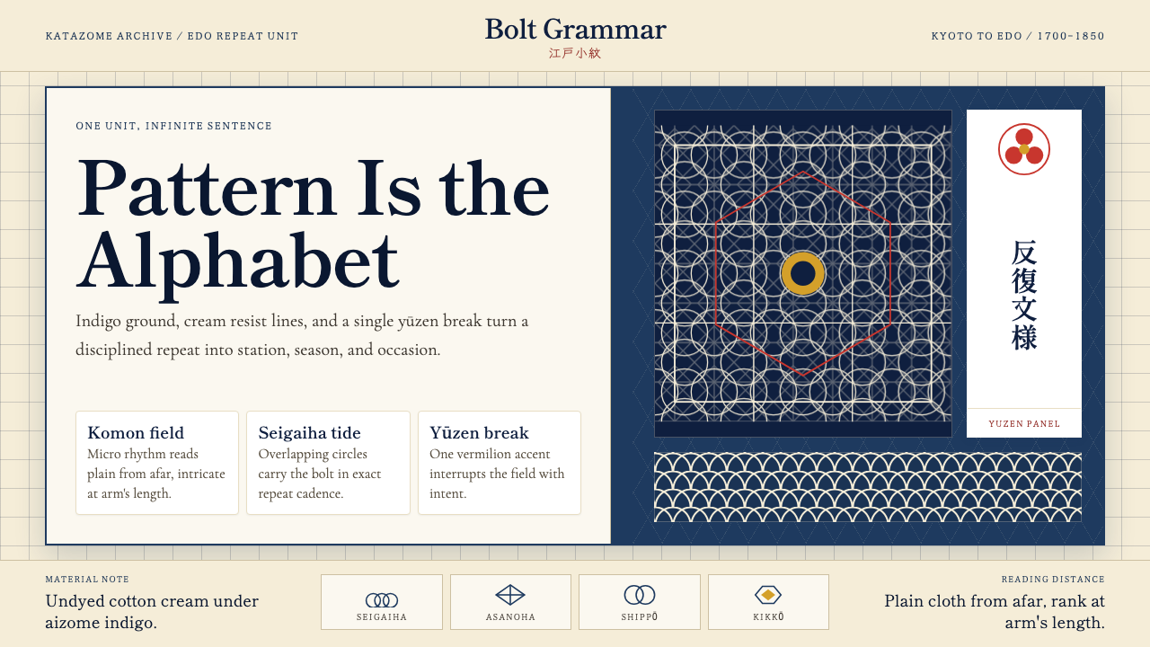 Edo Kimono TextilePattern becomes language. Indigo repeats, cream resist lines, one vermilion p…
 Ethiopian Orthodox ManuscriptSacred page, alive. Brick red, indigo, and ochre harag borders frame a starin…