What is Oyster Farm (Estuary)?
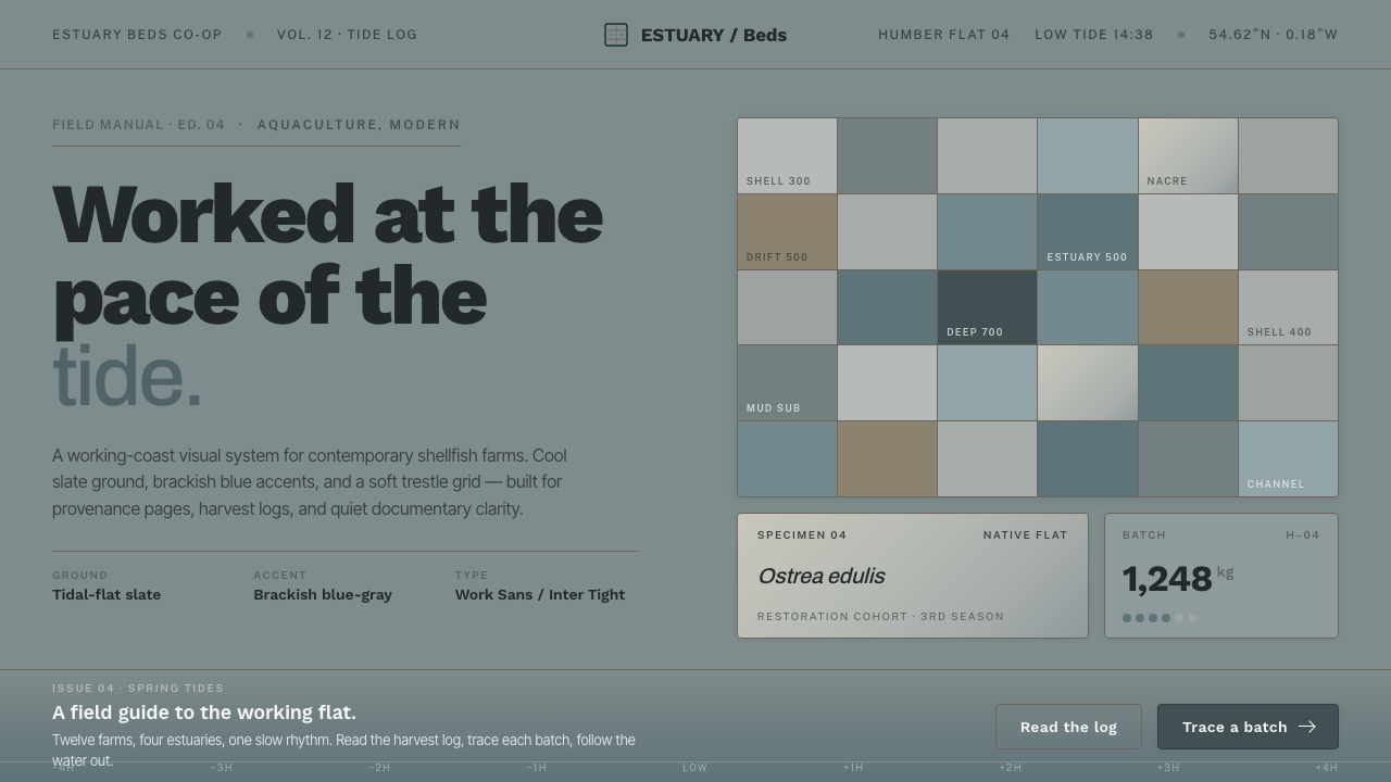
Oyster Farm (Estuary) is designed at the pace of the tide: cool slate ground, weathered shell surfaces, and one restrained note of brackish blue-gray held in a working trestle grid.
Oyster Farm (Estuary) in brief
Oyster Farm (Estuary) is a contemporary visual language drawn from tidal oyster beds at low tide in Atlantic and North Sea estuaries. Its scene is not the polished restaurant plate or the nostalgic seaside postcard, but the productive intertidal landscape behind them: weathered gray shells, silvered trestle posts, damp mudflat, and blue-gray water gradually draining away. The result is quiet, cool, and operational. It treats coastal food production as a present-day discipline with its own material intelligence.
The system begins from a mid-neutral cool-gray ground. It is deliberately neither white nor cream, because whiteness would make the palette feel hygienic in a generic way and cream would introduce a domestic warmth the estuary does not have. Rough shell-gray, pearly nacre, and muted water tones create contrast through temperature, grain, and reflectivity rather than bright color. A brackish blue-gray accent appears sparingly, like a shallow channel of water catching the light across the mudflat.
Its visual character is clean but not sterile. Crisp grotesque sans-serif type, restrained spacing, and a trestle-like grid make the work contemporary and legible, while shell roughness and softened structural lines prevent it from becoming an abstract corporate system. Oyster Farm does not romanticize labor through nautical decoration. It honors the repeated, practical work of coastal aquaculture by making order, weathering, and restraint visible.
Where does Oyster Farm (Estuary) come from?
Oyster Farm belongs to the contemporary aquaculture aesthetic of 2010 to the present rather than to a closed historical style. Its geographic reference is Western Europe, especially Atlantic and North Sea estuaries such as the Humber and French estuary beds. These are working coastal environments where the visual field changes with water level: a landscape can move from reflective water to exposed mudflat, from dark wet surface to pale shell accumulation, without ceasing to be a place of food production.
The low-tide oyster bed is the central origin image. When water drains across a cool slate mudflat, it leaves a restrained spectrum of grays, pearly surfaces, and blue-gray residues. Weather does not add theatrical drama here; it slowly alters the materials already at work. Shells roughen, posts silver, and the shallow water keeps a muted brackish cast. The style turns those conditions into a useful design vocabulary: cool ground, small shifts of texture, and one carefully rationed water-colored accent.
Its cultural context is sustainable aquaculture, coastal and estuary food production, and restoration ecology. Those movements make the setting more than scenery. An oyster bed is simultaneously habitat, infrastructure, and food system, so the visual language must carry practicality without becoming industrially harsh. Trestle grids provide the organizing model: they imply repetition, spacing, alignment, and maintenance. The grid is therefore not a decorative pattern pasted over a page; it is a quiet reference to the structures through which the work is done.
The figures behind the style are collective rather than celebrity authors. Contemporary shellfish farmers, native oyster restoration projects, and estuary aquaculturists provide its real frame of reference. Their world favors materials that can weather, surfaces that can be read at a glance, and systems that remain orderly in variable coastal conditions. Oyster Farm translates that collective visual environment into contemporary editorial and interface language without pretending it is a period movement or a branded doctrine.
What defines the Oyster Farm (Estuary) look?
Cool Slate Ground
The base is a mid-neutral cool gray, recalling exposed mudflat under receding estuary water. It should feel mineral, damp, and calm rather than paper-white or domestically warm. This ground gives pale shell surfaces somewhere to register and lets dark typography remain firm without becoming severe.
Shell and Nacre
Rough shell-gray and pearly nacre create the internal range of the palette. The contrast is material rather than decorative: chalky weathering beside a quieter, light-catching inner surface. Use these qualities to distinguish layers, panels, or supporting information, never to imitate luxury polish.
Brackish Accent
Muted estuary blue-gray is the system's single clear color event. It behaves like retained water in a shallow channel: present, useful, and limited. Reserve it for an active state, a selected datum, a navigational cue, or one focal mark. If it spreads across the whole composition, the tidal restraint disappears.
Grotesque Sans
Crisp grotesque sans-serif type keeps the style contemporary and workmanlike. It should read as labeling, logging, and clear instruction rather than coastal nostalgia. Hierarchy comes from measured changes in scale, density, and placement, with enough air around headings that the layout feels like an organized bed rather than a crowded menu.
Trestle Grid
The layout takes its logic from rows of trestle posts: repeated intervals, soft structural alignment, and clear lanes between units. It is more accommodating than a rigid technical grid, because an estuary surface is never perfectly uniform. Let repeated elements establish rhythm, then allow small shifts in grouping or empty space to keep the composition tidal rather than mechanical.
Weathered Restraint
Texture should suggest exposure, use, and salt air without turning into rustic decoration. Prefer subdued grain, softened edges, and slight shifts between matte and pearly surfaces over picturesque ropes, anchors, waves, or marine illustrations. The style is about the working estuary after the water has moved through it, not about performing a generic maritime identity.
Who shaped Oyster Farm (Estuary)?
Contemporary shellfish farmers are the style's most immediate human reference. Their working environment supplies the weathered shells, repeated trestles, exposed ground, and practical visual order that define Oyster Farm. The style borrows the discipline of that setting, not an imagined rustic past.
Native oyster restoration projects locate the aesthetic within restoration ecology. They make visible that an oyster bed can be understood as more than a harvest site: it belongs to a wider coastal relationship among habitat, water, and food production. This supports the style's calm, responsible, non-extractive tone.
Estuary aquaculturists provide the operational logic behind the design language. Their setting demands systems that can remain readable amid wet surfaces, changing tide lines, and repeated infrastructure. In visual terms, this becomes clear labeling, stable hierarchy, muted material contrast, and a grid that serves use before display.
How do you use Oyster Farm (Estuary) today?
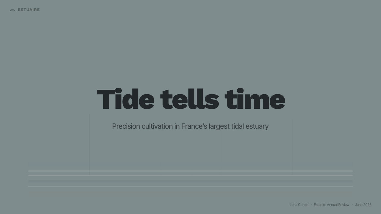
For presentation covers, Oyster Farm works best when the slate field carries most of the page and a single pearly or brackish accent establishes the focal point. Treat the title as an identification mark placed within a trestle-like alignment, not as a dramatic poster gesture. On content slides, retain the same ground and use repeated horizontal or vertical lanes to organize headings, notes, and supporting material. The atmosphere should feel composed after low tide: open, cool, and ready to be read.
Data slides benefit from the style because its restrained palette makes hierarchy visible. Use the shell and nacre range for context, comparison, and secondary values, then let the estuary accent identify the one series, selection, or change that deserves attention. Charts should remain plain and structural, with labels doing real explanatory work. Avoid turning every mark blue-gray; the accent is meaningful precisely because most information does not use it.
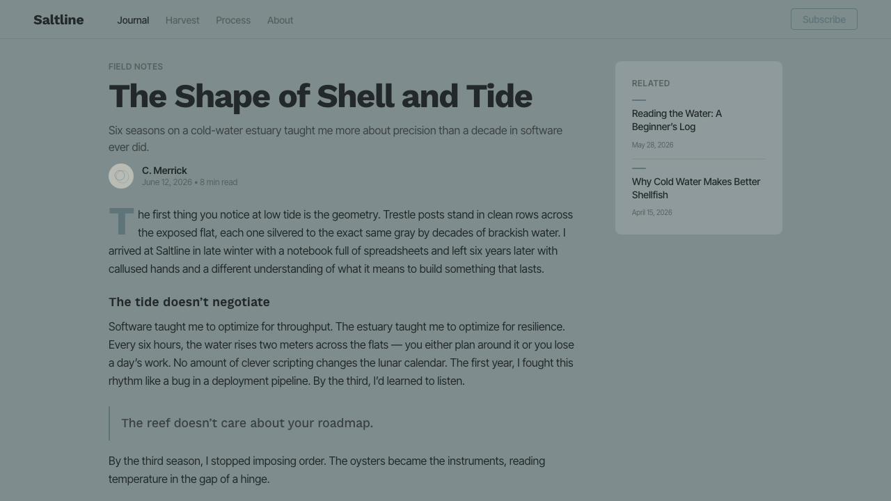
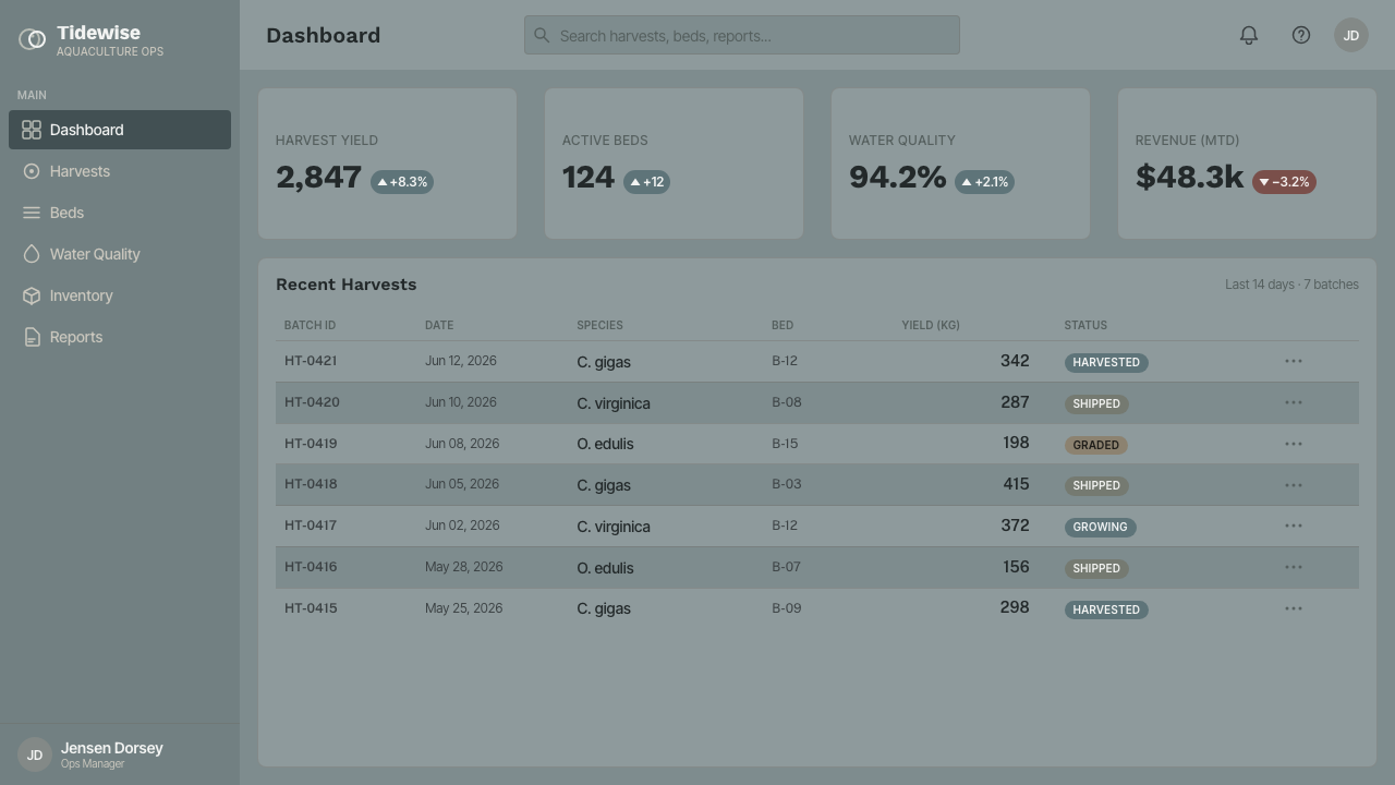
For web interfaces, Oyster Farm suits dashboards, operational tools, catalogs, and pricing pages where calm scanning matters. A trestle grid can organize cards, tables, filters, and tier comparisons while allowing generous exposed ground between them. Grotesque sans-serif labels should be direct and compact. Use darker shell-derived surfaces for navigation and dense information, pearly surfaces for areas that need relief, and the brackish accent for current location, active choices, or important status.
In editorial and marketing work, the style is strongest when it tells a material story. Long-form articles can use a cool ground, narrow reading areas, and small shell-like callouts for field notes or metadata. Marketing pages can alternate more exposed slate sections with quieter nacre sections, letting production process, origin, and care take precedence over lifestyle spectacle. Photography or imagery, if present, should reinforce mudflat, shell, trestle, and water conditions rather than importing sunny coastal clichés.
The common mistake is to mistake Oyster Farm for a generic nautical theme. Adding bright marine colors, rope motifs, anchors, beach imagery, or overtly rustic textures destroys its contemporary aquaculture character. Another mistake is overusing the blue-gray accent until it becomes the background. Keep the field cool and neutral, let the grid remain soft but disciplined, and allow weathered material contrast to carry the identity.
Oyster Farm (Estuary) — FAQ
Is Oyster Farm a rustic coastal style?
No. It draws from weathered coastal materials, but its core is contemporary aquaculture: clean grotesque typography, controlled hierarchy, and trestle-based organization. Rustic decoration turns the working estuary into scenery. Oyster Farm keeps the focus on material conditions and practical food production.
Why should the background avoid white and cream?
The style is built around a cool slate mudflat at low tide. White shifts the result toward generic cleanliness, while cream introduces warmth associated with a different visual world. A mid-neutral cool-gray ground better supports shell, nacre, and water tones, and it preserves the estuary's damp mineral atmosphere.
Can the blue-gray accent be used as the main color?
Usually it should not. In Oyster Farm, blue-gray is analogous to water left in channels after the tide recedes: it gives orientation and liveliness because it is limited. If it dominates the entire interface or page, the balance between slate ground, shell material, and active water is lost.
What kinds of products suit this style?
It is particularly suitable for dashboards, operational interfaces, catalogs, pricing pages, editorial systems, and food-production or restoration communications. These contexts benefit from calm hierarchy and material credibility. It is less suitable when a product needs exuberant celebration, high-saturation energy, or an overtly luxurious and polished mood.
How should imagery be handled in an Oyster Farm layout?
Use imagery to document the estuary's working conditions: shell surfaces, trestle rows, exposed mudflat, and shallow water. Keep crops purposeful and material-focused, with the grid and typography retaining control of the layout. Avoid postcard beaches, decorative sailing imagery, or pictures that replace the productive coastal setting with generalized leisure.
Related design styles
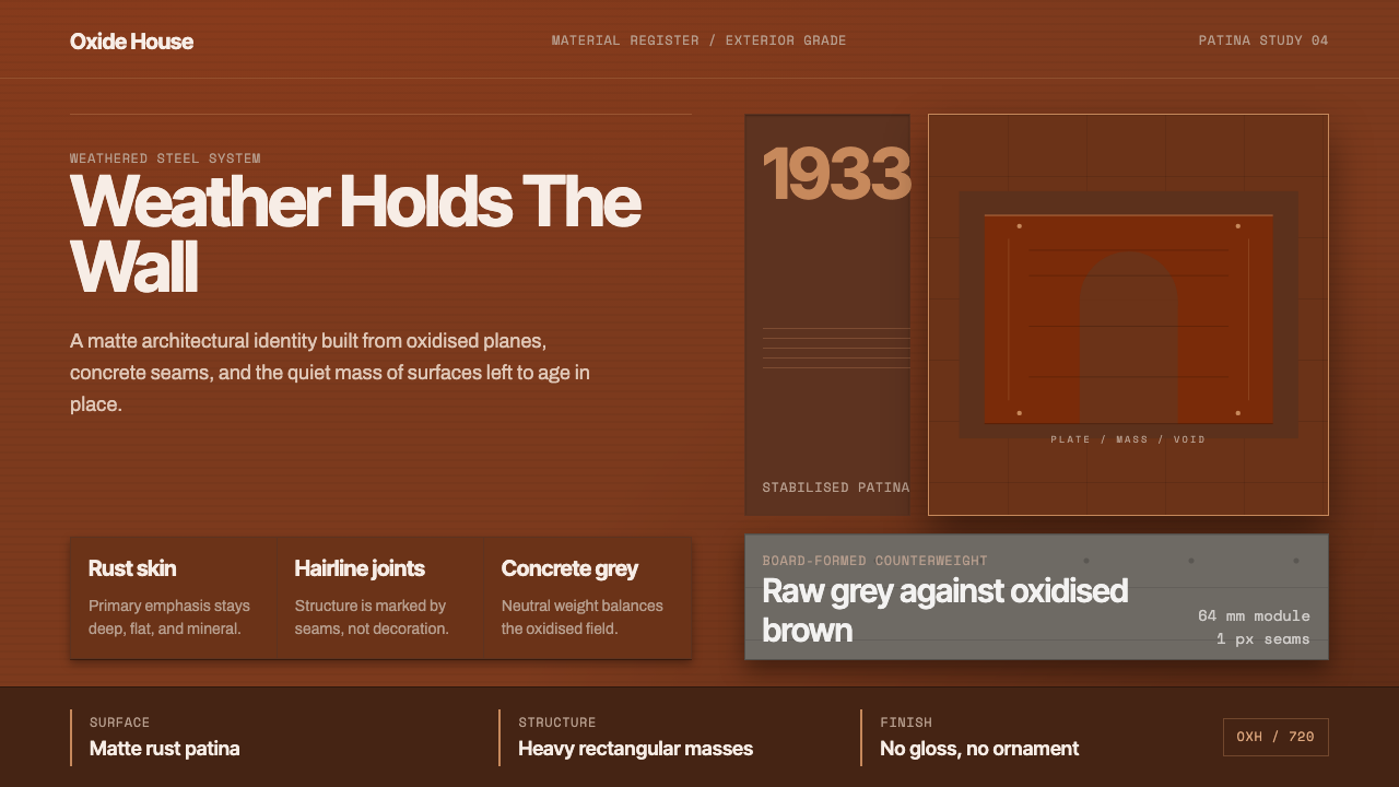 Corten Weathering SteelWeight over ornament. Rust-brown planes and concrete-grey seams make mass vis…
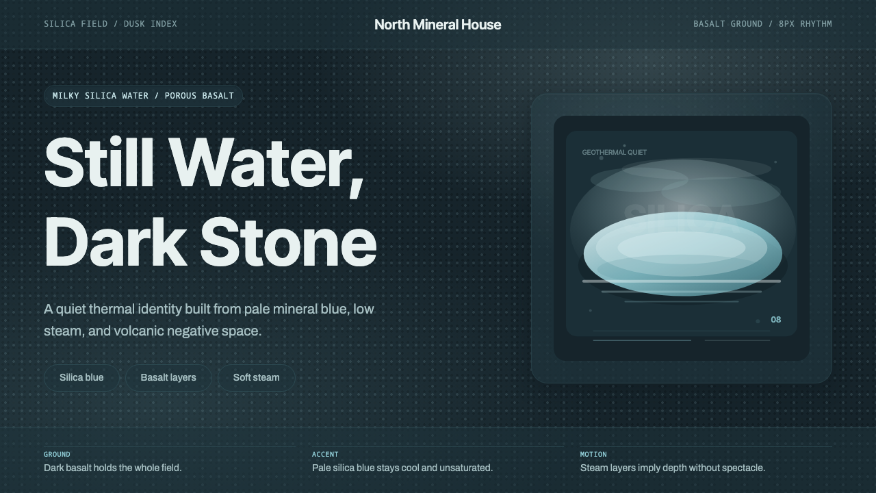 Glacial Teal LagoonQuiet feels elemental. Basalt darks and milky silica blue drift in a low-cont…
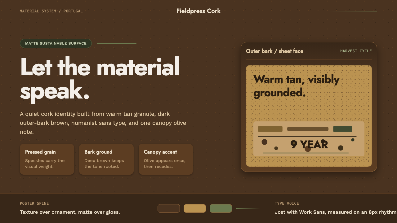 Portuguese CorkGrounded by texture. Cork tan speckles on bark brown, with one olive rule.
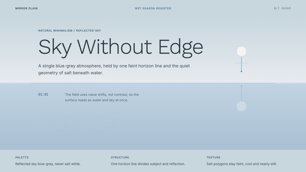 Salt Flat UyuniAtmosphere does the work. Blue-grey space, one horizon line, faint salt polyg…
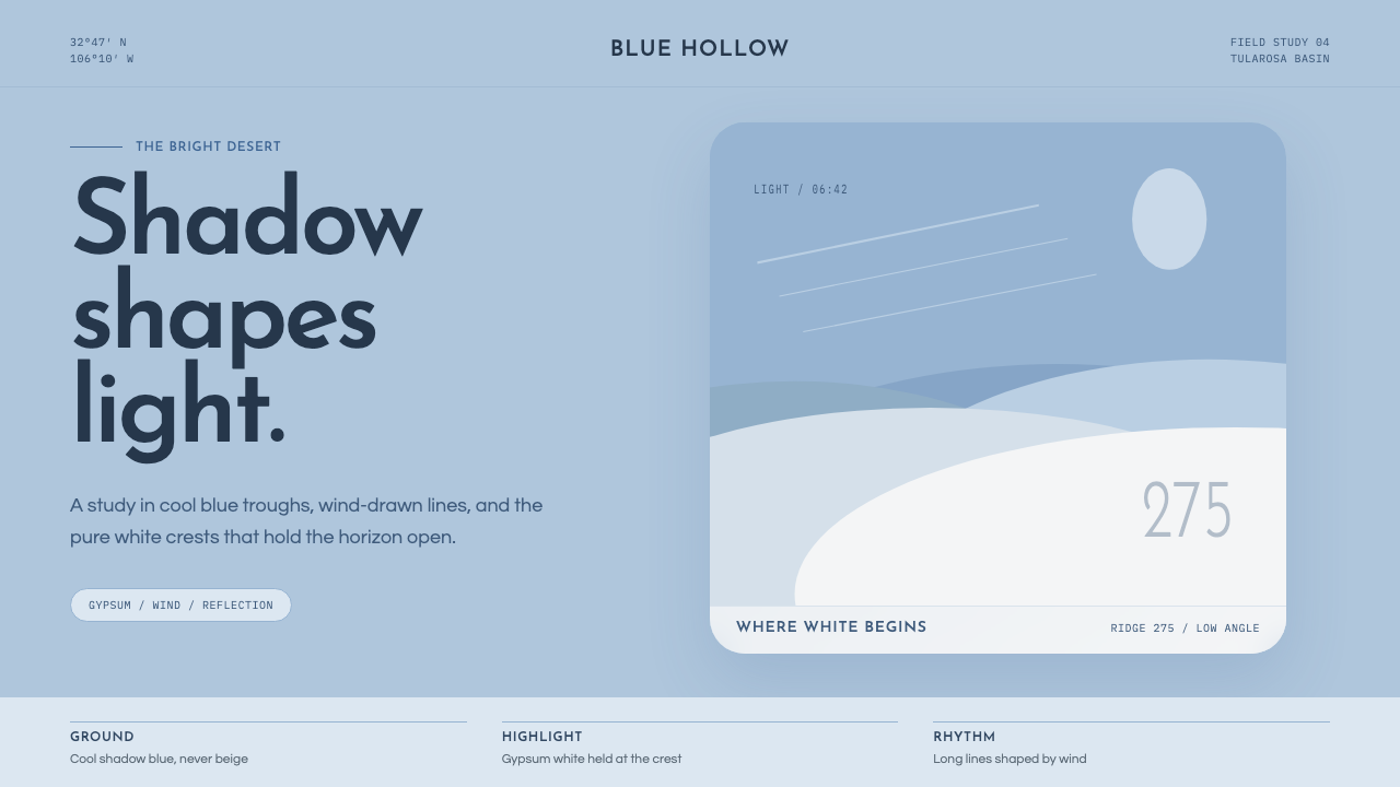 White Sands Gypsum DunesBlue shadow makes white luminous. Airy geometry follows wind-drawn gypsum cre…
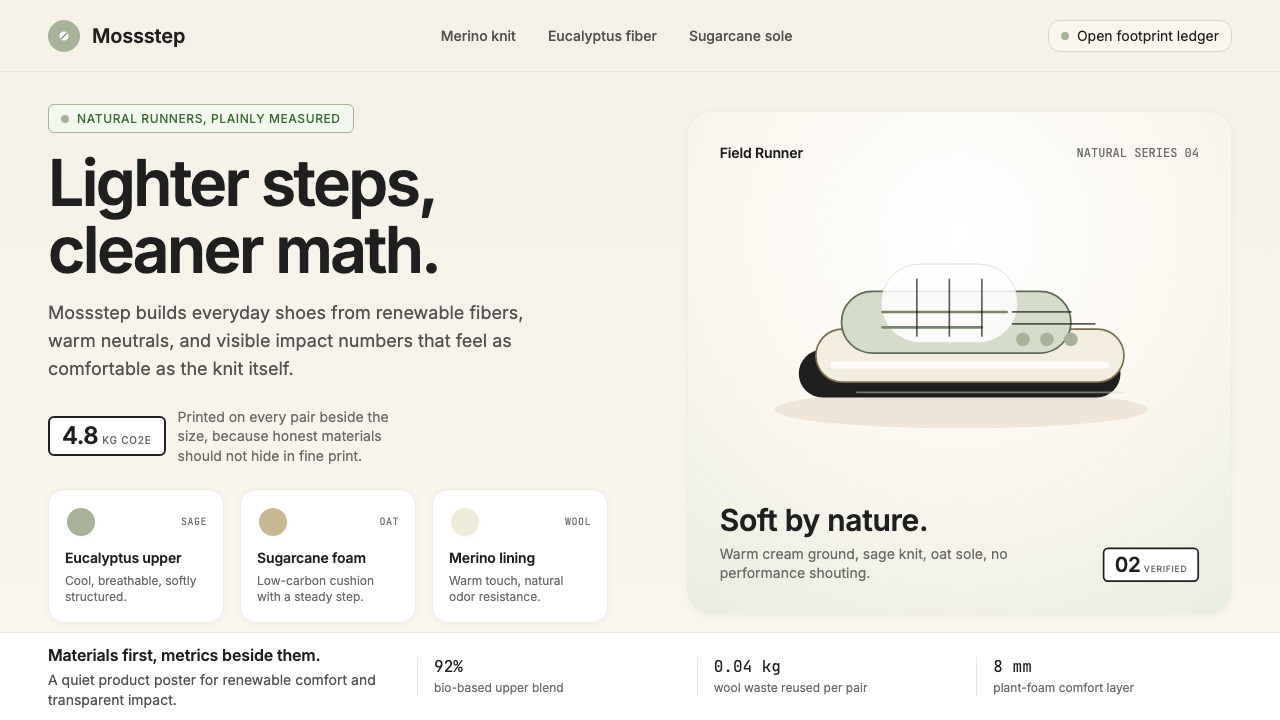 AllbirdsSustainability that breathes. Cream-and-sage tones, carbon labels next to pri…