What is White Sands Gypsum Dunes?
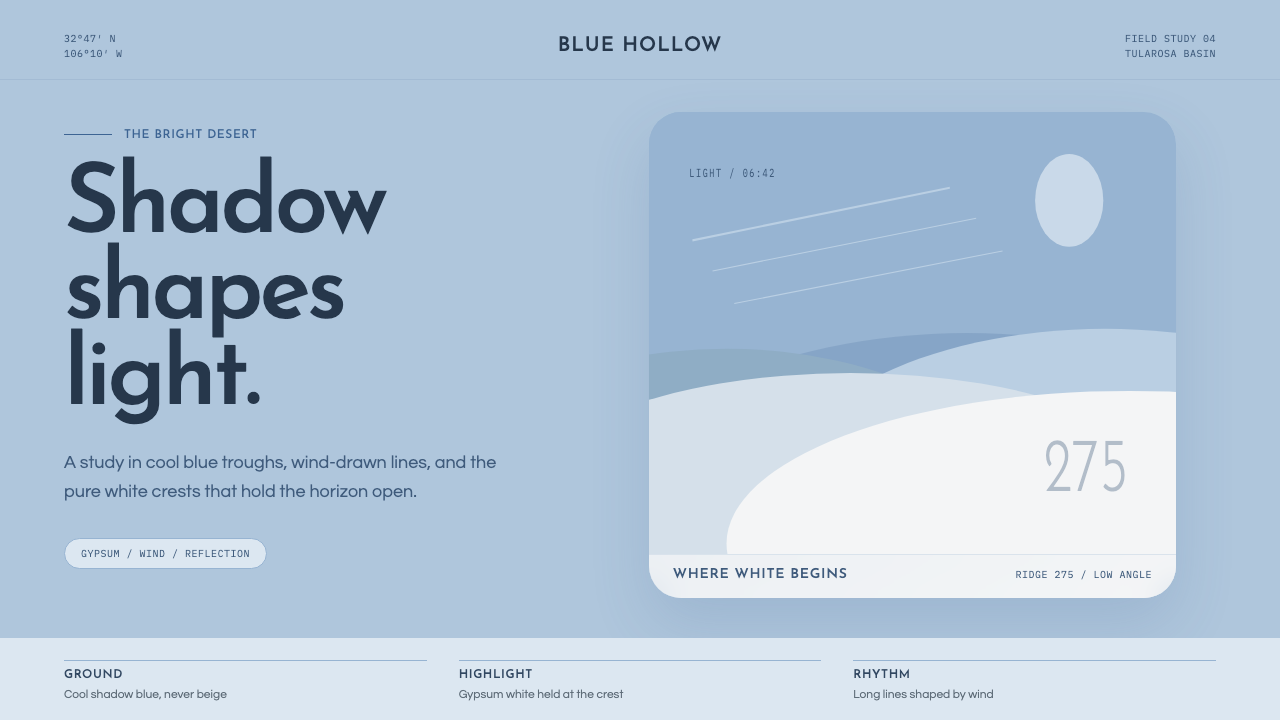
White Sands turns a landscape lesson into a visual system: cool blue shadow gives brilliant white its depth, while wind-drawn gypsum lines make emptiness feel alive.
White Sands Gypsum Dunes in brief
White Sands Gypsum Dunes is a contemporary landscape-derived style rooted in the Tularosa Basin of New Mexico, home to the world’s largest gypsum dunefield. Its defining contrast is not simply white sand against sky, but bright gypsum surfaces articulated by cool blue shadows. The result is luminous rather than blank: white operates as a high highlight, while blue reveals contour, distance, and direction.
The visual language translates wind-shaped dune formations into airy abstraction. Long crestlines, gentle ripple curves, and broad fields of open space replace dense framing and decorative detail. Geometry is present, but it is softened by natural movement; lines should feel drawn by wind rather than engineered with a ruler.
This is a high-key system with an unusually specific emotional register. It feels quiet, expansive, and fresh without becoming sterile. Its restraint comes from landscape observation: the eye moves slowly across pale ground, finds a blue fold of shadow, then follows that line toward another illuminated ridge.
Where does White Sands Gypsum Dunes come from?
The system belongs to a contemporary reading of White Sands rather than to a historic school with a fixed manifesto. Its source is the gypsum dunefield of the Tularosa Basin, where gypsum reflects sunlight instead of absorbing it. That physical condition gives the landscape its extraordinary whiteness and establishes the central visual problem: how to preserve a bright field without losing form.
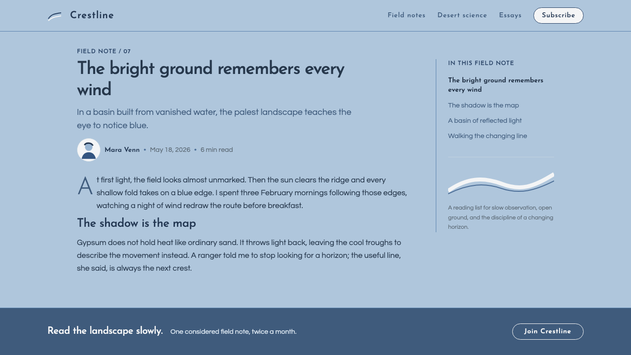
The answer is found in shadow. Across wind-rippled dunes, cool sky-blue shade traces crestlines and separates one luminous plane from the next. This observation shifts the style away from generic minimalism. Its blue ground is a deficit color: not cream, not an undifferentiated white, but a pale cool field that allows gypsum white to remain exceptional.
Its stated era is 2010 to the present, aligned with high-key minimalist landscape and natural-form geometric abstraction. White Sands became a National Park in 2019, while National Park Service interpreters and dunefield landscape photographers provide the human perspectives associated with the place. The style does not imitate the desert as scenery; it extracts its relationships of light, air, curve, and interval.
What defines the White Sands Gypsum Dunes look?
Blue Shadow Ground
Cool sky-blue shadow is the system’s organizing field. It should read as an atmosphere that reveals white forms, not as a decorative accent added afterward. Pure gypsum white is reserved for the brightest surfaces and moments of emphasis.
Luminous White
White is active, reflective, and spatial. Large white areas should feel illuminated rather than empty, with nearby blue shadow providing the contour that lets brightness register as light.
Crestline Curves
Sweeping arcs and long, shallow curves echo wind-drawn gypsum ridges. They guide the eye through a composition gently, avoiding abrupt turns, dense ornament, or aggressively mechanical geometry.
Air and Negative Space
Generous open space is structural, not unused. It creates the sensation of distance and makes each ripple, line, or word feel isolated against an expansive field.
Soft Natural Geometry
The composition uses abstraction without becoming rigid. Repeated bands, curves, and pale planes may suggest geometry, but their relationships should remain fluid, gradual, and landscape-led.
High-Key Restraint
The mood is bright and airy, with contrast carried by shadow tracing rather than by heavy darkness. Visual density should remain low so that luminosity, calm, and movement can coexist.

Who shaped White Sands Gypsum Dunes?
National Park Service interpreters are listed among the key figures for this landscape context. Their role locates the style in public understanding of White Sands: a place whose gypsum, light, and dune movement can be read as connected natural phenomena rather than isolated visual effects.
Dunefield landscape photographers are central to the contemporary visual reading of White Sands. Their attention to crestlines, ripple shadows, and luminous surfaces supports the style’s emphasis on framing, interval, and the changing relationship between blue shade and white gypsum.
White Sands National Park is the geographic and conceptual figure behind the system. Designated a National Park in 2019, it supplies both the material fact of gypsum reflection and the visual grammar of broad white planes divided by cool shadow.
How do you use White Sands Gypsum Dunes today?
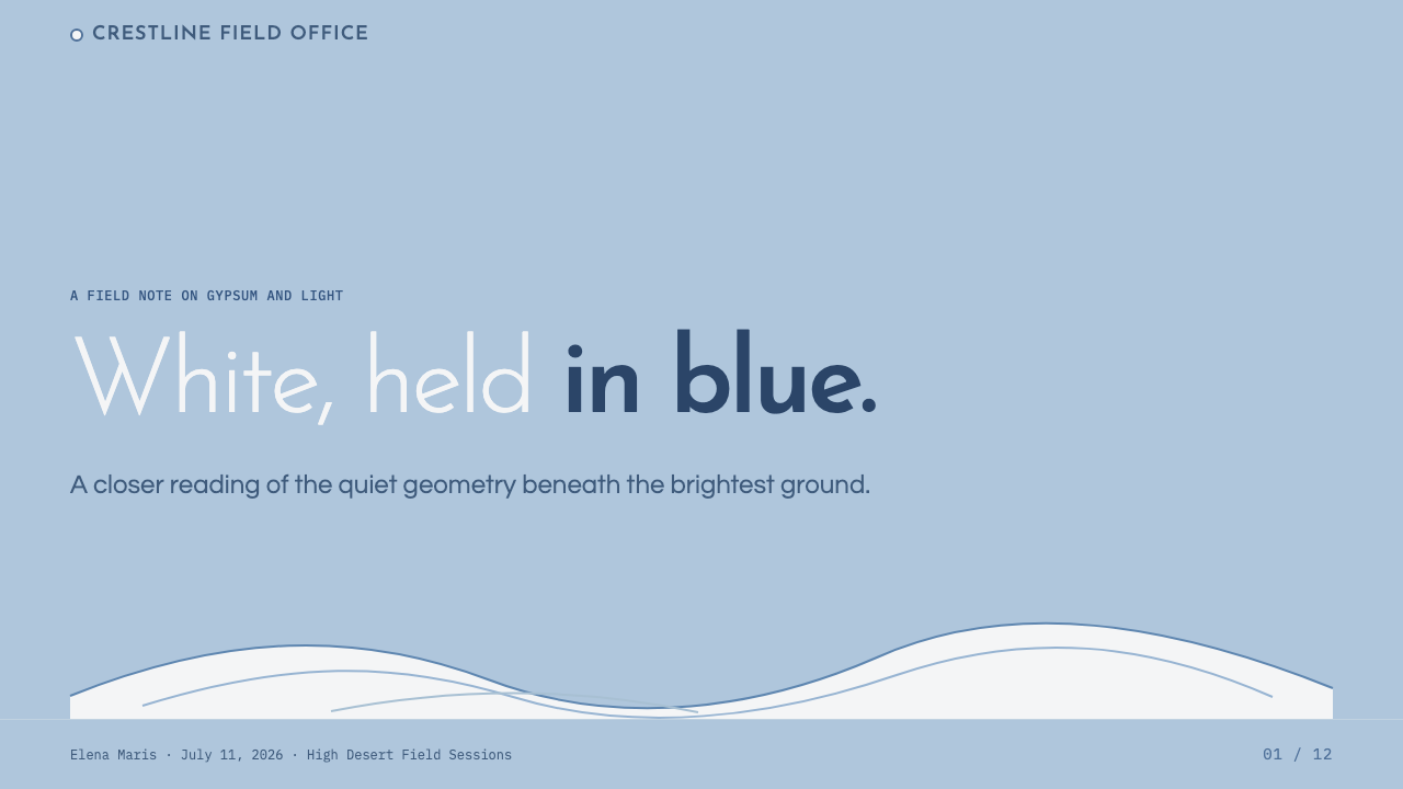
For presentation covers, use a broad pale field with one sweeping crestline or ripple curve establishing direction. Place the title where the composition has already created calm, and let a concentrated white highlight carry the sense of arrival. Avoid filling the cover with landmarks or literal desert imagery; the landscape should be felt through light and interval.
On content slides, treat blue-shadow fields as quiet containers for information. Use long curves to separate sections or lead attention between ideas, while keeping body copy comfortably surrounded by open space. For data, favor clear pale planes and restrained directional lines so that charts retain the system’s airy readability rather than becoming dense technical surfaces.
For web interfaces, this style suits dashboards, planning tools, and pricing pages that benefit from calm orientation. A cool blue ground can hold navigation, filters, or lower-priority context; luminous white panels can bring focus to active decisions. Curves should guide progression through the interface, not become ornamental borders around every component.
For editorial and marketing work, White Sands supports stories about clarity, discovery, travel, atmosphere, or thoughtful technology. Let headlines emerge from broad space, use a long contour as a section transition, and allow imagery to feel cropped by light rather than boxed into rigid frames. Marketing pages can alternate between blue-shadow expanses and white highlight moments without losing their quiet continuity.
The common mistake is reducing the style to white backgrounds plus any blue accent. Its character depends on the relationship between reflective white, cool shadow, and wind-led line. Overloading a layout with unrelated curves, dense cards, or strong dark contrast destroys the sense of open dunes; the style needs room for its brightness to move.
White Sands Gypsum Dunes — FAQ
Is White Sands Gypsum Dunes simply a minimal white-and-blue style?
No. The palette matters because it describes a real landscape relationship: gypsum reflects light, while cool blue shadow makes dune contours visible. A generic white-and-blue design can resemble the style superficially, but it lacks the crestline logic, luminous hierarchy, and wind-shaped movement that give the system its identity.
Should pure white be used as the main background everywhere?
Pure gypsum white works best as a highlight rather than an automatic default. The system specifically begins from a cool blue-shadow ground, which gives white its luminous force. If white dominates every surface without shadow or contour, the design can become flat and lose the distinctive reading of dune light.
Can the style use photography?
Yes, especially when photography preserves the defining observations of the dunefield: reflective white gypsum, blue shadow, rippled surfaces, and long crestlines. Images should support the abstract structure of the page rather than compete with it through crowded scenery or excessive visual detail.
What products are the best fit for this style?
It is most useful where calm orientation, spaciousness, and clear hierarchy support the experience: presentation systems, editorial stories, dashboards, planning interfaces, and pricing pages. It is less convincing when a product needs dense visual energy or decorative abundance, because the style’s meaning depends on intervals, restraint, and the visibility of light.
Related design styles
 Succulent CactariumQuiet desert order. Sage rosettes and terracotta rings rest on dark warm soil.
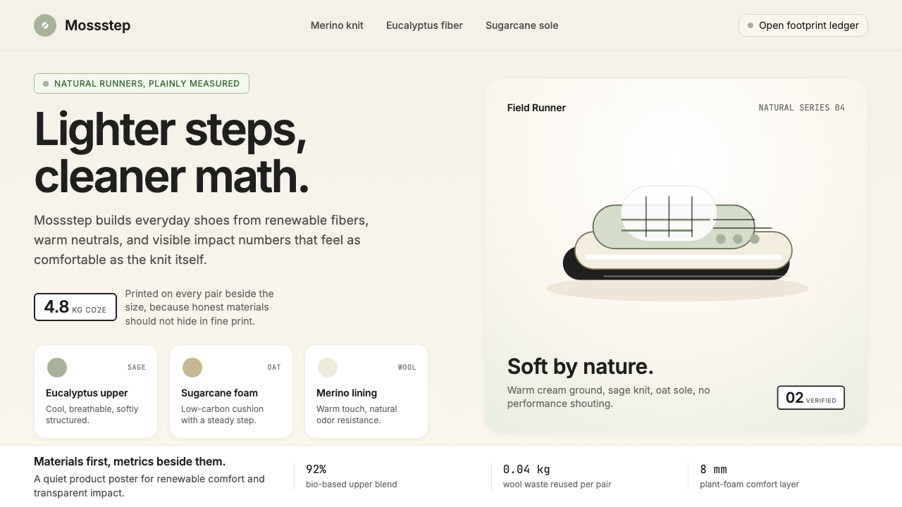 AllbirdsSustainability that breathes. Cream-and-sage tones, carbon labels next to pri…
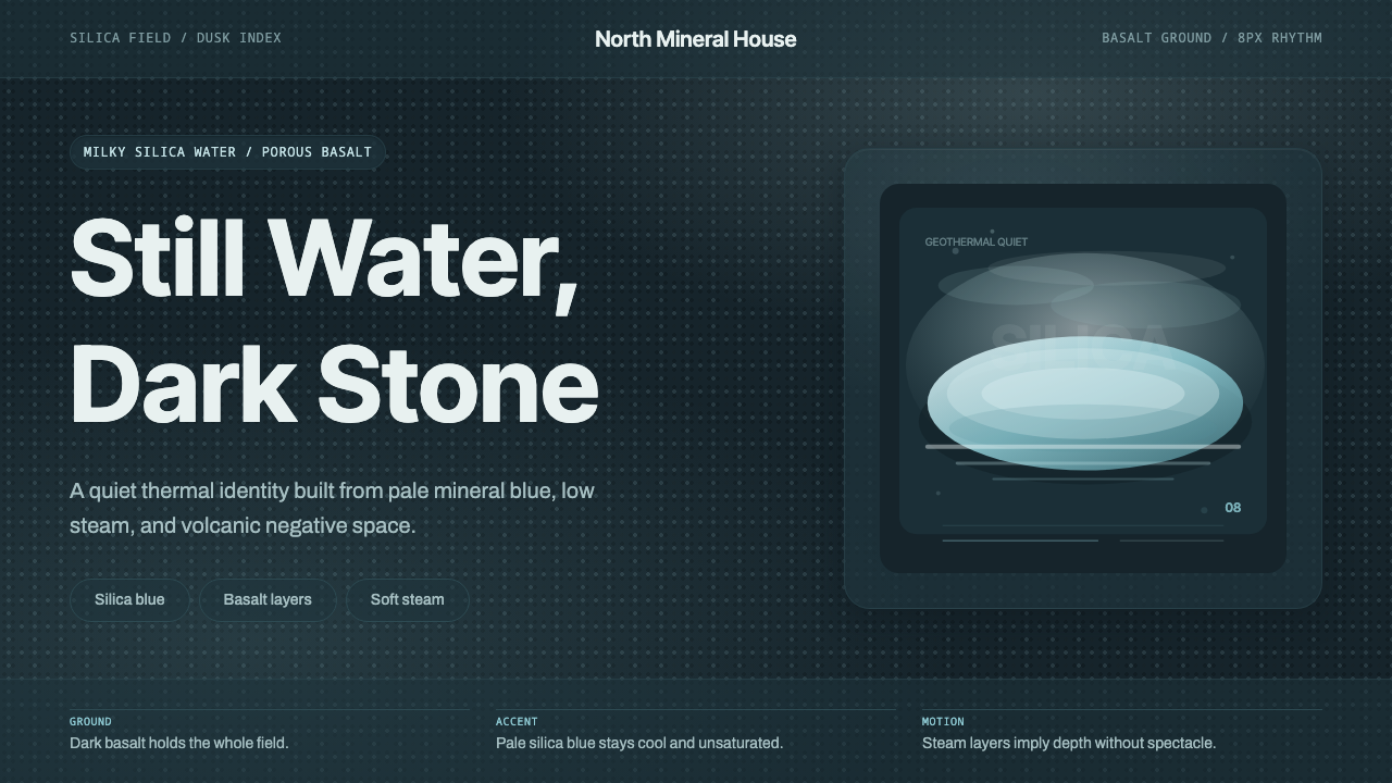 Glacial Teal LagoonQuiet feels elemental. Basalt darks and milky silica blue drift in a low-cont…
 Oyster FarmWorked at the pace of the tide. Slate ground, brackish blue accent, grotesque…
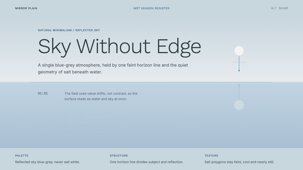 Salt Flat UyuniAtmosphere does the work. Blue-grey space, one horizon line, faint salt polyg…
 Airbnb 2014Coral red, soft pill cards, Cereal type. The Bélo wraps strangers in warm, da…