What is Overwatch (2016)?
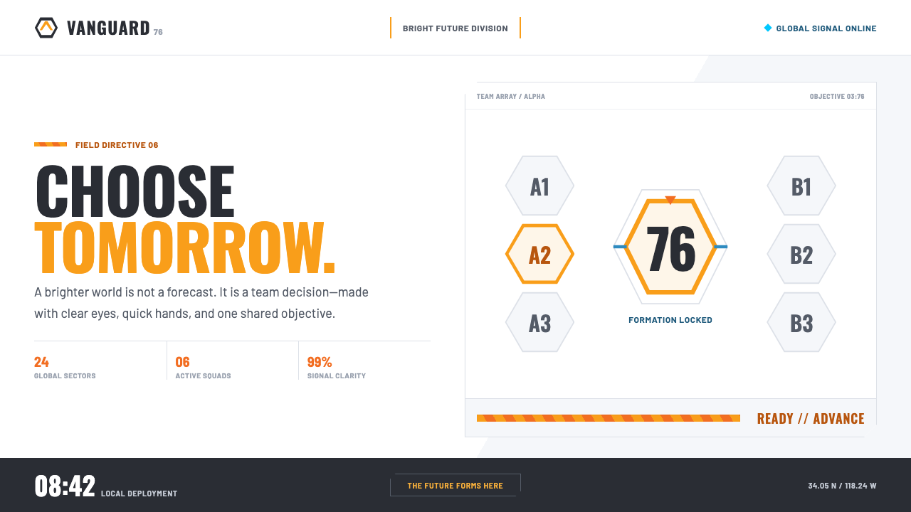
Overwatch made competitive shooting look like a bright public future: white space, hot orange, hexagonal structure, and the restless clarity of a scoreboard.
Overwatch (2016) in brief
Overwatch is a 2016 visual system for a competitive hero shooter that rejects the genre’s familiar brown-grey heaviness. Its near-future world is sunny, clean, and deliberately hopeful. Instead of presenting competition as grime, damage, and military weight, it makes competition feel legible, energized, and open to view.
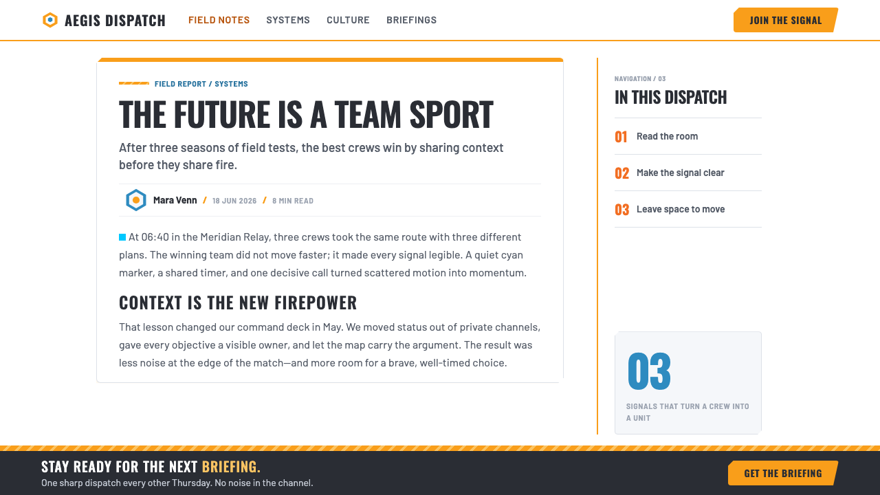
The system is built around white space, a single hot orange, and the hexagon. Hexagonal badges frame heroes, tiles sit apart with clean gaps, and angled stripes cut across banners with the forward movement of a payload. These elements turn interface furniture into a visual language: structure is visible, action has a clear signal, and every screen carries an unmistakable directional force.
Its impression is part retail display, part sports broadcast, part polished animated science fiction. Crisp condensed display type stacks information like a scoreboard, while large ranks, countdowns, and ultimate-charge percentages become visual protagonists. The result is not merely a game menu aesthetic; it is an optimistic competitive system that treats information as spectacle.
Where does Overwatch (2016) come from?
Overwatch launched on May 24, 2016, after its visual identity was developed from 2014 to 2016. The timing matters because the identity was formed as a complete system rather than as an isolated menu treatment: its bright surfaces, hero framing, action signals, and information hierarchy all speak the same visual language.
The work originated in Irvine, California, and belongs to a near-future optimistic science-fiction direction. Its future is not presented as distant, dim, or corroded. It is bright enough to feel immediate, and clean enough that players can quickly understand where attention belongs.
The style also sits at the meeting point of hero-shooter interface design and e-sports broadcast graphics. Hero identity needs recognizable containers, competition needs visible status, and broadcast language needs information that can be read at speed. Hex badges, condensed headings, rankings, countdowns, and charge indicators answer those needs without abandoning a sense of celebration.
Jeff Kaplan, Arnold Tsang, Bill Petras, Michael Chu, and Hong SoonSang are identified with the project’s key figures. Together, their presence anchors the visual identity in the launch-era Overwatch team and in the broader task of making a competitive game feel welcoming, high-energy, and future-facing.
What defines the Overwatch (2016) look?
Bright Ground
White space is not empty background; it is the system’s operating climate. Broad clear fields separate status, heroes, and calls to action so that competition feels exposed to daylight rather than buried in atmosphere. The brightness makes information feel public, direct, and ready to move.
Hot Orange Signal
A single hot orange carries urgency and focus. It appears as an action pip, a call to action, or a sharp point of emphasis against white space. Because the accent is concentrated, it reads as a decision rather than decoration: the eye understands that something here deserves an immediate response.
Hexagonal Identity
The hexagon supplies the system’s basic container. Chamfered hex badges give hero identity a stable, repeatable frame, while hex grids suggest a larger network of selectable roles and states. The shape is technical without becoming cold, linking near-future machinery to a clear sense of team membership.
Diagonal Momentum
Diagonal payload stripes push banners and transitions forward. Their angle interrupts the stillness of white fields and gives otherwise static information a competitive velocity. The direction feels athletic and broadcast-like: an interface state is never merely displayed, but presented as part of an ongoing match.
Scoreboard Typography
Crisp condensed display type gives headings a stacked, scoreboard-like presence. Large numerals and compact labels establish hierarchy through immediacy: rank, countdown, and ultimate charge can take visual priority without requiring dense decoration. Type behaves as both instruction and event graphics.
Optimistic Competition
The defining emotional quality is that the future is worth fighting for. Clean gaps, bright grounds, and controlled action accents prevent intensity from becoming oppressive. Even when the interface communicates pressure or countdown, it maintains an upbeat belief that competition can be clear, social, and exhilarating.
Who shaped Overwatch (2016)?
Kaplan is listed among the key figures connected to Overwatch’s launch-era identity. His inclusion places the visual system within the project’s central team rather than treating its bright competitive language as an anonymous interface layer.
Tsang is identified as a key figure in the Overwatch project. In the context of this identity, the name belongs to the group associated with a world where heroes, interfaces, and optimistic near-future presentation are tightly connected.
Petras appears among the project’s key figures. The visual language associated with the launch period depends on a coherent world view: bright space, legible competitive status, and a future that feels designed for public attention.
Chu is named as a key figure for Overwatch. The identity’s hero-focused interface makes character selection and match information feel part of the same optimistic presentation, rather than separate systems competing for attention.
Hong SoonSang is included among the key figures associated with the project. The launch-era identity pairs a clean visual surface with high competitive energy, demonstrating how polished presentation can support rapid reading rather than slow it down.
How do you use Overwatch (2016) today?
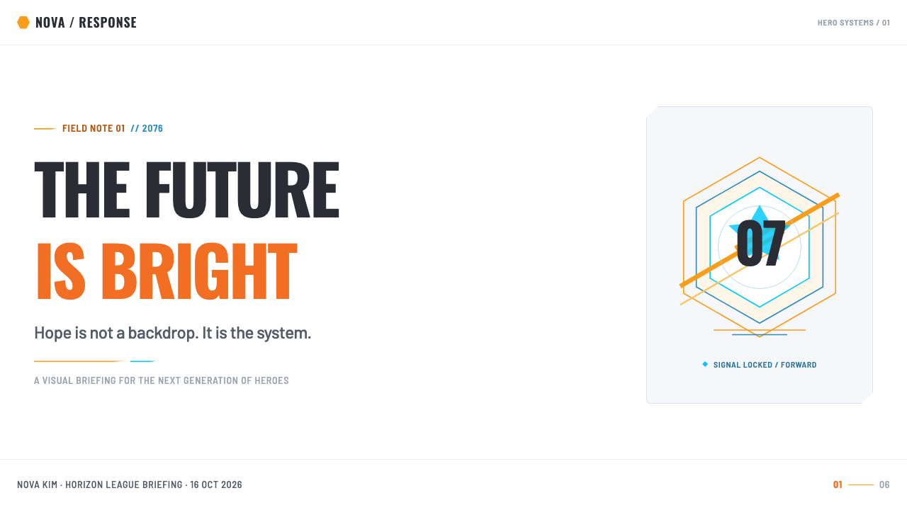
For presentation covers, use a broad bright field, a dominant hexagonal or chamfered badge, and one concentrated orange action mark. Let the title sit in condensed, scoreboard-like display type, with generous clear space around it. The cover should feel like a hero-select moment: a decisive identity arriving before the details.
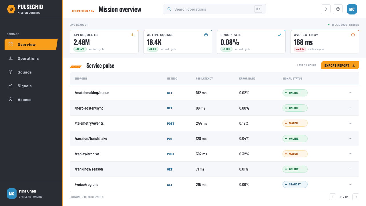
For content and data slides, make rank, progress, countdown, comparison, or status the visual center. Group supporting explanation into compact blocks, then separate states with white gaps and disciplined hexagonal containers. Charts work best when treated as competitive readouts rather than decorative illustrations: clear labels, visible comparison, and one orange signal for the most important state.
For web interfaces, the style is especially useful for dashboards, player profiles, status pages, pricing comparisons, and any product that needs fast scanning. Build the page from bright panels, hex or chamfered identity frames, concise labels, and directional banners. Reserve orange for the primary action, selected state, alert, or progress cue so that the interface retains its immediate hierarchy.
For editorial and marketing work, use the style’s broadcast confidence rather than turning every surface into a game screen. A campaign page can alternate spacious white story sections with diagonal banners, hero badges, large numerical proof points, and compact scoreboard headings. The tone should stay inviting: the future is presented as clean, active, and available to join.
The common mistake is copying the orange-and-hex motif while losing the white space and information discipline that make it work. Too many orange accents flatten hierarchy; too many hexagons turn a system of identity frames into texture; too much visual noise makes the result feel like generic science fiction. The style succeeds when every signal has a job and the bright field has room to breathe.
Overwatch (2016) — FAQ
Is the Overwatch aesthetic simply a game UI style?
No. It is rooted in game interface design, but its strongest ideas are broader: bright spatial separation, clear competitive hierarchy, concentrated action color, modular identity containers, and directional broadcast energy. Those ideas can transfer to products that need visible status and fast decisions.
Why are white space and orange so important together?
White space creates calm, separation, and legibility; hot orange introduces urgency and action. Their contrast gives the system its optimistic competitive charge. Without the bright ground, orange loses precision; without the accent, the bright ground can lose its sense of forward motion.
What role does the hexagon play beyond decoration?
The hexagon acts as an identity and organization tool. It frames heroes, suggests selectable states, and gives repeated interface elements a shared geometry. Its value is structural: it helps a system feel modular and connected while preserving the technical optimism of the near-future setting.
Can this style work for a pricing page or dashboard?
Yes, particularly when the product benefits from comparison, progress, visible tiers, or immediate action. Use the bright ground for scanability, compact scoreboard-like type for status, and orange only where a user should decide or move. The goal is not to imitate a game, but to make information feel active and clear.
What makes an imitation of the style feel unsuccessful?
It fails when the visual motifs become noise. A dense field of orange, hexagons, diagonals, and large type can lose the clarity that the original system depends on. Keep the bright space generous, choose a small number of meaningful signals, and make every badge, number, and stripe support reading or action.
Related design styles
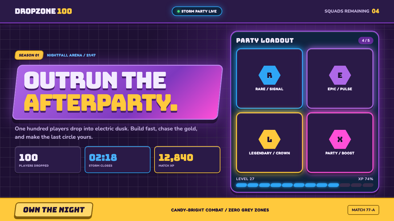 Fortnite (2017 Battle Royale)Battle royale becomes a neon party. Chunky caps and rarity glows electrify st…
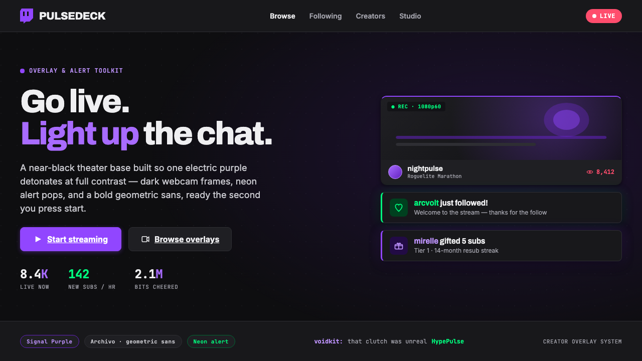 Twitch Streamer OverlayNear-black theater base, one electric purple. Dark webcam frames, neon alert…
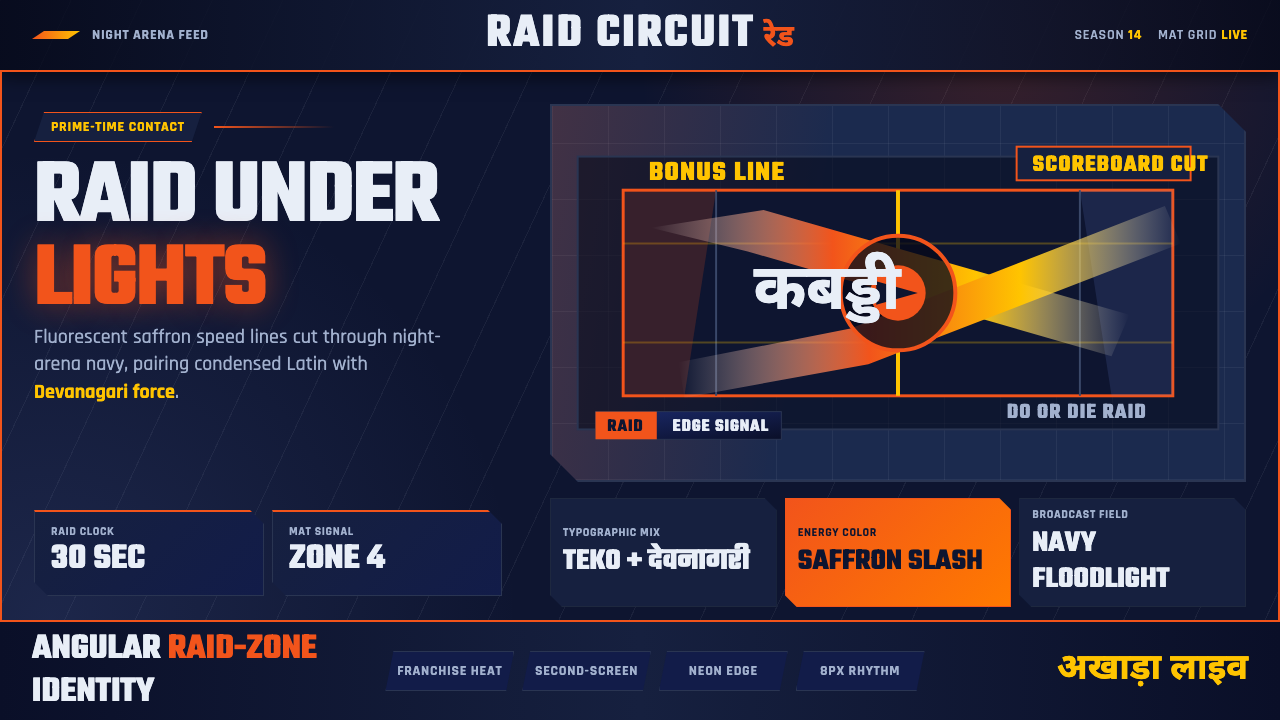 Pro Kabaddi LeagueBroadcast electricity. Saffron slashes, navy court grids, and Devanagari type…
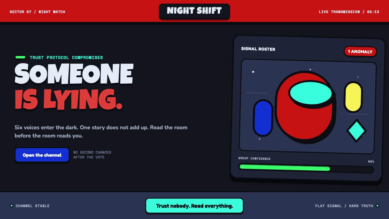 Among Us (crewmate space)Trust is ready to break. Loud capsule colors cut through a navy void with har…
 Discord 2024Blurple cozy. Charcoal grounds, illustrated characters — every surface says '…
 Altered CarbonNeon screams off noir. Magenta glass, cyan scanlines, and stacked vertical si…