What is Oshi no Ko?
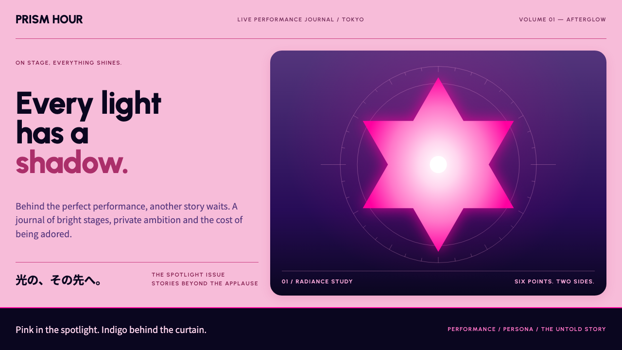
Oshi no Ko dresses its pages in pink stage haze and a glinting six-pointed star, then lets indigo shadow show what the spotlight is hiding.
Oshi no Ko in brief
This design language is lifted from the Season 1 key visual of the anime Oshi no Ko. The page is washed in pink stage haze, magenta spotlights fan down from an unseen rig, and a six-pointed star, the glint in the eyes of the idol Ai Hoshino, is reused as icon, bullet point and crop frame. It is glamorous in the most literal sense: everything is lit, soft-edged and shining.
Beneath that bright surface sits a second register. Violet and indigo stage panels, borrowed from the music video for YOASOBI's song Idol, add depth, grain, bloom and tiny sparkle points. Pink speaks for the front-of-house shine; indigo speaks for the backstage tension. The style switches between the two the way the story does, which is why it feels both dazzling and slightly uneasy.
In a design library, Oshi no Ko is the style for products that have to sell a performance: fandom pages, live ticketing, talent rosters and audience dashboards. It turns the idea of stardom into a visual system, and it works because the two moods are held in the same frame rather than separated into different pages.

Where does Oshi no Ko come from?
Oshi no Ko began as a manga written by Aka Akasaka and drawn by Mengo Yokoyari, serialised in Weekly Young Jump from 2020 to 2024. The television anime adaptation premiered in April 2023 for its first season, with a second season following in 2024. The work comes from Tokyo, the centre of Japan's entertainment industry, and it takes that industry as its subject: the story follows the hidden costs of fame in the idol world.
The title itself points to a culture. An oshi is the performer a fan chooses to support wholeheartedly, and oshi culture, with its glow sticks, fan clubs, cheering and merchandise, is a central part of Japanese idol fandom. The series draws on this culture to build its visuals. Stage lights, banners and bright costume colours are natural ingredients, and the repeated star motif works like a fan's emblem.
The production side also shapes the look. Daisuke Hiramaki and Tetsuya Usami are among the figures associated with the anime's visual direction, while the opening song Idol by YOASOBI became a landmark moment in which a music video functioned as a pop event in its own right. Its violet and indigo stage panels, with glowing particles and slightly grainy bloom, supplied the darker, more cinematic register that complements the key visual's pink.
Seen in context, the style belongs to three overlapping traditions: Japanese idol culture, showbiz drama manga that exposes what happens offstage, and the modern tradition of anime songs and videos released as events. The strength of the aesthetic lies in that tension, in which sparkle and shadow share a surface, and every tool in the system, from the glow to the star, is used to hold the two together.
What defines the Oshi no Ko look?
Pink stage haze
The page ground is washed in a soft, hazy pink that behaves like atmospheric light rather than a flat fill. It gives the layout an immediate sense of being on stage and makes everything on it feel a little luminous.
Magenta spotlight beams
Fan-shaped magenta beams descend from the top of the composition, directing attention toward the focal element. They work as an organising device, pulling the eye downward and framing a hero image or headline like a performer.
Six-pointed star motif
The star from the idol's eyes is reused as icon, list bullet and image crop. A single recurring shape makes the whole system recognisable, and it carries the idea that every item on the page is a small point of light.
Indigo and violet backstage panels
Darker panels of indigo and violet appear alongside the pink, providing contrast and depth. They are used for data, details and quieter content, and they bring the sense of what lies behind the performance.
Grain, bloom and sparkle
Subtle film grain, glowing bloom around bright elements and small sparkle points add a cinematic, concert-lighting texture. They should stay delicate and sparse so that they feel like light, not clutter.
Two-register mood switching
Sections alternate between bright pink glamour and darker indigo gravity. The shift is the style's signature, giving a page the same emotional arc as the story, from sparkle to shadow and back.

Who shaped Oshi no Ko?
Writer of the Oshi no Ko manga, whose story about the hidden side of fame defines the work's tone.
Artist of the manga, responsible for the character designs including the star in Ai's eyes.
Associated with the television anime's direction and visual realisation.
A figure connected to the anime production behind the Season 1 visuals.
The music duo whose song Idol, and its music video, supplied the violet and indigo stage register.
How do you use Oshi no Ko today?
On slides, Oshi no Ko suits fandom reports, entertainment-industry pitches, event recaps and talent presentations. A cover can use pink haze with magenta beams falling toward a large title, with a star marking the key phrase. Content slides can alternate between pink glamour pages and indigo detail pages, so the deck has its own rhythm of reveal and substance. For data, place figures on indigo panels with glowing accent numbers, and use stars as markers instead of plain bullets.
In web interfaces, the style suits live-event ticketing, fan community hubs, streaming schedules, artist rosters and audience-analytics dashboards. Hero sections take the pink haze and spotlight; detail pages shift into indigo and violet panels with soft glows on interactive elements. Pricing or ticket tiers can be shown as stage cards, with the featured tier given a star and a gentle bloom. Keep the animation graceful: slow glints and fades rather than abrupt jumps.
In editorial and marketing work, it is built for campaign key visuals, concert announcements, magazine spreads about idols and any content that wants a theatrical glow. Large imagery of a performer under beams, framed in a star-shaped crop, anchors the page. Copy can be bright, enthusiastic and direct, with the occasional darker line to hint at depth.
The most common mistake is to use only the pink half, which produces a flat, sugary look and loses the tension that defines the style. The opposite error is making the indigo too heavy, so the glamour disappears. Another is overloading the page with grain, glow and sparkles until the layout becomes noisy. Keep the effects light, use the star consistently and let each section choose one mood clearly.

Oshi no Ko — FAQ
What is the Oshi no Ko visual style?
It is a design language drawn from the anime's Season 1 key visual: pink stage haze, magenta spotlights and a six-pointed star motif, paired with a darker violet and indigo register taken from the music video for YOASOBI's Idol.
What does the six-pointed star mean?
It is the glint in the eyes of the idol Ai Hoshino. In the design system it becomes a recurring icon, bullet and crop frame that signals brightness and star quality.
Why does the style use both pink and indigo?
Pink represents the glamour seen by the audience, while indigo represents the backstage tension the story explores. Switching between them matches the work's theme of a bright surface hiding something darker.
What projects suit this style?
Fandom sites, live-event ticketing, talent rosters, streaming and audience dashboards, concert announcements and entertainment-industry presentations. It is less suited to austere, technical or minimalist work.
What is the most common mistake?
Using only the pink half, or piling on grain, glow and sparkle until the page is noisy. The style works when the two moods stay balanced and the effects stay delicate.
Related design styles
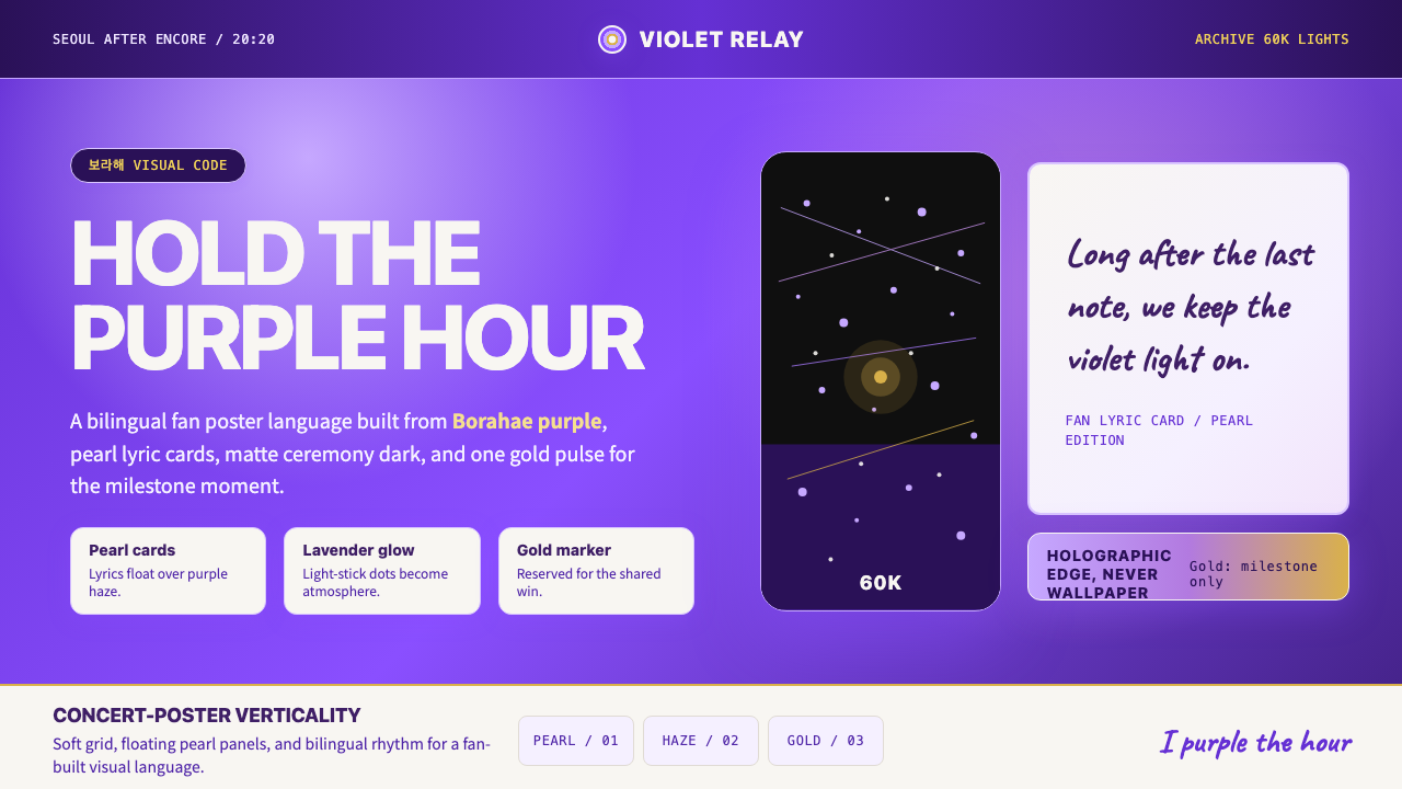 BTS Army Purple 2020Fandom becomes atmosphere. Borahae purple, pearl cards, lavender glow, one go…
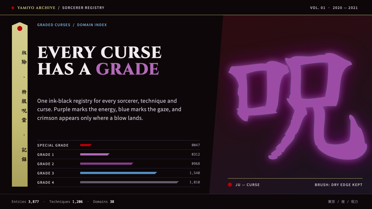 Jujutsu KaisenCrimson only at impact. Ink-black night, purple cursed glow, brush kanji and…
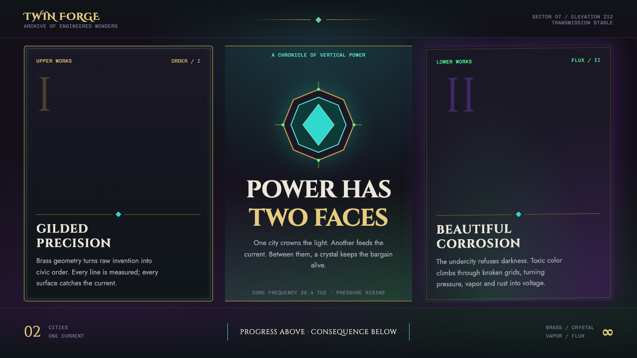 Arcane Hextech (2021)Progress and rot share a current. Brass symmetry meets teal crystal and toxic…
 Bolivian Cholita FashionUnapologetic satin power. Hot pink fields, emerald stitches, centered pollera…
 Medellín Comuna 13 MuralsRefuses blank walls. Hot pink, neon green, and cobalt blocks pack the grid li…
 Taylor Swift Eras (2023)Every chapter catches light. Hot pink, lavender, gold and beadwork glow on mi…