What is Oromo Gada?
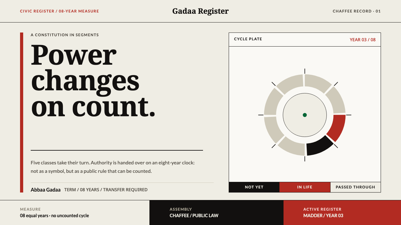
Oromo Gada draws a constitution as a clock: black, madder red and white segments on undyed cotton, where every cycle can be counted and every handover happens on time.
Oromo Gada in brief
Oromo Gada is a design language built on Gadaa, the generation-grade system of the Oromo people of Ethiopia and northern Kenya. Gadaa is not an ornament or an emblem. It is a constitution that runs on an eight-year clock, sorting public life into five gada classes and eleven age grades, with power passing from one class to the next on a fixed schedule. The visual system takes that schedule as its subject.
Visually, the style is a diagram before it is a decoration. The ground is the warm, slightly uneven off-white of undyed handspun cotton. Three colours do almost all the work: black, a deep madder red, and white. Each one carries a meaning. Black is the life not yet entered, red is the life being lived, white is the life passed through. Anything that describes a cycle is drawn as a ring cut into equal, countable segments, and free-flowing blobs, waves and gradients have no place on the page.
What separates this system from other heritage-inspired palettes is that its rules are semantic rather than aesthetic. Colour is not chosen for mood but given a role, and form is not chosen for charm but for countability. The result is calm, austere and unusually legible: a page that tells you where you are in a sequence and what comes next. It suits interfaces and documents where time, rotation, tenure and handover are the real content.
Where does Oromo Gada come from?
Gadaa is far older than the twentieth century. The record places it before 1900, documented in oral chronology over centuries, and it is still practised today. The Oromo of Oromia in Ethiopia, and Oromo communities in northern Kenya, hold it as a living institution rather than a historical curiosity. In 2016 UNESCO inscribed Gadaa on its Representative List of the Intangible Cultural Heritage of Humanity, a recognition that gave outside readers a way into a system that had always been carried by memory, assembly and ritual practice rather than by written statute.
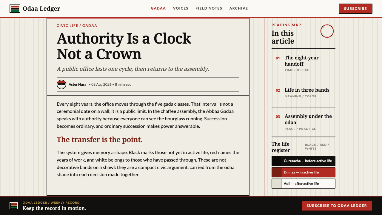
The mechanics explain the visual logic. Authority is held in eight-year terms. Society is sorted into five gada classes and eleven age grades. The transfer of power happens on schedule whether or not the officeholder, the Abbaa Gadaa, wants to hand it over. The assembly that makes and affirms law is the chaffee, whose council members are the hayyuu, and it meets under the odaa, a sycamore-fig that serves as an open-air civic hall. A clock that nobody is allowed to stop is the central idea of the whole institution, and the design system inherits it as a ring of equal segments.
Objects mark the offices. The kallacha, an ornament worn at the brow, the bokkuu, the staff of authority, and the siinqee, the staff of the women's institution, are the regalia through which legitimacy is displayed. The woven band called tibeb carries the deep madder red that becomes the system's single warm accent, and the undyed handspun bullukoo cotton supplies its ground. None of these is borrowed as a pattern. They are the actual materials and signs of the institution, and the design system uses them in its vocabulary rather than painting over them.
Writing and ritual carry the system into the present. The Irreecha ritual of thanksgiving is one of the practices associated with it, and Qubee, the Latin-script orthography in which Oromo is now commonly written, explains why the terms in this article carry doubled vowels, as in Gadaa, Abbaa and odaa. The anthropologist Asmarom Legesse, whose study of the system is a standard scholarly reference, gave outside readers a map of how the classes, grades and terms fit together. Together these threads give the design system something rare: a source that is simultaneously a visual tradition, a legal order and a calendar.
What defines the Oromo Gada look?
Undyed Cotton Ground
The page is the warm, slightly uneven off-white of undyed handspun bullukoo cotton, never a stark screen white. It reads as cloth rather than paper: matte, quiet and a little soft at the edges. Because the ground is neutral by design, every colour placed on it has to justify itself, and nothing is allowed to glow.
Black, Red, White as a Life Register
The three colours are a diagram, not a palette. Black stands for the life not yet entered, red for the life being lived, white for the life passed through. Used consistently, they let a reader tell at a glance what is upcoming, what is current and what is done, which is exactly the job a generation-grade system performs for a community.
Madder Red as the Single Warm Voice
The deep madder red comes from the woven tibeb band and is the only warm accent in the system. It is dark and earthy rather than bright, closer to a dyed root than a signal lamp. Reserve it for the present moment: the active term, the current stage, the one thing the viewer should look at now.
The Counted Ring
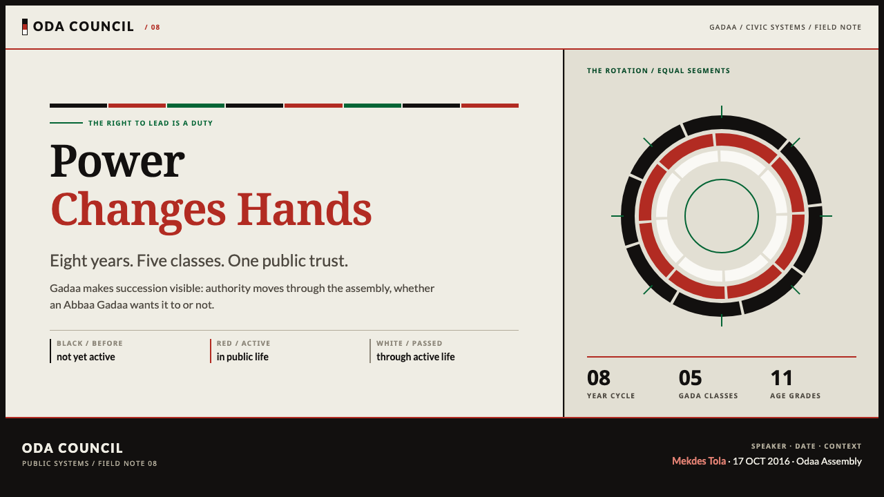
Anything cyclical is drawn as a ring divided into equal, countable segments, echoing the eight-year clock. Each segment has hard edges and the same width as its neighbours. A ring may be filled, outlined or left empty segment by segment, but it is never smoothed into a continuous sweep. If a reader cannot count the parts, the ring has failed.
Scheduled Rhythm
Repetition and sequence replace expressive flourish. Rows, steps and rings advance at an even pace, and spacing stays regular enough that the eye can feel the interval between one stage and the next. Handover is the emotional core of the system, so layouts should always suggest what comes after the current item.
Regalia as Signs
The kallacha, bokkuu and siinqee appear, when they appear at all, as small, flat, schematic marks that identify an office or an institution. They are named objects with specific meanings rather than decoration, so they are used sparingly and in context: beside the thing they signify, never scattered as a border or a repeat pattern.
Plain Text, Intact Names
Typography stays plain and legible, supporting a vocabulary of Oromo terms written in the Qubee Latin orthography. Doubled vowels such as Gadaa, Abbaa and odaa must be set exactly as spelled, with no case changes or substitutions. Type carries information, not personality; the ring and the colour register do the expressive work.
Who shaped Oromo Gada?
An anthropologist whose study of Gadaa is the reference most outside readers meet first. He is listed among the key figures of this style because his scholarship made the system legible beyond Oromo communities: the idea that a society can organize political succession around fixed classes and a fixed clock, rather than around personal rule, is largely understood through accounts like his. For designers, he is part of the reason Gadaa can be described as a constitution rather than a custom.
The officeholder who leads during a gada term, on the eight-year clock. The defining fact recorded about the office is that it is handed over on schedule, whether or not the holder wishes to give it up. That single rule is the origin of the design system's insistence on fixed intervals and visible transitions: an office is a position on a ring, not a possession.
The hayyuu are the council members of the chaffee assembly, which meets under the odaa sycamore-fig. They stand for the deliberative side of the institution: law is made and affirmed in the open, by an assembly, in a place anyone can find. In the design system this is why layouts favour open ground, clear sequence and visible structure over enclosure or ornament.
In 2016 UNESCO inscribed the Gadaa system on its Representative List of the Intangible Cultural Heritage of Humanity. The recognition matters for design because it frames Gadaa as a living institution under stewardship, not a lost artefact. A style drawn from it should therefore be credited, described accurately and used with the same care a designer would give to any practising community's heritage.
How do you use Oromo Gada today?
Oromo Gada is most at home wherever the real subject is time: terms, rotations, sequences, handovers, stages. Its palette is small and its logic is strict, so it rewards designers who first decide what each colour will mean and then hold to it. Treat it as a notation system for status rather than a mood board, and it will repay you with pages that explain themselves.
On cover slides, let one large segmented ring carry the composition, set against the undyed ground with the title beside it in plain dark type; the ring can show the real structure of the talk, one segment for each part. Content slides should read like a ledger: a few quiet rows, black for what is still ahead, red for the item currently under discussion, white or open outline for what has been covered. Data slides suit proportional rings and counted segment charts, where every segment has the same width and the value is carried by how many segments are filled, not by a smooth sweep.
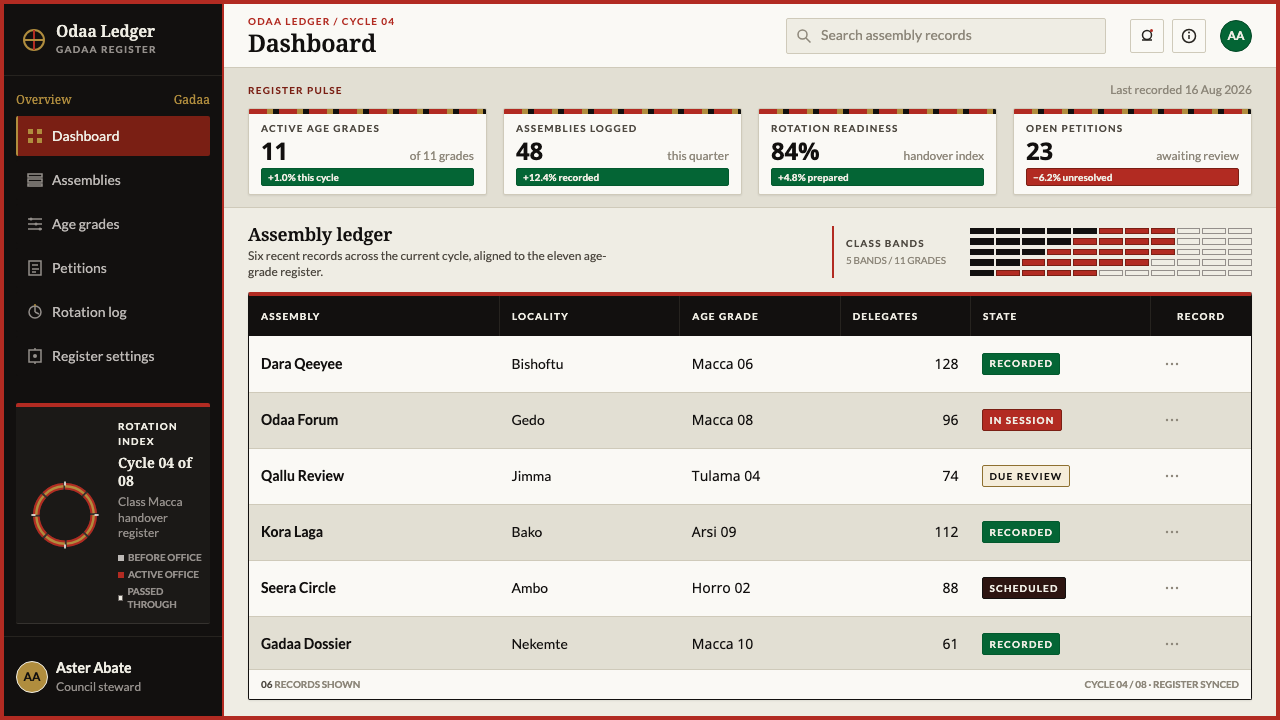
In product interfaces the style fits dashboards that track cycles: sprints, on-call rotations, billing periods, subscription terms, onboarding stages, course progress. Use black, red and white as status states, not started, in progress and complete, and use them the same way on every screen. Pricing pages can present plan tiers or term lengths as a row of counted segments, with the recommended or current plan marked in madder red. Keep controls plain, flat and rectangular, with no glows or gradients, and a single warm accent so the eye always knows where ‘now’ is.
In editorial and marketing work the style suits civic, legal, educational and institutional subjects: constitutions, elections, term limits, cooperative governance, calendars, annual reports organized by cycle. Layouts stay open and quiet, with generous undyed ground, plainly set text and the ring as the single recurring graphic device. Products built on scheduled handover, such as rotating roles, team transitions or succession planning, can use the ring as a logo-adjacent mark. Because Gadaa is a living institution, name it and credit it in a caption or colophon rather than using the look as anonymous decoration.
The most common mistake is to treat black, red and white as a flag or a fashion palette and apply them wherever there is empty space. In this system the three colours are a register, so using red for decoration breaks the meaning of ‘now’. A second mistake is drawing rings freehand, smooth and gradient-filled with no countable divisions, which discards the central rule that a cycle you cannot count is not a cycle. A third is adding generic tribal-looking motifs or fringes: the system contains no such ornament, and invented pattern would misrepresent the institution.
Oromo Gada — FAQ
What is Gadaa?
Gadaa is the generation-grade system of the Oromo, practised in Oromia in Ethiopia and in Oromo communities in northern Kenya. It sorts society into five gada classes and eleven age grades and runs on an eight-year cycle, at the end of which authority passes to the next class on schedule. The Abbaa Gadaa leads during a term, the chaffee assembly with its hayyuu deliberates law, and the odaa sycamore-fig is where the assembly meets. UNESCO inscribed it in 2016, and it remains a practised institution.
Why does the style use only black, red and white?
Because the three colours are a diagram of a life, not a mood. Black is the life not yet entered, red is the life being lived, and white is the life passed through. Adding more hues would dilute the register: if blue or green appeared, a reader could not tell whether it meant a fourth state or just decoration. The undyed cotton ground and the madder red from the tibeb band complete the picture, so the discipline is also a material one.
Can I use gradients, curves or free-form illustration with this style?
Rarely, and only if the result is still countable. The system's central rule is that cycles are drawn as equal segments, so a smooth gradient ring or a hand-drawn blob would discard the very thing the style is about. Curves are fine where they are geometric, such as a ring divided into equal parts. Illustration that does not map to a count, a sequence or a named object has nothing to anchor it here and will read as foreign.
Is it appropriate to use a living institution as a visual style?
It can be, if it is done with attention. Gadaa is a practised constitution, recognised by UNESCO, not a vanished motif. Use the vocabulary accurately, spell the terms as they are spelled, keep the colour meanings intact, and credit the source in captions or colophons. Avoid using the look as generic ethnic decoration or attaching it to subjects with no connection to time, governance or cycles, where the borrowed meaning would be hollow.
What products suit Oromo Gada, and where does it struggle?
It suits anything organized by turns and terms: project and sprint trackers, governance and voting tools, education and course platforms, calendars, planning documents and institutional reports. It struggles in contexts that call for expressive or playful shapes, rich photography or a wide emotional palette, such as entertainment, fashion or food brands. Its strength is clarity about sequence, and a product with no sequence to show will find the system austere and underused.
Related design styles
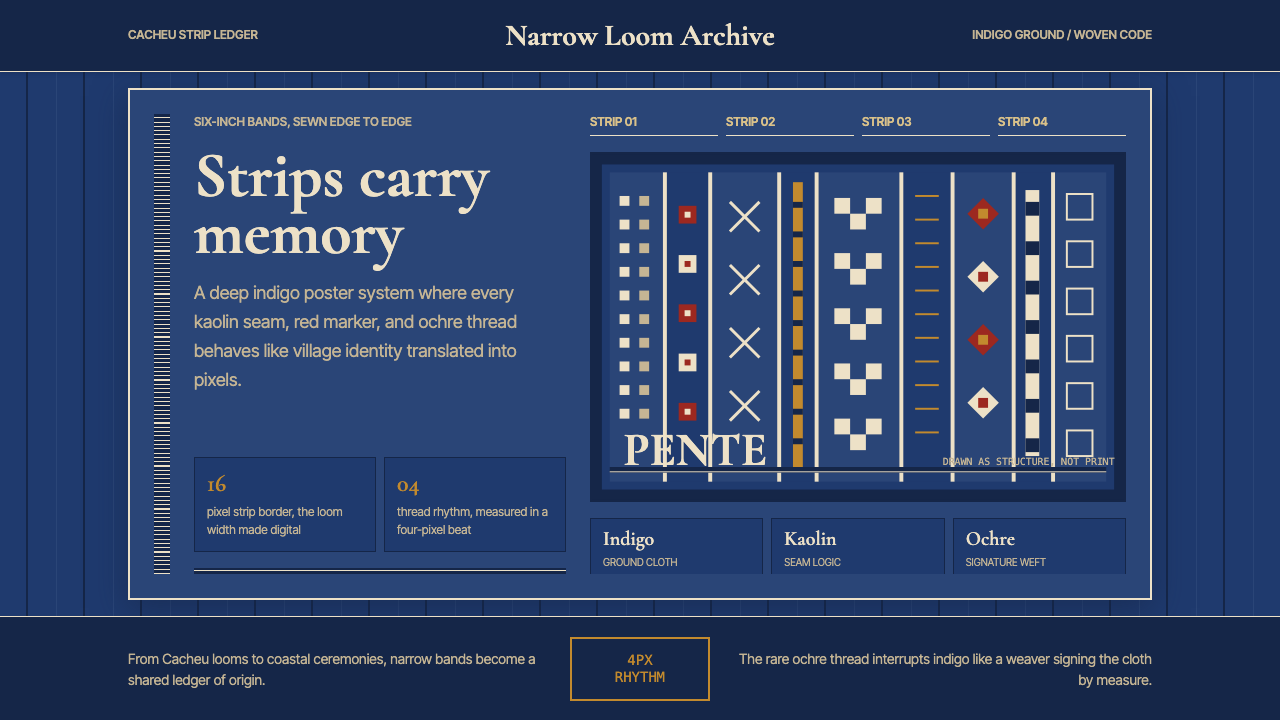 Bissau-Guinean Pano de PenteIndigo remembers. Narrow bands and kaolin seams turn weave grammar into pixel…
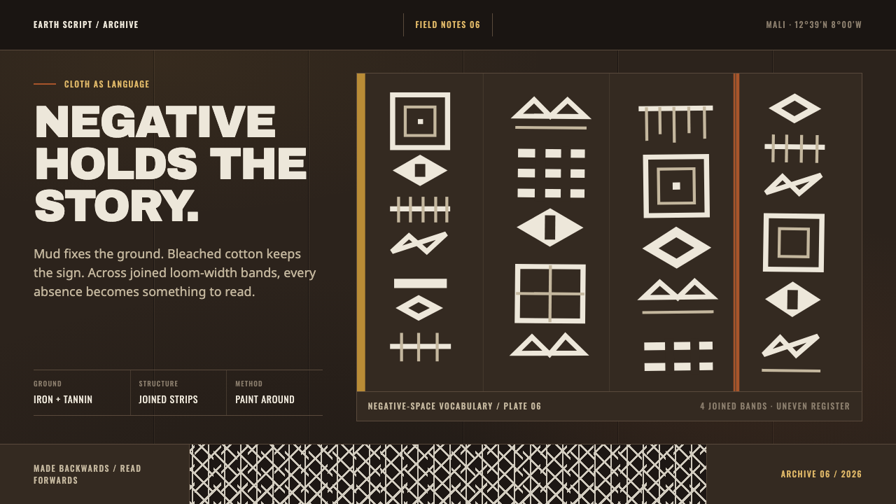 Bogolanfini MudclothAbsence becomes language. Warm iron-black bands hold uneven bleached-cotton s…
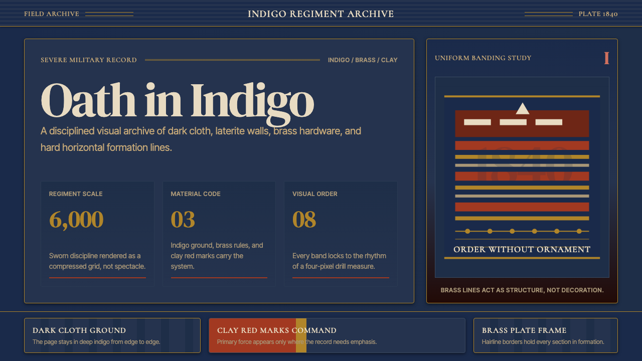 Dahomey Amazons (1840)Severity holds. Indigo ground, brass rules, and clay bands lock the archive i…
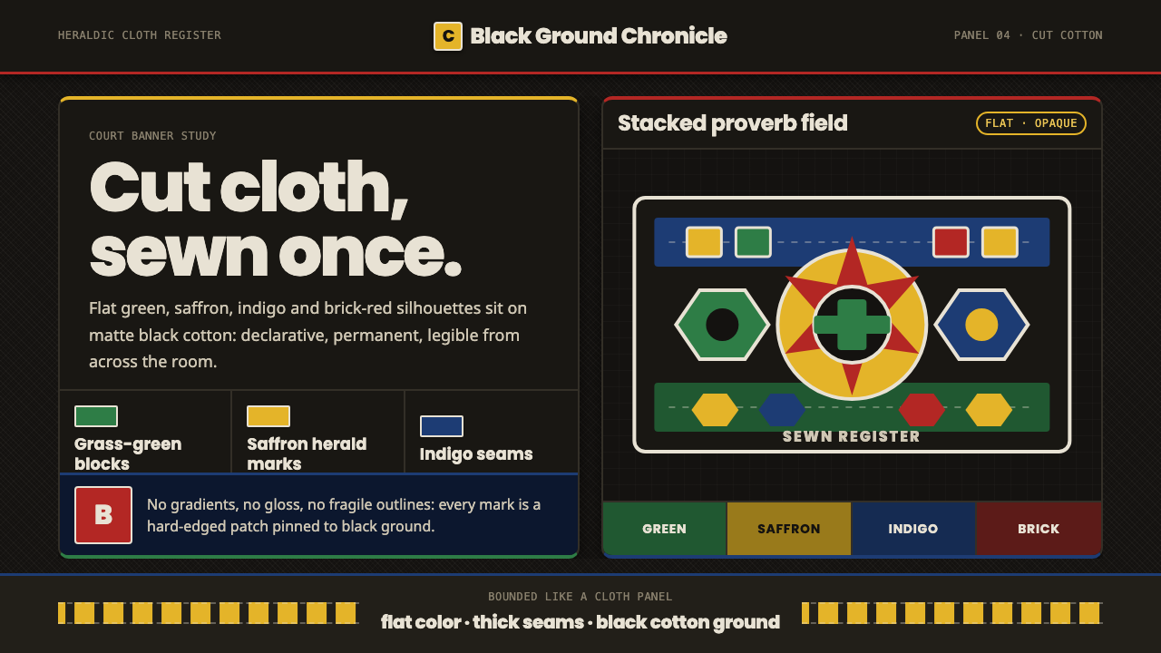 Fon Applique Banner AbomeyRoyal cloth speaks plainly. Flat saffron, green and indigo silhouettes on bla…
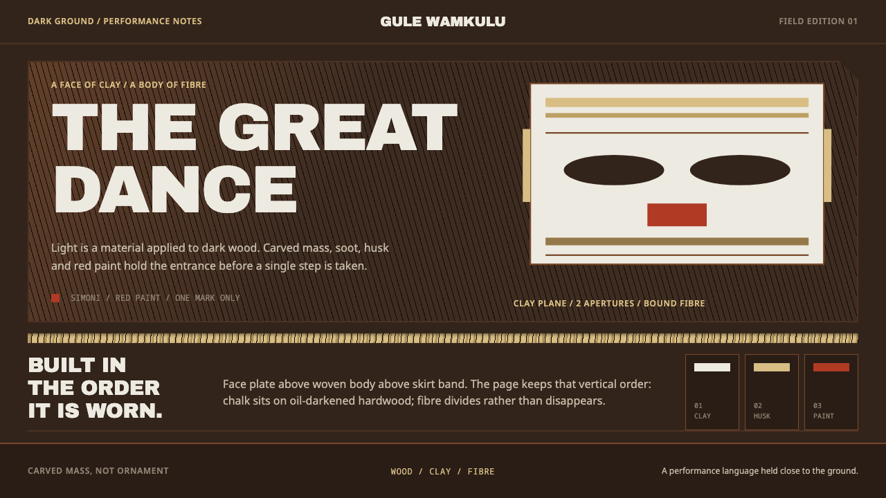 Gule Wamkulu MaskLight carries weight. Clay-white Anton and husk bands sit on soot-darkened wo…
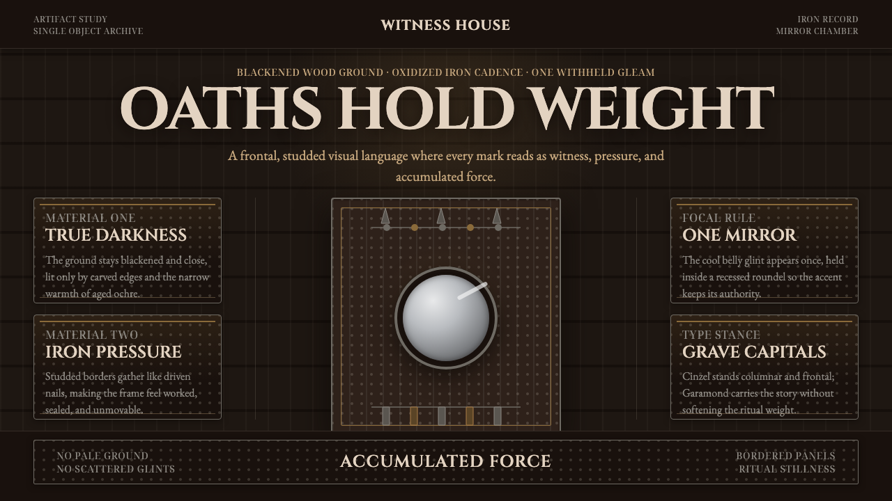 Kongo Nkisi Nkondi FigurePower accumulates in darkness. Black wood, iron studs, and one mirror glint h…