What is Orbital Hotel Booking?
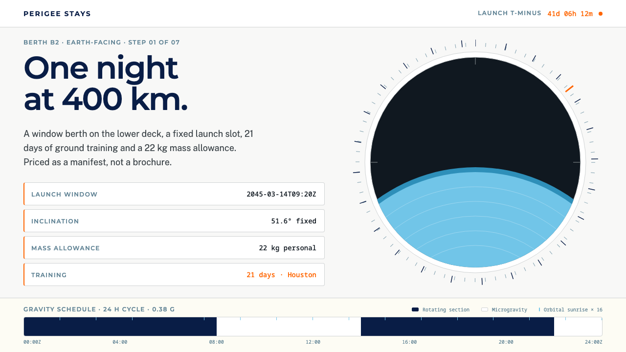
Orbital Hotel Booking reads like aerospace documentation that happens to take payment: pale ground, navy monospaced data, orange for every limit you cannot negotiate, and the Earth as the only vivid colour.
Orbital Hotel Booking in brief
Orbital Hotel Booking is a design system for imagining the booking page of a night in low Earth orbit. It is built from the visual vocabulary of the two companies actually putting commercial space stations up there: the near-white ground and deep navy of Axiom Space, the warm-white section bands of Vast, and the padded, maple-slatted calm of the interior of Haven-1. The result is a page that feels more like a flight manifest than a travel brochure.
The core idea is that a booking for space should be presented as technical documentation. Altitude, inclination, launch window and mass allowance appear up front, set in monospace, as the primary facts of the stay. Anything the traveller cannot change, such as a hard limit on weight or a fixed departure window, is marked in the orange that aerospace convention reserves for constraints. Everything else stays quiet. The design never tries to sell with excitement; the destination is exciting enough.
The only saturated colour on the page is the Earth, seen through a domed window just over a metre across. That choice gives the style its distinctive tension: a sober, precise, almost bureaucratic interface framing a single spectacular image. It suits products that ask a customer to trust an unfamiliar, high-stakes experience, such as spaceflight, extreme travel, scientific services and any premium booking where precision is itself part of the luxury.

Where does Orbital Hotel Booking come from?
This style is a deliberately speculative design anchored in real companies. Its stated horizon is the year 2045, but its sources lie much closer to the present. Axiom Space was founded in 2016, Vast in 2021, and Haven-1 is positioned as the first commercial space station. The broader period it draws on runs from 2016 through the 2030s, as private companies take over from governments the business of building and operating stations in low Earth orbit. The 2045 booking flow is a projection of what ordering a stay there might look like once the novelty has worn off.
Four people are named in its background. Michael Suffredini and Kam Ghaffarian are associated with Axiom Space, whose public identity supplies the pale ground and the navy that the system treats as its base. Jed McCaleb is associated with Vast, the company behind Haven-1, whose website contributes the warm-white band used to separate sections. Peter Russell-Clarke is the designer connected with Haven-1's interior, which was deliberately kept from feeling like a cold laboratory. His padded walls and maple slats are the reason this interface, too, is calm rather than clinical.
The geography of the style is American. It points to Houston and Long Beach as the home bases of the two companies, and to launch sites in Florida and Texas as the starting points of the journey to orbit. That grounding matters for the visual language. The typesetting follows the conventions of aerospace technical documents, with monospaced data and tables of parameters, which the style names as one of its three movements. The other two are commercial spaceflight branding and hospitality booking conventions.
The meeting of those two worlds is the heart of the style. Hospitality booking has its own habits — dates, rooms, rates, confirmations — that customers recognise instantly. Aerospace documentation has another set: units, limits, margins, tolerances. This system lets the first sit inside the second, so a traveller sees the familiar booking steps but reads them in the language of mission planning. The overall effect is reassuring: if the interface is this rigorous about the facts, the trip itself is likely to be run with the same care.
What defines the Orbital Hotel Booking look?
Pale ground, deep navy
The base is a pale, almost white surface carrying text and data in a deep navy that echoes the Mesosphere shade used by Axiom Space. It is a high-contrast, low-glare combination that reads like printed technical documentation. Sections are separated by a slightly warmer white band, borrowed from Vast, rather than by lines or shadows, so the page stays open and quiet.
Monospaced data up front
Altitude, inclination, launch window and mass allowance are set in a monospaced typeface and placed at the top of the page, before any marketing copy. The fixed-width characters align into neat columns and communicate precision. Prose is kept short and set in a plain sans-serif, so the monospace carries the identity of the system.
Orange for hard limits
Orange is reserved for constraints the traveller cannot negotiate, following aerospace practice. It marks weight limits, fixed windows and mandatory preparation. Because it is used for nothing else, a glance down the page shows exactly where the non-negotiable parts of the trip are. It is a functional signal, never a decorative accent.
Earth as the only vivid colour
The one saturated element is a photograph or rendering of the Earth seen through a domed window. Everything else on the page stays desaturated so that the image dominates. This restraint gives the picture enormous weight and means that the interface does not compete with the thing the customer is paying to see.
Padded, warm calm
Haven-1's interior, with its padded surfaces and maple slats, supplies the emotional temperature. The system uses soft, generous spacing, restrained rounded forms and warm neutrals alongside the technical data. This stops the aerospace vocabulary from becoming cold and makes the page feel like a place someone could actually sleep in.
Booking conventions, aerospace grammar
The page follows the familiar structure of a hotel booking: choose dates, choose a room, review rates, confirm. Each step, however, is expressed as a table of parameters with units and tolerances. The layout therefore feels familiar and unfamiliar at once, which is exactly the right feeling for an experience that is both a holiday and a mission.

Who shaped Orbital Hotel Booking?
Suffredini is named among the people connected with Axiom Space, the company founded in 2016 whose near-white ground and deep navy give this system its base palette. His name anchors the commercial-station side of the story in a real company rather than in speculation.
Ghaffarian is also associated with Axiom Space. Together with Suffredini he represents the company whose visual identity this booking system borrows: calm, light and technical, closer to a documentation site than to a consumer travel brand.
McCaleb is associated with Vast, founded in 2021, the company behind Haven-1. Vast's website contributes the warm-white section band that this style uses to divide the page, a gentle counterpoint to the cooler tones associated with Axiom Space.
Russell-Clarke is the designer connected with the interior of Haven-1. He deliberately avoided the feel of a cold laboratory, choosing padded surfaces and maple slats. That decision is the emotional origin of this interface's quiet, warm manner.
How do you use Orbital Hotel Booking today?
In slides, treat each page as a mission document. A cover can be a pale slide with the title set in navy, a short block of monospaced parameters beneath it and a single large image of the Earth or a comparable vivid photograph. Content slides should use tables and labelled parameter lists rather than bullet points. Data slides are the style's home territory: columns of monospaced figures aligned in a grid, with orange reserved for the one or two constraints the audience must not overlook.
On the web, the style suits booking and reservation flows for high-stakes or high-value experiences: expeditions, charter flights, research stays, premium events, scientific instruments and aerospace-adjacent products. The first screen should present the key facts in monospace and the main image, with the booking form following the familiar sequence of dates, options and confirmation. Use the warm white band to separate steps. Never use orange for promotion or decoration; it must always mean a constraint.
For editorial and marketing work, the system turns well into explainers, launch announcements, investor summaries and technical white papers. A feature on commercial space travel could present each station as a specification table with a single large image. Because the palette is restrained, the layout photographs and prints reliably, and a single saturated image on a pale page produces an arresting, magazine-like contrast.
Beyond screens, the look works for itineraries, boarding-style passes, welcome packets and safety cards. These printed items benefit most from the aerospace grammar: aligned columns, fixed-width figures, clear units. Soft paper stock and a warm white tone bring in the Haven-1 calm that stops the documents from feeling bureaucratic. A single orange stamp or band can mark the mandatory preparation steps.
The most common mistake is to treat the style as science fiction. Glowing gradients, neon accents, starfield backgrounds and dark cockpit panels contradict the pale, documentary character of the system, which is based on real companies' restraint. A second mistake is to spread orange across buttons and highlights, which destroys its meaning as a marker for non-negotiable limits. Finally, avoid centring or decorating the data: the monospaced columns need to stay aligned and plain, because their precision is what makes the page trustworthy.

Orbital Hotel Booking — FAQ
Is Orbital Hotel Booking based on real companies?
Its visual language is drawn from the public identities of Axiom Space and Vast, two real companies building commercial stations in low Earth orbit, along with the interior of Vast's Haven-1. The booking flow itself, set in the year 2045, is a speculative projection. The style is therefore an imagined product built from real, documented design sources.
Why is orange used only for limits?
Aerospace convention reserves orange for constraints, so the system follows it. When orange is never used for decoration or promotion, the reader learns that it always means something fixed: a weight allowance, a launch window, a mandatory step. That makes the page scannable for the parts of the trip that cannot be changed.
Why is the data set in monospace?
Monospaced type aligns digits and units into tidy columns and signals technical precision. It also echoes the typesetting of aerospace technical documents, one of the movements the style draws on. Placing those parameters at the top of the page tells the traveller that facts come before persuasion.
Can I use it for ordinary travel or hotel sites?
You can borrow its structure, but it is most convincing where the experience is unusual or high-stakes. For a standard hotel site, the monospaced parameter blocks and the orange constraint system may feel excessive. Consider adopting only the pale ground, the warm section bands and the single hero image.
What stops the style from feeling cold?
The warm-white section bands, generous spacing and soft forms, which come from the padded, maple-slatted interior of Haven-1. The designer of that interior deliberately avoided a laboratory feel, and the interface inherits that decision, so precise data sits inside a calm, hospitable frame.
Related design styles
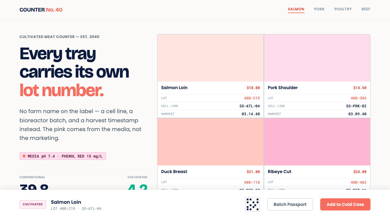 Cultivated Meat CounterNo lab drama, paperwork. Phenol-red coral on white tile, lot codes stamped in…
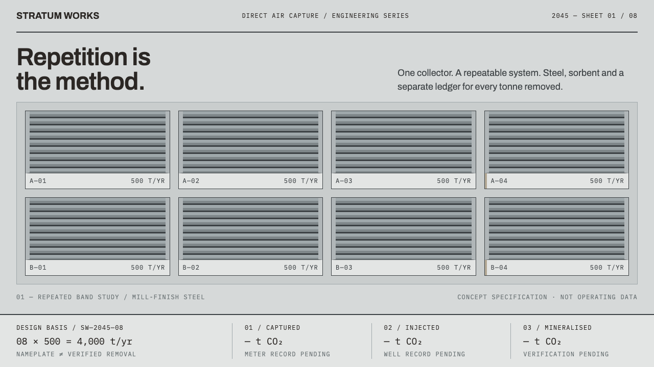 Direct Air Capture PlantRepetition, not rhetoric. Steel-grey louvre bands and monospaced ledgers make…
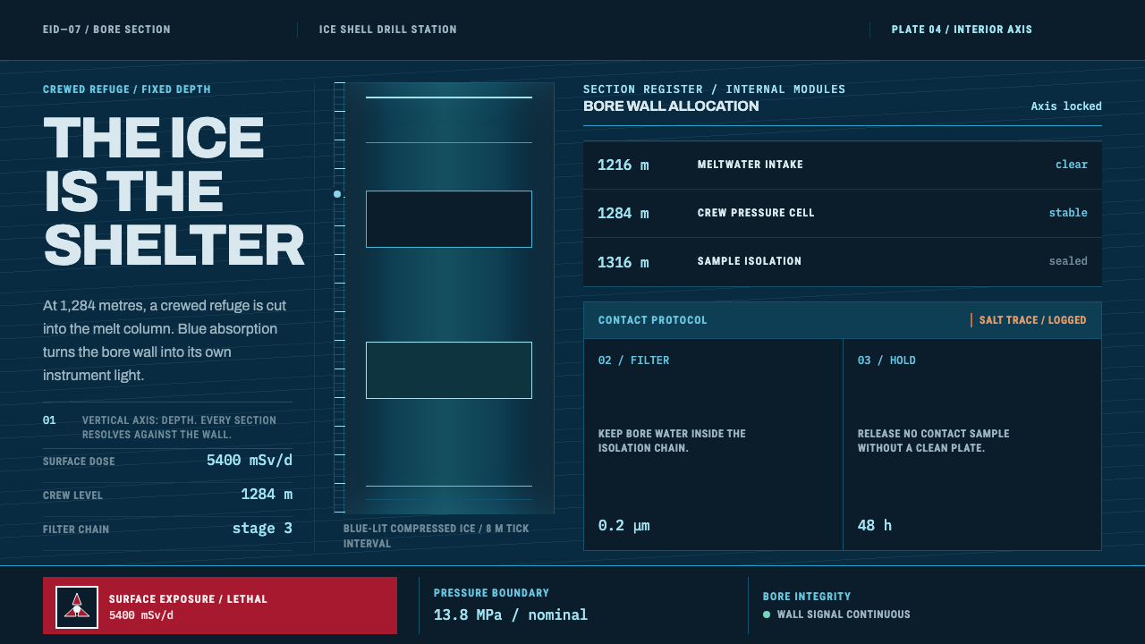 Europa Ice Drill StationShelter is a depth, not a room. Blue bore axis, hard tables, and earned radia…
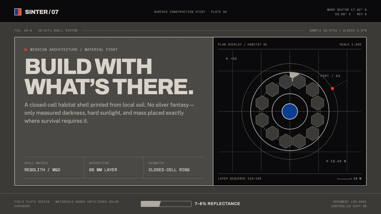 Lunar Regolith SettlementMoonlight without the myth. Regolith gray, hard terminators, and a strict tec…
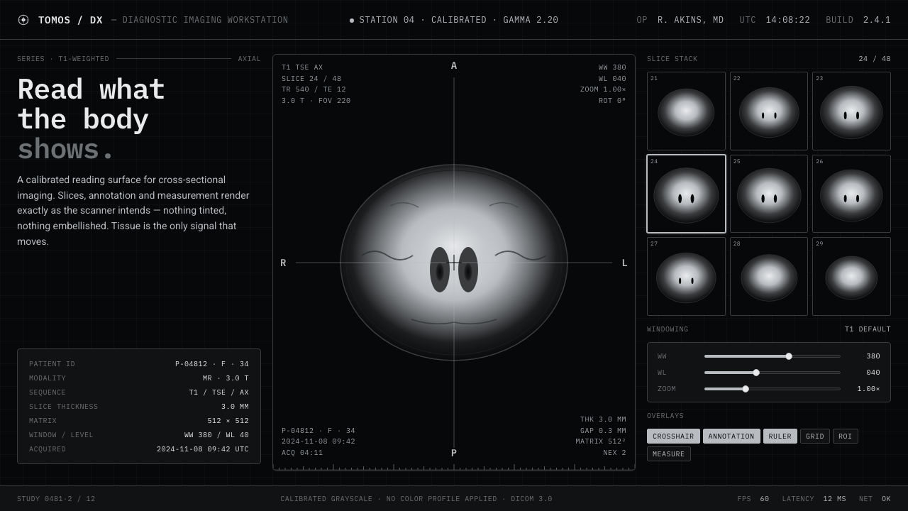 MRI ScanReads like a radiology viewport. Tissue-gray tomograms on pure black, IBM Ple…
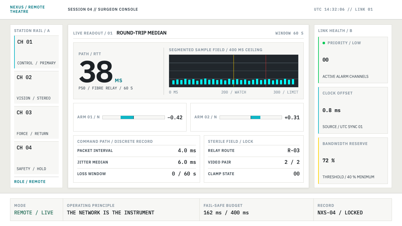 Telepresence Surgery SuiteNothing vague survives. Cyan latency bars and IBM Plex Mono make state measur…