What is Opal Play-of-Color?
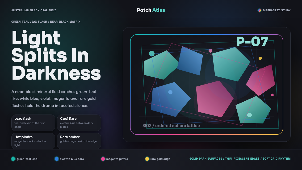
Opal Play-of-Color proves that darkness makes color precise — a near-black ground is what lets a handful of diffracted flashes read as fire rather than noise.
Opal Play-of-Color in brief
Opal Play-of-Color translates the diffraction physics of Australian black opal into an interface language. Inside the stone, stacked microspheres of silica split white light into shifting patches of cyan, green, pink, and gold, all glowing against the near-black ironstone 'potch' — the dark host rock — that cradles the gem and gives its color its full intensity.
Green and teal lead the palette, since these are the most common flashes seen in genuine black opal, while electric blue, magenta, violet, and a rarer gold-orange surface only as the eye or the stone shifts position. The effect is never uniform or evenly distributed — color appears in discrete patches across a faceted surface, not as a continuous gradient washing over the whole field.
The result reads as luminous, gem-faceted, and dark, but never garish. This is subtle spectral shimmer rather than rainbow noise: a small number of precise, glowing color patches against overwhelming darkness, not a full-spectrum gradient competing for attention across an entire surface.
Where does Opal Play-of-Color come from?
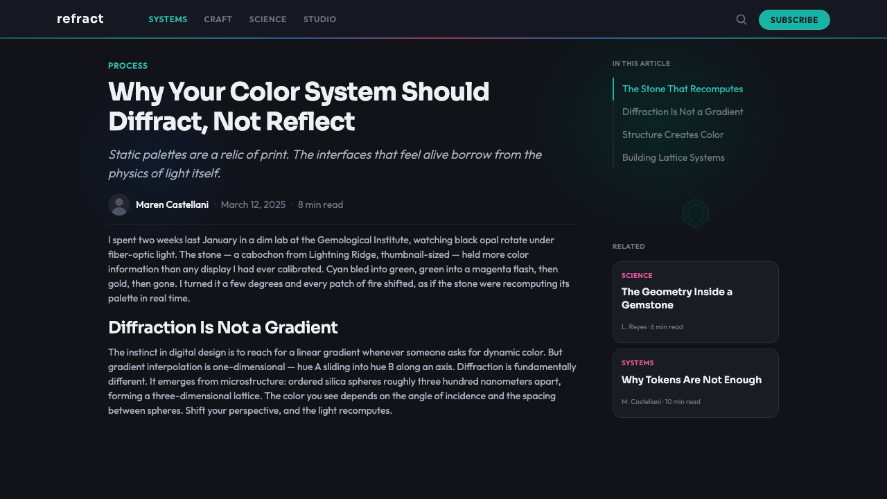
Opal is hydrated amorphous silica — unlike quartz or most other gemstones, it lacks a crystalline structure entirely. It forms when silica-rich water percolates through cracks and voids in sedimentary rock over long geological timescales, gradually depositing microscopic spheres of silica that stack into a regular, lattice-like arrangement as the water evaporates. Whether the resulting stone displays play-of-color at all depends on how uniform that stacking is: irregular stacking produces common, colorless 'potch,' while unusually regular stacking produces the color-splitting structure prized in gem-quality opal.
For most of its history as a valued gem, opal's color was a mystery rather than a measured phenomenon. Pliny the Elder, in his first-century Natural History, praised opal extravagantly, describing its shifting colors as combining the qualities of every other precious stone at once — but no one understood the physical cause. That changed in 1964, when Australian physicist J.V. Sanders, working at the CSIRO (Australia's national science agency) alongside colleagues P.J. Darragh and A.J. Gaskin, used electron microscopy to reveal that precious opal's internal structure was a densely packed, regular lattice of silica microspheres of remarkably uniform size — a natural diffraction grating splitting white light into the spectrum, rather than any pigment or dye.
Australia produces the overwhelming majority of the world's gem-quality opal, and black opal specifically — opal with a dark, often near-black host material that makes its color flashes read with maximum contrast — comes almost exclusively from the Lightning Ridge district of New South Wales, mined at significant scale since the early 20th century and still marketed globally as the source of the finest black opal available. Coober Pedy and Andamooka, both in South Australia, are historically significant sources of lighter-bodied opal by comparison.
Opal also carries deep cultural resonance in Australia predating its gemological description: in some Aboriginal Australian oral traditions, the origin of opal's shifting color is associated with the Rainbow Serpent, a widely recognized ancestral figure across many (though not all) Aboriginal nations, whose passage across the land is said in certain tellings to have left behind the stone's iridescent trace. This cultural layer sits alongside, rather than replacing, opal's more recent identity as a globally traded gemstone.
What defines the Opal Play-of-Color look?
Near-Black Ironstone Ground
The base surface reads as dark, dense host rock rather than pure digital black — a near-black with faint mineral variation rather than a flat, uniform fill. This ground is what allows the color patches sitting on top of it to read with maximum intensity and contrast.
Discrete Diffraction Color Patches
Color appears as distinct, irregularly shaped patches rather than a smooth continuous gradient — each patch reads as its own small event, bounded and specific, the way light diffracts off a particular facet of a stone rather than washing evenly across it.
Green-Teal Dominant Flash
Green and teal should be the most frequently occurring color in any composition, consistent with the most common flash seen in genuine black opal. Other hues are used more sparingly, appearing as occasional accents rather than equal partners in the palette.
Rare Accent Hues
Electric blue, magenta, violet, and gold-orange appear only occasionally and in small areas, echoing how these rarer flashes surface in genuine opal only as the stone or the viewing angle shifts. Their scarcity is what preserves their impact — overusing them collapses the sense of a precious, unpredictable flash into generic rainbow decoration.
Faceted Gem Geometry
Surfaces and dividers follow angular, faceted geometry rather than smooth curves, echoing the cut surfaces of a polished gemstone. Each facet can carry its own patch of color, reinforcing the sense that color is tied to a specific plane rather than floating freely across the composition.
Subtle Spectral Shimmer
The overall effect should feel restrained and precise rather than loud — a small number of glowing patches against dark ground, not a full-spectrum gradient competing for attention. This is the crucial distinction between genuine opal-inspired design and generic rainbow or holographic decoration.
Luminous Against Dark
Color patches should appear to glow rather than simply sit flat on the surface, echoing the way light seems to originate from within a genuine opal rather than merely reflecting off it. This inner luminosity is best achieved through contrast with the surrounding darkness rather than through raw color saturation alone.

Who shaped Opal Play-of-Color?
An Australian physicist working at CSIRO, Sanders led the 1964 electron-microscopy research that first revealed precious opal's internal structure — a regular, densely packed lattice of uniform silica microspheres — explaining for the first time why the stone splits white light into a visible spectrum rather than displaying any pigment.
Working alongside Sanders at CSIRO, Darragh and Gaskin contributed to the collaborative research that established the silica-sphere diffraction model of opal's structure, turning what had been centuries of poetic speculation about the stone's color into a precisely described physical phenomenon.
In his first-century Natural History, the Roman naturalist Pliny the Elder praised opal extravagantly, describing its shifting play of color as uniting the finest qualities of every other precious stone — an early written testament to the fascination the gem's optical effect provoked long before its physical cause was understood.
The miners and traders of Lightning Ridge, New South Wales, developed the district into the world's principal source of black opal beginning in the early 20th century, establishing the mining techniques, grading conventions, and global marketing that made black opal specifically — rather than opal in general — a recognized category of gem.
Researchers at the Gemological Institute of America developed standardized terminology and grading criteria for opal's play-of-color, including systematic classification of body tone, brightness, and pattern, giving the trade a shared vocabulary for describing an effect that had previously been discussed only in impressionistic terms.
How do you use Opal Play-of-Color today?
Opal Play-of-Color carries a register of precision and restrained luminosity — it works best in contexts that want to feel premium, precise, and quietly dazzling, and it struggles wherever a design calls for flat, uniform, high-key brightness.
For presentation slides, the style is especially effective on cover slides and closing moments, where a near-black field with a small cluster of faceted, glowing color patches makes a striking, memorable image without needing supporting copy. Content slides should keep the near-black ground dominant and use color sparingly — one or two accent patches per slide, tied to a specific highlighted number or idea, rather than scattering color throughout.
For web interfaces, the aesthetic suits premium product pages, jewelry and luxury goods e-commerce, and portfolio sites that want to signal precision craftsmanship. Pricing pages can use the faceted, color-flash treatment to differentiate tiers — a subtle color patch per plan level — but the style should be used carefully in dashboards, where color typically needs to map consistently to data rather than shifting decoratively.
For editorial and marketing content, the style rewards restraint: a hero section built from a large near-black field with a handful of glowing color facets in one corner reads as considered and premium, while covering an entire page in shifting color reads as garish and undermines the exact quality that makes real opal striking. Marketing calls-to-action benefit from a single glowing accent color drawn from the palette, used consistently rather than shifting hue by hue.
A common mistake is treating this as a generic 'holographic' or 'iridescent' gradient effect and applying color evenly across large surfaces — genuine play-of-color is discrete and patchy, not a smooth rainbow wash, and smoothing it out removes the precision that separates opal-inspired design from generic iridescent decoration. A second mistake is lightening the ground toward gray or white, which collapses the contrast that makes the color patches read as luminous in the first place.

Opal Play-of-Color — FAQ
What physically causes opal's play-of-color?
Precious opal is built from a regular, densely packed lattice of microscopic silica spheres of remarkably uniform size. When light passes through this structure, it diffracts — splits into its component wavelengths — the same way light splits when passing through a fine diffraction grating, producing the shifting color patches known as play-of-color. This was scientifically confirmed only in 1964, through electron microscopy research led by Australian physicist J.V. Sanders.
Why does black opal show its color more dramatically than lighter opal varieties?
The dark host material in black opal acts the way a dark backdrop does for any light source — it absorbs surrounding light rather than reflecting it back, so the diffracted color patches appear with maximum contrast and intensity. In lighter-bodied opal, the same diffraction phenomenon is physically occurring, but the pale host material scatters more ambient light, muting the visible contrast of the color flashes.
Is this the same as a generic 'iridescent' or 'holographic' design trend?
It is related but more disciplined. Generic iridescent or holographic effects tend to sweep a full-spectrum gradient smoothly across a surface for a slick, uniform sheen. Genuine opal play-of-color is discrete and patchy — specific colors appear in specific bounded areas against overwhelming darkness — which produces a more precise, considered feeling than a continuous rainbow wash.
Where does the world's black opal actually come from?
The overwhelming majority of black opal comes from the Lightning Ridge district in New South Wales, Australia, mined at significant commercial scale since the early 20th century. Australia as a whole produces the large majority of the world's gem-quality opal generally, with Coober Pedy and Andamooka in South Australia historically significant for lighter-bodied varieties rather than the near-black material Lightning Ridge is known for.
Does opal have cultural significance in Australia beyond its value as a gemstone?
Yes. In some Aboriginal Australian oral traditions, the stone's shifting color is associated with the Rainbow Serpent, a widely recognized ancestral figure across many (though not all) Aboriginal nations, whose passage across the land is described in certain tellings as having left behind the stone's iridescent trace. This cultural layer exists alongside, and predates, opal's more recent identity as an internationally traded gem.
Related design styles
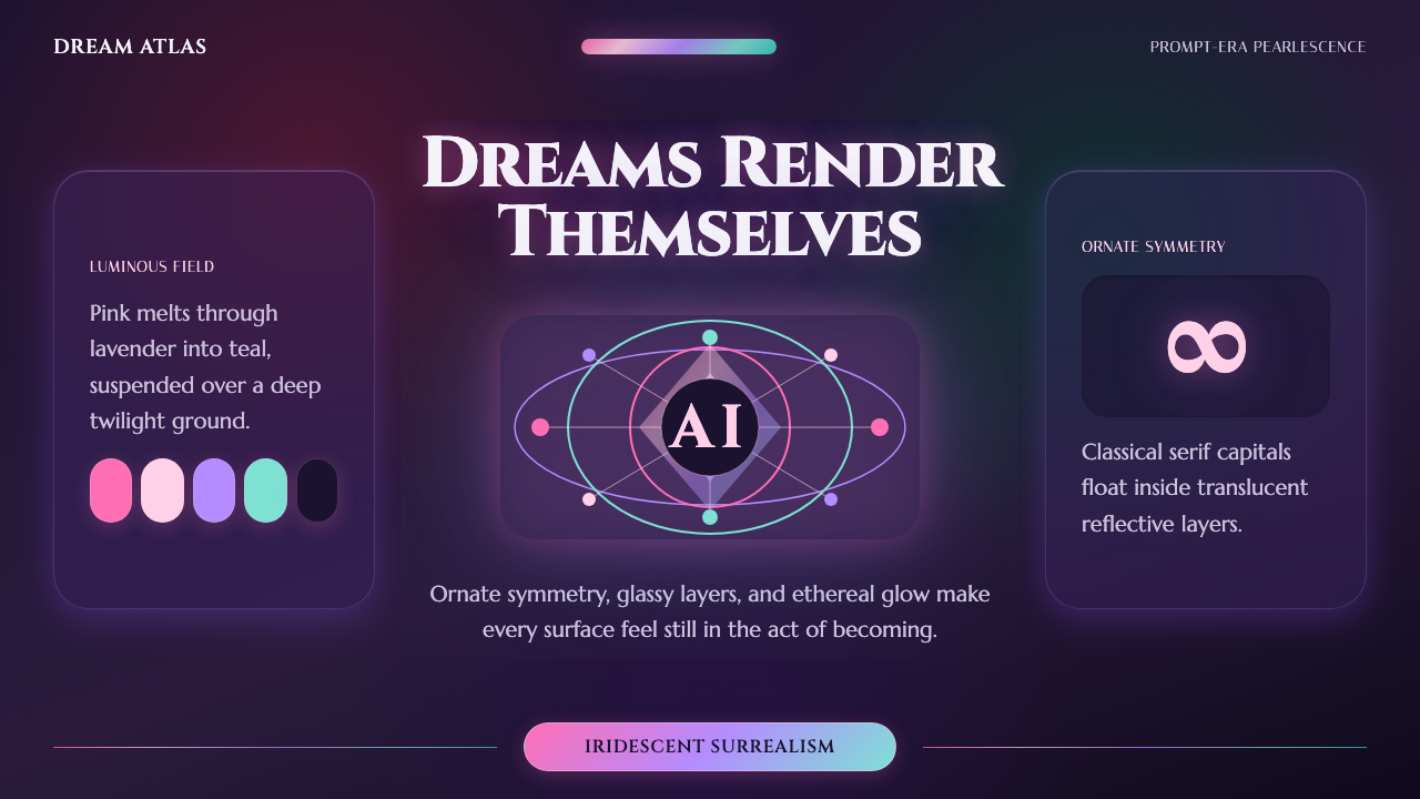 AI Diffusion ArtDreamlike, luminous, uncanny. Pink-to-teal gradients glow over twilight glass.
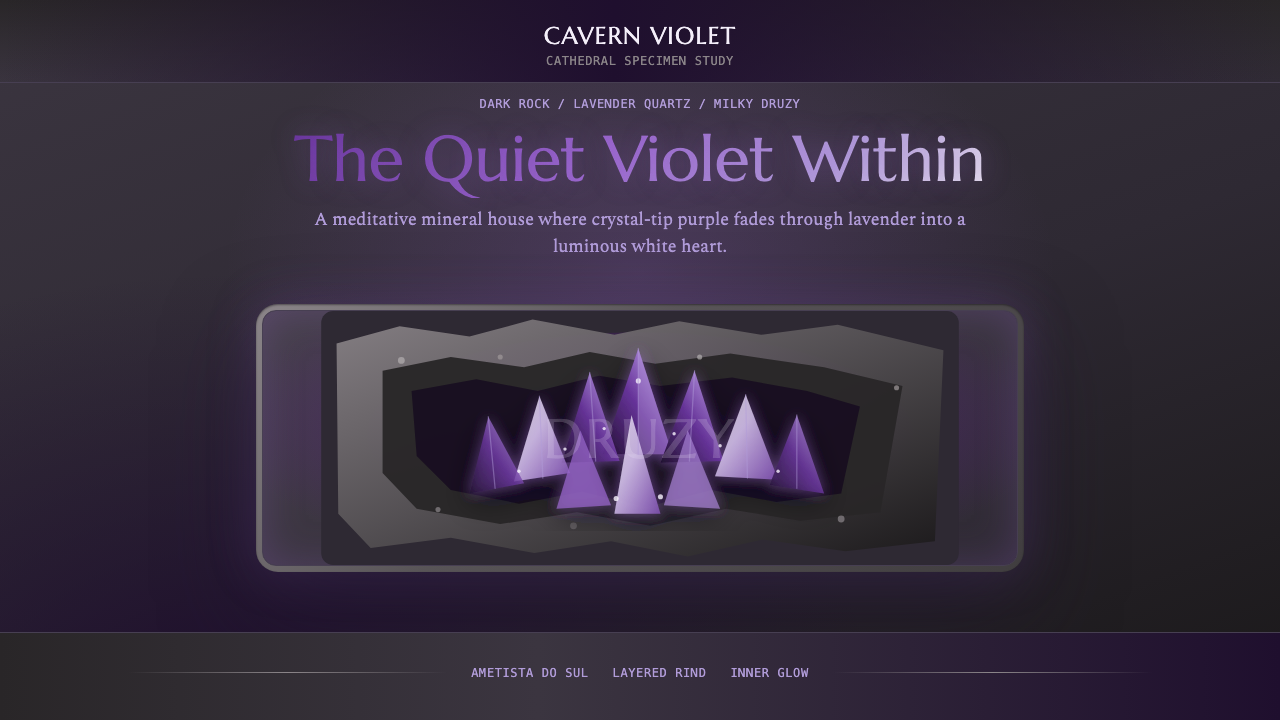 Amethyst GeodeMeditative gem luxury. Amethyst gradients glow in dark stone, framed by rough…
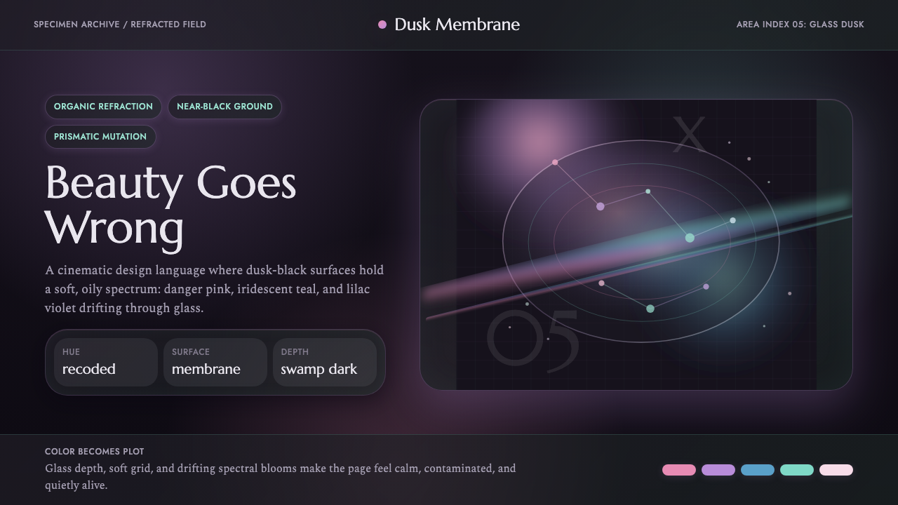 Annihilation (The Shimmer)Beautifully wrong. Dusk black carries pink, teal, and lilac refraction throug…
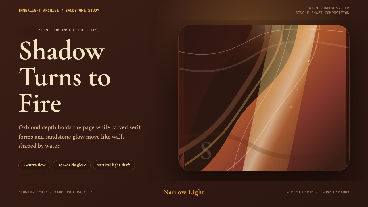 Antelope Slot CanyonGlows from shadow. Oxblood ground, sandstone S-curves, and one warm gold shaf…
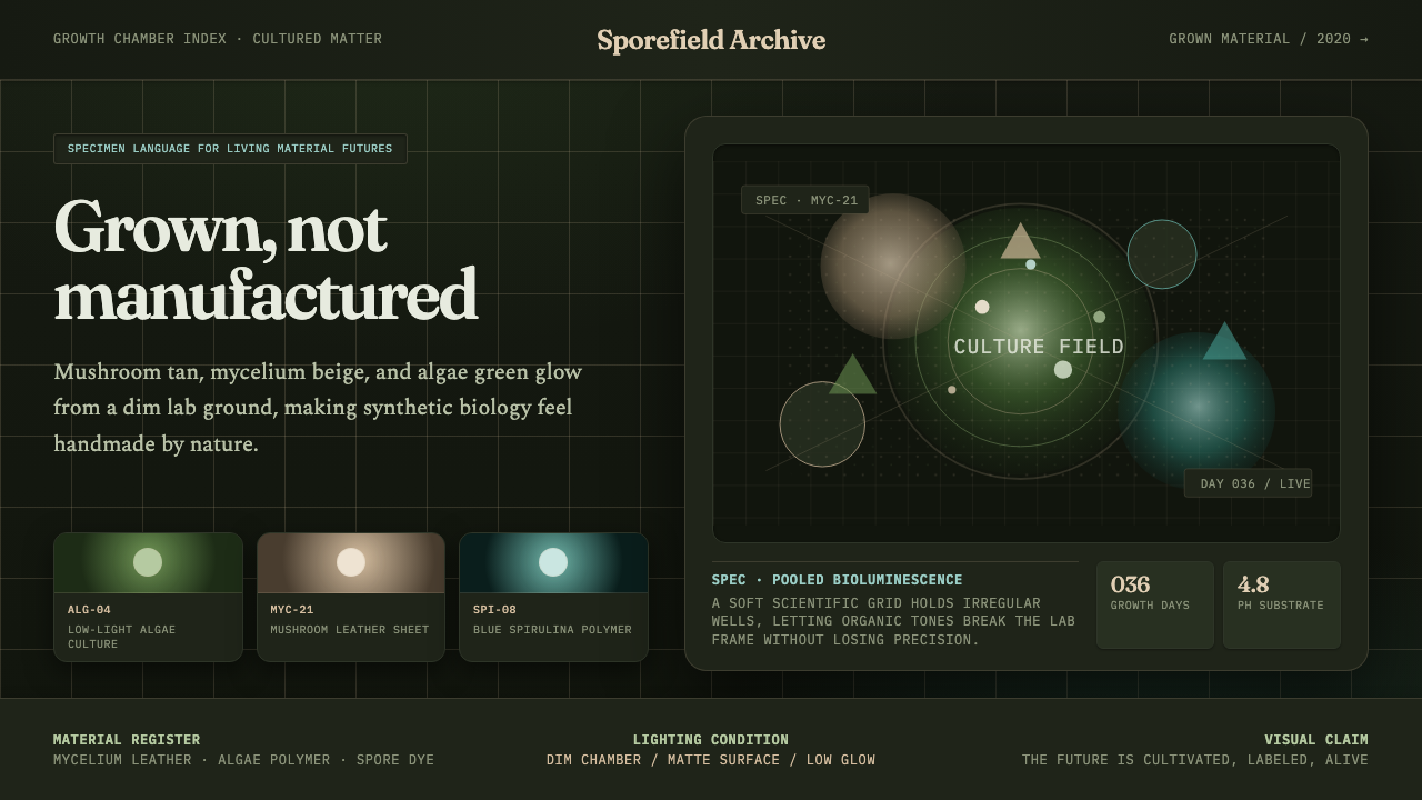 Biopunk GrownLife replaces industry. Algae green glows on chamber dark with serif voice an…
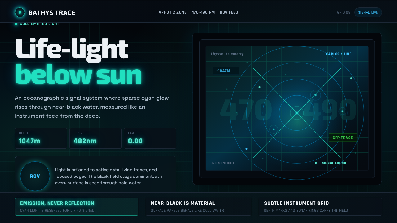 Abyssal BioluminescenceDark carries the signal. Electric cyan pins and Exo 2 readouts surface from a…