What is Amethyst Geode?
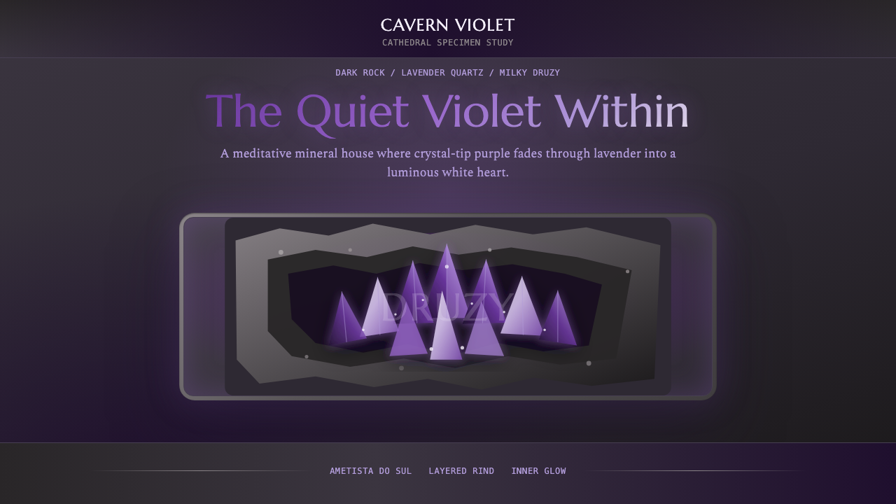
Amethyst Geode translates the ancient drama of volcanic crystal chambers into a design language: luminous violet glowing from deep stone, meditative gradients, and the raw texture of a mineral rind that frames every radiant center.
Amethyst Geode in brief
Amethyst Geode is a design aesthetic rooted in the visual drama of natural crystal geodes — hollow volcanic stones whose rough grey-beige exterior shells enclose chambers lined with violet quartz crystal points. The defining tension is one of contrast: a coarse, muted outer world giving way to an interior that radiates warmth and depth.
The palette draws directly from the geology: deep charcoal and ashy stone tones form the ground, while the featured hues range across the violet spectrum — from the saturated, near-indigo depths of newly cleaved crystal faces to the dusty lavender of oxidized crystal tips, finishing in the chalky, milky whites of druzy quartz surfaces. Gradients are central and deliberate, never flat, never neon — they trace the way light actually moves through mineral facets.
The aesthetic belongs to a broader cultural moment in which gemstone and crystal imagery moved from geological specimen cabinets into wellness culture, luxury branding, and digital design. It carries dual associations: the scientific precision of mineralogy and the intuitive, meditative appeal of crystal healing. In design contexts, Amethyst Geode reads as both grounded and luminous — simultaneously earthy and otherworldly.
Where does Amethyst Geode come from?
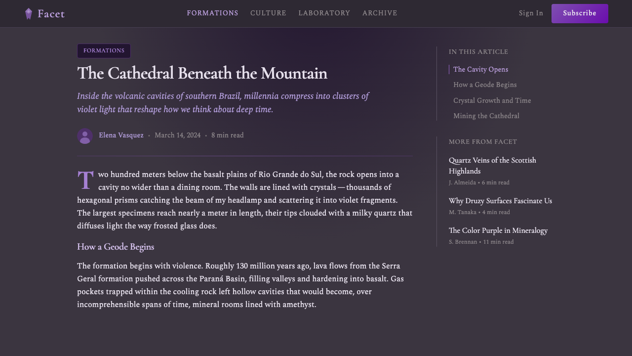
The raw material of this aesthetic is geological and ancient. Amethyst geodes form over millions of years inside basaltic lava flows, most famously in the Paraná Basin of southern Brazil — particularly around Ametista do Sul in Rio Grande do Sul and neighboring regions of Uruguay. Volcanic gas bubbles create cavities in cooling lava; silica-rich groundwater seeps in over geological time, and trace amounts of iron within the silica crystallize as violet quartz under the right conditions of temperature and pressure. The result is the cathedral geode: sometimes over a meter tall, weighing hundreds of kilograms, the outer rind rough and unremarkable, the inner world a palace of purple.
The Brazilian lapidary trade developed from the early twentieth century as geological surveys revealed the scale of deposits in the south. By mid-century, Ametista do Sul had become the world's primary source of large amethyst geodes, with specimens exported to mineral museums, collectors, and eventually to the decorative interiors market. Gem cutters learned to split and polish geodes not just for their mineral content but for their dramatic visual contrast — the reveal of the crystal interior became a designed experience.
The crystal aesthetics moment in visual culture accelerated through the 1990s and especially the 2000s and 2010s, when New Age wellness imagery — crystal grids, healing stones, gemstone meditation — moved from niche spiritual shops into mainstream lifestyle branding. Instagram and Pinterest amplified the circulation of amethyst geode imagery: the purple-on-dark contrast photographed particularly well, and the association with calm, luxury, and natural rarity gave the imagery cultural staying power. Digital design followed, with the gradient-heavy, gem-toned visual language becoming shorthand for a certain kind of premium, spiritually adjacent brand identity.
Today, Amethyst Geode as a design system distills this visual tradition into a repeatable, token-based system: the geology becomes design vocabulary. The rough rind becomes a textural framing device; the crystal interior becomes the primary palette; the gradients trace paths that honor how light moves through real facets. The result is a style that carries genuine cultural depth without requiring the viewer to know its mineralogical origins.
What defines the Amethyst Geode look?
Color: Violet Spectrum on Dark Ground
The palette is structured as a geological cross-section. The ground tones are deep — near-black charcoals, muted ash greys, and the warm taupe of mineral rind — evoking the outer shell of the geode before it is opened. Against this darkness, the crystal tones emerge: a range across the violet spectrum from deep, saturated blue-violet through mid purple, then brightening through lavender and lilac toward milky, chalky whites. The critical property of these violet tones is luminosity: they should appear to emit light against the dark ground rather than merely sitting on top of it.
Gradients: Mineral Light Paths
Gradients are the structural language of this system, not decoration applied after the fact. They trace the actual physics of light in crystal: entering at crystal tips as intense, saturated violet, transitioning through mid tones as the crystal deepens, and dissolving into diffuse, pale chalky whites where druzy surface meets void. The movement is always directional — from concentrated source to diffused edge — and never circular or radial without intent. Flat fills undercut the system's core claim; every field should carry some sense of internal luminosity.
Texture: The Rind and the Druzy
Two distinct textures define the system. The outer rind texture is rough, granular, almost geological — it appears in background treatments and framing elements, communicating the raw earth context from which the crystals emerge. The druzy texture, by contrast, is fine and sparkling — the microcrystalline surface of geode interiors where tiny quartz points scatter light in all directions. In digital interfaces, these textures function as framing devices: rough rind at the periphery, fine crystal glimmer at centers of focus. Neither should overwhelm type or functional elements, but both anchor the aesthetic's sensory depth.
Luminosity: Glow From Within
The defining perceptual quality of Amethyst Geode is the sense that the violet elements are generating light rather than reflecting it. This is achieved through careful contrast management: the surrounding dark tones must be sufficiently deep for the violet to register as self-luminous. In practice, this means resisting the urge to lighten the dark ground for readability — the darkness is not a background, it is an active compositional element that makes the crystal tones do their work. Any lightening of the ground risks flattening the whole system into mere purple-on-grey, losing the geode's essential drama.
Depth and Layering
Spatial depth is implied rather than constructed with hard shadows. The system builds foreground, midground, and background through tonal progression — the deepest, darkest elements recede while the most luminous violet and white elements advance. Overlapping translucent layers echo the way crystal formations stack in real geode chambers. This layering should feel organic and geological rather than engineered: slight variations in opacity and saturation create the sense of looking into something three-dimensional, without resorting to explicit drop shadows or elevation metaphors.
Framing: The Rind as Container
One of the system's most distinctive compositional principles is the use of darker, rougher peripheral framing to draw the eye toward luminous centers. In natural geodes, the rough outer rind physically contains and contrasts the crystal interior; the design system translates this into compositional logic. Important content — headlines, primary calls to action, central imagery — sits within a zone of higher luminosity surrounded by darker, textural framing. This is the opposite of typical dark-mode design, which uses elevation and lighter surfaces to signal importance; here, radiance signals importance.
Mood: Meditative and Rare
The overarching emotional register of Amethyst Geode is meditative luxury — not the assertive luxury of gold and sharp angles, but a slower, more contemplative sense of rarity and depth. The violet spectrum carries longstanding cultural associations with spirituality, royalty, and the liminal space between worlds. The dark ground amplifies this by removing urgency: there is no bright white demanding immediate action, no aggressive contrast compelling quick scanning. The pace is deliberate. This makes the style well-suited to contexts where the user should feel held, considered, and rewarded for attention rather than processed.

Who shaped Amethyst Geode?
The mining communities of Rio Grande do Sul, particularly around the town of Ametista do Sul, shaped the visual vocabulary of the amethyst geode as a designed object. Their craft practice — splitting geodes to reveal interiors, polishing base cuts, and staging specimens on black velvet for display — established the essential contrast composition that now underlies the design system: dark ground, luminous violet interior, rough-edged framing. Without the lapidary tradition's careful staging of the geode reveal, the aesthetic's core drama would have no precedent.
The transition of amethyst geodes from geological specimens to designed interiors objects was substantially driven by New Age wellness culture, which took root in the 1970s and expanded dramatically through the 1990s and 2000s. Crystal healing practitioners developed the visual grammar of gemstone display — backlit specimens, intentional arrangement, the vocabulary of 'energy' and 'vibration' attached to specific mineral colors — that gave amethyst its modern cultural meaning. Their retail and display aesthetics, particularly the use of dark backgrounds to intensify crystal luminosity, directly anticipates the design system's compositional logic.
Natural history and mineralogy museums developed sophisticated display practices for large geode specimens throughout the twentieth century. Lighting designers working with museum curators learned to treat the geode as a theatrical object: directional lighting entering the crystal chamber, dark surrounds preventing washout, careful placement to maximize the impression of interior luminosity. These museum staging conventions — which exist in institutions from the Smithsonian to the Natural History Museum in London — codified the contrast principles that now feel intrinsic to the aesthetic.
The translation of crystal and gemstone aesthetics into digital design accelerated through social media platforms in the 2010s. A generation of digital designers — many without explicit mineralogical knowledge — synthesized the visual codes of crystal photography, New Age branding, and luxury goods into a digital idiom characterized by violet-to-white gradients, dark backgrounds, and soft internal glow. This collective design practice, distributed across thousands of independent practitioners, consolidated what might be called the crystal aesthetic as a recognizable visual genre, giving Amethyst Geode as a formal design system a ready-made cultural vocabulary to draw from.
How do you use Amethyst Geode today?
Amethyst Geode rewards careful application precisely because its power depends on contrast management. Dilute the darkness and the violet loses its luminosity; compress the gradient range and the system flattens into generic purple. The key discipline is treating dark ground not as empty space but as an active compositional element that does structural work — holding the violet in tension, making the lightest tones read as genuinely radiant.
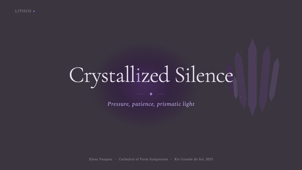
For presentation slides, Amethyst Geode works best when cover slides and section dividers do the heavy aesthetic lifting, allowing content slides to be simpler and more readable. A strong cover page places a large, deep-gradient crystal form — oval or irregular, echoing actual geode shapes — against near-black, with headline text positioned in the most luminous zone. Content slides should pull back: a dark ground with restrained violet accents for headers and key data points, keeping body type in pale lavender or near-white for readability. Data slides work well with the style's layered quality — charts rendered in violet gradient fills against dark grounds convey both precision and visual richness.
For web UI and dashboards, the style is particularly well-suited to premium subscription products, wellness platforms, and any product where conveying considered, rare quality matters more than conveying speed or urgency. Navigation elements and UI chrome should be relatively subdued — dark tones with minimal violet accents — reserving the full gradient depth for hero sections, feature illustrations, and primary calls to action. Cards and containers work well with slight internal luminosity gradients, as if each component is a small geode cross-section.
For editorial and marketing work, Amethyst Geode is a strong choice for contexts associated with luxury, spirituality, wellness, or any domain where deliberate pacing is a brand signal. Full-bleed dark sections with centered, luminous headline type create the stopping power needed in editorial environments. Marketing materials benefit from using the rind-to-crystal contrast as a metaphor for before-and-after or hidden-value narratives — the rough exterior giving way to the radiant interior is a natural story structure.
The most common mistake when applying this style is reaching for a lighter background to improve readability, not realizing this undermines the entire system's visual logic. The darkness is not a legibility problem to be solved — it is the source of the style's power. Instead of lightening the ground, increase the luminosity of text by moving it into the highest-value violet and near-white zones of the gradient palette. The second common mistake is using gradients that are too smooth and too uniform, losing the organic, geological feeling of mineral formation in favor of something that looks like a generic tech gradient.
Amethyst Geode — FAQ
Is Amethyst Geode suitable for a dark mode interface, or is it specifically a dark aesthetic?
Amethyst Geode is not dark mode in the functional sense — it is a dark-ground aesthetic with a specific visual logic that depends on darkness to work. Functional dark modes are designed around readability: they flip light interfaces to reduce eye strain in low-light environments, while maintaining all the same information hierarchy. Amethyst Geode uses darkness compositionally, to create luminous contrast. This means it is not a system you would apply as a mode toggle — it is an entire design commitment. A light-ground version of this system would require a complete reconceptualization, not merely color inversion.
How does Amethyst Geode relate to other crystal or gemstone aesthetics?
The gemstone aesthetic family is broad — it includes rose quartz pinks, tourmaline greens, obsidian blacks, and the full spectrum of precious and semiprecious stone. Amethyst Geode is distinguished within this family by two specific qualities: the geode structure (outer-rough, inner-luminous contrast) and the violet specificity (purple tones rather than, say, the aqueous blues of aquamarine or the warm reds of garnet). It is also more explicitly geological in its references than, say, a general crystal gradient aesthetic, which tends toward abstraction. Understanding that Amethyst Geode is specifically about the geode reveal — the drama of opening — rather than gemstone surface pattern alone is what separates authentic application from generic purple gradient work.
Can this style work for data-heavy or analytical interfaces?
It can, with deliberate restraint. The challenge is that Amethyst Geode's meditative pace and high visual richness can work against the quick scanning and rapid hierarchy parsing that data-heavy interfaces require. The way to navigate this is to use the aesthetic principles lightly in functional areas — dark grounds, subtle violet accents for interactive states, restraint on gradients in dense data zones — and reserve the full compositional drama for hero and summary sections. The style actually works well for dashboards designed for extended, focused sessions rather than rapid decision-making, where the depth and visual richness reward sustained attention.
What types of content or products is this style least suited for?
Amethyst Geode struggles in high-urgency contexts where speed and quick decision-making are paramount — flash sales, emergency interfaces, time-sensitive alerts, or productivity tools designed for rapid throughput. It also sits awkwardly alongside corporate or institutional visual languages that rely on white space and legibility-first clarity. Children's products, food and beverage brands, outdoor and active lifestyle products, and anything that needs to convey kinetic energy rather than meditative depth will find the style's deliberate slowness and darkness more constraint than asset. The honest test is whether the product's core promise aligns with the values the style carries: depth, rarity, contemplation, and reward for attention.
How should type be handled in this dark, gradient-rich environment?
Typography in Amethyst Geode requires the same contrast logic as the rest of the system: type must appear luminous against the dark ground, not simply legible. For headlines and key display text, near-white or the palest lavender tones work best — they read as part of the crystal interior's own light rather than as overlaid text. For body text, a slightly warmer near-white or light grey maintains readability without competing with the violet palette. The critical thing to avoid is placing text directly on mid-range violet tones, where the contrast collapses and the text appears to sink into the ground. Treat the palette as having a luminosity axis — deepest at the ground, brightest at the tips — and position type within the bright zone accordingly.
Related design styles
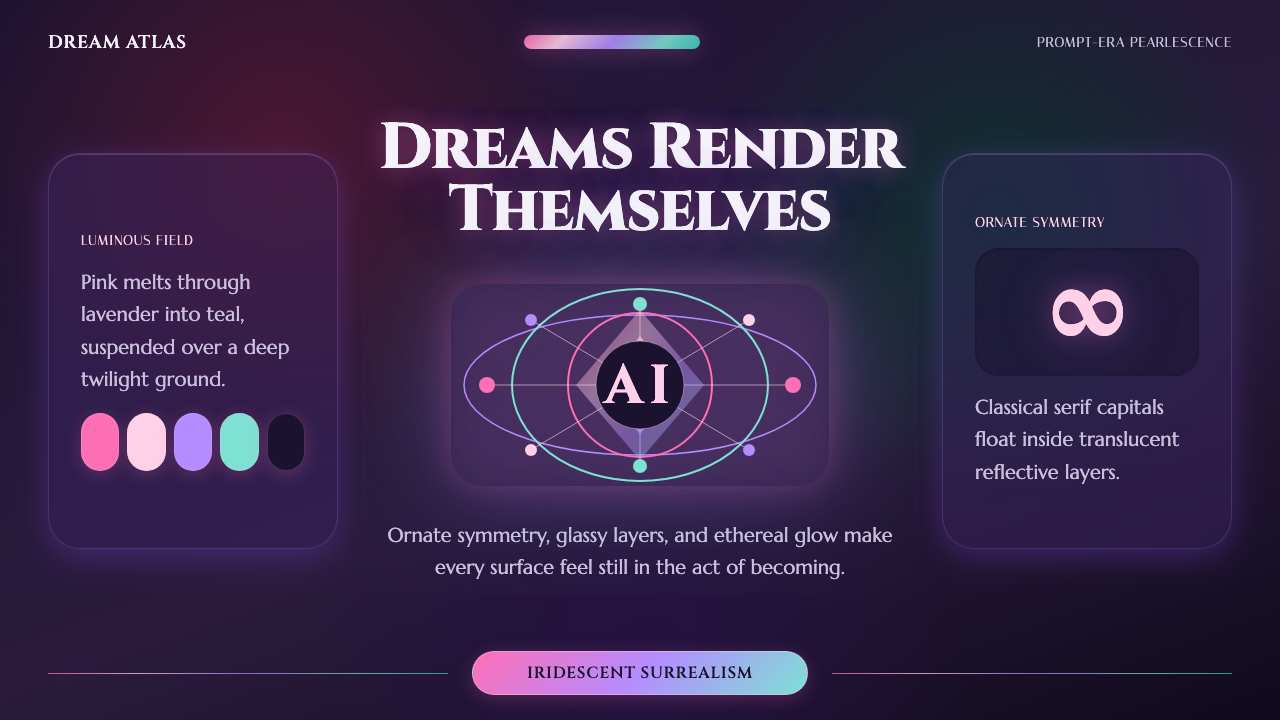 AI Diffusion ArtDreamlike, luminous, uncanny. Pink-to-teal gradients glow over twilight glass.
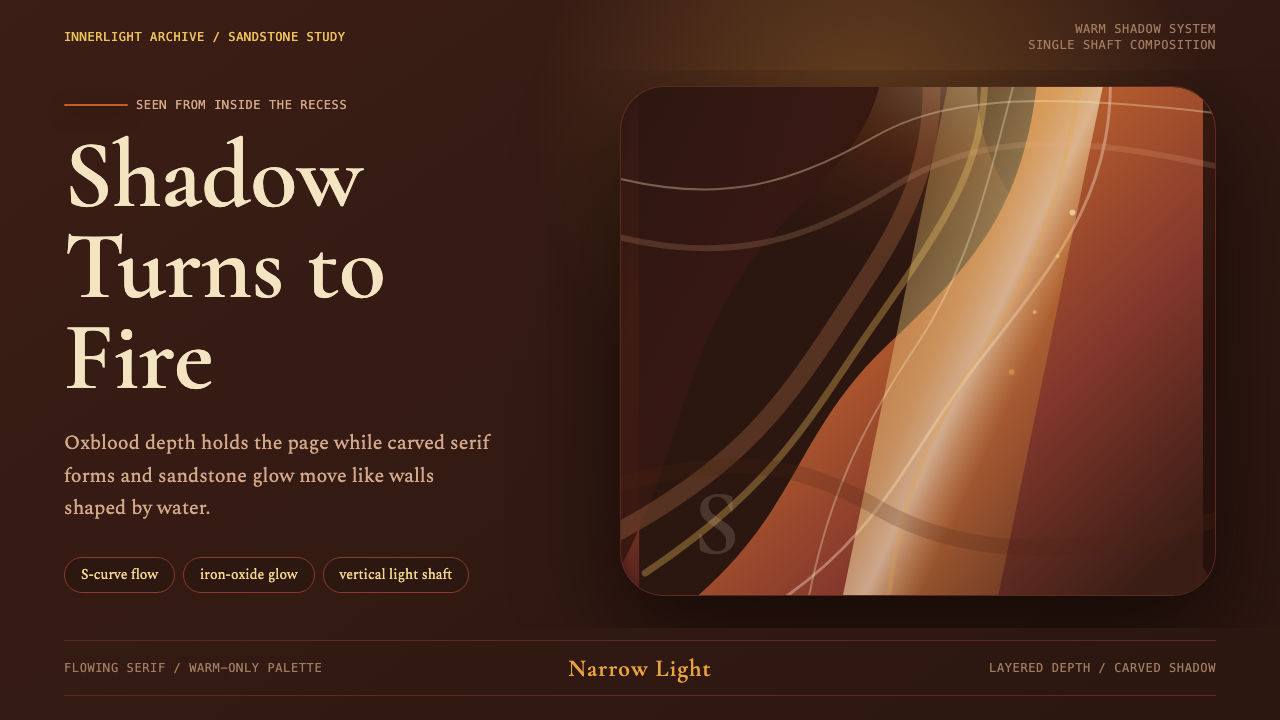 Antelope Slot CanyonGlows from shadow. Oxblood ground, sandstone S-curves, and one warm gold shaf…
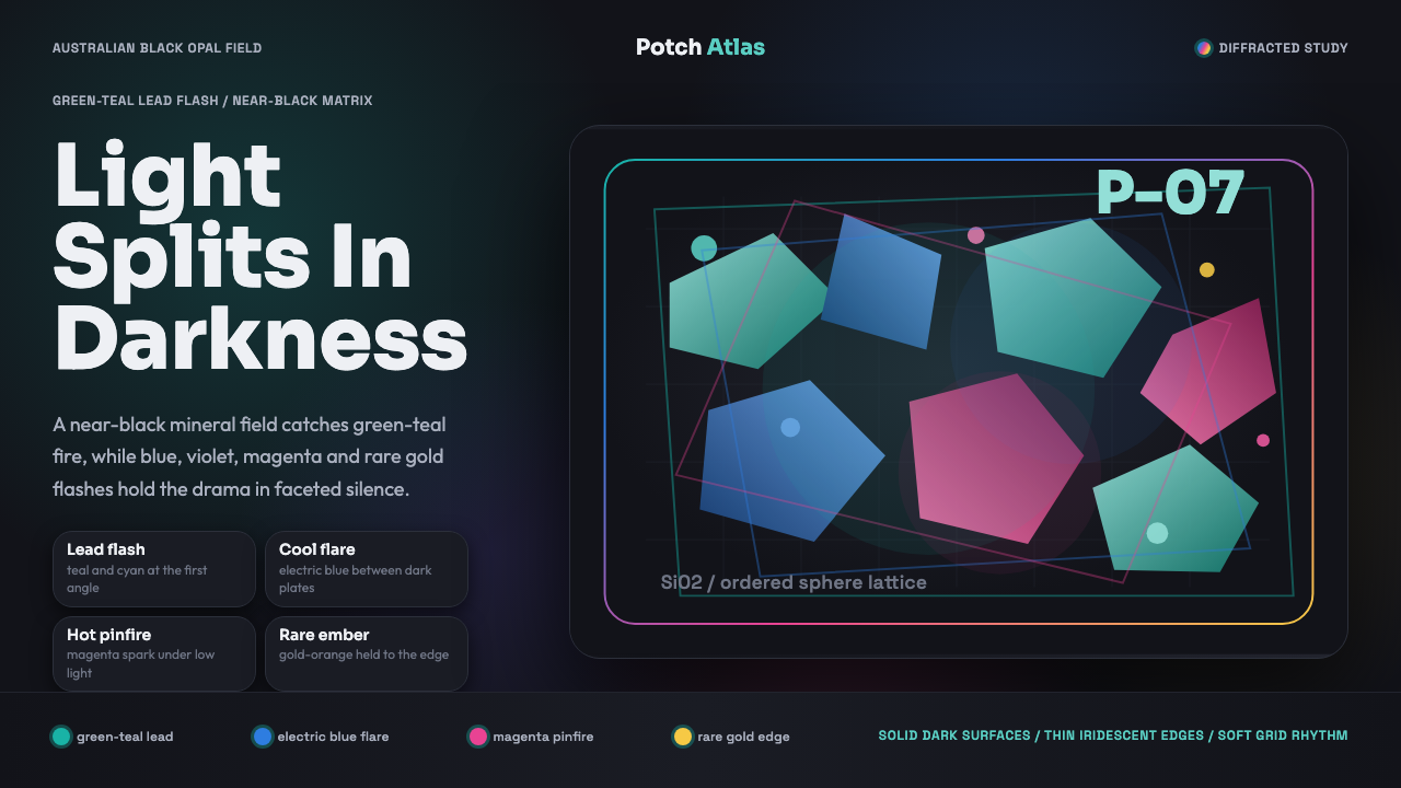 Opal Play-of-ColorDarkness makes color precise. Teal-led flashes fracture across a near-black f…
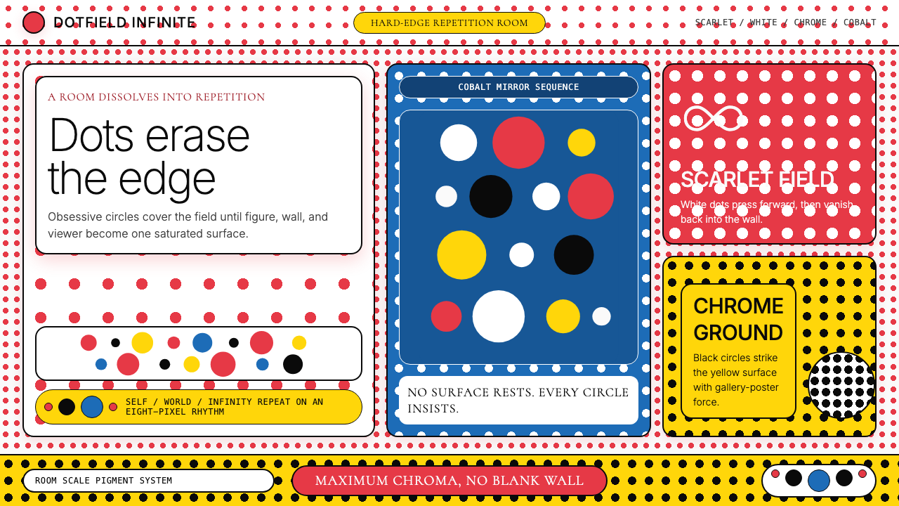 Yayoi Kusama Polka DotInfinity eats the wall. Scarlet-white dots and chrome-yellow panels repeat wi…
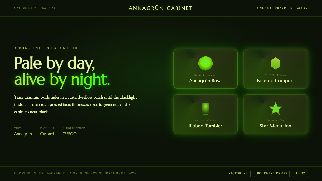 Uranium Vaseline GlassPale by day, electric green by night. Uranium glass fluorescing out of cabine…
 Absinthe Art Nouveau Green (1875)Ornate and verdant. Chartreuse field, gold filigree, vine-script type, and lo…