What is Onitsuka Tiger?
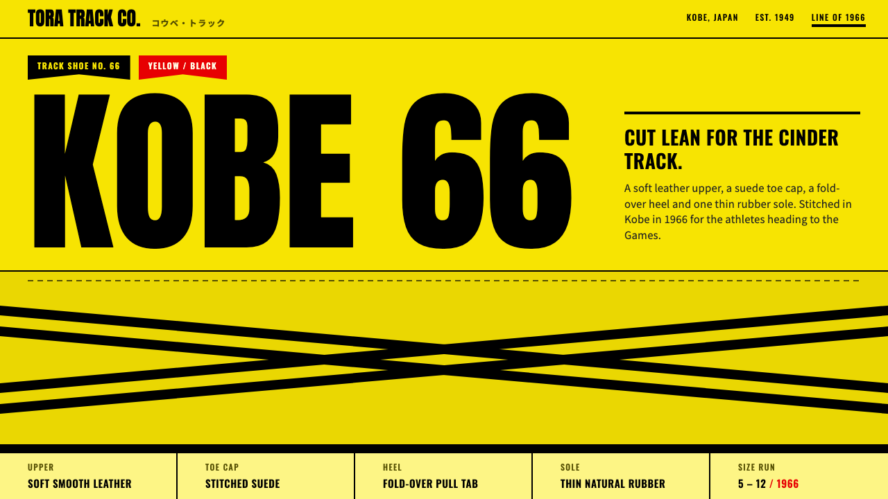
Mexico 66 is black on yellow leather and nothing else: crossed Tiger Stripe bands, tall condensed capitals and hard offset shadows, like the lid of a track shoebox.
Onitsuka Tiger in brief
The Onitsuka Tiger Mexico 66 style is a design language cut from a single shoe: the yellow and black Mexico 66 sneaker. The page plays the role of the yellow leather upper, and everything drawn on it is black. Crossed Tiger Stripe bands, heavy rules and tall condensed model names carry the whole composition, with no gradients, no photography needed and no ornament that does not belong on a sports shoe.
Its voice is that of athletic equipment from the 1960s. Spec labels, sizes and model codes are set the way a shoebox end label would show them, in compact capitals with precise spacing. Katakana for the brand name sits alongside Latin type, a reminder that the product comes from Japan. Corners stay tight, and shadows are hard offsets, as though the elements were printed on card and slightly misregistered.
A film connection adds a second layer. Red and orange appear only in small amounts, like the trim on a movie poster, referring to the yellow jumpsuit that made the shoe a pop-culture icon. The long side profile of the shoe is always on show, so the object itself remains the hero. The style is simple, loud and confident, a good fit for anything that wants heritage sportswear energy.

Where does Onitsuka Tiger come from?
Onitsuka Tiger traces back to 1949, when Kihachiro Onitsuka founded the company in Kobe, Japan, and made its first basketball shoe. The firm grew with Japanese athletic footwear of the 1960s, a period when Japan was building its sports culture around events like the Olympic Games. In 1966 the company introduced the Mexico Line, developed in the run-up to the 1968 Olympic Games in Mexico City.
The signature detail of that line was the crossed Tiger Stripe stitched on both sides of the shoe. It gave the design an instant, graphic identity that could be read from across a track. The yellow and black colourway of the model later known as the Mexico 66, a name adopted around 2001, became the version most strongly tied to the brand's heritage image.
The shoe's second life began in 2003, when Quentin Tarantino's Kill Bill Vol. 1 put the yellow-and-black sneaker on Uma Thurman's character, in a nod to the yellow jumpsuit worn by Bruce Lee in Game of Death. Film costume turned a niche piece of sportswear into a global product icon, and it fed directly into the retro sneaker revival of the 2000s.
Three currents meet in the style: 1960s Japanese athletic footwear, which supplies the technical, no-nonsense look; the 2000s retro sneaker revival, which brings nostalgia and collectability; and film costume as product icon, which explains the small bursts of red and orange. The result is a design system that is both functional and playful, grounded in a real object with a real history.
What defines the Onitsuka Tiger look?
Color
Yellow leather is the ground and black is the only ink. That two-colour rule gives the style its punch. Red and orange appear in small amounts, like the trim on a film poster, and never take over. The yellow is warm and slightly worn rather than neon, which keeps the page feeling like real material, not a screen effect.
Tiger Stripe bands
Crossed diagonal bands are the signature graphic, taken from the stitching on the shoe's sides. They work as section dividers, header ornaments and background motifs, always in black and always bold. The crossing is the key idea: two strokes meeting create an instantly legible mark that suggests speed and direction.
Typography
Model names are set in tall condensed capitals, with Anton as the voice, so they stand like numbers on a track. Sizes and spec labels use Oswald, echoing the end label of a shoebox. Katakana for the brand name is set in Noto Sans JP. Everything is uppercase or compact, with tight leading, so text blocks feel like stamped labels.
Hard offset shadows
Shadows are solid black blocks shifted to one side, with no blur. They make cards and buttons look like die-cut pieces of cardboard stacked on a sheet. The effect is deliberately flat and graphic, in keeping with print production, and it avoids the soft depth of modern interface design.
Side-profile hero
The long side profile of the shoe is always on show, usually large and central, sometimes cropped by the frame. The object is the hero, and the layout is arranged around its silhouette. For other products, the equivalent is a single clear, side-on image placed against the yellow field with text wrapped around it.
Tight corners
Corners are kept tight and restrained, never bubbly. Rules are heavy, edges are crisp and boxes feel like printed cards. The overall impression is of a technical product label rather than a friendly app. Precision and weight matter more than softness.

Who shaped Onitsuka Tiger?
Onitsuka founded the company in Kobe in 1949 and made its first basketball shoe. His company's growth through the 1960s, including the Mexico Line created in the lead-up to the 1968 Olympics, set up the heritage on which the entire visual style draws.
Tarantino's 2003 film Kill Bill Vol. 1 turned the yellow-and-black sneaker into a pop-culture icon. By dressing its heroine in the shoe as a tribute to a famous yellow jumpsuit, the film linked sportswear with cinema and gave the design its small touches of poster red and orange.
Thurman wore the sneaker in Kill Bill Vol. 1, making the yellow-and-black pair one of the best-known pieces of film costume in sneaker culture. Her association with the shoe is a major reason it re-entered public attention during the retro sneaker revival of the 2000s.
Lee's yellow jumpsuit in Game of Death is the source of the colour story behind the film tribute. Although he is not connected to the shoe's design itself, the visual reference travels through the style, explaining why bright yellow with black stripes feels so charged with action-film energy.
How do you use Onitsuka Tiger today?
On slides, the Mexico 66 style makes bold cover pages and section dividers. Fill the slide with yellow, place one huge condensed title in black, add a crossed stripe band and a hard offset shadow behind a card. Keep copy short and use capitals sparingly for labels. A deck in this style feels like a product launch for sportswear, so it suits campaign pitches, brand histories and creative reviews.
For data slides, use black on yellow with a single accent. Big numbers in condensed capitals beside small spec-style labels give an athletic scoreboard feel. Charts should be simple, with thick bars or lines and no gradients. If you need to emphasise one value, use the small touch of red or orange rather than adding more colours, so the page stays disciplined.
In web interfaces, the style suits sneaker and apparel shops, sports brands, product drops and anything with heritage athletic energy. Product pages can put a large side-profile image on a yellow field, with spec labels and size selectors styled as shoebox tags. Buttons are black with tight corners and hard shadows, and hover states can shift the shadow rather than fade. Stripe bands separate sections and give pages a clear rhythm.
For editorial and marketing work, the style makes striking posters and social graphics. A huge model name, a crossed stripe and a shoe silhouette tell the whole story. Katakana adds an authentic Japanese touch. Because the palette is so reduced, the layout does the work, so spend effort on scale, cropping and alignment rather than adding colour.
The most common mistake is diluting the two-colour rule. Adding extra accent colours, gradients or soft shadows turns the page into generic sportswear. A second mistake is overusing the stripe, which should appear as a deliberate band rather than wallpaper. A third is losing the object: if the shoe or product silhouette is missing, the style has no hero. Keep it yellow, black and heavy, and let the silhouette lead.

Onitsuka Tiger — FAQ
What is the Onitsuka Tiger Mexico 66 design style?
It is a design language based on the yellow and black Mexico 66 sneaker. The page acts as the yellow leather upper, everything drawn on it is black, and the main devices are crossed Tiger Stripe bands, tall condensed capitals and hard offset shadows, with small touches of red and orange.
Where does the Mexico 66 name come from?
The Mexico Line was introduced in 1966 in the run-up to the 1968 Olympic Games in Mexico City, and the name Mexico 66 for the model came into use around 2001. The shoe's founder, Kihachiro Onitsuka, had started the company in Kobe in 1949.
Why do red and orange appear in the style?
They refer to Kill Bill Vol. 1 from 2003, where the heroine wears the yellow-and-black sneaker in a tribute to Bruce Lee's yellow jumpsuit. The colours are used in small amounts, like trim on a film poster, so they add personality without breaking the yellow and black rule.
Do I need a product photo to use this style?
A strong side-on silhouette of the product helps a great deal, because the style is built around the object as hero. If you have no photo, a bold flat illustration or cut-out shape works. Without any central object, the page loses its anchor and feels like generic yellow branding.
Can I soften the shadows or round the corners?
It is better not to. Hard offset shadows and tight corners are what make the layout feel like printed card and shoebox labels. Soft blur and big radii push it toward a generic app look and weaken the athletic, 1960s character of the style.
Related design styles
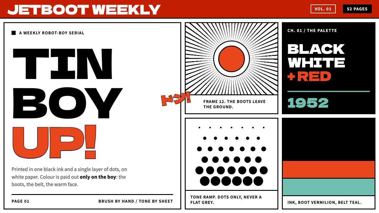 Astro BoyColour only on the boy. Black ink and benday dots on white paper, framed in h…
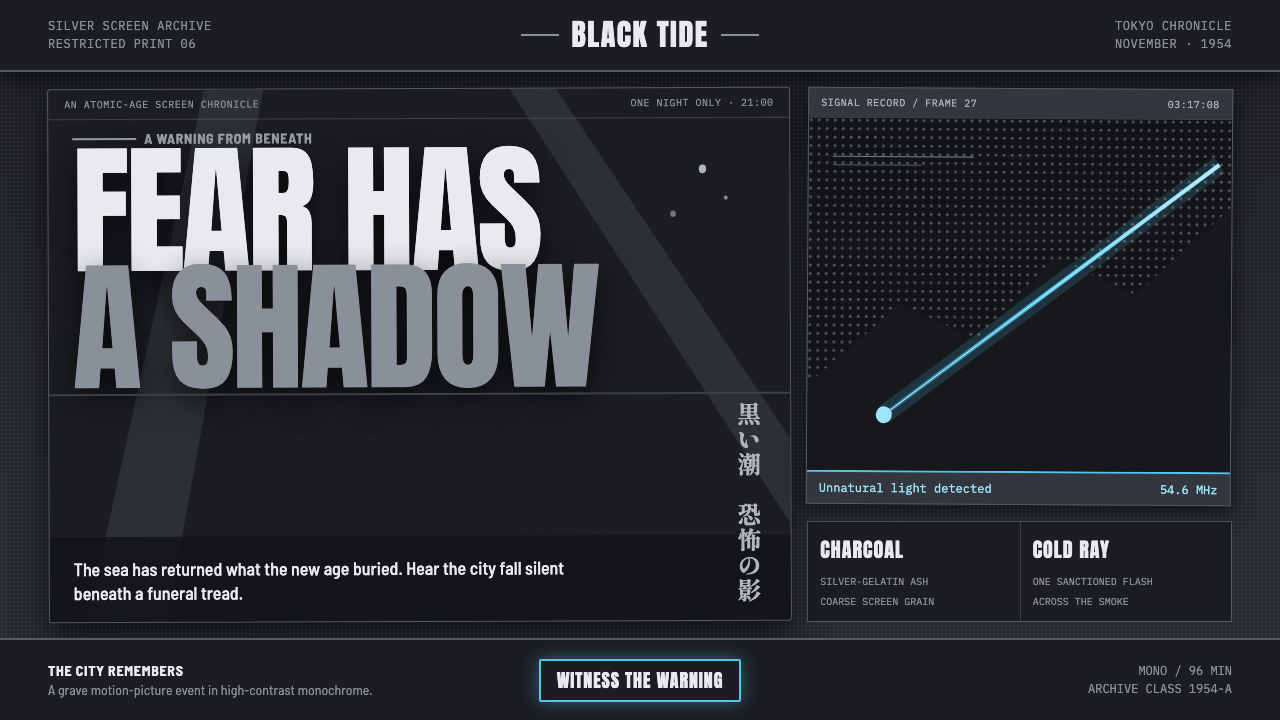 Godzilla (1954 Showa)Fear takes monumental form. Charcoal halftones split under one atomic-blue ra…
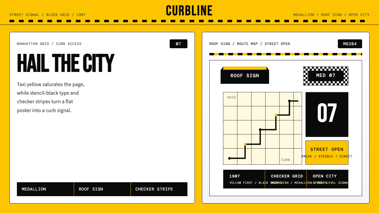 New York Yellow Cab (1907)Visibility is the brand. Taxi yellow, stencil type, checker stripes.
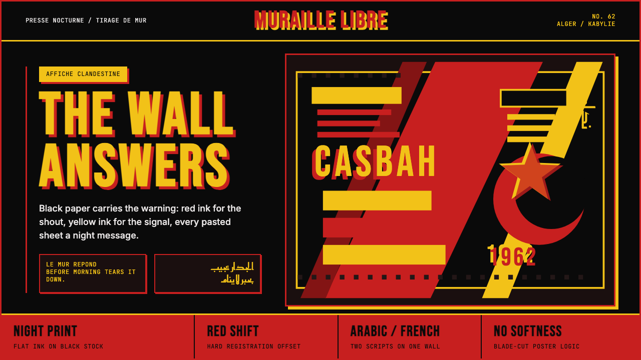 Algerian Casbah Poster (1954–1962)Every surface is a manifesto. Blood red, warning yellow, and stencil type hit…
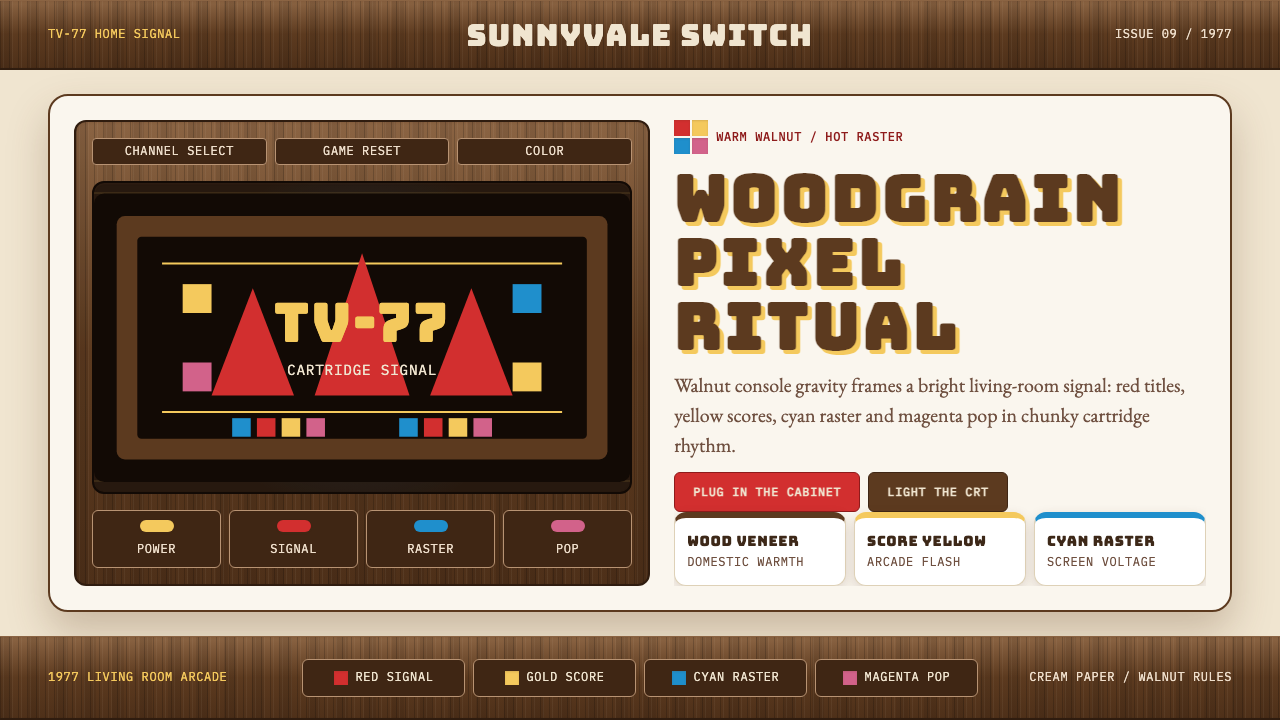 Atari 2600 (Woodgrain)Woodgrain meets raw pixels. Walnut panels frame Bungee type and CMYK raster b…
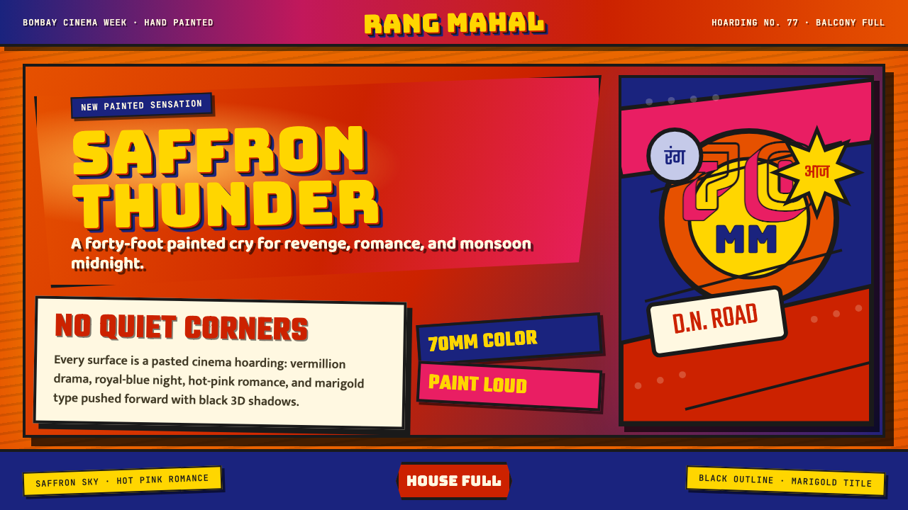 Bollywood Poster Art (1970s)Subtlety is unaffordable. Saffron fields, Bungee shadows, diagonal hoarding d…