What is Olinalá Lacquer?
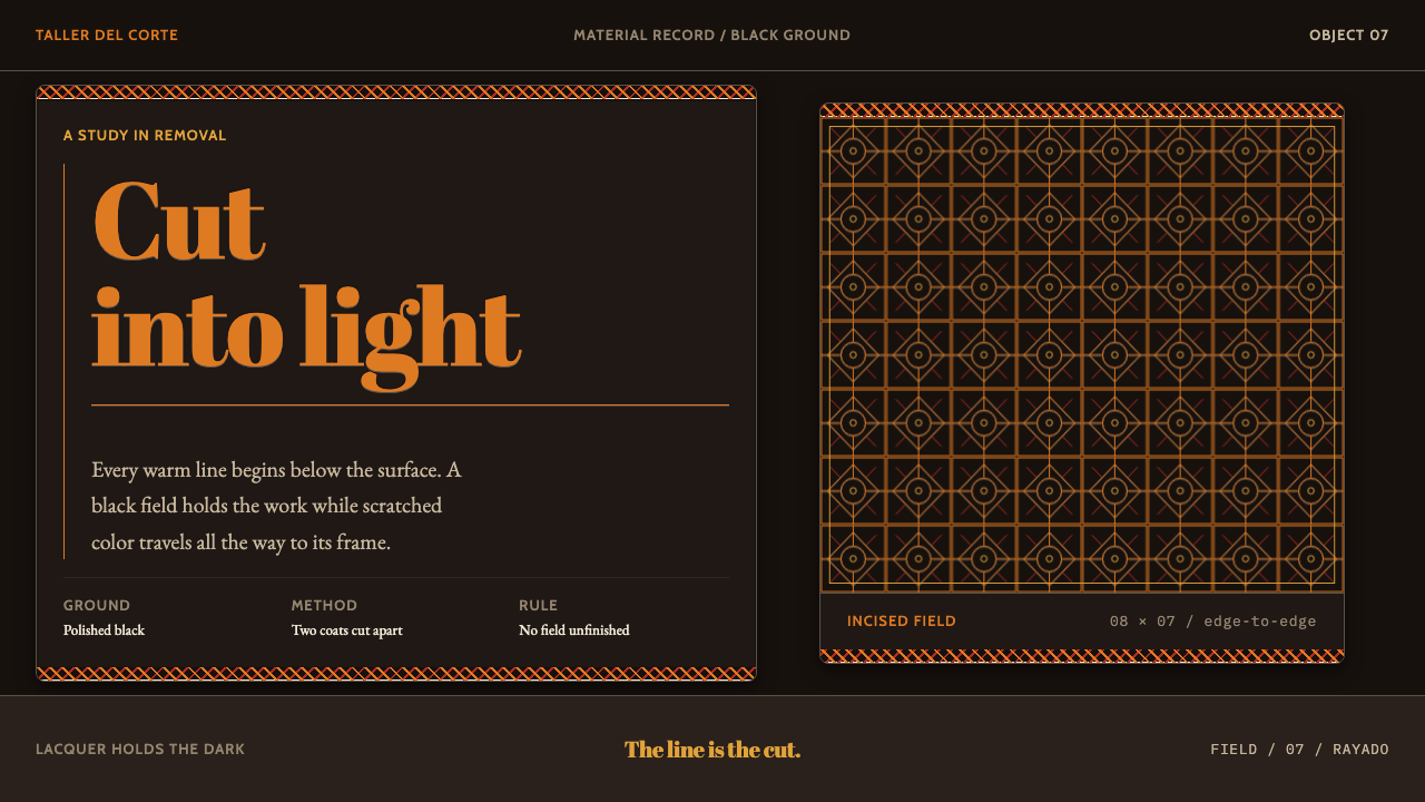
Olinalá lacquer draws by subtraction: a black coat is scratched away with a thorn-tipped quill, so that ochre rabbits, deer, birds and flower fields emerge as cut lines packed right to the edge of the frame.
Olinalá Lacquer in brief
The Olinalá Lacquer design system comes from the lacquered boxes of Olinalá, in the Sierra Madre del Sur of Guerrero, Mexico. The boxes are cut from aromatic linaloe wood and coated with a paste of aje insect grease, chia oil, dolomite and mineral earths. Two lacquer layers go down in contrasting colours, and the top one is scratched away with a turkey quill tipped with a thorn. The technique is called rayado.
What emerges is drawing by removal. Ochre rabbits, deer, birds and dense flower fields appear as line lifted out of a black ground, never as dark ink laid onto a light page. The black is not a background colour chosen for drama. It is the material itself, and every mark is a cut through it that reveals the colour beneath.
The system keeps that inversion. Black is the substance, the line is an opening, and the field is a framed area filled to every edge. There is no empty space in this language and no outline drawn on top of a surface. The picture is made of what has been taken away.

Where does Olinalá Lacquer come from?
The craft belongs to Olinalá in the Sierra Madre del Sur of Guerrero, Mexico, and the origin note describes it as a pre-Hispanic lacquer tradition that runs continuously through the colonial period to the workshops of the present. That continuity is a defining fact. The surface language of Olinalá is not a revival or a reconstruction; it is the visible record of a technique handed on from generation to generation.
The materials explain the look. The box itself is cut from linaloe, an aromatic wood. The lacquer is a paste made from aje, an insect grease, together with chia oil, dolomite and mineral earths, so the coating is built entirely from natural substances. Two layers are applied in contrasting colours. This sequence matters, because the whole image depends on the order in which colour is laid down before any line is cut.
The rayado step is where the picture is made. The maker uses a turkey quill tipped with a thorn to scratch through the top layer, exposing the colour beneath. The tool leaves a slightly irregular, quick, living line, with the confident variations of a hand that is cutting rather than tracing. Rabbits, deer, birds and dense flower fields are the usual subjects, and the lines are packed together until the framed area is full.
Mexican laca, or maque, is the name the wider tradition goes by, and Olinalá sits within Guerrero's handicraft landscape. The record also notes a colonial mission trade in lacquered chests, a reminder that these objects travelled and were valued well beyond their home valleys. The hereditary lacquer families of Olinalá are the carriers of the technique, and the design system treats their craft with the same seriousness as a fine drawing practice.
What defines the Olinalá Lacquer look?
Black as Material
Black is the substance of the object, not a background chosen for effect. It is the surface coat that the maker works through, and it covers almost the entire field. This gives the system a deep, dense, slightly glossy darkness in which every cut line has something to stand against. In a layout, black should be treated as material, with weight and solidity, rather than as empty night.
Ochre Cut-Lines
The drawing is carried by a warm ochre-orange that is revealed beneath the black. It is a single line colour with a glowing, earthy quality, and because it appears only where the lacquer has been removed, it always reads as emerging from darkness. The line has a slightly irregular edge, a trace of the quill and thorn.
Drawing by Removal
The defining principle is subtractive. The picture is made by taking away the top layer, so each line is a cut and not an addition. This changes how shapes behave: forms are defined by openings, outlines come from where the dark remains, and the dark is always the whole from which the image is carved.
Framed Fields
The pattern lives inside a framed field, with a border that contains it. The frame turns the box lid or panel into a clearly bounded picture, and what happens inside it is governed by the same cut-line language. Frames can nest, and different fields can carry different animal or floral scenes, but every field has a clear edge.
Edge-to-Edge Density
Nothing is left empty. Flower fields are packed, animals sit in dense growth, and the lines continue until they meet the frame. Whitespace is not part of the vocabulary here. Density creates richness, and the repeated small cuts give the surface a rhythmic texture that is still legible because every mark belongs to one tool and one colour.
Animal and Floral Vocabulary
Rabbits, deer, birds and flowers are the recurring subjects. They are drawn as simple, readable silhouettes filled with and surrounded by small cuts, with a folk directness rather than naturalistic detail. The vocabulary is generous and warm, and it gives the dark surface a sense of life and movement.
Hand-Cut Line
A thorn on a quill does not give a mechanical line. It varies with pressure and direction, producing quick, slightly wavering strokes with small tapers and hooks. This human variation is part of the aesthetic, and a faithful digital version should keep it: lines that look cut by a hand, not rendered by a vector tool with perfect regularity.

Who shaped Olinalá Lacquer?
The craft is carried by families who hold the technique through generations. Their craft stands behind the whole sequence the system describes, from the lacquer paste to the contrasting layers to the final cutting of the design. They are the real authors of the style, and the design system exists to translate a craft practised by hand into a language that keeps its logic.
Rayado is the scratching technique at the heart of the craft: a turkey quill tipped with a thorn cuts through the top lacquer layer to reveal the colour beneath. It is both a tool and a way of thinking about images. Every shape in the system is the result of removal, and the technique explains why line, field and darkness behave the way they do.
The box is cut from aromatic linaloe wood and carries the whole sequence of materials: wood, lacquer paste, two coats, cut lines. It is both the support and the record of the process. The box is a useful reminder that the style belongs to a made object with edges, lids and corners, which is why framed fields are so central.
The record notes a colonial mission trade in lacquered chests. It shows that Olinalá's work was an object of exchange across long distances, valued well beyond the place that made them. The tradition therefore has a history of speaking to audiences beyond its own community, which is a useful precedent for a design language meant to travel.
How do you use Olinalá Lacquer today?
The Olinalá style fits projects that want a dark, rich, intricate surface with a strong handmade character. Its idea is easy to state and demanding to apply: the dark is solid and the drawing is cut out of it. If a layout follows that rule, it gains a distinctive depth and warmth without needing gradients or effects.
On a cover slide, use a black field with a framed panel inside it, and fill the frame with ochre line-work of animals and plants running to the edges. The title can be set in the same ochre tone, either within the frame or in a clear opening cut into the pattern. Content slides should keep the black ground, place text in clean cut-out areas, and use pattern bands as borders and dividers. On data slides, draw charts as ochre lines on black, using line weight and spacing rather than filled areas to show quantities.
For web interfaces, the style suits dark-mode product pages, cultural and craft platforms, gaming and storytelling sites, and premium editorial pages. Use thin ochre outlines for icons, inputs and cards, so that every component looks cut from the dark rather than placed on it. A pricing page can frame each plan in a bordered field, with the recommended plan carrying the richest line-work. Keep body text clear and high in contrast, and confine the dense pattern to borders, headers and decorative bands.
For editorial and marketing work, full-bleed black pages with packed line-work borders create strong impact. The style is natural for packaging, posters, book covers, album art and exhibitions about folk craft. Illustrations should be rendered as outline silhouettes with interior cuts, and photography, if used, should be dark-toned and framed within the same bounded fields.
The most common mistake is to flip the style onto a white page with black lines. That is drawing by addition, and it loses the whole point of the craft. Other errors include adding gradients or glows to the ochre lines, using several line colours, leaving big empty zones that break the sense of a packed field, and drawing lines so thin and low in contrast that text or icons become hard to read. Keep the lines deliberate, warm and legible.

Olinalá Lacquer — FAQ
What is rayado?
Rayado is the scratching technique used on Olinalá lacquer. Two lacquer layers are applied in contrasting colours, and the maker removes parts of the top layer with a turkey quill tipped with a thorn. The colour underneath shows through in the cut lines, so the image is created by removal rather than by painting on top.
Why is the system dark?
Because black is the material of the object. The top lacquer layer is dark, and the image appears wherever it has been cut away. A light version would reverse the logic and turn the drawing into ink on paper. Keeping the ground dark preserves the sense that every line is an opening, and it gives the ochre its glowing quality.
Why does the pattern run all the way to the edge?
Because empty space is not part of the language of this tradition. The framed field is filled completely with animals, birds and flowers, and the lines carry on until they reach the border. The density is what gives the surface its richness. Whitespace would make the dark look like a background rather than a material, and the cut lines would lose their rhythm.
How is this different from ordinary line art on a dark background?
In ordinary line art, lines are drawn on top of a surface. Here, the surface is cut open and the line is the colour beneath. This affects behaviour: lines are slightly irregular, shapes are defined by openings, and the darkness feels solid. The difference shows up in layout choices, such as keeping a single line colour, avoiding glows, and treating the black as a material.
Are there accessibility concerns with ochre lines on black?
Yes. Fine decorative lines can be pleasant at large scale but become hard to read when used for small text or icons. Keep text in clear, high-contrast areas, make interactive elements bold enough to be recognised, and use the dense pattern for borders and ornament rather than for information. The style works best when the pattern frames the content instead of competing with it.
Related design styles
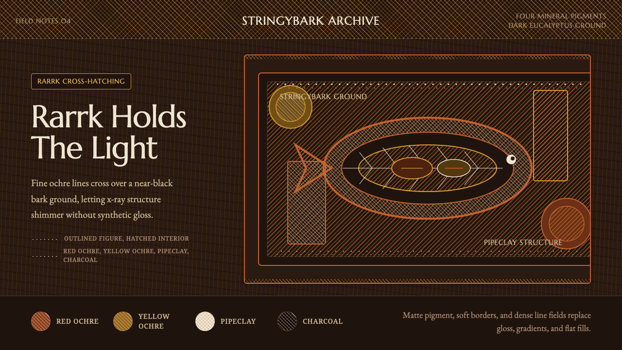 Arnhem X-Ray Bark PaintingShimmers without gloss. Ochre rarrk lines vibrate on dark stringybark.
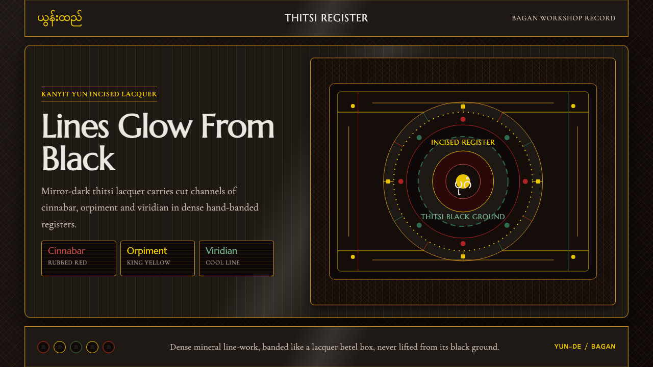 Burmese Yun LacquerwareLacquer glows in cut lines. Cinnabar, orpiment and viridian band a mirror-bla…
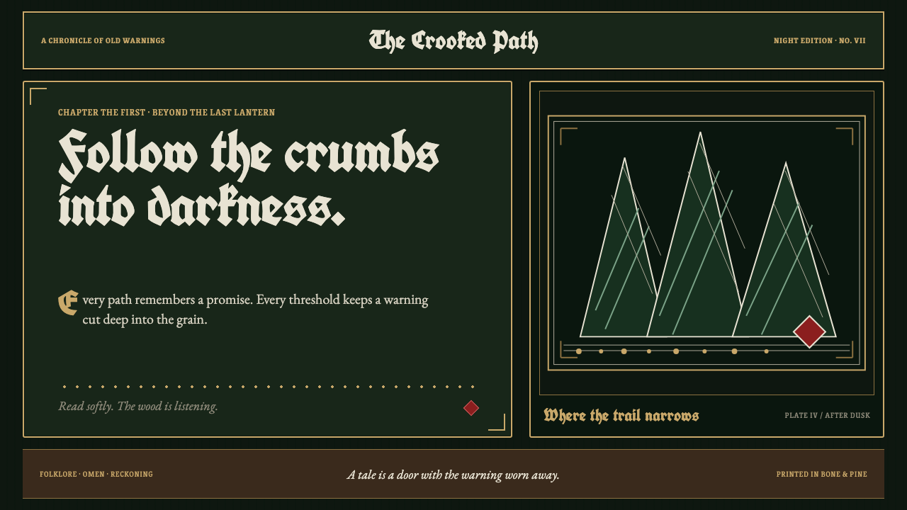 Grimm Fairy Tales (Black Forest Woodcut)The dark wood closes in. Bone-white cuts and aged-gold frames score a pine-bl…
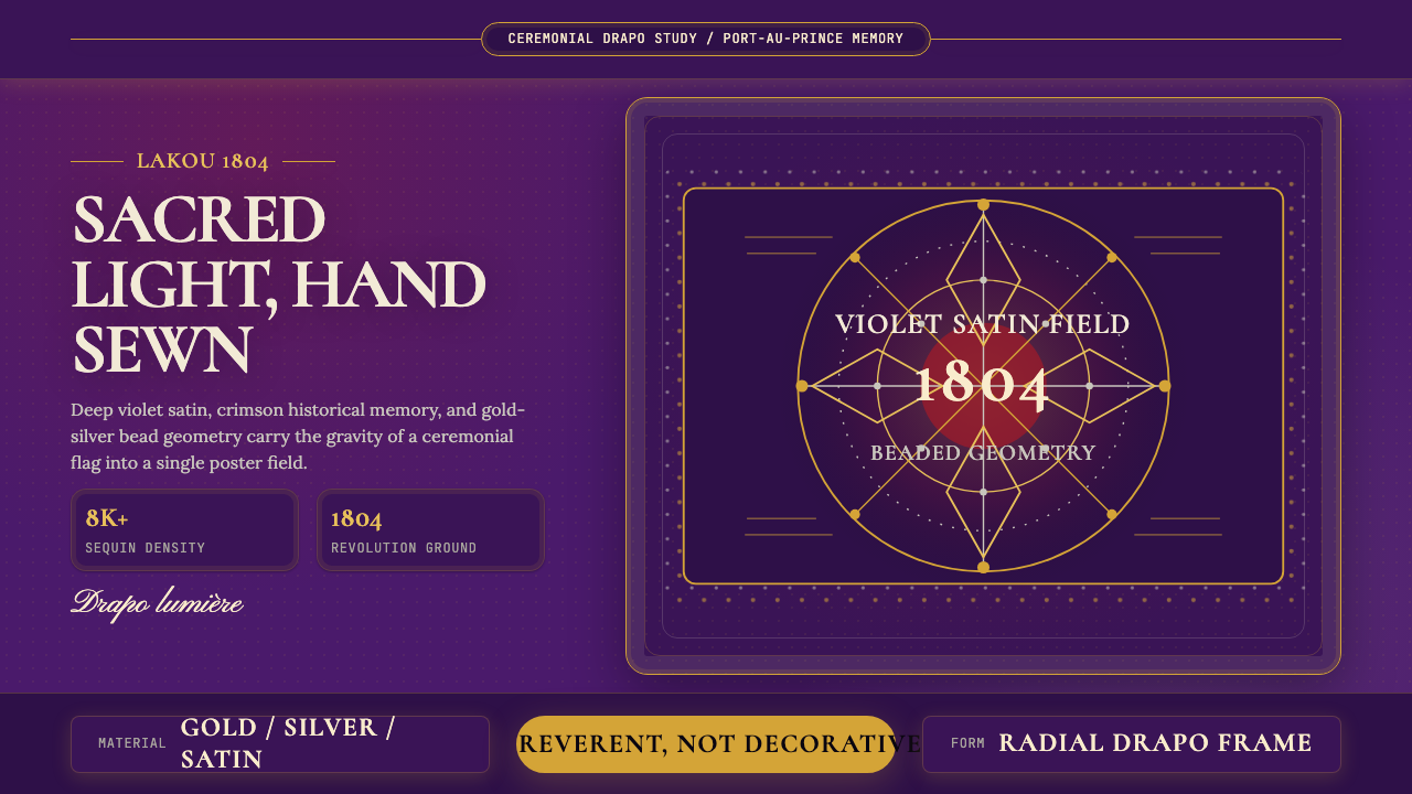 Haitian Vèvè Sequin Drapo 1804Sacred density. Violet satin, gold sequins, and radial geometry hold 1804 gra…
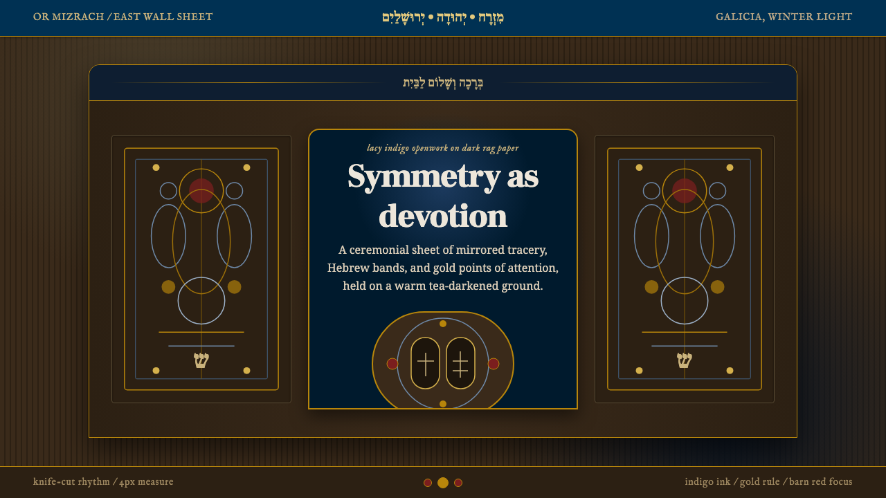 Jewish Papercut MizrahDevotion as openwork. Indigo filigree and Hebrew bands glow on dark rag paper.
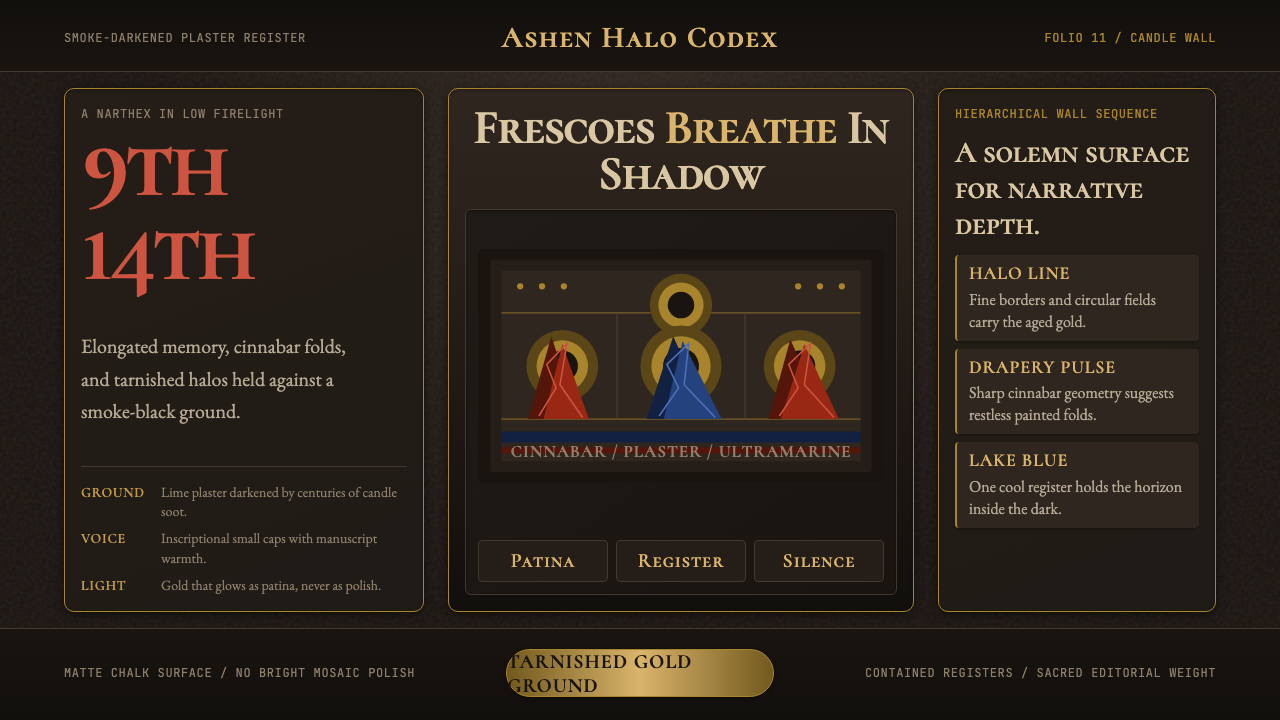 Macedonian Ohrid Fresco (Byzantine)Sacred darkness breathes. Tarnished gold rings, cinnabar folds, and plaster g…