What is Ōkami?
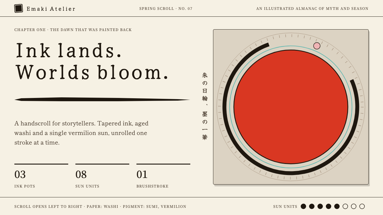
Ōkami turns an interface into a handscroll: tapered sumi strokes on warm washi paper, curling ukiyo-e clouds and a single vermilion sun as the only loud note.
Ōkami in brief
The Ōkami style is a design language drawn from Clover Studio's 2006 game of the same name, in which the sun goddess Amaterasu runs as a white wolf through a Japan painted like a moving handscroll. Black sumi outlines taper and swell as if drawn with a loaded brush, ukiyo-e clouds curl in spirals, and the whole world sits on a layer of warm washi paper.
Its centre of gravity is a single vermilion sun disc. That one saturated red anchors every composition, and the same red appears in the kumadori-style markings painted on the white wolf. Everything else, ink black, paper cream, a few muted earth tones, plays quietly around it. The restraint is part of the Japanese ink-painting tradition: negative space is not empty, and a single strong mark can carry an entire picture.
Interfaces made in this style read like scrolls rather than dashboards. Ink pots, sun units, hanko seals and tapered strokes replace gauges, badges and dividers. Every action should feel like a brushstroke being laid down, with weight at the start, speed in the middle and a pointed finish. It is a style for projects that want a hand-made, cultural warmth instead of mechanical neatness.

Where does Ōkami come from?
Ōkami was released by Clover Studio, based in Osaka, on the PlayStation 2 in 2006, in April in Japan and September in North America. A Wii port followed in 2008 and high-definition remasters in 2012 and 2017. The game was directed by Hideki Kamiya, with Atsushi Inaba, Sawaki Takeyasu and Masami Ueda among the names associated with its creation. Its premise cast the player as Amaterasu, a sun goddess in the form of a white wolf, restoring life to a cursed Japan.
The visual direction drew from three traditions at once. Sumi-e is ink-wash painting, where a single brush can make a thin line or a swelling stroke depending on pressure and speed, and where the unpainted paper is as important as the ink. Ukiyo-e woodblock prints supplied the spiralling clouds, stylised waves and flat areas of colour. Kabuki kumadori, the bold painted lines on a performer's face, supplied the red markings on the wolf's body.
What made the game unusual was that these were not decoration applied to an ordinary 3D world. The rendering itself imitated a scroll painting, with outlines that thinned and thickened, textures that looked like paper fibre and a palette built from natural pigments. Even the game's mechanic, painting on the screen with a celestial brush to change the world, tied the visuals back to the act of drawing.
As a design reference, Ōkami continues to be cited because it showed that a game could look like a specific artistic tradition rather than a generic fantasy world. The style that grew from it carries the same idea into interfaces: use the logic of the brush, the scroll and the seal, and let the page feel painted rather than constructed.
What defines the Ōkami look?
Color
Warm washi cream is the ground, ink black does the drawing, and a single vermilion carries all the emphasis. That red appears as the sun disc, as seal impressions and as the markings on the wolf. A few muted earth tones may sit in the background, but nothing competes with the red. The palette is deliberately narrow so that each mark feels placed by hand.
Brush strokes
Lines are never uniform. They begin thick, taper toward a point, and sometimes swell again mid-stroke, the way a loaded brush behaves under changing pressure. These tapered strokes replace ordinary dividers, underlines and borders. The result is an edge with a pulse, where every rule looks like a gesture, not a measured line.
Washi texture
The background is not a flat fill but a warm paper with subtle fibre and tonal variation. It gives the page a hand-made, tactile feel and lets ink read as ink. Areas left bare are as important as areas painted, following the sumi-e principle that negative space is part of the composition.
Ukiyo-e clouds and waves
Spiralling cloud curls, stylised wave crests and flat colour fields are borrowed directly from woodblock print tradition. They appear as decorative borders, section transitions and background motifs. Their shapes are rhythmic and repeating, which gives long pages a gentle flow without resorting to photographs.
Seals and ink pots
Interface furniture is replaced by objects from the world of calligraphy. A hanko seal stands in for a badge or a confirmation mark, an ink pot for a progress or resource meter and a sun unit for health or count. These metaphors keep the interface inside its world and make small status elements feel like part of the painting.
Kumadori accents
Bold painted lines, inspired by the markings on kabuki performers' faces, appear as accents in vermilion. They sharpen focus on key elements such as headings, calls to action and portraits. Used sparingly, they give the page a theatrical punch; used everywhere, they would lose their force.

Who shaped Ōkami?
Kamiya directed Ōkami at Clover Studio. His name is the one most strongly tied to the game's unusual ambition: to build an entire action adventure in the visual language of Japanese ink painting. The scroll-painting look that results is the origin of this design style.
Inaba is listed among the key figures associated with Ōkami. His role belongs to the production side of Clover Studio's team, which made it possible for the game's distinctive art direction to be realised on the PlayStation 2 and later ported to the Wii and remastered for high-definition platforms.
Takeyasu is among the named contributors tied to the game. As part of the team behind Ōkami, he is connected to the visual identity that blends sumi-e brush logic, ukiyo-e motifs and kabuki-inspired markings into a single coherent world.
Ueda is another name linked to the creation of Ōkami. His association with the project reflects how many contributors were needed to turn a bold art direction into a playable, consistent game that has remained a reference point for stylised visual design.
How do you use Ōkami today?
On slides, the Ōkami style suits cultural presentations, heritage brands, tea, craft and wellness topics and any narrative that benefits from a scroll-like pace. Use a warm paper background, a bold brushstroke for the title and a single vermilion sun disc as the focal graphic. Let one stroke or one seal carry each slide. Resist adding photographs and charts that fight with the painted look; the space around the ink is part of the design.
For data slides, replace conventional gauges with the style's own metaphors. A sun unit can mark the headline figure, an ink pot a remaining amount and a tapered stroke a trend line. Keep the charts few and hand-drawn in feel. Use vermilion only for the number that matters, and let black ink handle everything else, so the slide keeps its calm, scroll-like composition.
In web interfaces, the style fits cultural sites, storytelling pages, tea and craft e-commerce, museum exhibitions and portfolio presentations. Navigation can unroll like a scroll, section breaks can be painted strokes with tapered ends, and calls to action can be a vermilion seal or a sun disc. Hover and click feedback should feel like ink landing on paper. Transitions should be fluid and brush-like, never mechanical.
For editorial and marketing work, the style gives posters, book covers and seasonal campaigns an unmistakable hand-made character. Pair a large brush mark with restrained copy and one bright seal, and the page delivers warmth and tradition without cliché. It works best when the subject really connects to Japan, ink, craft or storytelling, because the style carries cultural meaning of its own.
The most common mistake is to treat it as a generic Asian-themed skin and scatter motifs without understanding them. Overusing clouds, waves and seals turns the page into a pattern; the sumi-e principle is to leave space. A second mistake is introducing many loud colours, which kills the sun disc's authority. A third is using uniform vector lines, which flattens the brush character. Keep one red, taper the strokes and let the paper breathe.

Ōkami — FAQ
What is the Ōkami design style?
It is a design language based on Clover Studio's 2006 game Ōkami. It combines black sumi brush strokes that taper and swell, warm washi paper, ukiyo-e clouds and one vermilion sun disc as the focal accent. Interfaces built on it read like handscrolls rather than dashboards.
What traditions does the style draw on?
Three: sumi-e ink-wash painting for the brush logic and use of empty space, ukiyo-e woodblock prints for the spiralling clouds and flat colour, and kabuki kumadori makeup for the bold red markings. Together they make a coherent, hand-painted world rather than a collage of motifs.
Why is there only one loud color?
Because the vermilion sun disc is the anchor of every composition. Ink black and paper cream do the drawing and the ground, so the red can be the single focal point. Adding more loud colours would weaken it and make the page lose its calm, scroll-like balance.
When was Ōkami released?
It came out on the PlayStation 2 in 2006, in April in Japan and September in North America. A Wii port followed in 2008, and high-definition remasters arrived in 2012 and 2017.
Is this style only for Japan-themed projects?
It works best when the subject connects to Japan, ink, craft, tea, heritage or storytelling, because the style carries its own cultural meaning. For unrelated subjects it can feel like a costume, so it is wise to use the brush and paper principles with care rather than copying every motif.
Related design styles
 Lofi Hip-Hop Anime Girl (2018)Solitude glows warm. Caveat notes, plum night, and amber geometry loop like v…
 Studio Ghibli (Miyazaki)Hand-painted wonder breathes. Cumulus blue, meadow green, and Cormorant type…
 HopepunkSoftness becomes defiance. Deep moss, honey amber, and vine borders make care…
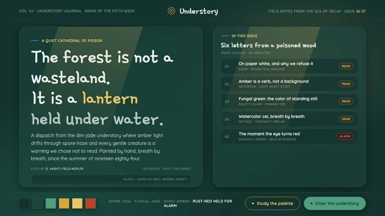 Nausicaä Toxic JungleRefuses paper-white. Jade-teal understory lit by drifting amber spores, rust-…
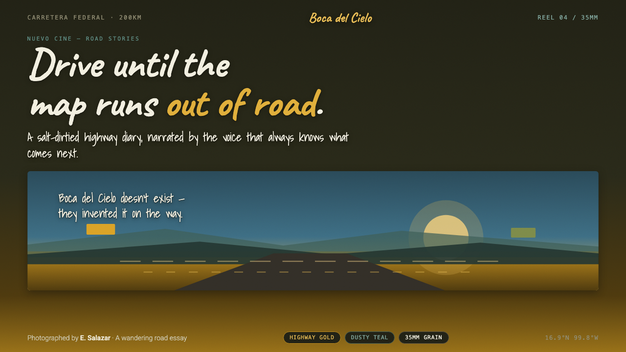 Y Tu Mamá TambiénSun-bleached road-movie warmth. Highway gold and dusty teal on dusky film, ha…
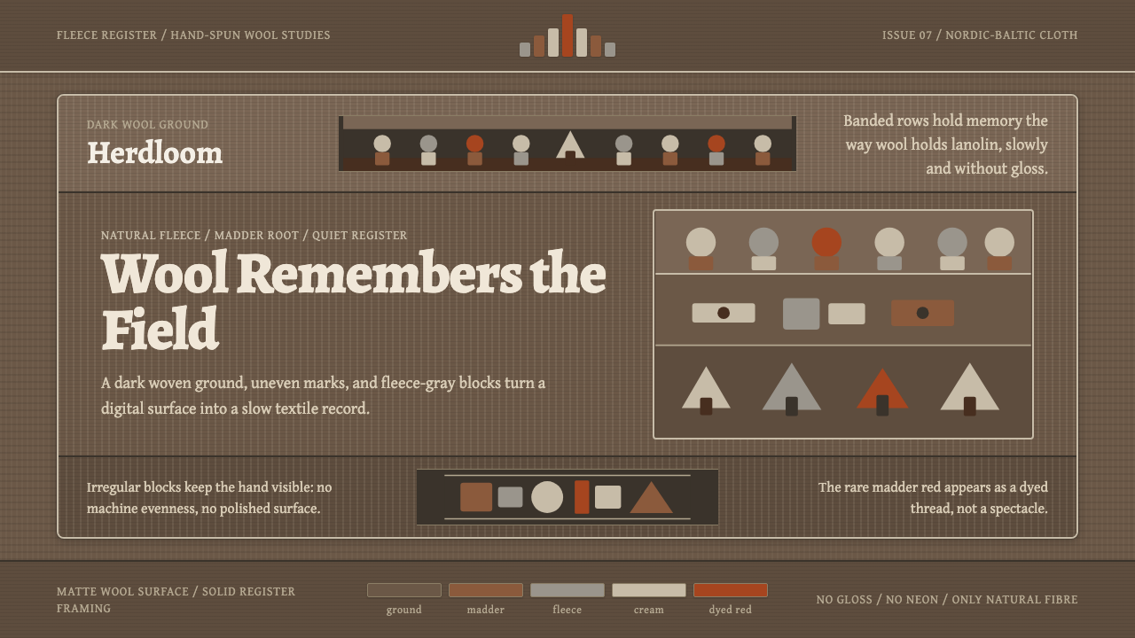 Estonian Folk Tapestry (Anu Raud)Quiet wool carries memory. Banded fleece browns and Alegreya type move like a…