What is Nausicaä Toxic Jungle?
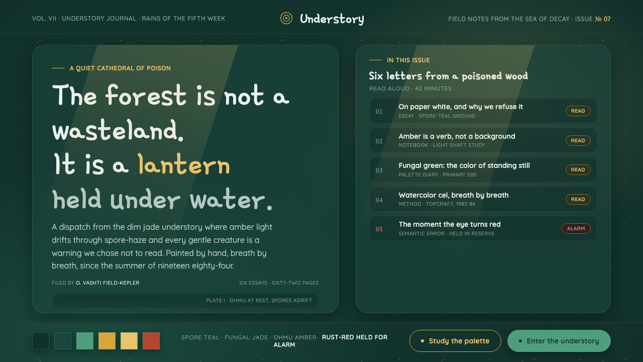
Nausicaä Toxic Jungle turns a poisoned forest into a living interface: jade-teal darkness, amber breath, and rust-red alarm held until the ecosystem asks for attention.
Nausicaä Toxic Jungle in brief
Nausicaä Toxic Jungle is a dark design system distilled from the Sea of Decay in Hayao Miyazaki’s 1984 film Nausicaä of the Valley of the Wind. Its defining atmosphere is not nocturnal blackness or theatrical darkness, but the dense interior of a forest that seems dangerous at first glance and protective on closer inspection. The ground is dim jade-teal, cool and mineral-rich, with enough inner luminosity to suggest moisture, spores, leaves, and depth without ever becoming paper-white.
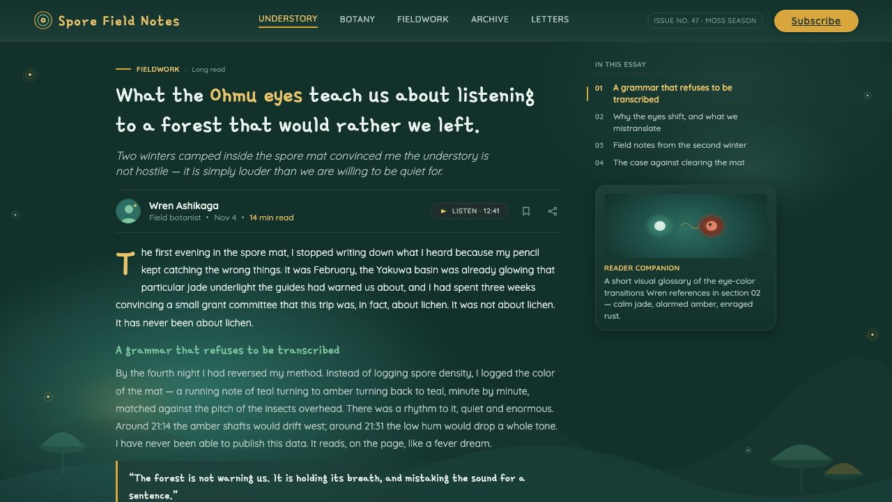
The system borrows the visual logic of hand-inked watercolor cels rather than attempting to imitate a single frame. Forms should feel layered, softened by atmosphere, and gently separated by changes in value rather than by hard decorative containers. Warm amber appears as drifting spores, narrow shafts of light, or a small signal of life within the undergrowth. It is illumination, not general decoration.
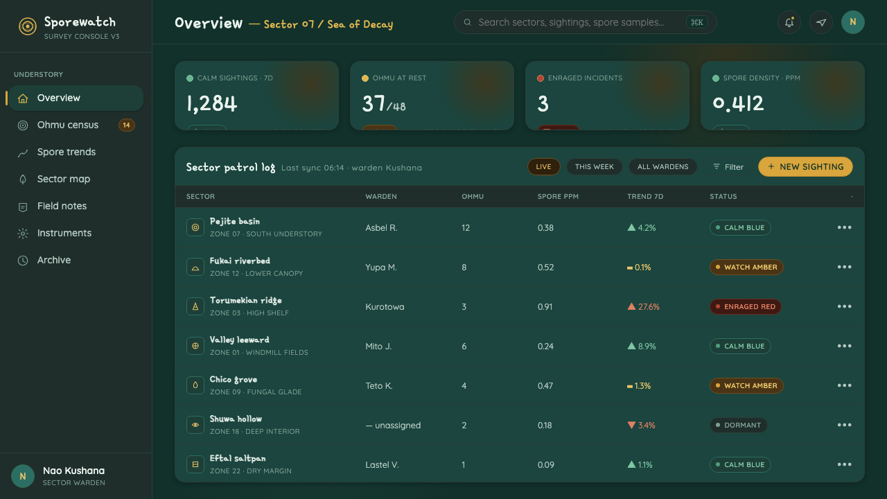
Rust-red is the system’s most disciplined color. It recalls the moment when an Ohmu’s calm blue eyes flare in alarm, so it belongs to danger, rupture, and urgent consequence. The style depends on withholding that note. A screen filled with warnings loses the emotional ecology that makes one warning meaningful; a restrained field of cool darkness makes a single red event feel immediate.
Where does Nausicaä Toxic Jungle come from?
The source image-world begins with Nausicaä of the Valley of the Wind, released in 1984 by Topcraft, the studio identified as a precursor to Studio Ghibli. Hayao Miyazaki’s forest is central to the design language because it refuses a simple opposition between contamination and purity. The Sea of Decay is poisonous, yet it is also quietly sanctuary-like; its atmosphere holds threat and gentleness together rather than assigning either one a separate visual world.
That contradiction is carried by the film’s hand-painted eco-fantasy anime language. Hand-inked watercolor cels make the forest feel materially made: outlines retain a human touch, color seems suspended in translucent layers, and light can appear to emerge from the image rather than merely strike its surface. The result is naturalist watercolor illustration with a science-fiction premise, where unfamiliar biology still feels observed rather than mechanically invented.
The Ohmu gives the system its emotional structure. Described as towering and gentle, the creature prevents the jungle from becoming a conventional monster setting. Its calm blue eyes establish a baseline of watchfulness and coexistence; their rust-red alarm state establishes an exception. This relationship gives the palette a narrative hierarchy: cool tones sustain the habitat, warm gold makes its hidden life visible, and red announces that equilibrium has been disturbed.
Japan is the stated regional origin, while Hayao Miyazaki, Joe Hisaishi, and Topcraft Studio are named as key figures. The associated movements are hand-painted eco-fantasy anime, naturalist watercolor illustration, and environmental science-fiction. Together they explain why the style works best when it remains ecological rather than merely decorative: every visual choice should feel like part of a living system with atmosphere, attention, and consequence.
What defines the Nausicaä Toxic Jungle look?
Jade-Teal Understory
The dominant field is a dim jade-teal gloom, cool enough to imply damp foliage and poisoned air, yet luminous enough to preserve legibility. It should feel inhabited and deep rather than empty or cinematic. Near-white grounds break the premise: this world begins under a canopy, where light arrives filtered, dispersed, and incomplete.
Amber Bioluminescence
Amber is used as a living light source. It can gather around a focal point, drift through a background, or trace a path through dense information, but it should never flatten into a general-purpose highlight color. Its warmth matters because it is scarce: it gives the interface the sensation of spores caught in a beam of light.
Alarm in Reserve
Rust-red has a single narrative job: to communicate an Ohmu-like alarm state. Use it for danger, destructive action, irreversible change, or a condition demanding immediate attention. It should not compete with ordinary navigation, promotional emphasis, or routine status. The less often it appears, the more forcefully it carries consequence.
Watercolor Atmosphere
Surfaces should suggest hand-painted watercolor cels through quiet variation, translucent overlap, and atmospheric softening. This is not a license for visual fog. Information remains organized, while transitions between layers feel organic and moist rather than polished into sterile digital gloss.
Layered Canopy Depth
Depth comes from overlapping silhouettes, receding cool values, and selective pools of amber light. Foreground, middle distance, and background should feel like distinct ecological strata. Panels and content groups can be present, but they should read as sheltered clearings within a larger field, not as disconnected floating objects.
Gentle Monumentality
The Ohmu suggests scale without aggression. Major headings, hero imagery, and primary information can be monumental, but they should be calm, rounded in rhythm, and protective of smaller details. The style does not seek industrial severity; even its most imposing elements belong to a habitat rather than a machine.
Who shaped Nausicaä Toxic Jungle?
Miyazaki is the source material’s central creative figure: in 1984 he painted the Sea of Decay as both poison and sanctuary. That dual reading is the system’s governing idea. His forest supplies its dim jade-teal atmosphere, drifting amber light, and the moral distinction between ordinary life and an Ohmu’s alarm state.
Joe Hisaishi is named among the key figures connected to the 1984 film. Within this design reference, his presence anchors the work in a collaborative film world rather than treating the jungle as an isolated illustration. The system should therefore feel time-based and atmospheric: a place where attention gathers, pauses, and changes in response to life.
Topcraft Studio released the film in 1984 and is identified as a precursor to Studio Ghibli. Its inclusion grounds the visual language in hand-painted production rather than generic fantasy imagery. The relevant lesson is craft: layered color, inked definition, and a world whose texture comes from painting rather than from ornamental excess.
How do you use Nausicaä Toxic Jungle today?
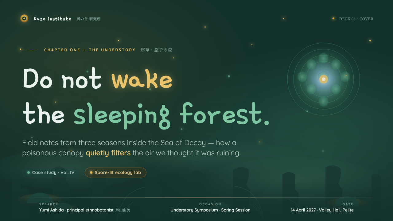
For presentation covers, treat the page as an entrance into the understory. Let a broad jade-teal field establish the environment, then introduce one amber focal point near the title or a cropped organic silhouette. The title should be calm but commanding, with enough open darkness around it to feel discovered rather than announced. Content slides benefit from a layered reading order: a primary idea in the clearest illuminated zone, supporting material receding into cooler surrounding strata.
Data slides should preserve the palette’s narrative roles. Use cool teal families for the stable field, amber for selected evidence or movement worth following, and rust-red only for a genuinely alarming exception. Charts should feel like instruments within an ecosystem rather than bright corporate widgets placed on a dark backdrop. Labels need clean contrast, while contextual notes can sit farther back, as though seen through foliage.
For web interfaces, the style is especially effective for dashboards, monitoring tools, research products, and pricing pages that need to turn complexity into attention. A dashboard can use the jade-teal field to establish continuity across modules, amber to guide the next useful action, and red to distinguish conditions requiring intervention. On pricing pages, amber can clarify a preferred route without making every tier compete; the atmosphere should still feel observant and calm.
Editorial and marketing work can use the style to make long reading feel exploratory. Lead images or illustrated fields should resemble openings in dense vegetation, while pull quotes, labels, and calls to action act as small bioluminescent signals. Keep copy readable and deliberate. The goal is not to bury information in texture, but to make each section feel encountered after moving through a coherent world.
The common mistake is treating the theme as a dark teal background with random gold glow and frequent red accents. That produces generic fantasy decoration and loses the film-derived emotional order. The correct application gives each color a role: teal sustains the habitat, amber reveals living attention, and rust-red interrupts only when calm has been meaningfully broken.
Nausicaä Toxic Jungle — FAQ
Is Nausicaä Toxic Jungle simply a dark fantasy style?
No. Dark fantasy often treats darkness as menace, spectacle, or decorative mood. This system is built around a more specific tension from the Sea of Decay: a poisonous environment that is also a sanctuary. Its darkness is ecological and protective, not merely ominous. Amber suggests life within the gloom, while rust-red is reserved for a disturbance in that living balance.
Why should paper-white be avoided?
Paper-white changes the setting from an interior forest to an exposed page. The source material describes a cool teal-green gloom lit from within by spores and amber shafts, so brightness should feel filtered and local rather than universal. Light areas are still useful for legibility, but they should read as illuminated clearings or suspended glow, not as a blank default behind every element.
Can rust-red be used for calls to action?
Only when the action is genuinely consequential. Rust-red inherits the meaning of an Ohmu’s alarmed eyes, so it is appropriate for destructive confirmation, severe failure, or an urgent condition. Using it for ordinary primary buttons teaches users to read routine action as danger. Amber is usually the better choice for a preferred action because it signals attention and living light without implying rupture.
How should imagery behave in this style?
Imagery should support the feeling of a layered understory: organic silhouettes, atmospheric depth, suspended particles, and selective light are more faithful than literal fantasy ornament. Images should not make the jungle appear uniformly hostile or overly polished. The most useful visual tension is between density and refuge, with one clear area of attention emerging from a larger, cooler environment.
Where does this style work poorly?
It is a poor fit when a product needs paper-like neutrality, relentless promotional brightness, or constant high-urgency signaling. Its meaning depends on darkness having depth, amber having rarity, and red having consequence. If every surface must be bright, every action must shout, or every status must compete for attention, the ecological hierarchy collapses and the style becomes costume rather than system.
Related design styles
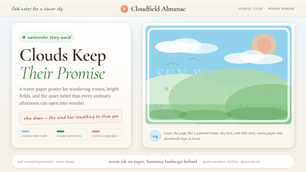 Studio Ghibli (Miyazaki)Hand-painted wonder breathes. Cumulus blue, meadow green, and Cormorant type…
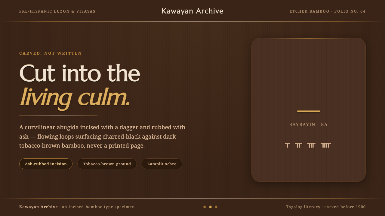 Baybayin ScriptCarved, not written. Curvilinear baybayin ash-rubbed into tobacco-brown bambo…
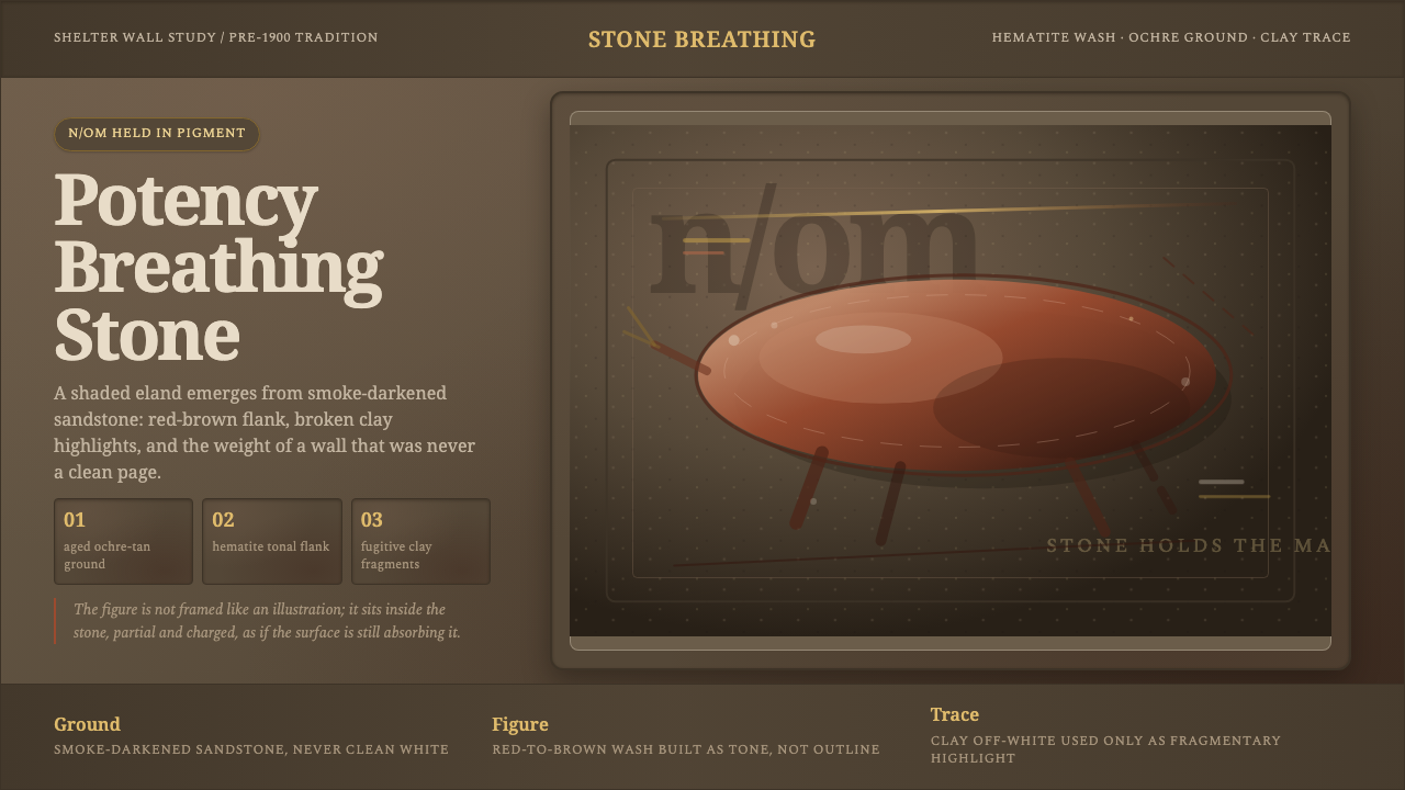 San Rock Art DrakensbergPotency stains the stone. Hematite gradients breathe over smoke-dark sandston…
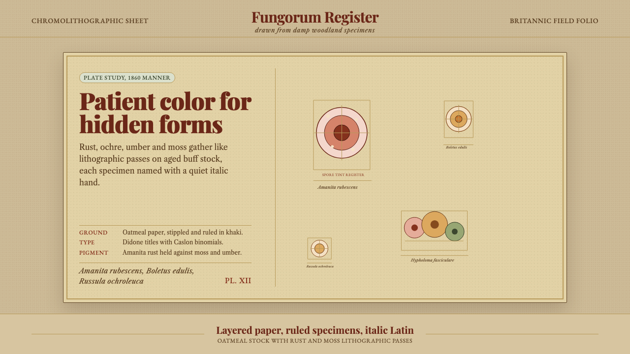 Victorian Mycology PlatePatient field science. Rust and moss specimens sit on stippled buff paper wit…
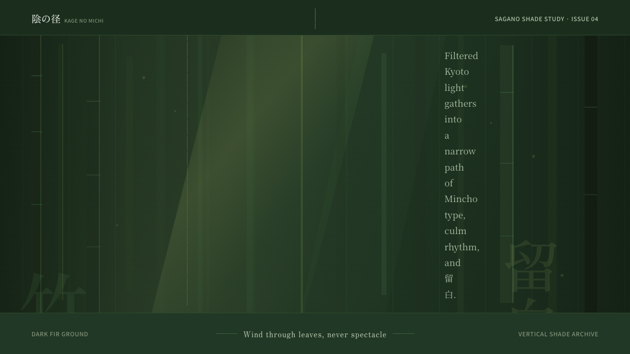 Bamboo GroveQuiet goes vertical. Fir green, Mincho type, and dappled culm rules create de…
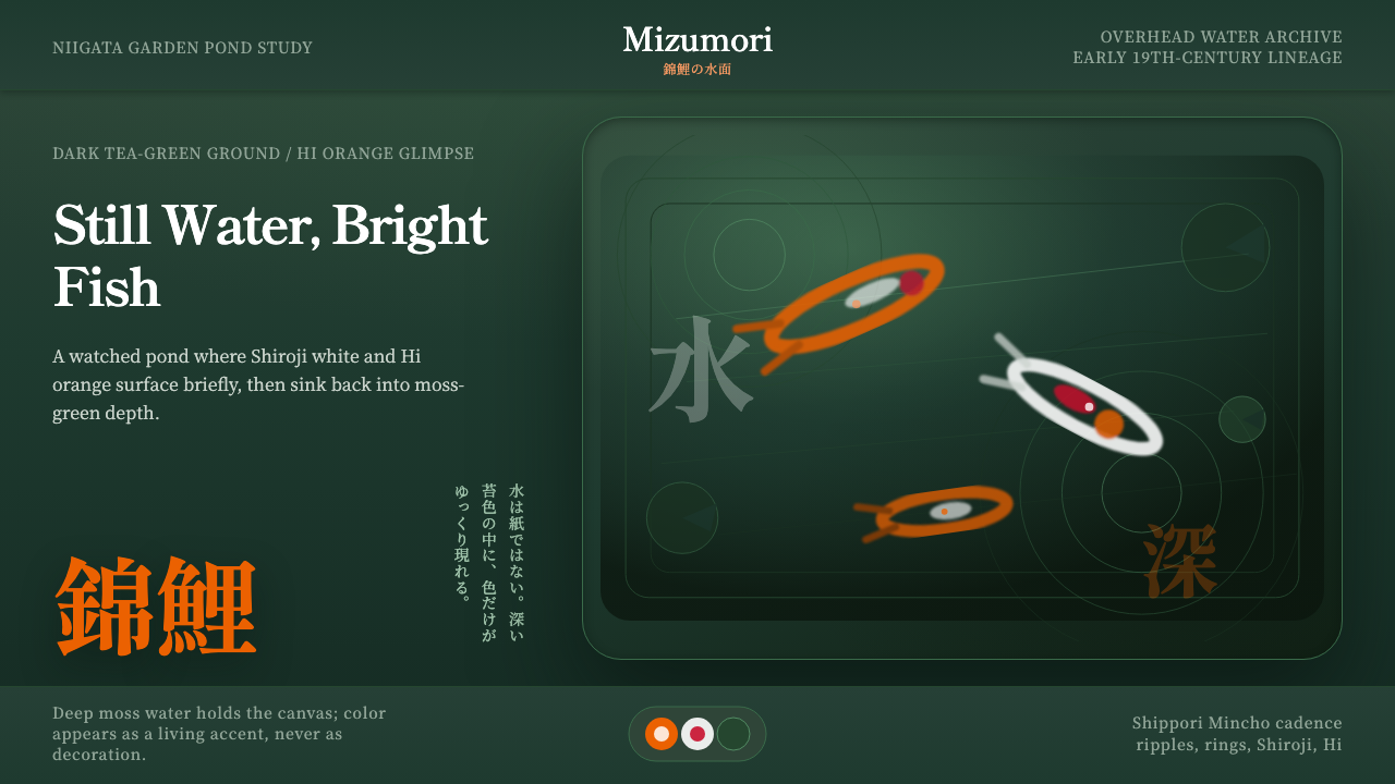 Koi PondQuiet water carries color. Moss depth, Mincho type, and orange koi flashes.