What is Octopath Traveler?
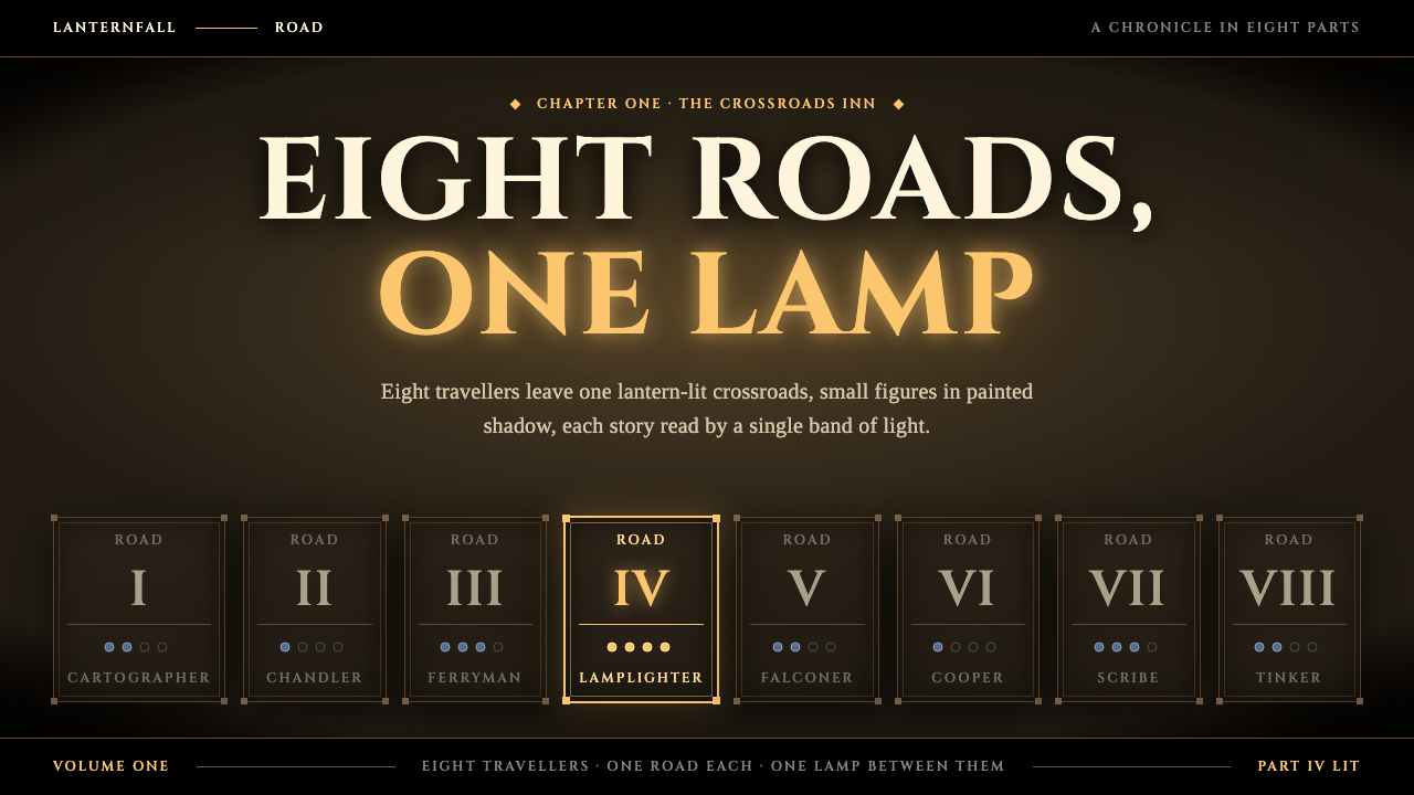
HD-2D is a lit stage in the dark: pixel-art travellers standing in three-dimensional sets, with parchment-pale capitals, amber torchlight and one sharp band of focus.
Octopath Traveler in brief
HD-2D is the visual style that Square Enix named and popularised with Octopath Traveler, the role-playing game developed with Acquire and released in 2018. It combines pixel-art characters with three-dimensional environments, then lights the whole scene as if it were a miniature set. The result feels both nostalgic and unmistakably modern: sprites that recall sixteen-bit games, standing in worlds that glow with depth, bloom and atmosphere.
As a design system, the style translates that stage into interface terms. The page is a warm near-black, and a sharp band of light runs through the middle while everything above and below softens into blur and vignette. Headings are set in Roman capitals, body text in a bookish serif, and colours are the pale cream of old paper. The page does not feel like a dashboard; it feels like the opening of a chapter.
Colour carries meaning in a restrained way. Amber is the colour of firelight and marks whatever is lit, active or chosen. Cool blue belongs to night, caves and the game's boost mechanic. Between them, a dark room and a pale page create a sense of ceremony that suits narrative, storytelling and anything that wants to feel like a journey rather than a transaction.

Where does Octopath Traveler come from?
Octopath Traveler was released on the Nintendo Switch in July 2018, with a Windows version following in 2019. It was made by Square Enix together with the studio Acquire in Tokyo, and it was built around a deliberate idea: take the look of sixteen-bit Super Famicom role-playing games and rebuild it with modern rendering. Sprites stayed pixel art, but the world around them became three-dimensional, lit with depth of field, bloom and soft shadows.
The result was named HD-2D by Square Enix, and the term has since become a recognised style in its own right. It draws on two sources at once. One is the Super Famicom era's tradition of role-playing games with small, expressive characters and map-based worlds. The other is tilt-shift miniature photography, where a narrow band of sharpness and a blurred foreground and background make full-scale scenes look like toy dioramas.
The style travelled beyond its first game. Triangle Strategy in 2022 and the HD-2D version of Dragon Quest III in 2024 carried it into new titles, confirming that it had become a house look for Square Enix and not a one-off experiment. Several named contributors are linked to its development, among them Tomoya Asano, Keisuke Miyauchi, Naoki Ikushima and Yasunori Nishiki.
For interface design, the interesting move is that HD-2D turns nostalgia into depth. It does not ask designers to reproduce old pixel menus. It asks them to make a flat page feel like a stage with a spotlight, a horizon and a mood. That is why the design system built on it works for storytelling more than for utility.
What defines the Octopath Traveler look?
Color
The ground is a warm near-black rather than a cold neutral, so the page feels like a room lit by a single flame. Parchment-pale cream carries text and key surfaces. Amber, the colour of torchlight, marks what is active or chosen. Cool blue is reserved for night, caves and boost states. Colours glow rather than sit flat, and highlights bloom softly at their edges.
Typography
Headings use Roman capitals with classical proportions, set with generous letter spacing so they read like chapter titles carved on a plaque. Body copy uses a bookish serif that suits long, narrative text. The pairing evokes an old hardback storybook. There is no heavy sans-serif and no casual rounded type; every line should feel like part of a printed tale.
Band of light
The signature composition is a sharp horizontal band running through the middle of the page, with the area above and below falling into blur and vignette. It borrows directly from tilt-shift miniature photography and gives the eye one clear place to rest. In an interface it becomes a focus strip for the main content, with navigation and secondary elements dissolving toward the edges.
Depth and layering
Scenes are built in layers: a sharp mid-ground, a blurred foreground and a soft, hazy background. Shadows are diffuse and glows spill gently around lit objects. Cards and panels feel as though they stand on a stage rather than lie on a page. Depth is the main way the style creates atmosphere, in place of heavy decoration.
Pixel-art sprites
Characters and icons keep the crisp, blocky look of sixteen-bit pixel art, even when set against smooth modern lighting. The contrast between the hard pixel edge and the soft glow around it is the style's central tension. In an interface, small pixel icons or portraits can sit beside smooth typography and gradients of light without clashing.
Eight portrait cards
The game's eight travellers are shown as a row of character cards, each with its own portrait and small details. The pattern of a parade of equal cards becomes a layout idea: a calm, even row of choices, none dominant, each inviting a click. It suits character selection, team pages, chapter menus and any place where several options deserve equal ceremony.

Who shaped Octopath Traveler?
Asano is among the key figures linked to the development of Octopath Traveler. His name belongs to the group credited with shaping the game's identity at Square Enix, where the HD-2D look was first named and shown to the public in 2018.
Miyauchi is another named contributor to the Octopath Traveler project. Along with the rest of the team, he is part of the story of how a modern engine was used to reimagine the look of sixteen-bit role-playing games rather than simply imitate them.
Ikushima is listed among the people connected to the game's creation. His inclusion reflects the collaborative nature of the project, which brought together Square Enix and the Tokyo studio Acquire around a single stylistic idea.
Nishiki is recognised as one of the key contributors associated with Octopath Traveler. Together with his colleagues, he is part of the lineage that carried HD-2D from the 2018 original into later titles such as Triangle Strategy and the HD-2D edition of Dragon Quest III.
How do you use Octopath Traveler today?
On slides, HD-2D suits storytelling decks, game pitches, brand narratives and keynote openers. Use a warm near-black slide with a single bright horizontal band for the main content, a Roman capital title in parchment cream and one amber accent. A cover can read like a chapter opening. For content slides, keep text short and let the vignette frame the focus. Avoid filling the whole slide with detail; the darkness around the band is the point.
For data slides, treat the lit band as the data zone. Use cream for the main figures, amber to highlight the active or selected value, and cool blue for secondary or night-mode comparisons. Charts should be few and clearly lit rather than dense. A single large number against a dark field, with a short caption in a serif, delivers the ceremony the style is built for.
In web interfaces, the style fits narrative products, game launch pages, portfolio sites, interactive stories and onboarding sequences. Layouts can use a central lit strip for content with navigation fading into the vignette at the edges. Character or option cards arranged in an even row work well for selections. Amber highlights mark hover and active states, while cool blue signals secondary or special modes. Transitions should feel like moving light, not like sliding panels.
For editorial and marketing work, HD-2D makes a strong poster or hero treatment. Pixel-art imagery set against lit, blurred backgrounds, captions in classical capitals and a restrained palette gives a nostalgic but polished impression. It works especially well for anything with a story arc: a game, a book, a campaign with chapters or a product launch framed as a journey.
The most common mistake is brightening the whole page. If the whole canvas is evenly lit, the band of focus disappears and the stage becomes a flat dark theme. A second mistake is using sans-serif body text or casual rounded fonts, which breaks the storybook tone. A third is scattering amber everywhere; it should mark only what is lit or active. Keep the room dark, the band sharp and the type classical.

Octopath Traveler — FAQ
What is HD-2D?
HD-2D is the term Square Enix uses for a visual style that combines pixel-art characters with three-dimensional environments, lit with depth of field, bloom and vignette. It was introduced with Octopath Traveler in 2018 and later used in Triangle Strategy in 2022 and the HD-2D edition of Dragon Quest III in 2024.
Where does the look come from?
It draws on two sources: sixteen-bit Super Famicom role-playing games, which supplied the pixel-art characters and map-based worlds, and tilt-shift miniature photography, which supplied the narrow band of focus and blurred edges that make scenes look like toy dioramas.
What colors does the Octopath Traveler design style use?
A warm near-black ground, parchment-pale cream for text, amber for torchlight and active states, and cool blue for night, caves and boost states. The palette is kept small and the colours glow softly rather than sitting flat.
Is HD-2D suitable for business dashboards?
Not usually. It is built for narrative, ceremony and atmosphere, with a dark room and one lit band of focus. Dense dashboards need even light and many equal elements, which cuts against the style. It works better for storytelling decks, game pages, portfolios and onboarding flows.
What is the most common mistake when using this style?
Lighting the whole page evenly. The style relies on a sharp band of focus surrounded by blur and vignette, so removing the darkness removes the stage. Using casual sans-serif body text or scattering amber everywhere are other common ways to lose the storybook tone.
Related design styles
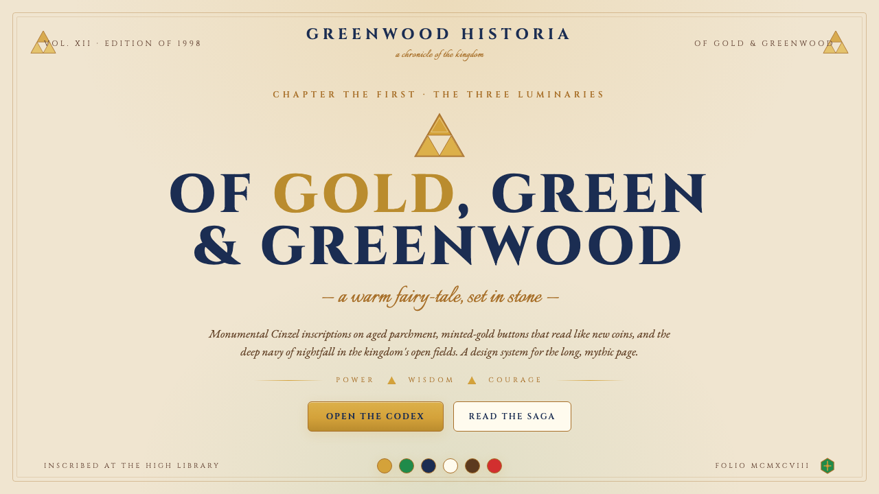 Zelda Ocarina of TimeWarm-fantasy mythology as a UI. Cinzel inscriptions on cream parchment, minte…
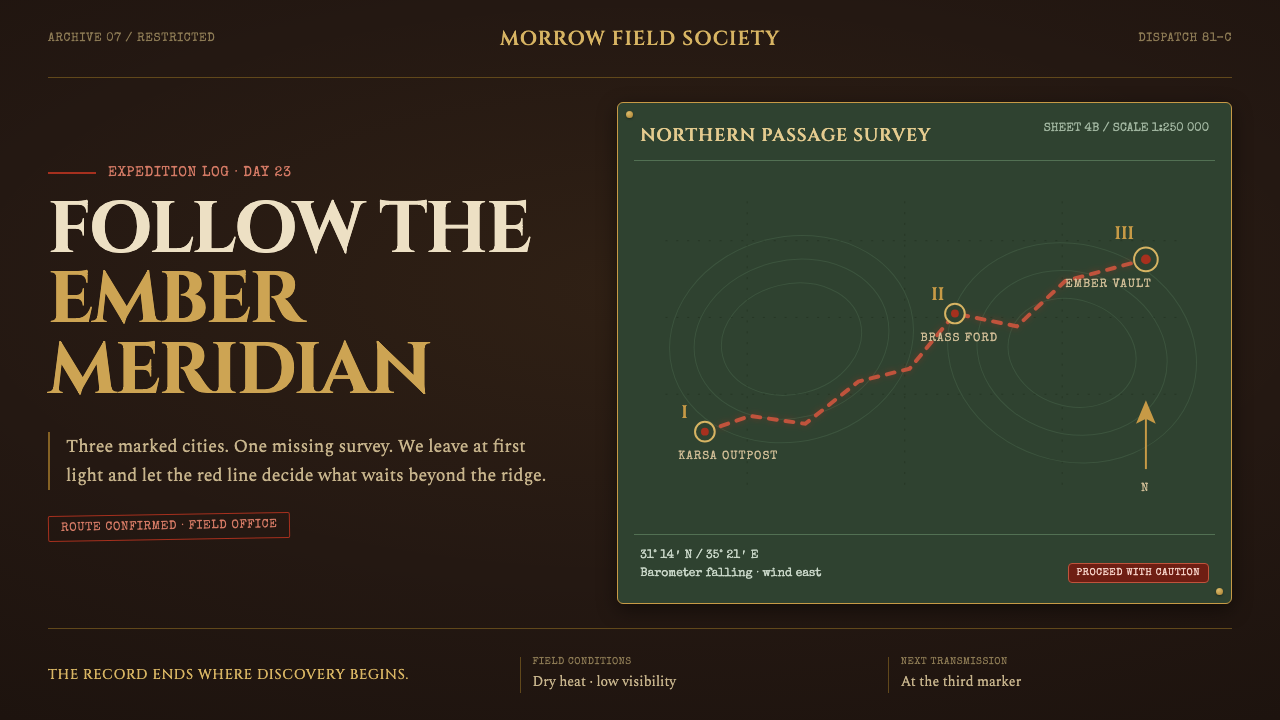 Raiders Expedition (1981)Adventure stays mid-journey. Red routes cross saddle leather under tarnished…
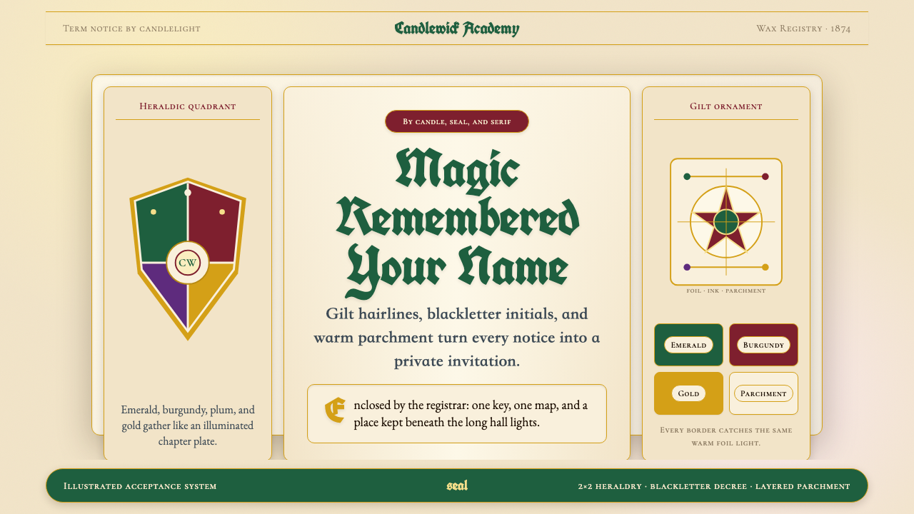 Harry Potter IllustratedMagic arrives by parchment. Emerald, burgundy and gilt borders frame blacklet…
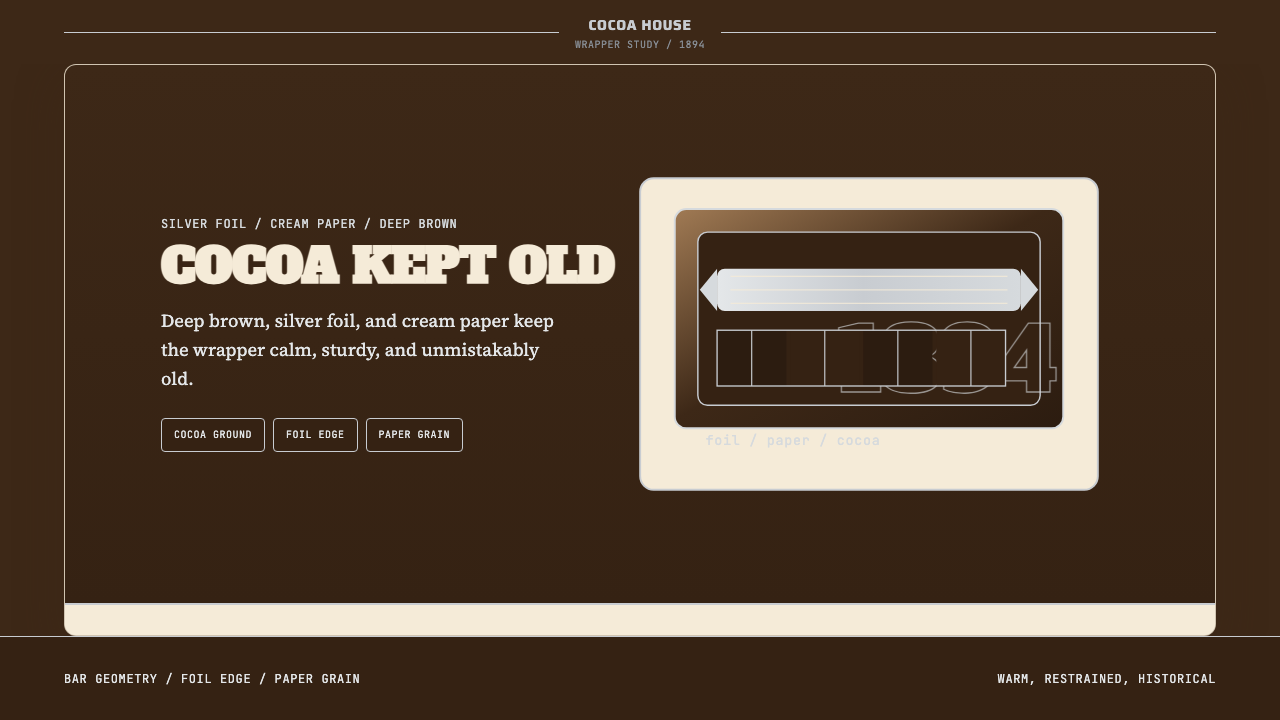 Hershey's Chocolate Brown (1894)Plain, enduring, warm. Cocoa brown meets silver foil on cream paper.
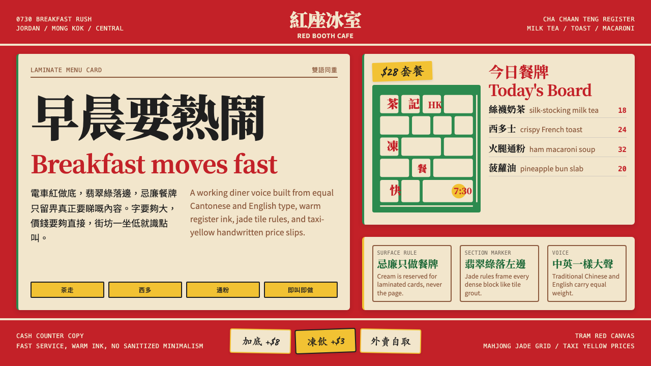 Hong Kong Cha Chaan TengDemocratic diner warmth. Tram red, jade rules, cream menu cards, equal Canton…
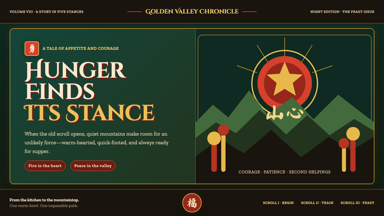 Kung Fu Panda (2008)Ancient calm meets comic momentum. Vermilion, gold and paper-cut peaks glow i…