What is Raiders Expedition (1981)?
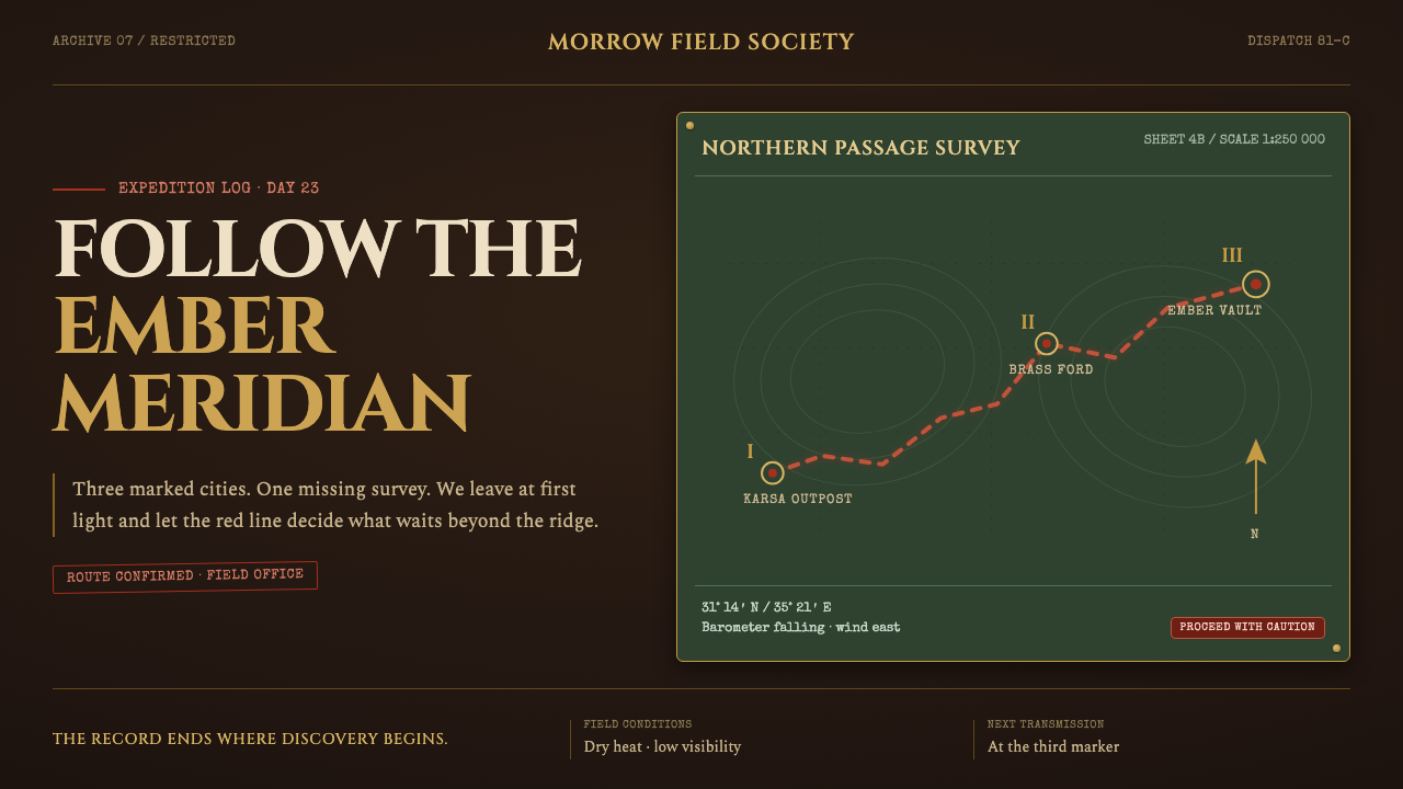
Raiders Expedition turns an interface into a torchlit field journal, where every route, rule, and stamped coordinate suggests the next danger is already ahead.
Raiders Expedition (1981) in brief
Raiders Expedition is a dark adventure style derived from the atmosphere of Raiders of the Lost Ark, released theatrically in 1981. It frames digital content as an archaeologist’s working record rather than a polished museum display: a deep saddle-leather ground, tarnished brass dividers, map fragments weathered by sun and dust, and a dashed red route that advances from city to city. The page should feel active, provisional, and slightly dangerous, as though its owner has paused only long enough to mark the next destination.
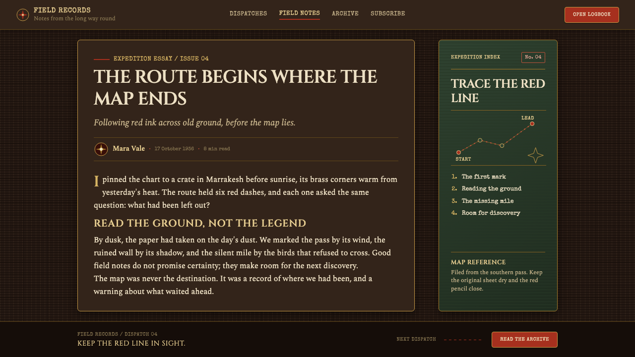
Its visual system depends on contrast between darkness and warmth. The brown field is intentionally deep rather than parchment-like, allowing brass lines to catch an imagined lamplight and red marks to appear urgent. Brass is never pristine; it should imply age, oxidation, and use. Red is not a decorative flourish but the visual evidence of movement: a plotted route, a warning, a target, or a trace left by someone who knows where they are going.
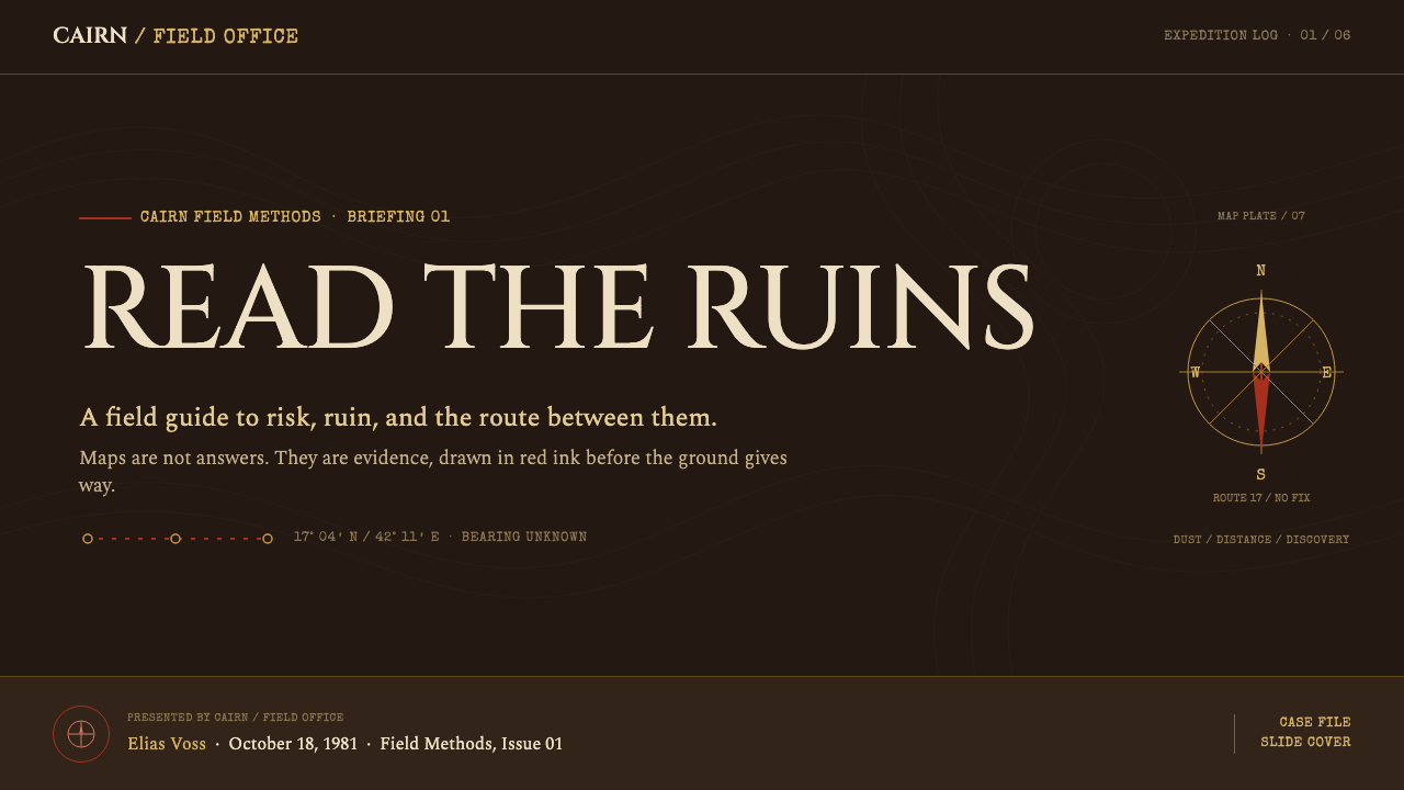
Typography gives the style its narrative credibility. Cinzel capitals carry the monumental authority of carved temple lintels, Spectral gives longer passages the measured tone of a field report, and Special Elite introduces the irregular, mechanical character of a typewritten coordinate or legend. Together they create a productive tension between ancient sites, practical documentation, and the fast-moving adventure serial.
Where does Raiders Expedition (1981) come from?
The style begins with Raiders of the Lost Ark and its 1981 theatrical release. Its source material places the production within Hollywood and Lucasfilm, with work connected to Elstree Studios as well as locations in Tunisia and Hawaii. That geographic spread matters to the style’s imagined world: the interface should feel assembled from travel, fieldwork, and changing terrain, not from a single immaculate interior.
Raiders Expedition explicitly revives the adventure serials associated with Republic Pictures in the 1930s. The resulting tone is not quiet historical reverence. It is matinee momentum: maps promise movement, clues lead outward, and visual artifacts appear to have been handled under pressure. A route line is therefore central not because it is nostalgic decoration, but because it converts the page into a scene between departures.
The source describes this lineage as a pulp-adventure revival, a matinee-serial homage, and a form of New Hollywood spectacle. Those three ideas should remain visible together. Pulp contributes danger, clues, and exoticized travel imagery; the serial tradition contributes relentless forward motion; spectacle contributes the confidence to make a single map, rule, or title treatment carry a whole screen.
Steven Spielberg, George Lucas, Lawrence Kasdan, and Norman Reynolds are named as key figures in the source material. Within the style, those names anchor Raiders Expedition to a collaborative film production rather than to a generic vintage mood board. The design language should preserve that sense of authored production design: cinematic enough to suggest a world, but disciplined enough to serve information.
What defines the Raiders Expedition (1981) look?
Dark Saddle Leather
The ground is deep brown, dense enough to suggest leather, smoke, and a room lit after sunset. It must remain dark; a pale parchment substitute changes the mood from active expedition to archival display. The darkness creates the stage on which brass and red can perform.
Tarnished Brass Rules
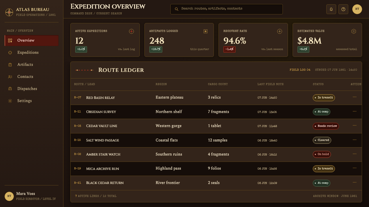
Brass rules organize the page like instrument edges, map borders, and expedition hardware. They should feel aged rather than luxurious: warm, dulled, and slightly weathered. Their job is to contain information and establish order without becoming ornamental frames.
Red Route Ink
A dashed red route is the style’s clearest narrative device. It should crawl across a map, connect named places, or point toward a destination beyond the visible frame. Used sparingly, red turns navigation into plot; used everywhere, it loses its danger and urgency.
Carved Capitals
Cinzel capitals establish a monumental voice for titles, section markers, and place names. They should read as inscriptions rather than luxury branding: firm, historical, and architectural. Their formality works best when balanced by quieter prose and rougher typewritten details.
Field-Journal Prose
Spectral carries the longer reading experience with a literary but practical tone. It should feel like an observer recording evidence, conditions, and discoveries. This is not decorative old-world typography; it is the calm voice that makes the surrounding danger believable.
Stamped Coordinates
Special Elite is reserved for coordinates, legends, labels, and short operational notes. Its typewriter character suggests hurried annotation and portable equipment. It is strongest in small bursts of information, where its irregularity feels like evidence of handling rather than visual noise.
Who shaped Raiders Expedition (1981)?
Spielberg is named in the source material as a key figure connected to Raiders Expedition. His inclusion anchors the style to the film’s cinematic adventure identity rather than to an abstract historical imitation.
Lucas is named as a key figure and connects the style to Lucasfilm and its Hollywood production context. In design terms, that context supports an interface with clear narrative stakes and an expansive sense of travel.
Kasdan appears among the source’s key figures. His presence reinforces that Raiders Expedition belongs to a constructed adventure narrative, where routes, clues, and destinations should feel consequential rather than merely scenic.
Reynolds is named as a key figure in the source material. For this style, that association foregrounds production design: the world is conveyed through surfaces, instruments, dividers, typography, and objects that imply prior use.
How do you use Raiders Expedition (1981) today?
For presentation covers, treat the screen as a departure board for an expedition. Let a map fragment or directional composition establish the journey, then place a carved all-cap title with one concise subtitle. A brass rule can contain the title area, while a red route or destination mark supplies the single most urgent accent. The cover should promise motion before it explains the subject.
For presentation content and data slides, use the field-journal logic to create hierarchy. Spectral can carry explanations, while Special Elite marks locations, sources, categories, or compact annotations. Data should behave like expedition evidence: charts sit inside restrained brass structures, major findings receive a red route-like emphasis, and labels remain practical. Avoid turning every datum into a relic; clarity remains more important than atmosphere.
For web interfaces, the style is especially effective for dashboards, planning tools, collections, and pricing pages that benefit from a sense of progress and discovery. Use deep leather-like grounds to unify the surface, brass rules to separate functional zones, and red only for active movement, alerts, or decisive calls to action. Navigation should resemble a usable legend, with labels, destinations, and status made immediately legible.
For editorial and marketing work, build pages like a dossier assembled on the road. Section introductions can use monumental capitals, long-form copy can settle into Spectral, and pull-outs can take the form of typed coordinates or map legends. The common mistake is mistaking the style for generic vintage decoration: pale parchment, excessive distressing, ornate gold, and constant red all weaken the expedition story. Keep the brown deep, the brass purposeful, and the route line rare enough to matter.
Raiders Expedition (1981) — FAQ
Is Raiders Expedition a parchment-map style?
No. The source is explicit that the style is not cream parchment. Its dark saddle-leather ground is essential because it lets tarnished brass suggest lamplight and makes red route ink glow with danger. A pale map treatment shifts the result away from torchlit expedition and toward decorative antiquarianism.
What should the red route line communicate?
It should communicate movement with consequences: a journey underway, a connection between places, a target, or an approach toward danger. The line is strongest when it crosses a map-like surface and points beyond the current view. It should not be used as a universal accent, because its narrative force depends on scarcity.
How should the three typefaces be divided?
Cinzel belongs to titles and place-like markers, where its carved-capital character can establish authority. Spectral belongs to sustained reading, where the interface needs a composed journal voice. Special Elite belongs to short labels, coordinates, and legends, where its typewritten character can imply field equipment and annotation.
Can this style work for a pricing page?
Yes, if the expedition metaphor supports the product. Brass rules can clarify tiers, field-journal labels can identify conditions, and red can identify the selected or decisive action. The practical information must remain easy to scan; theatrical mood should frame the decision, never obscure the offer.
What most often makes an application feel inauthentic?
The usual failure is replacing the style’s production-design discipline with generalized nostalgia. Too much fake age, too much red, ornate metallic decoration, or a pale parchment background turns the interface into costume. Raiders Expedition works when every brass rule, typewritten note, and route segment appears to have a functional role in the journey.
Related design styles
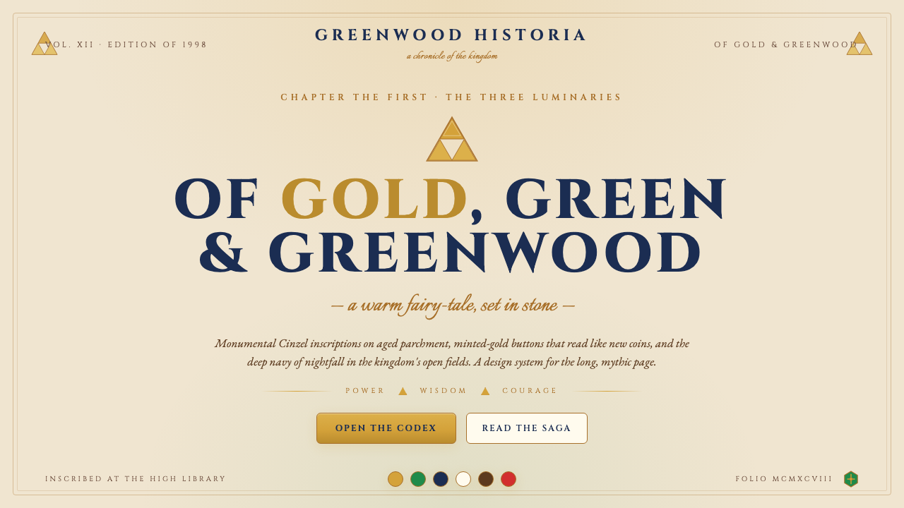 Zelda Ocarina of TimeWarm-fantasy mythology as a UI. Cinzel inscriptions on cream parchment, minte…
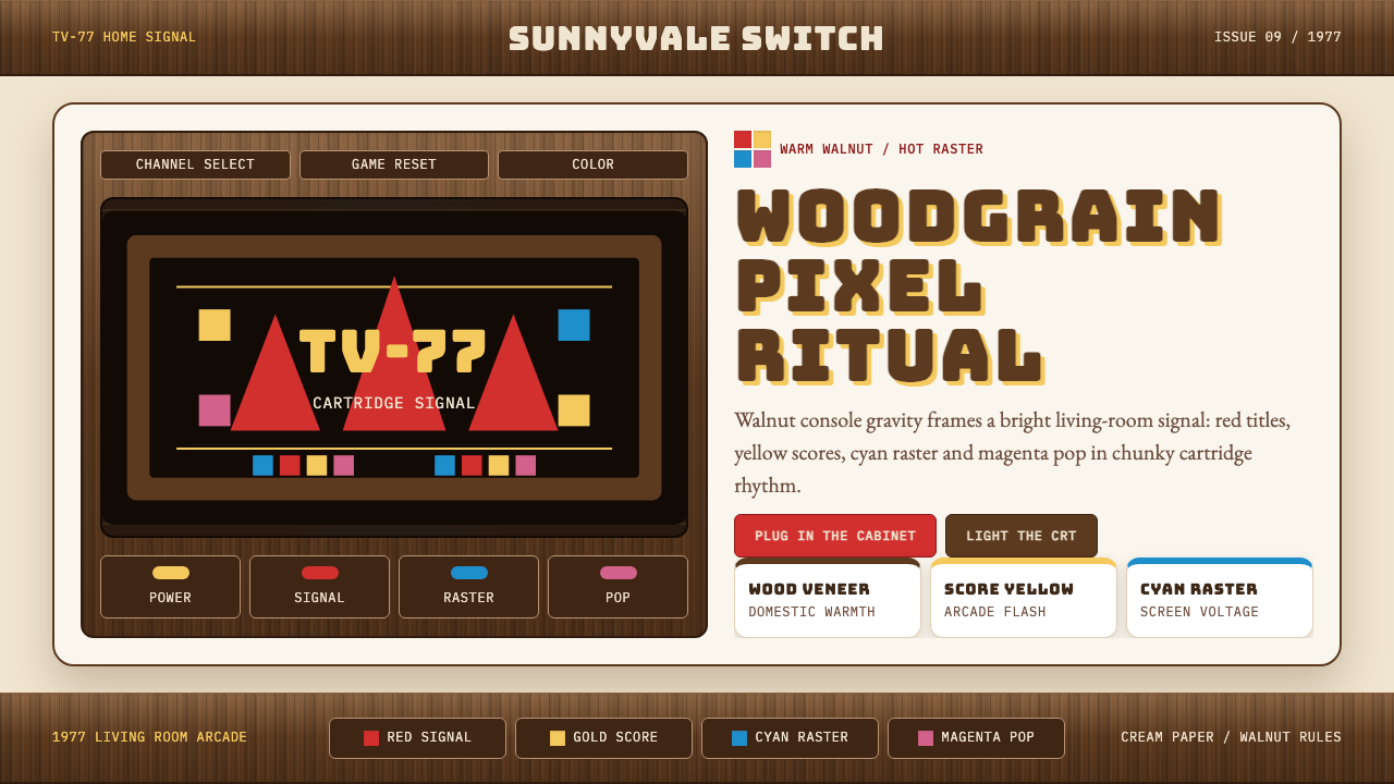 Atari 2600 (Woodgrain)Woodgrain meets raw pixels. Walnut panels frame Bungee type and CMYK raster b…
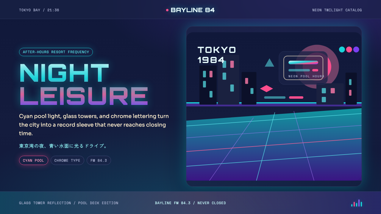 City Pop TokyoNeon leisure after dark. Cyan pool lines, chrome Orbitron, and pink-purple du…
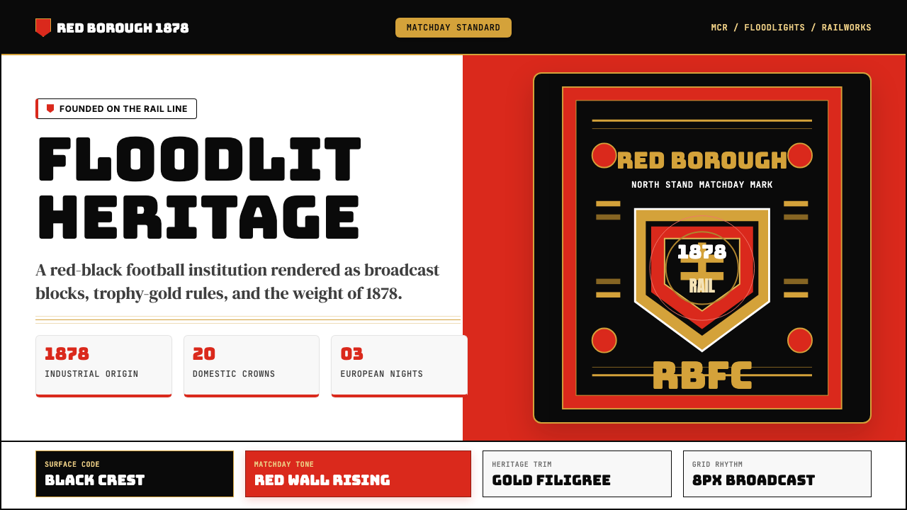 Manchester United (Red Devils)Heritage hits like a chant. Red-black blocks, Bungee type, and gold filigree…
 Public Enemy — Fight the PowerTakes a side loudly. Red bands, black ink, and target geometry hit like a ral…
 Vietnamese PropagandaFlat color commands. Flag-red fields, gold star rays, and Anton slogans hit a…