What is Nutri-Score?
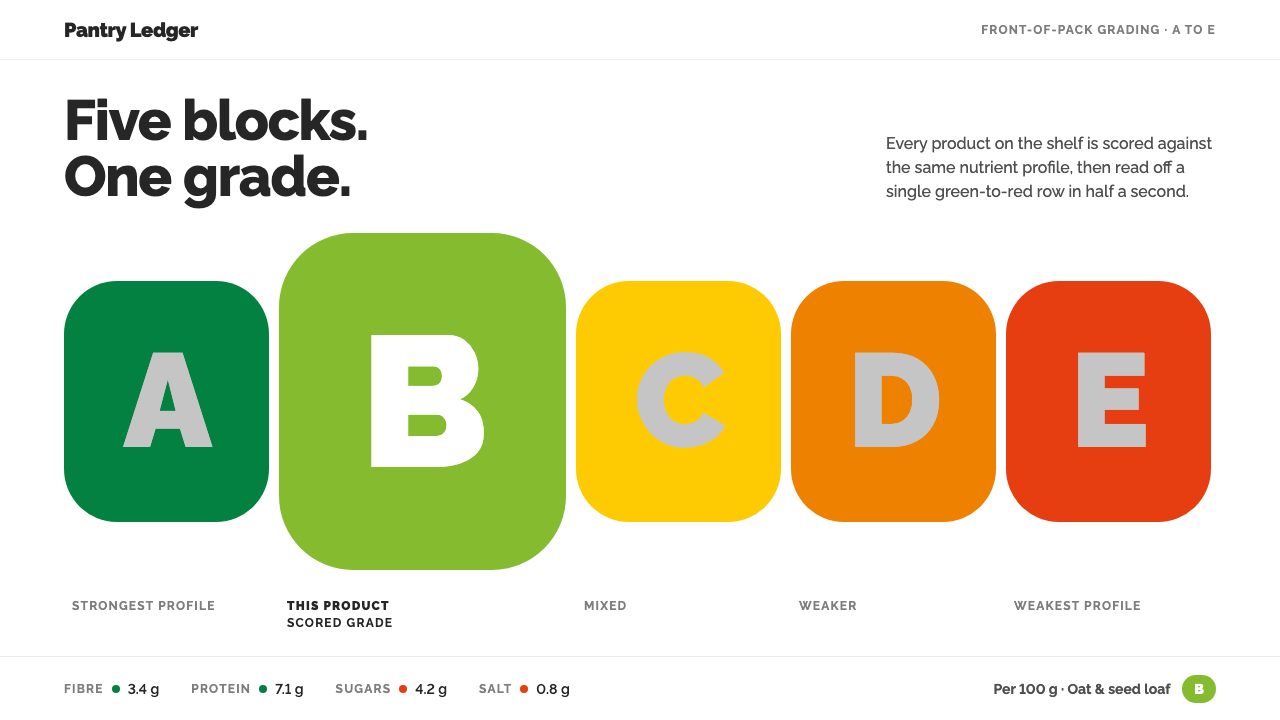
Nutri-Score turns a whole nutrient-profiling model into one row of five rounded blocks, from deep green to orange-red, with the product's own grade pulled out and enlarged.
Nutri-Score in brief
Nutri-Score is a front-of-pack nutrition label, and as a design style it is among the clearest examples of a regulation expressed as a graphic. A full scoring model is reduced to a single row of five rounded blocks labelled A to E, running from deep green to deep orange-red. The block that matches the product's result is pulled out of the row, enlarged, and its letter is knocked out in white.
The style that grew from it keeps to the module's own rules. The field is white, the six colours are fixed and may not be changed, the typeface is Raleway in every weight, and exactly one step on any ramp may be promoted. There are no leaf icons and no handwritten flourishes. The graphic is meant to be read in a second at a shelf, not admired.
What makes it distinctive is how little it needs. The whole information design rests on an ordered colour scale, a single enlarged element and a letter. Because it behaves like a public-health signal rather than a brand, it shows how a rigorous system can communicate a verdict instantly and still look orderly, calm and fair.

Where does Nutri-Score come from?
Nutri-Score entered the world as French public policy. A French decree of 31 October 2017 set up the label, which was developed from a scoring model produced by the team of the nutritional epidemiologist Serge Hercberg. The source also names Santé publique France, the national public-health agency, among the key figures. From the start, the graphic was meant to be a state-backed signal that could be placed on any food package and understood by anyone, whatever their education or language.
The label then spread beyond France. According to the source, it was adopted across seven countries between 2018 and 2021, which gave the design an international life and made consistency important. A mark that appears in several markets cannot afford variations, and that is why the style insists on fixed colours, a single typeface and exactly one enlarged step. Those constraints are the price of a recognisable, trustworthy symbol.
The source places Nutri-Score within three lines of development. The first is front-of-pack nutrition labelling, the movement to put a simple judgement where shoppers look first, instead of leaving all information in tables on the back. The second is graded, colour-coded public-health signalling, in which an ordered colour scale replaces a list of numbers. The third is the traffic-light label lineage, an earlier model that used red, amber and green. Nutri-Score extends that tradition by adding letters and five levels.
The UK Food Standards Agency is named among the key figures, reflecting that traffic-light labelling had a British history that fed the discussion. Together with Hercberg's research team and Santé publique France, the list shows a style created by public institutions and scientists, not by advertisers. That is the source of its character: it is plain on purpose, it avoids promotional flourishes, and it prefers legibility and neutrality to personality. Its strength lies in being understood, and a designer who respects that will keep the module intact.
What defines the Nutri-Score look?
Five-block ramp
The core module is a row of five rounded blocks marked A to E, ordered from best to worst. The order is visual as well as alphabetical, because the colours move in a single direction. Viewers understand it as a scale even before they read a letter.
Green to orange-red
The colour ramp runs from a deep green at A to a deep orange-red at E, passing through intermediate steps. These six colours are fixed and must not be adjusted, tinted or replaced with brand colours. Their consistency across countries is what makes the label recognisable on any package.
One enlarged step
Only the product's own grade is enlarged, and its letter is knocked out in white while the others stay small. Exactly one step may be promoted on any ramp. This rule is the entire hierarchy: the eye goes to the large block first and reads the verdict, then understands the context from the smaller ones.
White field
The label sits on a plain white field, which keeps the colours at full strength and prevents interference from packaging. There are no gradients, shadows or textures. White also signals neutrality, in keeping with the public-health origin.
Raleway in every weight
One typeface, Raleway, is used in all weights for letters and supporting text. Heavy weights suit the knocked-out grade letter, while lighter ones handle explanatory lines. Using a single family keeps the module neutral and prevents it from competing with product branding.
Regulation, not personality
There are no leaf icons, no handwriting and no friendly illustrations. The graphic reads like a regulation because it is one. This restraint is a design choice: a health signal gains authority by looking official, impartial and unchanged from one package to the next.

Who shaped Nutri-Score?
Named in the source as the nutritional epidemiologist whose team produced the scoring model behind the label.
The French public-health agency listed among the key figures, tied to the official adoption of the label under the decree of 31 October 2017.
Listed among the key figures, reflecting the traffic-light labelling lineage from which graded colour signalling developed.
How do you use Nutri-Score today?
For slides, the Nutri-Score style is excellent for a verdict slide. Place a row of five rounded blocks on white, enlarge the one that matches your result and knock out its letter. A cover can be as simple as the title above a single ramp. Comparisons between options work well as stacked ramps, each with one enlarged step, so the audience sees ranking at a glance.
For web and app interfaces, use the style for anything that grades or ranks: energy ratings, security scores, repair or sustainability indices, risk levels, quality tiers. Keep the ramp as a reusable component with fixed colours and only one promoted step. Put a short plain-language explanation under the label, and let the enlarged grade link to the criteria. A pricing page can use grades for features or support levels, as long as the colours keep their meaning.
For editorial and marketing pages, the style adds credibility to comparison articles, product guides, consumer tests and public information. A white page with a single ramp and short factual text feels impartial. It also works as a poster or infographic where a message must be received in seconds, such as a shelf talker or a campaign for healthy choices.
The deeper lesson is useful beyond food: when a complex model must be summarised for the public, an ordered colour scale, one highlighted element and a letter are often enough. Doing so shows respect for the audience's time.
The most common mistake is to modify the module: changing the colours to fit a brand palette, enlarging two blocks, adding leaf icons or a handwritten font, or placing it on a busy photograph. Each of these destroys the guarantee that the label means the same thing everywhere. Another mistake is using the green-to-red ramp for items that are not ranked from good to bad, which causes viewers to read a verdict that was never intended. Finally, do not hide the letter; the letter lets colour-blind readers understand the grade.

Nutri-Score — FAQ
What is the Nutri-Score design style?
It is a style based on the front-of-pack nutrition label: a white field, a row of five rounded blocks marked A to E from deep green to orange-red, one enlarged block with a white letter for the product's grade, and Raleway as the only typeface.
Why can only one block be enlarged?
The single enlarged step is the whole hierarchy. It tells the viewer which grade applies and makes the other four act as context. If two blocks were enlarged, the verdict would become ambiguous.
Can the colours be changed to match a brand?
No. The six colours are fixed. The label is recognisable in several countries because it never varies, and altering the colours would break the meaning of the ramp.
What is it good for outside food packaging?
Any graded or ranked information: energy ratings, security scores, sustainability indices, risk levels, quality tiers and consumer comparisons. It works wherever a complex model needs a one-second verdict.
Where does Nutri-Score come from?
It comes from France, under a decree of 31 October 2017, based on the scoring model of Serge Hercberg's team and supported by Santé publique France. It was adopted across seven countries between 2018 and 2021, following the traffic-light labelling lineage.
Related design styles
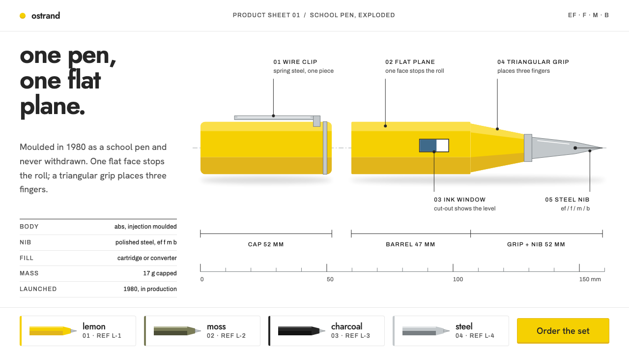 LAMY safariA school pen drawn as a parts sheet. Lemon on pure white, hairline leaders, l…
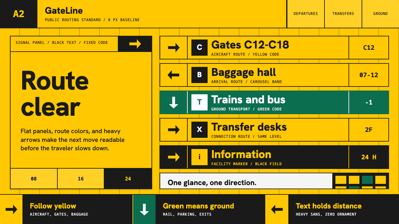 Airport Wayfinding GeometricLegibility becomes command. Signal yellow, black sans, and green route bands…
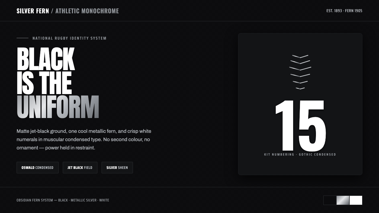 All Blacks Silver FernOne colour, total force. Jet-black field, a single metallic-silver fern, whit…
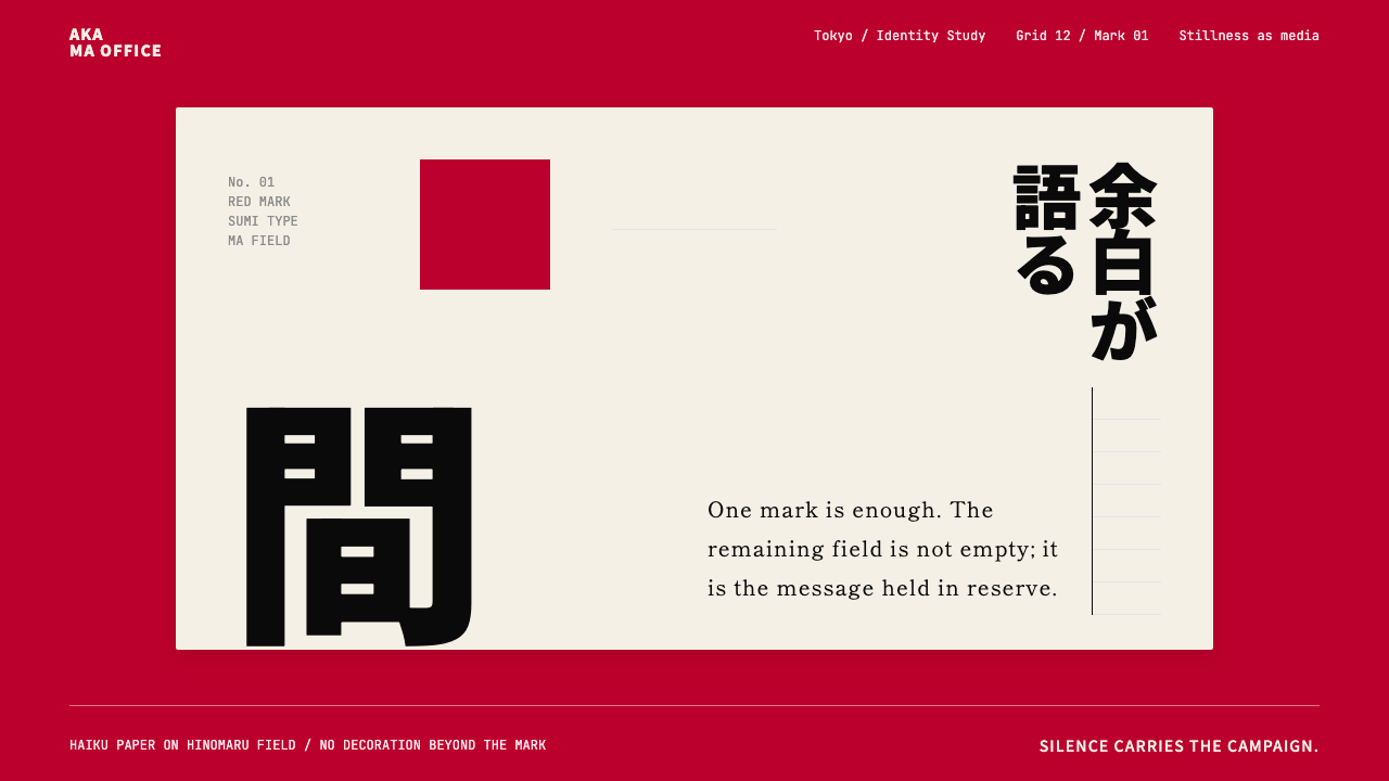 Dentsu Tokyo CreativeSilence does the selling. Hinomaru red, sumi type, and empty columns carry th…
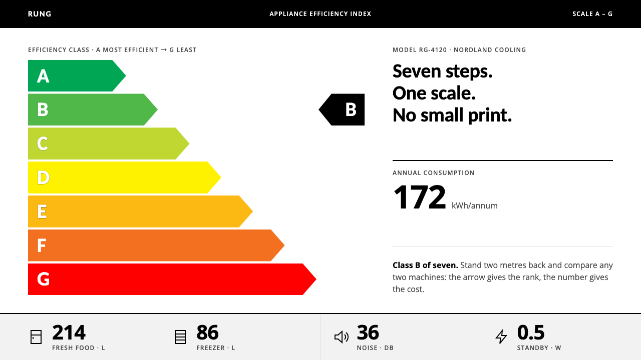 EU Energy LabelRank first, decorate never. Seven stepped arrows, green to red, on white with…
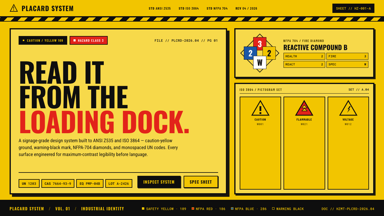 Hazmat SignageRead it from the loading dock. Caution-yellow ground, NFPA diamonds, monospac…