What is Nupe Brass Tray?
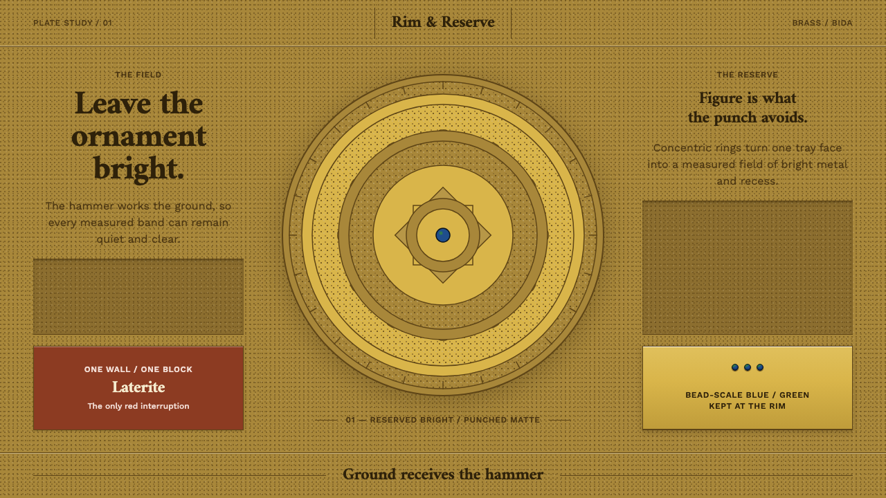
A Bida brass tray reverses the usual logic of decoration: the smith roughens the ground into a matte stipple and leaves the scrolls and rosette bright, so the ornament shines by being left alone.
Nupe Brass Tray in brief
The Nupe Brass Tray design system comes from Bida, the brass town of the Nupe kingdom in Niger State, northern Nigeria. Whole quarters of the city belong to the tswata muku, a hereditary guild of brasssmiths, who work beside the Masaga glass-bead makers under the patronage of the Etsu Nupe court. Brass is not a side activity here. It is the identity of the place.
The signature object is the hammered tray. The smith punches the entire background into a matte stippled field and leaves the leafy scrolls and the central rosette standing bright and untouched. The ornament is plain and the ground is textured, which is the reverse of what most decoration does. Light catches the smooth shapes, while the punched field absorbs and scatters it, so the pattern appears to glow against a quiet, grainy background.
Composition runs from the centre outwards: a rosette, a ring of scrolls, a border band, ring upon ring, with no empty ground left over. As a design language this gives a warm metallic palette, a strongly textured field, a bright reserved motif and a rigorous concentric order. It is ornament made from restraint rather than from addition.

Where does Nupe Brass Tray come from?
Bida lies in Niger State in northern Nigeria, and its brass craft is a guild tradition that long predates the twentieth century. The origin note describes it as a pre-1900 guild tradition, documented in the early 1900s and still practised today. The system sits within the broader field of West African guild metalwork, and specifically within a technique the notes call punched-ground repoussé: working a metal surface so that the pattern stands apart from a deliberately textured field.
The people behind the work are organised and named. The tswata muku are a hereditary guild of brasssmiths, meaning that the knowledge, the workshops and the standing of the craft pass down within families. Their city quarters lie close to the Masaga quarter of glass-bead makers, so two exacting crafts share a neighbourhood and a patron. That patron is the Etsu Nupe court, the royal household of the Nupe kingdom, whose support connects the work to the identity of the whole polity.
The surface of a tray shows the technique at its clearest. The smith punches the whole background into a matte stippled field. Only the leafy scrolls and the central rosette are left unpunched, so they keep their smooth, bright finish. The result looks as if the pattern has been lit from within. It is also an economical idea: the area worked is the area that is not the ornament, and the ornament is protected by the labour spent on everything around it.
One further detail from the record is telling. The Ulster Museum holds a Bida plate raised from a spent artillery shell. Brass is brass wherever it comes from, and the tradition uses the metal that is available. The craft is therefore not about the novelty of a raw material but about what a skilled hand and a set of punches can do to it, which is the same approach the design system takes to its own materials: one metal, two finishes, all the meaning in the difference between them.
What defines the Nupe Brass Tray look?
Reserved Ornament
The defining idea is inversion. The pattern is not added; it is what remains untouched while everything around it is worked. Smooth, bright shapes read as ornament precisely because the ground has been roughened. In a layout, the featured element should be the cleanest and calmest thing on the surface, set against a background that carries the texture.
Punched Ground
The background is a matte stipple, a dense field of small punch marks that absorbs light instead of reflecting it. It has grain and a faintly irregular, handmade rhythm. Because it is dull, it makes the bright shapes more vivid; because it is busy at close range, it should stay quiet at reading distance, acting as texture rather than as pattern.
Concentric Composition
Everything is organised from the centre outward: a rosette at the heart, a ring of scrolls around it, then a border band, and sometimes further rings. The structure is radial and self-contained, almost like a diagram of attention. It gives the surface a clear hierarchy and a natural focus without needing any asymmetry or movement to guide the eye.
Leafy Scrolls
The ornamental vocabulary is the leafy scroll, a continuous curling line that turns around the tray and fills the ring between rosette and border. Scrolls are smooth, fluid and slightly organic, in sharp contrast to the stippled ground. They give the otherwise strict radial order a living rhythm.
One Metal, Two Finishes
The palette is essentially brass in a warm, golden register, seen in two states: bright and polished where the ornament is, matte and dull where the ground has been punched. There is no second hue to carry meaning. This keeps the surface unified and shows that contrast can be made from texture alone, without a change of colour.
Full Surface
No area is left empty. The punched field fills every space between the ornaments, and the rings fill the tray from centre to edge. This density is not clutter, because it is organised by the concentric structure. A layout built on this logic leaves no dead zones, and every region either carries a bright motif or supports one.
Calligraphic Serif Voice
Where type appears, it uses a serif face with calligraphic character, a pen-drawn quality in its curves and joins. This suits the scrolling forms of the metalwork and keeps the typography close to the hand-worked surface. Text should sit on the smooth, calm areas rather than on the stippled ground, so that it keeps the clarity of the bright ornament.

Who shaped Nupe Brass Tray?
The tswata muku are the hereditary guild whose work defines Bida. Whole quarters of the city belong to them, and their craft passes through families. Their hammered trays embody the reversal that gives the system its character: they spend their labour on the ground, so that the ornament can stay bright and untouched.
Beside the brass workshops stands the Masaga quarter of glass-bead makers. Their presence shows that Bida was a place of several exacting crafts working side by side under the same patronage. They are part of the story of the system because they place the brass tray inside a wider culture of fine, hand-controlled surface work.
The Etsu Nupe court is the royal household of the Nupe kingdom and the patron of the guild craftsmen. Its support places Bida brass among court crafts, objects made with standards high enough to represent a kingdom. In a design context, it explains the formal confidence of the trays: they are made to be seen, held and valued.
A Bida plate in the Ulster Museum was raised from a spent artillery shell. It is a reminder that the craft is about transformation of available metal through skill, not about precious raw material. It also shows how a Bida piece is read: by its worked surface, its ring structure and the contrast of bright motif and punched ground.
How do you use Nupe Brass Tray today?
The Nupe style suits projects that want warmth, craft and clear focus without heavy decoration. Its core move is simple enough to apply to almost any layout: keep the important thing smooth and bright, and let the supporting ground carry the texture. When that principle is respected, the result looks rich and deliberate rather than busy.
On a cover slide, put a circular or radial focal element at the centre, such as a title inside a ring, and frame it with a concentric border built from simple scroll-like lines. Let the background have a subtle stipple texture in a warm brass tone, while the title area stays smooth and clean. Content slides can use rings as section markers and keep text blocks on calm, untextured panels. Data slides are especially natural: radial charts, concentric gauges and donut charts turn the ring structure into information.
For web interfaces, the style works for craft and heritage brands, marketplaces, hospitality and cultural platforms. Use a textured background behind content cards, but keep the cards themselves smooth and bright so the information stands out. A pricing page can arrange plans in a ring or radial emphasis, with the recommended plan placed in the clean centre of the composition. Icons and dividers should follow the scroll vocabulary: flowing, continuous and organic.
For editorial and marketing work, borders and band dividers are the strongest import. Use scroll-like bands to separate sections, circular crops for images, and a strong central motif on covers or posters. Packaging and print suit the style especially well, because the real material difference between matte and bright finishes can be used directly, for instance with a spot-gloss finish against a matte field.
The most common mistake is to apply the texture to the wrong layer. If the ornament is stippled and the ground is smooth, the entire logic is reversed and the result looks muddy. Other errors include making the punched texture so strong that it fights the text, leaving large empty areas where the style expects density, and introducing a second metal or accent colour that breaks the one-metal-two-finishes idea. Keep the contrast in the surface, not in a change of hue.

Nupe Brass Tray — FAQ
What does 'punched ground' mean?
It means that the smith uses punches to texture the entire background of a brass piece into a matte stippled field, leaving the leafy scrolls and central rosette smooth and bright. The craft is described as punched-ground repoussé. The effect is that the ornament appears to shine by contrast, even though it has been left alone, while the surrounding area has absorbed all the work.
Is this a gold or metallic theme?
Only in a limited sense. It uses one warm brass-like metal in two finishes, bright and matte, rather than a range of metallic colours. The system is about contrast of texture, not shine for its own sake. It works best as a light, warm theme in which the bright ornament is the exception and the matte ground is the norm.
How do I use texture without hurting legibility?
Keep text on smooth areas and give the texture only to supporting backgrounds. The punched ground should be quiet at reading distance, with low contrast between dots and field. A good test is whether the stipple remains a surface quality rather than a visible pattern. If it competes with the content, reduce its strength or confine it to margins and borders.
Why is the system a light theme?
Because the brass reads as warm and luminous, and the contrast between bright polished shapes and a matte punched field is easiest to perceive on a light-toned surface. The trays are about reflecting light back, not about glowing in the dark. A dark version can be made, but it should keep the same relationship between smooth motif and absorbing ground.
Where does the style struggle?
It struggles in very airy, minimal layouts, because its logic is built on a full, structured surface. It also struggles with content that has no natural centre or focal element, such as long, uniform lists, since the concentric composition needs something to organise around. It works best when there is one hero element, a clear hierarchy and room for rings, borders and bands.
Related design styles
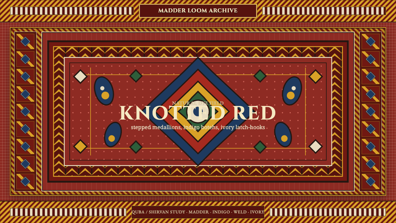 Azerbaijani Quba CarpetRed is the field. Indigo botehs and ivory latch-hooks orbit a stepped medalli…
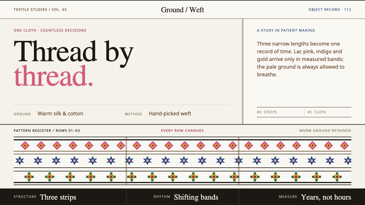 Bhutanese KushutharaPatience made visible. Lac pink and indigo bands shift across a warm silk gro…
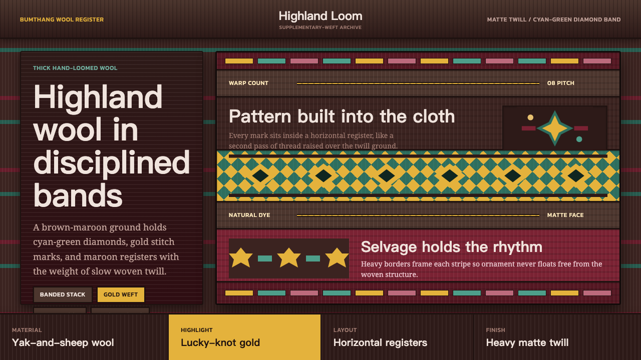 Bhutanese Yathra Wool WeaveHighland wool made digital. Brown-maroon bands carry cyan diamonds and spare…
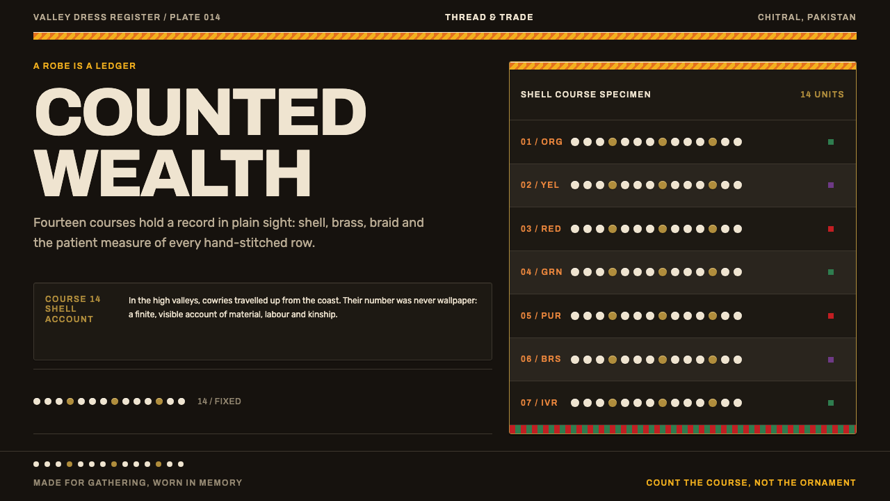 Kalash KupasDensity carries value. Ivory shell courses and orange braid are counted on wa…
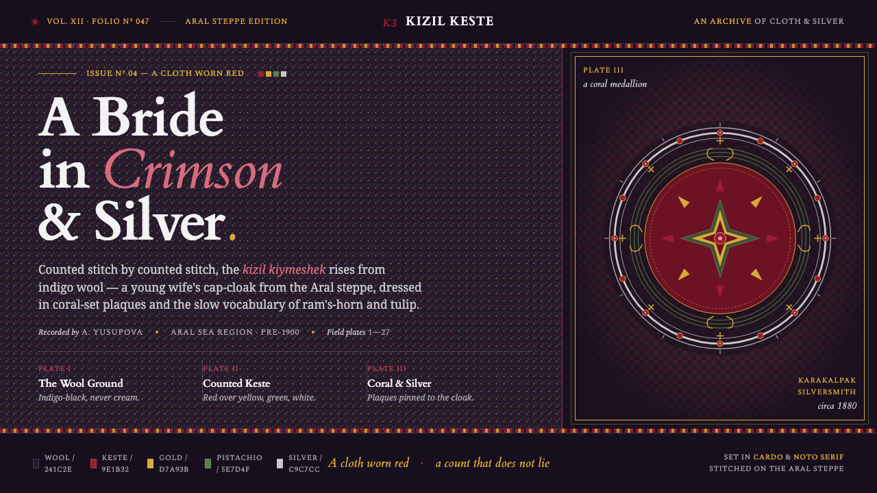 Karakalpak Kimeshek DressA cloth worn red. Crimson keste cross-stitch on indigo wool, set with silver-…
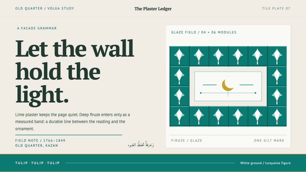 Kazan Tatar TileworkOrnament held to its proper place. Turquoise tulip bands cut across quiet lim…