What is Nothing Phone Glyph?
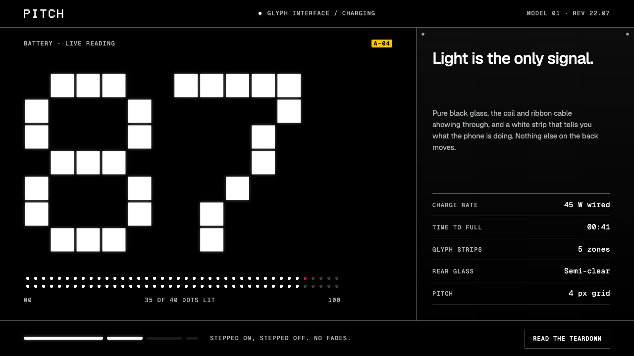
Nothing Phone Glyph is a design system lifted from the back of a phone: black glass, white LED light, dot-matrix numerals, hairline seams, and one small red accent.
Nothing Phone Glyph in brief
Nothing Phone Glyph is a dark interface style that takes its materials from the back of a Nothing phone. Pure black stands for the glass. The grey of the hardware shows through it, and strips of plain white LED light read clearly only because everything around them is dark. The page is not decorated to look like a phone; it is built from the same parts.
Numerals are the main visual event. They are set very large in a dot-matrix face, while labels and specifications use a monospaced face and headlines use a clean geometric sans. The result is a system where figures, model names and technical details are treated as the ornament, in the manner of a teardown diagram or a component datasheet rather than a lifestyle advertisement.
One accent colour, a red, does a single job, and it is used in tiny quantities. States change in hard steps rather than easing, the way the lights on the phone switch on and off. Hairline rules mark panel seams, and grey is the colour of internal parts. The overall impression is of a device laid open on a table, with its logic on display.

Where does Nothing Phone Glyph come from?
The style is rooted in Nothing, a consumer-electronics company founded in 2020 in London. Its Phone (1) arrived in July 2022 with the Glyph Interface, a set of LED strips on the back of the phone that light up in patterns for calls, notifications and charging. That feature is the origin of the style's name and its central visual: light as a language, displayed against a dark, translucent body so that the lighting itself becomes the interface.
The story continues with the Phone (3) in 2025, where the Glyph Matrix replaces the strips with a small dot-matrix display made of 489 lamps. The source notes this development explicitly, and it explains why the style treats dots as its basic unit. A grid of tiny lit points is both a technical constraint and a graphic identity, and the type, numerals and borders of the page all inherit that logic of discrete points that are either on or off.
The source names three currents the style sits within. The first is a revival of transparent electronics, the old pleasure of seeing screws, cables and a wireless-charging coil through a clear shell, now brought back as a premium statement. The second is dot-matrix and pixel typography, a lineage of displays and printers in which letters are assembled from points. The third is the product teardown as ornament, the habit of treating the internal layout of a device as something beautiful in its own right.
The key figures listed are Carl Pei, the founder; Adam Bates; and Teenage Engineering, the Swedish design firm associated with the playful, instrument-like objects that influenced the brand's character. The mix points to a design culture that is part engineering and part industrial design, with a sense of humour about its own seriousness. The interface does not hide its mechanics; it presents them as personality. That is why the same grammar of black, white, grey and a rare red works equally for a hardware page, a spec sheet and a launch presentation.
What defines the Nothing Phone Glyph look?
Black glass ground
The ground is a pure, deep black meant to read as glass rather than as a coloured dark theme. Nothing on it is soft or glowing except the white light, so contrast is sharp and the content seems to float on an empty surface. Large blank areas are intentional, because the dark is part of the material.
Dot-matrix numerals
Numbers, times, prices and model digits are set enormous in a dot-matrix typeface. Their letterforms are built from separate points, echoing the phone's lamp grid. Used on a few key figures per view, they become the hero element in place of photography or illustration.
Monospace labels
Specifications, captions and model names use a monospaced face in small, evenly spaced lines, which gives the page the tone of a datasheet. Headlines use a clean geometric sans that stays out of the way of the numerals. The three type voices have separate jobs and never overlap.
Hairline seams
Panels are separated by very thin lines, like the seams between parts of a device. There are no heavy boxes, no soft shadows and no rounded blobs. The lines make the layout feel assembled from components while keeping the page light.
Grey as hardware
Greys are reserved for the internal parts visible through the glass: secondary text, inactive controls, structural lines. They are never used as a fashionable mid-tone background. This keeps the scale simple, with black, white and a family of greys that all mean something physical.
Red accent and hard states
The single red is used in very small amounts, as a dot, a marker or a key state, and has one clear job. States change instantly instead of fading, so a control is either on or off, like a lamp. The lack of easing gives the interface a precise, mechanical feel.

Who shaped Nothing Phone Glyph?
Named in the source as the founder behind Nothing, the London company founded in 2020.
Listed among the key figures of the style as one of the people associated with Nothing's product identity.
A design firm named in the source as a key influence, associated with instrument-like objects and a playful technical aesthetic.
How do you use Nothing Phone Glyph today?
For slides, use black as the whole slide and let one giant dot-matrix figure be the only large thing on it. A cover can be a product name in a clean sans, a line of small monospaced details and a single red marker. Content slides should be sparse, with hairline separators and short labels. For data slides, a few numbers presented as enormous dot-matrix figures with monospaced captions are stronger than a busy chart.
For web and app interfaces, the style fits hardware products, developer tools, dashboards, clocks, timers, system monitors and anything where status and numbers are the content. Make every state change a hard switch, keep the single red for one meaning only, and rely on hairline rules for structure. A pricing page works as a spec sheet: plans as columns, figures large, and details in monospaced labels.
For editorial and marketing pages, the style suits launches of devices and technical products. Instead of lifestyle photography, show a product teardown, a close-up of a seam, a row of lights or a diagram, and let the type be the main graphic. Long articles should keep paragraphs short and use monospaced captions to maintain the datasheet tone.
The style also serves any brand that wants a restrained, engineered personality: audio tools, camera apps, automation, analytics and games with an instrument feel. Its strength is that it makes the technical honest rather than glossy.
The most common mistake is to use the dot-matrix face everywhere. When body text, buttons and headlines all turn into dots, the numerals stop being special and readability suffers. A second mistake is to add additional accent colours or gradients, which kills the black, white and single-red logic. Another is to soften state changes with long fades or springy motion; the hard step is what makes the interface feel like light switching. Finally, avoid heavy shadows and rounded cards, which belong to a different, softer kind of system.

Nothing Phone Glyph — FAQ
What is the Nothing Phone Glyph design style?
It is a dark system taken from the back of a Nothing phone: pure black glass, grey hardware parts, white LED light, huge dot-matrix numerals, monospaced labels, hairline seams, one red accent, and hard on-off state changes.
Why are states switched instantly?
Because the reference is the Glyph lights, which blink on and off rather than fading. A hard step gives the interface a precise, mechanical character and makes the black, white and red logic feel like physical light.
What does the dot-matrix lettering refer to?
It echoes the phone's LED lamps, which on the Phone (3) form a Glyph Matrix of 489 lamps, and it belongs to a long lineage of dot-matrix and pixel typography. Using it for a few big numerals makes the figures the main graphic.
What is it good for?
Hardware and technical products, dashboards, developer tools, timers and system monitors, and launch pages where status and numbers are the content. It is less suited to warm, soft or highly illustrative brands.
Where does the style come from?
From Nothing, founded in London in 2020, whose Phone (1) introduced the Glyph Interface in July 2022 and whose Phone (3) added the Glyph Matrix in 2025. It sits within a revival of transparent electronics, dot-matrix typography and the teardown-as-ornament idea.
Related design styles
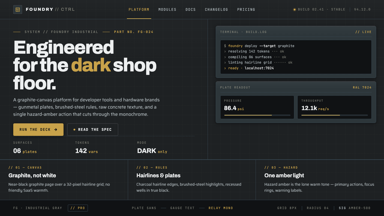 Foundry Industrial GrayBuilt for the dark shop floor. Graphite canvas, hairline plates, mono labels,…
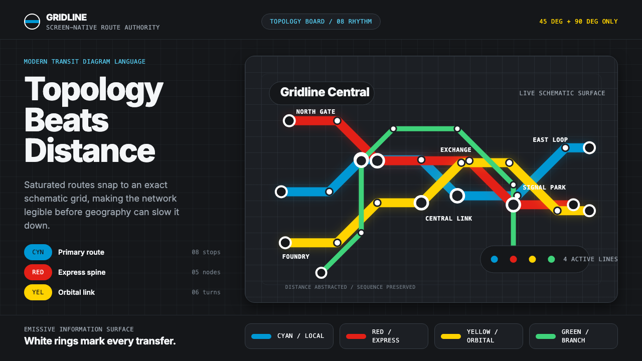 Transit Diagram (modern)Topology over geography. Cyan, red and yellow routes lock to 45-degree angles…
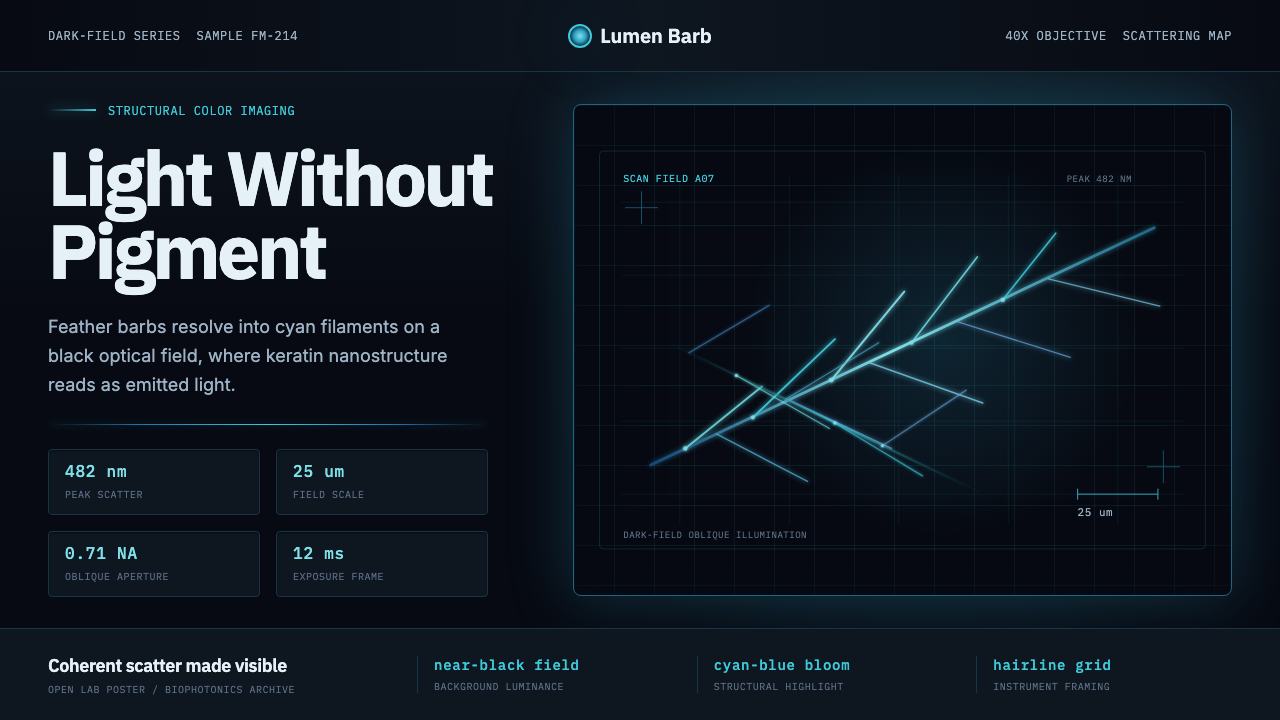 Feather MicroscopyPhysics glows in the dark. Cyan filaments and mono scale bars cut a black ima…
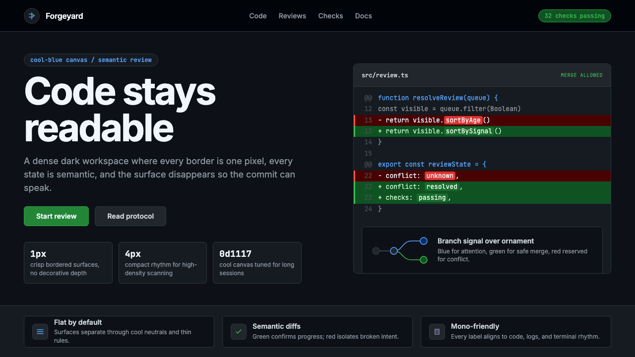 GitHub DarkCode-first darkness. Cool-blue canvas, 1px borders, green/red diff lines.
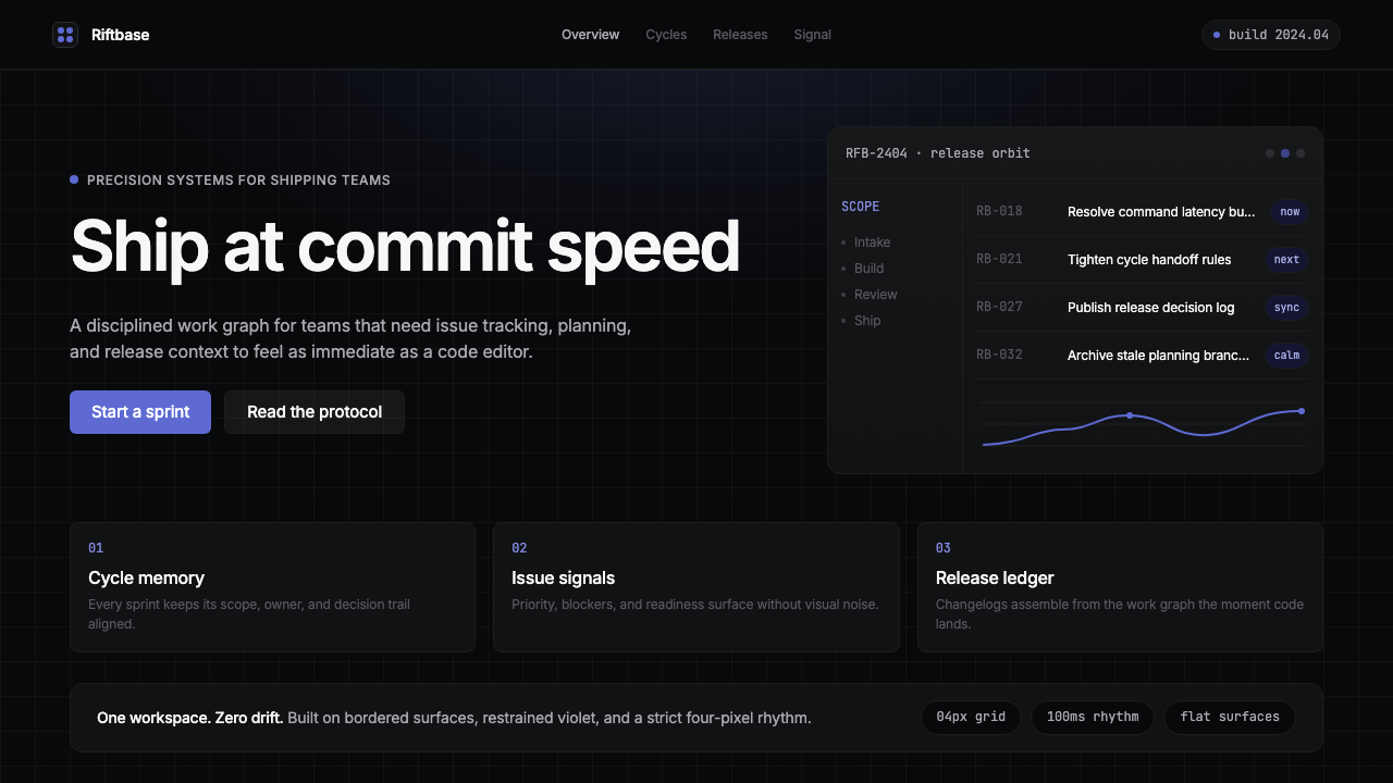 Linear 2024Precision down to the millisecond. Near-black, indigo-violet accents, Inter D…
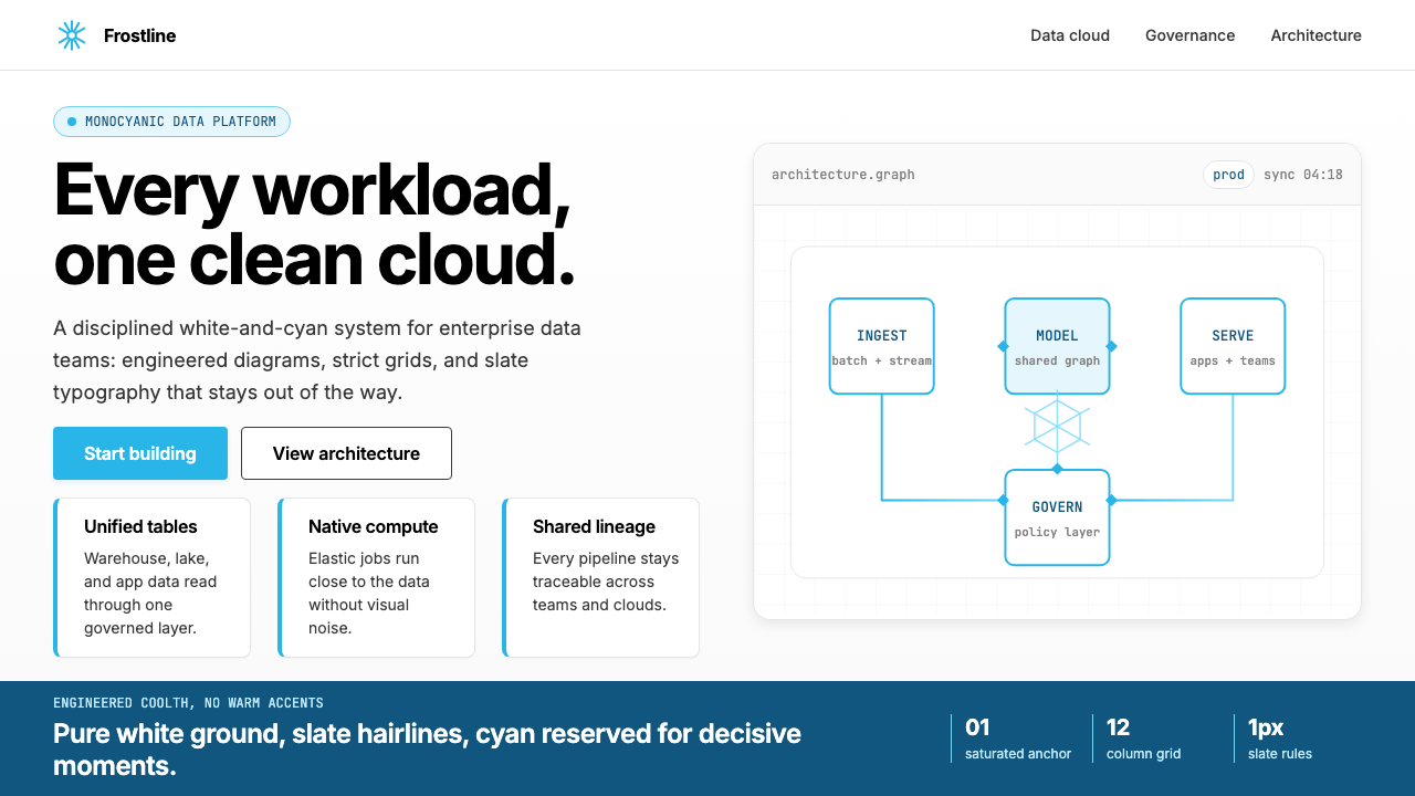 Snowflake Data CloudCool precision wins. Icy cyan, Inter grids, and hex data diagrams stay engine…