What is Norton Commander?
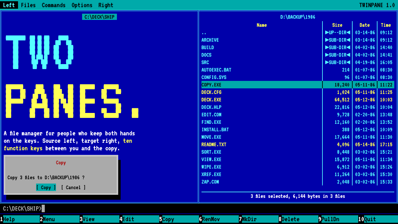
Norton Commander made the whole screen the design: two blue double-framed panels, a cyan cursor bar and a row of function keys, all locked to a grid of character cells.
Norton Commander in brief
The Norton Commander style is the visual language of a DOS text-mode file manager. Its screen is a grid of character cells, eighty columns by twenty-five rows, and every element sits on whole cells. Two panels fill the display side by side, each framed in double box-drawing lines on a deep blue ground, with file names in bright cyan and a bar of cyan highlighting whichever entry the cursor is on.
What defines the look is that nothing can be freehand. There are no curves, no gradients, no soft shadows and no proportional type. One monospace face sets everything, corners stay square, and the only depth cue is a solid black block offset by a single cell behind a dialog box. Because the medium allowed only a small set of characters and colours, the design reads as a system of rules rather than a set of decorations.
Today the style is used for nostalgia and for clarity. It signals tools made by and for people who live in a terminal, communicates density without clutter, and makes every control visible at once. A row of labelled function keys along the bottom of the screen tells you what the keyboard can do right now, which is a lesson in discoverability that has not aged.

Where does Norton Commander come from?
Norton Commander began in 1984 as a project called Visual DOS by John Socha, then a graduate student at Cornell. The idea was to give DOS users a visual way to move around their files instead of typing paths at a prompt. By 1986 it shipped as version 1.0 from Peter Norton Computing, a company based in Santa Monica, California, already known for utilities that made the PC easier to live with.
Its central idea, the orthodox two-panel file manager, put two directory listings side by side so that copying, moving and comparing files became a matter of pointing at one pane and acting on the other. The pattern was so natural that it defined a whole genre. The last DOS release, version 5.51, arrived on 1 July 1998, after a run of years in which the program had become a standard fixture on business and hobbyist machines alike.
Visually, everything came from the constraints of MS-DOS text mode. The display could draw only characters from a fixed set, so frames were built from box-drawing characters, and a limited palette made blue panels with cyan and yellow text the sensible choice. The designers worked with what the hardware offered, and the result was an interface with an unusually strong identity: one that a user could recognise at a glance and navigate by keyboard alone.
The legacy is large. Midnight Commander, Total Commander and FAR Manager all follow the same two-panel layout, and each has kept the idea alive on newer systems. The style as a design language carries that lineage with it, borrowing the grid, the colours and the keyboard-driven spirit of a program that taught a generation of people how to treat their files.
What defines the Norton Commander look?
Color
A deep blue ground fills the panels, with bright cyan for ordinary file names, a cyan bar for the cursor line and yellow for marked files. The palette is small because the text mode could not offer more, and that smallness is the appeal. Each colour has a job: blue is the field, cyan is the thing you can act on, yellow means selected. Colour is used as a status signal, never as mood decoration.
Typography
One monospace face sets everything on the screen, so every letter occupies exactly one cell. Headings are not larger; they are distinguished by colour, position or by being enclosed in a frame. This makes columns of names and sizes line up perfectly without any layout effort and gives the page the feel of a printed terminal listing.
Double-line frames
Panels are enclosed by double box-drawing lines, a doubled stroke that feels more deliberate than a single rule. Single lines appear inside for internal division, creating a quiet hierarchy between outer containers and inner groupings. Corners join cleanly at right angles. The frame is the only ornament in the whole system, and it is structural.
Grid and alignment
Everything snaps to whole character cells. Panels are half the width of the screen, dialogs are centred on cell boundaries, and spacing is measured in characters rather than fractions. The grid is not a guide laid over the design; it is the design. Any element that falls between cells breaks the illusion of a real terminal.
Shadow and depth
Depth is expressed with one device: a solid black block offset by one cell behind a dialog box. There is no blur, no soft falloff and no gradient. The shadow reads as a stack of layers rather than a light source, and it is crisp, hard and slightly comic in a way that suits the nostalgic tone.
Function-key row
A row of labelled keys runs along the bottom, numbered from the first to the tenth function key, each with a short action name. It is the interface's help system, always visible, always accurate to the current mode. In a modern product it becomes a persistent action bar that tells users what they can do without asking them to hunt for menus.
Hard edges
Corners stay square, edges are crisp and no element is rounded or softened. This is not a stylistic rejection of roundness so much as a consequence of the medium, and the style keeps it as a principle: precision over friendliness. It makes the interface feel dense, capable and slightly severe, like a professional instrument.

Who shaped Norton Commander?
Socha began the program in 1984 as Visual DOS while a graduate student at Cornell. His design instinct, to show two directories side by side and let the keyboard drive everything, is the defining idea of the whole genre. The look of the program followed from that decision as much as from the limits of text mode.
Norton's company published the program in 1986 and gave it its name. Peter Norton Computing was based in Santa Monica, California, and was already known for utilities that made PCs more approachable. Attaching that reputation to a file manager helped establish the two-panel layout as a mainstream standard rather than a niche tool.
This later program follows the same orthodox two-panel layout and carries the idea onto newer systems. It is cited alongside Total Commander and FAR Manager as proof that the original structure outlived the DOS environment it was born in, and its screens keep much of the same blue-and-cyan visual identity.
How do you use Norton Commander today?
On slides, the Norton Commander style suits technical talks, developer conferences and retrospective decks. Use a deep blue slide with a double-line frame, set the title in a single monospace face and add a bottom row of keys as a footer or navigation hint. A cover that looks like a terminal screen immediately tells the audience what kind of talk this is. Keep slides sparse and aligned to a clear grid, and avoid photography that breaks the text-mode illusion.
For data slides, use tables and lists rather than charts with curves. Columns of aligned names and numbers, cyan for the primary values and yellow for flagged items, make the slide feel like a real terminal listing. Block characters can stand in for bar charts, which is both authentic and legible. Colour should stay in its assigned roles, so that a yellow row always means the same thing across the deck.
In web UI, the style works well for developer tools, command-line product sites, documentation, log viewers and dashboards that value density. Panels with double borders, a persistent action bar and keyboard shortcuts displayed on screen give an interface that rewards experts. Components should snap to a consistent grid with generous but regular spacing, and every control should be visible without hover or hidden menus. Keyboard focus states should look like the cyan cursor bar.
For editorial and marketing work, the style carries nostalgia and credibility with technical readers. Landing pages for developer products, retro-computing features and launch announcements can adopt the frame, the key row and the monospace type to signal that the product is built by people who know the terminal. Copy should be short, literal and a little dry, matching a tool that never wasted a character.
The most common mistake is softening the style: adding rounded corners, blurred shadows, gradients or a second typeface. Once any of these appear, the page looks like a modern interface wearing a costume rather than a terminal screen. A second mistake is breaking the grid, letting elements sit between cells, which destroys the feeling of alignment that makes the whole system work. Stay with one face, whole cells and a handful of colours.

Norton Commander — FAQ
What is the Norton Commander design style?
It is a design language based on the DOS text-mode file manager Norton Commander, released in 1986. It uses a character-cell grid, blue panels framed in double lines, cyan highlight bars, yellow selections and a function-key row along the bottom, all set in one monospace face with square corners and no soft effects.
Who made Norton Commander?
John Socha began it in 1984 as Visual DOS while studying at Cornell, and Peter Norton Computing, based in Santa Monica, California, shipped version 1.0 in 1986. The last DOS release, version 5.51, came out on 1 July 1998.
Why does the style use two panels?
Because the program popularised the orthodox two-panel file manager, in which two directory listings sit side by side so that copying, moving and comparing become simple. Successors such as Midnight Commander, Total Commander and FAR Manager kept the layout, and the design style inherits it as its signature structure.
Can the Norton Commander style use rounded corners or soft shadows?
No. The style depends on square corners and a single hard shadow, a solid black block offset by one cell behind dialogs. Rounded corners, blur or gradients make it read like a modern interface in costume. If you need softness, a different style will serve you better.
What projects suit this style best?
Developer tools, command-line products, technical documentation, retro-computing content and any interface that values density, keyboard control and nostalgia. It is a poor fit for consumer lifestyle brands, soft wellness products or anything that needs warmth and large imagery.
Related design styles
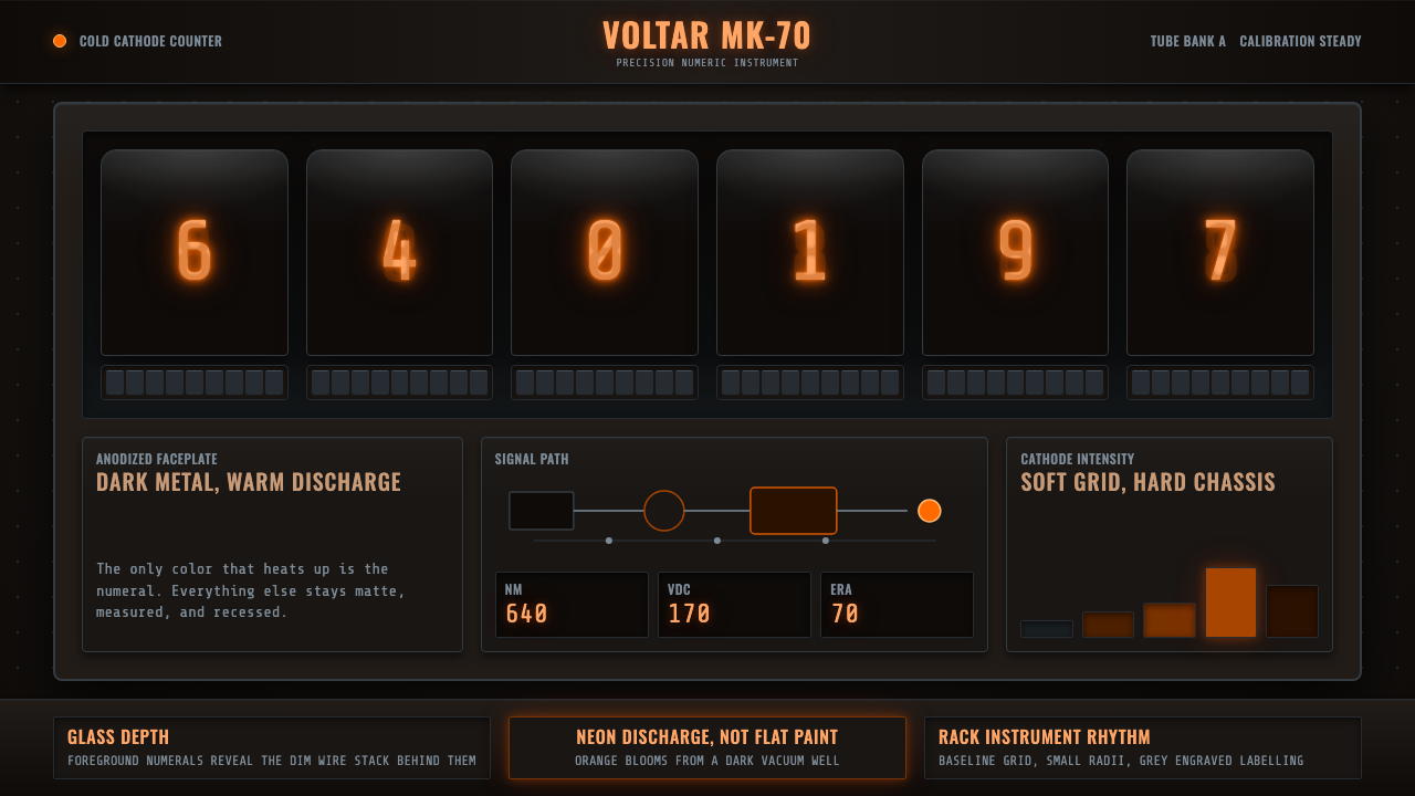 Nixie Tube DisplayHeat inside the machine. Neon-orange digits glow over black metal gridwork.
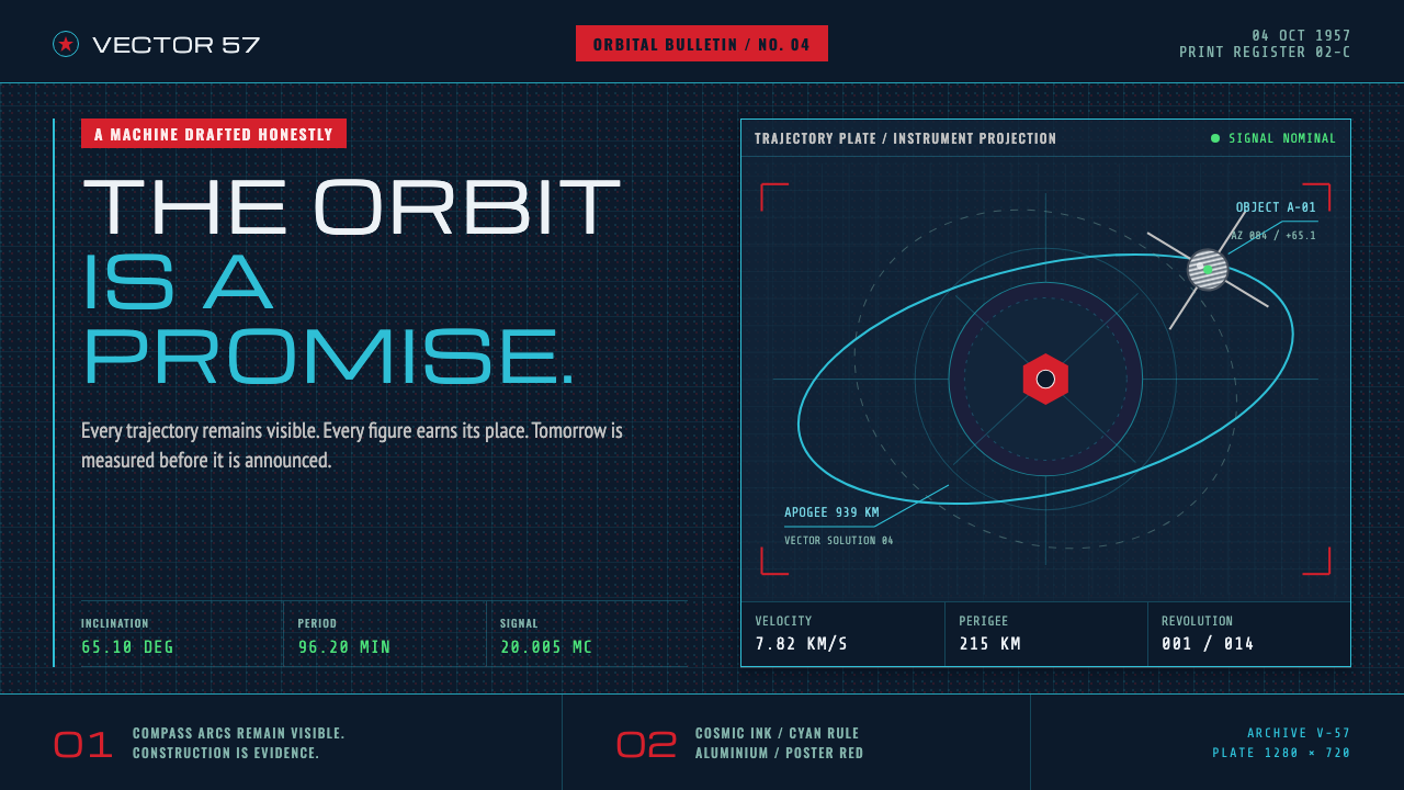 Atompunk Sputnik EraTomorrow, drafted precisely. Cyan orbits cross cosmic ink with red poster blo…
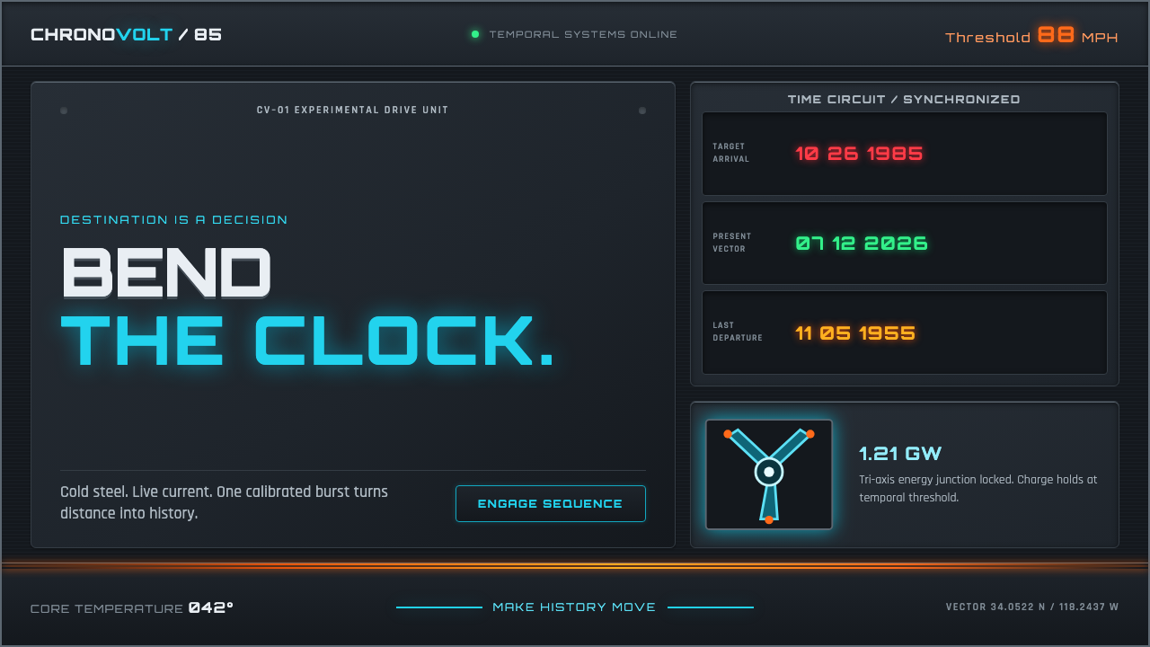 Back to the Future (1985)Cold steel, live current. Cyan circuits and orange trails turn the dashboard…
 Bloomberg Terminal (Amber CRT)Hostile data authority. Amber mono grids and four hard panels make black glas…
 Bloomberg Terminal (CRT Green)Hostile density wins. Orange CRT mono, black grids, and four-panel data walls.
 Cassette FuturismThe future hums in amber. VT323 glow, scanlines, and gunmetal grids make anal…