What is NZ Backcountry Hut?
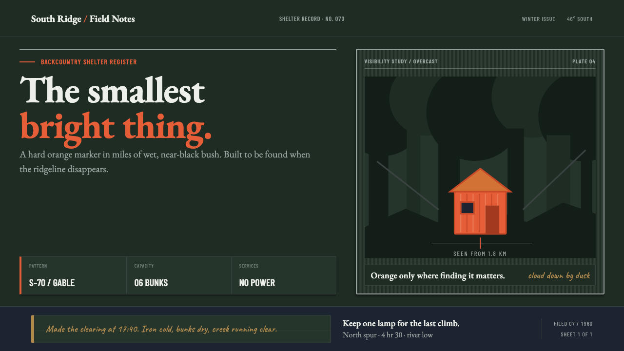
A New Zealand backcountry hut is built to disappear into function and stand out in an emergency — a small rectangle of survival orange holding its ground against an ocean of near-black beech forest.
NZ Backcountry Hut in brief
The New Zealand backcountry hut is a government-issue object, not an architect's statement, and it looks like one: a single-volume gabled box with almost no visual incident beyond the one decision that matters — colour. Everything else about the hut is left plain, because the hut's job is not to please anyone standing next to it. Its job is to be located by someone who is not yet close, in weather that is actively working against them. That functional brief produces a visual language built on extreme contrast rather than composition: an enormous, nearly featureless field of dark wet bush, and inside it, one small saturated rectangle that reads as a beacon rather than a building.
The material vocabulary reinforces the same restraint. Corrugated iron sheets, ridged and galvanised, form the walls and the gable roof, their surface catching flat daylight in identical parallel lines rather than any single highlight. There is no attempt to soften this into something residential — no lining on the inside, no power laid on, no decoration on the outside. The huts were issued as a parts list rather than designed one at a time, so the same handful of silhouettes recur across the whole network: a six-bunk model, a smaller four-bunk model, and a minimal bivouac just large enough to sit out a storm. Repetition, here, is not a stylistic choice so much as a supply-chain fact that happens to produce a coherent aesthetic.
Inside that engineered shell sits the one element nobody engineered: the hut book, a logbook filled in by hand, in biro, by whoever passed through. Names, dates, weather notes, jokes, warnings about a swollen river — the handwriting is uneven, the ink fades and darkens page to page, and none of it was designed at all. The contrast between the outside (a single deliberate colour decision, nothing else) and the inside (an accumulating, undesigned human record) is the real subject of the style: engineered visibility on the exterior, informal testimony on the interior.
Where does NZ Backcountry Hut come from?
The huts began as working infrastructure for the New Zealand Forest Service's deer-control operations through the 1950s and 1960s. Deer had been introduced to New Zealand and multiplied without natural predators, and government cullers were sent into remote high country for extended stints to bring numbers down; those cullers needed shelter that could be flown or carried in and erected quickly across a huge and roadless backcountry. A hut, in this context, was equipment, budgeted and specified the same way a tool would be.
That equipment mindset produced standardisation rather than architecture. Designs were issued as named types — the S70, a six-bunk model; the S81, a four-bunk model; the S86, a minimal bivouac — and built to the same plan wherever the terrain required one. The first S70 went up at Cow Creek in 1960, and from that point the Forest Service was effectively running a construction programme, not commissioning individual buildings. Galvanised corrugated iron was chosen because it could survive the climate with no maintenance, arrive in sheets light enough to carry, and require no skilled finishing on site — a gable roof, six bunks, and nothing else.
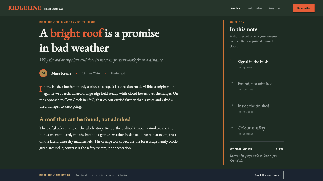
Colour was the one variable applied with intent rather than convenience. Huts were painted survival orange specifically so that a tramping or hunting party, caught out in bad weather, could pick the structure out against snow, mist, or the near-black green of wet beech forest in places like the Tararua and Kaweka ranges and the Southern Alps. The colour choice only functions in relation to what surrounds it — it is not a colour anyone would call attractive on its own, but against that particular bush it becomes legible from a genuinely useful distance.
In 1987, responsibility for the hut network passed to the newly formed Department of Conservation, and stewardship of the colour policy passed with it. The rule that persists today is pragmatic rather than decorative: huts that a party genuinely needs to spot from far off in poor visibility keep the bright orange; huts where that kind of emergency visibility is not the priority are painted to recede — greens, greys, and browns supplied by New Zealand paint manufacturers such as Resene and Dulux, chosen to blend the same structure into the same landscape that the orange huts are built to interrupt.
What defines the NZ Backcountry Hut look?
Colour Contrast
The entire visual system rests on one relationship: a small saturated survival-orange field set against a vast, nearly black-green expanse of wet beech forest. Neither colour is meant to be judged in isolation — the orange is chosen purely for how far it carries against that particular dark ground.
Scale Ratio
Composition works through extreme disproportion: one small rectangle against an enormous dark field, never the reverse. As soon as the bright element grows to compete with the field around it, the beacon logic collapses into ordinary decoration.
Standardised Form
The silhouette is a plain gabled box, repeated across a small family of named types rather than designed individually. Uniformity across the whole network, not variation within one building, is what gives the style its coherence.
Material Honesty
Ridged, galvanised corrugated iron is left exposed as both wall and roof, unlined and unfinished inside. There is no cladding or surface applied to make the material look like anything other than what it is.
Interior Austerity
Inside, the hut offers only bunks — no power, no lining, no furnishing beyond what survival requires. The starkness is not an aesthetic pose; it is the honest result of a shelter built to a budget and a function.
Handwritten Record
The hut book, filled in by hand in biro by every party that passes through, is the one undesigned surface in the whole system — uneven line weight, fading and darkening ink, a running human record against an otherwise engineered object.
Contextual Camouflage
Not every hut is bright. Where emergency visibility is not the priority, the same structure is painted to recede into green, grey, or brown — proof that the palette is a rule applied by context, not a fixed decoration.
Who shaped NZ Backcountry Hut?
The Forest Service ran the original deer-culling hut programme through the 1950s and 1960s, issuing standardised designs such as the S70, S81, and S86 as working equipment for cullers operating in remote terrain, and raising the first S70 at Cow Creek in 1960.
DOC inherited stewardship of the hut network in 1987 and continues to enforce the pragmatic colour rule in use today: paint bright where a party needs to be found in an emergency, and paint to blend in everywhere else.
Resene is one of the New Zealand paint manufacturers whose standardised colour formulations, including the greens, greys, and browns used on huts meant to blend into their surroundings, keep the hut network's palette consistent across the country.
Dulux is the other major supplier of the standardised paint used across the hut network, providing the manufactured colour consistency that lets a single visibility policy be applied uniformly to huts scattered across very different terrain.
How do you use NZ Backcountry Hut today?
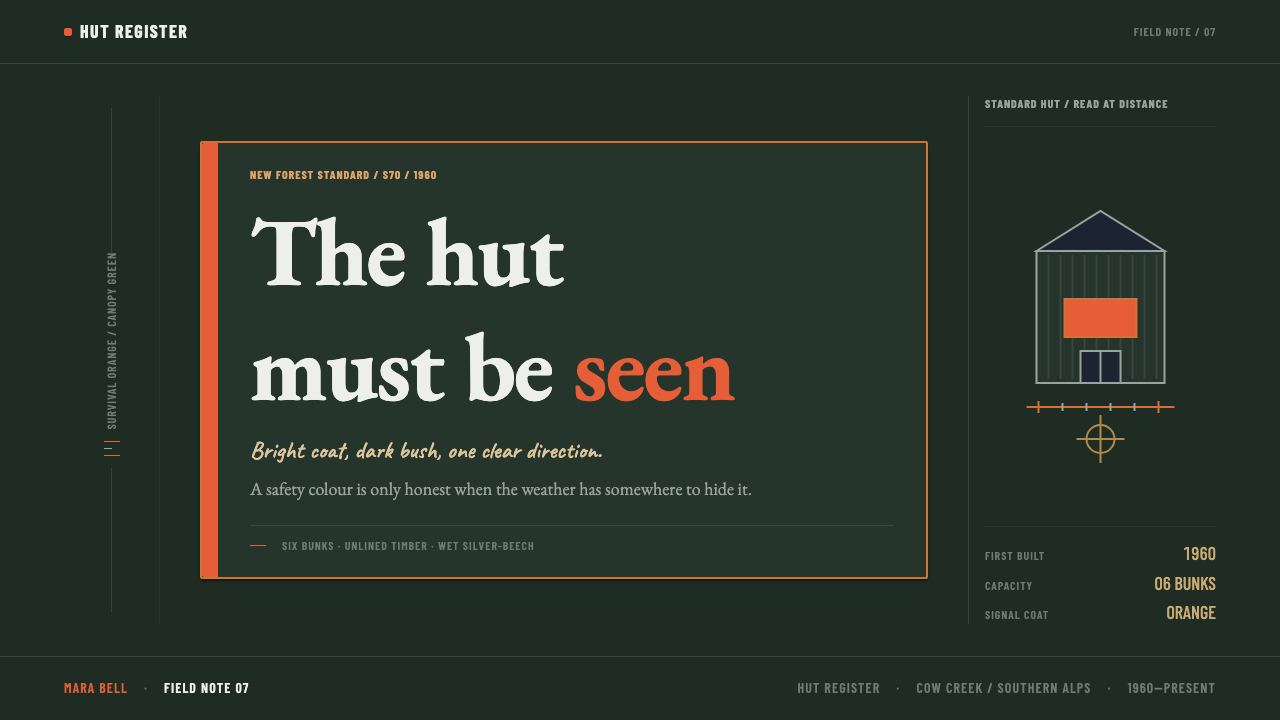
Applying this style well means treating darkness as the dominant surface and colour as a rare, deliberate interruption, not the other way around. A slide deck cover works when the background is an almost featureless dark field — near-black green, not literal forest texture — with a single small block of saturated orange placed off to one side carrying the title or a key number. The rest of the page should offer nothing else to look at; the entire effect depends on that one element having no competition.
Content slides should stay almost entirely dark and typographic, using the bright accent only where a reader genuinely needs to locate something quickly — a single highlighted figure in a table, a warning callout, a call-to-action button. Overusing the accent across a deck defeats the logic immediately; the style only communicates urgency or importance because the colour is rare.
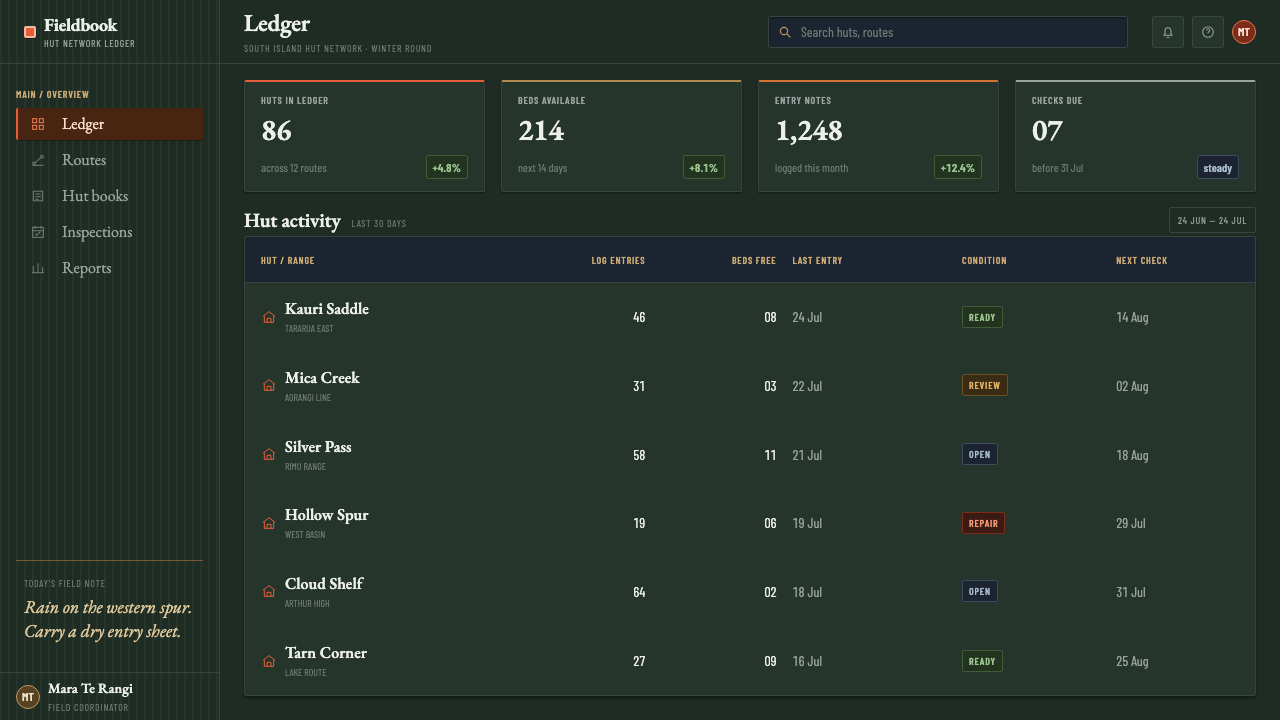
In web interfaces, this translates well to a dark-themed dashboard where the near-black field is the default surface and one accent colour is reserved exclusively for status alerts or a single primary action button — never for decoration, navigation icons, or branding flourishes. Data that must be found quickly (an overdue task, a critical alert) is the correct use case; data being merely displayed should stay in the muted dark register.
For editorial or marketing pages telling an outdoor, survival, or utilitarian story, the style supports full-bleed dark photography or dark-field backgrounds with one small bright graphic element per section — a single icon, a single pull-quote box — plus a handwritten or informal typeface treatment for testimonial-style content, echoing the hut book's undesigned voice against the engineered structure around it.
The most common mistake is treating survival orange as a brand colour to be used generously — headers, buttons, borders, icons all at once. That inverts the entire premise. The style depends on one small bright rectangle in an overwhelming dark field; spread the colour out and the beacon effect, along with the sense of restraint that makes it credible, disappears entirely.
NZ Backcountry Hut — FAQ
Why survival orange specifically, rather than red or yellow?
The source material identifies survival orange as the colour chosen so that a tramping or hunting party could pick a hut out against snow, cloud, and the near-black green of wet beech forest. The choice is entirely relational: it is the colour that carries furthest against that specific dark, cool-toned bush, not a colour valued for its own appearance.
Are all New Zealand backcountry huts painted the same bright colour?
No. Today's policy, carried forward by the Department of Conservation since 1987, is pragmatic: huts where emergency visibility genuinely matters are painted bright, while huts where that is not the priority are painted in greens, greys, and browns to blend into the surrounding bush instead.
What is the hut book, and why does it matter to the style?
The hut book is a logbook kept inside each hut, filled in by hand in biro by whoever passes through — names, dates, weather notes. It matters because it is the one element in the entire system that was never designed, and it sits in direct contrast to the deliberate, engineered colour decision on the exterior.
Who actually designed these huts?
No individual architect is credited. The huts were issued as standardised types — the S70, S81, and S86 — by the New Zealand Forest Service as part of its deer-culling programme, with the first S70 raised at Cow Creek in 1960, and the network was later handed to the Department of Conservation in 1987.
Does this style suit anything beyond outdoor or travel brands?
It works anywhere a single piece of information genuinely needs to cut through a dense, dark field — critical alerts, safety information, emergency status. It is a poor fit for consumer products that need a warm, decorative, or colour-rich atmosphere, since the entire logic depends on colour staying rare.
Related design styles
 Banded Agate SliceCollector-calm glow. Rust and amber rings orbit a quartz core on near-black b…
 Estonian Folk Tapestry (Anu Raud)Quiet wool carries memory. Banded fleece browns and Alegreya type move like a…
 Sable (Mœbius)Still desert science fiction. Ochre ground, pastel sky, and thin ink contours…
 Akubra Outback (1970s Stockman)Worn honesty. Leather brown, Pilbara orange, and cream catalogue frames carry…
 Baybayin ScriptCarved, not written. Curvilinear baybayin ash-rubbed into tobacco-brown bambo…
 Mexican Taqueria Rotulo SignageStreet craft over polish. Fat outlined letters, hard offset shadows, flag col…