What is New Aesthetic?
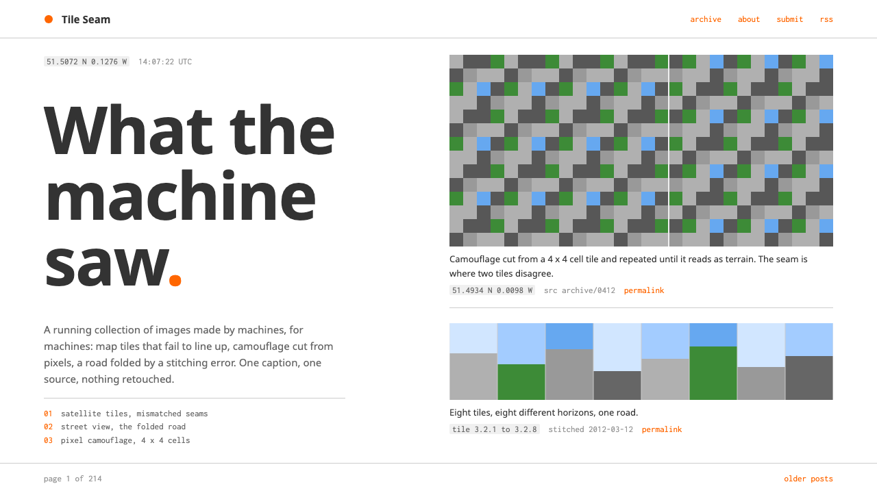
The New Aesthetic as a design style keeps the page quiet so the noise can talk: a white column, grey type, one orange accent, and a long scroll of images that machines made.
New Aesthetic in brief
The New Aesthetic is the look of a Tumblr blog that James Bridle started in May 2011 to collect what the world looks like through machines: satellite imagery with visible tile seams, Street View roads stitched together wrongly, drone views from above, frames from surveillance cameras and camouflage made of pixel blocks. The design system reproduces the container for that collection, not the collection itself.
That container is deliberately almost nothing. A white page, grey humanist text, a small touch of orange in the icon colour, and one centred column of images running down the screen. The page chrome stays flat and quiet so that the found captures can carry all the noise. Mosaic, compression artefacts and digital seams stay inside the pictures, and are never repeated in the interface around them.
Each post follows a strict pattern. There is one image, one short caption, one source link, and a line of monospaced text carrying coordinates or a timestamp. That final mono line is the style's signature: it treats every image as a data record, a place and a moment, rather than as a piece of art.

Where does New Aesthetic come from?
The style began in London. Tumblr had launched on 6 May 2011, and James Bridle used it to start a running collection of images in which machine perception was visible: how a satellite sees a field, how a camera misreads a road, how software renders a place it has never seen. The phrase New Aesthetic came to name that collection and the way of seeing behind it.
The idea moved from blog to wider conversation in 2012. On 12 March, a panel at SXSW was devoted to it, and in April Bruce Sterling published a long essay in Wired that discussed it. Joanne McNeil and Russell Davies are also listed among the key figures in the source material, as participants in the conversation around the term. From a personal collecting project it became a shared vocabulary for writers, artists and designers thinking about network culture.
The template itself, the part the design system actually copies, is an ordinary blog layout. It looks like what a simple Tumblr theme of the period looked like: white background, one column, grey text and a single accent colour. The simplicity is intentional and functional. A blog meant to show strange machine-made images works best when its own design asks for no attention.
The movements the source lists are New Aesthetic itself, post-internet art, and machine vision and network culture writing. All three share an interest in the way digital systems shape what we see, and a preference for showing the evidence rather than explaining it. The design system translates that attitude into a layout: show the artefact, label it plainly, cite its source and give its coordinates.
What defines the New Aesthetic look?
One centred column
Everything runs in a single column down the middle of a white page. There are no sidebars, grids or cards. The column carries one post after another, so the experience is a long scroll in which images arrive in sequence, like frames in a film strip or entries in a log.
Grey humanist text
Body copy is set in a soft grey humanist typeface, neither stark black nor decorative. The grey keeps the words subordinate to the pictures. The letterforms are warm and ordinary, which contrasts with the cold artefacts in the images and makes the captions read as quiet human commentary.
A single orange accent
Orange appears as the link and icon colour, and nowhere else. Because it is the only saturated hue on the page that is not inside a picture, it directs attention to the one interactive thing, the source link. This is the discipline that keeps the interface from competing with the images.
Monospaced captions
Coordinates, timestamps and technical labels are set in a monospaced face. The mono line sits under the caption and treats each image as a record with a place and a time. It is the one typographic flourish in the system, and it gives the page a machine-readable undertone without any visual noise.
Noise belongs to the images
Pixelation, compression blocks, mosaic seams and low resolution are the subject matter, so they live inside the pictures and nowhere else. The interface around them is flat and clean. This division is the central idea of the style: the more orderly the frame, the more strange the content appears.
Captions as citations
Each post gets one short caption and one link to its source. The structure is closer to a bibliography than to social media: it says where the image came from and moves on. This habit of attribution gives the page credibility and a research-notebook tone.

Who shaped New Aesthetic?
Bridle, based in London, started the Tumblr collection in May 2011 and is the central figure of the style. The design system copies the template of that blog, and the idea behind it, that a calm and neutral frame is the best way to show images produced by machines.
Sterling wrote a long essay on the New Aesthetic for Wired in April 2012. The article took the idea beyond the blog and helped establish the term in wider discussion about technology and visual culture.
McNeil is listed in the source among the key figures associated with the New Aesthetic. Her presence in the story points to how the idea was shaped by a circle of writers and thinkers on network culture, rather than by a single author.
Davies is also listed among the key figures in the source. Together with the others, he belongs to the group whose conversation, from the blog to the SXSW panel in March 2012, turned a collection of images into a named way of looking.
How do you use New Aesthetic today?
In slides, the New Aesthetic style is a strong choice for talks about technology, data, AI, mapping, surveillance, game worlds and digital culture. Use a white background, a single column of content in the middle, grey text and one orange link or highlight. A slide should hold one image, one caption and a mono line with the source or a date. Cover slides can be almost empty: a title in grey and a single image below it.
On the web, it suits research notebooks, archives, visual blogs, field notes and portfolios whose content is already visually strong. Because the frame is so quiet, it works best when the pictures are interesting on their own. Build each entry as a repeated unit: image, caption, source link, mono metadata. Long scrolling pages perform better than grid layouts here.
For data and technical content, use the mono line as a design tool. Coordinates, dataset names, sensor details, timestamps and version numbers all belong there. Charts should be flat and minimal, in grey with a single orange series, and be treated as another found image with a caption and a source.
In editorial and marketing work, the style gives a thoughtful, research-driven tone. It suits essays about technology, exhibition pages, reports on digital culture and campaigns that want to look curious rather than promotional. Keep copy short and factual and always name the source, because the style's credibility depends on it.
The most common mistake is to decorate the frame. Glitch effects, scan lines, neon gradients or mosaic backgrounds around the layout misunderstand the style entirely: the noise is the content, and the frame exists to hold it still. The second mistake is to use several accent colours, which defeats the single-orange discipline. The third is to hide the captions and sources, which turns the page into a gallery and removes the research tone.

New Aesthetic — FAQ
What is the New Aesthetic design style?
It is the look of James Bridle's 2011 to 2012 Tumblr collection of machine-made images: a white page, grey humanist text, a single orange accent colour, one centred column of pictures and monospaced lines for coordinates or timestamps. The frame stays quiet so the images can carry all the visual noise.
Where does the name come from?
James Bridle began collecting the images on Tumblr in May 2011, and the phrase New Aesthetic became attached to the collection and its way of seeing. The term spread in 2012, after a SXSW panel on 12 March and a long essay by Bruce Sterling in Wired in April.
Should I add glitch effects to make it feel more digital?
No. The noise belongs inside the images, not in the interface. The whole logic of the style is a calm, neutral frame around strange content. Adding glitch to the frame removes the contrast that makes the content stand out.
What is the monospaced line for?
It records coordinates, timestamps or technical details for each image. It treats the picture as a record of a place and a moment, and it gives the page a machine-readable undertone. It is the one typographic detail the style depends on, so keep it consistent across all entries.
What kinds of projects suit this style?
Research notebooks, archives, essays on technology and culture, visual blogs, conference talks and portfolios where the images are already strong. It is less suited to products that need heavy navigation or an energetic brand personality, because the style is built around restraint.
Related design styles
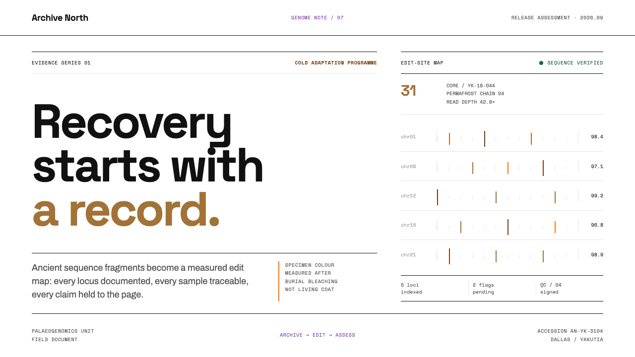 De-extinction LabResurrection reads as evidence. Black rules and specimen brown map every geno…
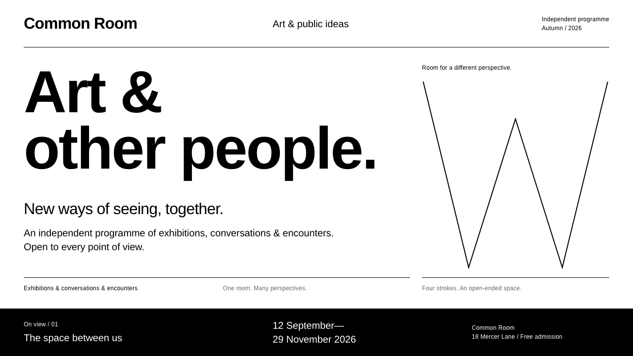 Experimental JetsetNothing extra. Tight Arimo, black rules & a four-stroke W turn white space in…
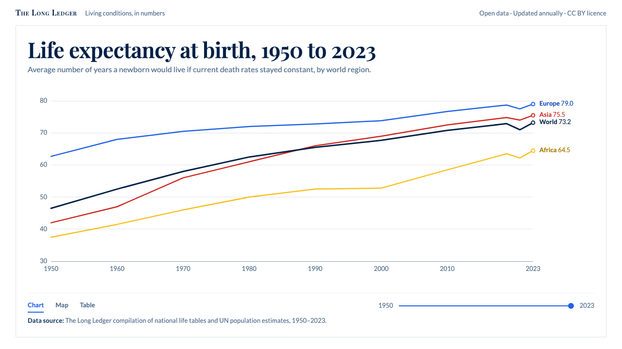 Our World in DataCharts that cite themselves. Thin lines named at their ends on white, source…
 Speculative DesignRefuses to seduce. Cool-grey wall, Inter labels, matte concept objects — the…
 Brutalist Web 2014Browser defaults, weaponized. Times New Roman, electric-blue links — raw HTML…
 KindleNothing glows. Green-grey paper, grey Literata ink, one justified column, a b…