What is Neumorphism?
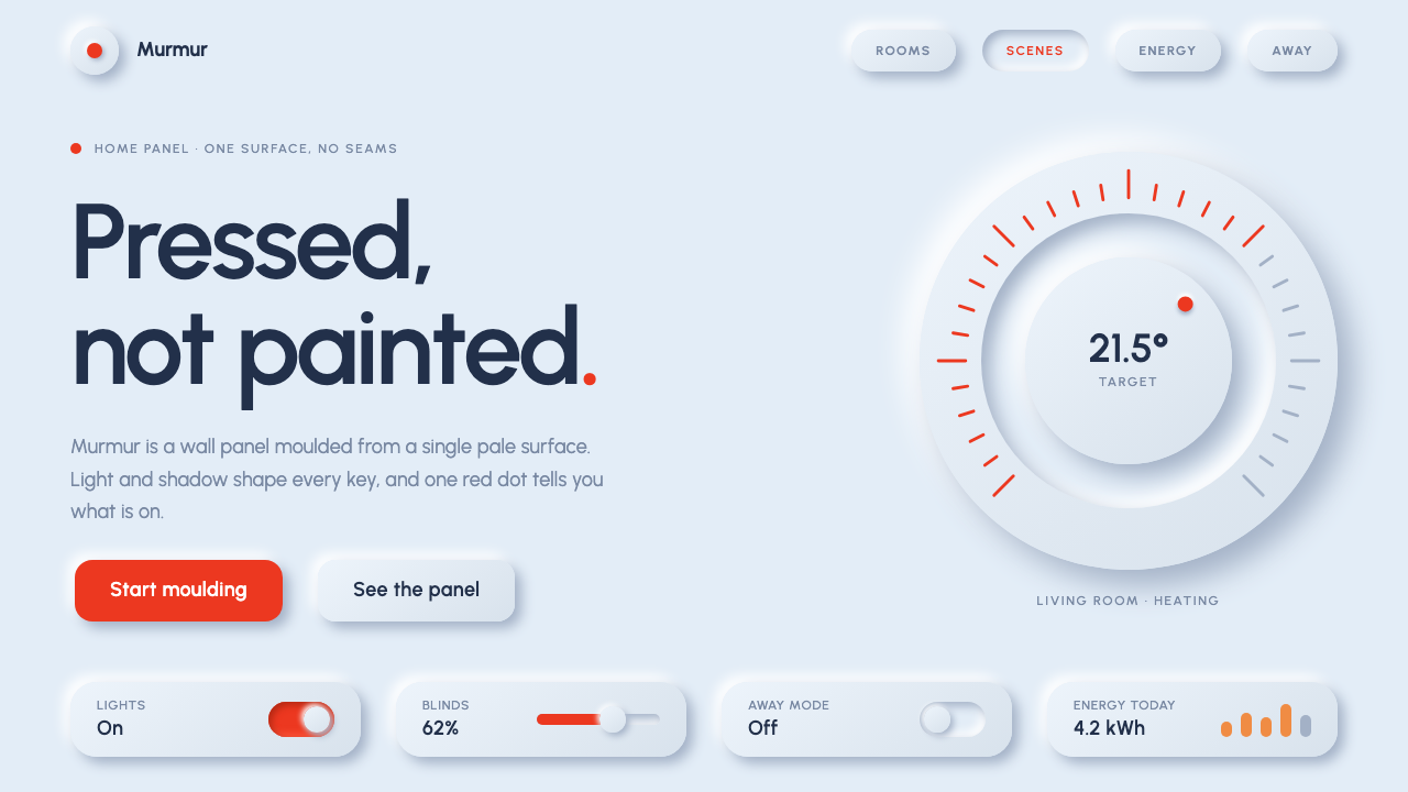
Neumorphism moulds an interface out of a single soft surface: every card, button and knob rises from or sinks into the same pale blue-grey plane, shaped only by paired shadows and light.
Neumorphism in brief
Neumorphism, also called soft UI, is an interface style in which every element is made from the same material as its background. The surface is one pale, cool blue-grey. Cards, buttons and knobs do not float above it and do not carry outlines. Instead they either rise out of the plane or sink into it, shaped only by a dark shadow falling to the lower right and a white highlight at the upper left. The effect is of soft, matte plastic that has been moulded by light.
Its parts are simple. There is a single base colour, near-monochrome. Shapes have generous radii, so corners look pressed rather than cut. Shadows come in pairs, one dark and one light, and they are the only thing that gives an element form. Pressed states are shown by reversing the shadows so that the element appears pushed into the surface. Typography is quiet, and colour accents are rare.
The style became famous for its calm, tactile beauty and equally famous for its weakness: because every element shares one colour and the only difference is shadow, it can be hard to tell what is active, what is clickable and what is on. The version described here keeps the original restraint but fixes that problem with a red accent and a clearly inset pressed state, so a person can always see what is switched on.

Where does Neumorphism come from?
The style has an unusually precise birthday. In the autumn of 2019, the designer Alexander Plyuto posted a concept for a skeuomorphic mobile banking app to Dribbble. His shot was archived on 8 November 2019 and spread through design circles through early 2020. Within weeks, designers all over the world were copying the soft, moulded look of its buttons and cards, imitating the way the elements seemed to grow out of a single surface.
The name followed shortly afterwards. Michal Malewicz, a designer who wrote tutorials and commentary on interface trends, gave the look the name Neumorphism, a contraction of new and skeuomorphism, and the name stuck. In Chinese-speaking design circles it is usually called new skeuomorphism, which carries the same idea. Jason Kelly is another name connected with the conversation around the style and its practical use. Through the first half of 2020 the style spread widely on Dribbble and on design Twitter, which makes it a clear example of a trend that moved across the global design community in a matter of weeks.
To understand why it caught on, it helps to place it in its moment. By 2019 many designers had grown tired of the two dominant looks of the previous years: completely flat design on one side and Material-style layered surfaces on the other. Neumorphism offered a third path, a post-flat, post-Material revival of skeuomorphism. It reintroduced physical feeling to screens, but in a restrained way, without the leather textures and glossy buttons of earlier skeuomorphic interfaces. It was tactile without being literal.
It also became a case study in the limits of trend culture. Because the style was born as a concept on a design-sharing platform, it was judged by beauty first and usability second. Critics pointed out the weakness at once: with such low difference between elements, controls were hard to find and states were hard to read. The system described here is a response to that criticism. It keeps the near-monochrome plane, matte plastic and generous radii, and adds the clear red indicator and inset pressed state that the original images lacked.
What defines the Neumorphism look?
One shared surface
The background, the cards and the buttons are all made from the same pale cool blue-grey. This is the defining move of the style. Because nothing is a different colour from its surroundings, the interface reads as a single sculpted object rather than a collection of separate layers. It is calm, cohesive and tactile, but it also means that all hierarchy has to be carried by shape and shadow.
Paired shadows
Every raised element carries two shadows: a dark one falling to the lower right and a white highlight at the upper left. Together they suggest a single light source coming from the upper left and make the element look pushed out of the surface. The pair must always be applied together and with the same direction across the whole interface, because inconsistent light immediately breaks the illusion.
Raised and inset states
A button at rest rises from the surface. When pressed, the shadows reverse and the element appears pushed into it. This inset state is the style's way of showing activity, and it is why the system works as a believable control panel. Toggles, sliders and knobs use the same logic, moving between raised and inset to show whether they are off or on.
Generous rounded forms
Corners are rounded with large radii, so cards and buttons look like pillows of plastic rather than rectangles. Circles are common for knobs and icon buttons. The softness of the forms matches the softness of the shadows, and sharp corners would look out of place because they suggest cutting rather than moulding.
A red mark for what is on
The style's best-known weakness is that it is hard to tell what is active. The remedy here is a single red accent, a small dot, line or label colour that marks the thing currently switched on. Red appears sparingly and always means state. Because the rest of the interface is a single cool colour, this one warm point is seen at once.
Matte, quiet typography
Type is set in a clean sans-serif in a medium-dark grey tone rather than pure black, with modest weights. Labels sit beside controls without competing with them. Because the shapes already carry the visual interest, type is deliberately plain, and large decorative headlines are avoided.

Who shaped Neumorphism?
Alexander Plyuto is the designer whose concept for a skeuomorphic mobile banking app, posted to Dribbble and archived on 8 November 2019, started the trend. His shot showed buttons and cards that looked moulded from a single surface, and designers around the world began copying it through early 2020.
Michal Malewicz is the designer and educator who wrote about the look and gave it the name Neumorphism. His tutorials helped turn a single viral image into a recognisable style that other designers could learn and apply, and the term he coined is now the standard name for it.
Jason Kelly is another name connected with the conversation around Neumorphism and its practical use in interface design. Alongside Plyuto and Malewicz, he belongs to the group of people whose work and commentary shaped how the style was understood during its rapid spread.
How do you use Neumorphism today?
Neumorphism suits products that want to feel like physical devices: smart-home panels, music players, timers, wellness apps, fintech dashboards with a few clear controls and any interface built around toggles, sliders and dials. It is best used where the number of controls is small and each one deserves visual attention. It is a poor choice for dense data tables, long forms or any screen where accessibility depends on strong contrast between elements.
For presentation slides, use the style on cover and concept slides rather than on slide after slide of dense content. A cover can be a single pale blue-grey page with a raised circular badge holding the title or logo, with soft paired shadows. Content slides can place one or two raised cards on the surface, with text kept short. Data slides work if charts are simple: raised bars, inset tracks for progress and a red marker for the key figure.
For web and app interfaces, build around a single base colour and a consistent light direction. Buttons, cards and inputs share the same colour as the page, with raised shadows at rest and inset shadows when pressed or focused. Toggles and sliders are natural fits, with a red indicator for the on state. Avoid putting text directly on low-contrast raised surfaces unless it is dark enough to read clearly, and always provide a second cue, such as a label or icon, so that state is never carried by shadow alone.
For editorial and marketing work, the style is most effective in hero sections and product showcases. A device mock-up, a dial or a control cluster rendered in soft plastic makes a strong centrepiece. Surrounding copy should be spare. For long articles, keep the reading area flat and place neumorphic elements only in navigation or interactive modules, since large surfaces with soft shadows are tiring over long stretches.
The commonest mistake is to rely on shadow alone, so that users cannot tell what is clickable or what is active. Use the red accent and the inset pressed state consistently to avoid this. A second mistake is inconsistent lighting, with different elements casting shadows in different directions, which immediately looks wrong. A third is turning the contrast up until the shadows look like heavy drop shadows, which destroys the soft, moulded feel. Keep the plane near-monochrome and the shadows gentle.

Neumorphism — FAQ
What is Neumorphism?
Neumorphism, or soft UI, is an interface style where elements are made from the same material as the background and shaped only by a dark shadow at the lower right and a white highlight at the upper left. Elements appear to rise out of or sink into one pale surface. The name combines new and skeuomorphism.
Where did the style come from?
It began with a skeuomorphic mobile banking concept by Alexander Plyuto on Dribbble, archived on 8 November 2019. The look went viral through early 2020, and Michal Malewicz named it Neumorphism. It sits within a revival of skeuomorphism that followed flat and Material design.
Why is it criticised for accessibility?
Because every element shares one colour and differs only by shadow, controls can be hard to find and states hard to read, especially for people with low vision. The version described here addresses this by adding a red accent for what is on and a clear inset pressed state, and by recommending a second cue such as a label or icon.
How is it different from skeuomorphism?
Classic skeuomorphism copies real materials in detail, such as leather, wood and glossy chrome. Neumorphism keeps only the sense of moulded, tactile form and strips away the textures, working with a single matte surface and near-monochrome colour. It is a restrained, post-flat revival rather than a literal imitation of objects.
Which light direction should I use?
Follow the original convention: a dark shadow to the lower right and a white highlight to the upper left, which implies light from the upper left. What matters most is consistency. Use the same direction on every element across the whole interface, and reverse the pair, rather than changing direction, to show a pressed state.
Related design styles
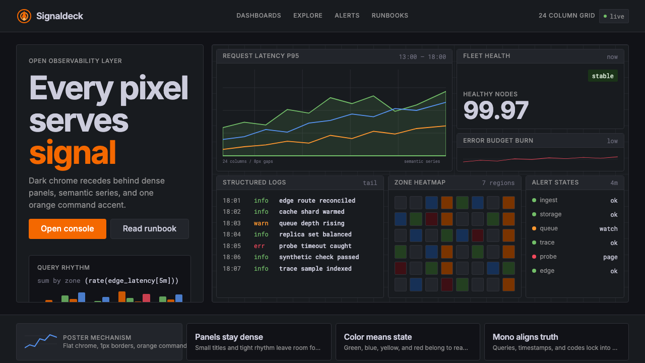 GrafanaData first, chrome last. Orange accent cuts through dense dark panels and sem…
 Shopify ModernMerchant ally, not corporate SaaS. Emerald actions on bordered white cards ca…
 Tableau (Business Intelligence)Enterprise clarity. Navy workbook chrome, hairline panes, and 10-color marks…
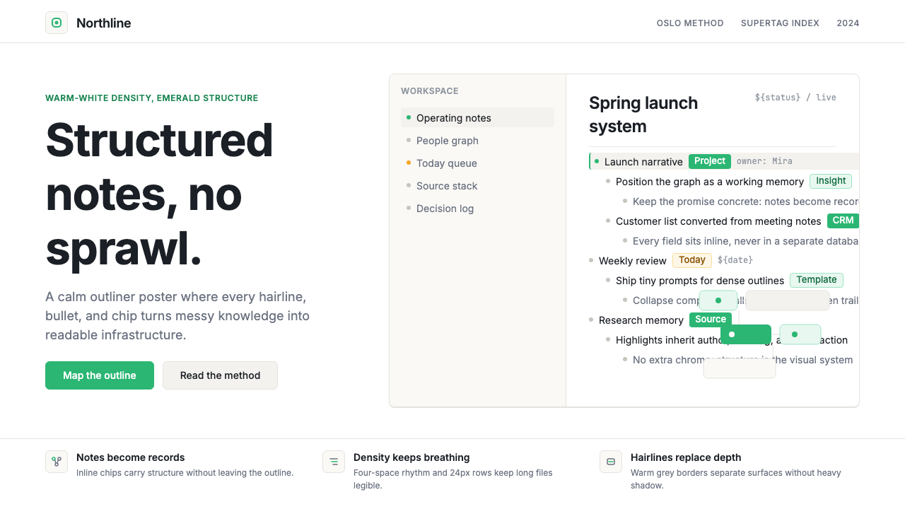 Tana SupertagsCalm density wins. Inter outlines and emerald chips punctuate pure white stru…
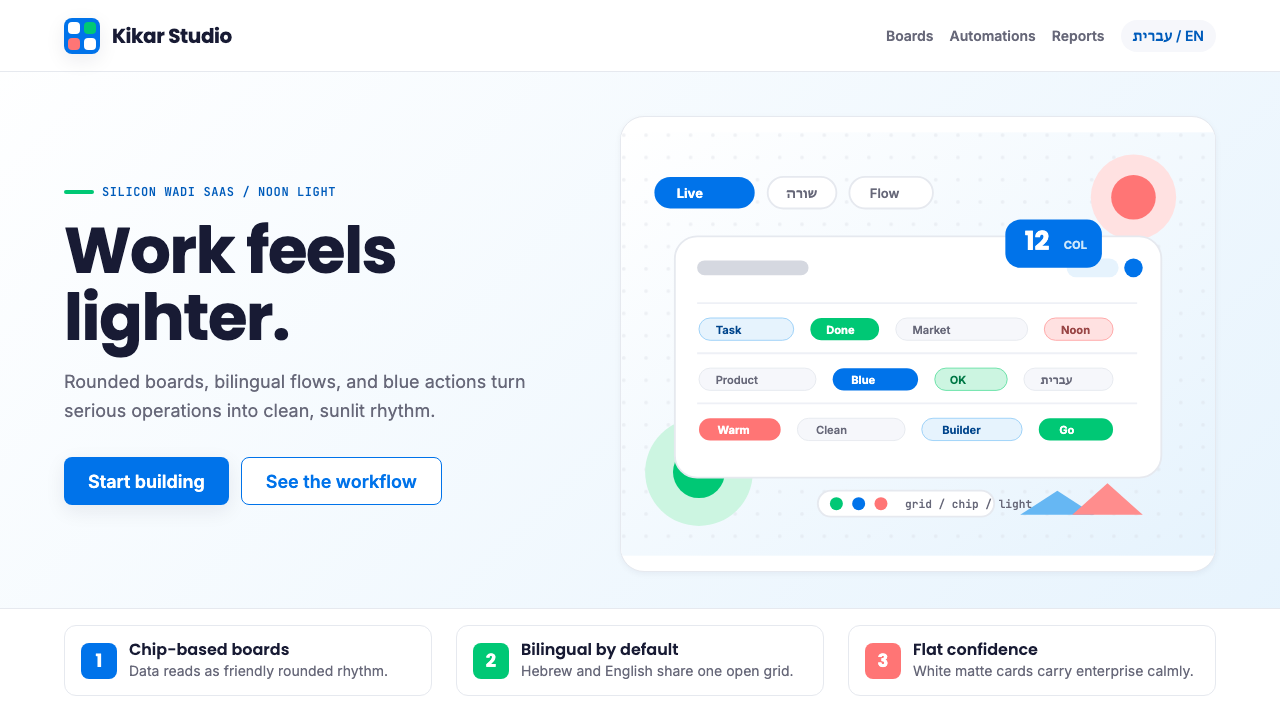 Tel Aviv Silicon WadiEnterprise feels sunny. Azure chips and Poppins grids soften flat SaaS surfac…
 Threads (Meta)Restraint is the brand. Black Inter type, narrow feed, thin connectors, white…