What is Neo-Geo?
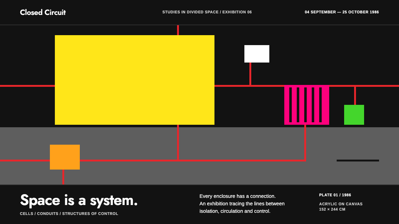
Neo-Geo treats geometry as social space: fluorescent cells on a flat black field, wired together by straight, rigid conduits.
Neo-Geo in brief
Neo-Geo, short for Neo-Geometric Conceptualism, is the New York art tendency of the 1980s associated above all with Peter Halley. As a design system it is dark and hard-edged: fluorescent yellow, orange, pink and green blocks sit on a flat, near-black field, linked by thin orthogonal bands that work at once as dividers and as connections between sections.
The vocabulary is Halley's diagram of cells, prisons and conduits. A rectangle stands for a cell; a narrow band stands for a conduit that feeds or confines it. Read this way, geometry is not abstract decoration but a picture of social space, of how people and information are boxed in and plumbed together in modern life. The look is simultaneously glossy and cold, loud in color and strict in structure.
Type is small and factual, like the checklist you would pick up at a downtown gallery in 1986. Corners are square, shadows are absent, and the only real texture is a patch of coarse, sandy white. The mood is deadpan: the brightest colors imaginable, deployed with bureaucratic calm.

Where does Neo-Geo come from?
The roots lie in New York City, in the East Village and SoHo, where a younger generation of artists in the early 1980s reacted against both the expressive painting of the moment and the purity of earlier abstraction. They took the language of geometric art and reloaded it with irony and social meaning. The movement is known by several names: Neo-Geo, Neo-Conceptualism and Simulationism, each stressing a different side of the same attitude.
Peter Halley is the central figure. His work from 1981, including Prison with Conduit, established the basic grammar: a rectangle as a cell, a line as a conduit, a flat field of industrial color. Through the mid-1980s, with the key works dated 1985 and 1986, he refined the vocabulary until it became unmistakable. His surfaces mix fluorescent, day-glo hues with a rough, sandy texture of the kind sold for interior ceilings, a deliberately cheap material that undercuts the preciousness of painting.
Around him gathered artists who shared the sensibility without sharing the style. Haim Steinbach, Jeff Koons and Ashley Bickerton are the names usually placed beside Halley, and a group show at the Sonnabend Gallery in 1986 helped fix the idea of a recognizable New York current. Each of them treated objects and images as commodities in a consumer system, examining the way modern life packages meaning, desire and value into units that can be displayed, stacked and sold.
As a visual system, Neo-Geo inherited the grid from modernism but emptied it of utopian promise. Where earlier geometric art offered harmony, this version offered containment and circulation: cells that hold, conduits that connect. That reversal is the source of its distinctive chill, and it explains why the style is so well suited to material that is about structure, networks and relationships.
What defines the Neo-Geo look?
Color
The ground is a flat, near-black, slightly softened canvas tone, and on it sit fluorescent yellow, orange, pink and green. The brightness is almost aggressive, as if the colors might leap off the screen, yet they never glow, blur or fade: each block has a hard edge and a single flat fill. Red is used for the connecting conduits. The restraint is structural rather than tonal, a few loud colors, each kept in its own box.
Cells
The basic unit is a rectangular cell, solid in color and square in the corners. Cells can be stacked, nested or arranged in rows, and they often hold a small label or numeral instead of an image. They stand in for the prison and the apartment block in Halley's diagrams, and in an interface they translate directly into cards, panels and table cells that feel both orderly and confining.
Conduits
Thin orthogonal bands link cells to one another. They run only horizontally and vertically, never diagonally or in curves, and they serve as dividers, connectors and section links at once. Conduits make relationships visible: a diagram instead of a list, a network instead of a stack. They are the most distinctive structural element and should be kept straight and thin.
Typography
Type is small, plain and factual, closer to a gallery checklist than to an advertisement. A neutral sans-serif handles labels and body text, while a geometric sans takes titles and numerals. There is no flourish: text is set flat and aligned to the cells, with sizes kept modest so that color and structure, not typography, make the noise.
Flat, Shadowless Surfaces
There are no soft shadows, no glows and no gradients. Elements are separated by edges and by color alone, so everything sits on one plane. This flatness is what makes the style read as diagrammatic: the page is not a stage with lighting but a chart of positions.
Rough Texture Patch
A single textured area, a coarse and sandy white coating, interrupts the smooth surfaces. It recalls the cheap interior-ceiling material Halley used in his paintings, and it gives the system its only tactile moment. Use it as one deliberate patch, not as a repeated background, so that it acts as an accent against the otherwise glassy flatness.

Who shaped Neo-Geo?
The painter at the center of Neo-Geo, whose vocabulary of cells, prisons and conduits, developed from 1981 onward, is the direct source of this design system. His key works of 1985 and 1986 fixed the look of fluorescent blocks wired together by straight bands.
An artist usually placed beside Halley in accounts of the movement, known for treating displayed objects as commodities within a consumer system.
A fellow participant in the mid-1980s New York scene, whose polished treatment of consumer imagery shares the movement's deadpan attitude toward commerce.
Another artist associated with the group and with the 1986 gallery show that helped identify the tendency, working in the same ironic relationship to commodity culture.
How do you use Neo-Geo today?
In slides, Neo-Geo is excellent for explaining structure. A title slide can use a black field with one block of fluorescent color and a thin conduit leading to the title. Content slides work best as diagrams: cells for concepts and orthogonal bands for relationships, which turns a bullet list into a map. Data slides suit numerals in the geometric title face inside colored cells, with each category given its own fluorescent hue and a conduit tying the figures to their explanation.
On the web, the style suits art institutions, exhibitions, galleries, cultural publications and technical documentation about data structures, architectures and networks. A homepage can be a grid of colored cells acting as navigation, connected by thin lines that double as dividers. Dashboards map naturally onto cells and conduits, with each widget a block and each dependency a visible band. Pricing pages can show plans as cells linked to the features they include.
For editorial and marketing work, it carries a knowing, late-twentieth-century art-world tone. Posters for exhibitions, covers for essay collections and campaigns about systems, surveillance, infrastructure or consumer life can use the fluorescent-on-black look to signal critique with a straight face. Keep copy short and factual, in the manner of a wall label, and let the color blocks do the shouting.
The most common mistake is to soften the geometry. Rounded corners, glows, gradients and drop shadows break the flat, diagrammatic logic and make the fluorescent colors look like a generic neon theme. A second mistake is bending the conduits into curves or diagonals; they should only run horizontally and vertically. A third is to use too many colors in one view; each block should earn its hue. Finally, do not use the rough white texture as a full-page background, because it is meant as a single accent.

Neo-Geo — FAQ
What is Neo-Geo?
Neo-Geo, or Neo-Geometric Conceptualism, is a 1980s New York art tendency associated most closely with Peter Halley, also known as Neo-Conceptualism and Simulationism. It revives geometric abstraction with irony, treating rectangles as cells and lines as conduits to depict social space.
What do the cells and conduits mean?
In Halley's vocabulary a cell stands for a prison or an apartment unit, and a conduit stands for the channel that feeds or connects units. Together they picture modern social space as boxed-in and networked. In a design system they become cards, panels and the straight lines linking them.
Which colors does the style use?
A flat, near-black ground with fluorescent yellow, orange, pink and green blocks, plus red conduits. Colors are fully flat, with hard edges and no glow, and a single coarse white texture patch provides the only tactile note.
Is it suitable for data and technical content?
Yes. The cell-and-conduit structure maps naturally onto architectures, dependencies and networks, which is why it works well for documentation and dashboards. Keep one hue per category and let straight bands show relationships.
What is the most common mistake with this style?
Softening it. Rounded corners, glows, gradients and shadows destroy the flat diagrammatic logic and turn the fluorescent palette into a generic neon theme. Keep corners square, edges hard and conduits straight.
Related design styles
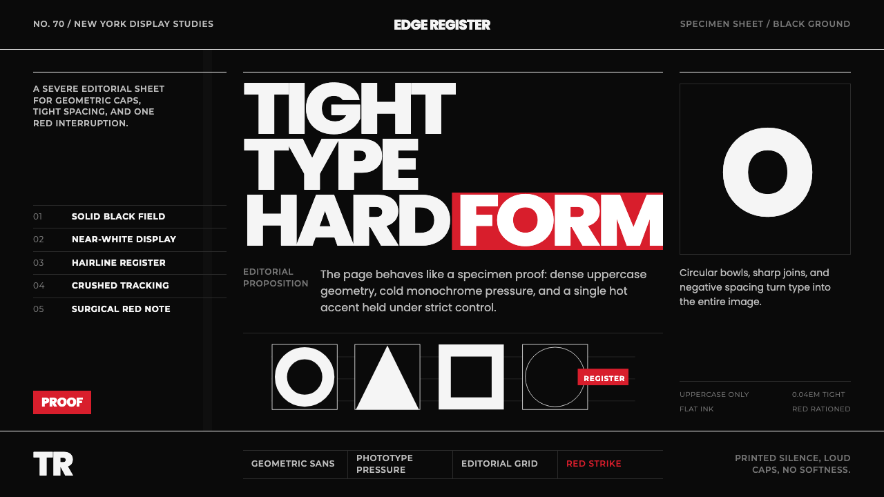 Avant Garde GothicType is the image. Tight white caps on black, ruled grids, one hot red strike.
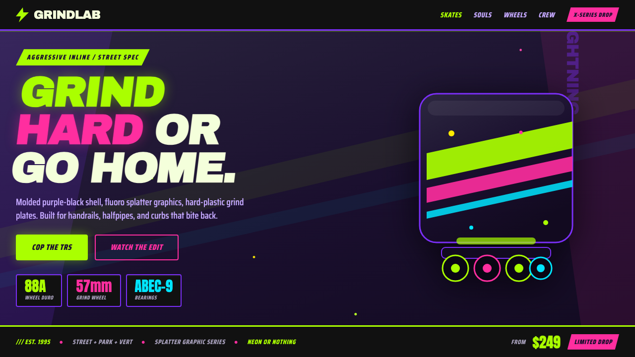 90s Aggressive Inline SkateX-Games attitude in plastic and paint. Fluoro lime and magenta slash across m…
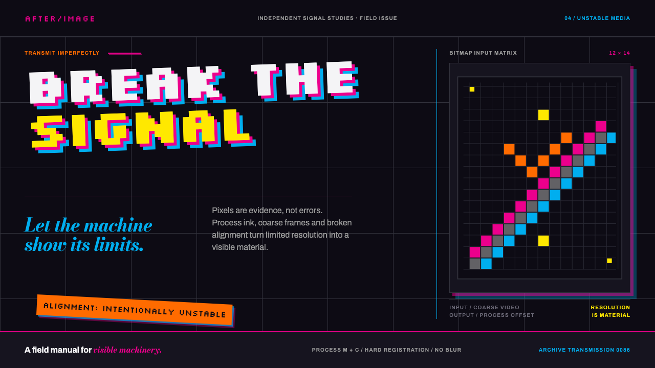 April Greiman HybridResolution becomes material. Bitmap type and process magenta collide on a bro…
 Emigre Magazine (1984–2005)Defies the tidy grid. Cyan, ochre, and hot-pink bitmap type collides on black.
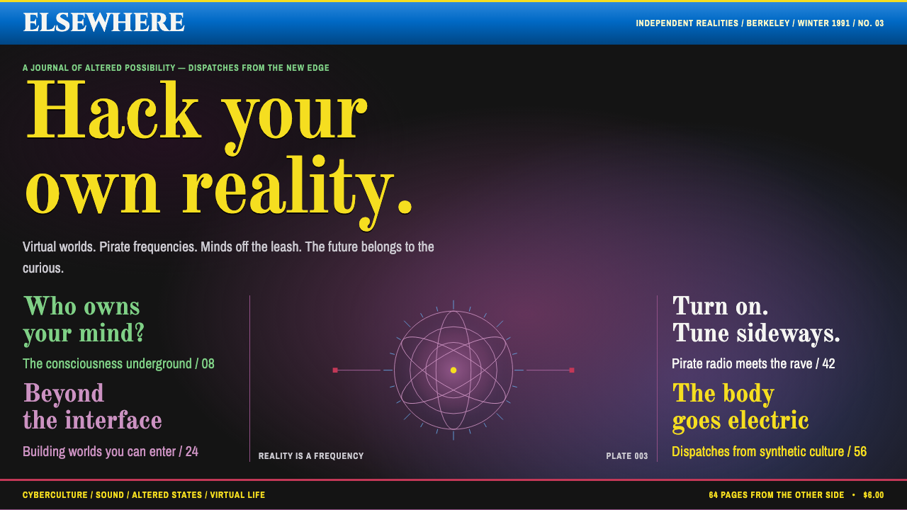 Mondo 2000Reality is up for grabs. Yellow serif cover lines crowd a black-and-purple si…
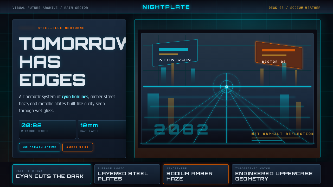 Retro-Futurism (Syd Mead)Tomorrow looks dangerous. Steel-blue night, neon cyan edges, and amber rain r…