What is Ne Zha?
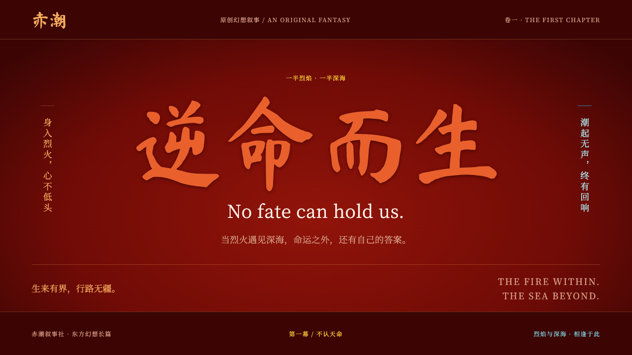
Ne Zha's look is defiance in cinnabar: a crimson fire field, brush-script titles and vertical serif taglines, with a cold turquoise sea held back as counterpoint.
Ne Zha in brief
The Ne Zha design style is drawn from the 2019 animated film Ne Zha, and later extended by its 2025 sequel. It is a dark, high-contrast system built around a deep crimson fire field, flame-orange titles, and the smoky-eyed face of a demon child who refuses the fate handed to him. Its emotional engine is confrontation: two figures facing each other across a burning frame.
Typography does much of the storytelling. Titles are brushed in bold, hand-drawn script, while taglines run in tall vertical columns of serif Chinese text. The contrast between wild brushwork and orderly vertical type echoes the story itself, which pits rebellious energy against inherited rules. Ornament is kept sparse, because the poster composition and the face-off carry the weight.
A second palette lives alongside the fire. The sequel introduced the cold turquoise of the East Sea, a gold sash and ink-wash landscape scrolls. Used together, fire for action and water for counterpoint, they give the style a two-sided character: heat and restraint, vengeance and calm, flame and tide.

Where does Ne Zha come from?
The visual world starts from an old story. The source is the Ming-dynasty novel Fengshen Yanyi, a sixteenth-century work of gods, spirits and wars of succession, in which the child Ne Zha already appears as an unruly figure with magical weapons. Over the centuries the tale has been told in opera, illustration and film, and each telling re-dressed the boy in the visual language of its time.
The 2019 film rebuilt the legend as a story about identity. Directed by Jiaozi (Yang Yu) and produced in Chengdu by the studio Chengdu Coco Cartoon with Beijing Enlight Pictures, it takes a child born from a demon pearl and asks whether he must live out the destiny stamped on him. Its main poster set the tone for everything that followed: a field of deep red fire, a sullen face with smoky eye makeup and a crooked grin, a fire-tipped spear in his hand and a red sash streaming behind him. Opposite him stands Ao Bing, born from the spirit pearl, who is coolly associated with the East Sea.
The film belongs to a wider Chinese animation revival of the 2010s and 2020s, in which mythology is retold through modern three-dimensional animation instead of being preserved in classical forms. Its visuals are one expression of that shift: ancient characters rendered with contemporary lighting, texture and scale, yet still pointing back to traditional art. A notable example is the use of Song-dynasty court painting quoted inside digital sets, including the scenic scroll world of the mountains-and-rivers painting, where the gaze moves from fire to landscape.
The 2025 sequel added the turquoise East Sea, a gold sash and ink-wash scrolls to the original red-and-orange palette. The work of the design group Coloroom is credited in the project's context, and the combined look is what this style packages: fire and brush for the original poster identity, water and ink for the sequel's cooler counterweight. Taken together, the two films gave a mythological figure a recognizable modern identity that holds up as a design system.
What defines the Ne Zha look?
Color
The ground is a deep, dark crimson, like a field of banked embers, and the primary action color is flame orange. Gold is held in reserve for numerals and emblems, so it reads as a precious accent rather than a second background. A cold turquoise, the East Sea tint, is reserved for the water side of the story and for the rival figure. The discipline is the point: fire carries action, gold marks value, and turquoise is rationed so that when it appears it feels like relief.
Brush Titles
Display titles are set in bold brush-script letterforms with visible stroke pressure, ragged ink edges and uneven rhythm. They look written rather than typeset, which gives headlines the physical force of a shouted word. The typefaces involved are hand-lettered Chinese scripts chosen for exactly this rawness. Use them for a few large words at most; their energy fades if they are asked to carry sentences.
Vertical Serif Taglines
Supporting lines run top to bottom in tall columns of serif Chinese type, pressed up beside the brush title. The sharp, thin-and-thick contrast of the serif characters is the opposite of the brush's roughness, and the pairing creates a tension between impulse and order. Vertical setting also brings a quiet reference to traditional Chinese book and poster layout, so the page feels both cinematic and rooted.
The Central Face-Off
Composition is built on confrontation. Two characters, one aligned with fire and one with water, face each other across the middle of the frame, and everything else arranges itself around that axis. The balance is dramatic rather than calm: heat on one side, cold on the other, with the empty space between them charged like the gap before a clash.
Embers and Brushed Edges
Texture is limited to a few motifs: drifting embers, flame licks and edges that look dragged by a loaded brush. Boxes and panels avoid clean geometric perfection and take on the slightly torn look of ink on paper. These touches give the dark ground depth without resorting to heavy decoration, and they should stay sparse so that the main face-off is never crowded.
Ink-Wash Scrolls
From the sequel comes a quieter layer: landscape scrolls rendered in soft ink-wash tones that stretch horizontally behind or beneath the main content. They bring depth, scale and a classical Chinese painting memory, and work best as backdrops for water-side sections or transitional bands between fiery ones.

Who shaped Ne Zha?
The director whose 2019 retelling turned a sixteenth-century legend into a story about refusing fate. His film gave Ne Zha the smoky eyes, crooked grin and fire-field poster identity that this design style is built on.
The Chengdu animation studio behind the films' production, a visible expression of how the Chinese animation revival grew outside the traditional capitals of the industry.
The Beijing company associated with the film's production and release, forming the other half of the partnership that brought the project to audiences.
A design group credited in the project's visual context. Its name belongs to the story of how the film's colors, graphic identity and typography were shaped into a recognizable system.
How do you use Ne Zha today?
In slides, the style suits storytelling and conflict. A cover can use the crimson fire field with a single large brush-script title and a vertical serif tagline beside it. Content slides work as face-offs: two columns, one warm and one cool, for before and after, risk and reward, or challenger and incumbent. Data slides should keep the dark ground and use gold for the key figure, flame orange for the primary series and turquoise for the comparison series, so the chart reads like fire versus water.
On the web, it fits game landing pages, film and entertainment campaigns, cultural events, brand launches with a heroic or rebellious tone, and narrative microsites. A hero section can place two characters or two product states on either side of a central axis. Dashboards can adopt the dark ground with orange accents for alerts and active states, though dense data screens should lean on calm neutral cells so the fire does not overwhelm reading. Pricing pages can use gold sparingly to mark the recommended plan.
For editorial and marketing work, it is a natural fit for posters, covers, festival graphics and long-form features about myth, youth, destiny or opposition. The vertical serif tagline is a strong poster device, and a sparse scatter of embers can add motion to a static layout. Because the style is built on one dominant mood, it is best deployed on pieces that want a single, emphatic emotional note rather than a calm explanatory tone.
The most common mistake is to turn it into festive decoration. The red is a dark crimson used for drama, not a bright holiday red, and the style is a poor fit for New Year packaging or red-envelope designs. A second mistake is overusing the brush type, setting paragraphs in it until the energy dissolves. A third is adding ornament everywhere; the system relies on emptiness and a central face-off, so extra patterns weaken it. Finally, do not use turquoise as a full second background; it works only as counterpoint.

Ne Zha — FAQ
What is the Ne Zha design style based on?
It is based on the 2019 film Ne Zha and its 2025 sequel, which retell a story from the Ming-dynasty novel Fengshen Yanyi. The look combines a deep crimson fire field, flame-orange brush titles, vertical serif taglines and, from the sequel, a cold turquoise sea with ink-wash scrolls.
Why does the style use both fire and water colors?
The story is built on two opposed figures, one tied to fire and one to the East Sea. Fire colors carry action and rebellion, while turquoise is the cold counterpoint. Used together, with the fire dominating, they reproduce the film's face-off in color form.
Which fonts or letterforms define the look?
Titles use bold hand-brushed Chinese scripts, specifically brush-style display faces, and taglines use a serif Chinese face set in vertical columns. The contrast between rough brushwork and orderly serif type is central to the style.
Is it suitable for Chinese New Year designs?
No. The red is a dark, dramatic crimson built for confrontation and storytelling, not a bright festive red, and the mood is defiant rather than celebratory. It is better suited to entertainment, narrative and cultural-event work than to holiday packaging.
Where should I use the turquoise and gold accents?
Keep gold for numerals, badges and the single most valuable item on the page, and keep turquoise for the water side of a comparison or for transitional bands. Both should stay rare so the fire palette remains dominant and the accents keep their impact.
Related design styles
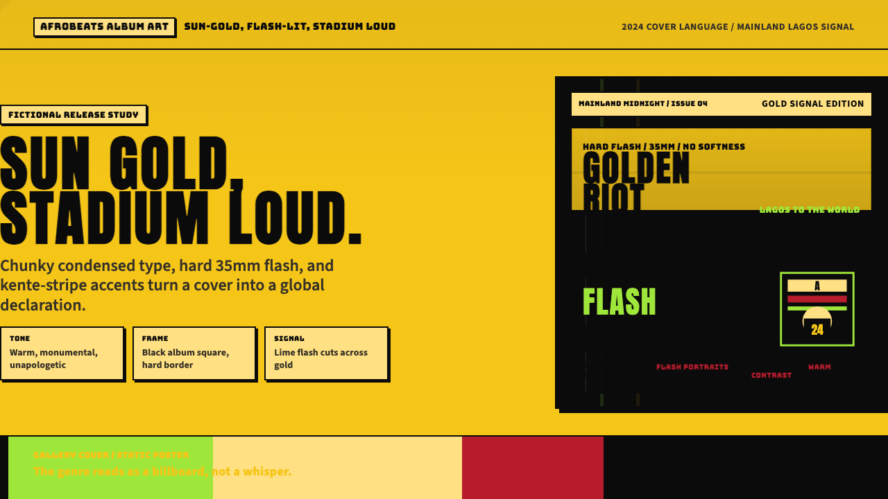 Afrobeats Album Art 2024Sun-gold and stadium loud. Anton type, kente stripes, and hard flash drive th…
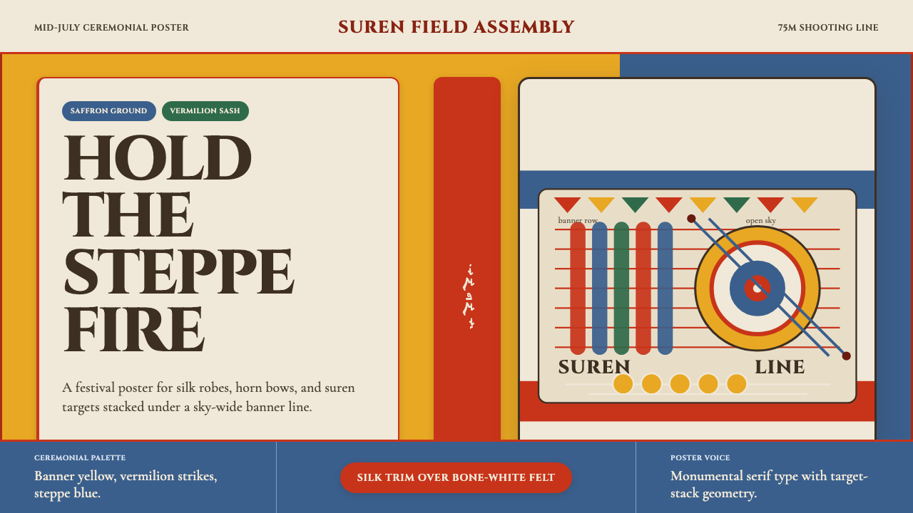 Mongolian Naadam ArcheryFestival heat at full draw. Saffron ground, vermilion trim, suren circles.
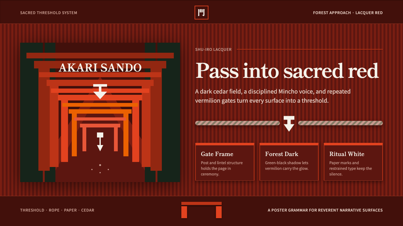 Shinto ToriiSacred red holds the dark. Vermilion gates, Mincho type, and shide white fram…
 Yayoi Kusama Polka DotInfinity eats the wall. Scarlet-white dots and chrome-yellow panels repeat wi…
 Malagasy Lamba HoanyWords become ornament. Hot fuchsia, saturated print plates and a border that…
 Spanish Flamenco PosterPassion printed as ritual. Blood red, ivory paper, Didone type, and flat gold…