What is Spacecraft Schematic?
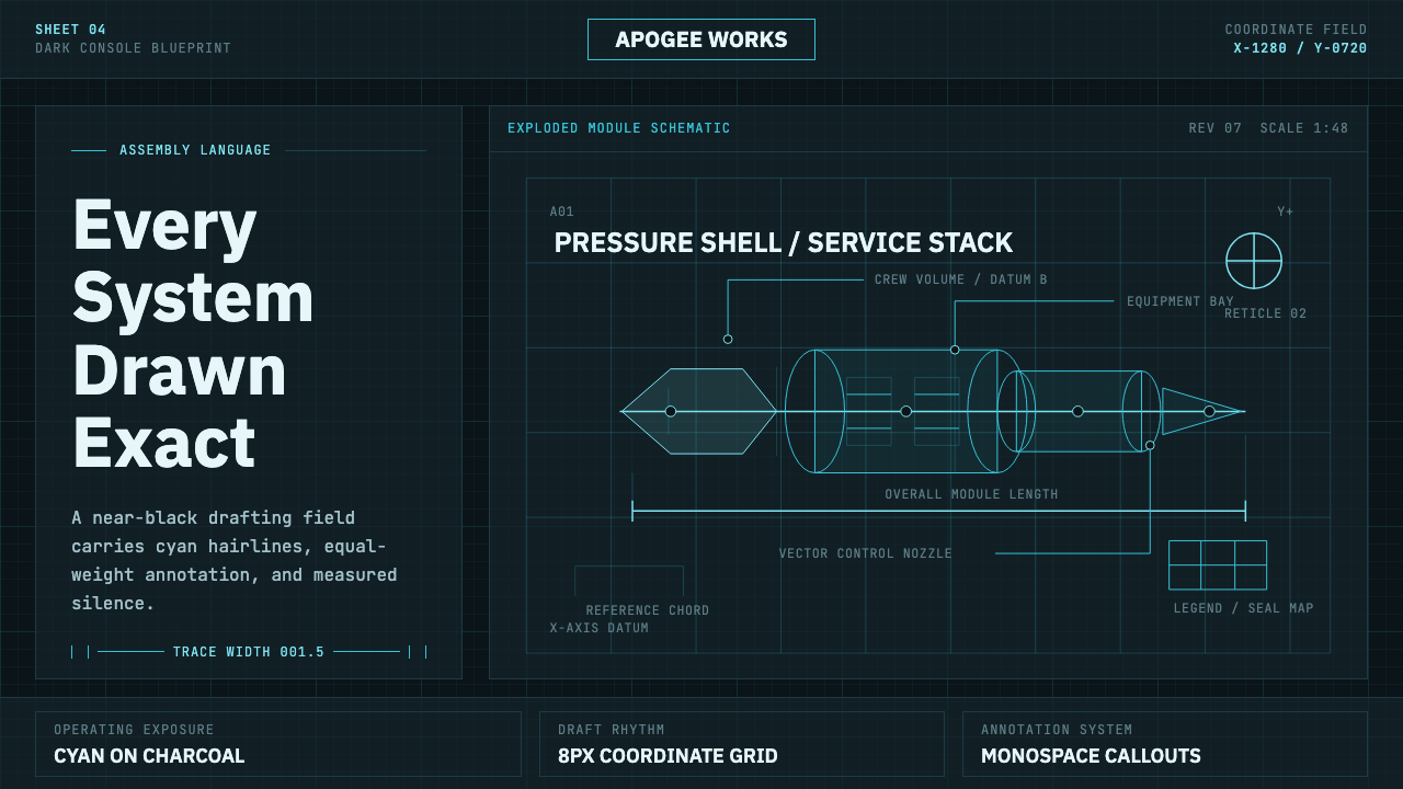
Spacecraft Schematic takes the Apollo-era engineering blueprint and inverts it into a glowing dark-mode instrument panel of cyan hairlines on charcoal teal.
Spacecraft Schematic in brief
Spacecraft Schematic renders the visual language of a technical engineering drawing as a dark screen rather than a light printed page: a deep charcoal-teal field that inverts the traditional Prussian-blue cyanotype blueprint, carrying the same precise, hairline-thin technical linework, now rendered in cyan-white against the dark ground. It draws directly on the visual conventions of Apollo-era engineering documentation — exploded cutaway views, dimension callouts, leader lines, and coordinate ticks — pulled out of the paper archive and reimagined as if lit for a spacecraft console.
Nothing here is decorative. Every visual element corresponds to an actual drafting convention: a faint grid underlies the composition like the ruled lines of a drawing board, annotation is set in equal-weight monospace type as if produced on a technical typewriter or plotter, and strokes remain thin and exact rather than expressive or varied in weight. The discipline of technical drafting — where every line represents a measurement or a real structural edge — is treated as the source of the style's authority.
The mood is deliberately cool and restrained: no warm color casts, no glossy three-dimensional rendering, only cool cyan light held against a near-black teal ground. This is the visual logic of a schematic displayed on an instrument panel rather than a photograph or an illustration — information rendered with total clarity and zero ornamentation, legible under the specific, focused viewing conditions of a control room or cockpit.
Where does Spacecraft Schematic come from?
The blueprint itself originates from the cyanotype photographic process, developed in the nineteenth century, in which paper coated with iron-based chemicals turns a deep Prussian blue when exposed to light except where covered by a drawing on translucent paper, leaving crisp white lines against a blue field. This process made it cheap and fast to reproduce technical drawings in bulk, and by the twentieth century 'blueprint' had become the standard term for any engineering or architectural technical drawing, regardless of the actual reproduction method used.
The Space Age, spanning roughly 1950 to 1990, produced an enormous volume of engineering documentation as the American space program moved from early rocketry through the Apollo program and into the Space Shuttle era. NASA engineering drafting teams developed standardized conventions for representing complex spacecraft systems on paper: exploded views separating components for clarity, precise dimension callouts, leader lines connecting labels to specific parts, and coordinate or grid ticks establishing scale and position — a visual language built entirely around unambiguous technical communication between engineers, contractors, and technicians across a vast, distributed program.
Richard Danne and Bruce Blackburn are closely associated with NASA's broader visual identity work of this period, having designed the agency's distinctive 'worm' logotype in 1975 as part of a Federal Design Improvement Program initiative to modernize government graphic identity. While their signature contribution was the logotype rather than engineering schematics specifically, their work is emblematic of the era's broader graphic culture — precise, geometric, unornamented, and oriented toward absolute legibility — the same values embedded in the technical drawings this style draws from.
The shift from paper blueprint to illuminated screen reflects a later, retrospective design move: taking the cyanotype's blue-and-white logic and inverting it for a dark, glowing display, evoking not a paper drawing under office light but a schematic rendered on a cockpit or control-room monitor. This inversion preserves the informational discipline of the original blueprint — thin exact lines, no ornament, precise annotation — while recontextualizing it for the aesthetic of digital instrumentation rather than paper archives.
What defines the Spacecraft Schematic look?
Color
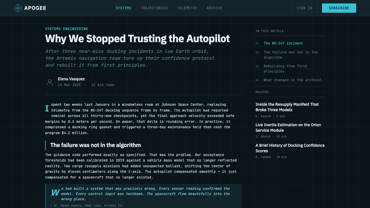
A deep charcoal-teal ground carries cool cyan-white linework, the inverse of the traditional Prussian-blue-on-white cyanotype relationship. No warm color casts appear anywhere in the system — every hue sits in the cool blue-green range, reinforcing the sense of an instrument display rather than a printed page.
Hairline Precision
Linework stays thin and exact throughout, with no variation in stroke weight for expressive effect — every line represents a real dimension, edge, or leader, never a decorative flourish. This uniform thinness is what gives the style its technical, drafted-rather-than-drawn quality.
Exploded Cutaway Views
Complex structures are shown with components pulled apart along their assembly axis, revealing internal relationships that would be hidden in an assembled view. This convention, borrowed directly from engineering documentation, treats visual separation as a form of clarity rather than as literal representation of an object's normal state.
Dimension Callouts and Leader Lines
Annotation connects labels to specific points on a structure via straight leader lines, with dimension callouts marking precise measurements between reference points. This apparatus of labeling is dense but orderly, never freeform, always anchored to a specific coordinate or edge.
Underlying Grid
A faint grid sits beneath the entire composition, evoking the ruled surface of a drafting table or drawing board. This grid is barely visible against the dark ground but provides an implicit structural discipline that every other element aligns to.
Monospace Annotation
Labels and callouts are set in equal-weight monospace type, as if produced by a technical typewriter or plotter rather than hand-lettered. This typographic choice reinforces the sense of standardized, machine-produced documentation rather than personal or expressive mark-making.
Cool Restraint
The overall mood withholds warmth and gloss entirely — no simulated lighting, no reflective surfaces, no soft ambient glow beyond the cyan linework itself. Every visual decision serves legibility under focused, instrument-panel viewing conditions rather than aesthetic richness for its own sake.
Who shaped Spacecraft Schematic?
The broad, largely uncredited body of engineers and drafters across the American space program who developed and standardized the technical drawing conventions — exploded views, dimension callouts, leader lines, coordinate ticks — that define this style's underlying structural vocabulary.
Co-designer, with Bruce Blackburn, of NASA's 1975 'worm' logotype, part of the Federal Design Improvement Program's effort to modernize government visual identity with precise, geometric, unornamented graphic design values consistent with the broader technical aesthetic of the era.
Co-designer of NASA's 'worm' logotype alongside Richard Danne, contributing to the era's broader graphic identity culture that valued absolute legibility and geometric restraint — the same values reflected in the technical schematics this style draws from.
How do you use Spacecraft Schematic today?
Spacecraft Schematic works when a designer treats technical precision and restraint as the point, not decoration to be softened for a friendlier feel — every added flourish, gradient, or warm accent chips away at the authority the style depends on.
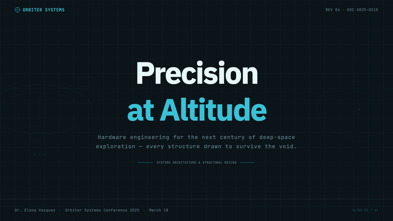
For presentation slides, this style suits cover pages and technical content especially well: a charcoal-teal field with a single exploded-view diagram rendered in thin cyan linework and monospace callouts communicates precision instantly. Data slides benefit strongly from this system, since dimension-callout conventions translate directly into chart annotation — leader lines pointing to data points, coordinate-tick gridlines behind a chart, monospace labels for exact values.
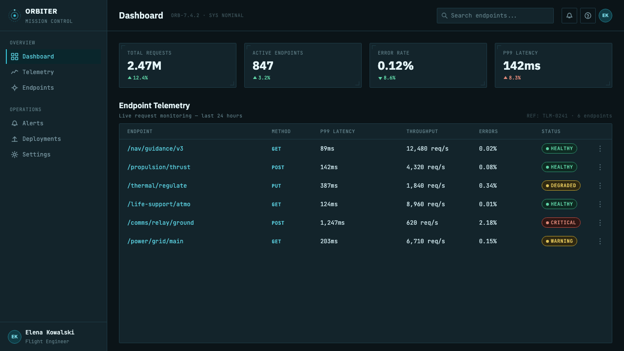
For web interfaces, the palette suits technical products, engineering and developer tools, and dashboards where information density and precision are valued over warmth — a dark charcoal-teal ground with cyan accent color for interactive states and monospace type for data values reproduces the console-like authority of the source material. This is one of the styles best suited to dense, numeric dashboards specifically, since its entire visual logic already assumes technical annotation.
For editorial and marketing work, the style suits technology, aerospace, and engineering-adjacent brand storytelling, where a hero section built from exploded-view-style diagrams and precise callout typography signals technical credibility. It is less suited to warm, consumer-lifestyle marketing, where the cool restraint can read as distant or clinical rather than inviting.
A common mistake is treating the cyan-on-dark-teal palette as a purely decorative dark-mode color scheme while ignoring the drafting conventions underneath — exploded views, leader lines, coordinate ticks, monospace annotation — that give the style its actual authority. Applying the colors without the technical drawing logic produces a generic 'sci-fi dark UI' look rather than a genuine reference to engineering documentation. Another mistake is introducing gradient glows or soft bloom effects around the linework, which contradicts the hard-edged, unambiguous precision the source material is built on.
Spacecraft Schematic — FAQ
Why is the color scheme inverted from the original blue-on-white cyanotype blueprint?
The inversion recontextualizes the blueprint's informational precision for a screen-based, dark-mode viewing environment — evoking a schematic glowing on a cockpit display or control-room monitor rather than a paper drawing under office light. The underlying drafting logic (thin lines, precise annotation, no ornament) stays identical; only the light-versus-dark relationship flips to suit a digital instrument-panel aesthetic.
Does this style require literal spacecraft or engineering subject matter to work?
No — the transferable core is the drafting discipline itself: hairline-thin exact strokes, exploded or layered views, leader-line annotation, coordinate grids, and monospace labeling, all rendered as cyan-white on a dark charcoal-teal ground. Applying this discipline to non-technical subject matter — a product diagram, an organizational chart, a data visualization — still produces a recognizable result, as long as the annotation conventions are preserved.
What is the historical significance of the word 'blueprint' itself?
The term comes directly from the cyanotype photographic reproduction process, in which exposed paper turns Prussian blue except where a drawing blocks the light, leaving white lines on a blue field. Because this process was the dominant cheap method of reproducing technical drawings for much of the nineteenth and twentieth centuries, 'blueprint' became a generic term for any engineering or architectural drawing, even after photographic and digital reproduction methods replaced the original chemical process.
How strict should the monospace annotation and grid conventions be when applying this style?
Fairly strict — the style's authority depends on annotation feeling standardized and machine-produced rather than casual or handwritten, so monospace type for labels and callouts, consistent leader-line angles, and an underlying grid (even if barely visible) are close to essential. Loosening these conventions toward a more expressive, hand-drawn feel undermines the specific technical-documentation reference the style is built on.
What products or brands suit this style, and where does it not work well?
It suits engineering and developer tools, technical documentation platforms, aerospace and technology brands, and data-dense dashboards where precision and authority are valued qualities. It struggles for warm, consumer-lifestyle, or emotionally expressive contexts — hospitality, wellness, children's products — where the cool, restrained, instrument-panel mood reads as distant rather than inviting.
Related design styles
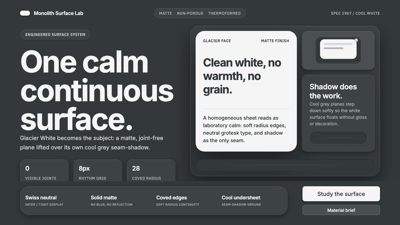 Corian Solid SurfaceSeamless matte calm. Glacier White floats over cool grey shadow with neutral…
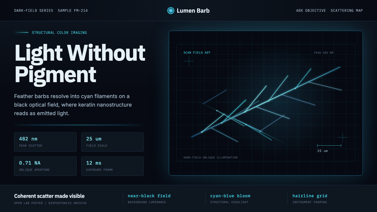 Feather MicroscopyPhysics glows in the dark. Cyan filaments and mono scale bars cut a black ima…
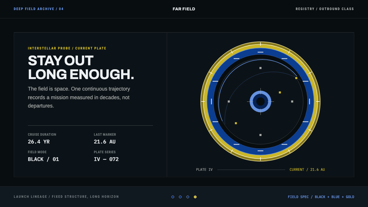 Interstellar Probe PatchCruise made visible. Black space, blue name rings, and a gold-ticked trajecto…
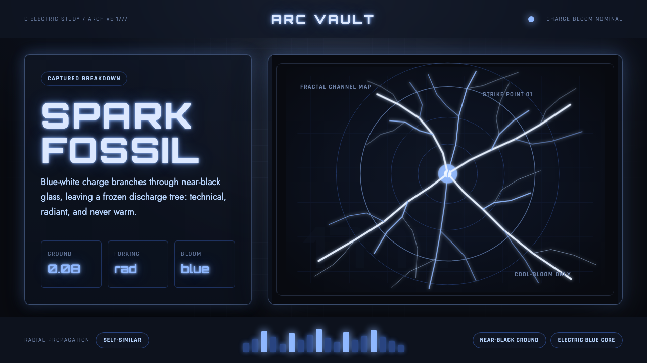 Lichtenberg FigureA spark fossil. Blue-white fractals bloom across near-black dielectric glass.
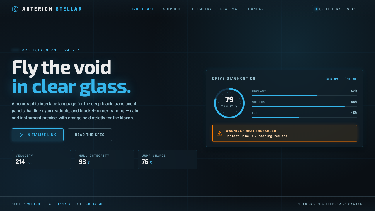 Star CitizenDisciplined holographic HUD. Cyan readouts on glass over a black void, orange…
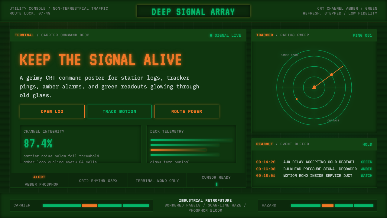 Alien: IsolationLo-fi dread glows. Amber phosphor and terminal green pulse through bordered C…