What is MySpace Profile?
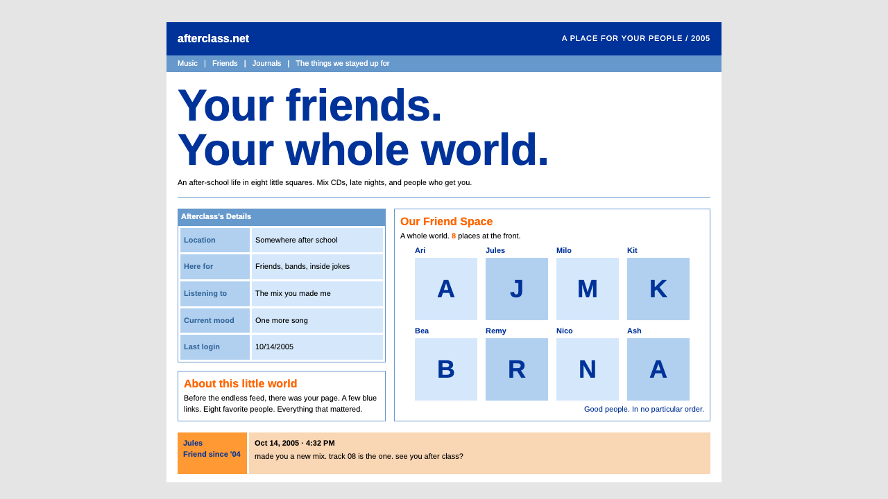
The MySpace profile was the web's first teenage bedroom: a dense grid of hard-edged tables, tiny type, a deep blue header and eight friends on permanent display.
MySpace Profile in brief
The MySpace profile design is the default page layout of the social network that dominated teenage internet life in the middle of the 2000s. Its signature is unmistakable: a fixed-width column of white tables resting on a flat grey ground, a deep blue header, a mid-blue navigation bar, pale-blue information tables with orange section titles, and a square grid of friend photographs known as the Top 8.
Everything about it is small, dense and rectangular. Body text is set tiny, cells are separated by hard thin borders, and not a single corner is rounded. The page reads less like a designed product and more like a spreadsheet that someone has decorated with their personality. That density is the point: the layout is built to hold as much of a person as possible — photo, mood, interests, friends, comments, music — in one scrollable rectangle.
As a design language, it is a document of the table-based web. Before flexible layout tools matured, pages were built from nested tables, and the profile wears that structure openly. The result is a visual system that feels deeply nostalgic to anyone who grew up with it, and a useful reference for designers who want an unmistakable mid-2000s social-web flavor.

Where does MySpace Profile come from?
MySpace launched in 2003 in Santa Monica, California, and its public faces were Tom Anderson and Chris DeWolfe. Its profile layout reached its peak as the default look between 2005 and 2006, when millions of teenagers opened the site every day after school. It belongs to the era of Web 2.0 social networking, when the web moved from pages you read to pages you were.
The structure of the profile came from the technology of its time. Layouts were assembled from HTML tables, so every block on the page is a table cell with a hard border and a background fill. A left column held the profile photo, contact options and the pale-blue Details table; a right column held the orange-titled friend space, the Top 8 and rows of comments. Nothing in this arrangement was fashionable in a design-school sense. It was simply the clearest way to stack many small boxes of personal information into a fixed, predictable frame.
What made the page culturally distinctive was what users did on top of it. A do-it-yourself culture of profile customization grew up around the default template: people pasted in their own CSS and HTML, swapped in glittering backgrounds, and loaded songs that started playing the moment a visitor arrived. The underlying table scaffold never changed, which is why the default layout remains the recognizable skeleton beneath all the decoration.
One small detail became a shared memory. The stock setup came with Tom, one of the site's founders, already sitting in every new member's friend list, so every first account began with the same first friend. That quirk, together with the Top 8 grid that turned friendship into a ranked and publicly visible choice, tied the visual system to the social habits of a generation. As later platforms moved toward cleaner, rounder, image-led feeds, the MySpace profile stayed behind as the emblem of an earlier, noisier, more handmade web.
What defines the MySpace Profile look?
Color
The palette is blunt and saturated rather than refined. A deep, strong blue anchors the header, a medium blue carries the navigation bar, and a pale, washed blue fills the information tables. Orange is the sole warm accent, reserved for section titles and for the friend-space headings. The ground behind everything is a flat, neutral grey, and the content tables are white. There are no gradients to soften transitions; each color block ends where its table cell ends.
Typography
Type is deliberately tiny and set in plain default-looking sans-serif forms. Labels, headings and body copy sit close together in size, so hierarchy comes from color and position rather than scale. Section titles take the orange accent, body text stays dark and small, and links keep the familiar web look. The effect is a page that rewards close reading and is meant to be scanned in clusters of short phrases, like captions on a crowded bulletin board.
Table Grid
The layout is a fixed-width column built from nested tables, split into a narrower left side for identity and contact details and a wider right side for friends and comments. Because the structure is a literal table, alignment is rigid: every box shares edges with its neighbors and rows stack in straight horizontal bands. Spacing is tight and uniform, with just enough padding to keep text from touching borders.
Hard Edges
Every border is a thin, crisp line and every corner is square. There are no rounded buttons, no soft panels, and no blurred shadows. Depth is almost absent: boxes sit flat on the page and separate from each other only through border and fill. This rectilinear discipline is what makes the page feel like a form or a spreadsheet, and it is the single easiest feature to lose when imitating the style with modern rounded components.
The Top 8 Friend Grid
The most iconic component is the square grid of friend photographs under an orange title. Each cell pairs a small portrait with a name, and the grid's fixed number of slots turns friendship into a visible ranking. As a layout device it is a tidy rectangular gallery; as a social device it explains much of the site's emotional charge. Faces, not logos or illustrations, are the page's primary imagery.
Comment Wall
Below the friend grid, visitors' comments stack in rows of small cells with orange and pale pink fills, each carrying a thumbnail and a short message. The repetition of identical boxes creates a rhythmic, ledger-like pattern. This is where the page becomes social: the same rigid container receives an endless stream of casual, personal text, and the contrast between strict structure and loose speech is part of the charm.
Density and Personal Clutter
The system is built for maximum information per screen. Photo, mood, interests, friend space, comments and navigation all share one scroll, and whitespace is a luxury. That density leaves room for the personalization that defined the platform, because a rigid, predictable skeleton is what lets users decorate freely without breaking the page.

Who shaped MySpace Profile?
One of the site's founders and its best-known public face. The default arrangement placed him in every new member's friend list, making him the first friend of a generation and a lasting symbol of the platform's personal, approachable tone.
A co-founder alongside Tom Anderson, associated with building and growing the service from its Santa Monica base. His name belongs to the story of how a small California network became the default social space for teenagers in the mid-2000s.
The network itself is the central author of this visual system. Its default profile template, built on the table-based HTML of the day, defined the layout that millions of users wore, then customized, for several years.
How do you use MySpace Profile today?
In slides, the MySpace profile style works best as a deliberate nostalgia device. A title slide can mimic the deep blue header and mid-blue navigation bar, with the speaker's name in the orange section-title treatment. Content slides can borrow the two-column table layout: a narrow left box for context and a wide right box for the main idea. Data slides suit the pale-blue information-table treatment, where rows of labels and values sit in hard-bordered cells, so a comparison reads like a profile's Details section. A friend-grid slide, laying out team members or customers as a square gallery of portraits with names, is the most recognizable single move.
On the web, the style suits products that want warmth through density rather than polish: community pages, fan sites, retro landing pages, music or youth-culture projects, and playful personal homepages. A dashboard can adopt the nested-table structure, with each widget as a bordered cell on a grey ground, and a pricing page can present plans as rows in pale-blue tables with orange titles. Keep the column fixed and centered, keep corners square, and let information sit close together so the page feels lived-in.
For editorial and marketing work, the look is a strong shorthand for an era. Campaigns about the early social web, the 2000s, or growing up online can use the grey ground, the blue header and the orange titles as an instant visual cue. Posters and covers can arrange a grid of faces like the Top 8, and zines or newsletters can use bordered boxes with small captions to evoke a crowded profile page. The same rigidity that makes it nostalgic also makes it easy to recognize in a thumbnail.
The most common mistake is to modernize it halfway. Adding rounded corners, soft shadows, generous whitespace or large type removes the very density and hardness that define the style, and the result looks like a generic blue interface. A second mistake is overusing the orange accent; it belongs to section titles and friend-space headings, not to every button. A third is ignoring the grey ground and floating the white tables on pure white, which erases the sense of boxes resting on a flat surface.

MySpace Profile — FAQ
What is the MySpace profile design style?
It is the default profile layout of MySpace at its mid-2000s peak: a fixed-width column of white tables on a flat grey ground, a deep blue header, a mid-blue navigation bar, pale-blue Details tables with orange section titles, and a square grid of friend photos called the Top 8. Type is tiny, borders are hard and no corner is rounded.
Why does it look like a spreadsheet?
Because it was built from HTML tables. Before flexible layout tools matured, pages were assembled from nested table cells, and the MySpace profile shows that structure openly. Every block shares edges with its neighbors, which gives the rigid, gridded look.
What is the Top 8?
It is the square grid of friend photographs displayed beneath an orange title on the profile. Each cell pairs a small portrait with a name, and the limited number of slots made it a visible ranking of friends, which is why it carried so much social weight as well as visual identity.
Can I use this style for a modern product?
Yes, as long as you commit to it. It suits community pages, retro-themed landing pages, nostalgia campaigns and playful personal sites. Keep the fixed centered column, the square corners, the hard thin borders and the dense small type. Softening those features turns it into an ordinary blue interface.
Which colors define the look?
A deep blue for the header, a medium blue for navigation, a pale blue for information tables, and orange for section titles, all set against a flat grey page ground with white content tables. Orange is the only warm accent, so use it sparingly.
Related design styles
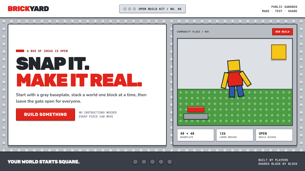 Roblox (2006)Play begins with a click. Fire-engine red cuts through a hard-edged gray stud…
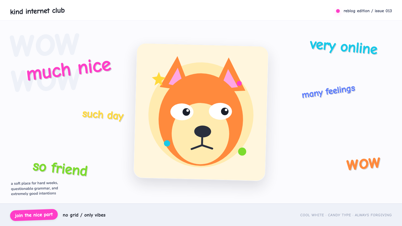 Doge Meme (2013)Anti-design becomes pure joy. Candy Comic Neue captions drift at lazy angles…
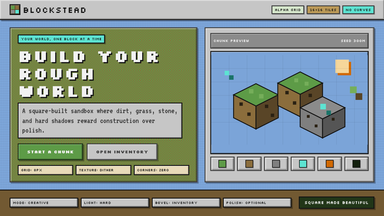 Minecraft VoxelUgly becomes buildable. Grass green, dirt brown, hard bevels, and 16×16 grids…
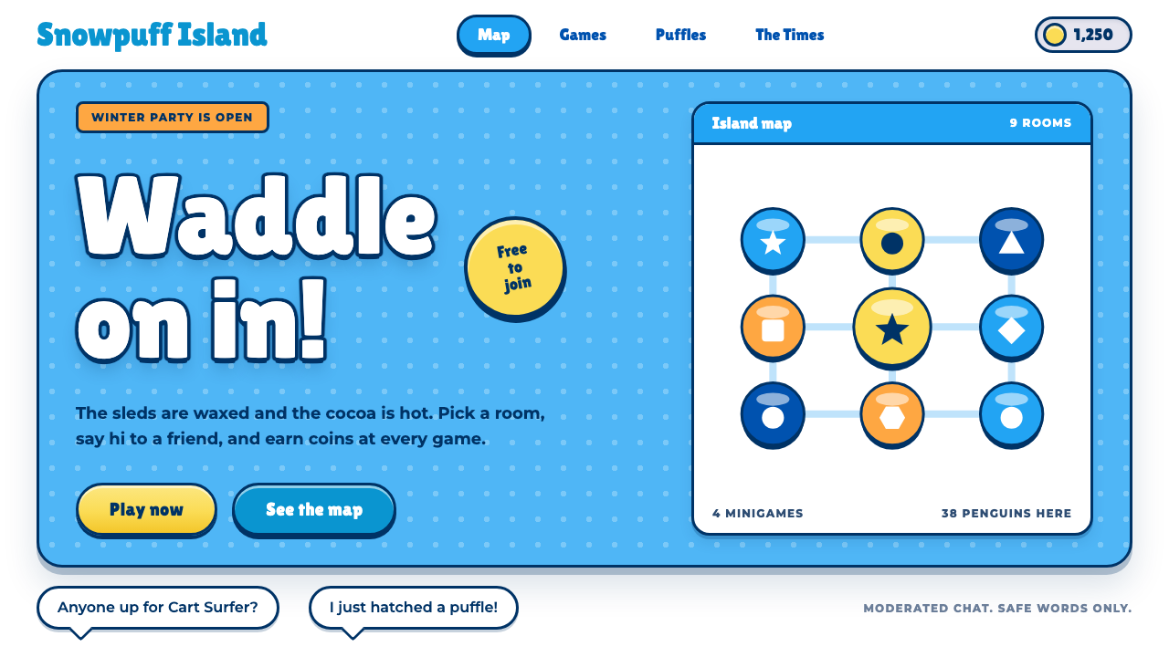 Club PenguinA snow-white island that talks like a kid. Sky-blue panels, navy outlines on…
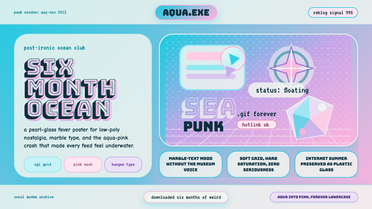 Seapunk Tumblr (2012)Burns bright then crashes. Aqua-pink wash, Bungee type, glassy CGI-grid colla…
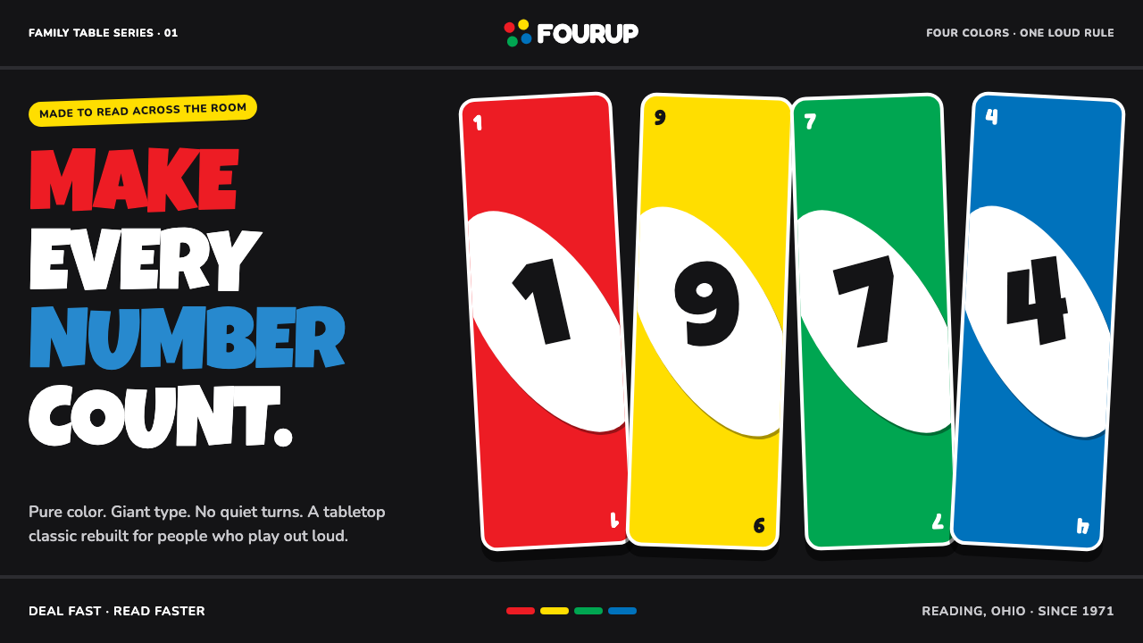 UNO (1971)Every number shouts. Four pure primaries punch through black with tilted whit…