What is Mr. Robot?
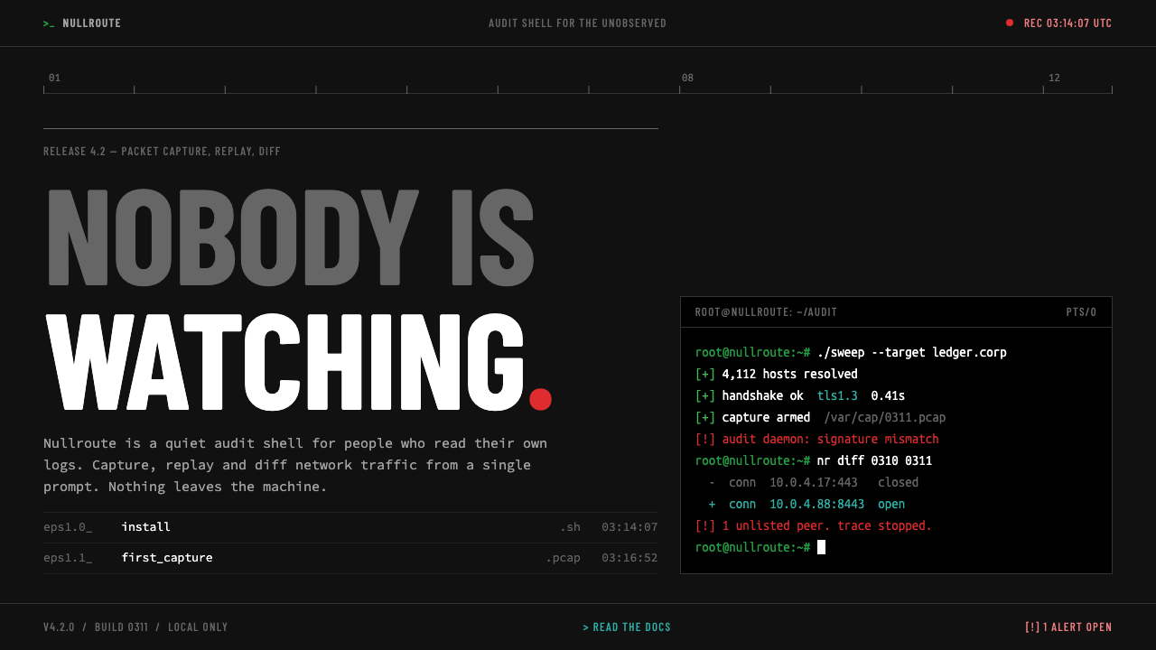
The Mr. Robot look is a terminal at night: a near-black shell, grey condensed capitals, a green prompt, one red error, and content pushed into a corner beneath a wall of empty space.
Mr. Robot in brief
The Mr. Robot style is a visual language drawn from the American television series of the same name, which ran on USA Network from 2015 to 2019. The show is remembered as much for how it looked as for its story. Its hacking scenes were shot with real tools, with real commands typed into near-black terminal windows, and its camera had a habit of placing a character low and off to one side of the frame, under a large empty wall.
As an interface style it combines those two habits. The page itself is a near-black shell, as dark as a terminal with the lights off. Body text is set in a monospaced typeface, headings are set in grey condensed capitals, and the colour that does appear is functional rather than decorative: a green command prompt, a red error line, and a cool cyan for links. Content sits low or to one side, and the space above it is left empty on purpose.
The result feels cold, watched and slightly cramped, which is exactly the intention. It tells the visitor that this is a place for people who read logs and write commands, or for stories that want to share a sense of isolation. It fits security tools, developer documentation and command-line products, and it is just as useful for narrative pages that want a measure of chill.

Where does Mr. Robot come from?
Mr. Robot was created by Sam Esmail and premiered on USA Network in 2015. It followed a young security engineer named Elliot, played by Rami Malek, through a story about hacking, surveillance and social alienation set in New York City. The series ran for four seasons and 45 episodes, ending in 2019. It belongs to the broader tradition of techno-thriller television, but it distinguished itself by taking the technical side seriously instead of treating computers as a prop.
That seriousness is the first source of the look. Rather than invent glowing, impossible interfaces, the show used Kali Linux shells, real commands and near-black terminal windows. A viewer who knew the tools could follow what a character was actually doing. This realistic on-screen hacking gave the show an unusual authority, and it gave designers a reference for how a real working environment looks: plain, dense, monochrome, with colour used only for meaning.
The second source is the camera. The cinematographer Tod Campbell favoured an off-centre short-siding composition, in which characters are pushed into the lower corner of the frame and a large blank wall hangs above them. A person framed this way looks small and isolated, as if the space itself were pressing down. The effect was so consistent that it became part of the show's identity, and it translates very naturally to a page layout, where content can be placed low and to the side while the empty area above stays empty.
The wider creative team shaped the rest of the atmosphere. Anastasia White is among the names credited with the production's look, and together with Esmail, Malek and Campbell she belongs to the group that made the series feel coherent. The system here takes both of the show's habits, the terminal realism and the short-sided frame, and expresses them in the vocabulary of a web page: a dark shell, monospaced text, condensed grey headings, signal colours with clear meanings, and a refusal to fill the space above the content.
What defines the Mr. Robot look?
Near-black shell
The page background is a very dark neutral, close to black but not pure black, like a terminal window on a screen in a dim room. It is not designed to be admired. It is designed to disappear, so that text and signals carry the entire page. Panels, borders and cards are kept to a minimum, and where layers are needed they are separated by small shifts in darkness rather than by bright outlines.
Monospaced body text
Body copy is set in a monospaced typeface of the kind used for source code. Every character occupies the same width, which gives paragraphs a ruled, typewritten rhythm and makes line lengths feel deliberate. It reads as machine output, and it signals that the page is a working surface. Line spacing is comfortable, but the texture is always that of a console rather than of a magazine.
Grey condensed capitals
Headings use a condensed sans-serif in capitals and a muted grey rather than bright white. The narrow letterforms feel clipped and bureaucratic, like labels on a server rack. Because they are grey, they never glare against the dark ground, and they leave the signal colours to speak louder. The contrast between narrow headline capitals and wide monospaced body gives the page a distinct two-voice rhythm.
Signal colours with meaning
Colour is used the way a terminal uses it. A green prompt marks where a command begins or where something succeeded. A red line marks an error or an alert, and there is usually only one at a time. A cool cyan is reserved for links. These colours are not mixed or softened for decoration, and because they are rare they carry real weight whenever they appear.
Short-sided composition
Content is pushed low and to one side of the page, leaving a large empty field above and across the other side. This mirrors the way the series framed its characters. In layout terms it means headings and text blocks do not centre themselves, and the empty area is never filled with decoration, illustration or filler copy. The emptiness is the point: it creates the feeling of being small beneath a large, silent surface.
No ornament, no softness
There are no rounded decorative cards, no glossy gradients, no friendly illustrations. Corners are plain, borders are thin or absent, and interactive elements look like command-line affordances rather than consumer buttons. The effect is austere on purpose. The page asks to be read, not browsed, and it rewards the visitor who is willing to look for what they need.

Who shaped Mr. Robot?
Sam Esmail created Mr. Robot. His insistence on technical accuracy, from real command-line tools to believable screens, is the root of the show's visual authority. The series ran for four seasons and 45 episodes, and his creative direction is the reason the look has been so widely imitated.
Rami Malek plays Elliot, the withdrawn security engineer at the centre of the series. His performance is the human anchor for the cold, short-sided frames: a small figure in the corner of a large empty wall, watching the screen. The style's feeling of isolation is inseparable from that image.
Tod Campbell is the cinematographer associated with the show's off-centre framing. His habit of placing characters low in the frame, with a large empty wall above, is the main source of the style's short-sided layouts. Designers who borrow it are borrowing his sense of how empty space can make a person feel watched.
Anastasia White is credited among the creative team behind the series. Her name belongs to the group that gave Mr. Robot its coherent atmosphere, in which every visual choice reinforces a single idea: a quiet, observed world seen through screens.
How do you use Mr. Robot today?
The Mr. Robot style is a strong mood, and it should be used where that mood is true. It belongs to products and stories about security, code, surveillance, privacy and isolation. For anything that needs warmth, friendliness or celebration it is the wrong choice. When it fits, it communicates credibility to technical audiences immediately, because it looks like the tools they already use.
For presentation slides, build the cover as a dark field with the title set low and to one side in grey condensed capitals, leaving the upper area empty. Content slides work as terminal screens: a short monospaced list, a single green prompt line marking the key point, and nothing else. Data slides suit plain monochrome charts, with a single red element used to flag the number that matters most. Resist adding images or icons, which break the severe tone.
For web interfaces, the style suits developer documentation, security dashboards, status pages and command-line product sites. Use a near-black background, monospaced body text and grey condensed headings. Reserve green for success and prompts, red for errors and alerts, and cyan for links. Place primary content low and off-centre, and keep the empty space above it intact. Tables and logs can be rendered as plain text with minimal rules, and buttons should look like command affordances rather than rounded consumer controls.
For editorial and marketing work, the style is a good fit for long-form narrative about technology, investigative stories and campaigns for security software. An article can open under a large empty field, with the headline set low, then continue in a single narrow column of monospaced text. Marketing pages can present features as lines of output, using the green prompt as a quiet rhythm marker. The tone should be dry and precise, because jokes and exclamation marks fight the atmosphere.
The most common mistake is to use too many signal colours at once. The style depends on a single red alert and a restrained green prompt, so a page full of bright accents turns into a generic neon cyberpunk look and loses the show's cold realism. Another mistake is filling the empty wall. Adding a hero image or decorative graphics above the content removes the sense of being small and watched. Finally, do not use pure white text for everything, because the grey headings are part of the tonal control.

Mr. Robot — FAQ
What is the Mr. Robot design style?
It is a dark, terminal-inspired visual style drawn from the American series Mr. Robot, which aired on USA Network from 2015 to 2019. Its elements are a near-black shell, monospaced body text, grey condensed capital headings, a green prompt, a single red error line, cyan links, and content pushed into a corner beneath a large empty area.
Why is the content placed low and to one side?
Because the series framed its characters that way. Cinematographer Tod Campbell favoured an off-centre short-siding composition that pushes a person into the lower corner of the frame with a large blank wall above. In design, the same layout makes the visitor feel small, observed and focused, and it keeps the empty area above the content as a deliberate part of the page.
Which fonts suit the style?
Body text works best in a monospaced typeface such as Source Code Pro, which looks like real source code. Headings are set in a condensed sans-serif in capitals, such as Barlow Condensed, in grey rather than white. The pairing of a narrow headline voice and a wide monospaced voice is central to the page's rhythm.
Can I use it for a consumer product?
Usually not. The style is cold and austere, and it will feel hostile in food, family, wellness or celebration contexts. It works for consumer products only when the product itself is about privacy, security or technology, where the dark, technical atmosphere is part of the promise.
How should the red and green colours be used?
Treat them as signals, not decoration. Green marks a prompt or a success state, and red marks an error or alert, with usually only one red element visible at a time. Because they are rare, each one commands attention. Using them as brand colours across large areas removes their meaning and breaks the cold realism of the system.
Related design styles
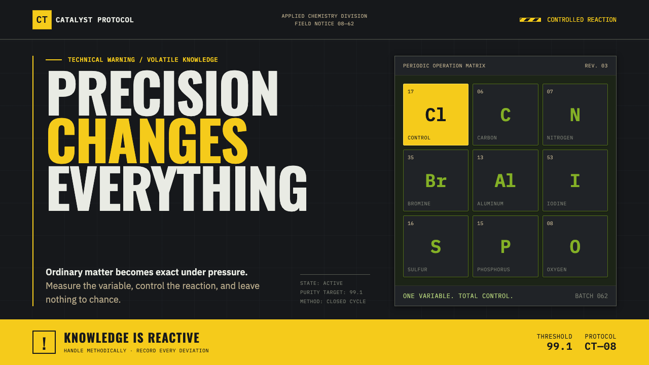 Breaking Bad (2008)Precision turns dangerous. Hazmat yellow and element tiles cut through asphal…
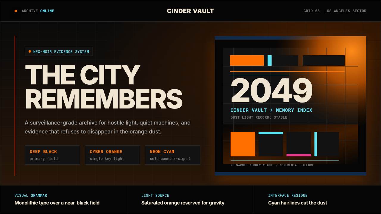 Blade Runner 2049Noir with tectonic weight. Orange dust, cyan hairlines, and monumental Inter…
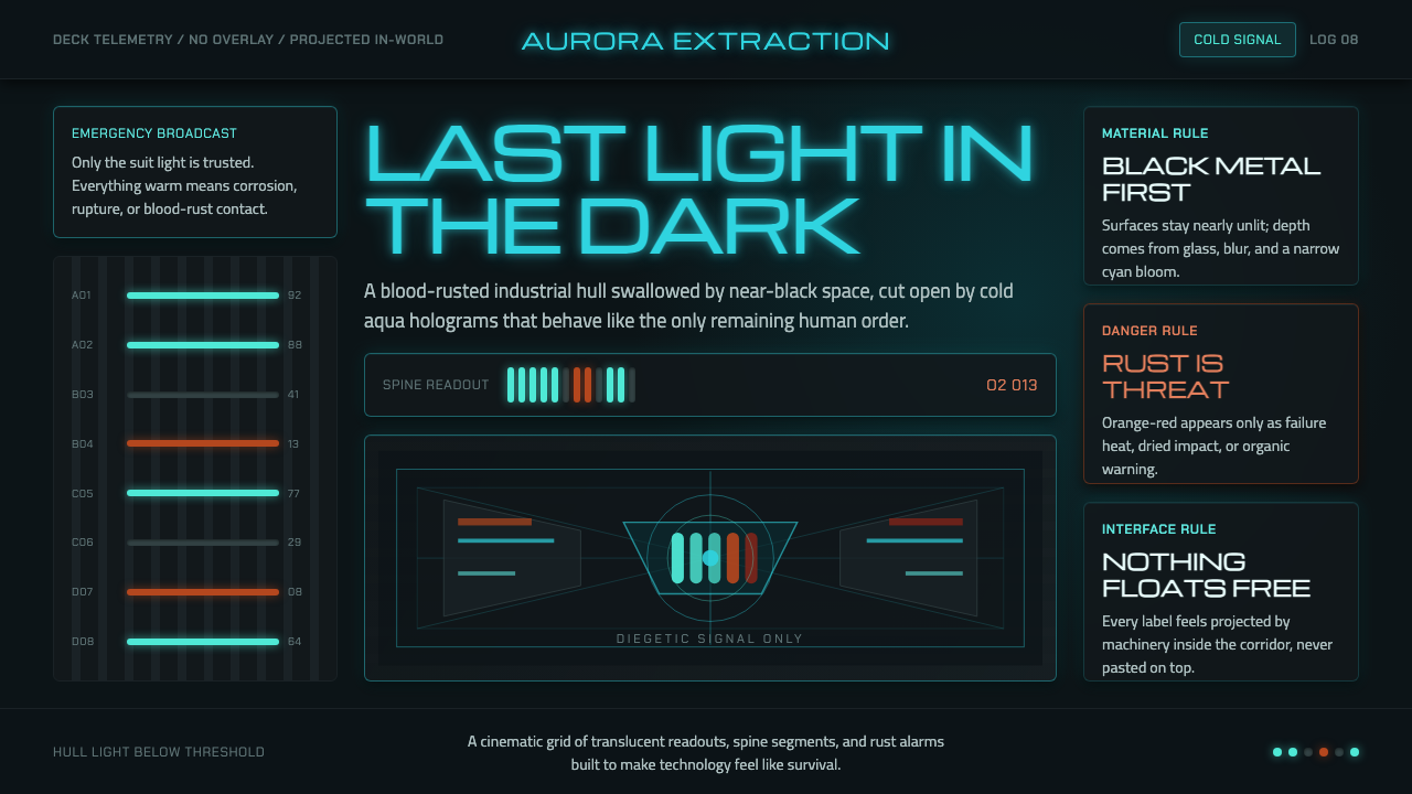 Dead Space IshimuraLast light in the dark. Near-black rust cut by aqua holographic panels.
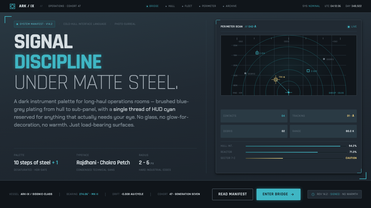 Knights of SidoniaSignal discipline under matte steel. Blue-grey hull, condensed Rajdhani, one…
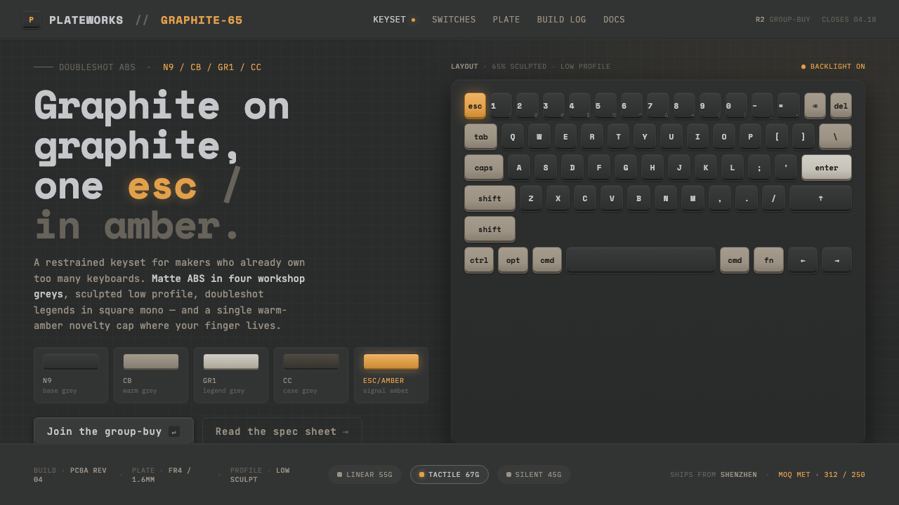 Mechanical KeyboardGraphite on graphite, one key in amber. Doubleshot ABS in GMK greys with mono…
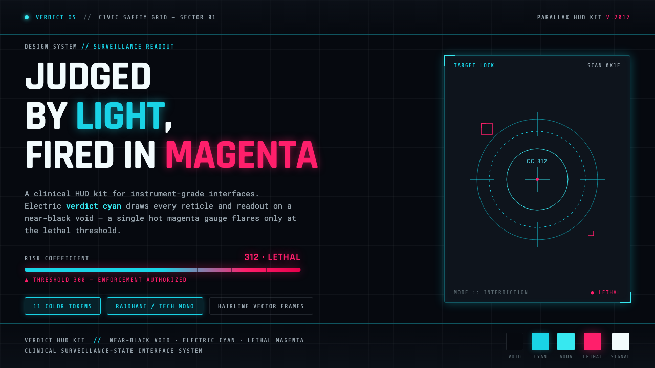 Psycho-PassA surveillance HUD. Cyan reticles on a near-black void; magenta flares only a…