What is M-Pesa Mobile Money?
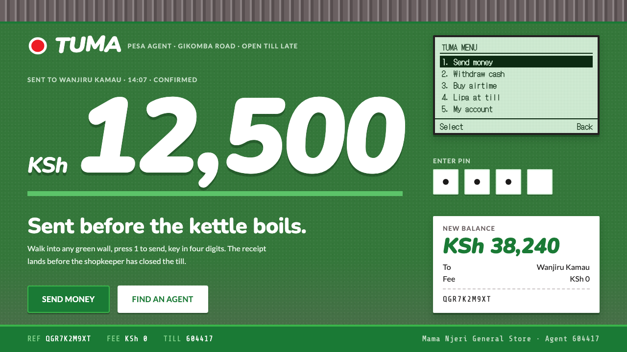
M-Pesa Mobile Money puts a hand-painted green shopfront and a numbered phone menu on the same page, and makes the amount the biggest thing in sight.
M-Pesa Mobile Money in brief
M-Pesa Mobile Money is a design language built from two things you would see in any Kenyan market town. The first is a roadside duka, a small shop, painted top to bottom in Safaricom green with M-PESA hand-lettered across it in white and red. The second is the numbered SIM Toolkit menu on a Nokia keypad phone, the screen through which the money actually moves. The system keeps both registers honest and never lets one pretend to be the other.
The brand register is the wall: painted green fields, brush baselines that drift a little off true, and a corrugated-iron band that sits like a roof across the top. The transaction register is the menu: a narrow monospaced column, numbered options, four PIN boxes and a few plain lines of receipt. One speaks to the street and the other does the business. Amounts are always the biggest thing on the page, set heavy and slanted so that there is no doubt about what is being sent.
What is missing matters as much as what is present. There are no glass cards, no gradient halos, no floating decorative objects. The look is blunt and quick, the look of ordinary trade that happens every day, and it sits on the dark side of the spectrum, closer to a phone screen at the counter than to a sunlit shop wall. It is fast, direct and unfussy by design.

Where does M-Pesa Mobile Money come from?
Walk into any Kenyan market town and the picture repeats: a small duka at the roadside, its walls brushed green, M-PESA lettered across the front by hand, a sheet of corrugated iron overhead. These shops are the places where the service meets the street, and the design system starts from that wall rather than from a bank branch. The hand-lettering is imperfect on purpose. Baselines wander, letters are fat or thin where the brush ran out, and that human unevenness is the sign that someone local made it.
The second source is the handset. M-Pesa was piloted in 2005 and launched in March 2007, a period when the typical phone was a keypad feature phone and money moved through the SIM Toolkit menu delivered by the SIM card. Options were numbered one to five, a transaction ran about four levels deep, and it finished with a four-digit PIN. The visual reference for the system runs from 2007 through the smartphone years to 2024, but its interface logic is the feature-phone logic: numbered, linear and almost impossible to misread.
The source names four key figures: Michael Joseph, Nick Hughes, Susie Lonie and Bob Collymore. Their names are linked with the service's conception, launch and growth. The movements it cites are mobile money and branchless banking, SIM Toolkit interface design, and hand-painted African shop signage. The interesting thing is the pairing: the first two are infrastructure and interface, and the third is a visual tradition of the street. The design system puts them on the same page and refuses to rank them.
Branchless banking is the idea that makes the visual argument coherent. If money does not need a bank building, then the places where it changes hands are the shop, the phone and the hand-painted sign. That is why the design avoids the glass and gradient look of conventional fintech: it would misrepresent where this money actually lives. The honest surfaces here are paint, corrugated iron, a small LCD and a printed receipt, and every layout decision follows from keeping that honesty.
What defines the M-Pesa Mobile Money look?
Painted green wall
The brand lives on large fields of Safaricom green that look brushed on rather than printed. The green is a place, not an accent: a wall that takes up a good part of the layout, with edges that show the stroke. White and red lettering sits on it the way signwriters set it on a shopfront. This is the system's loudest register, and it is the one that tells you whose service this is.
Hand-lettered signage
Display lettering is hand-painted in character: baselines drift, spacing is optical rather than mechanical, strokes vary in thickness. Colour is limited to white and red on the green wall. The lettering is used for the name and a few short claims, never for body text. It is the one place where unevenness is celebrated, because it is the visual signature of hand-painted shop signage across the region.
Corrugated-iron band
A horizontal band of ridged metal runs across the top of key compositions, like the roof of the duka. It is a structural cue more than a decoration: it marks the top of the building, separates the brand zone from the content below, and gives the layout a recognisable silhouette. The ridges are regular, the surface slightly worn, and it never competes with the wall beneath it.
Heavy italic amounts
Amounts are the biggest thing on the page, always, in a heavy slanted face that reads at a glance. The slant gives movement, as if the money is already travelling, and the weight guarantees that no one has to squint to confirm a figure. Labels, names and instructions fall into a clearly smaller scale, so the hierarchy is simple: how much first, everything else afterwards.
Numbered LCD menu
The transaction register is a narrow single column of monospaced text, with numbered options one to five and prompts that go one level at a time. It mimics the small screen of a keypad phone: no icons, no cards, no sideways navigation. The visual rhythm is vertical and plain, and its virtue is predictability, because the user always knows what pressing a number will do.
Four PIN boxes
The PIN is entered into four separate boxes, one digit each. They are the clearest ritual in the system, a pause in which the user commits. Visually they are small, square, evenly spaced and plain, with no shadow or glow, and they are the only part of the interface that deliberately slows the user down.
Plain receipt lines
After the money moves, the confirmation is a short receipt: a few lines on a white ground, a string of transaction code, the amount, the parties. It is set in the same plain face as the menu and looks like something torn from a counter pad. Its job is to reassure through clarity, not through decoration, which is why it is the least embellished piece in the system.

Who shaped M-Pesa Mobile Money?
Named in the source as a key figure and associated with Safaricom's leadership in the period when M-Pesa was launched. His name stands for the corporate commitment that carried a pilot into a national service, and for the era in which the service had to be explained to people who had never used mobile money.
A key figure in the source, linked with the idea behind the service and with its early pilot. His name belongs to the conceptual stage, when the question was whether a phone could stand in for a bank branch at all, and it anchors the branchless-banking thread that makes this design system's honesty about surfaces make sense.
A key figure in the source, linked with turning the early concept into a usable product. Her name stands for the practical side of the project: menus, flows and the small decisions that make a transaction work on a basic handset, which is the territory the numbered menu and the PIN boxes occupy in this design language.
A key figure in the source, associated with Safaricom as the service grew well beyond its launch. His name stands for the later, larger phase in which M-Pesa became an everyday habit, which matches the system's choice to look like routine commerce and not like a product launch.
How do you use M-Pesa Mobile Money today?
M-Pesa Mobile Money is a high-clarity style for anything where numbers, quick decisions and trust in an everyday setting matter. It works best when the two registers are kept separate: the painted wall for brand moments, the plain menu for the task. The designer's discipline is to resist blending them and to keep the amount larger than everything else.
For presentation slides, a cover can be a green full-bleed field with the title lettered in white and red, a corrugated band across the top and no photography at all. Content slides should flip into the transaction register: white or very plain ground, a narrow numbered list in a monospaced face, one idea per slide. Data slides suit the style superbly because the amount is the hero: one figure, huge and slanted, with a plain line of context underneath, rather than a crowd of small charts.
For web interfaces, the style fits payment flows, wallet screens, transfer forms, agent finders and dashboards of simple balances. Show the amount at the top in the heavy slanted face, list options as numbered lines, and put the four PIN boxes in a calm area of the screen. Pricing pages can present tiers as numbered menu options with a large figure next to each. Use the green wall as a header or full-height panel for brand moments, and keep the working areas plain so that nothing slows the task.
For editorial and marketing work, signage is the model. Headlines can be hand-lettered in white and red on green, with sloping baselines, and campaign pages can alternate wall panels with receipt-like confirmations. The style speaks well to everyday commerce, small businesses, remittances, informal markets and anyone building services for people who primarily use a phone, so long as the tone stays direct and the claims stay short.
A common mistake is to blend the registers, putting the hand-painted brush lettering on the transaction screens or setting the menu in the shopfront style, which makes both unclear. Another is to shrink the amount to match a conventional hierarchy; in this system a small figure is a bug. A third is to polish it into generic fintech with glass cards and glowing gradients, which removes the street-level honesty that is the point of the style.

M-Pesa Mobile Money — FAQ
What are the two registers in the M-Pesa style?
The brand register and the transaction register. The brand register comes from the painted duka: green wall fields, hand-lettered white and red signage, drifting brush baselines and a corrugated-iron band. The transaction register comes from the numbered SIM Toolkit menu: a narrow monospaced column, numbered options, four PIN boxes and plain receipt lines. Keeping them separate is the core discipline, because the first sells trust and the second carries it out.
Why are the amounts so large and slanted?
Because the amount is the most important piece of information in any money interface, and this system makes that hierarchy literal. The heavy weight removes any chance of misreading, and the slant gives the figure a sense of motion, as though the money is already on its way. Everything else on the screen is deliberately smaller, so that the first thing anyone sees is how much.
Why use a monospaced numbered menu on modern screens?
Because it is predictable. A numbered list in one narrow column tells the user exactly what each key does and in what order, which is what made the original SIM Toolkit menu workable on a basic handset. On modern screens the same structure reads as calm and trustworthy for repeated, high-stakes tasks. It also carries cultural memory: for many users the numbered menu is what the service has always looked like.
Is the style only for fintech?
No. Although it was born from mobile money, the underlying ideas, a loud brand wall and a plain task screen, a dominant number, a ritual pause before commitment, apply to any service built around quick everyday transactions: transport tickets, utility payments, market apps, event ticketing and community platforms. It is less suited to slow, atmospheric or luxury content, where the blunt directness would feel out of place.
Does a hand-painted look undermine trust in a financial product?
In this system it does the opposite, as long as the registers stay separate. The painted wall signals that the service is part of the neighbourhood, while the plain numbered menu and receipt supply the clarity people need to trust a transaction. Trouble starts only when the hand-lettered look leaks onto the task screens, where roughness reads as carelessness. Keep the roughness on the wall and the precision in the menu.
Related design styles
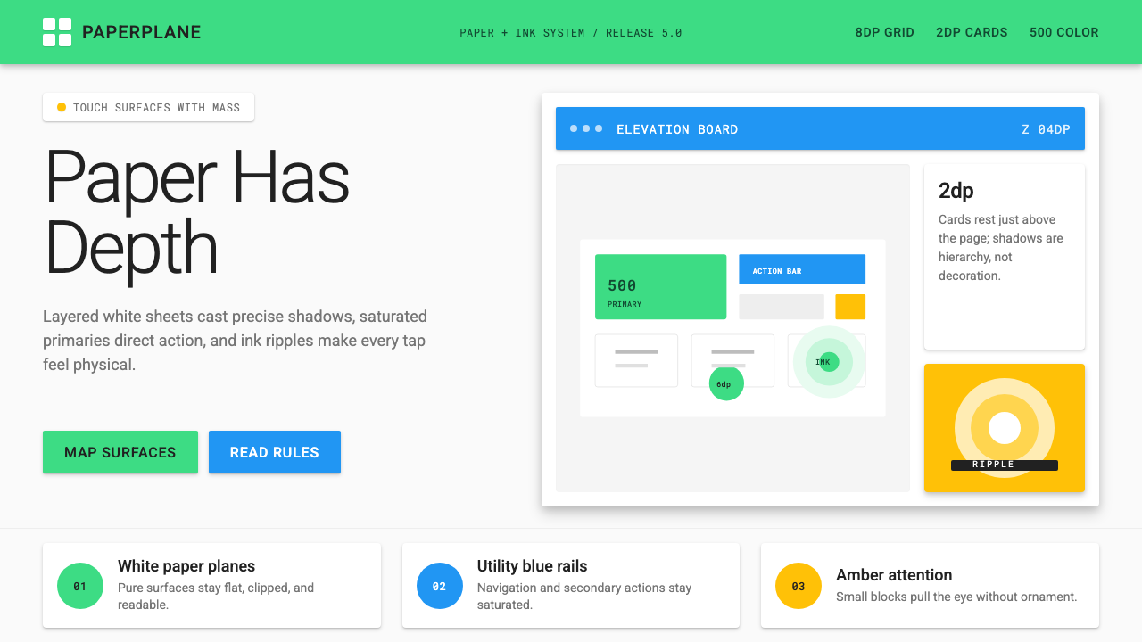 Android Lollipop (Material 1.0)Paper becomes physical. Roboto, green FABs and sharp shadows give white cards…
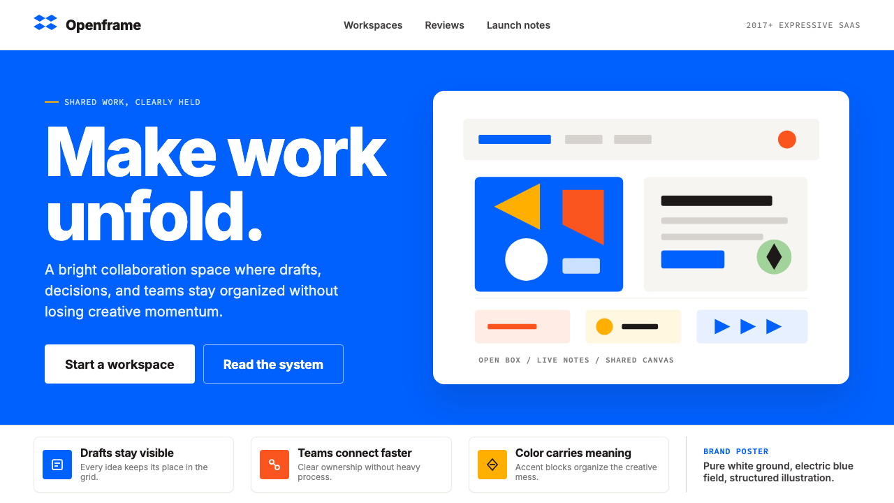 Dropbox ModernFriendly SaaS gets loud. Electric blue and Sharp Sans drive a structured geom…
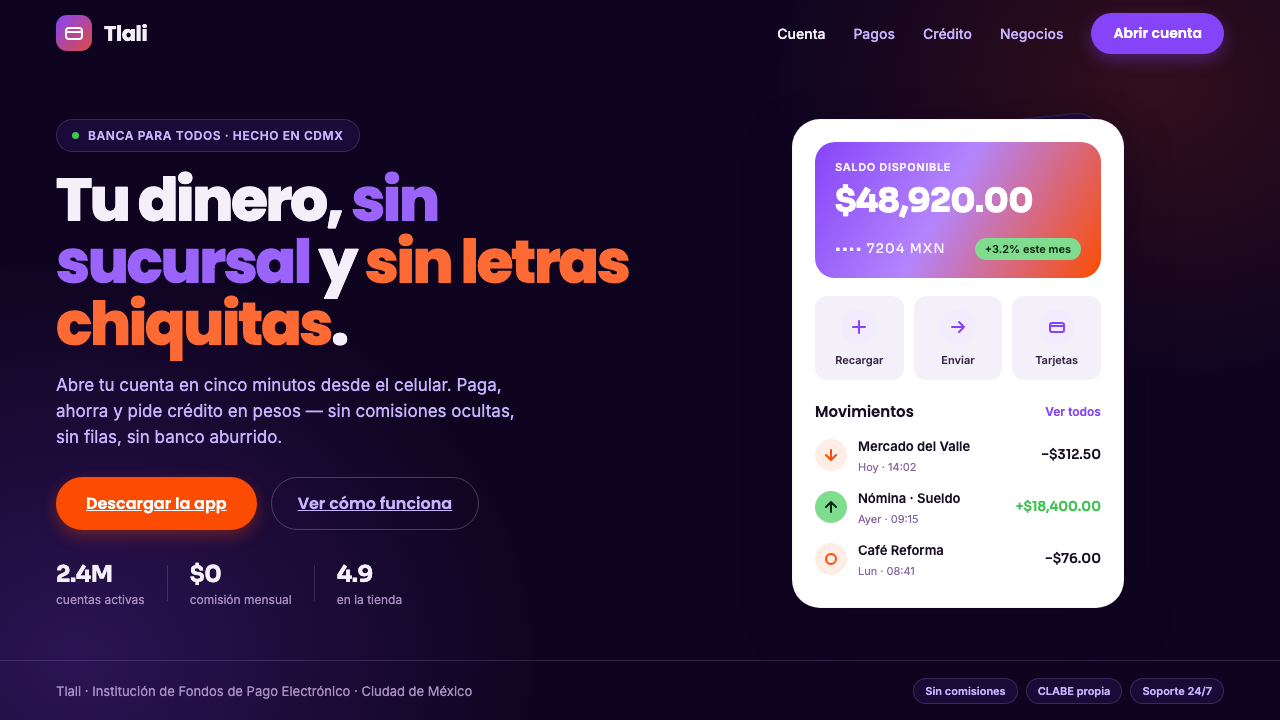 Mexican Fintech StartupNeobank, not legacy bank. White rounded cards float on near-black plum, lit b…
 CareemNo page without the green. Flat green planes cropped by the edge, Arabic and…
 Duolingo Green Owl MascotFriendly guilt goes loud. Saturated green, Nunito heft, and press-shadow butt…
 Gojek SuperappCity speed, ordered. Electric green tile grid turns rides, food, and pay into…