What is Moser Glass?
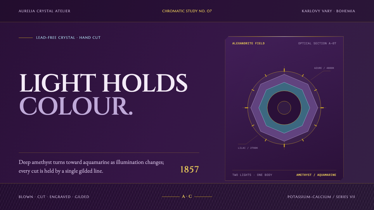
Moser glass is built on colour that changes with the light, with saturated transparent amethyst, faceted surfaces and gilded hairlines where the planes meet.
Moser Glass in brief
Moser is a Bohemian glassmaker that has blown, cut and engraved crystal in Karlovy Vary since 1857. As a visual style, Moser glass stands for imperial-court luxury expressed through material: deep transparent colour, sharp facets, engraved motifs sunk into the wall of the glass, and fine gilded edges. It is the look of a rich object that earns its weight through craft rather than through excess ornament.
The house is best known for its colours. Its range includes alexandrite, beryl, topaz, rosalin, aquamarine, eldor, oceanite and smoke, each a saturated, transparent tone that behaves like a gemstone. Alexandrite is the most celebrated, because it is dichroic: it looks like a soft lilac under one light and a bright azure under another. The shifting hue is the house's signature, a colour that seems alive.
The visual system drawn from Moser follows the logic of cut glass. A saturated transparent ground replaces a flat background, panels read as facets, gilded hairlines sit where facets meet, and the primary colour can shift toward azure when it is touched, as if the light had changed. The result is a dark, jewel-like design with historical weight, suitable for anything that wants prestige without sliding into generic gold-covered display.

Where does Moser Glass come from?
Karlovy Vary lies in Bohemia, in what is now the Czech Republic, and Bohemia has long been one of Europe's great glassmaking regions. The town is a spa, and spa towns have long drawn travellers of means, so the glass made there found a ready audience among visitors who wanted objects worthy of their status. When Moser began operating in 1857, it was entering a tradition with deep technical roots and a customer base used to fine things.
The firm was founded by Ludwig Moser, and under his name it grew into the supplier of choice for rulers. The reference record names the Austrian emperor Franz Joseph I, King Edward VII of Britain and Mozaffar ad-Din Shah of Persia among the figures connected with the house, and Ottoman sultans also appear among its customers. The pattern is clear: first the Austrian imperial court, then, in the words of the record, half the courts of Europe and the Near East. This royal clientele is the origin of the style's atmosphere of ceremony and historical weight.
The material is as important as the clientele. Moser works in lead-free potassium-calcium crystal, which is harder than lead glass. That hardness allows deeper cutting, so the oak leaves and stags for which the house is known are sunk into the wall of the glass rather than scratched onto its surface. The technique is known as deep intaglio engraving, and its effect is of a design that has been carved into the object. Gold is then applied to the edges, so a finished piece combines the depth of engraving with the thin brightness of gilding.
Alongside engraving, colour became the house's defining achievement, and it is the aspect that most directly shapes the visual system. The saturated transparent tones are an invention of the glasshouse rather than a decorative finish, and alexandrite's change from lilac to azure is a property of the glass itself, not a surface effect. The reference record places the tradition within Bohemian crystal and Austro-Hungarian court glass, and it carries the era of the court through to the house colours of today. A design inspired by Moser therefore inherits a tradition that is still in production, with a living palette.
What defines the Moser Glass look?
Transparent Amethyst Ground
The background is a deep, saturated and translucent purple, like light passing through thick crystal. It is not a flat dark fill but a coloured medium, with a sense of depth and slight glow, as though the content sits inside the glass. This ground carries the main mood of the style, rich, historic and quietly dramatic.
Faceted Panels
Cards and containers behave like cut facets, with crisp edges and slightly different tones from their neighbours. Rather than floating on soft shadows, they sit next to each other like planes of a cut stone, and the difference between adjacent surfaces suggests light catching an angle. The layout feels carved, not assembled from rounded blobs.
Gilded Hairlines
Where facets meet, a fine line of gold marks the edge. These gilded hairlines are thin, bright and precise, never thick or decorative in themselves. They echo the gold applied to the edges of the glass and give the layout a delicate framework, defining structure without adding bulk. Gold is a line, not a fill.
Colour That Shifts
The primary colour behaves like alexandrite. At rest it reads as a soft lilac or purple, and when the user touches or hovers it leans toward bright azure, as if the light source had changed. The shift is smooth and meaningful, and it makes interaction feel like turning a glass in the hand rather than flipping a switch.
Gemstone House Colours
Beyond alexandrite the palette draws on the house's colours: beryl, topaz, rosalin, aquamarine, eldor, oceanite and smoke. Each is a saturated, transparent tone, used one at a time for contrast, emphasis or category. They should feel like glass in different shades rather than paint, and they work best in small, deliberate doses against the deep ground.
Deep Intaglio Motifs
Ornament, where it appears, is sunk into the surface rather than raised from it. Oak leaves, stags and hunting scenes belong to the engraving tradition, and their effect is of carved depth, with edges that catch light inside the glass. In design terms, this means preferring inset, recessed treatments over raised, embossed ones, and using ornament sparingly.
Imperial Restraint
Although the style speaks of luxury, it avoids the gaudy. Weight comes from material, depth and craft, not from heaps of gold or crowded ornament. Typography is refined and measured, spacing is generous, and each element earns its place. It is the luxury of a court that already knows its own standing and does not need to shout.

Who shaped Moser Glass?
Ludwig Moser founded the glassworks in Karlovy Vary in 1857 and gave the house its name. His firm blew, cut and engraved crystal, and under his direction it grew from a local workshop into a supplier to ruling courts. His name stands for the combination of technical ambition and aesthetic discipline that still defines the brand, and for the idea that a craft business can become a symbol of prestige.
Franz Joseph I, the Austrian emperor, represents the imperial court that first supplied Moser with its prestige. The reference record places Austro-Hungarian court glass at the heart of the tradition, and the emperor stands for the ceremonial setting in which the glass was meant to be seen. For designers, he evokes the formal, high-status atmosphere that the style carries with it.
Edward VII, King of the United Kingdom, is named in the record as one of the foreign rulers connected with the house. His presence shows how the firm's reach extended beyond the Austrian court to the royal tables of western Europe. He stands for the international side of the brand, where Bohemian craft was valued as a mark of taste far beyond its home region.
Mozaffar ad-Din Shah, the Persian ruler, represents the Near Eastern courts that formed part of Moser's clientele. The glass produced for such patrons shows the house's colour range at its most gem-like, and his name signals that the tradition was shaped by a conversation between Bohemian craftsmen and tastes far from Bohemia. He is a reminder that the style's richness had an international source.
How do you use Moser Glass today?
The Moser style is made for designs that want prestige, history and visual richness without cliché. Its structure is simple: a deep translucent ground, facet-like panels, gilded hairlines and a primary colour that changes with interaction. It suits brands whose products are objects of craft or ceremony, and it asks designers to think of every surface as glass, with depth and light.
For presentation slides, a cover can use the deep amethyst ground with a faceted panel carrying the title in a refined light-toned serif, and a single gold hairline dividing the panel from the background. Content slides place text on facet-like cards, separated by thin gold lines. Data slides work well on the dark ground, using gem colours for the series so that charts look like cut stones, with the focus series shifting to azure to draw the eye.
For web interfaces, the style fits luxury goods, jewellery, spirits, hospitality, fine dining, galleries and premium subscriptions. Use faceted cards with sharp corners instead of soft rounded ones, thin gold lines as dividers and focus borders, and a hover transition in which the primary colour moves from purple toward azure. Keep gold to hairlines and small details, ensure text has strong contrast against the deep ground, and use the other house colours sparingly as category markers or badges.
For editorial and marketing work, the style supports heritage storytelling, craft features, invitations, gala events and brand histories. A dark page with a refined serif typeface, a small engraved-style motif and photography of glass or candlelit tables creates an atmosphere of occasion. Copy should be measured and confident, with restraint in its claims, because the style's authority comes from composure rather than from loud promises.
A common mistake is to treat the style as an excuse for gold gradients, which turns refined luxury into kitsch. Another is to use a flat purple without any sense of translucency or depth, which loses the glass quality entirely. Shifting hue too often or too far, putting too many gem colours on screen at once, or placing low-contrast text on the saturated ground all undermine the style. The colour change should feel like a change of light, and it should happen only where it means something.

Moser Glass — FAQ
What makes alexandrite glass change colour?
Alexandrite glass is dichroic, which means it shows different colours under different light. It looks like a soft lilac under one light source and a bright azure under another. The effect belongs to the glass itself rather than to a surface coating. In the design system the idea is translated into a primary colour that moves from purple toward azure when it is touched, as if the light had changed.
Why does lead-free crystal matter for the look?
Moser uses lead-free potassium-calcium crystal, which is harder than lead glass and can therefore be cut and engraved more deeply. That is why its oak leaves and stags look sunk into the wall of the glass rather than scratched onto the surface. In design terms, the lesson is to prefer inset, carved effects with real depth over thin decorative overlays.
Is this just a luxury gold style?
No. Gold appears in the style only as fine hairlines where facets meet, echoing the gilded edges of the glass. The real source of richness is colour and depth: saturated, transparent tones and surfaces that look cut. Filling large areas with gold, or using gold gradients, moves the design away from Moser and toward a more generic idea of luxury.
Can the style work in a light theme?
It is built as a dark design, because the deep transparent ground is what gives it the sense of looking into glass. A light variant is possible, using a pale, clear ground with the gem colours as accents and the gold hairlines retained, but it will feel lighter and less dramatic. For the most faithful result, keep the saturated dark ground and treat light as something that moves across it.
What are Moser's house colours?
The reference record lists alexandrite, beryl, topaz, rosalin, aquamarine, eldor, oceanite and smoke. Alexandrite is the dichroic lilac-to-azure tone, rosalin is a rose pink, aquamarine a sea blue, and smoke a soft grey-brown, while beryl, topaz and eldor lean toward green and golden shades. Treat them as a family of transparent gem tones, and use one at a time rather than all together.
Related design styles
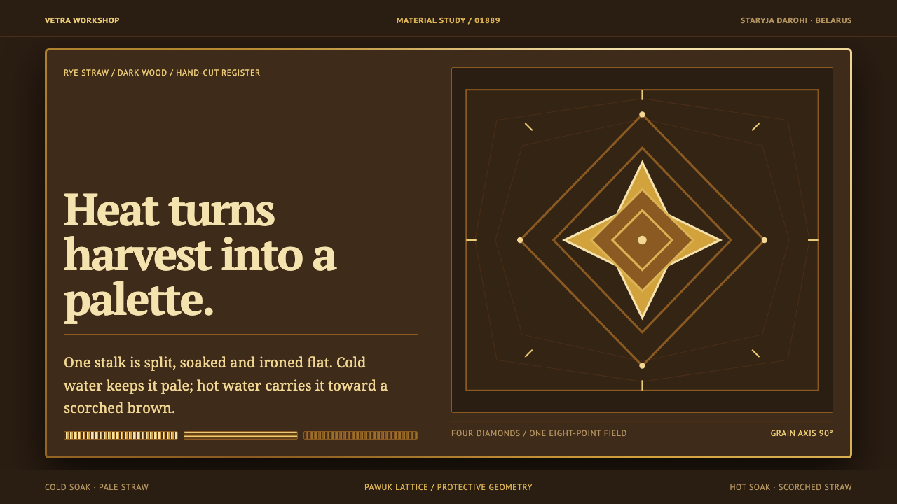 Belarusian SolomkaOne harvest, a tonal ladder. Straw diamonds turn pale gold to scorched brown…
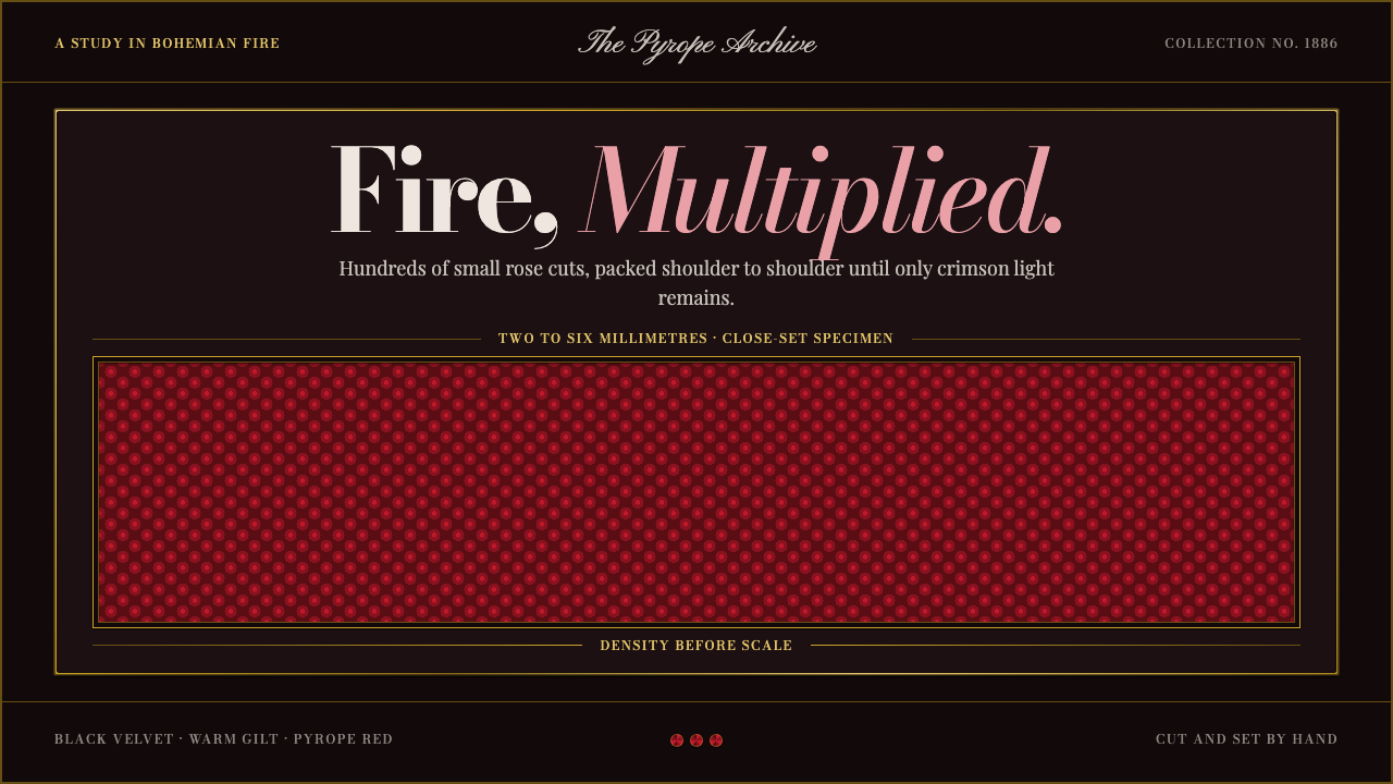 Bohemian GarnetFire thrives in density. Tiny pyrope facets pack tight against black velvet a…
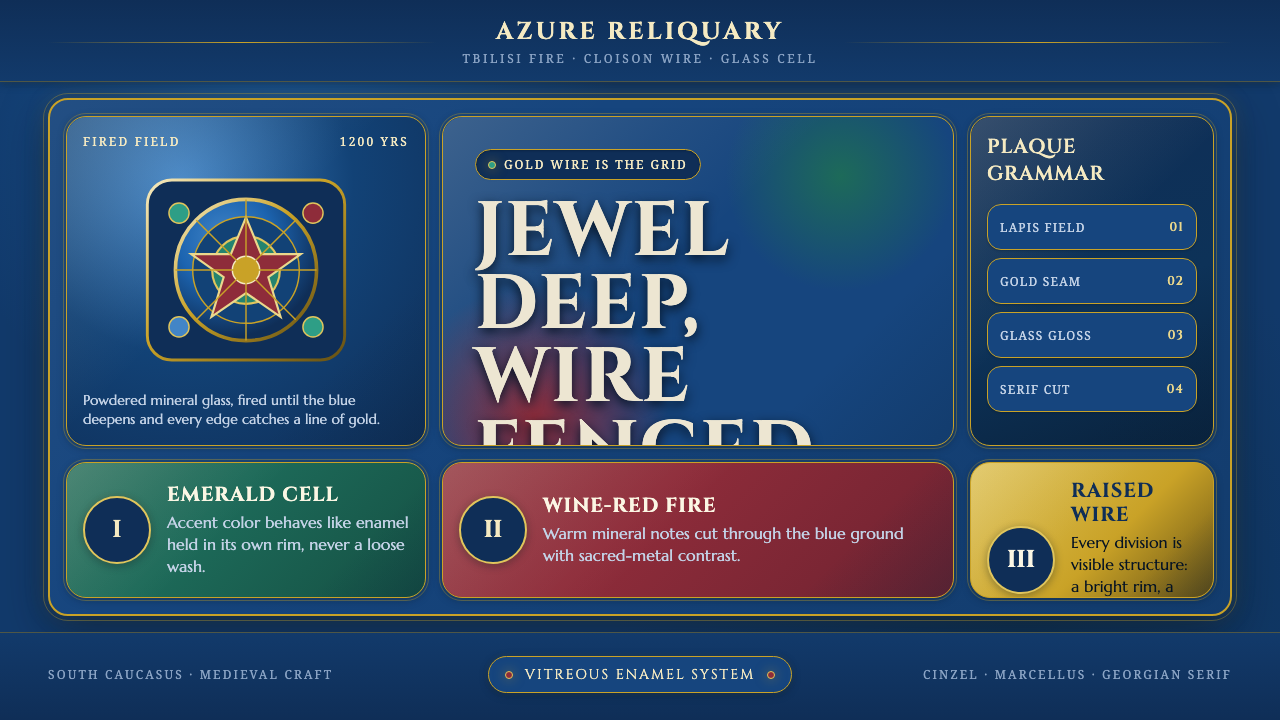 Georgian Minankari CloisonnéJewel-deep and wire-fenced. Lapis enamel, gold seams, emerald cells, glossy s…
 Kosovar Prizren Filigree SilverAir becomes ornament. Burgundy velvet and stone grey frame Cinzel type with c…
 Albanian Bektashi Sufi (Tekke)Sacred quiet in cypress green. Gilt stars and Cormorant type frame a dusk tek…
 Belarusian Slutsk SashCourtly silk, vitrined. Taupe ground, crimson panels, Cinzel type, antique go…