What is Monsters, Inc.?
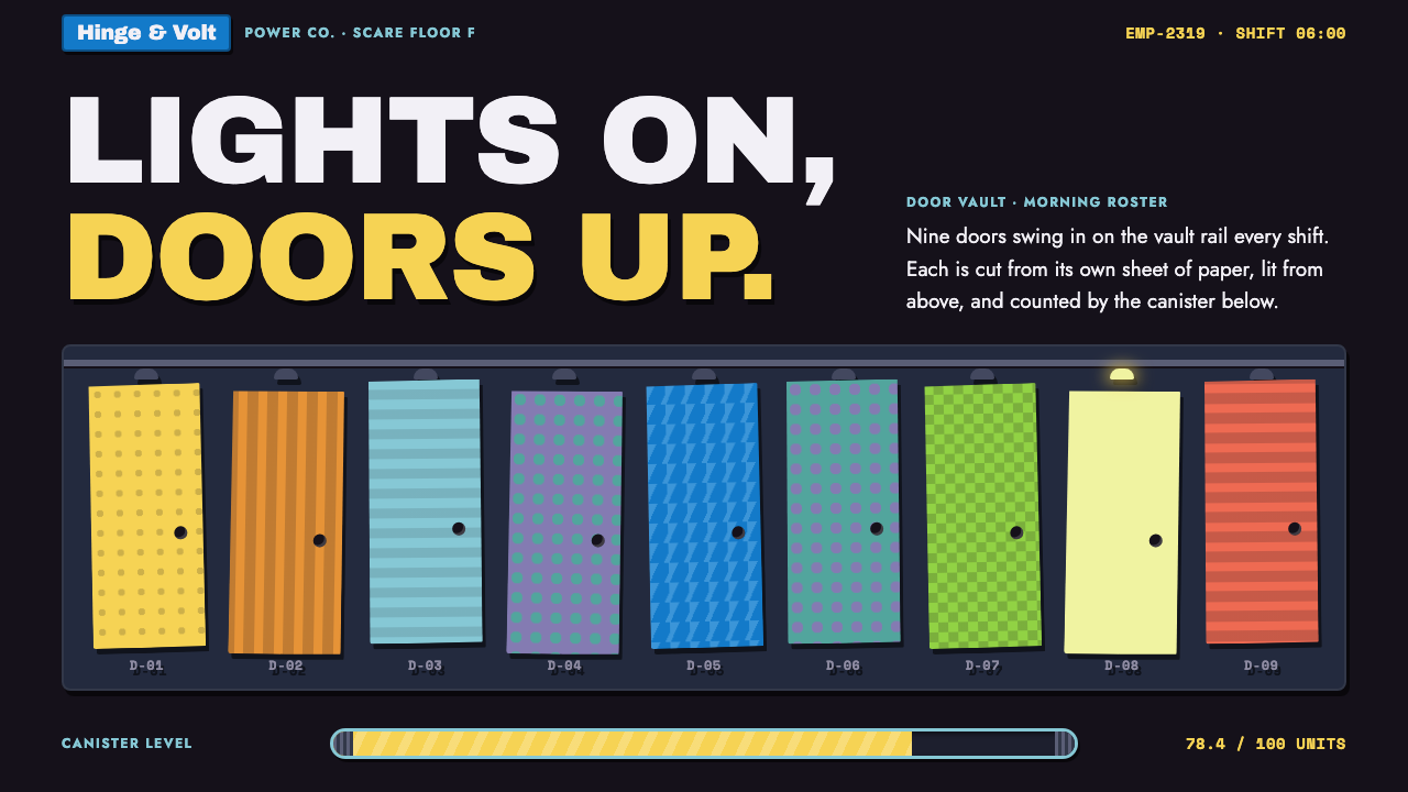
Monsters, Inc. as a design style is a stage of black construction paper where hand-cut paper doors bounce, flip and slide, every one of them a different colour, and every one hiding a small story.
Monsters, Inc. in brief
The Monsters, Inc. style is a visual language drawn from the opening titles of Pixar's 2001 film of the same name. Those titles were designed by Geefwee Boedoe as a sequence of hand-cut, coloured-paper doors that hop, spin and shuffle across a field of black construction paper, accompanied by Randy Newman's brassy jazz score. The look borrows the crisp, playful economy of Saul Bass-style title design and combines it with the tactile warmth of paper craft.
In practice the style is built on a few strong decisions. The ground is black, like a sheet of matte card. Panels sit on it in a slate blue-grey that recalls the film's vast door vault. Every card behaves like a door: it has its own colour, its own pattern, a small knob and a tiny light above the frame. The result is a layout in which repetition does not feel monotonous, because each repeated unit is individualised the way doors in a warehouse of doors would be.
Colour follows the film's cast. A bright logotype blue carries the main actions, a furry teal and a spotted purple handle secondary surfaces, and a fresh lime green marks progress. Scream canisters, the film's power source, become progress meters that slowly fill. Shadows are hard and offset, as if one sheet of paper had been laid over another, and the finish is matte throughout. It suits products that want to feel lively and a little narrative without becoming childish.

Where does Monsters, Inc. come from?
The style has two roots: a film and a title sequence. Monsters, Inc. was produced at Pixar in Emeryville, California between 1996 and 2001 and released in November 2001. Pete Docter led the project, Harley Jessup worked on the production design that gave the monster city its industrial-corporate character, and Bob Pauley contributed to the characters. The story is set in a company whose business is turning children's screams into energy, which is why the world looks like a mid-century factory: signage, uniforms and machinery all have the confidence of a well-run industrial firm.
The company-signage side of the film is worth noting, because it explains why the style never feels like a children's book. Industrial corporate graphics of the mid-twentieth century, with their bold simplified shapes and clear hierarchy, sit under every poster and sign in the film. That attitude, serious and tidy and slightly absurd, is what makes the comedy work, and the design system preserves it in its clean panels and legible labels.
The title sequence is the other root. Geefwee Boedoe built it from cut paper, a technique associated with Saul Bass's film titles of the 1950s and 1960s, where simple flat shapes were animated with great wit. In Boedoe's version the shapes are doors, since doors are the film's central device: portals between a child's bedroom and the monster world. They tumble in a rhythm that follows the score, so music and image feel like one gesture.
Two influences from the source movements therefore meet: Saul Bass-style cut-paper title design and mid-century modern graphics. Cut paper contributes the flat colour, hard edges and offset shadow. Mid-century graphics contribute the confident, simplified geometry and the corporate seriousness. Together they explain why a style from a computer-animated film looks hand-made: the opening titles deliberately stepped away from three-dimensional rendering and returned to the table and the scissors.
What defines the Monsters, Inc. look?
Ground and panels
The page is a sheet of black paper, and the panels laid over it are a muted slate blue-grey, the colour of the film's door vault. The contrast is strong but not harsh, because the slate is matte and slightly cool. Content sits on panels, never directly on the black, so the black reads as stage rather than as background fill.
Doors as cards
Each card is a door. It has its own colour and pattern, a small round knob, and a little light above its frame. Because the doors differ from one another, a grid of them feels like a catalogue of individual things rather than a row of identical rectangles. The motif is the signature of the style and should appear wherever a collection of items is shown.
Colour roles
Colour is assigned by character. Logotype blue drives primary action. A fur-like teal and a spotted purple take secondary surfaces. A lime green marks progress and success. The colours are saturated but flat, with no gradients, so each one reads like a separately cut sheet of coloured paper.
Hard offset shadows
Shadows are solid shapes shifted to one side, the way a sheet of paper casts a crisp shadow on the sheet beneath it. There is no blur and no glow. This gives every element a physical thickness and keeps the layered, paper-craft feel intact even on a screen.
Scream canisters as meters
Progress is shown by a canister that fills, taken straight from the film's power source. A meter that fills slowly feels more like an event than a thin bar, and it carries the world's logic into the interface. It works for loading, quotas, goals or any measure of accumulation.
Type and tone
Lettering is bold, friendly and clearly legible, closer to company signage than to storybook calligraphy. Headings have the stout confidence of a sign over a factory door, while body text stays plain. The overall voice is cheerful and orderly, with jokes carried by the imagery rather than by decorative type.

Who shaped Monsters, Inc.?
Boedoe designed the film's opening titles, the cut-paper sequence of bouncing doors on black construction paper that this style is built on. The sequence follows the tradition of mid-century title design while giving it a new subject, and it remains the most direct source for the layering, offset shadows and flat colour in the design system.
Docter led the production of Monsters, Inc. at Pixar. His film established the premise of a monster city powered by children's screams, and with it the confident, industrial-corporate world that the design system borrows its signage and tone from.
Jessup is credited in the source material among the key figures behind the film's world. His production design gave Monstropolis its look of a functioning industrial company, with the door vault as its most memorable space, which is the origin of the slate panel colour and the door motif.
Pauley is listed among the key figures of the production and worked on the film's characters. The distinct personalities of its leading monsters are what give the colour roles in the design system their meaning: teal fur, purple spots and a lime-green companion each have a face behind them.
How do you use Monsters, Inc. today?
In slides, the Monsters, Inc. style works best for decks that want warmth and a story: product launches with a human angle, team updates, children's education, game or entertainment pitches. Use the black ground as the master background, set content on slate panels, and give the cover a single large door with a knob and a light. For content slides, a row of three or four doors makes a natural way to present options, chapters or customers, each one a different colour.
On the web, the doors-as-cards idea suits product catalogues, template galleries, onboarding checklists and dashboards for lightweight tools. A pricing page can show each plan as a door in its own colour, with the recommended plan's light switched on above the frame. Progress, quotas and goal tracking are the obvious home for the filling canister. For data slides, stay with the flat colour roles: one colour per series, using blue as the highlight, and keep every chart on a panel so the black remains a frame.
For editorial and marketing work, the style gives you a recognisable, slightly theatrical identity. It is good for launch pages, event sites, newsletters with a playful voice and social graphics where the cut-paper character carries the brand. Pair it with short, punchy copy; the style already supplies charm, so the words can be plain and confident.
It also suits apps that deal in collections or small rewards, such as habit trackers, learning tools or reading lists, because every item can have its own door, colour and little light that switches on when the task is done. The paper-craft feel makes small interactions feel handmade rather than automated.
The most common mistake is to treat the style as a pile of cartoon decorations. The look depends on discipline: a black ground, matte slate panels, flat colour, hard offset shadows and a consistent door motif. Adding gradients, glossy highlights or soft glow instantly breaks the paper illusion. The second mistake is overusing colour. Give each door one colour and pattern, but let the surrounding text and panels stay calm, or the page will feel noisy instead of playful.

Monsters, Inc. — FAQ
What is the Monsters, Inc. design style?
It is a visual language taken from the opening titles of Pixar's 2001 film Monsters, Inc., designed by Geefwee Boedoe. Hand-cut paper doors in different colours move across black construction paper. As a design system it means a black ground, slate panels, flat saturated colour roles, hard offset shadows, door-shaped cards and canisters that fill as progress meters.
How is it related to Saul Bass?
The opening titles follow the cut-paper title tradition associated with Saul Bass, in which simple flat shapes are animated with wit and speed. The Monsters, Inc. style inherits the flat colour, crisp edges and playful economy of that tradition, but swaps abstract shapes for doors, the film's central object.
Is it only suitable for children's products?
No. The playfulness is real, but the underlying structure is a disciplined, mid-century corporate look: clear hierarchy, flat panels and legible labels. That is why it also works for launch pages, internal tools, dashboards and slides for adult audiences who simply want something warmer than a standard business template.
Why use black as the main background?
Because the original is a sheet of black construction paper. A black ground makes coloured paper shapes jump forward and gives the whole page a stage-like quality. The key is that content sits on matte slate panels, not on the black itself, which keeps text comfortable to read.
Which colours matter most?
Four roles matter. A bright logotype blue marks the main action, a furry teal and a spotted purple fill secondary surfaces, and a lime green marks progress. Keep each colour flat and assign it consistently, so the palette communicates meaning instead of just cheerfulness.
Related design styles
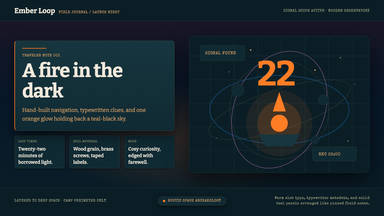 Outer WildsCosy cosmic melancholy. Campfire orange glows through typewritten teal field…
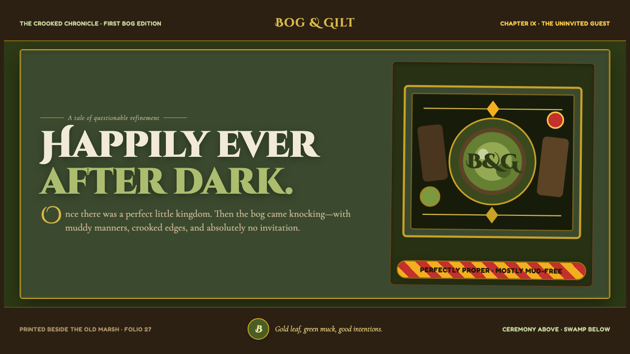 Shrek Swamp (2001)Fairy-tale ceremony gets muddy. Gilt frames collide with moss green and candy…
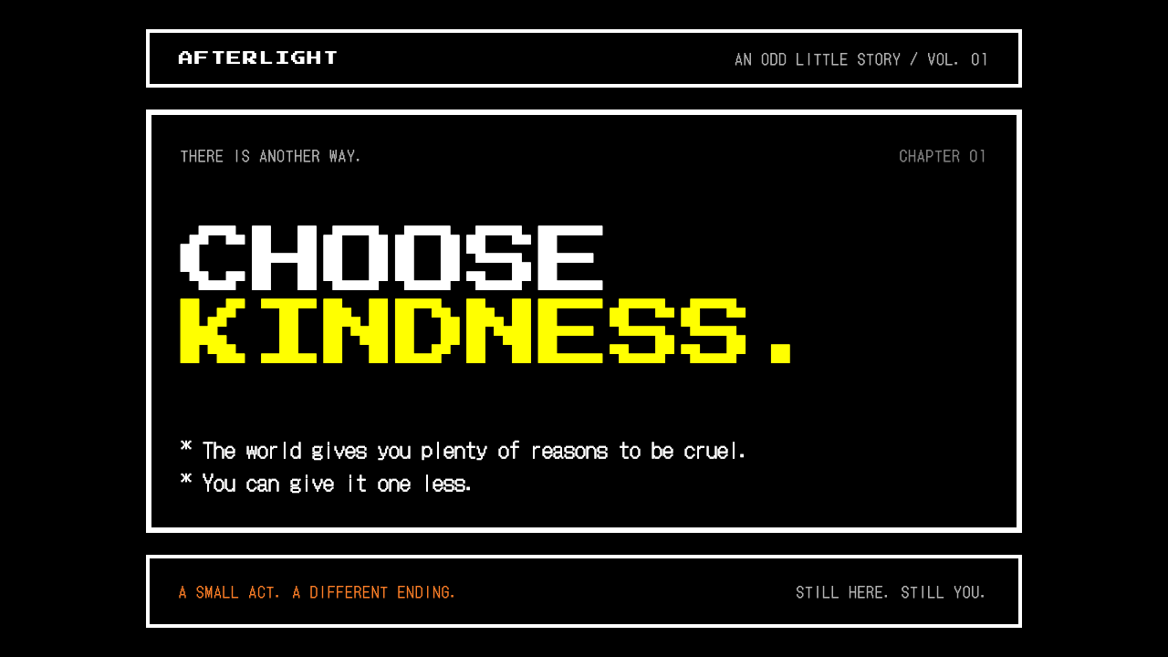 UndertaleKindness carries weight. Black screens, white pixel frames, and a yellow that…
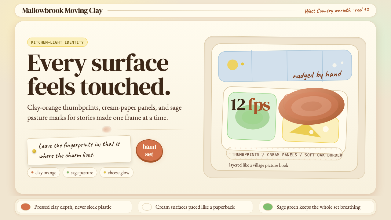 Aardman ClaymationHandmade warmth, visibly touched. Clay-orange panels, Caveat notes, thumbprin…
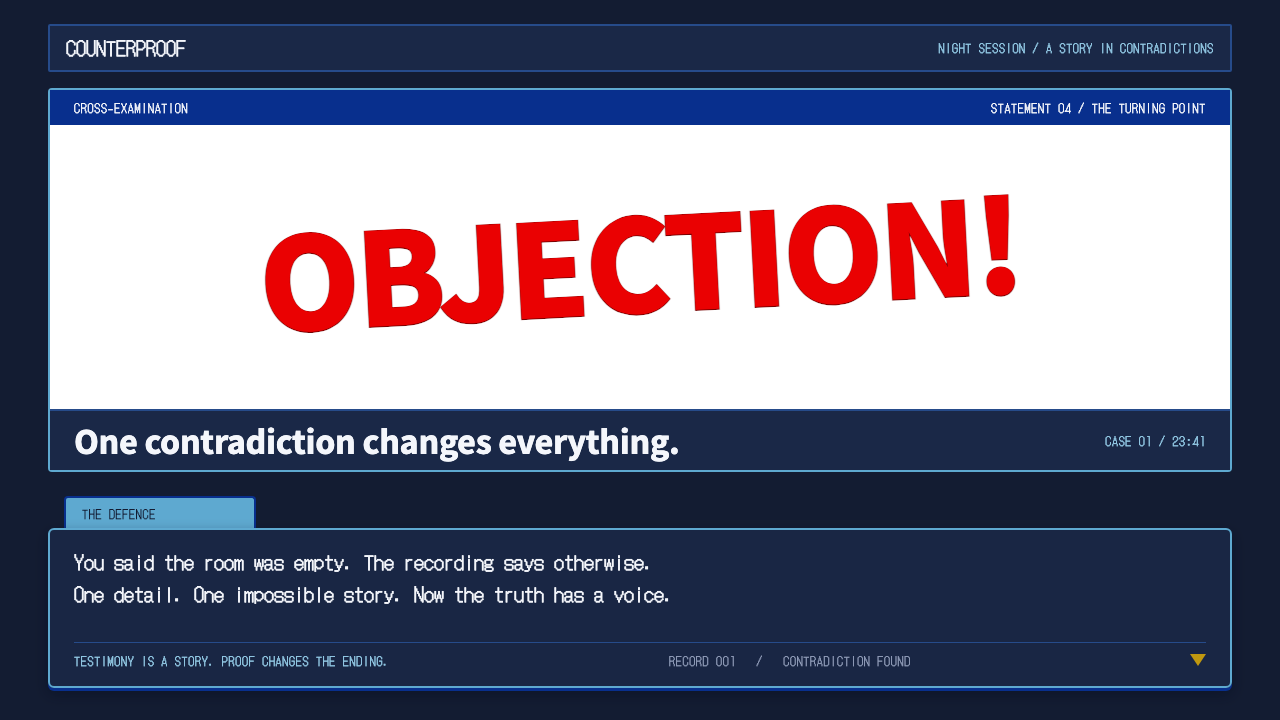 Ace AttorneyQuiet testimony. One red shout breaks the navy calm, with bitmap dialogue bel…
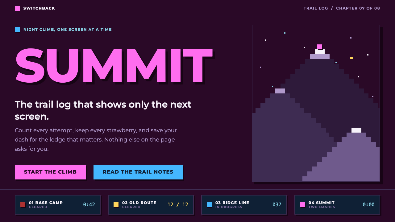 CelesteA quiet night climb. Plum sky, navy cards, one dash-pink signal, hard 8px off…