What is Monster Hunter?
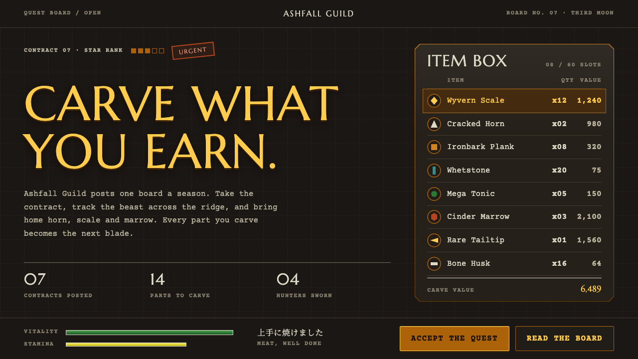
Monster Hunter's menu language is carved stone and aged bronze: dark panels, bone-white edges, gold quest titles and a green health bar over a yellow stamina bar.
Monster Hunter in brief
Monster Hunter is Capcom's hunting action game, and its 2004 debut on the PlayStation 2 defined the look of its menus. As a visual style, it means dark carved-stone and leather-brown backdrops, translucent olive-brown panels edged in thin bone-coloured lines, and weathered bronze frames around selected tabs and key actions. It feels like the interface of a guild hall, not a spaceship.
Colour is functional and sparing. Gold marks quest titles and rewards. A long green health bar sits above a shorter yellow stamina bar, and rust red is held back for damage and urgent quests. Titles use chiselled Roman capitals, while item lists, stats and counts use a monospaced face, so the page reads as a ledger kept by someone who takes inventory seriously.
The style works because every number points somewhere. Quantities, rarities and requirements all connect to the next thing you might craft, carve or hunt. It is a design language for dense, ritual-heavy information, and its sense of weight and material makes lists feel like objects worth collecting.

Where does Monster Hunter come from?
The source places the original release in 2004 on the PlayStation 2, in Japan in March and in North America in September. It came from Capcom in Osaka. Ryozo Tsujimoto and Kaname Fujioka are the two key figures listed in the material, and together they are associated with turning a new idea, hunting giant creatures with a small group of friends, into a franchise with its own identity.
Two technological facts shaped the design from the start. The source lists co-op online and ad-hoc multiplayer on the PlayStation 2 and the PSP as part of its context, which meant the interface had to serve groups preparing together: shared quest boards, party status and item exchange. The PSP Portable series that followed between 2005 and 2008 spread the game's style across a new audience and a handheld format where small, legible menus mattered even more.
The game loop is a crafting-and-loot loop, and the interface follows it. You accept a quest, hunt a monster, carve materials from it, bring them back, and turn them into better weapons and armour, which sends you out again. Menus therefore exist mainly to manage lists of materials, quantities and requirements. That is why monospaced figures and ledger-like layouts feel natural here, and why the style carries so many tables and counters.
The third influence named in the source is the tradition of naturalist field guides and bestiaries, books that catalogue creatures with careful names, habitats and notes. This is the source of the style's scholarly, slightly ceremonial tone. Carved capitals, bone-coloured rules and bronze frames all suggest an old reference book or guild archive, one where a hunter looks up the creature before facing it. That blend of practical interface and old-world field guide is what makes the look distinctive.
What defines the Monster Hunter look?
Carved-stone backdrop
The base surfaces are dark stone and leather-brown, with a subtle weathered texture. They set a heavy, grounded mood and give lighter elements something to stand against. Nothing is glossy or glassy; surfaces look worked by hand and aged by use.
Translucent olive-brown panels
Information sits in translucent olive-brown panels outlined with thin bone-coloured lines. The slight transparency lets the dark backdrop show through, so panels feel layered on the environment rather than floating above it. The thin outline keeps edges crisp without adding weight.
Bronze frames
Selected tabs and key actions are wrapped in weathered bronze frames. The metal reads as old and worn rather than polished, which suits the guild setting. It acts as the system's selection language: whatever has the bronze frame is where you are, or what you are about to do.
Gold for value
Gold is reserved for quest titles and rewards, the things worth reading and wanting. Because it is used only there, it works as an instant cue for importance. Overusing it would weaken that signal and flatten the hierarchy.
Stacked status bars
A long green health bar sits above a shorter yellow stamina bar, and the difference in length encodes how much of each resource matters. Rust red appears only for damage and urgent quests. The restraint keeps colour tied to meaning, so any change draws the eye.
Chiselled caps, ledger numerals
Titles are set in Marcellus SC, a chiselled Roman small-capital face that looks cut into stone. Item lists, stats and counts use Courier Prime, a monospaced face that aligns columns neatly, and Japanese text uses Noto Serif JP. The pairing feels like an inscription and a ledger on the same page.

Who shaped Monster Hunter?
A key figure listed in the source for the original game at Capcom. His name is associated with building the franchise around co-operative hunting and a crafting-and-loot loop, the structure that the interface was designed to support.
The other key figure named in the material for the 2004 release. Together with Ryozo Tsujimoto, he is tied to the original design of the game and, through it, to the menu language that grew out of its quests, items and equipment.
The Osaka-based developer and publisher behind the series, which released the first game on the PlayStation 2 in 2004 and followed with the PSP Portable series from 2005 to 2008. Its menus became the reference point for the style described here.
How do you use Monster Hunter today?
In slide decks, the style suits game-industry talks, fantasy and tabletop-adjacent themes, strategy briefings and any presentation that treats information as a collection to be managed. A cover slide can be a dark stone ground with a gold title in carved capitals and a bronze-framed call to action. Content slides use translucent panels with bone-coloured edges, stacked like pages from a guild archive.
For data slides, treat the numbers as inventory. A ledger-style table in monospaced type, with a gold column for the item that matters, communicates more than a chart does. Where a chart is required, use the stacked-bar logic: a long green bar for the main quantity, a shorter yellow bar for the secondary one, and rust red only for loss or urgency.
In web and product UI, the language fits quest boards, crafting and upgrade trees, bestiary or encyclopedia pages, inventory managers and community hubs for games. Use bronze frames for selected tabs and primary actions, translucent panels for content, and monospaced figures for stats. Because the style is dense, give lists enough row spacing that the ledger feel does not become cramped.
In editorial and marketing work, the look gives a project a sense of ritual and craft. It works for launch pages, wikis, event announcements and fan-facing sites where players expect the weight of the original menus. Pair it with copy that is concrete and specific, naming materials, thresholds and rewards, as the original does.
The most common mistake is colour overload. If everything is gold, nothing is valuable; if every bar is a different bright hue, the status language falls apart. Another mistake is adding glossy gradients or bright glassy effects, which contradict the stone-and-bronze materiality. Keep surfaces dark and matte, and let gold, green, yellow and rust red each keep their single job.

Monster Hunter — FAQ
Which game is this style based on?
It is based on the menus of Capcom's Monster Hunter, first released in 2004 on the PlayStation 2, in Japan in March and in North America in September. The PSP Portable series that followed between 2005 and 2008 carried the same menu character to a new audience.
Why is gold used so rarely?
Because gold marks quest titles and rewards, the items of highest value. If it is spread across the interface, the signal is lost. Keeping it scarce lets users find what matters at a glance and keeps the rest of the hierarchy readable.
What fonts does the style use?
Titles use Marcellus SC, a chiselled Roman small-capital face. Item lists, stats and counts use Courier Prime, a monospaced face. Japanese text uses Noto Serif JP. Together they give the interface an inscription-plus-ledger character.
Is it a dark or a light theme?
It is a dark theme. The base is carved stone and leather-brown, with translucent olive-brown panels on top, bone-coloured outlines and bronze and gold accents. Lighter colours are used sparingly for meaning, not for large surfaces.
What kinds of interfaces suit this look?
It is a strong fit for quest boards, crafting and upgrade screens, bestiaries, inventory tools and game community sites, anything built around lists of materials, quantities and requirements. It is less suitable for light, airy consumer products, where the heavy, ceremonial mood would feel out of place.
Related design styles
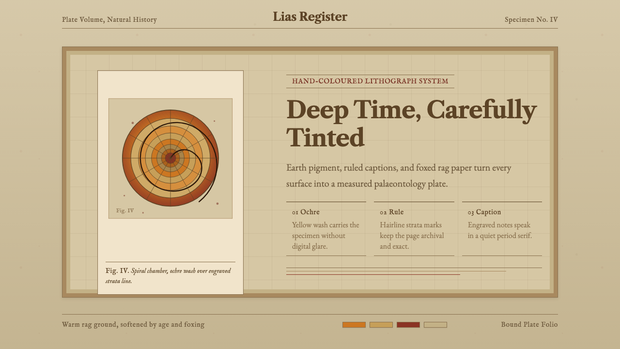 Ammonite Fossil PlateDeep time feels hand-tinted. Ochre spiral, foxed paper, and engraved captions…
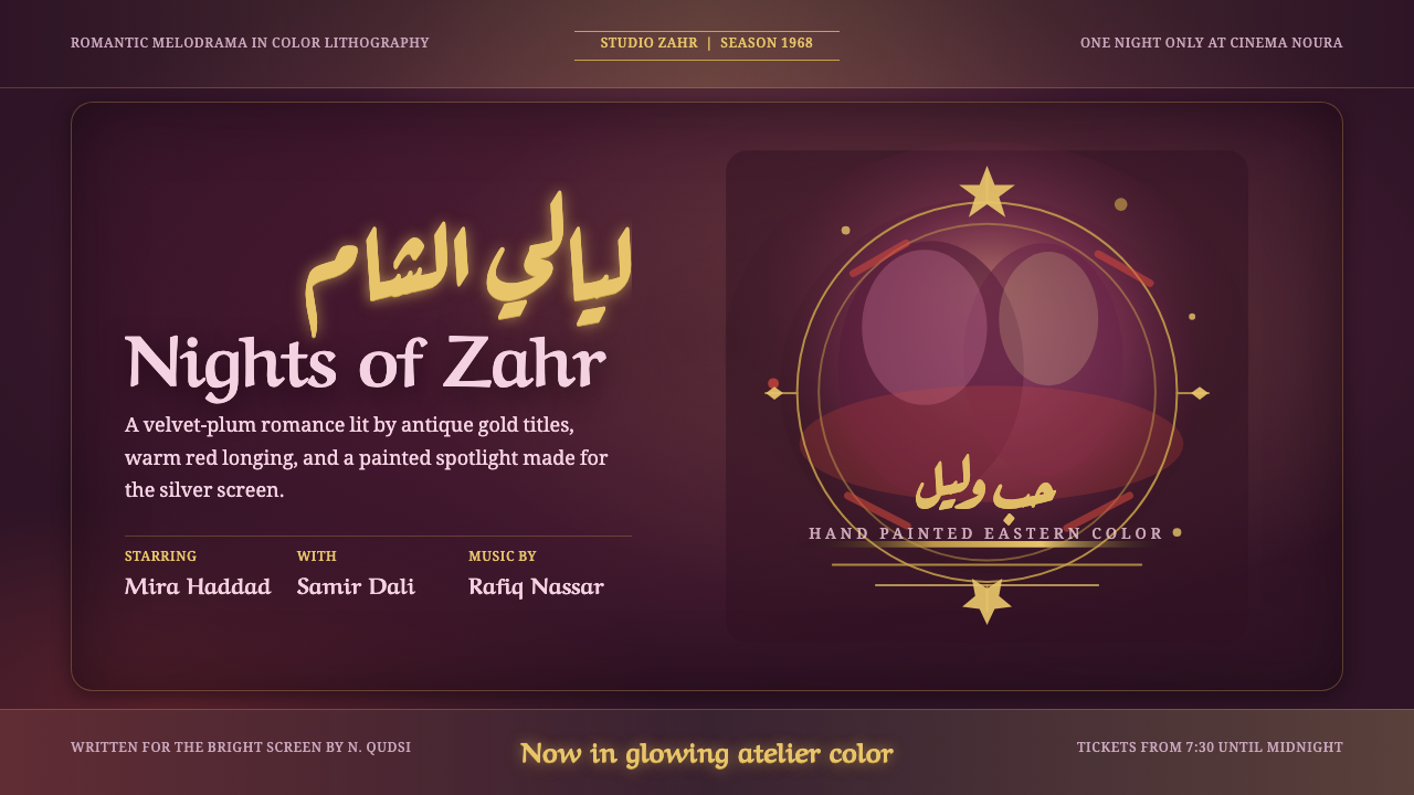 Damascus Cinema PosterGlows like hand-painted cinema. Plum ground, gold Ruqaa title, red spotlight…
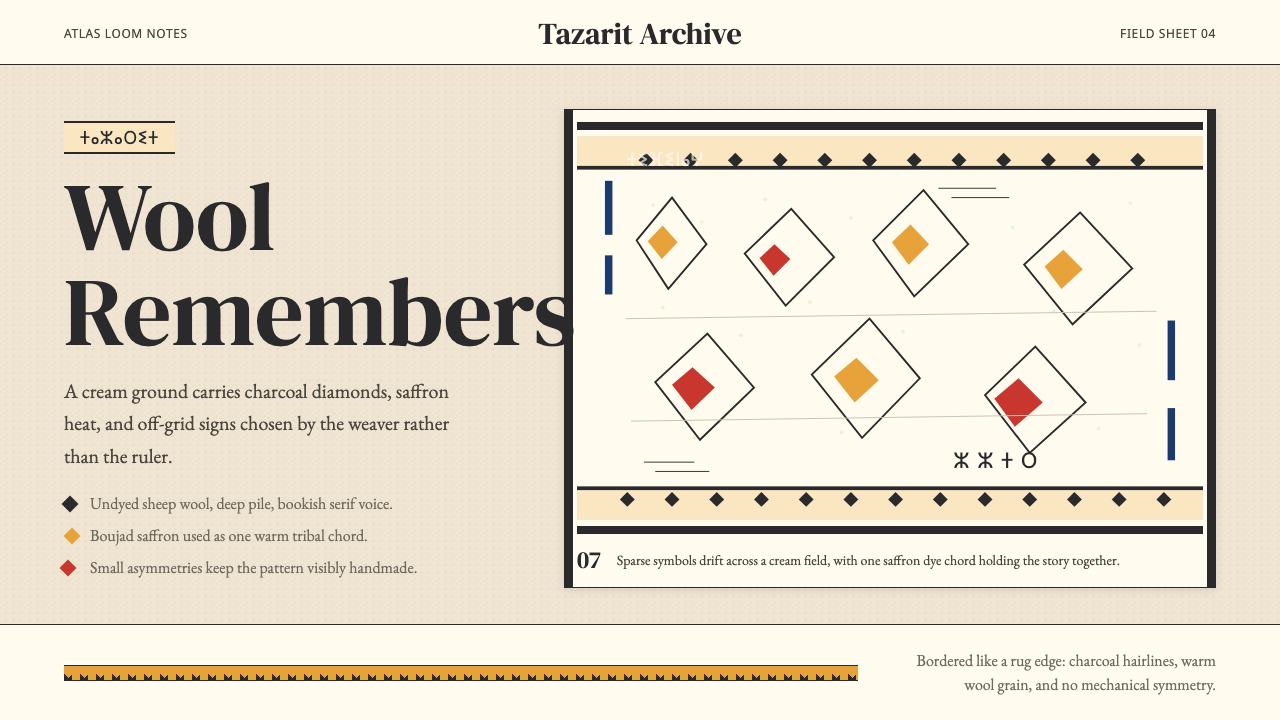 Moroccan Amazigh Berber RugAutobiography in wool. Cream ground, charcoal diamonds, saffron bands drift o…
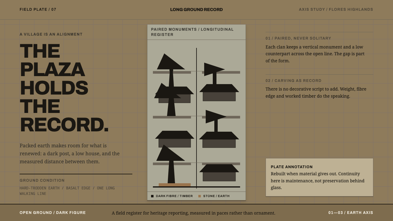 Ngada Ancestor PostsThe plaza is the record. Ijuk-black pairs stand on packed earth along one mea…
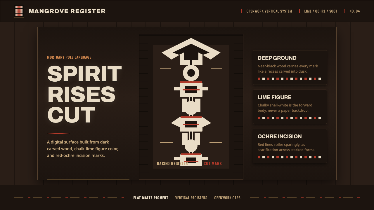 Asmat Bisj Ancestor PoleCeremonial vertical force. Lime-white figures rise from dark wood with red-oc…
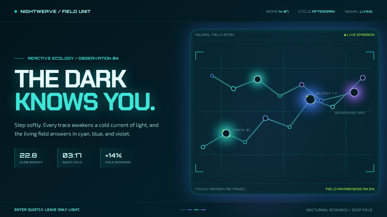 Avatar — Pandora Bioluminescence (2009)The forest knows you are there. Cyan light blooms across a deep-teal living f…