What is Moldovan Vineyard Modernist?
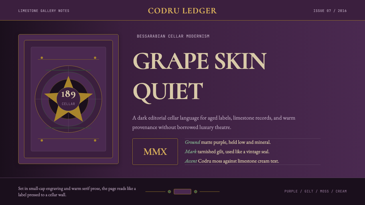
Moldova's limestone wine cellars and the post-Soviet rebirth of its vineyards gave rise to a design language that pairs deep grape-skin darkness with antique gilt restraint — a visual world where old-world terroir and modernist editorial discipline meet underground.
Moldovan Vineyard Modernist in brief
Moldovan Vineyard Modernist is a design aesthetic rooted in the premium wine culture of the Republic of Moldova — a small, landlocked country in Eastern Europe with one of the highest per-capita vineyard densities in the world. The style draws from the visual identity of Moldova's celebrated underground cellars and the ambitious rebranding efforts that emerged from the country's wine estates in the 2010s, particularly from Purcari, one of the oldest and most internationally recognized Moldovan wineries.
The visual language is defined by darkness relieved by warmth: a ground of deep grape-skin purple, almost black at its richest, serves as the dominant field. Against this, antique gilt ornament — vintage seals, vine-cartouche borders, small heraldic flourishes — appears tarnished rather than bright, suggesting centuries of cellar aging rather than freshly stamped gold. The typographic voice draws from classical display serifs with strong contrast between thick and thin strokes, referencing nineteenth-century label-making traditions while the underlying page structure stays firmly in the Swiss-editorial modernist camp.
What makes this style distinctive is the tension it holds between two worlds. The ornamental details carry the romance and weight of Bessarabian winemaking history — Roman viticulture on these lands reaches back to the first century BCE — while the grid, the typographic hierarchy, and the restrained deployment of color all speak the language of contemporary premium branding. The result is not pastiche but integration: a palette that feels genuinely aged, operating within a structure that is genuinely modern.

Where does Moldovan Vineyard Modernist come from?
Moldova's viticultural identity is ancient. Grape cultivation in the region stretching between the Prut and Dniester rivers — historical Bessarabia — predates Roman settlement, though it was under Roman administration in the first and second centuries CE that wine production was systematized and documented. The Codru forest region at the heart of what is now Moldova gave its name to one of the country's principal wine-growing zones, and the terroir of heavy clay-limestone soils and continental climate produced grape varieties, including Negru de Purcari — a blend of Cabernet Sauvignon, Rara Neagră, and Saperavi — that had no direct equivalent elsewhere.
The Soviet era transformed Moldovan viticulture at enormous scale. Under Soviet centralization, Moldova became the primary wine-producing republic for the entire USSR, with hundreds of thousands of hectares under vine. The great underground cellars were built or massively expanded during this period: Cricova, established in the 1950s in a network of limestone quarry tunnels carved for building material during World War II, grew into a cellar complex spanning over 120 kilometers of tunnel, housing millions of bottles including famously a private collection seized from Hermann Göring. Mileștii Mici, recognized by Guinness as holding the world's largest wine collection, similarly traces its modern scale to Soviet-era infrastructure investment. The visual culture of this period was utilitarian — Soviet label design prioritized legibility and standardization over elegance.
The post-independence period after 1991 initially brought economic collapse and the near-destruction of many vineyards in a political campaign against alcohol in the late Gorbachev era. But recovery came, and with it a deliberate cultural repositioning. The 2010s saw a wave of premium rebranding across the Moldovan wine sector, anchored by estates like Purcari, Château Vartely, and Cricova's own premium lines. These rebrands drew on both the cellars' historical depth and contemporary European luxury design conventions — Swiss-influenced editorial grids, antique-style ornamental borders revived with modern restraint, and palettes that echoed the deep hues of the wines themselves. This is the design moment that the Moldovan Vineyard Modernist style crystallizes.
The key figures in this tradition are not graphic designers in the conventional sense but vintners, brand architects, and cultural advocates who understood that the bottle and its label are inseparable from the wine's identity. Igor Cherny and Vasile Bumacov shaped Moldova's modern viticultural policy and international positioning in ways that created the conditions for premium design to emerge. Costas Lefter brought contemporary branding methodology to bear on estates whose history stretched back centuries. Constantin Stere — the estate that bears his name is one of Moldova's most design-forward producers — represents the fusion of literary and agrarian Bessarabian identity with contemporary premium aesthetics. The movement they collectively advanced — sometimes called the Codru terroir movement or the Bessarabian wine revival — gave the visual style both its historical legitimacy and its present-day vitality.
What defines the Moldovan Vineyard Modernist look?
Palette
The dominant ground is a deep grape-skin purple that reads almost black at full intensity — the color of a Negru de Purcari pressed against a stone cellar wall. This is relieved by tarnished gilt, which appears not as bright gold but as the oxidized warmth of aged brass or old wax seals. Moss-green vine accents provide the only cool note, drawn from the Codru forest canopy visible above the vineyard rows. Limestone cream — the color of the quarried rock from which the cellars were carved — appears only in inset surfaces, text fields, and negative space, never as a full background. The palette as a whole reads as matte and light-absorbing rather than reflective.
Typography
The typeface voice is classical display serif with high contrast between thick and thin strokes — the kind of letterform associated with nineteenth-century label and certificate printing. Small-capitals are used extensively for names, appellations, and estate titles, evoking the formal register of a vintage label without resorting to imitation script. Body text is set tightly and compactly, in service of an editorial rather than decorative function. The scale contrast between a large display headline and a compact block of body text is sharp and intentional, creating visual hierarchy through proportion rather than color.
Ornament
Ornamental elements are present but controlled: vine cartouches frame key sections, small heraldic devices appear at corners or as section breaks, and border rules are drawn from nineteenth-century typographic ornament rather than contemporary geometric abstraction. Crucially, the ornament is always tarnished or aged in tone — it reads as inherited rather than applied. Each decorative element has a structural function (framing, separating, or accentuating a hierarchy level); pure decoration without a compositional role is absent.
Grid and Composition
Despite the historical ornamental vocabulary, the underlying composition is rigorously Swiss-editorial in structure: a clear column grid, consistent vertical rhythm, and asymmetric balance achieved through weight and placement rather than mirroring. The layout would not look out of place in a European fine-printing context or a contemporary premium catalogue. Elements align to implicit grid lines; ragged-right text blocks and wide outer margins are common. The discipline of the grid is what prevents the ornamental elements from tipping into pastiche.
Texture and Surface Quality
The style implies physical texture — the rough grain of limestone, the matte vellum of a quality label, the waxy surface of an aged cork seal — without simulating it through digital gradients or noise filters. Surface quality is achieved through palette and contrast rather than simulated material. Dark grounds absorb; cream insets feel solid and inert. The overall impression is of weight and permanence, as if the design has been pressed rather than printed.
Depth Without Illusion
The style creates a strong sense of depth — foreground, middle-ground, and background layers are clearly differentiated — but without soft shadows, atmospheric haze, or gradient transitions. Depth is achieved through value contrast: the deep purple ground recedes, the cream insets advance, the gilt ornament floats at an intermediate level. Where shadows appear, they are hard-edged and flat, read as a solid shape rather than a lighting effect. This is the style's most modernist inheritance: depth as a compositional tool, not a naturalistic simulation.
Restraint in Warmth
Perhaps the most difficult quality to replicate is the style's emotional temperature: it is warm without being cozy, historical without being nostalgic, rich without being opulent. The tarnished gilt does not celebrate excess — it evidences duration. The vine ornament does not romanticize agriculture — it acknowledges terroir. Every warm element is counterbalanced by the rigor of the grid and the severity of the dark ground. The style's discipline is expressed not in what is absent, as in pure minimalism, but in the precise calibration of what is present.
Who shaped Moldovan Vineyard Modernist?
A central figure in Moldova's post-independence wine governance, Cherny shaped the institutional frameworks that allowed the country's premium wine sector to emerge as a credible international presence after decades of Soviet-era mass production. His influence extended beyond policy into the cultural positioning of Moldovan wine as a product with deep historical roots and genuine terroir identity — a prerequisite for the kind of premium visual branding that the Moldovan Vineyard Modernist style represents.
As a long-serving figure in Moldovan agricultural and viticultural administration, Bumacov was instrumental in rebuilding the wine sector's infrastructure and international trade relationships following the catastrophic disruptions of the early post-Soviet period, including the Russian embargo on Moldovan wine. His work to establish Moldova's wine zones — Codru, Ștefan Vodă, Valul lui Traian — as internationally recognized appellations gave the country's visual identity a geographic and terroir specificity that grounded the aesthetic in place rather than generic Eastern European nostalgia.
Lefter represents the generation of Moldovan brand architects who brought contemporary design methodology to estates with centuries of history. His work helped articulate a visual language for Moldovan wine that could hold its own alongside premium producers from France, Italy, and Spain — not by imitating those traditions but by making the Bessarabian terroir, the underground cellars, and the indigenous grape varieties legible to an international audience accustomed to sophisticated label design. The result was a template that influenced how the country's wine industry presents itself globally.
The estate that bears Constantin Stere's name — named after the nineteenth-century Bessarabian novelist, jurist, and agrarian activist — is among the most design-conscious producers in modern Moldova. Stere the historical figure embodied the tension between Western European modernity and Bessarabian cultural particularity that runs through the Moldovan Vineyard Modernist aesthetic: educated in Russia and drawn to Western liberal thought, yet deeply rooted in the land and its traditions. The estate's visual identity draws explicitly on this duality, making the Stere name an apt emblem for a style that holds modernist structure and historical ornament in deliberate tension.
Purcari is not a person but a place and institution that functions as the primary visual reference point for the style. The estate's origins in Ștefan Vodă date to at least the eighteenth century; its wines were served at coronations of the Russian imperial family. The post-2010 Purcari rebrand is the single most influential design act in the history of Moldovan premium wine packaging — it established the now-canonical combination of deep jewel-tone backgrounds, tarnished heraldic gilt, high-contrast classical serif typography, and editorial-modernist grid discipline that defines the Moldovan Vineyard Modernist aesthetic. Every subsequent premium Moldovan winery visual identity has navigated toward or away from Purcari as a reference.
How do you use Moldovan Vineyard Modernist today?
Moldovan Vineyard Modernist is a specialized premium style with a specific emotional register — it communicates depth, provenance, and quiet authority. It performs best when the product or context shares those values: heritage brands, limited-edition offerings, wine and spirits packaging, luxury hospitality materials, and any presentation or publication where the content has genuine historical or cultural weight that the design should honor rather than override.
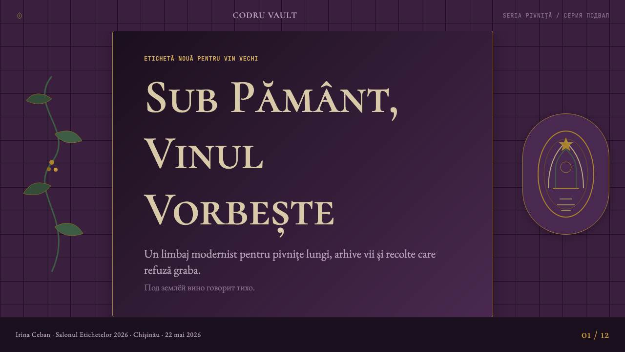
For presentation slides, the style works beautifully for cover pages and section dividers. A deep grape-purple ground with a single vine-cartouche ornament in tarnished gilt at the top or bottom, a limestone-cream inset panel for the title in classical small-capitals, and a compact body text block at the bottom of the layout — this composition communicates premium restraint without requiring complex visual construction. Content slides should lean into the editorial grid: wide outer margins, strict type hierarchy using size and weight alone, and sparingly placed ornamental rules to separate major sections. Data slides are the most challenging; keep charts minimal, use cream as the data-ink color against the dark ground, and resist the temptation to add decorative borders to charts — the grid should do all the structural work.
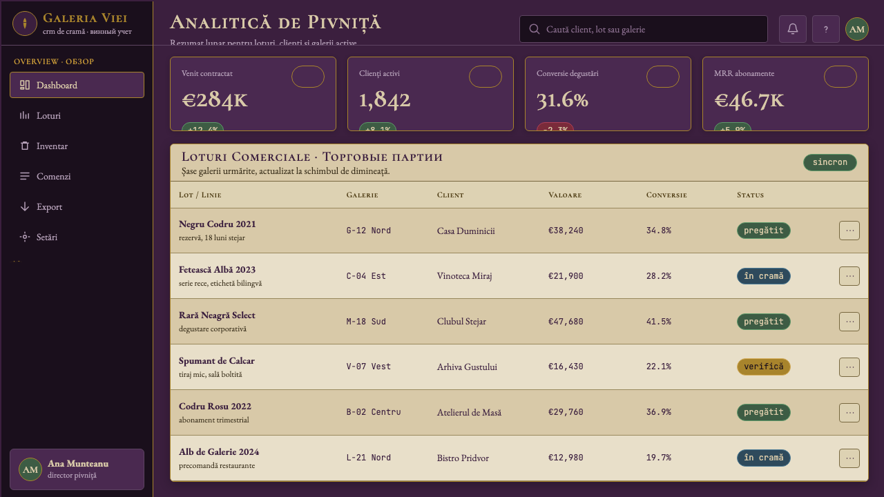
For web interfaces, the style is well-suited to landing pages, pricing pages, and about sections for luxury or heritage-positioned brands. The approach: establish the dark ground as the primary surface, use cream for all body text and secondary information panels, and reserve gilt-adjacent warm tones for interactive highlights and calls to action. Navigation should be typographic — high-contrast classical serifs or small-capitals for labels, no icon decoration beyond a simple vine or heraldic accent that remains consistent throughout. Dashboard or analytical interfaces are more difficult territory; the palette's darkness can reduce scannability for data-dense displays, so consider reserving the full dark-ground treatment for hero and navigation areas while using cream or near-white as the content panel background.
For editorial and marketing work, the style excels at printed materials — invitations, certificates, annual reports for premium brands, and event programs — where the tactile quality of the palette's implied materiality can be fully realized through paper stock and finishing choices. In digital editorial, the style works well for long-form pieces with natural pauses for visual breathing room. Use large ornamental drop-capitals to open sections, pair them with generous margins on both sides, and keep pull-quotes framed in simple horizontal rules rather than decorative boxes. Marketing materials should avoid the temptation to cram ornamental elements; one strong vine-cartouche frame per composition, used consistently, is more effective than many smaller decorations competing for attention.
A common mistake with this style is confusing its warmth for permission to add additional warm tones — amber, terracotta, dusty rose — beyond the established palette. The tarnished gilt already provides the warmth; supplementing it with additional warm hues dilutes the palette's specificity and tips it toward generic autumn-harvest decoration. A related error is using the ornamental elements at full brightness or in a clean gold rather than a tarnished, aged tone — this strips the historical weight from the design and makes it read as a costume rather than a provenance. Finally, abandoning the underlying modernist grid in favor of free-form historical layouts defeats the style entirely; it is the grid's discipline that transforms the ornamental vocabulary from pastiche into something genuinely contemporary.
Moldovan Vineyard Modernist — FAQ
Is this style only appropriate for wine or drinks brands?
Not at all, though it originated in that context. The visual system translates well to any premium or heritage brand where the product has a story rooted in place, craft, or history — fine food producers, artisan hospitality, cultural institutions, literary publishers, luxury travel, and bespoke craft goods of any kind. The key is that the brand genuinely has historical or cultural depth that the ornamental elements can reference; if the brand is new and has no such roots, the ornament reads as decorative pretense rather than honest provenance, and the style loses its integrity. Used authentically, the palette and structural approach work in any sector.
How does this style differ from generic 'vintage wine label' pastiche?
The difference is structural. Generic vintage-label pastiche uses historical ornament as surface decoration applied over conventional layouts — you can remove all the flourishes and what remains is an ordinary poster or brochure. Moldovan Vineyard Modernist uses historical ornament within a genuinely modernist grid structure; the ornamental elements have compositional roles (they frame, divide, and anchor the layout), and the grid is rigorous enough that it could exist without any ornament at all. The other key difference is palette discipline: pastiche tends to use many warm tones in cheerful combination, while this style commits to a severe, limited palette where the warmth comes from a single source (the gilt) against a mostly dark and cool ground.
Can this style work in a light-background version?
A light inversion is possible but requires significant rebalancing. In its native form, the style depends on the dark ground to give the tarnished gilt its sense of depth and age — on a light background, gilt ornament tends to read as either too precious or simply invisible. An effective light variant would use limestone cream as the primary field, deep grape-purple for large typographic elements and structural rules, and reserve the gilt for small, precise accent details only. The risk is that the inversion makes the style feel more generic — closer to a standard cream-and-dark-green heritage aesthetic than to the specific visual world of the Moldovan underground cellars. If the light variant is necessary for legibility or practical reasons, keeping the ornamental vocabulary tightly controlled is essential.
How should imagery or photography be handled in this style?
Photography, when used, should be treated with the same restraint as the ornamental elements — cropped tightly, desaturated or shifted toward the palette's dominant tones, and placed within the grid rather than allowed to bleed full-width in ways that overwhelm the typographic structure. High-contrast documentary images of cellars, barrels, vines, or hands work better than atmospheric lifestyle photography. Avoid images with competing warm color palettes (autumn foliage in full orange-red, for example) that would fight the grape-purple ground. If imagery is essential, consider converting to a duotone treatment using the deep purple and limestone cream — this integrates photographs into the palette without disrupting the overall color discipline.
What separates Moldovan Vineyard Modernist from other dark, editorial, premium wine styles?
The distinguishing features are the specific palette and the source of the ornamental vocabulary. French Burgundy-inspired premium design tends toward midnight blue or near-black with cream, with restrained classical serif type and almost no ornament. Napa Valley premium design is typically warmer and more illustrative, often featuring landscape vignettes. Moldovan Vineyard Modernist is distinguished by the particular grape-skin purple (a deeper, more violet-shifted tone than most wine label darks), by tarnished gilt rather than bright gold, by vine cartouche ornament drawn from the Bessarabian typographic tradition, and by the Swiss-editorial grid discipline that prevents the historical ornament from becoming nostalgic decoration. It is also specifically a dark-ground style — the darkness is not optional or incidental but essential to the visual world it constructs.
Related design styles
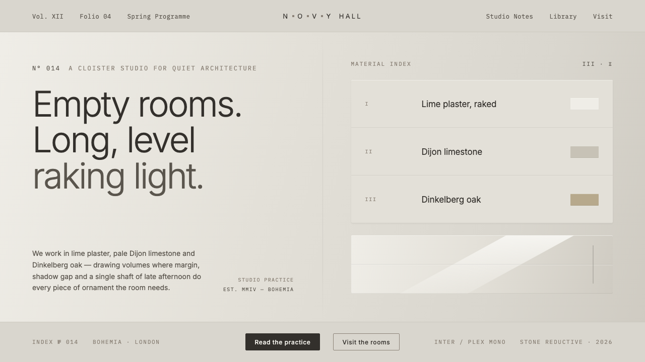 John Pawson MinimalismMonastic reduction. Cool stone-grey, pale oak, hairline shadow gaps as the on…
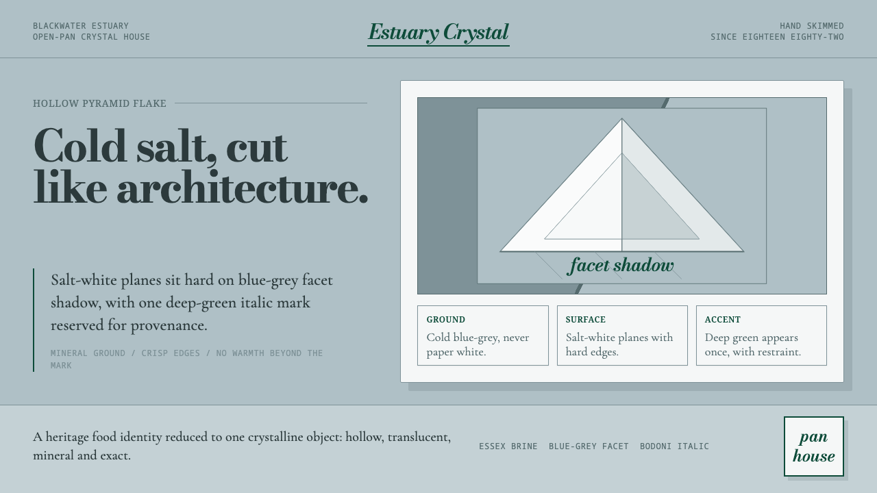 Maldon Sea Salt PyramidCold mineral luxury. Salt-white facets on blue-grey ground, struck once with…
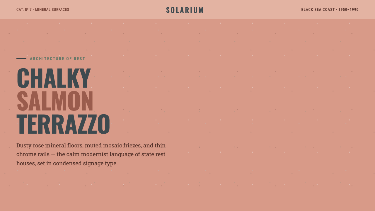 Soviet Sanatorium PinkState calm in stone. Salmon terrazzo, condensed signage, and chrome rails for…
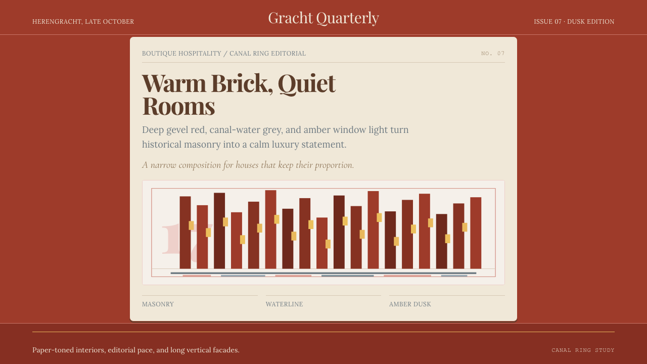 Amsterdam Canal HouseQuiet luxury in brick and cream. Playfair serif, narrow columns, amber window…
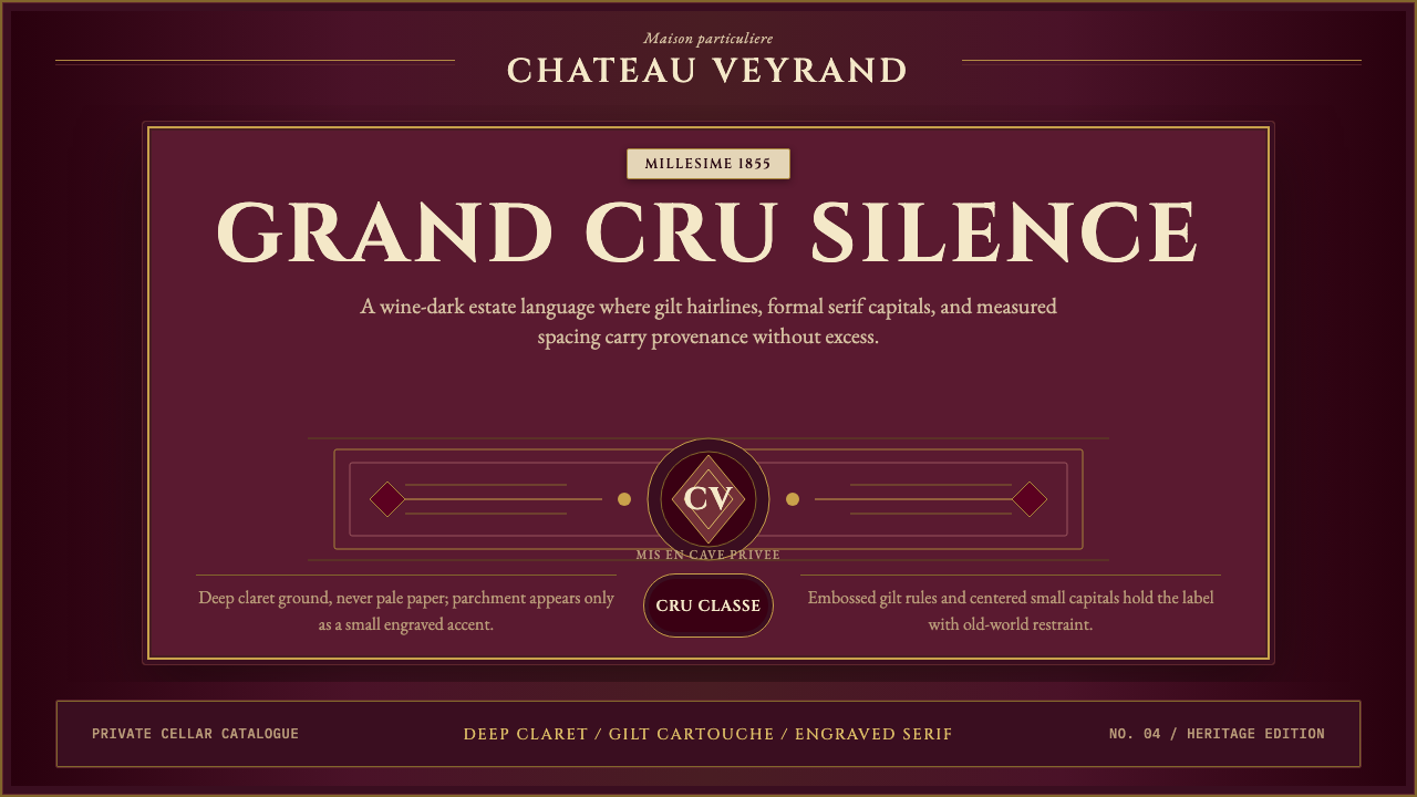 Bordeaux Wine ChâteauAged claret authority. Cinzel capitals, gilt rules, and label symmetry on win…
 Briar Pipe & TobaccoWarm gloom, precisely aged. Brass rules and Cinzel capitals sit on espresso w…