What is mixi?
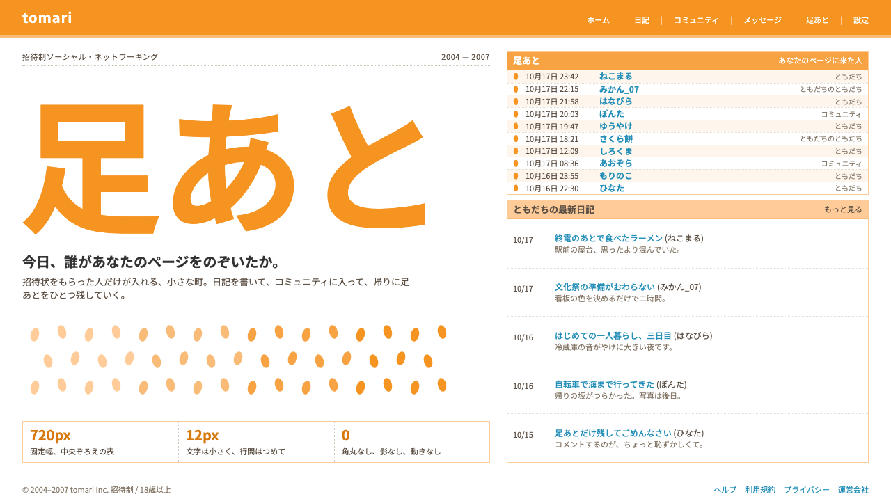
mixi's look is Japan's mid-2000s social web in miniature: a centred white table, orange header bands, hairline borders, small tight type and a log of who came by.
mixi in brief
mixi was an invitation-only social network that opened in Tokyo in 2004, and its PC site gave an entire generation of Japanese internet users a shared picture of what a social page looked like. As a visual style it means a fixed-width table centred on a white page, an orange logo header, peach-coloured heading bands, thin borders around every block, and small text set close together.
The structure is a classic table layout. Information is divided into boxed modules, each with a coloured title bar: a diary, a friends list, communities, and the famous ashiato, or footprints, a log that lists who has visited your page and when. Blue links turn khaki on a pale beige hover. Nothing is rounded, shadowed or animated; the page is flat, dense and entirely practical.
The mood is social but quiet. It is a place for diary entries, shared interests and low-key checking-in, not for performance or self-promotion. That calm, slightly intimate feel is what the style captures, and it is why it reads so differently from the bold, image-led feeds that came later.

Where does mixi come from?
mixi opened in 2004 in Shibuya, Tokyo, and was founded by Kenji Kasahara through his company eMercury. The source notes a detail that tells you a lot about its design: at launch the entire site was coded by a single developer, Batara Eto. A team of one meant a plain, durable, table-based layout in which every module was a rectangle, and that economy of means became the look.
Access was by invitation only. New members could join only when an existing member sent them an invitation, which made mixi feel like a closed circle of acquaintances rather than a public stage. That structure shaped the interface. The core experiences were diaries, communities built around shared interests, and the mymixi connections between people who already knew each other. The ashiato, the footprints log, turned a simple page-view record into a social ritual: you checked who had stopped by, and you left your own traces on other pages.
By February 2007 the source records ten million members, which made it the largest social network of Japan's 2000s. It belongs to a wider mid-2000s moment of social networking and to the older Japanese tradition of web diary culture, in which individuals wrote regular online journals and read each other's. It also sits next to keitai web, the world of mobile-phone internet in Japan, where compact, text-forward pages were the norm.
Because the visual language was shaped by constraints rather than fashion, it survives as an honest record of its time. The orange header, the peach bands and the narrow centred column were never meant to be trendy. They were the straightforward answer to a simple question: how do you put many small modules on a page so that anyone can find them? That directness is exactly what makes the style useful as a design reference today.
What defines the mixi look?
Centred fixed-width table
The whole page is a single narrow column of fixed width, centred on a plain white ground, with generous empty margins on either side. Content is arranged as stacked boxes inside this column. The constraint makes reading comfortable and gives every page the same predictable skeleton.
Orange header and peach bands
The logo header is a saturated orange, and each module title sits on a lighter peach band. These two warm tones are the only real colour on the page apart from link blue, and they give the interface its friendly, slightly nostalgic identity without ever becoming loud.
Hairline borders
Every block is outlined with a thin, single-weight border, and tables are divided by fine rules. There are no soft shadows or fills to separate areas, so structure is communicated entirely by line. The effect is orderly and a little bureaucratic, like a well-kept form.
Small, tight type
Text is small and closely set, with modest line spacing, so a lot of information fits on one screen. It is meant to be skimmed rather than savoured. Headings differ from body text mostly through colour band and position, not through dramatic size changes.
Blue links, khaki hover
Links are classic web blue. On hover they turn khaki and receive a pale beige background. This is the entire interaction vocabulary: a quiet, clear change of colour with no motion, lift or glow, which keeps the page feeling calm and trustworthy.
Footprints log
The ashiato module is the signature pattern: a plain, reverse-chronological list of visitors with names and times, presented as ordinary rows. It shows that the style is about information and relationships, not decoration, and the pattern can be reused for any visit history, activity log or recent-contact list.

Who shaped mixi?
The founder of mixi, who opened the service in 2004 through his company eMercury. Under him the site became Japan's largest social network of the decade, reaching ten million members by February 2007 while keeping its invitation-only, close-circle character.
The single developer who coded mixi at launch. His solo work explains the site's plain, table-based structure, in which every part is a simple rectangle. The visual economy of mixi is, in large part, the economy of one engineer building the whole thing.
The company through which Kasahara built and operated mixi. It stands for the small-team, product-first spirit of the project, in which the aim was to provide a dependable place for diaries, communities and social connections rather than to push visual novelty.
How do you use mixi today?
In slide decks, the mixi style suits talks about social media history, Japanese internet culture, community design and early-2000s nostalgia. A cover slide can be a centred white panel under an orange header, with the title set in small, plain type and a peach band for the subtitle. Content slides are stacks of bordered modules, each with its own title band, mirroring the diary, friends and community boxes of the original.
For data slides, use table-first layouts. A bordered table with fine rules and a peach header row is more authentic than any chart. When a chart is necessary, keep it flat and simple, using the orange as the main series colour and blue only for links and labels. A visitor-log style list is a natural way to present a timeline or a series of events.
In web and product UI, the style fits community platforms, forums, diary or journalling apps, internal intranets and any product that wants to feel like a friendly, low-pressure space. Use a centred column of fixed width, stacked modules with coloured title bars and hairline borders, and keep hover states to a simple colour shift. Activity feeds can adopt the footprint pattern directly.
In editorial and marketing work, it signals sincerity and nostalgia. It suits retrospectives on the early social web, campaign sites aimed at long-time users and brands that want to feel unpretentious. Short, direct copy fits best, since the interface itself sounds like a polite, ordinary conversation.
The common mistake is modernising it halfway. Rounded corners, soft shadows, big hero images and animated transitions all contradict the flat, dense, table-based logic. A second mistake is stretching the layout to full width; the narrow centred column is essential to the effect, and removing it turns the style into an anonymous grid of boxes.

mixi — FAQ
What is mixi?
It was an invitation-only social network launched in Tokyo in 2004 by Kenji Kasahara's company eMercury. Members wrote diaries, joined communities and connected with friends, and by February 2007 it had ten million members. It was the largest social network in Japan during the 2000s.
What does ashiato mean?
Ashiato means footprints. It is the feature that lists which members have visited your page and when, so you can see who has been by. In the visual style it appears as a plain list of names and times and has become the signature pattern of the system.
Why is the layout so narrow and centred?
Because the original PC site used a fixed-width table centred on a white page, which was the standard approach for web layouts of the time and kept reading comfortable on common screens. The narrow column is also what gives the style its calm, intimate feeling, so it should be kept.
Is it a light or a dark theme?
It is a light theme. The ground is white, borders are thin and grey-toned, and colour comes only from the orange header, the peach bands and the link blue. There is no dark mode in the original visual language.
What products is it good for?
It suits community sites, forums, journalling apps, intranets and nostalgia-driven campaigns, anything that benefits from a quiet, friendly, information-dense layout. It is a poor fit for products that rely on large imagery or bold motion, since it is built around small type, tables and bordered boxes.
Related design styles
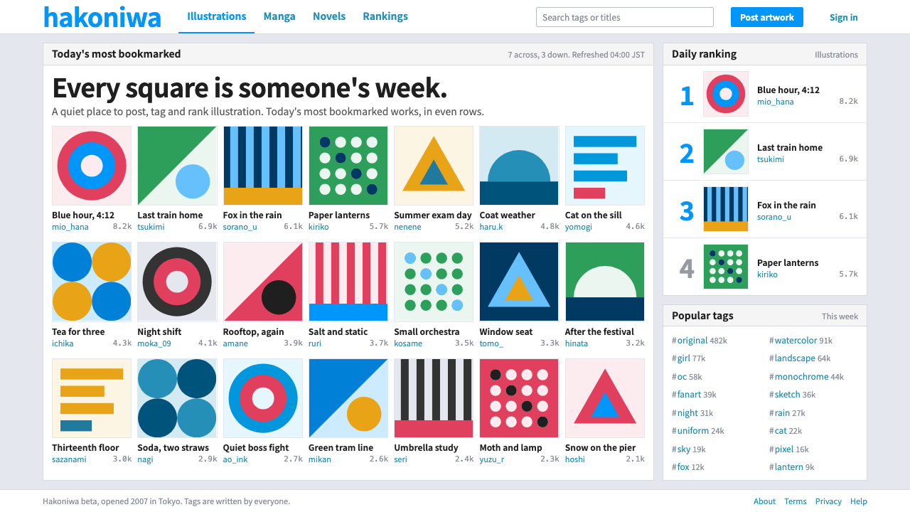 pixivQuiet chrome, loud artwork. White panels and one blue frame a strict wall of…
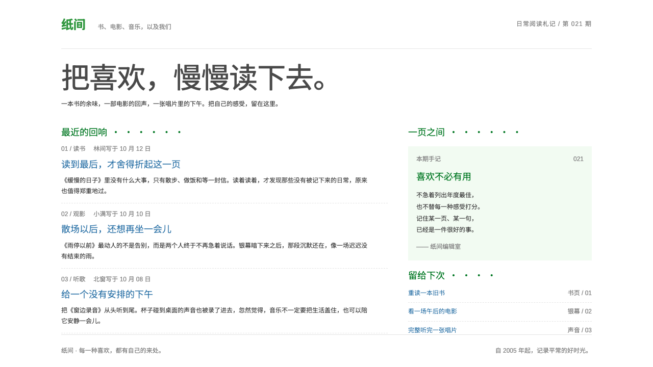 DoubanQuiet by conviction. Small blue text and dotted green headings keep the white…
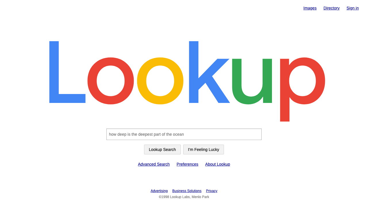 Google SearchA white page and a box to type in. Giant four-colour wordmark, Arial text, no…
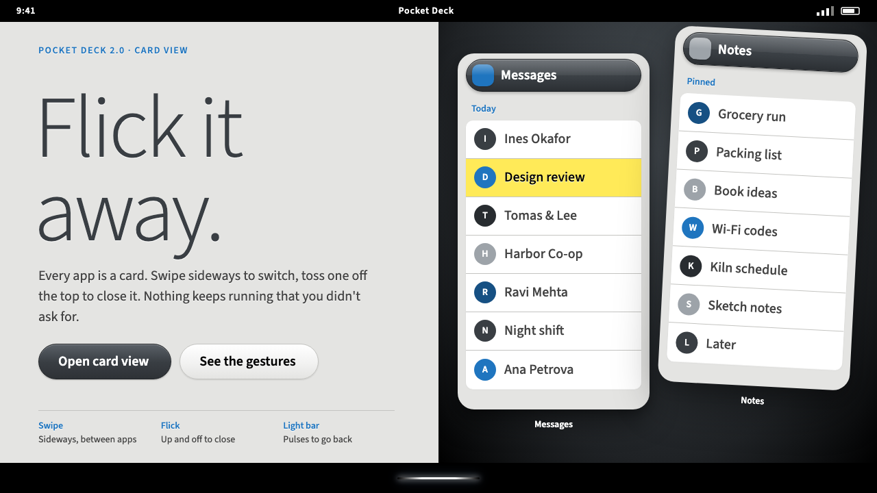 Palm webOSEvery app is a card you flick away. Charcoal gloss pills and blue labels on g…
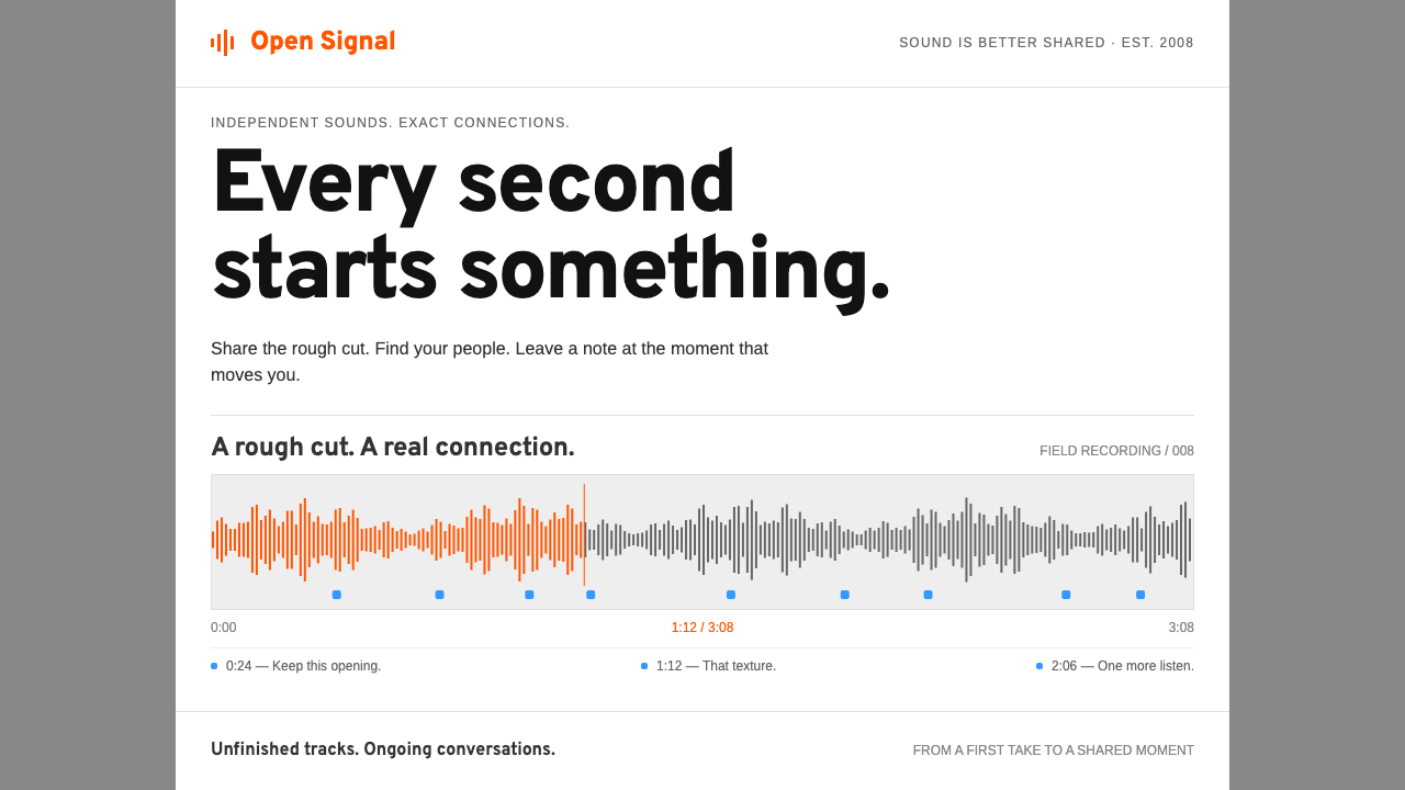 SoundCloudEvery second connects. Orange waveforms and blue notes give a white-and-grey…
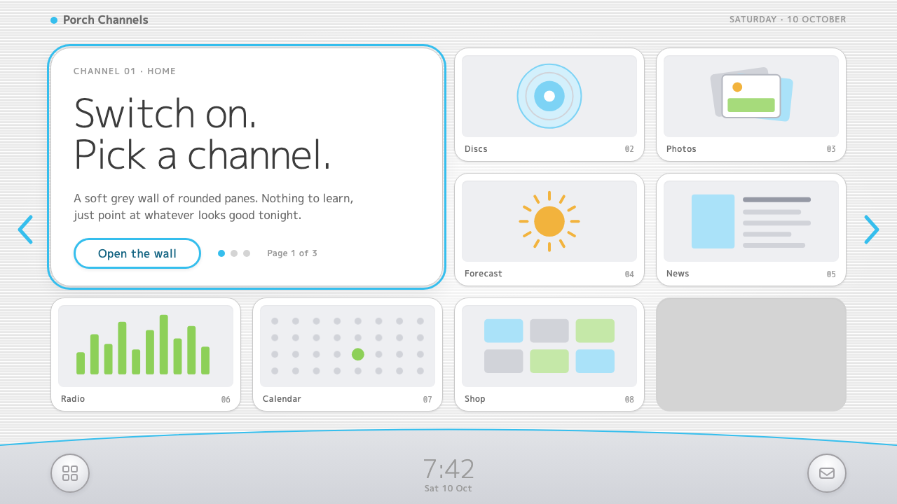 Wii MenuSwitch-on calm. White TV panes on a grey scanline wall, one thin blue line on…