What is Douban?
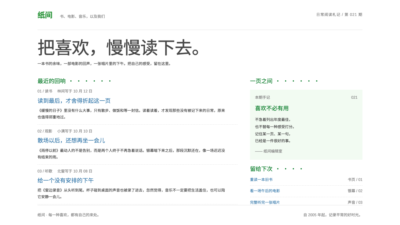
Douban's look is a quiet page of small blue links and dotted green headings, built on the conviction that a white sheet is the best place to read.
Douban in brief
Douban is the visual language of the Chinese community for books, films and music that Yang Bo started in Beijing in 2005. Its pages are close to raw HTML: a white ground, near-black body text, blue links that flip to a solid block of blue with white text on hover, and small green section headings followed by a row of dots.
The system keeps that discipline. It uses a fixed two-column page, small cover thumbnails, a numeric score with star bars and long, well-spaced runs of Chinese text. Green is the only strong color and is used sparingly, mostly for headings and the brand. There are no shadows, no gradients and no decorative imagery beyond the covers themselves.
The effect is of a quiet reading note: dense in information but easy on the eye, because the spacing between lines is generous and the structure never changes. It suits communities built around reviews and ratings, reading lists, film and music catalogues, forums and any product in which users write and read short opinions at length.

Where does Douban come from?
Douban launched in March 2005 in Beijing, founded by Yang Bo, who is widely known by the nickname Abei. It began with books and soon added Movie and Music, in 2005 to 2006, and later grew Groups and Local features in the late 2000s. It belongs to the first wave of Chinese Web 2.0, a moment when sites built around user-generated content began to organize people through their tastes.
Its core idea was that readers, viewers and listeners could record what they had consumed, rate it and write short reviews, and that these accumulated opinions would become the site's content. This is the user-generated review-and-rating tradition, and it shaped the page structure: an item page with a cover on the left, bibliographic facts on the right, a prominent score box and then a long column of brief comments. Interest-group communities grew around the same logic, bringing people with shared tastes into conversation.
The interface carried the tone of the early web. Instead of being redesigned toward richness, it stayed in a text-first style: small type, plain links, thin dividers. The signature touches, a green heading followed by a row of dots and a link of the form (more), are a kind of local dialect that regular users recognized instantly. The text-page style has been largely unchanged since those years, which is itself part of its identity.
The result is an aesthetic of conviction rather than minimalism for its own sake. It treats the page as a surface for reading and for people's words, and decorates nothing that does not help a reader find or weigh an opinion. That philosophy is why the look has aged into a kind of cultural reference for a certain thoughtful, literary corner of the Chinese internet.
What defines the Douban look?
White ground
The page is plain white, and the white is intentional: it leaves the text, the covers and the scores as the only things on the page. There are no tinted bands, no textures and no cards with background fills. The emptiness is what makes the long runs of text feel like a notebook rather than a feed.
Small near-black text
Body text is small, near-black and set with generous line spacing. The small size lets many items fit on a screen, while the open spacing keeps the density from tiring the eye. Chinese text in particular benefits from this: long reviews remain readable because each line has room to breathe.
Blue links with block hover
Links are plain blue text. On hover, a link flips into a solid block of blue with white lettering, a crisp, slightly old-fashioned interaction that gives instant feedback without any animation. The same blue and the same flip appear everywhere, so a reader learns to recognize anything clickable at a glance.
Green dotted headings
Each section opens with a small green heading, followed by a row of dots and, often, a link in parentheses reading (more). This is the system's most recognizable device. Green is the single strong color and is used for these headings and the brand only, so it works like a bookmark ribbon that marks where each module begins.
Fixed two-column page
The page has a fixed width and two columns: a main column for the item and its comments, and a narrower side column for related links and lists. Dividers are thin lines. An item page puts a small cover on the left, facts such as author, publisher and ISBN on the right, then a prominent score and a column of short comments below.
Score box and star bars
The rating area shows a large numeric score out of ten, accompanied by a distribution of star levels drawn as thin horizontal bars. It is data presented plainly: a number, five levels and the share of votes at each. The bars are flat and unadorned, and they let a reader judge consensus and disagreement at a glance.
No shadows, no gradients
Nothing is lifted off the page. Cards are not raised, buttons are not glossy and backgrounds are not graded. Structure is made by thin lines and spacing alone. The only imagery is the cover thumbnails, so the colors on the page come from the things being discussed rather than from the interface.

Who shaped Douban?
Yang Bo, widely known as Abei, started Douban in Beijing in 2005. His conviction that a site should be a quiet place for reading and for people's opinions is built into the plain, text-first interface the system preserves.
Books were where the site began in 2005. The item page with a small cover, bibliographic facts, a score box and a column of short reviews became the template for everything that followed.
Movie and Music followed in 2005 to 2006, reusing the same page grammar. That reuse is the reason the look feels unified: a film, an album and a book are all presented as the same kind of object, an item to be rated and discussed.
Groups, which grew in the late 2000s, turned shared taste into conversation. They carried the same text-first page style into forum-like threads, showing that the visual discipline extended beyond catalogue pages.
How do you use Douban today?
Douban's style is a strong fit for any product in which people read and write short opinions at length: review sites, reading lists, catalogues, forums and community knowledge bases. It is less suitable for brands that need visual spectacle. The key is discipline: small text, one green, one blue and a lot of white.
For presentation slides, a cover can be a white page with the title in near-black and a small green heading line followed by a row of dots, much like a Douban module header. Content slides should be set as quiet reading pages: two columns, a small image on the left and facts on the right, with section headings in green and links in blue. Data slides can borrow the score box and star bars, using thin flat horizontal bars to show distributions, with the green used for the headline number.
For web interfaces, build a fixed-width two-column layout with a main column for items and comments and a narrow side column for lists. Use thin dividers instead of cards, blue text links that flip to a blue block on hover, and green dotted headings with a (more) link to open each module. Item pages should lead with a small cover, a facts table, a clear numeric score with star bars and then a long, well-spaced list of short comments. Pricing or plan pages, if needed, should be a plain table rather than a stack of highlighted cards.
For editorial and marketing work, the style supports long reading-oriented pieces, reading-list roundups and community features. Keep line spacing open, especially for Chinese text, and use green headings to mark the start of each section. Cover images are the main visual; do not add decorative illustrations or banners.
The most common mistake is to treat the plainness as an invitation to modernize it. Adding card shadows, rounded buttons, gradients or a hero banner removes the very restraint that gives the look its character. The second mistake is to use green widely; it is meant for headings and the brand only, and if it spreads onto backgrounds or buttons, the quiet is lost. Finally, avoid cramped line spacing, because the density only works when each line has room.

Douban — FAQ
What are the signature elements of the Douban look?
Three things stand out. First, a white ground with small near-black text and blue links that flip to a solid blue block on hover. Second, small green section headings followed by a row of dots and a (more) link. Third, the item page: a small cover on the left, facts on the right, a prominent score with star bars and a long column of short comments. Together they create a quiet, text-first reading surface.
Why is green used so sparingly?
Because green is the only strong color and it has a precise job: marking headings and the brand. If it were used for backgrounds, buttons or decorations, it would compete with the covers and the text, and the page would stop reading as a calm notebook. Restricting it keeps its signal clear, like a ribbon that tells you where each module begins.
Does this style work for non-Chinese content?
Yes, the structure transfers, though it was shaped around Chinese text, where open line spacing and small type work especially well. For Latin text, keep the same discipline: small type, generous line height, a fixed two-column layout and a single green. Expect to adjust the type size slightly, since Latin letterforms read differently at small sizes.
Can I add shadows or rounded cards for a more modern feel?
You can, but it will stop being this style. The identity depends on thin dividers, flat blocks and the absence of depth effects. If you want a more contemporary feel, modernize the details that do not carry the identity, such as type rendering and spacing precision, and leave the structure and the color roles alone.
What kinds of products is it best suited to?
Products built on user-written opinions: review and rating sites, reading and film lists, music catalogues, forums and community knowledge bases. It is also well suited to long-form reading and archive-like pages. It is a weaker choice for e-commerce or marketing sites that need to sell with imagery and momentum.
Related design styles
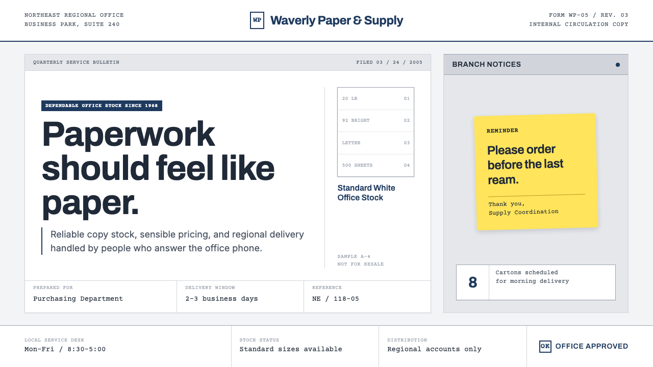 The Office (Dunder Mifflin, 2005)Mundanity is the punchline. Copier white, cubicle gray, memo grids, and one y…
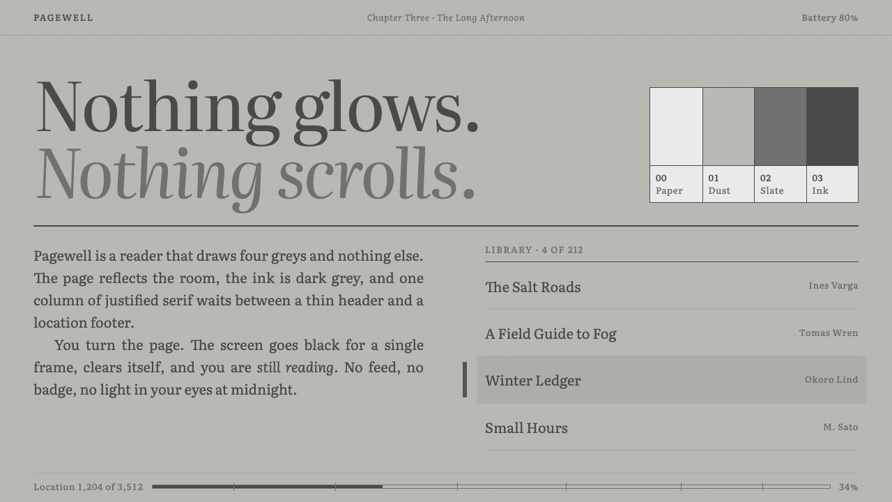 KindleNothing glows. Green-grey paper, grey Literata ink, one justified column, a b…
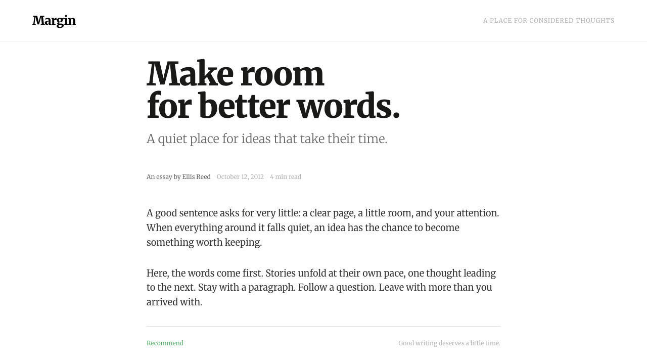 MediumWords come first. A narrow Merriweather column, warm grey ink and one quiet g…
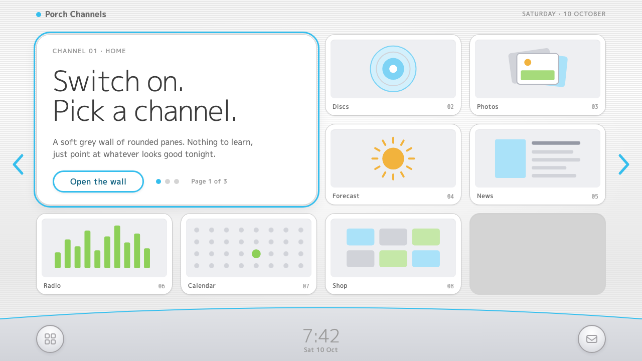 Wii MenuSwitch-on calm. White TV panes on a grey scanline wall, one thin blue line on…
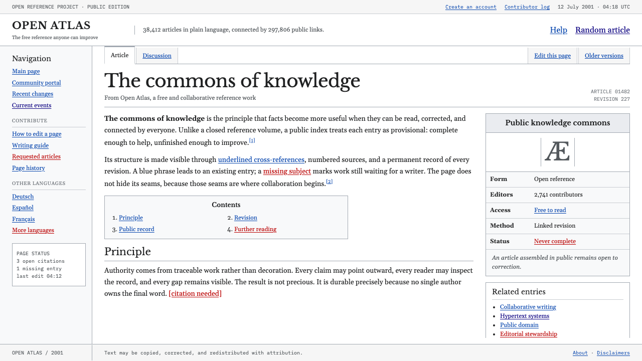 Wikipedia (2001)Content needs no ornament. Black serif text, gray hairlines, and blue links e…
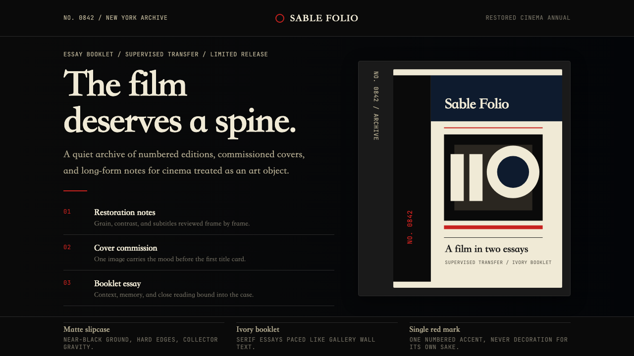 Criterion CollectionMuseum-grade cinema. Matte black, ivory serif, and one red numbered spine set…