What is pixiv?
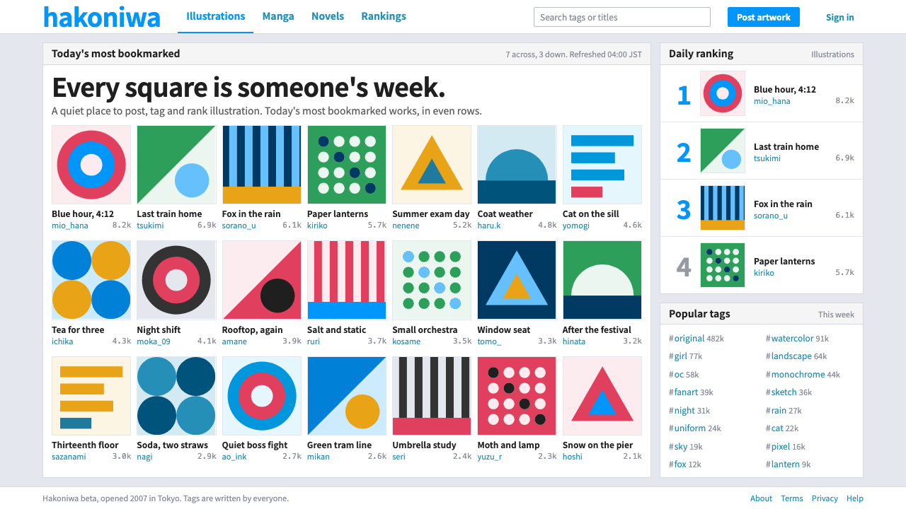
pixiv designed its interface to be quiet so the artwork could be loud: white panels, one blue for links, and a strict wall of square thumbnails.
pixiv in brief
The pixiv style comes from the Tokyo illustration community that Takahiro Kamitani opened as a beta in September 2007. Its interface is a set of white panels on a pale blue-grey surround, each holding an even grid of square thumbnails, small Gothic captions and blue links. It is a gallery layout in the most literal sense: a wall on which artists hang their work.
The system is deliberately quiet. Tags, daily rankings and bookmarks organise the content, a single pixiv blue marks whatever can be clicked, and the illustrations themselves, mostly anime- and manga-influenced, supply nearly all of the colour on the page. Chrome and artwork do not compete, because the chrome has been made as neutral as it can be.
The mood is dense but clean. Many items appear at once, yet nothing feels cluttered, because every unit has the same size, the same spacing and the same caption treatment. It reads as a community rather than a brand: practical, familiar and tuned for browsing for hours.

Where does pixiv come from?
pixiv launched as a beta in September 2007 in Sendagaya, in Tokyo's Shibuya ward. It was founded by Takahiro Kamitani, and Takanori Katagiri is also named among the people associated with its early identity. It quickly became a home for Japanese dōjin and fan-art culture, a world of self-published comics, illustration and derivative works traditionally shared at conventions and in small circles.
The site belongs to what can be called the participatory Japanese web of the late 2000s. Instead of a magazine model with editors choosing what to feature, it let ordinary users post their own artwork, tag it, rate it and bookmark the work of others. That created a feedback loop in which tag-based folksonomy, rather than a fixed taxonomy, organised the whole library.
Its classic visual period runs roughly from 2009 to 2011, when the white-panel and blue-link interface settled into the look that many users still remember. The 2008 logo was kept until 2025, which gives some sense of how stable the brand's identity was while the site itself grew. The restraint of the design is part of why it lasted.
Placing pixiv in context also explains its main design decision. A site whose entire value lies in the images of thousands of artists cannot afford a strong personality of its own. The interface therefore behaves like a museum wall painted in a neutral shade: it frames the work, makes it easy to reach and gets out of the way.
What defines the pixiv look?
White panels on pale surround
Content sits in white panels on a pale blue-grey surround. The two light tones are close, so panels are separated softly rather than with heavy borders. The page feels clean, calm and neutral behind whatever artwork is shown.
One pixiv blue
A single link blue marks every clickable thing: titles, tags, usernames and actions. Because there is only one accent, users learn instantly what is interactive. The blue stays out of the artwork's way and never appears as a decorative fill.
Strict square thumbnails
Artwork is shown as an even grid of square thumbnails. Cropping every piece to the same shape creates a visual rhythm, and it lets wildly different illustrations coexist side by side without chaos. The grid is the central organising device of the whole system.
Small Gothic captions
Titles, artist names and counts are set in small, plain Gothic type, the Japanese equivalent of a neutral sans. The text is compact and readable, designed to be scanned quickly beneath each image rather than read as prose.
Tags, rankings and bookmarks
Discovery depends on three devices: tags that users apply, daily rankings that surface what is popular, and bookmarks that act as a personal collection. The interface exposes these as compact text and counters, not as large banners.
Information density
A great deal of information fits on each screen, yet the repetition of units keeps it orderly. Spacing is consistent and tight but never cramped. It is a style for browsing many items rapidly, not for slow single-item storytelling.

Who shaped pixiv?
Kamitani opened pixiv as a beta in September 2007. His platform gave illustrators a place to post, tag and discover work, and its low-key interface set the standard that later art-sharing communities were compared to.
Katagiri is named alongside Kamitani among the people associated with pixiv's early identity, during the years when the white-panel interface took shape.
How do you use pixiv today?
The pixiv style is for any product where user-made visual content is the star and the interface should step back. That includes illustration communities, photo and portfolio galleries, asset libraries, template marketplaces and fan sites. It is built to handle large numbers of items without feeling heavy.
For slides, use it for gallery-like content: portfolio overviews, case-study grids, moodboards and image rundowns. A pale grey slide with a clean white panel holding a grid of square images is instantly readable. Keep captions small and quiet, and use the single blue only for links or the item you want to point out.
For web interfaces, the pattern works well for feeds, search results and profile pages. Use white cards on a pale surround, keep thumbnails square, put titles and counts in small neutral type, and treat tags as blue text links. Do not add additional accent colours; the thumbnails will provide all the variety the page needs.
For editorial and marketing work, it suits community showcases, creator spotlights and contest results, where the point is to show many pieces in good order. Let the images carry the colour and keep your own brand marks restrained. The neutral frame is what allows the content to look good.
The most common mistake is making the chrome too expressive. Bright backgrounds, decorative borders or several accent colours fight with the artwork, and the wall stops working as a wall. Another mistake is letting thumbnail sizes vary: part of the system's calm comes from every tile being exactly the same shape.

pixiv — FAQ
What is pixiv?
pixiv is an illustration community founded by Takahiro Kamitani, launched as a beta in Tokyo in September 2007. Artists post work, tag it and collect each other's pieces, and it became a central home for Japanese fan-art and dōjin culture.
Why is the interface so plain?
Because the user-made artwork is the content. White panels, a pale surround, small captions and one link blue keep the chrome neutral so the illustrations supply the colour.
Which period of pixiv does this style represent?
The classic visual period of roughly 2009 to 2011, after the 2007 beta launch. The 2008 logo stayed in use until 2025, so the brand mark and the classic interface share an era.
Can it be used outside art communities?
Yes. Any product with many visual items, such as stock libraries, template stores or portfolio sites, can benefit from the neutral frame and the square-thumbnail grid. It is less suitable where a strong brand personality is the goal.
What typography does it use?
Small, plain Gothic-style sans-serif type for titles, names and counts, with the pixiv blue for links. The text is functional, built for scanning beneath each thumbnail.
Related design styles
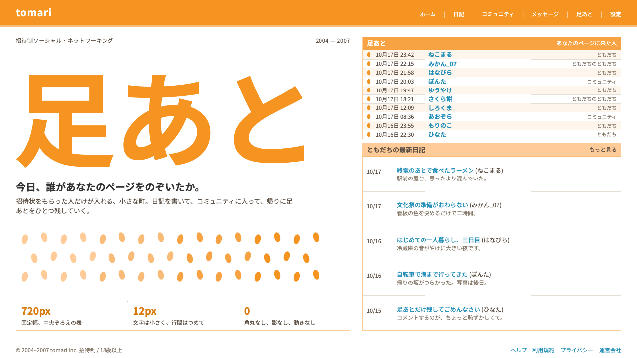 mixiSocial, but quiet. A 720px white table, orange heading bands and a log of who…
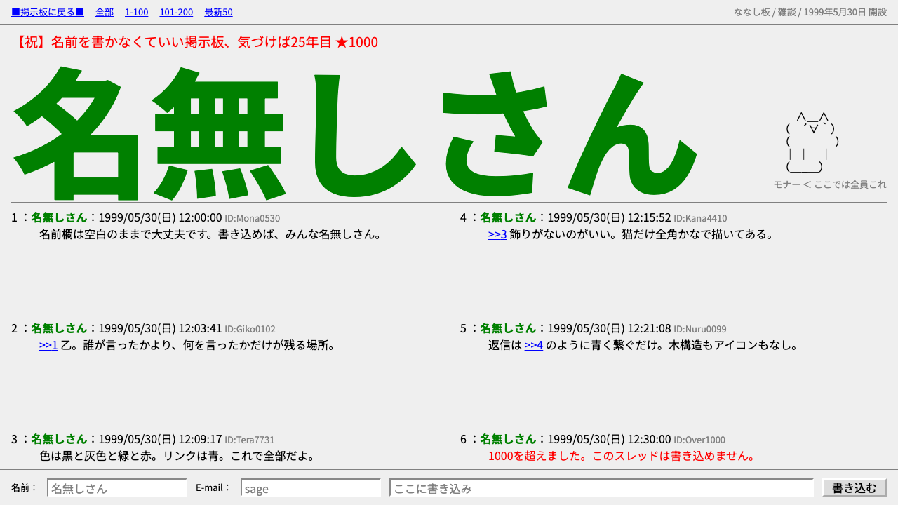 2channelRaw textboard, zero design. Flat grey page, red title, green bold 名無しさん, a ca…
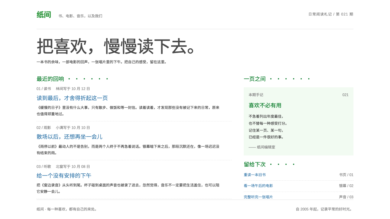 DoubanQuiet by conviction. Small blue text and dotted green headings keep the white…
 Google SearchA white page and a box to type in. Giant four-colour wordmark, Arial text, no…
 Palm webOSEvery app is a card you flick away. Charcoal gloss pills and blue labels on g…
 RedditCuriosity comes first. Blue link lists, pale-blue rules and one Orangered arr…