What is 2channel?
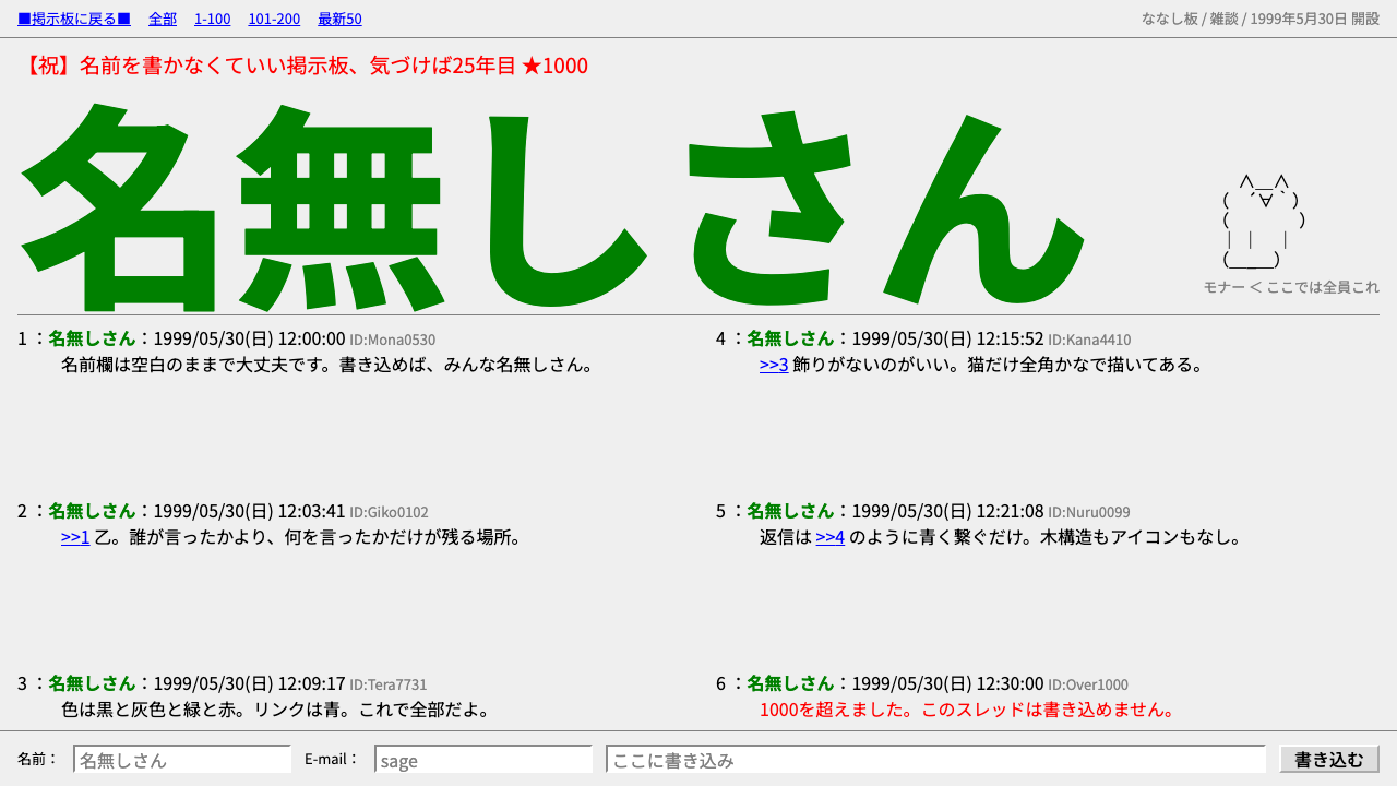
2channel is what a website looks like when nobody bothers to design it: a flat grey page, a red title, an anonymous green name on every post, and a cat drawn out of kana.
2channel in brief
2channel is the visual language of the anonymous Japanese textboard that Hiroyuki Nishimura opened in May 1999. Its thread pages are barely styled HTML: a red title at the top, then a vertical run of numbered posts in black text on a flat, light-grey page. Every post is headed by the default poster name 名無しさん, set in green bold, followed by a date and a short poster ID.
The style is defined as much by what it leaves out as by what it contains. There is one full-width column. Type sizes are whatever the browser decides by default. There are no shadows, no cards, no avatars, no rounded corners and no icons. The page makes no attempt to look friendly, and that refusal is exactly what gives it a character: it reads as a place where the only thing that matters is the next line of text.
The one decorative element is ASCII art, known in Japan as AA. It is drawn from full-width kana and symbols, stays proportional rather than monospaced, and has its own mascots, with the cat Mona (モナー) in the lead. In design terms, 2channel is the clearest example of an interface whose aesthetic is simply the raw material of the web, treated as a deliberate choice rather than a lack of one.

Where does 2channel come from?
The site opened on 30 May 1999. Its founder, Hiroyuki Nishimura, built it as a place where people could talk without registering and without a name, and it grew into the largest anonymous forum in Japan. A great deal of Japanese internet slang spread outward from its threads. The look of the site was never planned; it was simply what you got when a bulletin-board script wrote plain HTML into a browser's default stylesheet.
The thread layout most people remember, the read.cgi page, dates from roughly 2000 to 2004. In it each reply is a numbered entry with the poster name, date and ID on a single header line, followed by the message body in black. The name field defaults to 名無しさん, which means 'nameless' or 'Mr. No-Name'. Because nearly everyone posted under that default, the green bold label became the page's most recognizable repeated shape, a kind of visual rhythm made of anonymity itself.
The ASCII art tradition grew inside this environment. Japanese AA is built from full-width characters in the Shift_JIS encoding, and it depends on the proportional font MS PGothic to line up correctly, which is why the same cat can look perfect on one machine and collapsed on another. This fragile dependence on a particular default font is part of the aesthetic's identity: the art lives inside the raw medium instead of being an image placed on top of it.
The site's later history is complicated. It was split into two separate sites in 2014, and the main one was renamed in 2017. Jim Watkins appears in the history of the site's ownership during this period. Whatever the corporate story, the thread layout from the early 2000s is the form that survives in memory, and it is the one this style reproduces: a page that looks the way it did when the boards were new.
What defines the 2channel look?
Color
The palette is almost nothing. A flat, light-grey page sits under black body text, with a single red title across the top and the green of the poster name as the only recurring accent. Color is functional, not expressive: red says 'this is the thread', green says 'someone, anonymous, is speaking'. There are no gradients, no tints for hierarchy and no dark mode in the original.
Typography
Type is whatever the browser supplies, at its default sizes, with bold used only for the poster name. Japanese text is set in the system proportional Gothic face, and this matters, because the ASCII art is composed against its exact glyph widths. Line spacing is tight and uniform, so a long thread reads as a continuous strip of text rather than a set of separate items.
Layout
One full-width column, no sidebars, no containers and no maximum measure. Posts are stacked top to bottom with their number, name, date and ID on one header line and the body underneath. The structure is a log, not a feed: its order is chronological and its only navigation is scrolling. Everything the page needs to say fits in a single vertical stream.
Surface and depth
There is no depth at all. No shadows, no borders around posts, no raised or sunken elements and no rounded corners. Separation between posts comes from spacing and the header line alone. This flatness is not minimalism chosen for elegance; it is the absence of a design pass, kept on purpose, and that sincerity is why it still reads as authentic.
ASCII art as decoration
The only ornament is text drawn with text. Full-width kana, brackets and symbols are arranged into faces, animals and scenes, with the cat Mona as the unofficial mascot. The art is proportional, so it must be kept in a block that respects its own line breaks. Treated well, it gives the style its one warm, humorous note without breaking the rule of no images.
Anonymity as pattern
The default name 名無しさん repeats on almost every post, so it works as a visual texture. Down a long thread, the green bold label forms a steady beat that tells the eye where one voice ends and the next begins. Replacing it with avatars or varied names would destroy the effect, because the sameness is the message: here, everybody is equally nobody.

Who shaped 2channel?
Opened the site on 30 May 1999 as an anonymous textboard. His decision to leave the interface unstyled and the posting anonymous defined both the culture and the look of the board.
Appears in the history of the site's ownership after it split into two sites in 2014, a period that ended with the main site's rename in 2017.
The collective author of the board. Their shared default name is the page's most repeated visual element, and their ASCII art is its only decoration.
How do you use 2channel today?
On slides, the style works best as a deliberate joke or a piece of internet history rather than as a general-purpose theme. A cover slide can be a flat grey page with a single red title and nothing else. Content slides can stack short statements as numbered posts with the green bold name on the header line, which turns a list into something that feels like a thread. For data, keep charts out; a plain table of text, set in the default type, is truer to the source.
In web interfaces, the style suits community, forum and archive products, changelog pages and anything meant to feel like a log. Think of a comment section, an issue tracker rendered as a plain transcript, or a retro landing page for a project with a sense of humor. Dashboards are a poor fit, since the style has no components, no cards and no hierarchy beyond order, but a status page rendered as a plain numbered list can be surprisingly effective.
In editorial and marketing work, 2channel supplies a recognizable shorthand for anonymity, early internet culture and unfiltered speech. It is useful for articles about Japanese net culture, for nostalgic campaigns, and for pieces that want to look as though they were found rather than made. The ASCII art element gives a mascot-like moment for social images, but it must be authentic: draw it from full-width kana and keep it proportional.
The most common mistake is to modernize it. Adding a shadow, a rounded card, a soft pastel or an avatar slot immediately turns the page into an ordinary dark-grey forum template and removes the reason for choosing this style. The second mistake is to let the ASCII art drift into a monospaced font, which collapses the alignment. Keep the single column, keep the default type sizes, keep the red title and the green name, and resist the urge to polish.
A third risk is tone. The style comes from a board known for rough, unfiltered language, so the look should be borrowed without importing the behaviour. A good use treats the page as a visual quotation: clearly framed, clearly nostalgic, and filled with content you would be happy to stand behind.

2channel — FAQ
What does 名無しさん mean?
It means 'nameless' or 'Mr. No-Name' and is the default poster name on 2channel. Because most people left the field unchanged, it appears on nearly every post, set in green bold. In this style it is the main repeated visual element, not just a label.
Why is the style so plain?
The original pages were barely styled HTML produced by a bulletin-board script on top of a browser's default stylesheet. Nobody designed a skin for it. The style reproduces that absence on purpose: one column, default type, no shadows, cards or avatars.
What is Mona the cat?
Mona (モナー) is the best-known ASCII art character on the board, drawn from full-width kana and symbols. It is the unofficial mascot of Japanese AA and the lead example of the only decoration this style allows.
Why does the ASCII art need a particular font?
Japanese AA is composed against the exact glyph widths of the proportional MS PGothic face in the Shift_JIS era. In another font the lines no longer align and the picture falls apart. For a faithful result, keep the art in a block that preserves its line breaks and uses a proportional Japanese face.
When should I not use this style?
Avoid it for dashboards, commerce, onboarding flows and anything that needs components, hierarchy or a friendly tone. It has no cards, no buttons to speak of and no depth. It excels as a log, a thread or an archive, and as a deliberate piece of internet nostalgia.
Related design styles
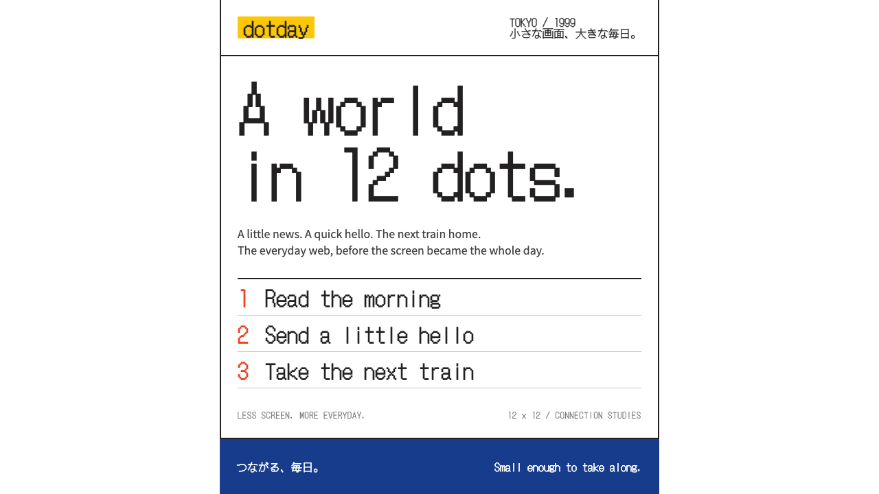 i-modeA whole world in a few dots. Bitmap type, white space and yellow bring the po…
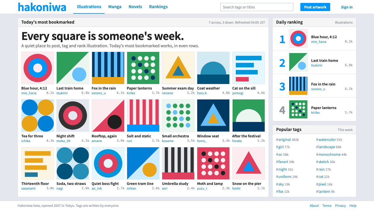 pixivQuiet chrome, loud artwork. White panels and one blue frame a strict wall of…
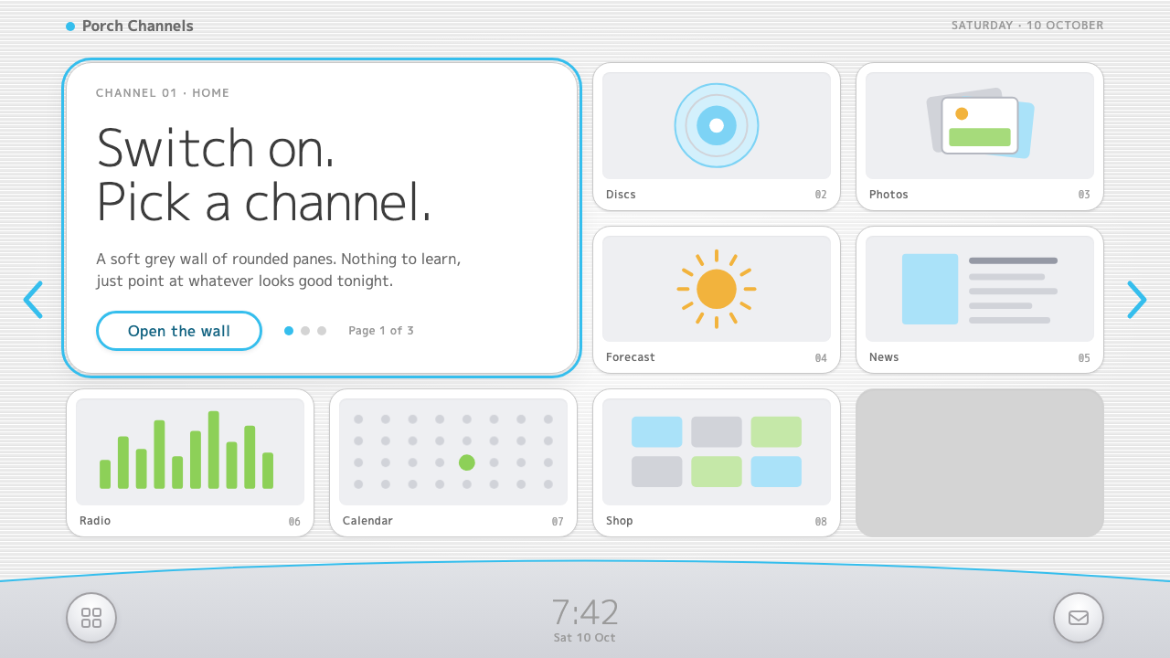 Wii MenuSwitch-on calm. White TV panes on a grey scanline wall, one thin blue line on…
 Chrome DinoWit from almost nothing. One grey ink on pale paper, pixel-font score digits,…
 Doge Meme (2013)Anti-design becomes pure joy. Candy Comic Neue captions drift at lazy angles…
 Naruto (2002 anime era)Underdog energy refuses the background. Hazard orange strikes steel-gray grid…