What is Minitel?
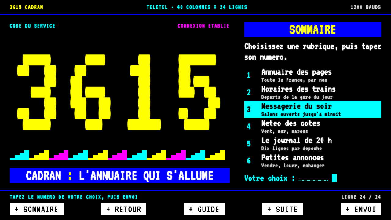
Minitel's interface is a page of eight saturated colours on black, built from a strict character grid, mosaic blocks and inverse-video function keys.
Minitel in brief
Minitel was the small beige CRT terminal that the French telecommunications administration handed to telephone subscribers from 1982. Every screen it dialled up from the Teletel network was a fixed page of text and chunky block graphics, drawn on black in a handful of fully saturated colours. As a visual style, Minitel means a cell grid, a monospaced type, mosaic pictures and a very particular vocabulary of keys.
The grid is 40 columns by 24 rows, and everything snaps to it. Letters and blocks share the same cells. Headings grow not by switching to a bigger typeface but by doubling the same face in height or width. Pictures are assembled from small mosaic blocks, each cell split into a two-by-three pattern of filled and empty rectangles, which gives illustrations a distinct stepped, pixel-like geometry.
Actions are not buttons with shadows but inverse-video labels: ENVOI, SUITE, RETOUR and similar words appear as light blocks with dark text, mirroring the physical keys on the terminal's keyboard. There are no rounded corners, no shadows and no mouse. The result is precise, cheap-looking in the best sense, and a little stubborn, a style that makes a virtue of absolute constraint.

Where does Minitel come from?
Minitel belongs to a specific French moment. The source places its Teletel trial in Vélizy in 1980 and 1981, followed by a national rollout from 1982. The French telecommunications administration chose to give terminals to subscribers rather than sell them, replacing the printed telephone directory with an electronic one and making the terminal a familiar object in homes and offices before most countries had any equivalent.
The intellectual framework is named in the source as télématique, the term for the merging of telecommunications and computing, associated with the figures Simon Nora and Alain Minc, whose report argued that society was becoming computerised. Gérard Théry, who led the telecommunications administration, is the third name linked to the project. Together they turned a policy idea into a nationwide product, and the visual language was dictated less by taste than by what the network and the cheap terminal could display.
That constraint is a standard: the source calls it CEPT/Teletel Videotex. Videotex defined a fixed way to send text and block graphics to a simple terminal, with a limited set of colours, a fixed character grid and special control characters. The Minitel look is simply that standard made visible. Its mosaic graphics were not an aesthetic choice but the only picture-making tool the terminal had.
Culture grew on top of the technology. The source highlights the messageries chat culture of the 3615 numbers, a social space of text conversations that appeared on screen line by line, and Minitel also covered the practical services people used every day: directory lookups, train reservations and many other transactions. The network closed on 30 June 2012, so the style now carries a clear sense of a finished era, which is part of why designers revisit it.
What defines the Minitel look?
Cell grid
Everything aligns to a fixed grid of 40 columns and 24 rows. Text, blocks and frames all occupy whole cells, so there is no free positioning and no fractional spacing. The strictness gives pages a disciplined, almost architectural rhythm, and it makes layouts predictable and easy to compose.
Eight colours
The palette is eight fully saturated colours on a black ground, with no tints and no gradients. Cyan is used for body text, while stronger colours mark headings and highlights. Because there are so few choices, colour works as a signal, not as decoration.
Mosaic blocks
Pictures are built from block characters, each cell divided into a two-by-three pattern of filled and empty parts. This produces a distinctive stepped look for logos, icons and illustrations. Diagonal lines and curves are approximated by staircases, and that roughness is the charm.
Doubled type
A single monospaced face, VT323 in this system, handles all text. Hierarchy comes from doubling the same glyphs in height, width or both, never from changing typeface or weight. The effect is consistent and economical, and it keeps the screen visually unified.
Inverse-video keys
Actions are presented as inverse-video labels, light blocks with dark text, using the vocabulary of the original terminal: ENVOI to send, SUITE for the next page, RETOUR to go back. They echo the physical keys of the Minitel keyboard and make interactive elements unmistakable.
No curves, no depth
There are no rounded corners, shadows, blurs or transitions. Surfaces are flat black, edges are sharp, and depth is absent. This flatness is not minimalism for its own sake but the natural consequence of a display that could only turn cells on and off.

Who shaped Minitel?
The head of the French telecommunications administration during the period when the terminal was distributed to subscribers. He is associated with the decision to hand out terminals widely, which is what made Minitel a mass phenomenon rather than a specialist tool.
Co-author, with Alain Minc, of the report that framed the idea of télématique, the merging of telecommunications and computing. The report gave the project its intellectual justification and its vocabulary.
Co-author of the same report. Along with Simon Nora, he is one of the names tied to the policy thinking behind the Teletel network and to the ambition of treating information services as national infrastructure.
How do you use Minitel today?
In slide decks, the Minitel style suits talks about internet history, French tech, retro-computing and any presentation that wants to feel like a terminal. A cover slide can be a pure black field with a large doubled title, a few lines of cyan text and an inverse-video label as the call to action. Content slides become strict grids: a headline, a handful of aligned lines and a mosaic illustration, with SUITE as a visual cue to the next slide.
For data slides, mosaic blocks can draw simple bar charts, each bar made of stacked block characters, with numbers set in the same monospaced face. A colour should mean something: one colour for the main series and another for the highlighted item. Keep the grid visible in the layout so that every element lands on a cell.
In web and product UI, the style fits command-line-adjacent tools, developer products, retro games, text-first communities and anything that wants to feel like a dialled-up service. Navigation can use inverse-video labels for primary actions, and menus can be numbered lists in the old Teletel manner. The lack of a pointer cursor in the original makes keyboard-driven interfaces especially natural.
In editorial and marketing work, it works as a deliberate act of nostalgia. A campaign page might look like a three-page Minitel session, with line-by-line text reveals and block-built logos. It is particularly effective for storytelling about early online culture and for brands that want to be perceived as technical, witty and slightly rebellious.
The main mistake is breaking the grid. If elements float between cells, if photographs replace mosaic pictures, or if smooth gradients and rounded buttons are mixed in, the style loses its logic. Another mistake is using too many type sizes; remember that hierarchy comes from doubling the same face, not from adding new ones.

Minitel — FAQ
What was the Minitel?
It was a small terminal with a CRT screen and a keyboard that the French telecommunications administration gave to telephone subscribers from 1982. It connected through the Teletel network to text-based services such as directories, reservations and chat. The network closed on 30 June 2012.
Why does the style use only eight colours?
Because the videotex standard behind the terminal supported a fixed set of eight saturated colours. The design system keeps that limit on purpose, so colour acts as a clear signal instead of decoration. Fewer choices also makes pages easier to compose consistently.
What are the mosaic blocks?
They are special characters in which each cell is divided into a two-by-three pattern of filled and empty rectangles. By combining them, the terminal could draw simple pictures and logos without any bitmap graphics. In the style they are used for illustrations, icons and charts.
Is this a dark or a light theme?
It is a dark theme. The base is CRT black and all text and graphics are drawn in bright, saturated colours on top of it. The inverse-video labels flip this relationship for key actions, becoming light blocks with dark text.
Can I use Minitel style for a modern product?
Yes, as long as the product benefits from a deliberate retro and technical mood, such as developer tools, text-first communities or nostalgic campaigns. Keep the cell grid, the limited palette and the inverse-video actions consistent. Avoid mixing in modern effects like blur or soft shadows, which would undermine the system.
Related design styles
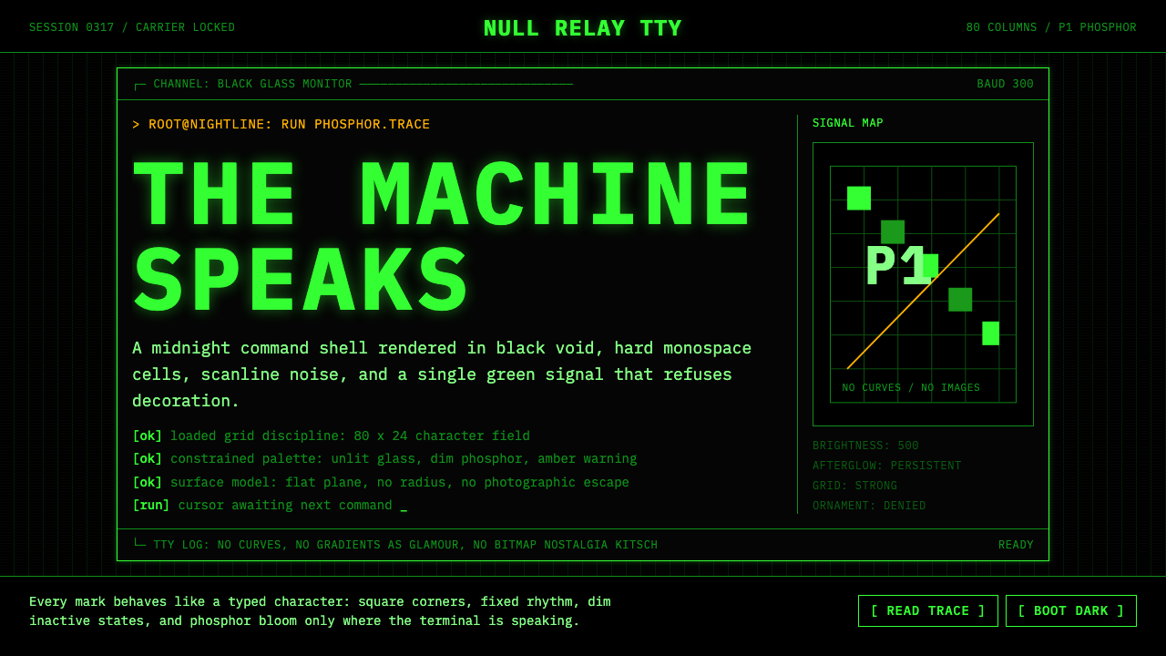 CLI Hacker Phosphor Green (1985)Pure terminal myth. Black glass, P1 green mono type, scanlines, and rigid 80-…
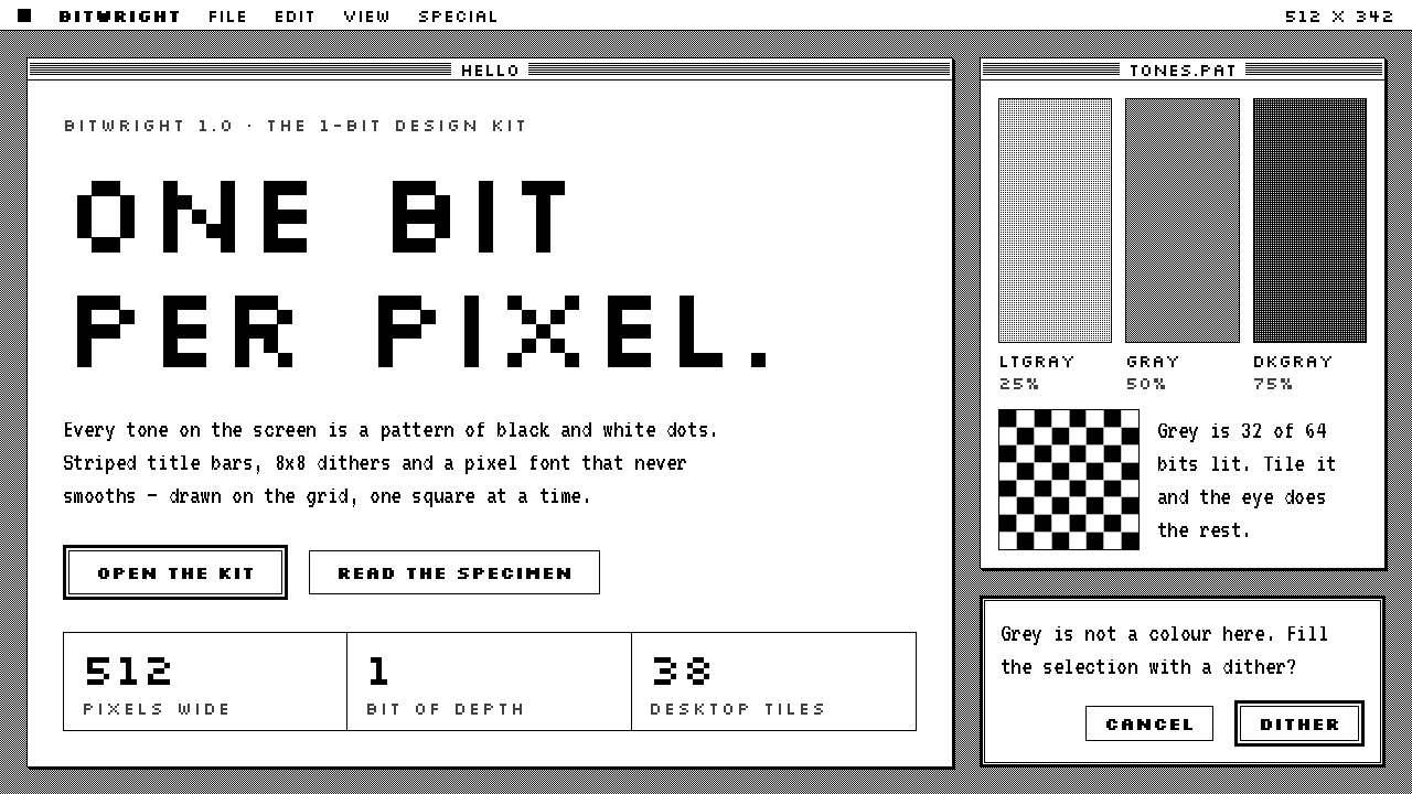 Macintosh 1984One bit per pixel, no grey. Black on white, striped title bars, dither fills…
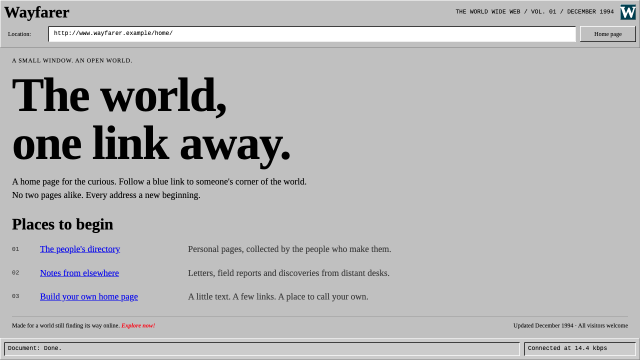 Netscape NavigatorThe web before polish. Grey bevels, blue underlined links and unadorned Times…
 Peter Saville / Factory RecordsAnti-design becomes high art. Void black, white pulsar lines, and FAC mono la…
 Photoshop 1.0One blue in a 1-bit world. Garamond wordmark, 1px frames, dithered greys, two…
 Windows 95One bevel does all the depth. Silver chrome and a navy title bar on a flat te…