What is Thriller (1982)?
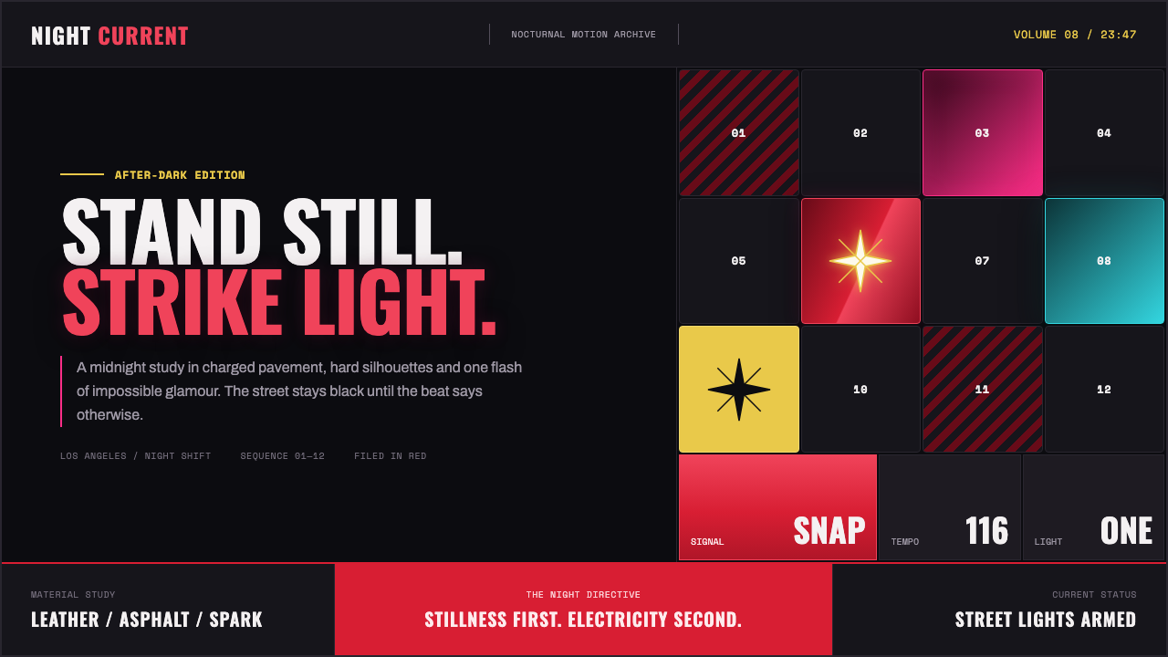
Thriller turns a blacked-out street into a stage: red leather, rhinestone sparks, and a pavement grid that wakes under the beat.
Thriller (1982) in brief
Thriller is a nocturnal pop spectacle drawn from the visual world surrounding the 1982 record: not horror-film gore, but the charged glamour of a city street after dark. Its scene is reduced to a few highly legible forces. A red zip-quilt leather surface catches sodium-like light. A rhinestone glove concentrates attention into one flashing gesture. Beneath the figure, a tiled pavement grid can ignite square by square in magenta and cyan. The surrounding darkness is not empty background; it is the condition that makes every reflective surface, red accent, and illuminated tile feel electrically present.
The style depends on controlled contrast between stillness and release. The figure does not drift through a soft, atmospheric scene. It holds a pose, presents a hard edge, and then lets a single detail deliver the shock. That logic makes Thriller less about visual abundance than visual timing. Black absorbs everything nonessential; red establishes the central silhouette; glitter becomes a sharp event rather than a general decorative texture. The resulting image feels theatrical, but its theater is concise: one street, one stance, one moment of light taking command.
Visually, Thriller combines glossy material, graphic outlines, neon-like illumination, and dance-floor geometry. The red leather should read as structured and reflective rather than soft or rustic. Rhinestones should produce hard points of brilliance, not a diffuse haze. The grid should feel like physical pavement with bordered tiles, each capable of becoming active on its own. This creates a dark visual system in which surfaces, gesture, and floor all participate in the same rhythm.
Where does Thriller (1982) come from?
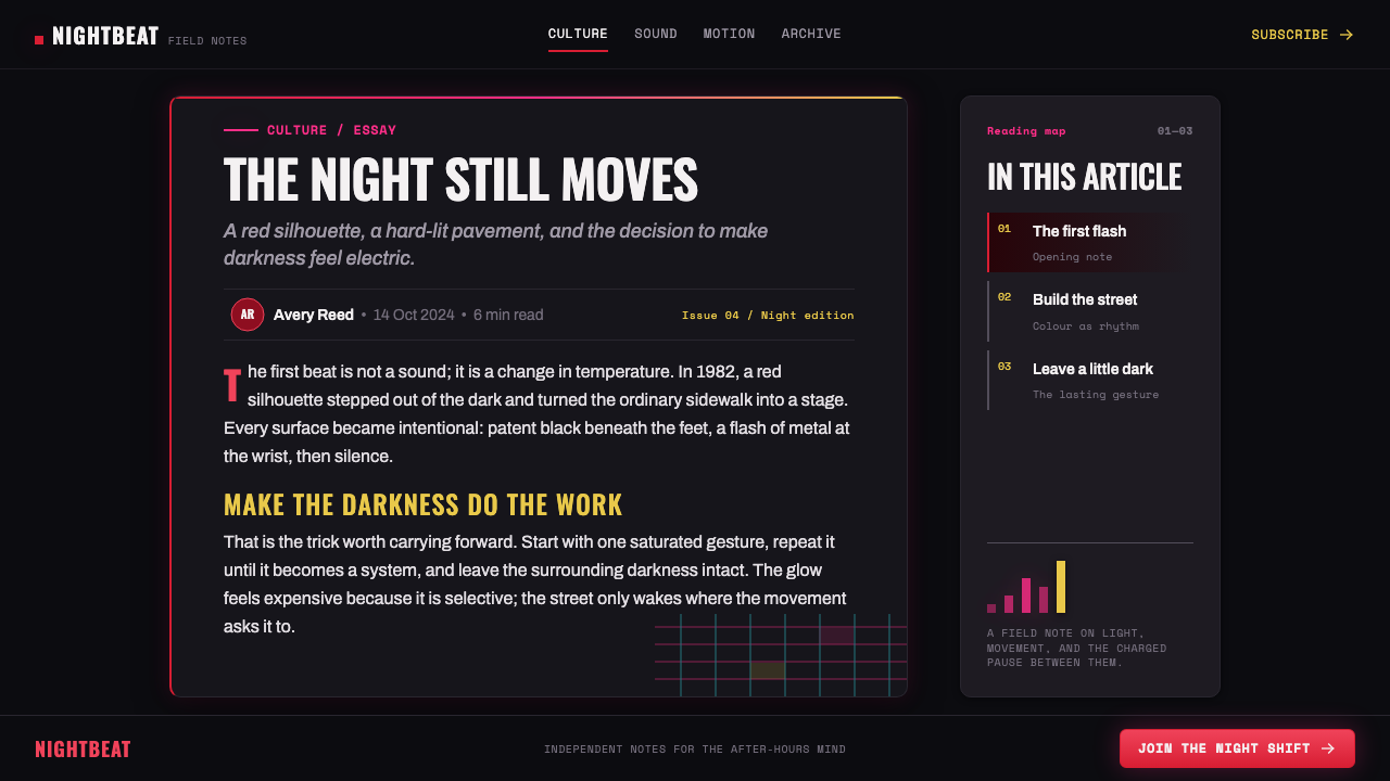
Thriller belongs to the period from 1982 to 1984, centered in Los Angeles, California. The album was released on November 30, 1982, and the Thriller short film aired in December 1983. Those dates matter because the style is inseparable from an early-1980s moment when pop music, television, choreography, and cinematic staging could operate as one public image system. The visual identity is therefore not merely album packaging or costume direction. It is an environment built for a performance to be remembered in still frames, gestures, and flashes of light.
The source material places the style within early-80s MTV music-video spectacle, post-disco pop, street-dance choreography, and cinematic pop iconography. These movements explain its unusual balance of polish and immediacy. It is glamorous without becoming distant, street-based without becoming casual, and cinematic without relying on a crowded narrative setting. The street is staged rather than documentary. The pose is choreographic rather than accidental. Every element is selected to remain legible when the image is frozen at its most charged instant.
Five key figures are named in the source material: Michael Jackson, Quincy Jones, Rod Temperton, John Landis, and Deborah Nadoolman Landis. Their presence situates Thriller in a collaborative cultural moment rather than treating it as the product of a single image alone. The visual system carries the trace of music, short-film presentation, clothing, movement, and spectacle meeting on the same night street. That convergence is why the style feels both intimate and monumental: a close-up sparkle can carry as much force as the illuminated pavement beneath it.
The period’s lasting contribution is a visual grammar of concentrated iconography. Rather than ask viewers to inspect an elaborate set of secondary references, Thriller gives them a handful of immediately memorable signs: leather red, a glittering glove, black night, a held pose, and lit square tiles. These signs work together because they are not interchangeable decoration. Each controls a different kind of attention: red identifies the figure, sparkle identifies the gesture, darkness isolates the action, and the grid gives the rhythm a visible ground.
What defines the Thriller (1982) look?
Blacked-Out Night
The ground is decisively dark, so the composition begins with absence rather than scenery. Black removes visual competition and gives the red leather, rhinestone flashes, and illuminated tiles room to strike. This is not a moody gray atmosphere or a richly described cityscape. It is a stage-like night in which only the activated surfaces are allowed to speak.
Leather Red
Red is the principal source of heat and identity. It should appear as zip-quilt leather: glossy, structured, and sharply separated from the dark ground. The material matters as much as the hue. A flat red field lacks the sense of costume, movement, and nocturnal glamour that the style requires; the surface must suggest seams, reflection, and a body held in a deliberate pose.
Rhinestone Spark
The rhinestone glove is a concentrated punctuation mark. It does not soften the scene with a general shimmer; it produces hard sparks that direct the eye toward a hand, a gesture, or a pose. Glitter is most effective when limited to this focal role. It should feel like light caught on a single decisive object, not like a decorative coating applied everywhere.
Lit Pavement Grid
The grid is not an abstract technical background. It is pavement made visible by rhythm: bordered square tiles that can glow independently. Magenta and cyan establish a neon-like charge against the blacked-out street, but their role is selective. The floor should pulse through isolated accents and paths of activation, preserving the idea that the beat is traveling through the ground rather than flooding every tile at once.
Stillness and Snap
Thriller uses pose as structure. The image begins in a held, readable state, then implies a sudden release through one gesture, one reflection, or one active section of floor. This makes the composition feel choreographic even when no movement is shown. A successful application should preserve that tension: the body or central object remains clear and controlled while the surrounding light suggests an imminent beat.
Hard Gloss
Edges remain hard and surfaces remain glossy. The style favors clean boundaries, direct reflections, and crisp tile borders over soft diffusion, mist, or worn texture. Gloss is not used to make everything luxurious; it is used to make chosen elements look charged by the night. The contrast between polished surfaces and the absorbing black ground supplies much of the visual drama.

Who shaped Thriller (1982)?
Michael Jackson is named among the key figures of the Thriller period. Within this visual language, the central figure is inseparable from the held pose, the red leather silhouette, and the single glove that turns gesture into a concentrated flash of attention.
Quincy Jones is listed as a key figure in the source material for the 1982–1984 Thriller era. His inclusion places the style within a larger pop collaboration in which music and visual spectacle are understood as parts of the same public experience.
Rod Temperton is named as one of the key figures connected to the Thriller era. The style’s visible sense of beat — light advancing across pavement, sparkle punctuating a pose, and a dark scene awaiting release — reflects the importance of rhythm as a compositional idea.
John Landis is included among the key figures, alongside the Thriller short film that aired in December 1983. The pairing locates the visual system within cinematic pop iconography: a street setting becomes a deliberately staged image, designed to carry drama through silhouette, light, and pause.
Deborah Nadoolman Landis is named as a key figure in the source material. Her inclusion reinforces that Thriller’s identity is carried not only by setting and movement, but by the immediately recognizable relationship between costume surface, red silhouette, and the brilliance of the glove.
How do you use Thriller (1982) today?
For presentation covers, Thriller works best when the page behaves like a night street before the beat lands. Use a nearly black field, establish one dominant red leather-like form or silhouette, and reserve sparkle for a single focal gesture. A restrained grid may rise from the lower portion of the composition, with only selected tiles illuminated. The title should feel posed rather than ornamental: clear, confident, and given enough empty darkness to command the frame.
Content slides should turn the lit pavement into an organizing system. Use bordered tile regions to group ideas, but avoid making every section glow at once. Let one active route through the grid guide the reading sequence, while secondary content sits quietly against the dark ground. For data slides, treat bars, markers, and comparison zones as tiles that can be activated individually. Red should identify the primary story; magenta or cyan can signal a selected contrast, change, or secondary path without dissolving the hierarchy.
For web interfaces, the style is strongest in dashboards, launch surfaces, entertainment products, and pricing experiences that benefit from urgency and spectacle. The dark background should keep surrounding interface furniture quiet. Use the red leather logic for the main action or featured tier, the rhinestone logic for a rare reward or status signal, and the pavement logic for navigation, progress, or grouped metrics. Interactive emphasis should travel through the interface as a sequence of isolated signals, not as constant universal glow.
For editorial and marketing layouts, Thriller can make announcements, product reveals, event pages, and campaign stories feel staged and kinetic. Build the page around a deep dark field with a strong red visual anchor, then use a controlled band of illuminated tiles to separate or connect sections. Photography or imagery should remain sharply cut from the background and treated as a performer on a set, rather than softened into a lifestyle atmosphere. Copy works best when it arrives in short, declarative blocks that leave room for the pose and the light.
The common mistake is to translate Thriller into generic retro neon: too many glowing colors, a busy city background, diffuse smoke, and sparkle scattered across every element. That loses the system’s discipline. The style needs black space, a single red focal identity, hard reflective surfaces, and independent grid accents. Likewise, treating the glove as a repeated motif weakens it; its power comes from being the one concentrated source of visual speech.
Thriller (1982) — FAQ
Is Thriller primarily a horror style?
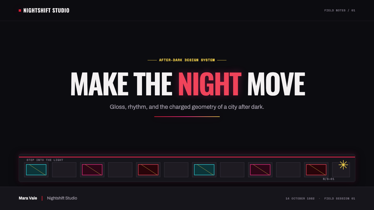
No. The source material explicitly draws the system from the glamour of the nocturnal street rather than horror-film gore. Its dramatic charge comes from blacked-out space, red leather, rhinestone sparkle, choreography, and illuminated pavement. The atmosphere can feel suspenseful because it withholds light and then releases it, but the core visual language is pop spectacle rather than gore.
Why is the background so dark?
The blacked-out ground is what gives the red and sparkle their charge. If the surroundings are equally bright or detailed, the leather silhouette, glove, and pavement grid lose their ability to direct attention. Darkness also supports the style’s rule of stillness and snap: the scene waits in silence until one chosen surface or tile becomes active.
Can magenta and cyan both appear in the same layout?
Yes, but they work best as selective pavement-grid illumination rather than as broad background color. The source describes bordered tiles that can glow independently, one accent at a time. Let the two hues create routes, contrasts, or separate moments of activation while the black ground and red focal identity remain dominant.
Does the style require a figure or a glove?
A figure and glove are the clearest references, but the deeper principle is concentrated gesture. A product, title, cursor, selected metric, or featured card can take the role of the glove if it is the single point that throws light into an otherwise controlled scene. The important part is not literal costume imitation; it is giving one element permission to do the talking.
Where does Thriller struggle as a design direction?
It struggles where constant calm, soft warmth, or dense everyday information is more important than dramatic focus. The style depends on darkness, selective emphasis, and a staged pause, so it can make routine utility screens feel overly theatrical if applied without restraint. It is strongest when a product or page has a clear moment to spotlight, and weaker when every element must compete for equal attention.
Related design styles
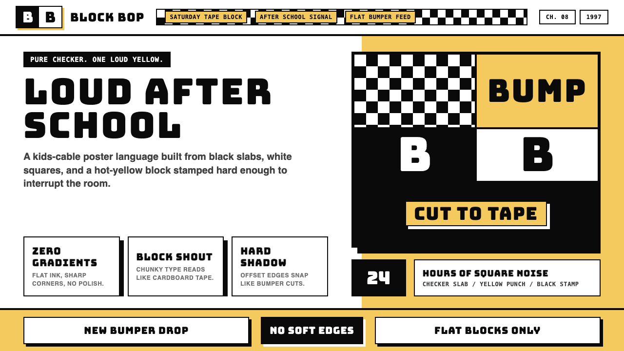 Cartoon Network 90s BlocksKids-cable noise, squared. Black-white checkerboards crash into hot-yellow Bu…
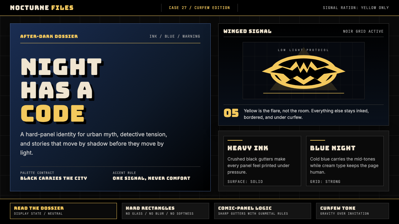 DC Comics Batman NoirGravity, not cheer. Black panels, Gotham blue, and one bat-yellow signal cut…
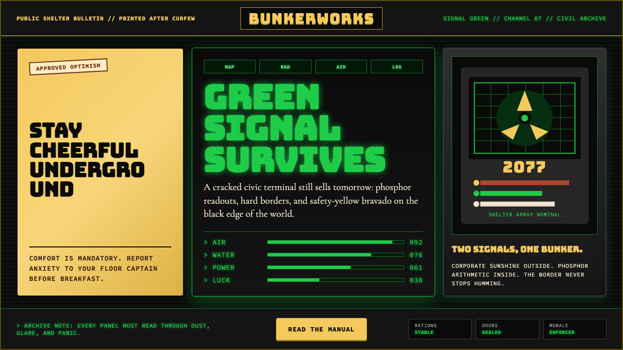 Fallout Vault-Tec Pip-BoyIrradiated optimism. Vault yellow and CRT green lock into a bordered bunker g…
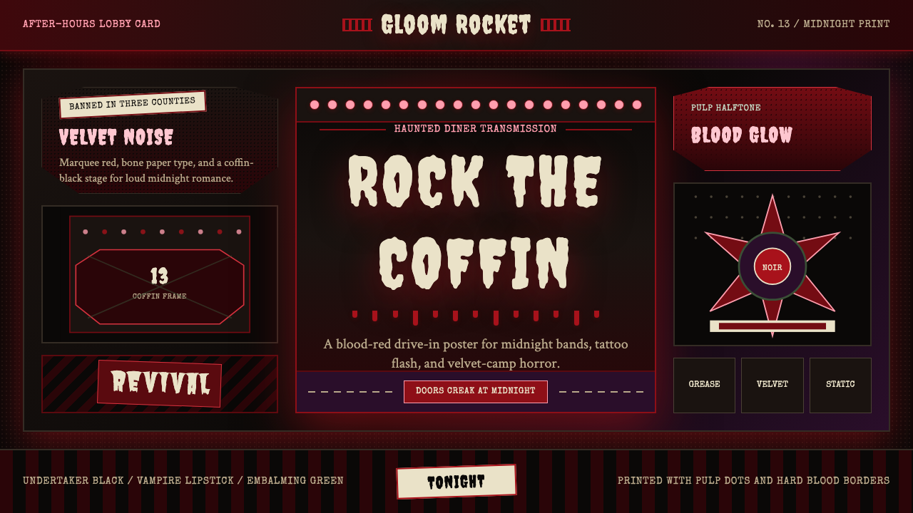 Gothabilly Horror RevivalHaunted swagger. Blood-red marquee type, coffin frames, and pulp halftone on…
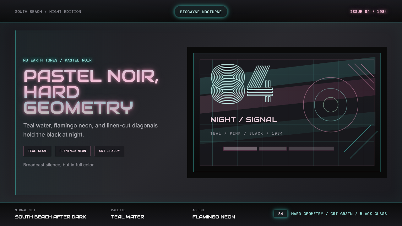 Miami Vice Pastel Teal (1984)Pastel noir, not nostalgia. Teal glow and flamingo pink slice black with geom…
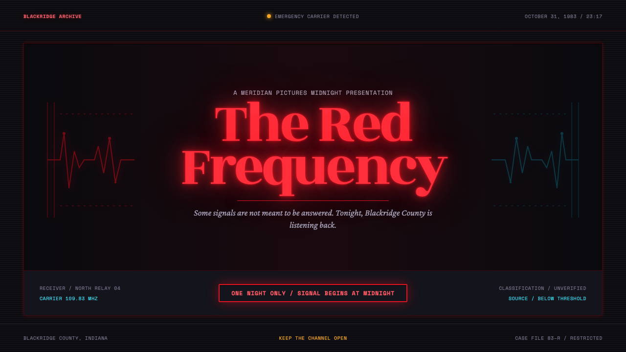 Stranger Things (1983)Red light breaks the void. A spurred serif blooms through VHS static and cold…