What is Metepec Tree of Life?
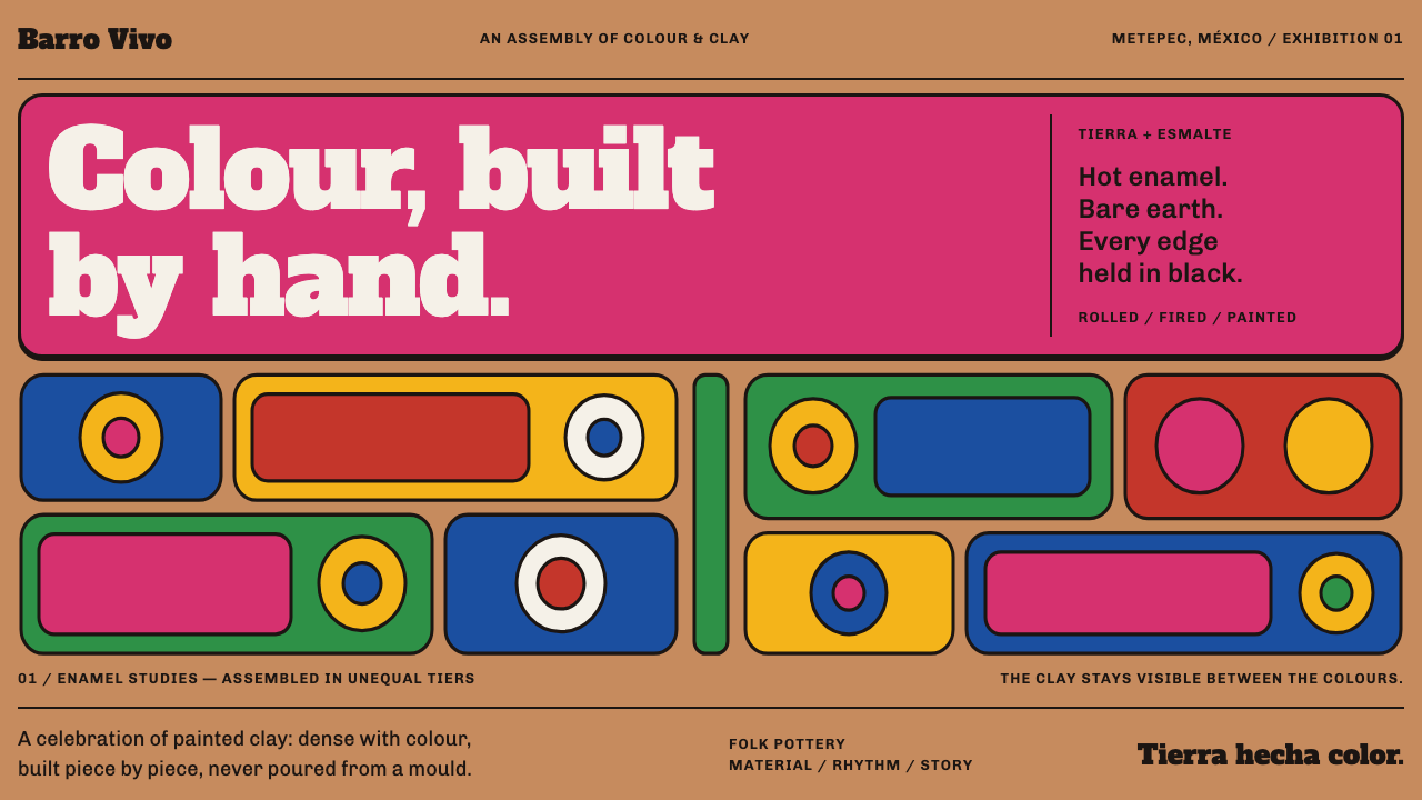
A Metepec tree of life is assembled, not designed — hand-rolled figures in enamel so hot it looks wet, tiered off a trunk, with bare clay showing in every gap.
Metepec Tree of Life in brief
Metepec Tree of Life is the visual language of the árbol de la vida made in Metepec, in the Estado de México, Mexico. A tree is built from parts: Adam and Eve, the serpent, angels, doves and six-petal flowers, each rolled by hand, fired, and then painted in enamel so hot it looks wet. Between the figures the sandy red-buff clay body is left bare, which is the whole tell that a human built the thing.
The design system works in exactly the same way. A clay-coloured ground carries flat colour fields, each one walled in by a black outline, stacked in tiers off a central trunk. Nothing is airbrushed. Nothing is perfectly symmetrical. No margin is left generous. Density is not a flaw to be corrected here; density is the point, and the craft is in how much can be fitted together while every piece stays distinct.
In terms of colour, the style is loud and warm: a hot pink, a cobalt blue and a chrome yellow, set against the earthy red-buff of the clay and held apart by black. It is festive, direct and crowded, a style that speaks in the voice of a village workshop and not that of a studio. In a Chinese-language context it suits folk art, exhibitions, festivals and handmade brands, which is where its warmth and bluntness land best.

Where does Metepec Tree of Life come from?
The imagery points back to colonial catechism. The Tree of Life in Metepec carries Genesis iconography: Adam and Eve, the serpent, the angels, the doves, all arranged on the branches of a single tree. The record describes it as village Genesis iconography with colonial roots, which tells us the form began as a way of picturing a story that a community already knew. That narrative purpose still shapes the look, because a story told in a single object needs to be read in parts, one figure at a time, and so the parts are individually clear.
The version that collectors know is more recent. The modern collector's Tree appears from the 1930s onward and peaks in the middle of the twentieth century, when Mexican arte popular collecting made handmade pieces from villages like Metepec into prized objects. It belongs to the wider tradition of Mexican folk pottery, particularly the polychrome clay called barro policromado, in which fired clay is finished with bright painted colour. In this period the Tree grew more elaborate, more crowded and more colourful, as makers answered a market that valued showpiece density.
The record attaches three names to this modern tradition: Modesta Fernández Soteno, Alfonso Soteno and Tiburcio Soteno. They are the people most closely associated with the collector's Tree as the style now understands it. The design system does not need to claim more about them than their names and the family line they suggest. What matters for the style is that the craft is carried by makers with a recognisable hand, and that each tree is the work of a person and a workshop, not a factory.
How the tree is made explains how the style looks. Each figure is rolled by hand, fired, and only then painted in enamel. Because the painting comes after the firing, colour sits on top of a finished clay body as a fresh, glossy-looking coat, and the places where it stops reveal the clay beneath. The tree is mounted on a trunk and built upward in tiers, so a viewer reads it from the base to the crown. This is a built object in which every joint is visible, and the design system treats that visibility as its main virtue.
What defines the Metepec Tree of Life look?
Bare Clay Ground
The ground is the colour of the clay body itself, a sandy red-buff, and it is allowed to show between the coloured fields. This is the key signal that the object is handmade and not moulded. In design terms, the background is not a neutral canvas to be hidden; it is an active colour that pokes through every gap and warms the whole page.
Enamel That Looks Wet
Colour is hot pink, cobalt blue and chrome yellow, laid on as flat, saturated enamel that seems barely dry. There are no gradients and no glassy highlights; the shine comes from the saturation and from the way a thick coat sits. Colours are chosen to clash productively, and the black outline is what stops the clash from turning into noise.
Black Outline Walls
Every colour field is walled in by a black outline. The outline is not decoration; it keeps neighbouring colours from bleeding together and makes each piece readable as a separate figure. It is drawn with a hand, so its weight varies and it wobbles, and it is always darker than any fill it contains. Think of the outline as the style's grammar.
Tiers Off a Trunk
The structure is a central trunk with tiers rising off it, each tier carrying a cluster of figures and flowers. Reading proceeds from the base to the crown, and the tiers give the crowd a sense of order. For layout, this means a clear vertical spine with horizontal layers that branch out to either side, so the page can be dense without becoming chaos.
Imperfect Symmetry
Left and right branches do not need to line up. A real tree never mirrors itself, and a hand-built one mirrors itself even less. Pieces differ in size, angle and spacing, and the differences are part of the charm. Symmetry is only approximate, enough to feel balanced, never enough to feel mechanical.
Stingy Margins, Crowded Edges
Whitespace is rationed. Figures crowd the edge of the frame and push against each other, and the gaps that remain are small and irregular. This density is the opposite of the modern preference for air, and it is deliberate: a Metepec tree is a showpiece, and it shows off by being full. Leaving a margin generous would turn the style into something else.
Hand-Rolled Motifs
A small repertoire repeats: Adam and Eve, the serpent, angels, doves and six-petal flowers. Each is rolled by hand, so no two copies are identical, and the repetition has the rhythm of a workshop rather than a stamp. For design, this suggests building with a limited set of recognisable shapes that recur with slight variation, not inventing a new shape for every occasion.

Who shaped Metepec Tree of Life?
Modesta Fernández Soteno is the first of three names the record associates with the modern collector's Tree of Life. Her name is a marker of the lineage of makers in Metepec, a family tradition in which skill is handed down inside a workshop. The style takes from this lineage its attitude: pride in density and in the visible hand, and a conviction that the maker's touch is the product.
Alfonso Soteno shares the Soteno name with the other makers in the record and belongs to the same Metepec tradition of collector's trees. His place on the list underscores that the Tree is a family craft, learned by watching and doing. For a designer, the family connection explains why the style hangs together as a recognisable language even though each tree differs.
Tiburcio Soteno is the third Soteno name attached to the modern Tree. Together with the other two, his name stands for a body of work made over decades, from the 1930s into the middle of the twentieth century, when the collector's Tree took its familiar shape. The record gives names, not a biography, so the useful reading is of a continuing craft carried by several hands.
Arte popular collecting is the movement that turned Metepec's trees from village objects into prized pieces, and it helped the collector's Tree reach its mid-twentieth century peak. Collectors rewarded showpiece density, bright enamel and clear Genesis storytelling, and they shaped how the form developed. For the style, the collectors are the original audience: people who looked at a crowded tree and valued exactly that crowding.
How do you use Metepec Tree of Life today?
Metepec Tree of Life is a strong fit for work that wants to be warm, loud and obviously handmade. Its principles are structural: put flat colour on a clay ground, wall each field in black, stack the fields in tiers off a trunk, and fill the frame. Applying it well means trusting density and letting the hand show.
For presentation slides, a cover can be built as a central trunk with tiers of outlined colour blocks and hand-made motifs rising behind the title, set on a clay-coloured ground. Content slides can treat each point as a tier, with the black outline separating them, and spacing kept tight. Data slides suit bars and segments filled with flat enamel colour and walled in black, with the bare clay colour showing between them as a natural gap.
For web interfaces, the style fits folk-art museums and exhibitions, festival and event sites, craft and handmade brands, regional food and drink, cultural education and playful community products. Cards can be outlined colour blocks packed together with only a small gap, buttons can be flat saturated fills with a black outline, and section dividers can be a tier of repeating motifs. Keep body text on a plain clay or cream block so reading stays easy, and let the loud areas live around it.
For editorial and marketing work, the style supports exhibition posters, festival programmes, packaging, calendars and craft catalogues. A poster can be built as a single crowded tree, and a programme can be arranged as tiers of events. Photography should be warm, close and a little imperfect. The style's directness works well for headlines, since a short bold line set against flat colour reads at once, and it welcomes hand-drawn lettering more than polished type.
The most common mistake is to soften it. Adding gradients, glossy highlights, soft shadows or airbrushed transitions removes the quality that makes the style itself. A second error is to impose perfect symmetry and generous whitespace, which turns a crowded tree into a tidy corporate layout. A third is to cover the clay ground completely, so no bare clay is left to show, or to use colour without the black outlines that keep the fields apart. Density is the point, but it only works when each piece stays distinct.

Metepec Tree of Life — FAQ
Why is the clay left bare between the figures?
Because the bare clay is the proof of the hand. The sandy red-buff body of the pot shows between the painted figures, and it tells the viewer that the piece was built and not poured into a mould. In the design system, the same ground colour shows through the gaps between colour fields. It also warms the palette and gives the loud enamel colours an earthy anchor.
What is the role of the black outline?
The black outline walls in each colour field. It keeps hot pink, cobalt and yellow from bleeding into one another, makes every figure legible as a separate piece, and gives the crowded composition its grammar. It is drawn by hand, so it varies in weight and wobbles slightly, but it stays darker than any fill it contains. Without it the style would read as a noisy patchwork rather than a tree.
Is the style really meant to be this crowded?
Yes. Density is the point. A Metepec tree is a showpiece that proves its craft by how much it holds and how clearly it holds it. The crowding is controlled by the trunk, the tiers and the outlines, which give the eye somewhere to go. If you want a calmer layout, reduce the number of tiers rather than loosening the margins, and keep the pieces that remain tightly packed.
Can the Metepec style work on a dark background?
The style depends on a mid-tone clay ground and on black outlines that are darker than the fills, so a black or very dark ground erases its grammar. A dark variant is possible only if the ground is a deep earthy brown and the outlines remain the darkest element on the page. In most cases it is better to keep the clay ground and, if a dark mode is needed, let the loud colours sit on a deep clay tone without losing the outlines.
Where does the style struggle?
It struggles wherever calm, minimalism or corporate polish is the goal: financial dashboards, legal services, enterprise software and luxury brands that rely on empty space. Its density and saturation can make long reading tiring, and it can overwhelm small screens if every area is filled. It is strongest for celebration, craft, culture and community, where warmth and directness are the values being sold.
Related design styles
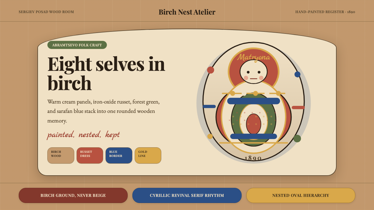 Russian Matryoshka 1890Warmth nests inward. Birch, cream, russet, and egg-oval type stage handmade d…
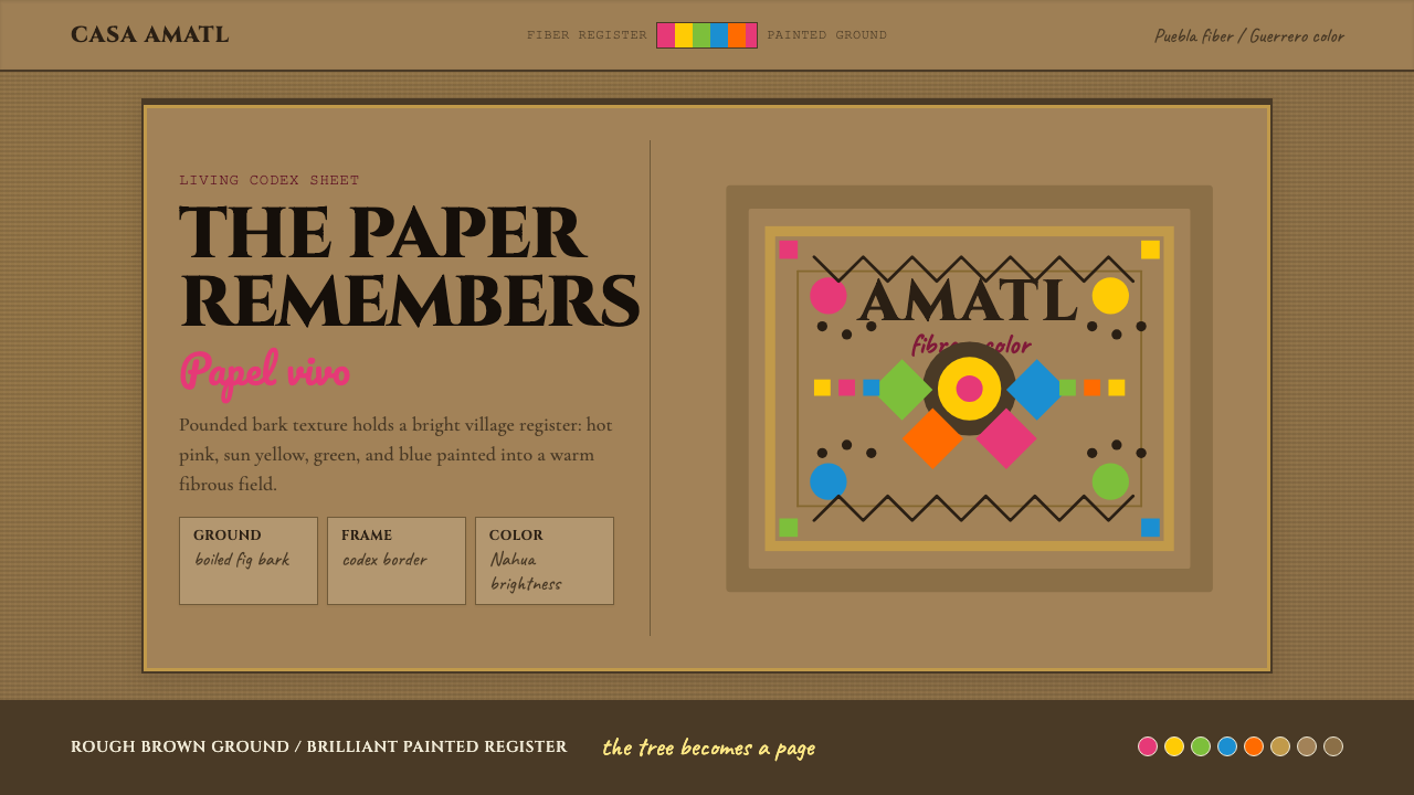 Mexican Amate Bark PaperLiving craft, not nostalgia. Bark-brown fiber carries hot pink and sun-yellow…
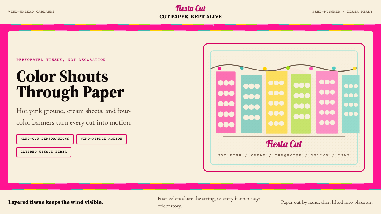 Mexican Papel Picado TissueFiesta cut paper. Hot pink, turquoise, yellow banners and hand-cut perforatio…
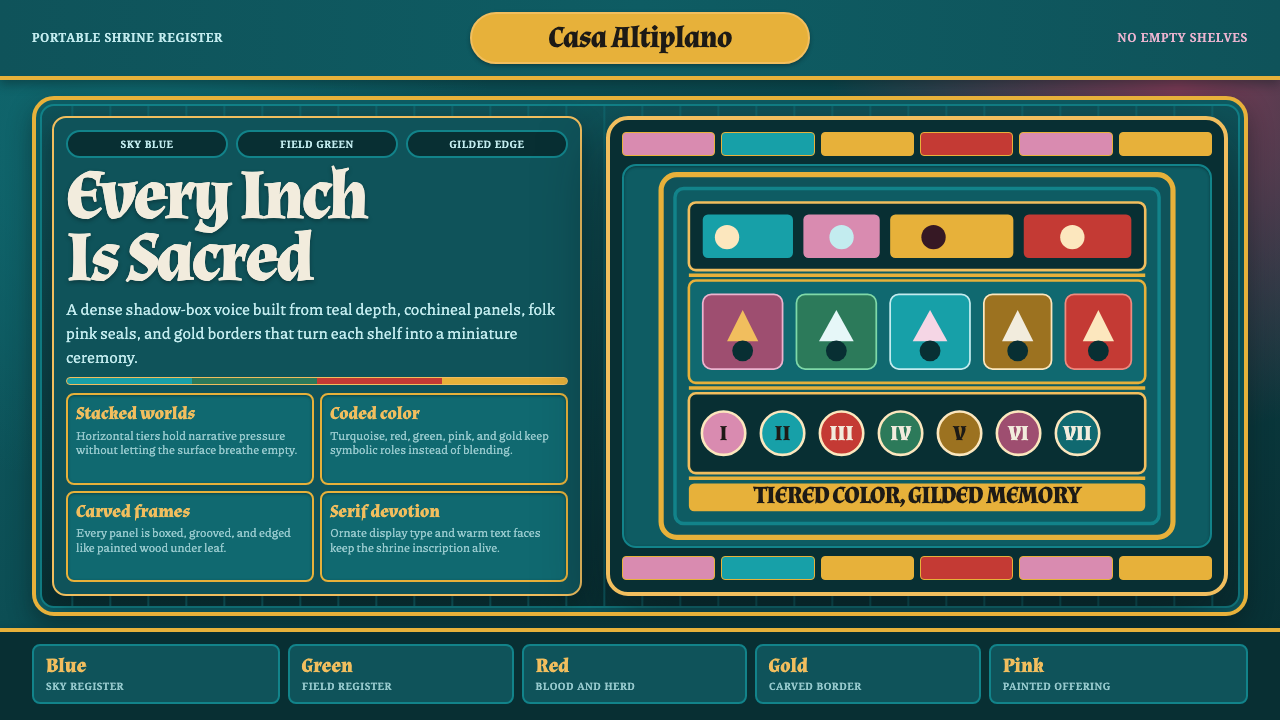 Ayacucho Retablo BoxSacred density. Deep teal shelves pack turquoise, cochineal, folk pink, and g…
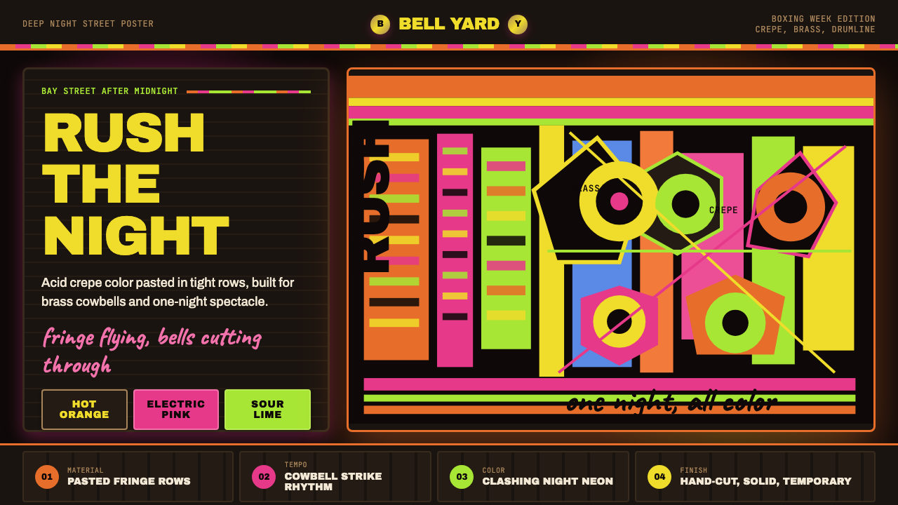 Bahamian Junkanoo CowbellNight refuses silence. Acid crepe stripes and block type collide like cowbell…
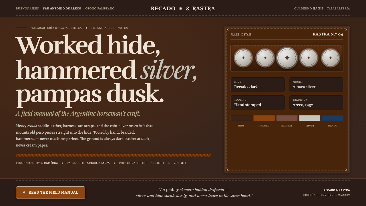 Gaucho LeatherHand-worked horseman craft. Dark recado leather, harness tan, coin-silver ras…