What is Mesh Gradient?
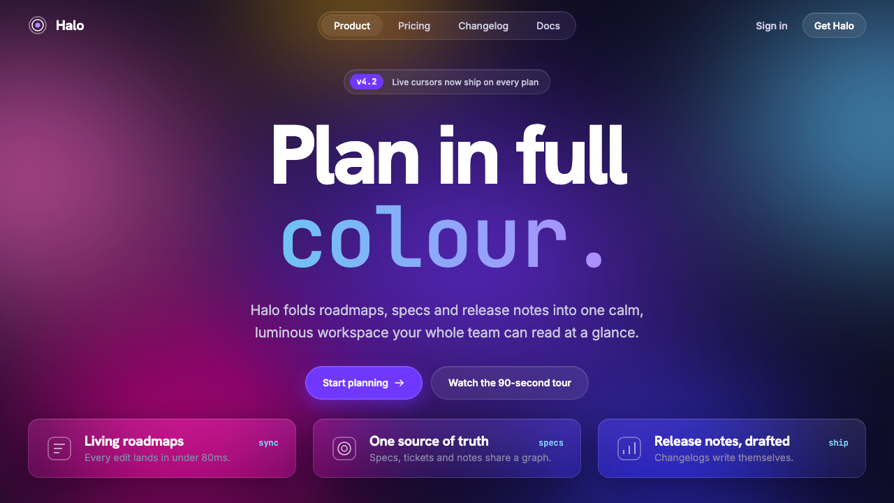
The mesh gradient is the early-2020s SaaS hero: soft blobs of violet, magenta and cyan melting into one another behind a bold headline, and the light itself becomes the background.
Mesh Gradient in brief
Mesh gradient design is the look of the early-2020s SaaS landing page: huge, soft blobs of violet, magenta, sky-cyan and amber melting into one another behind a bold sans-serif headline. The colors are blurred until no edges remain, so the background reads as a source of light rather than a picture of anything. It typically sits on a near-black base, which makes the colors glow.
On top of that glow sit a few carefully restrained elements. A heavy white headline carries the message. Frosted-glass cards, bordered by a thin translucent white line, hold features, prices or changelog entries. A single monospace word, often something like a builder or engineer label, adds a technical accent. Underneath, a calm twelve-column layout keeps everything aligned, so the drama is confined to the background and the content remains orderly.
The appeal is that it feels both expensive and weightless. The gradient suggests motion and possibility without needing an illustration, and the glass cards make the interface feel layered and modern. As a system it is a recipe more than a motif: glowing mesh, frosted cards, bold type, restrained grid, each component doing a specific job.

Where does Mesh Gradient come from?
The look has a traceable lineage. Stripe is widely credited with setting the gradient moving: around 2019 its marketing site used a WebGL-rendered animated gradient, and the period from roughly 2019 to 2020 is when that approach began to spread. A gradient that slowly shifted in a browser, rather than a static image, was a statement about craft, and other companies noticed.
The second ingredient is glassmorphism. The term was coined in November 2020, and Michal Malewicz is associated with naming and popularizing it: translucent, blurred panels with a light edge, floating over colorful backgrounds. Kevin Hufnagl is listed among the key figures of this wave as well. Combining glassmorphic cards with a blurred mesh background gave designers a way to show depth without heavy shadows or ornament.
The third ingredient is the dark base. Developer-focused companies, among them Vercel and Linear, put the gradient on a near-black ground and paired it with bold white type. Linear's web team is named among the key contributors to that look. By 2021 the dark-base gradient hero was at its peak, and many SaaS sites shared a similar opening screen: a glowing field, a large headline, a couple of glass cards.
As a movement, mesh gradient belongs to SaaS marketing design, glassmorphism and WebGL hero backgrounds, and its center was global but led by San Francisco and remote-first SaaS companies. It is a design of its moment: it reflects a time when software companies wanted to look technically capable and calm at once. Its ubiquity also made it a target for criticism as generic, which is why systems like this one focus on keeping the recipe honest, using each ingredient for a reason rather than as decoration.
What defines the Mesh Gradient look?
Color
The palette is a near-black base with a handful of luminous hues: violet, magenta, sky-cyan and a touch of amber. These colors never appear as flat blocks. They are blurred into each other so that transitions are continuous, and their saturation is high enough to glow against the dark. Text and hairlines are white, which keeps the colorful part confined to the background.
The blurred mesh
The defining element is a field of large, heavily blurred color blobs, often animated to drift slowly. Its edges have been dissolved, so it reads as ambient light. The mesh is placed behind the content as atmosphere, and it is the one place where the design is allowed to be lavish. The slow movement gives the page a sense of life without distracting from the message.
Frosted-glass cards
Cards are translucent and blurred, so the colors behind them show through softly, and each is edged with a thin white hairline of low opacity. They contain features, pricing tiers or release notes. The glass effect separates content from background without a hard shadow, and it keeps the glow visible across the whole page.
Bold sans headline
The headline is large, heavy and set in a clean sans-serif, in white, so it stays legible over the brightest part of the mesh. It is short and declarative, and it is usually the only large type on the screen. The strong weight is a deliberate counterbalance to the softness of the background.
One monospace word
Inside the headline or just beside it, a single word is set in a monospace face, signalling a builder or engineer audience. The restraint matters: using monospace for one word gives a technical accent, while using it throughout would turn the page into a terminal. It is a small gesture that tells developers the product was made for them.
Calm grid underneath
Beneath the spectacle sits a regular twelve-column layout. Cards snap to it, text aligns to it, and spacing between sections is generous and consistent. This is what keeps the page from collapsing into pure atmosphere: the structure is conservative so that the background can afford to be dramatic.

Who shaped Mesh Gradient?
Associated with naming and popularizing glassmorphism in November 2020. His articulation of translucent, blurred panels with a light edge gave designers a vocabulary for the frosted cards that sit over the mesh background.
Listed among the key figures of the glassmorphism and gradient-hero wave. His work belongs to the same moment in which blurred, layered interfaces moved from experiments into mainstream product marketing.
Credited with setting the gradient in motion around 2019 using a WebGL-rendered hero. That decision turned a static backdrop into a living surface and became the reference point for many later SaaS marketing sites.
Named among the key contributors to the dark-base gradient look. Their marketing pages helped show how a near-black ground, restrained type and glowing color could signal a precise, developer-oriented product.
How do you use Mesh Gradient today?
On slides, the mesh gradient is ideal for title slides, product launch announcements and section dividers. Use the glowing field as the full-bleed background, place a short white headline over it, and let a single glass card hold a subtitle or date. Avoid putting dense text directly over the brightest part of the mesh; for content slides, switch to a calmer area of the gradient or darken the background so the text remains easy to read.
For data slides, treat the gradient as a backdrop and the glass card as the stage. A chart inside a frosted card on a dark ground looks refined, as long as the chart itself uses a restrained set of colors drawn from the mesh. Keep gridlines faint, labels white and the number you care about large. Do not let the background colors compete with the data series; if the background is vivid, make the chart quiet.
In web interfaces, the style is at home on product launch pages, pricing pages and changelogs for developer tools and SaaS products. The hero carries the glow and the headline; pricing tiers and release notes live in glass cards beneath it. Keep the animated mesh slow and provide a static fallback for users who prefer reduced motion, since movement behind text can be tiring.
In editorial and marketing work, the look suits announcement posts, conference graphics, newsletter headers and social images where a single bold statement is enough. The gradient does the work of illustration, so the layout can stay minimal. It is less suited to long reading, because glowing backgrounds and glass layers are tiring over many paragraphs.
The most common mistake is to use the gradient as decoration on a page that is otherwise cluttered. The style depends on a calm structure and a small number of elements; adding more cards, more colors and more motion breaks the balance. A second mistake is low contrast, where text sits on a glass card over a bright blob and becomes hard to read. A third is overuse: because the look was so widespread, it can read as generic unless the content, copy and hierarchy are clearly specific to your product.

Mesh Gradient — FAQ
What is a mesh gradient?
A mesh gradient is a background made of several large, softly blurred patches of color that blend smoothly into one another, rather than a simple two-color linear fade. In the early-2020s SaaS style, the patches are typically violet, magenta, cyan and amber on a near-black base, and they are sometimes animated to drift slowly.
Who started this style?
There is no single author. Stripe is widely credited with the animated WebGL gradient around 2019 to 2020, glassmorphism was named in November 2020 and is associated with Michal Malewicz, and companies such as Vercel and Linear brought the gradient onto dark bases. The look emerged from the interaction of these influences and peaked around 2021.
What is glassmorphism, and how does it relate?
Glassmorphism describes translucent, blurred panels with a thin light edge that appear to float over a colorful background. In the mesh gradient style, the glass cards are the content layer and the mesh is the background layer. Each needs the other: the blur has little to show without color behind it, and the colorful mesh needs a calm surface for text.
How do I keep text readable on a mesh gradient?
Use white, heavy headlines and keep body text inside frosted cards rather than directly on the brightest parts of the mesh. Darken the base where long text sits, keep the number of competing colors small, and check contrast on the brightest area. If the gradient animates, keep the motion slow and offer a static version for users who prefer reduced motion.
Is the style dated now?
It is strongly associated with 2019 to 2022 and, because it was so widely copied, can look generic if used carelessly. It still works well when the structure is disciplined and the content is specific: a calm grid, a short headline and a small number of glass cards. Used with that restraint, it reads as a deliberate reference to a recognizable moment in software design rather than as a default.
Related design styles
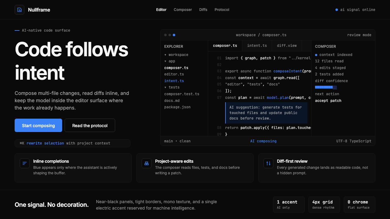 Cursor IDEAI-first code editor. Pure dark surfaces, off-white text, electric blue reser…
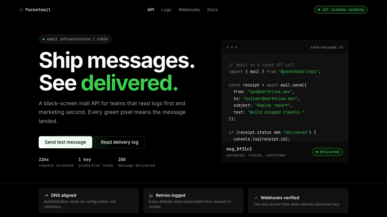 Resend 2024Clean code becomes brand. Pure black, JetBrains Mono, and one green delivered…
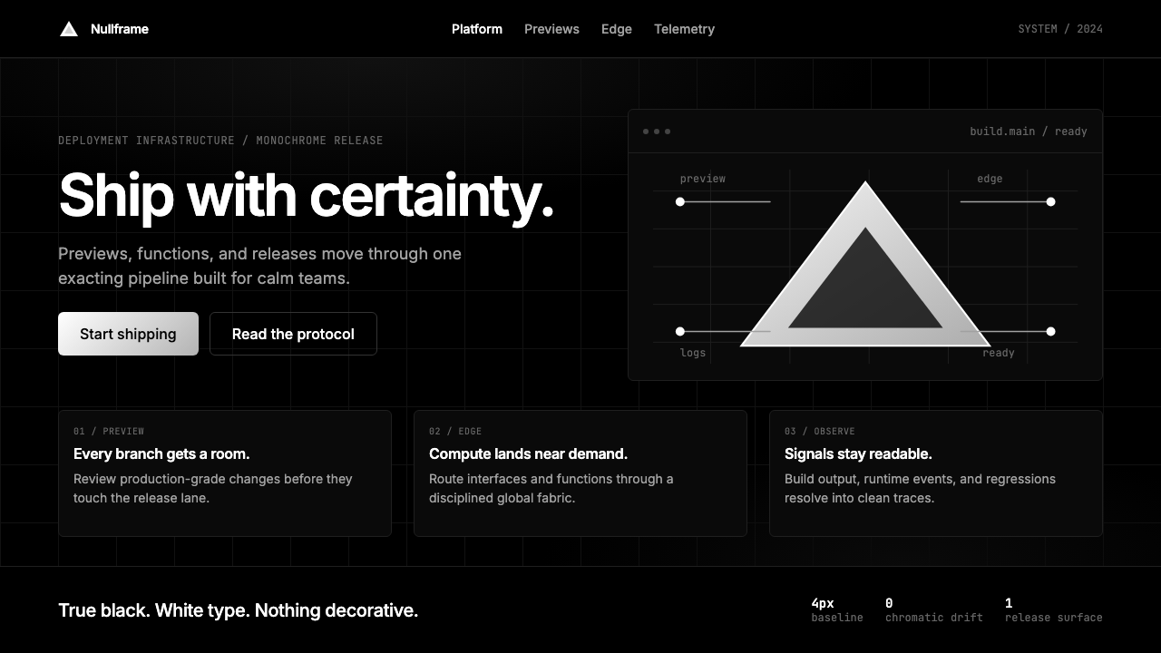 Vercel 2024Developer luxury by subtraction. Pure black, white Inter, rigid grid, triangu…
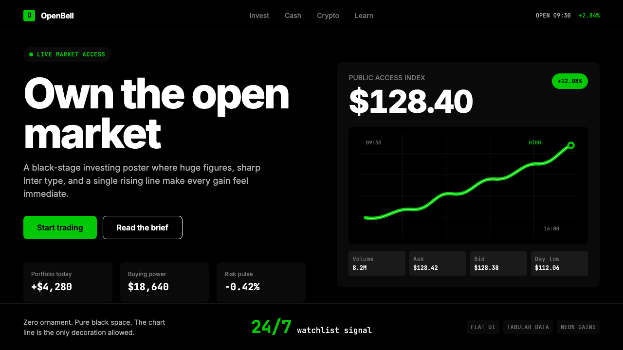 Robinhood 2023Markets feel immediate. Pure black, Inter numbers, and one neon-green line do…
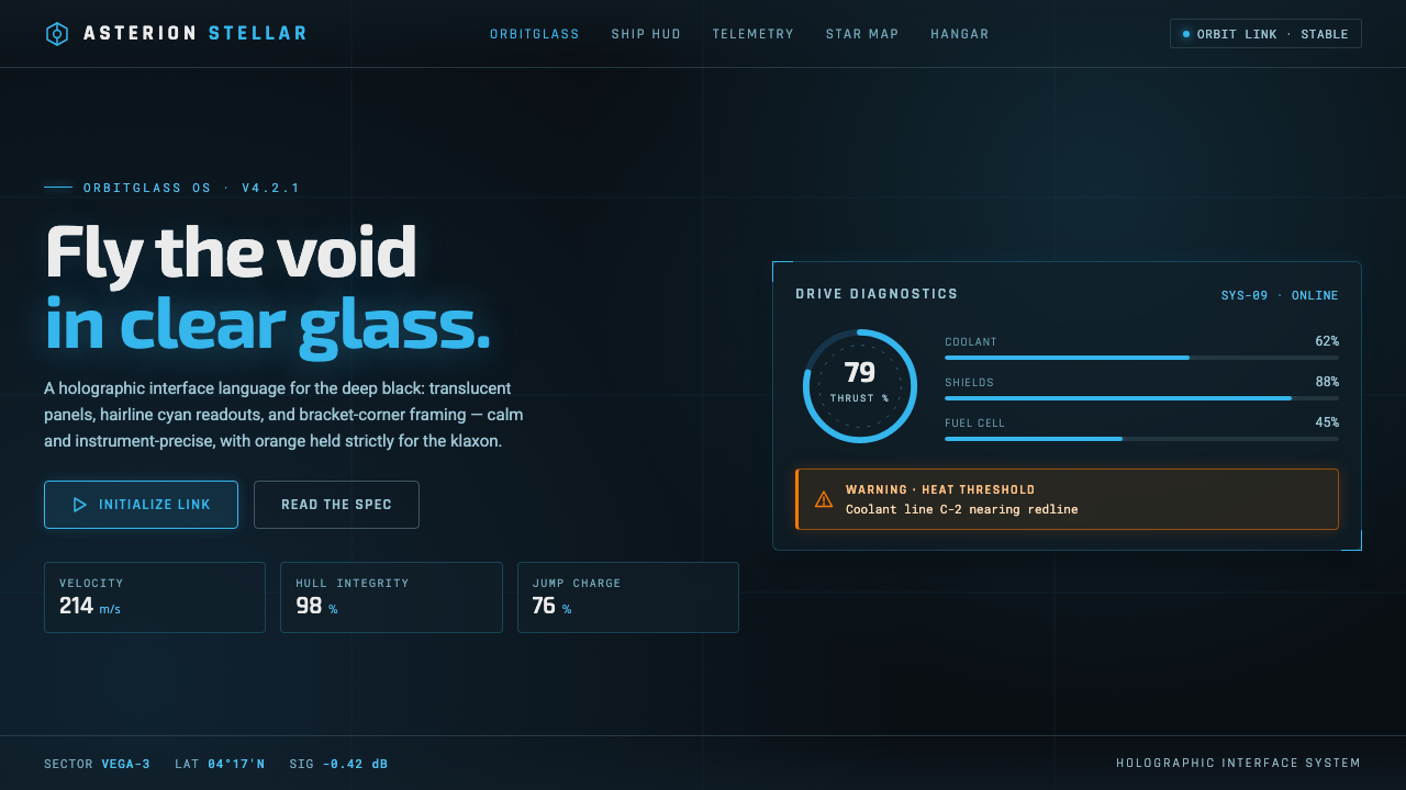 Star CitizenDisciplined holographic HUD. Cyan readouts on glass over a black void, orange…
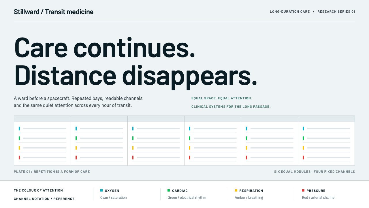 Cryosleep Transit WardCare without spectacle. Clinical white, equal bay grids and the fixed colours…