What is McBling?
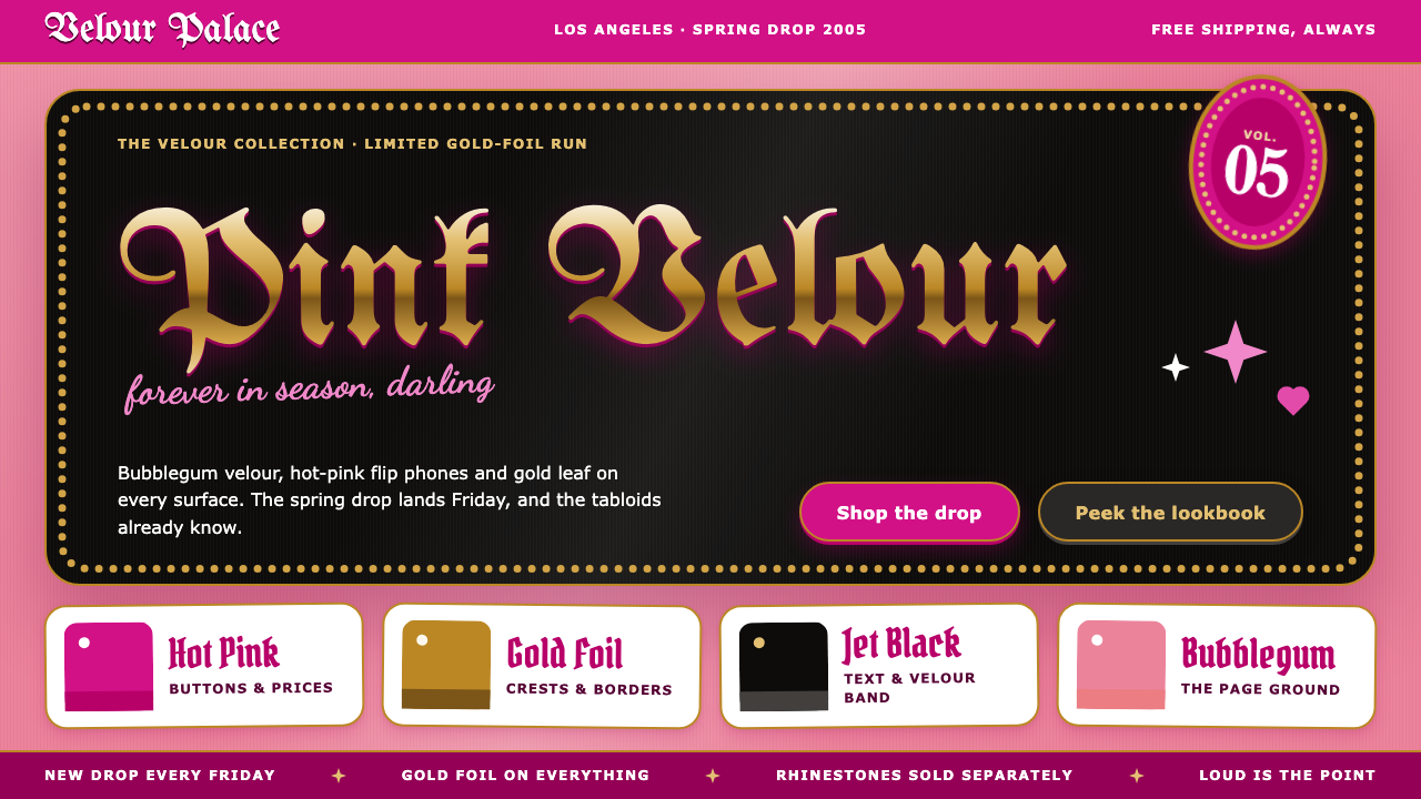
McBling is the sound of a hot-pink flip phone clicking open: rhinestones, velour and gold foil, all turned up as loud as a 2005 tabloid cover.
McBling in brief
McBling is the pink, rhinestoned look of Los Angeles celebrity culture between roughly 2000 and 2008. It is the aesthetic of Juicy Couture velour tracksuits, of a hot-pink Motorola RAZR flipped open at the club, of Bratz boxes and Ed Hardy tees stacked in every mall. The name itself is a compound of the era's two obsessions, the fast-food prefix 'Mc', shorthand for cheap and mass-produced, attached to the slang word for jewelry, and it tells you the tone straight away: shiny, a little ironic, and entirely unembarrassed.
Visually, McBling is the opposite of restraint. Grounds are bubblegum and velour rather than white space. Buttons are the pink of a phone casing. Crests are rendered like gold foil, wordmarks lean on blackletter, taglines are set in loopy script, and sparkles, hearts and crowns are scattered across the surface until nothing is left empty. Elements overlap on purpose, the way a page of a 2005 celebrity tabloid layers headlines, stickers and paparazzi crops on top of one another.
As a design system, McBling keeps this maximalism deliberate rather than accidental. The loudness is organized: a small family of materials (velour, foil, rhinestone dots) and a small family of motifs (crest, script, sparkle) repeat so that the page reads as one coherent costume. That is what separates it from simply being messy, and it is why the style still works as a nostalgic frame for products that want to feel like the early 2000s.

Where does McBling come from?
The look has a clear geography and a clear moment. It grew out of Los Angeles in the early 2000s, where celebrity culture, fashion retail and tabloid media fed each other in a loop. The period tends to be dated from about 2000 to 2008, with its peak around 2003 to 2006, and the markers that pin it down are specific: the reality series The Simple Life in 2003, the Motorola RAZR V3 in 2004, and the pink RAZR in 2005. Each of those products and shows turned a private taste into a public uniform.
Paris Hilton is the figure most closely tied to the image. She appeared in rhinestone-covered pink Juicy Couture velour, phone in hand, and the tabloid ecosystem of the time amplified every appearance. Juicy Couture itself was founded by Pamela Skaist-Levy and Gela Nash-Taylor, and its velour tracksuit became the garment that carried the aesthetic from celebrity photographs into ordinary shopping malls. The brand made leisure wear into a status object, and it did so with logos, glitter and a candy palette rather than discretion.
Christian Audigier belongs to the same story from a different angle. The Ed Hardy tee, with its tattoo-flash graphics and heavy embellishment, was the other pole of the era's clothing: ornate, loud, stacked in every mall. Together with the doll line Bratz, whose glossy, fashion-obsessed look matched the same audience, these products form the material culture McBling summarizes. Nothing here was subtle, and that was the point.
Art-historically, McBling sits at the meeting of three currents named in its background: McBling itself, logomania, and celebrity tabloid culture. Logomania supplied the habit of making brand marks into surface pattern. Tabloid culture supplied the layout logic of overlapping, shouting, crowded pages. McBling supplied the palette and the sparkle. Seen from today, the style also works as a document of how a specific place and media economy imagined glamour just before smartphones and social feeds replaced the flip phone and the magazine rack.
What defines the McBling look?
Color
Pink is the main voice: a bubblegum tone for large grounds and a hotter, phone-casing pink for anything you are meant to press. Black velour appears as the dark counterweight, and metallic gold is reserved for crests and ornament. The palette is saturated and candy-like, and it is never muted, because a quiet pink would simply read as a different style.
Surface and material
The surfaces imitate things: velour pile, gold foil, glossy plastic and rhinestone settings. Panels are framed with a border of small dots that stands in for a line of crystals. The aim is not a flat interface but the feeling of a handled, glittering object, closer to a phone charm or a tracksuit than to a spreadsheet.
Blackletter and script type
Wordmarks lean on blackletter, the gothic letterform that tattoo shops and streetwear had already made familiar, and they are often rendered in gold. Taglines and signatures switch to loopy, rounded script that looks like a celebrity autograph. The pairing of heavy gothic and bubbly handwriting is a signature of the style: one claims status, the other adds attitude.
Ornament and motifs
Crowns, hearts, crests and scattered sparkles are the vocabulary. They are not placed once and left alone but sprinkled across a layout so that no area is truly empty. Each motif is a small status symbol: the crown suggests royalty, the crest suggests a house or label, and the sparkle suggests that everything is being photographed.
Layering and overlap
Elements overlap deliberately, the way a tabloid page stacks a headline over a photo over a sticker. Cards, crests and text blocks sit on top of one another, and the crowding is part of the message. The eye is not guided along a calm path; it is pulled from one shiny object to the next, much like walking through a mall.
Tone and attitude
The tone is playful, self-aware and unashamed of excess. It borrows the voice of a tabloid caption and the confidence of a celebrity brand, and it treats shopping, fame and glitter as fun rather than shameful. That attitude is what keeps the maximalism from feeling heavy, and it is also what makes the style readable as nostalgia rather than as a serious luxury look.

Who shaped McBling?
Hilton is the public face of the McBling image: rhinestoned pink velour, a flip phone always in hand, and constant tabloid coverage. Her 2003 reality series The Simple Life is one of the dating anchors for the period, and the way she was photographed and styled gave the aesthetic its most recognizable picture.
Co-founder of Juicy Couture. The brand's velour tracksuit became the uniform that carried the style from celebrity photographs into shopping malls, turning casual clothing into a visible status object through color, glitter and logo.
The other co-founder of Juicy Couture. Together with Skaist-Levy she built the label whose candy palette and velour fabric define the clothing side of the era, and whose look is the starting point for much of this system's soft, plush ground.
Associated with the Ed Hardy line, whose tattoo-flash graphics and heavy embellishment sat at the other end of the era's wardrobe. His work represents the ornate, logo-driven side of the movement that logomania and McBling share.
How do you use McBling today?
On slides, McBling suits cover pages and section dividers where the goal is to announce a theme rather than explain a process. A velour-pink ground with a gold crest and a script tagline can open a trend report, a beauty launch or a millennial nostalgia talk. For content slides, keep one dominant area of calm: a single card with a clear heading and short text, framed by the dotted border, so that the audience can still read the point beneath the glitter.
For data slides, resist the urge to decorate every element. Charts work best when a single pink accent marks the number that matters and the rest stays in plain, legible tones. Treat sparkles as punctuation, used once or twice on the slide, not as a pattern behind the numbers. The style can carry a lot of ornament, but a table of figures still needs contrast and space to be believed.
In web interfaces, the natural homes are fashion and trend e-commerce, beauty, doll and toy merchandise, and event pages themed around the early 2000s. A hot-pink primary button, a velour hero and a crest-style logo create the identity quickly. Pricing pages and checkout flows should simplify: keep the pink as the call-to-action color and move decorative motifs to the margins so that form fields remain clear and accessible.
In editorial and marketing work, the tabloid layout logic is the strongest tool. Overlapping headlines, sticker-like badges and script captions can turn a campaign page, a newsletter or a poster into something that feels like a magazine spread from the period. Use it for nostalgia campaigns, themed parties and limited collections, where the audience is in on the joke and expects excess.
The most common mistake is to apply only the color and forget the structure. Pink alone reads as a generic cute theme; McBling needs the materials (velour, foil, rhinestone dots), the paired gothic and script type, and the crowded, overlapping composition to read as itself. The opposite mistake is overuse: when every element competes at full volume, nothing stands out. Decide what is the loudest thing on the screen, and let the rest support it.

McBling — FAQ
What does McBling mean?
McBling is the name given to the pink, rhinestoned, logo-heavy style of Los Angeles celebrity culture from roughly 2000 to 2008. The word combines the fast-food prefix 'Mc', shorthand for mass-produced, with the slang word for flashy jewelry, which captures its mix of mass-market and glamour. It describes both fashion and the broader visual culture around it, including phones, dolls and tabloid layouts.
Which years and events define the McBling era?
The era is usually placed between 2000 and 2008, with a peak around 2003 to 2006. Useful markers are the reality series The Simple Life in 2003, the Motorola RAZR V3 in 2004, and the pink RAZR in 2005. Products such as Juicy Couture velour tracksuits, Bratz dolls and Ed Hardy tees fill in the material culture.
Is McBling just the same as Y2K style?
They overlap in era but not in character. McBling is specifically tied to Los Angeles celebrity culture, with velour, rhinestones, gold foil and tabloid layering. Broader Y2K looks can lean on chrome, translucent plastic and futurist motifs that McBling does not use. If the design calls for pink velour and a gold crest, it is McBling; if it calls for silver and transparency, it belongs to a different corner of the period.
Where does McBling work well, and where does it not?
It works in fashion and trend commerce, beauty, doll and toy merchandise, nostalgia campaigns and themed events. It is a poor fit for serious financial, medical or legal interfaces, where the ornament would undermine trust and slow reading. When you do need it near dense content, confine the decoration to the margins and keep a calm, high-contrast area for the actual text.
How do I keep a McBling page readable?
Choose one loudest element per screen and let everything else support it. Keep body text on a plain, high-contrast panel rather than directly over sparkles, use the gold crest and script only for titles and taglines, and reserve the hottest pink for actions. The style survives heavy ornament as long as the reading path stays clear.
Related design styles
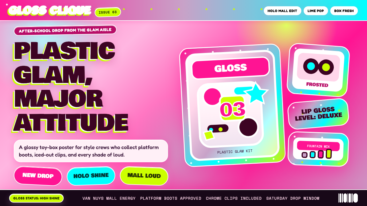 Bratz Doll 2003Y2K maximalism, mall-glossy. Hot-pink gradients, holographic lavender, chunky…
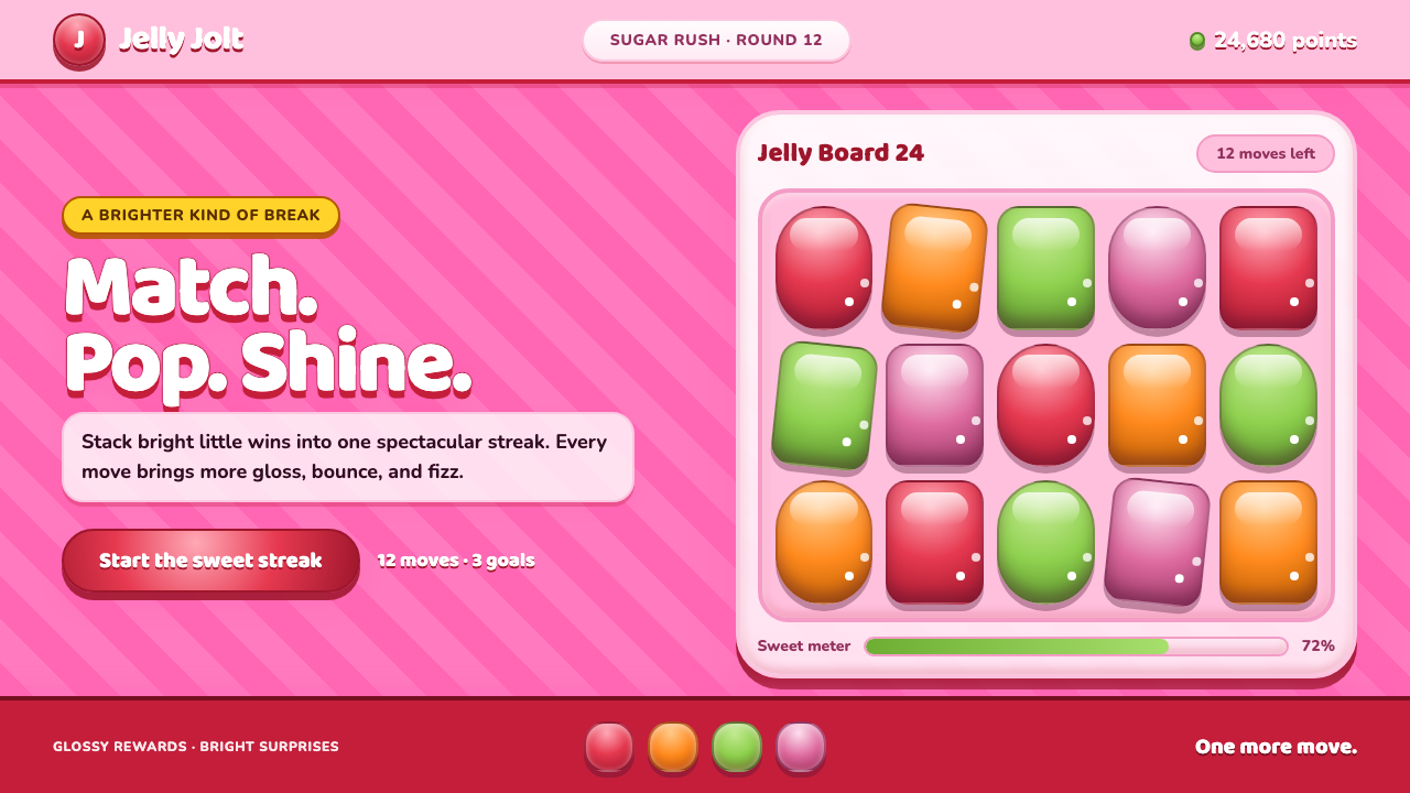 Candy Crush (2012)Sugar rush without restraint. Glossy candy tiles pulse across a striped bubbl…
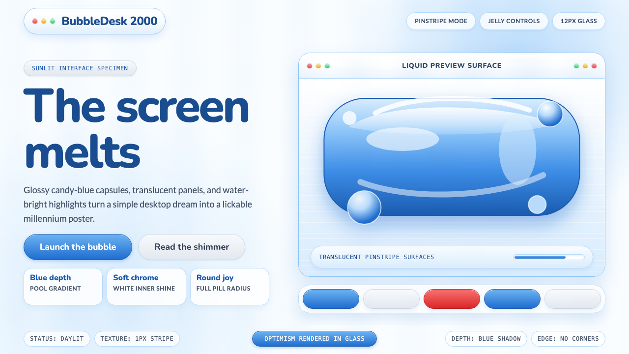 Y2K Aqua 2000Optimism looks lickable. Candy-blue pills, pinstripes, and glass panels gleam…
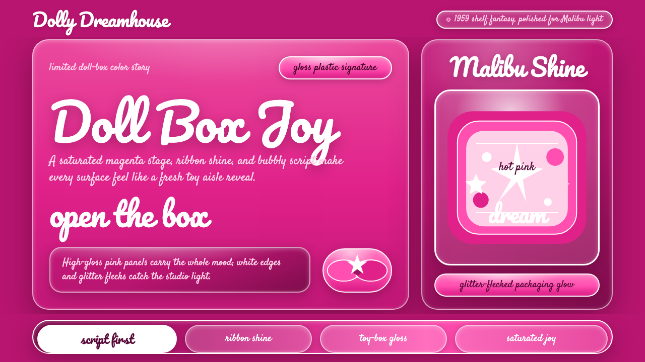 Barbie Hot Pink (Pantone 219)Saturated joy in plastic. Hot magenta, cursive script, gloss streaks, and gli…
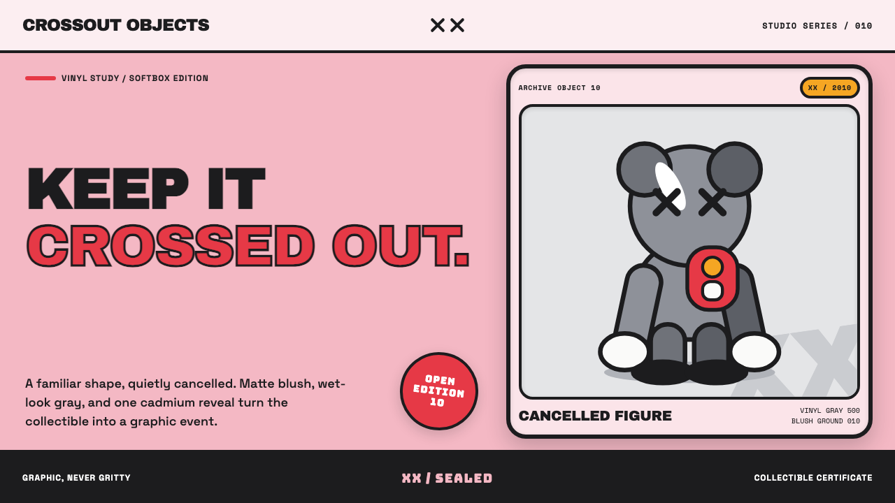 KAWS Companion (2010)Playful, with its eyes crossed out. Blush fields frame glossy gray vinyl and…
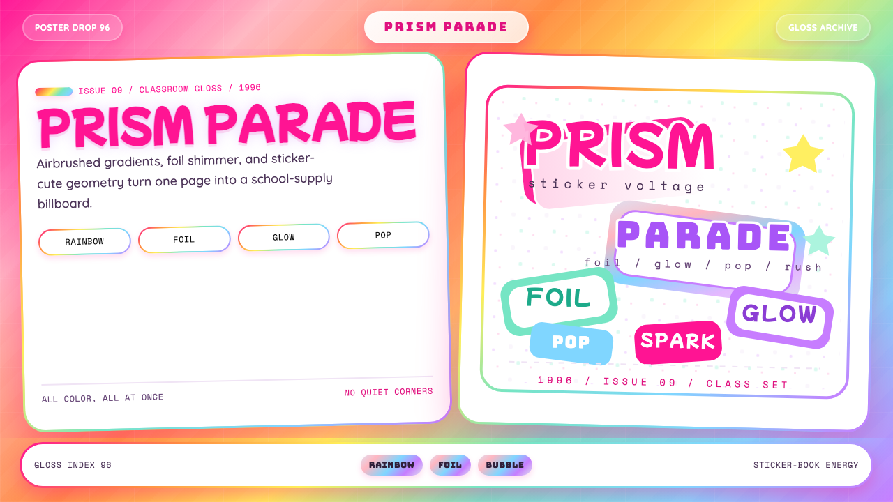 Lisa Frank Rainbow (90s)Pure sticker-saturation. Rainbow gradient, magenta glow, foil shimmer, bubbly…