What is Mbuti Barkcloth?
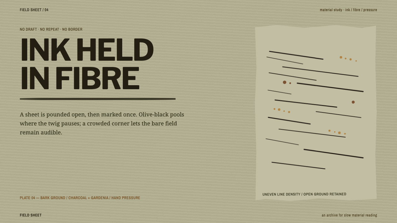
Mbuti barkcloth begins as beaten forest bark and ends as improvised line — olive-black marks bleeding into a khaki fibre ground, never corrected and never repeated.
Mbuti Barkcloth in brief
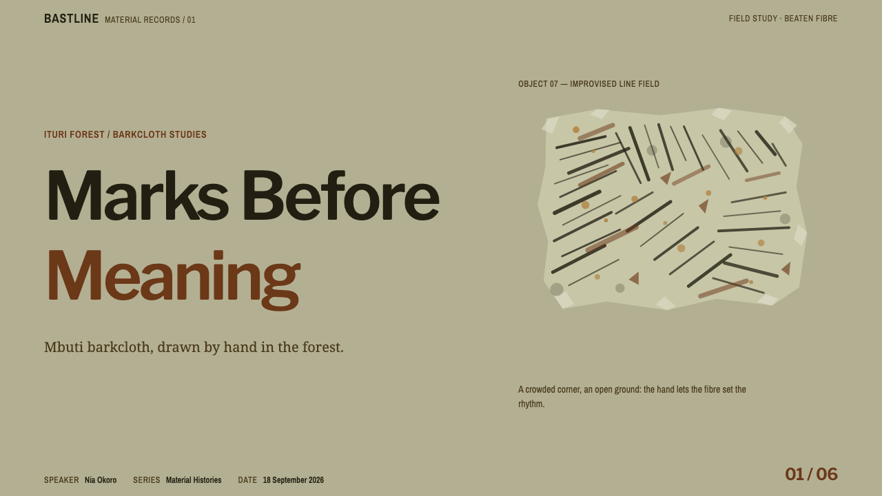
Mbuti Barkcloth is a design style taken from the painted barkcloth of the Ituri rainforest in the north-east of the Democratic Republic of the Congo. Men pound the inner bark of six forest tree species into a soft, fibrous sheet. Women then draw on it with a twig, a stem or a fingertip: networks of lines, fields of hatching, dotted runs, blotted forms. Each cloth is improvised once and never repeated.
As a design system it takes the sheet as the page. The ground is an unbleached khaki-oatmeal with a faint olive undertone. The ink is a warm olive-black that soaks and feathers into the grain, strongest in the middle of a stroke. Density is uneven on purpose: a crowded corner beside a bare one is the composition, not a mistake to be corrected.
Few historical styles are as tolerant of visible imperfection, and none of that tolerance is accidental. The style rests on the idea that improvisation is a form of authority: the painter commits to each mark without an underdrawing, a border or a correction, and the cloth keeps the whole record. For a designer, that means giving up the usual instruments of control — alignment, symmetry, even spacing — in favour of balance by feel. It is a demanding discipline precisely because it looks effortless.
Where does Mbuti Barkcloth come from?
The cloth comes from the Ituri rainforest in the north-east of the Democratic Republic of the Congo. The source dates the practice to before 1900 and describes it as continuing; the museum-collected corpus, the cloths that can now be studied in collections, is largely twentieth-century. Mbuti barkcloth belongs to the wider tradition of Central African barkcloth and to what the source calls forest-dweller material culture, a way of making cloth and ornament from what the forest itself provides.
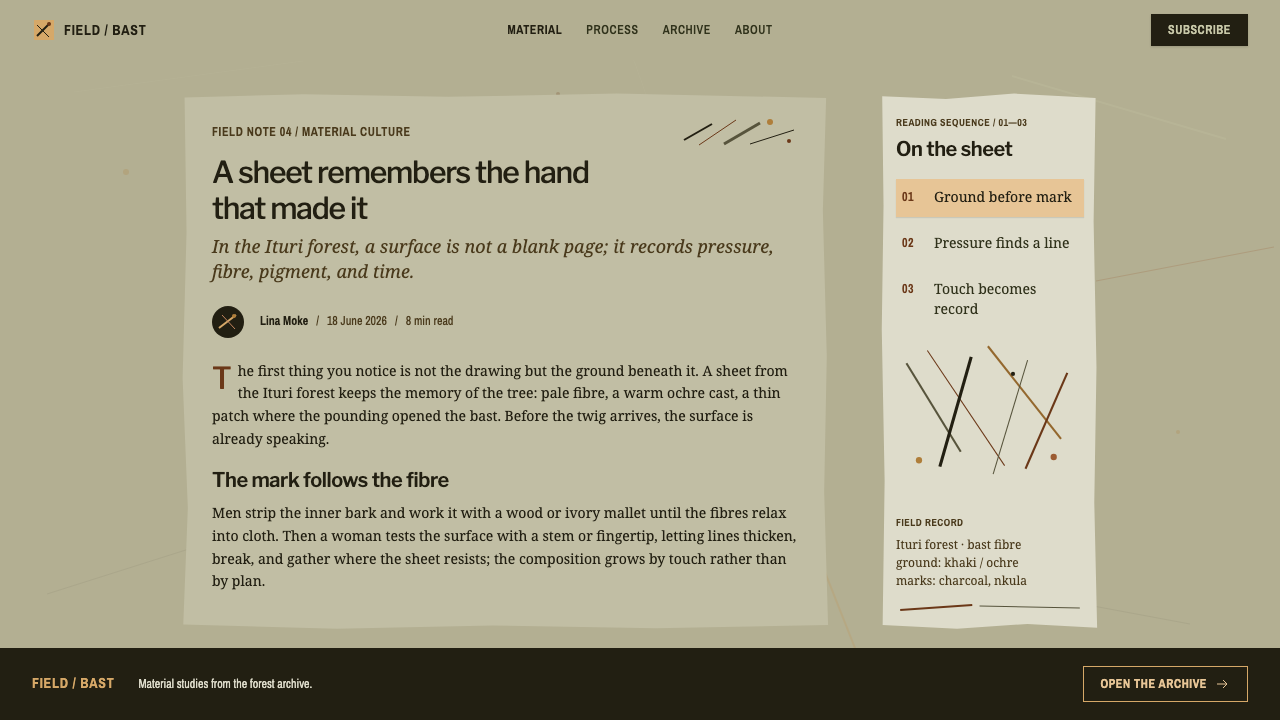
Making the cloth is a two-stage act, divided between people. Men strip the inner bark of six forest tree species and beat it, with a mallet of wood or ivory, until it becomes a soft, fibrous sheet. The beating decides the cloth's character: the bark is not woven but compacted into one flexible surface whose grain is the grain of the tree. The sheet is then passed to the women, who paint.
Women paint directly, with a twig, a stem or a fingertip, in an ink made from charcoal and a preparation of gardenia fruit and root that gives the warm olive-black of the finished work. There is no pencilled plan and no border, and the lines run across the whole cloth instead of stopping at a frame. Line networks cross the sheet, hatch fields sit beside bare ground, dots form loose queues. Because the ink soaks into the bark rather than sitting on its surface, strokes feather at their edges and deepen along their middle, and a mark, once made, stays. Improvisation here is not a style choice but a condition of the material.
In the twentieth century the cloths entered museums and galleries, and mid-century Western abstraction found an echo in them. The source lists Hamill Gallery and the Smithsonian National Museum of African Art among the key references, alongside the Mbuti women painters and the Efe forest painters who made the work. The cloths were never painted for a gallery wall, and the most honest way to use the style is to keep that fact in view: the abstraction was a viewer's interpretation, while the makers were painting cloths.
What defines the Mbuti Barkcloth look?
Fibre Ground
The ground is an unbleached khaki-oatmeal with a real olive undertone, the colour of beaten bark rather than of paper. It is never pure white and never perfectly even. The surface should feel fibrous, with grain visible and tone shifting gently across the page, because the ground is not a neutral container for the marks; it is the first material the marks have to respond to.
Soaking Ink
The ink is a warm olive-black, mixed from charcoal and a gardenia preparation. On the bark it soaks and feathers rather than sitting on top, so strokes have soft edges, deepen toward the middle and thin where the hand lifts. This is the opposite of crisp vector rendering. Edges are absorbed, not drawn, and the visual texture comes from the way dark meets fibre.
Uneven Density
Density is allowed to vary dramatically. One corner may be crowded with lines while the opposite side is left bare, and the imbalance is the composition. Designers used to equalising whitespace will find this uncomfortable. The principle is that emptiness is as intentional as fullness, and that a composition can be resolved by weight rather than by regularity.
A Small Vocabulary of Marks
The visual language is built from only a few kinds of mark: line networks, hatch fields, dotted runs and blotted forms. Each is made with the simplest of tools, a twig, a stem or a fingertip, so each has the particular wobble and pressure of a hand. Within that small vocabulary, variety comes from combination and scale, not from adding new kinds of ornament.
No Frame, No Underdrawing
There is no border, no pencilled plan and no grid. Lines run across the sheet at their own angles and are cut off by the edge of the cloth rather than by a frame. In layout terms, composition should feel as if it continues beyond the page, and elements should not be locked to a rigid alignment. Where structure is needed for reading, it must be supplied by clear areas, not by ruled lines.
Never Repeated
Each cloth is improvised once. Marks may rhyme but they do not copy each other, which rules out tiling a single motif as a background pattern. Where marks repeat in a layout, they should vary in length, density and pressure, so that no two clusters are identical. The style is best applied to decorative and atmospheric layers and not to repeated interface components, which have to stay consistent to be usable.
Who shaped Mbuti Barkcloth?
The painters of the cloth. The source is exact about the division of labour: men prepare the sheet from beaten bark, and women draw on it with a twig, a stem or a fingertip, with no underdrawing. Every quality this style asks for — the visible hand, soaked ink, uneven density — belongs to their decisions, and the style should be credited to them.
Named alongside the Mbuti in the style's references. Their presence is a reminder that barkcloth painting in the Ituri forest is documented as the work of more than one group of painters, and that the visual language described here should be credited broadly to the painters of the forest rather than to a single label.
A gallery named among the key references. As a gallery it represents the route by which these cloths were looked at as art, which is also the moment when the abstract reading of them began. It is a useful name for designers to keep in mind as a reminder that the frame around the cloths in Western collections was supplied by viewers.
An institution named in the style's references. Museum collections are where designers can see real cloths at full scale, with their grain, soak and uneven density intact, and they are the primary record against which any digital translation of the style should be checked.
How do you use Mbuti Barkcloth today?
Mbuti Barkcloth is a style for expressive, human, anti-corporate surfaces. It works wherever a product or publication wants to feel handmade and unpolished on purpose: craft and sustainability brands, cultural projects, journals, portfolios, creative tools and anything that celebrates the trace of a hand. It is poorly suited to contexts that need to project exactness or institutional control.
For slides, set the cover on the fibre ground with one dense cluster of marks pressing into a corner and a short title sitting in the open space beside it. Let the emptiness do the work and resist centring everything. Content slides can keep text in clear areas and use a small cluster of hatching or dots as a side element, different on every slide. Data slides are an opportunity to make charts look drawn: hatched fills in place of solid bars, dotted lines for projections, blotted markers for key points. Keep axes and labels legible and scales exact; the hand-made quality belongs to the marks, not to the numbers.
For web interfaces, the style fits landing pages, portfolios, journals, note-taking and creative tools better than dense dashboards. A hero can carry a hand-drawn network of lines bleeding off the edge, and section dividers can be a dotted run or a short hatch instead of a rule. Form fields become underlined strokes, and buttons can be blotted forms as long as their labels sit on adequate contrast. Pricing pages can express hierarchy through density, with the recommended tier given a heavier cluster of marks. Apply the soak and feather to decorative layers only; the edges of text must stay crisp for reading.
In editorial and marketing work, the style suits zines, field notes, craft and sustainability stories, cultural features and books. Long-form text should sit in a quiet, uncluttered column on the khaki ground, with marks in the margins and around the openings. Photography works best in an olive-black duotone, so that images feel printed on the same cloth. Because every spread can differ, the style rewards a series of layouts that are related but never identical.
The most common mistake is to turn the marks into a repeating pattern, tiling a single squiggle evenly so the page looks like wallpaper; that kills the improvised quality completely. A second mistake is to use pure white and crisp black, which strips out the fibre and the soak. A third is to treat the style as generic ornament detached from its makers: name the painters and the forest tradition. A fourth is to let ink-coloured marks run behind body text at low contrast. Keep the marks in the open areas and the reading text on clear ground.
Mbuti Barkcloth — FAQ
What is Mbuti barkcloth?
It is painted barkcloth from the Ituri rainforest in the north-east of the Democratic Republic of the Congo. Men beat the inner bark of six forest tree species into a soft fibrous sheet, and women draw on it with a twig, a stem or a fingertip. The marks are line networks, hatch fields, dotted runs and blotted forms, improvised once and never repeated. As a design style it takes the sheet as the page, with a khaki fibre ground and a soaking olive-black ink.
Who makes the cloth, and how?
Making is shared between two groups of hands. Men strip and beat the bark, using a mallet of wood or ivory, until it becomes a soft sheet. Women then paint on it directly, without an underdrawing, using a twig, a stem or a fingertip and an ink made from charcoal and a gardenia preparation. The source credits the Mbuti women painters and the Efe forest painters as the makers of the work.
Why is the density uneven on purpose?
Because on the original cloths a crowded area beside a bare one is the composition, not a flaw. There is no border or underdrawing to force the marks into equal spacing, so the painter balances weight by feel. Reproducing that balance in a layout means resisting the instinct to distribute whitespace evenly and instead letting one region carry the weight while another stays open.
Can this style work for data-heavy products?
Only partly. The style is at its best on landing pages, journals, portfolios and creative tools, where a hand-made feeling is a feature. For data-heavy screens, keep tables, forms and charts on clear fibre ground with exact scales and crisp text, and use the marks as a decorative layer around them, or draw chart elements in a hatched, dotted manner while leaving labels and numbers untouched.
Is Mbuti barkcloth abstract art?
That is how some twentieth-century viewers saw it. The source lists mid-century Western abstraction among the movements connected with the style, and the cloths were collected by museums and galleries. But they were never painted for a gallery wall; they are barkcloths made by Mbuti and Efe painters within a forest tradition. The safest practice is to describe the style by its makers and materials, and to treat the abstract reading as a later interpretation.
Related design styles
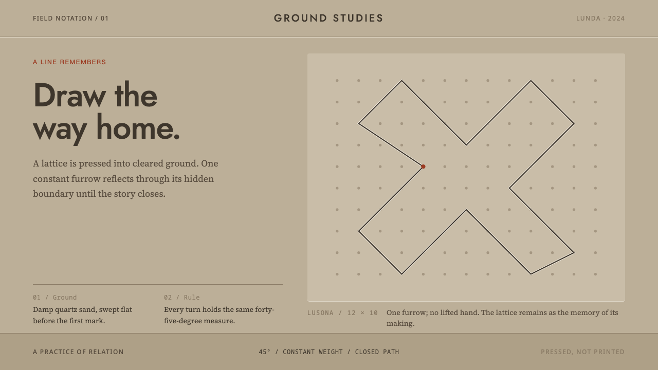 Angolan SonaA story closes in one stroke. A 45° furrow crosses visible dots on damp sand.
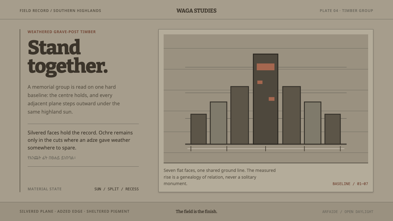 Konso WagaWeather makes the monument. Silver-grey timber, hard planes, and ochre held i…
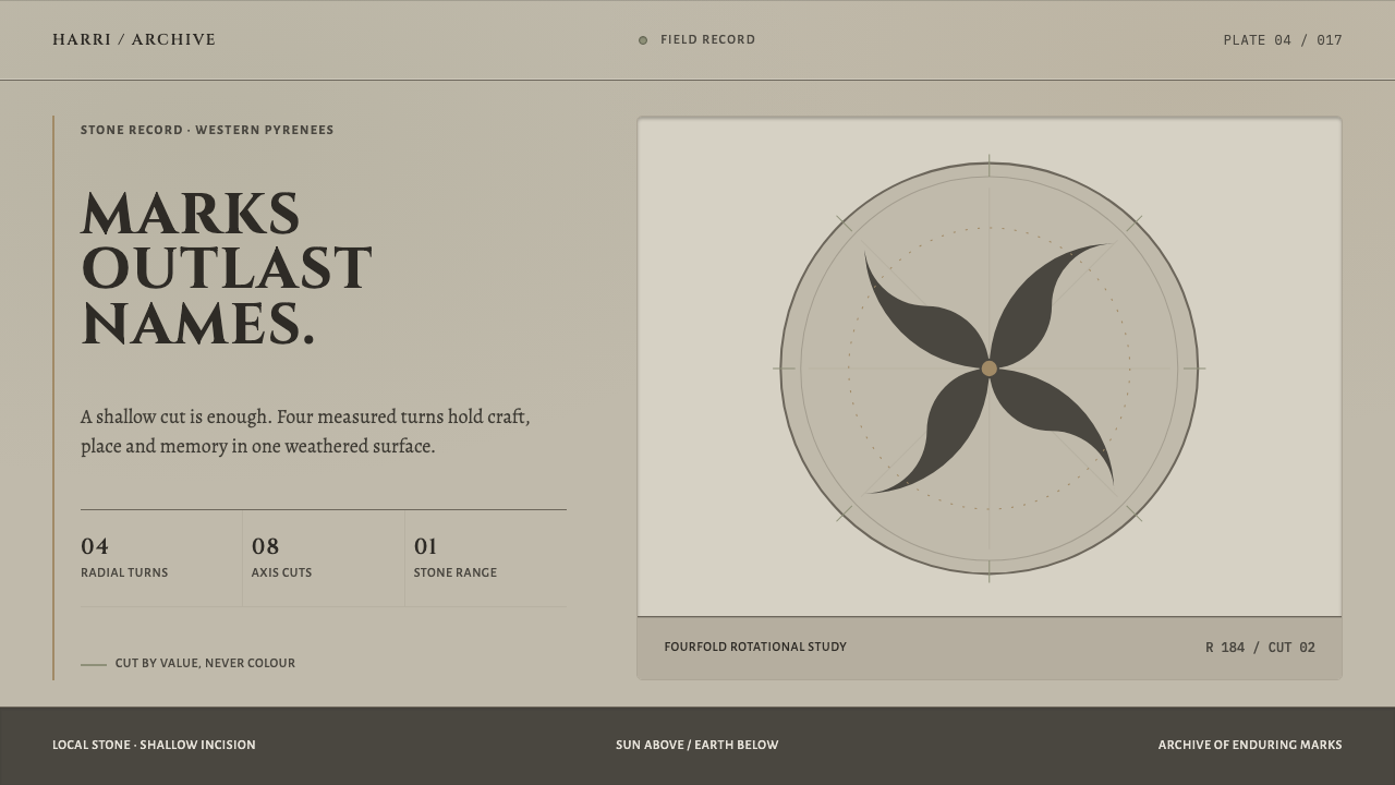 Basque LauburuMemory cut into stone. Warm grey planes and four measured turns build depth f…
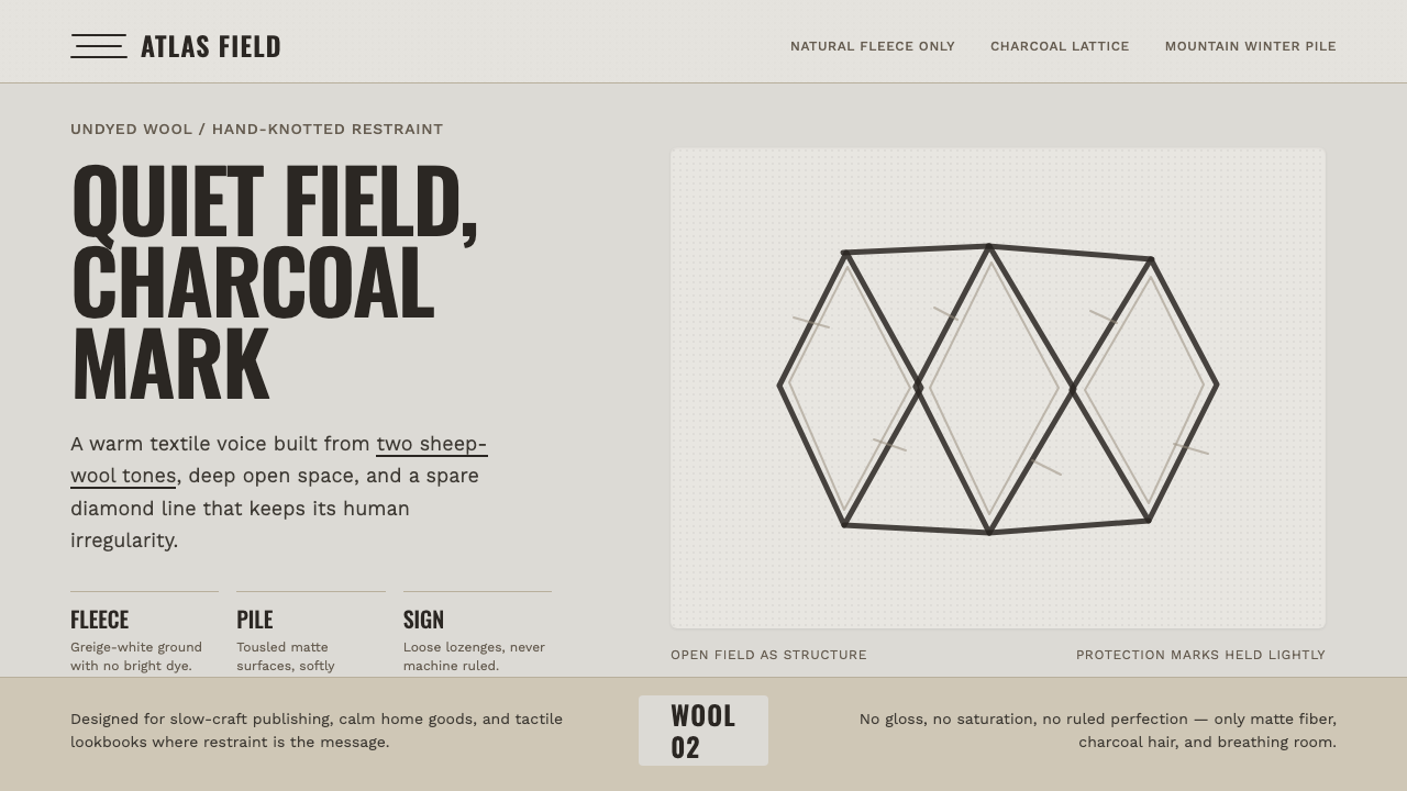 Beni Ourain Berber CarpetRestraint feels tactile. Greige wool field, Oswald type, and a loose charcoal…
 Bonsai CultivationQuiet asymmetry. Pine green rests on dark tray earth, sealed by one vermilion…
 Chancay Gauze TextileQuiet woven dignity. Tan silhouettes float through a dark open cotton mesh.