What is Matisse Cut-Outs?
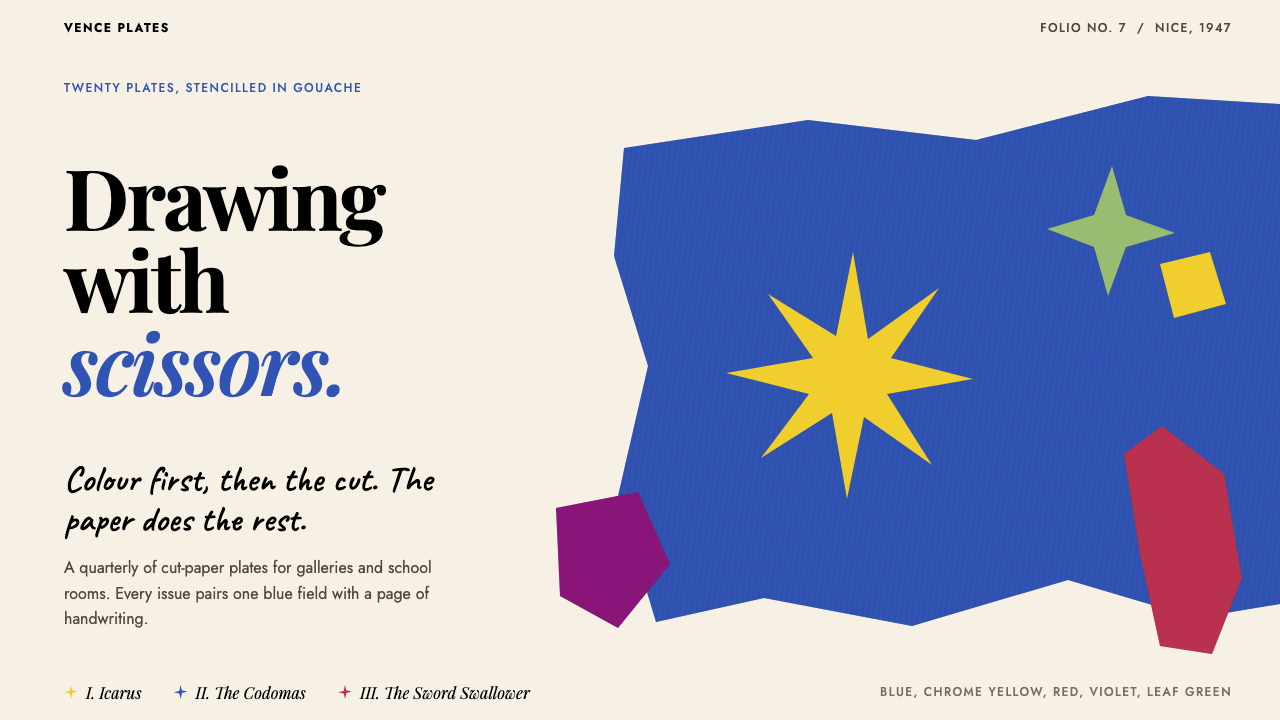
Matisse Cut-Outs is a style of drawing with scissors: flat gouache shapes with a tremor at the edge, floating off-axis on ivory paper, with one dominant blue and bare paper doing half the work.
Matisse Cut-Outs in brief
Matisse Cut-Outs is drawn from the late work of Henri Matisse, in particular the book Jazz, published in 1947, in which cut-paper compositions were reproduced by hand-stencilling on ivory paper. Its vocabulary is a dominant blue, a few saturated flat colours (yellow, red, a deep magenta and a leaf green), shapes with the slight tremor of scissors, no outlines, no gradients, no illusion of depth, and generous bare paper, with handwritten black text on the facing pages.
The central idea is drawing directly in colour. Matisse had spent his life arguing about the relationship between line and colour, and in cut paper he found a way to make them one gesture: the scissors drew the contour at the same moment as they cut the colour. A shape is therefore both outline and fill, and nothing is added afterwards. Shapes are set against one another with a sense of rhythm and weight, floating rather than sitting on a grid, and the gaps of bare paper between them are part of the composition.
The mood is joyous but not casual. The forms, seaweed, stars, leaves, acrobats and figures in mid-fall, come from things Matisse had known and loved, and they are arranged with an extremely refined sense of balance. The style offers hand-made warmth without sentimentality, and it suits cultural institutions, publishing, children's education and brands that want to feel crafted and alive.

Where does Matisse Cut-Outs come from?
By the 1940s Matisse was one of the most celebrated painters in the world. He had been a leading figure of Fauvism in the first years of the century, a movement of intense, unmixed colour, and had spent the following decades refining his sense of line, pattern and surface. In 1941 he underwent a major operation, and from then on he spent much of his time in bed or in a wheelchair. Standing at an easel was no longer possible. He came to regard the years that followed as a second life, and in them he did not simply work around his limitations; he invented a new way of making art.
His method was simple and precise. Lydia Delectorskaya, who had worked with him as his model and assistant since the 1930s, and other assistants painted sheets of paper with opaque gouache, in flat, even colour. Matisse then cut directly into the sheets with large scissors, without any preliminary drawing, and the shapes were pinned to the wall of his room. From his bed or chair he directed the arrangement, having pieces moved, tilted or removed until the composition balanced. He lived and worked at this time in Nice and in Vence, in the south of France, and sometimes in Paris. The cut paper began in about 1943, and he called the process drawing with scissors.
The book Jazz brought the technique to the public. It was published in 1947 by Tériade, the Greek-born publisher of artists' books in Paris, who produced editions with Matisse and many of his contemporaries. Twenty of the cut-paper maquettes were reproduced as plates by pochoir, a hand stencil process in which gouache is brushed through a separate stencil for each colour, so that the print keeps the matte, dense look of the original. Craftsmen such as the stencil printer Edmond Vairel translated the cut shapes into the printed page. Between the plates came pages of Matisse's own handwriting, set large, in black, which he intended to work as part of the visual rhythm of the book. The title, with its suggestion of improvisation, suited its circus and theatre subjects, among them the clown, the sword swallower and Icarus.
The cut-outs grew in scale in the years that followed, from designs for the stained glass and wall decorations of the chapel at Vence to the large Blue Nudes of 1952 and murals that filled the walls of his studio. Matisse died in Nice in November 1954, still cutting. As a design system, Matisse Cut-Outs takes its logic from Jazz in particular: the dominant blue, the small group of flat colours, the scissor-cut edge, the ivory page and the handwritten text. It is a graphic language already complete, flat colour, strong shape and generous space, and it was made by an artist who understood that less could give more life.
What defines the Matisse Cut-Outs look?
Jazz Blue
One deep, saturated blue dominates, as it does in Jazz. Yellow, red, magenta and a leaf green appear in smaller quantities as accents, and none of them competes with the blue for control. All colours are flat and opaque with the dense, matte feel of gouache, and they never blend into one another. The ground is ivory, and black is reserved for text.
Scissor Wobble
Edges are cut by hand, so curves tremble and points are slightly uneven. A star has arms of different lengths; a leaf has a contour that is almost, but not exactly, symmetrical. This wobble is the signature of the style. It must be small and authentic, not exaggerated: a perfectly smooth vector curve destroys the effect, and so does a deliberately wild one.
Drawing by Cutting
There are no outlines. The edge of the colour is the line. Shapes carry no gradients, shadows or modelling, and they suggest no depth beyond adjacency and the occasional light overlap. A figure is a silhouette; a plant is a cluster of cut forms. This directness means every shape must justify itself by its outline alone.
Bare Paper
At least half of the page is empty ivory paper, and the emptiness is active. Spaces between shapes are as carefully shaped as the shapes themselves, and a large pale margin lets a few forms breathe. The paper is warm rather than clinically white, and it should remain visible in the final design, never covered by tints or textures.
Floating Off-Axis
Compositions are asymmetrical and weightless. Shapes tilt, hover and overlap the edge of the page, rarely sitting on a grid or aligning with each other. Balance is achieved by contrast of scale and colour, such as one large blue form against a small red one, not by mirroring. The result feels like a mobile in mid-turn.
Handwritten Text
Text is handwritten in black, in large, open strokes with wide line spacing, and appears on pages of its own opposite the images. The lettering is irregular and personal, and works as a visual texture as much as a message. It is set in a loose, rhythmic block, never in a tight justified column.
Rhythm and Repetition
Forms recur at different sizes and angles, like beats in a piece of music: leaves, stars, algae, circles. Repetition with variation produces pattern and movement without any regular grid. The eye travels along the shapes in the way that a listener follows a rhythm. This is the visual meaning of the book's title.

Who shaped Matisse Cut-Outs?
Matisse was a leading figure of Fauvism and one of the most influential painters of the twentieth century. After major surgery in 1941 he spent much of his life in bed or a wheelchair, and turned to cut paper, which he called drawing with scissors. His late cut-outs, from Jazz to the Blue Nudes, are widely regarded as a culmination of his lifelong work on the unity of line and colour.
Matisse's model and assistant from the 1930s, she painted many of the sheets of gouache-coloured paper that he then cut. Her role was practical and artistic at once: the evenness and density of the colour was the ground on which his scissors worked. The cut-outs depended on her steady collaboration.
A Greek-born publisher in Paris who produced artists' books with Matisse and other leading painters. He published Jazz in 1947, giving the cut-outs a form in which they could be seen, handled and read. His editions treated the book as a work of art in its own right, with image, text and paper conceived together.
A stencil printer associated with the pochoir reproduction of Jazz. Pochoir is a craft in which colour is brushed through a stencil, one for each hue, and it let the printed plates keep the matte density of the gouache. Craftsmen of this kind are the reason that the book looks like the cut paper rather than a photograph of it.
How do you use Matisse Cut-Outs today?
Matisse Cut-Outs is best used when a subject benefits from joy with discipline: museums and galleries, publishing, children's learning, festivals, creative studios, wellness, cafes and any brand that wants a human, hand-made voice without kitsch. The style is generous with space and economical with form, so it works best when the content is small in volume and large in feeling.
For presentations, a cover can be a single large blue shape floating off-centre on an ivory ground, with a small yellow or red form for tension and the title in plain black. Content slides should use one or two cut shapes as anchors and leave half the slide empty. Data slides can turn bars into flat, slightly irregular rectangles and pies into cut discs, using the dominant blue for the main series and a single accent for the one that matters most.
For web interfaces, treat the cut shapes as illustration and landmark rather than as controls. The page keeps an ivory ground, black type and flat blocks of blue for primary actions, with no shadows or glows. Large shapes can bleed off the hero area and mark section changes. Pricing pages can distinguish tiers by shape and colour while keeping the layout generous. Hover can be a small tilt or nudge, never a glow. Keep forms and tables plain, because the style gives its character to the margins.
For editorial and marketing work the style is at home. Book covers, exhibition posters, catalogues, invitations and children's books can borrow the structure of Jazz itself: a full-page shape composition on one side and a page of large handwritten text on the other. Hand-lettered titles and quotations give the whole publication a voice, and a small group of forms repeated at different sizes can unify an entire campaign.
The most common mistake is to outline the shapes or give them a shadow, which turns a cut-out into an ordinary sticker. A second mistake is to smooth the edges to the point where they look machine-drawn, losing the tremor of scissors. A third is to use every colour at equal strength and fill the page, which removes the blue's lead and the paper's silence. Finally, avoid repeating the same seaweed or star as clip-art; the shapes should be varied and intentional.

Matisse Cut-Outs — FAQ
Is this the same as Fauvism?
No, though they share an artist. Matisse was a leading Fauve in the first years of the twentieth century, when the movement was known for wild, unblended colour applied with visible brushwork. The cut-outs come four decades later and are quiet by comparison: flat colour, clean contours and large spaces. They keep the Fauve love of pure colour but trade the brushstroke for the scissors.
How do I get the scissor wobble in a digital design?
Draw shapes by hand, or trace them freehand, rather than using perfect geometry. Keep curves slightly uneven, let corners be a little off, and avoid smoothing tools that remove the variation. The tremor should be small and consistent across the whole composition, so the shapes feel cut by the same hand. Avoid blur, soft edges and anti-aliasing tricks that hide the contour.
What is pochoir and why does it matter for the look?
Pochoir is a hand stencil printing process in which gouache is brushed through a separate stencil for each colour. It preserves the dense, matte, slightly uneven quality of painted paper, which a photographic reproduction would lose. For a digital style, the lesson is to aim for opaque, flat, matte colour with a handmade surface, not a glossy or gradient one.
Can the style work for serious or data-heavy content?
In moderation. The style can frame serious subject matter with warmth, and flat cut-shape charts can be elegant and legible. But dense tables, long forms and small-print detail fight against the empty paper and loose composition. A good approach is to keep the dense parts plain and let the cut shapes live in the headers, margins and transitions.
Where does the style struggle?
It struggles in tightly regulated, high-density interfaces such as finance tools or enterprise dashboards, and wherever a brand needs rigorous grid alignment. It also needs space: cramming it into a small area removes its main virtue. And it demands care, because an average execution of hand-made softness looks like a children's craft project rather than the work of a master.
Related design styles
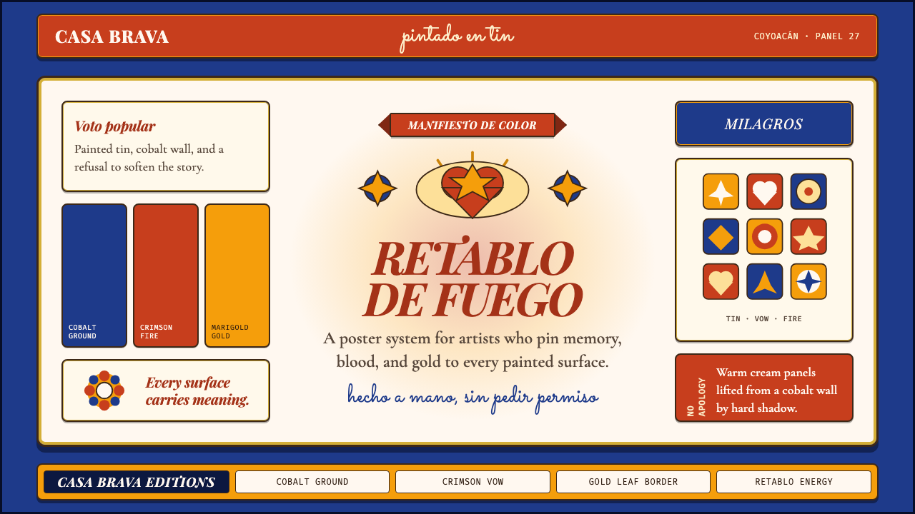 Mexican Folk Art (Frida-era)Defiance painted on tin. Cobalt ground, crimson vows, marigold borders, hard…
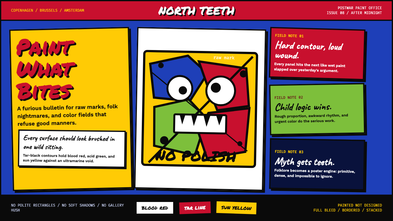 CoBrA (Asger Jorn, 1948)Paint refuses polish. Ultramarine ground, blood red slabs, and marker type th…
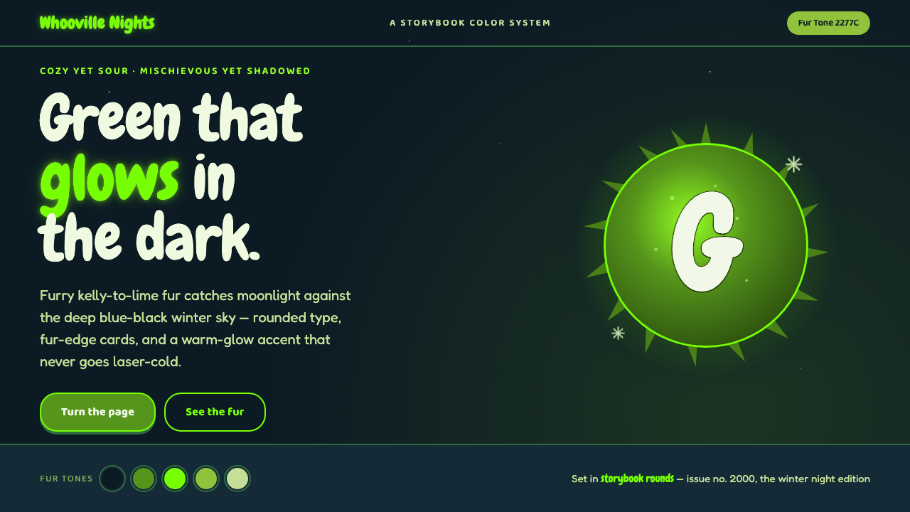 The Grinch Green Fur 2000Green that glows in the dark. Kelly-to-lime fur on blue-black Whoville night,…
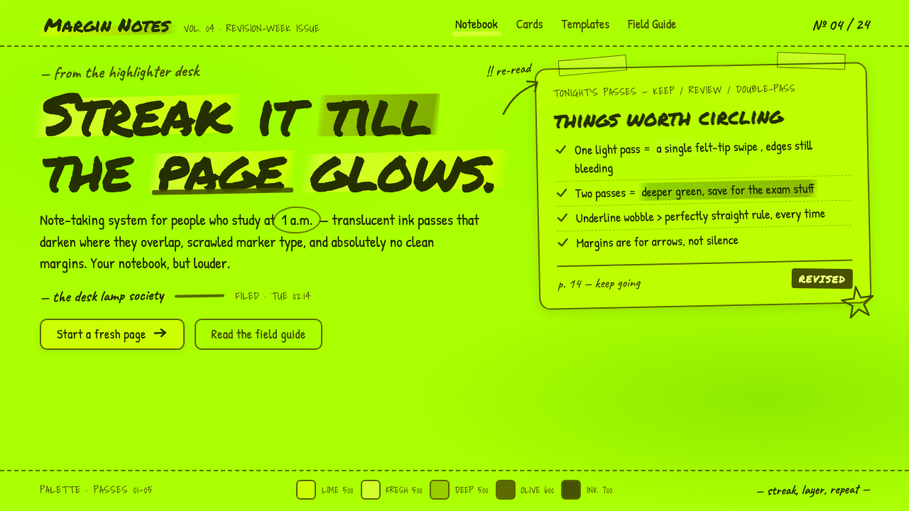 Fluorescent HighlighterStudy notes at 1am, made into a system. Translucent lime ink layered until th…
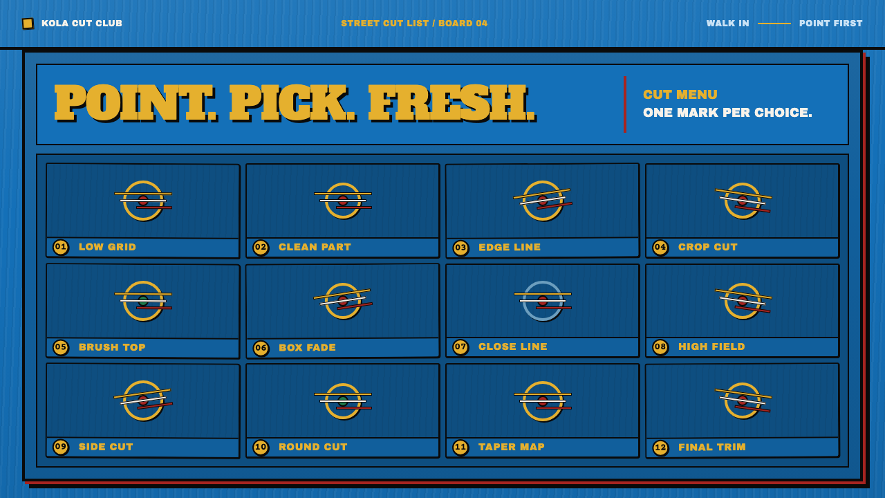 Ghana Barber Shop SignsChoice becomes a painted language. Chrome-yellow codes cut across an enamel-b…
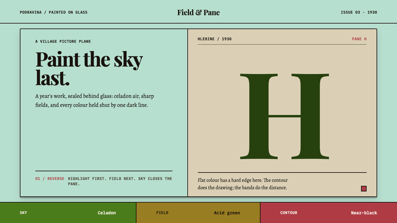 Hlebine Naïve PaintingPainted colour stays fresh. Celadon, field green and dark contours stack the…