What is Mary Vieira Kinetic?
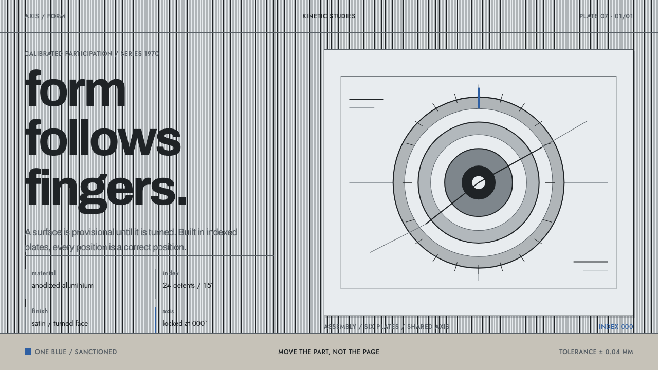
Mary Vieira Kinetic takes satin aluminium as its page: cool grey metal, one turned highlight, black anodized edges, a single measured blue, and Basel-grotesque type that reads like a tolerance drawing.
Mary Vieira Kinetic in brief
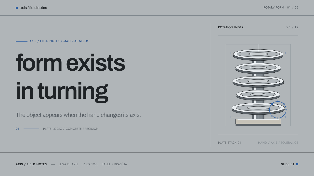
Mary Vieira Kinetic is a visual language drawn from the work of the Brazilian-born sculptor Mary Vieira, who left São Paulo for Basel in 1951 and spent the rest of her career making sculpture that the viewer operates. Her signature object is a stack of anodized-aluminium discs mounted on a lathed cylinder and seated in a concrete or marble base. Each disc turns on its own axis, so the work has no single fixed form — only the one your fingers have just made.
As a design style it takes the metal itself as the page. The ground is not a background colour in the usual sense but a surface: satin, mill-finished grey aluminium, interrupted by the thin bright ring of light that appears wherever a part has been turned on a lathe. Edges are black, as anodized edges are. Colour is almost absent, with one sanctioned blue permitted to appear once and no more. The overall impression is cool, exact and quietly tactile, like a well-made instrument rather than a picture.
The tone matters as much as the palette. The style sits at the meeting point of Brazilian concretism and Swiss concrete art, and it inherits their shared suspicion of anything decorative or anecdotal. There is no tropical warmth here, no carnival, no postcard Brazil. Every measurement is meant to read as a tolerance, every alignment as a fit between machined parts, and every state of an interface as a position on an indexed axis rather than a blur between two moods.
Where does Mary Vieira Kinetic come from?
Mary Vieira was born in São Paulo in 1927. In 1951 she moved to Basel to work near Max Bill, the central figure of Swiss Konkrete Kunst, and she stayed, eventually teaching at Basel's school of design from 1966. The move carried the ambitions of São Paulo concretism into a country with a long habit of precision manufacture. The shorthand for the result is Brazilian concretism cut on Swiss machines.
Two lineages meet in her work. Brazilian concretism, represented in this system's circle by artists such as Almir Mavignier and Lothar Charoux, treated art as a matter of geometry, rhythm and structure rather than depiction. Swiss Konkrete Kunst, which Bill championed, held that a work should be built from its own elements — line, plane, colour, number — and owe nothing to a landscape or a figure. Vieira shared both convictions and then added something neither strictly required: she handed the finished work to the public to rotate.
The works of 1970 show the idea at full strength. Polivolume: evento elipsoidal, made that year, and Ponto de Encontro — Meeting Point — placed in the Itamaraty Palace in Brasília, rest on the same grammar of stacked, rotatable plates. In Ponto de Encontro the participation is almost literal: 230 aluminium plates are put straight into visitors' hands, and the sculpture changes whenever someone turns one. The artwork is less an object than a procedure whose result you are invited to alter.
Her graphic work supplies the last ingredient. The single blue of the system is taken from the sky in her 1957 aviation poster, a reminder that she thought in flat, printed colour as well as in turned metal. The system's era, from about 1950 to 1990, therefore joins poster, sculpture and public commission under one temperament: restraint, precision, and the conviction that form should be produced by a logic the viewer can follow. That temperament, rather than any single artwork, is what the style distils.
What defines the Mary Vieira Kinetic look?
Satin Metal Ground
The ground is a satin, mill-finish grey, the colour of aluminium that has been rolled and then left alone. It is a surface rather than a wash: cool, slightly matte, never glossy and never chromed. Cards and panels sit on it the way plates sit on a workbench. Because the ground is already a material, the style needs no texture overlays or imitation-metal sweeps to feel physical.
The Turned Highlight
Where a surface has been turned on a lathe it carries a thin specular ring, one bright line that follows the curve. In the style this appears as a precise edge highlight on circular or raised elements, a sign that something is machined rather than painted. It is used sparingly and only on parts that could plausibly be turned: discs, dials, rounded controls and the rims of plates.
Black Anodized Edge
Edges are black, as they are on anodized components. A hard dark rim states every plate and every cut, so shape is defined by its outline rather than by atmosphere. Depth is shown by stacking one plate on another and by the tight dark line where they meet, not by glow or haze. The effect is crisp and exact, closer to a technical section than to a rendering.
One Sanctioned Blue
The palette carries exactly one hue beyond metal, black and stone: a blue taken from the sky in Vieira's 1957 aviation poster. It is a signal, not a theme. One use per screen is enough, whether that is the single selected state, the one series that matters in a chart, or a link. Spread across a layout it stops being a signal and starts being decoration, which the style does not tolerate.
Basel Grotesque Type
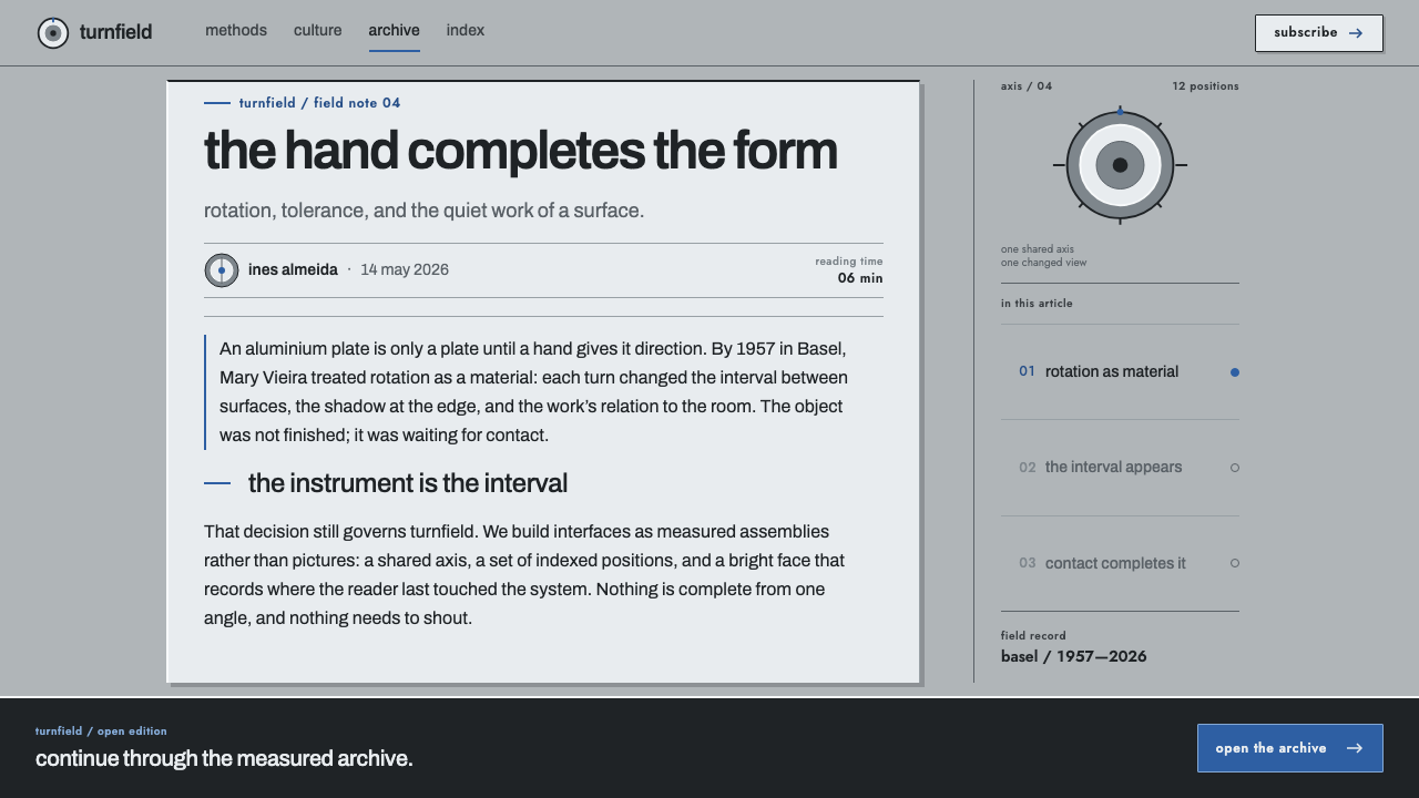
Type follows the Basel grotesque tradition: a neutral sans-serif, set flush left, with tight spacing and a clear preference for lowercase. Hierarchy comes from size, weight and position rather than from colour or ornament. Headings read like captions on a drawing and labels like the engraving on a dial. There is no centred display type and no capitalised shouting; the voice stays level.
Tolerance and Index
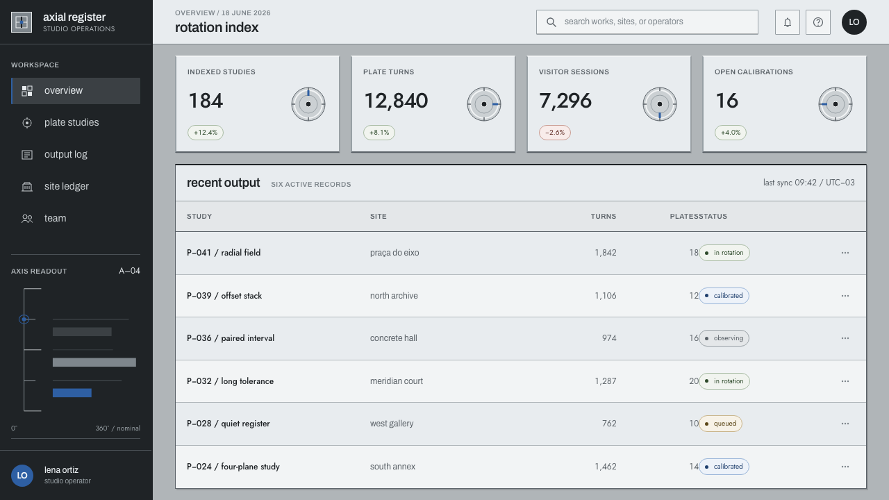
The governing idea is that every measurement should read as a tolerance. Alignments are exact, increments are consistent, and spacing looks calculated rather than eyeballed. Because her sculptures turn on an indexed axis, movement in this style is stepped: a control moves between defined positions, as a plate settles into place, instead of drifting through a continuous blend. Scales, tick marks and fine rules are welcome because they make precision visible.
Concrete Plinth
Vieira's sculptures stand on concrete or stone bases, and the style keeps a trace of that foundation: a heavier, mineral-toned zone with a visible aggregate grain beneath the light metal plates. It anchors the page. Footers, bases of panels and section floors can borrow this density, so that the cool, light plates above feel supported rather than floating.
Who shaped Mary Vieira Kinetic?
Born in São Paulo in 1927, Vieira moved to Basel in 1951 and taught at the Basel school of design from 1966. Her stacked, rotatable aluminium sculptures, among them Polivolume: evento elipsoidal and Ponto de Encontro of 1970, are the direct source of this style. She also designed for print, and the single blue of the system comes from her 1957 aviation poster. What she contributed beyond her teachers was participation: the viewer completes the work by turning it.
Vieira went to Basel to work near Bill, the leading figure of Swiss Konkrete Kunst, the tradition that builds a work purely from line, plane, colour and number. His example explains the system's austerity: flush-left grotesque type, exact alignment and an absence of anecdote. Bill's presence in Basel is the reason a Brazilian concretist ended up cutting her sculptures with Swiss precision.
Mavignier stands for the Brazilian concretist strand that Vieira carried to Switzerland, a strand defined by geometry, repetition and rhythm. His name belongs in the lineage as a reminder that the Swiss exactness of this style is only half of its sources: the other half is the São Paulo conviction that plain visual structure can carry meaning without any depiction.
Charoux is another São Paulo concretist in this circle. Including him roots the style in Brazil's own concrete movement rather than in an imported Swiss manner. He is the counterweight to any reading of the system as simply Basel design with a Brazilian name attached: the thinking began in São Paulo, and Vieira brought it with her.
How do you use Mary Vieira Kinetic today?
Mary Vieira Kinetic is best used when the subject really is precise: hardware, engineering, measurement, architecture or any product whose credibility rests on exactness. It rewards a designer who thinks like a machinist. Treat the page as a plate, treat each component as a part that must fit its neighbour, and ask of every element whether it is a tolerance or an ornament.
For presentation slides, a cover works well with a large, flush-left lowercase title on the satin grey ground, paired with one disc or ring carrying the turned highlight and a dark rim, and the blue used once at most. Content slides become engineered sheets: tight columns, fine rules, small captions, no decorative dividers. Data slides suit the style especially well, because charts can be treated as instruments. Use scales and tick marks, keep every series in black and grey, and let the single blue mark the one series the audience must notice.
For web interfaces, the style fits dashboards, configuration screens and pricing pages where precision and clarity are the values. Panels become plates with dark edges. Controls move between discrete, indexed states rather than easing between them: segmented selectors, steppers and dials replace free-floating sliders where possible. In a pricing layout the tiers can read as a stack of plates, with the blue reserved for the single recommended option. Navigation stays textual, lowercase and flush left, with the heavier mineral tone saved for the footer.
For editorial and marketing work, a single flush-left column with generous but exact margins carries long reading well, and photography of metal, concrete and machined detail suits it. Product pages for tools, studios and cultural institutions can use the plate-and-plinth structure to organise sections, with the turned highlight appearing only on the one element that is meant to be turned or tapped. Captions behave like drawing annotations: short, lowercase and aligned to the grid.
The most common mistake is to fake the metal. Large chrome-style gradients, glossy bevels and heavy reflections make the page louder and cheaper, when this style gets its material feel from a flat satin ground, a thin highlight and a dark edge. A second mistake is spreading the blue across headings, buttons and icons at once; the moment it is everywhere it is nothing. A third is adding Brazilian warmth through tropical colours or festive pattern. The system deliberately has no tropics and no carnival, only tolerance.
Mary Vieira Kinetic — FAQ
Does this style look Brazilian?
Not in the tourist sense, and that is deliberate. The Brazilian element is intellectual rather than pictorial: it comes from São Paulo concretism and its commitment to geometry, rhythm and structure. The look is that of precise Swiss-made metalwork, because Vieira made her work in Basel. If your brief calls for tropical warmth or festive colour, this is the wrong system.
How is it different from Swiss International Style?
They share a lineage, including flush-left grotesque type and a respect for exact alignment. The difference is material and participation. Swiss International Style is usually a paper-and-grid language, whereas this style takes a physical material, satin aluminium with turned edges and a plinth, as its starting point, and it imagines the interface as something a person can operate and rearrange. It is also far more restrained in colour, with a single blue.
How do I make a surface feel like metal without using gradients?
Rely on the three cues the sculptures themselves provide: a flat, cool, satin grey ground, a thin bright ring on turned or rounded edges, and a dark rim around every plate. Together they suggest anodized aluminium without simulating reflections. Large sweeping gradients that imitate chrome belong to a different and louder look, and they would blur the sense of tolerance that this style depends on.
Can the style work in a dark theme?
The system is built on a light satin ground, so a dark theme should not be an automatic inversion. Treat it as a black-anodized sibling: a dark plate, the same single blue used once, a thin bright ring on the turned edges and a mineral base beneath. Keep the type flush left and lowercase and keep the same discipline about decoration. If you cannot keep the hierarchy that clear, stay with the light ground.
Why lowercase and flush left?
Because that is how the Basel grotesque tradition speaks. Flush-left lowercase text is quiet, level and easy to align to a grid, and it avoids the ceremony of centred, capitalised display type. In this system it also helps every line read like a caption on a technical drawing, which suits a style whose central claim is that measurement, not decoration, makes an object trustworthy.
Related design styles
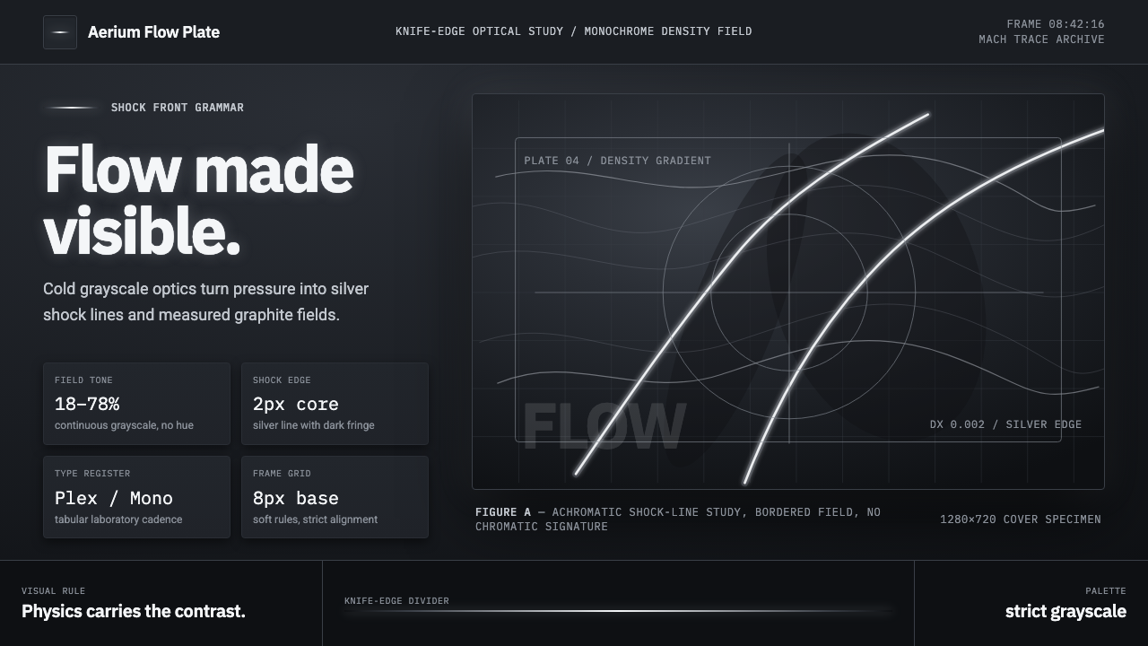 Schlieren ShadowgraphInvisible air becomes silver. Cool grayscale fields cut by precise shock line…
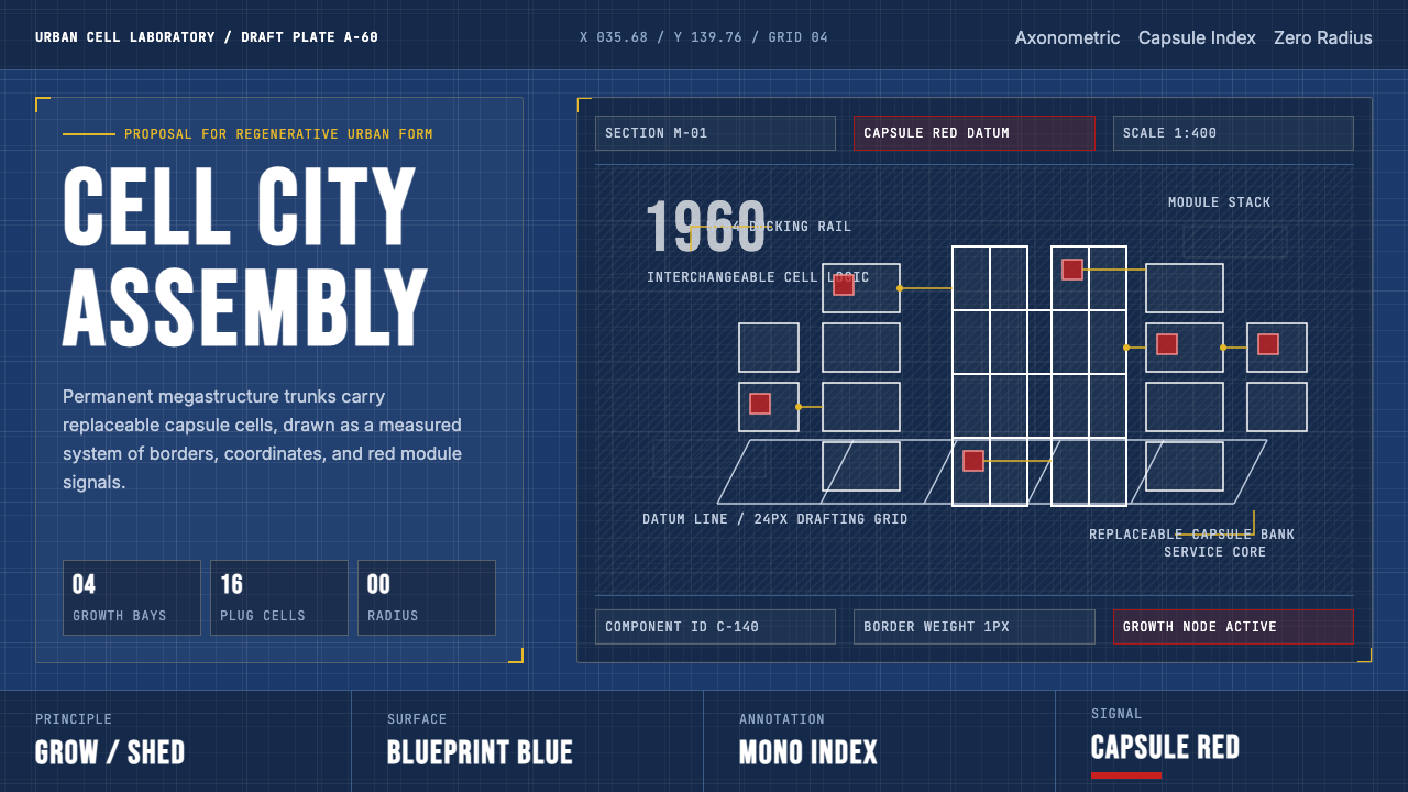 Metabolism Tokyo (1960)Cities become diagrams. Blueprint blue, mono labels, and capsule red mark mod…
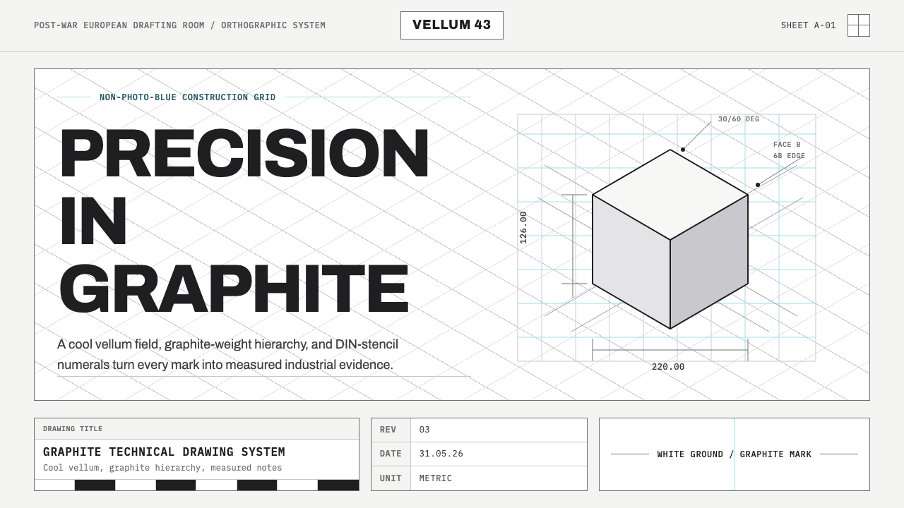 Graphite Technical DrawingDrafting-room precision. Non-photo-blue grid and graphite DIN lettering do th…
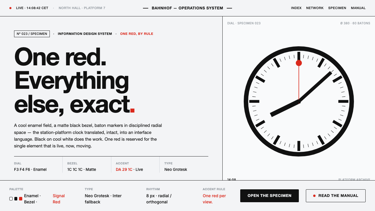 Hilfiker Railway ClockEverything exact, one thing live. Black hands on cool enamel white — one red…
 ISO Technical DrawingEvery line carries meaning. Near-black ruled geometry grades weight on cool t…
 Jesús Soto Kinetic Art (Venezuela)Perception is the medium. Cream ground, black-line grids, and primary squares…