What is Martian Dust Colony?
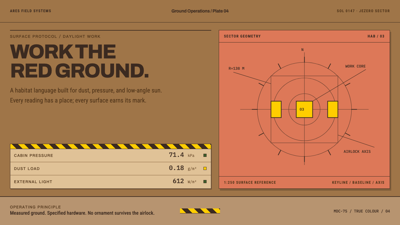
Martian Dust Colony shows Mars as the cameras recorded it and lays 1975 NASA graphics discipline over it: dust plates, safety-yellow data and nothing that fails to carry information.
Martian Dust Colony in brief
Martian Dust Colony is a design style about Mars as it was actually photographed, not as the movies drew it. Wind-laid iron-oxide dust lies over dark basalt regolith, and the sky is a butterscotch tone because suspended iron oxide scatters light that way. The ground itself is surprisingly dark; what reads as bright in the panoramas is simply full sun. That true-colour palette, dusty, muted, warm and low in contrast, is the ground of the style.
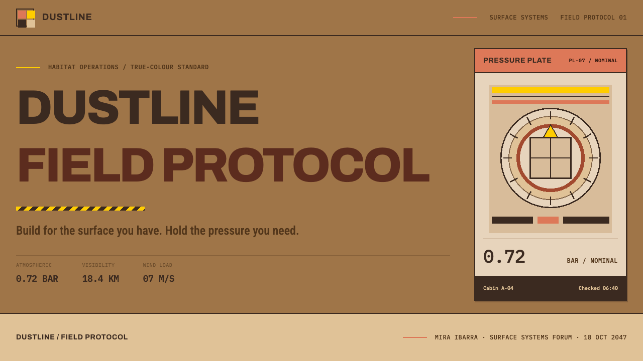
Over that ground the style lays the habitat layer: stencilled equipment plates, cabin-pressure readouts and standard hazard placards. These are set in the discipline of the 1975 NASA Graphics Standards Manual rather than in science-fiction styling. Everything is a label, a value, a unit and a status. Nothing decorative survives the airlock.
Two sources of authority meet in the result. One is nature, the physics of dust, light and low-angle sun. The other is engineering, the signage standards that say what a warning looks like. The style sits where they overlap: a place that has been surveyed honestly and is run by procedure. The mood that results is neither triumphant nor bleak. It is the working calm of people who know that the environment is indifferent and the checklist is not, and who have therefore written everything down in plain, standard language.
Where does Martian Dust Colony come from?
The style is built from three lineages. The first is true-colour planetary imaging. From 1997 to 2021, surface missions at sites such as Ares Vallis and Jezero Crater returned images in which Mars looks not red but ochre, tan and butterscotch, with a dark basalt floor under bright dust. The planetary geologist Matthew Golombek, long associated with the selection and study of Mars landing sites, is the scientist named in the style's reference set for that surface record. Those images corrected a generation of imagination: the planet is not a flame-coloured desert but a dim, fine-grained, dust-dressed one.
The second lineage is graphic. In 1975 the NASA Graphics Standards Manual, designed by Richard Danne and Bruce Blackburn, set out how an agency should look: disciplined type, rigid hierarchy and a preference for clarity over spectacle. It remains one of the great examples of an institution fixing its visual identity in a manual, and it gives the style its sobriety. Martian Dust Colony borrows its restraint and its sense of system, not its logo.
The third lineage is safety signage, in the form of the ISO 3864 and ANSI Z535 families of standards. They define how hazards are communicated at a glance: a yellow triangle for warning, red for prohibition, blue for a mandatory action and green for a safe condition, each paired with a pictogram and a short line of text. A settlement where people breathe manufactured air would need exactly this language, and the style adopts it as the habitat's voice, with safety-yellow hardware data, standardised placards and no improvisation.
Taken together, the three lineages explain the style's temperament. It is a near-future settlement drawn with the same sobriety that real agencies use, and its credibility comes from restraint. The timeline is stated plainly: true-colour imaging up to 2021, a graphics discipline from 1975, and an imagined settlement a little way beyond today. The result is believable because every element has a job.
What defines the Martian Dust Colony look?
True-colour ground
The palette is the one the cameras recorded: iron-oxide ochre, tan and rust-brown dust, dark basalt beneath it, and a butterscotch sky. Colours are muted, warm and low in contrast. There is nothing of the film-poster red planet here, only the dim, dusty colours of a real survey photograph.
Dark ground, bright sun
The surface is dark, and what looks bright in the panoramas is simply full sun. The interface follows that logic: page tones are dusty mid-values rather than clean white, and brightness appears as direct light on a surface instead of as a glowing screen. The page feels sunlit, not backlit.
Safety-yellow hardware data
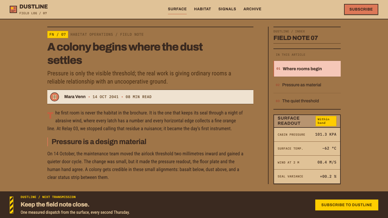
The one high-chroma accent is safety yellow, the colour of warning signs and hardware labels. It carries data, status and the things a person must read, usually paired with dark type for maximum legibility. Used sparingly it stands out against the dust like a marker on a rock.
Stencilled equipment plates
Panels read as equipment plates: rectangular, labelled, with clearly separated zones for names, values and statuses. Lettering has a stencilled, industrial character, tidy and unadorned. Every plate says what the object is and what state it is in, and then stops.
Label, value, unit, status
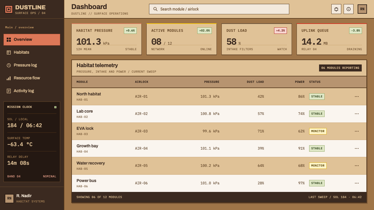
Data is arranged in four fixed parts: what it is, how much, in what unit, and whether that is acceptable. Every readout is complete, aligned and tabular. This simple rhythm, repeated down a panel, is the style's real grammar, and the reason a screen of Mars data stays calm and legible.
Settled dust and long shadows
Low-angle sunlight draws long, directional shadows, and fine dust sits on every horizontal surface, a little thicker in the corners. These cues are used as subtle texture and consistent light direction rather than as dramatic effects. They make panels feel placed in a real environment instead of floating on a screen.
No ornament past the airlock
Any element that does not carry information is left outside. There are no flourishes, no glows, no decorative icons and no sci-fi interface chrome. The restraint is practical rather than aesthetic: in an environment where every object has a function, decoration would be a kind of lie.
Who shaped Martian Dust Colony?
A planetary geologist long associated with choosing and characterising Mars landing sites, and the scientist named in the style's reference set for its surface-imaging side, tied to Ares Vallis and Jezero Crater. His place in the story is the ground truth: the sites where the dust, basalt and sky of the palette were actually photographed.
Co-designer, with Bruce Blackburn, of the 1975 NASA Graphics Standards Manual. The manual treats an agency's graphics as a system, with fixed rules for type, hierarchy and layout. His legacy in this style is its discipline: the idea that clear structure is the most credible aesthetic for an institution that must be trusted.
The other designer of the 1975 NASA Graphics Standards Manual, working alongside Richard Danne. The manual's clarity-first approach to labels, hierarchy and consistency is the direct ancestor of the style's label, value, unit and status panels. Where the manual speaks of an agency, the style speaks of a settlement.
The international and American standards families, ISO 3864 and ANSI Z535, that define how safety colours and hazard signs look and what they mean. They are the source of the style's warning logic and its safety-yellow hardware data, and they give the habitat its universal, unimprovised voice.
How do you use Martian Dust Colony today?
Martian Dust Colony suits any product built on measurement, equipment and procedure: engineering documentation, energy and industrial dashboards, field tools, logistics, scientific products and technical education. It is also a strong fit for believable near-future fiction, where the aim is to feel real rather than flashy. The key is to treat every element as a label and every label as a reading.
On slides, the cover should be a dusty mid-tone field with a plate-like title block: a stencilled name, a code and a status line, with one patch of safety yellow marking the single thing to read. Content slides are arranged as equipment panels, each with label, value, unit and status. Data slides are the style's home turf: use flat, thin charts with real units, mark thresholds the way a hazard placard would, and let yellow flag only what has crossed a limit.
For web interfaces, the style fits monitoring dashboards, field-service apps, documentation sites, status pages and technical product pages. Cards are plates with clear zones, tables are tabular and aligned, and warnings follow the standard colour logic, with yellow for caution, red for prohibition, blue for a mandatory action and green for a safe condition. A pricing page should read like a spec table, with a row for each included item and its unit.
In editorial and marketing work, speak in the voice of a mission log. Short, factual headings, concise captions with units and dates, and photographs that keep the true-colour feel and the long, low shadows work well. Avoid the language of wonder; the style persuades through accuracy, and its drama comes from the real landscape rather than from rhetoric. A report page might pair a single wide survey photograph with a short table of readings beneath it, so the reader sees the place first and the measurements second, in the order a field team would.
The most common mistake is to default to science-fiction cues: neon cyan, glowing HUD frames, translucent glass and a bright red planet. Those belong to a different, glossier genre. A second mistake is to spread safety yellow across the whole layout until it no longer signals anything. A third is to drop the unit or the status from a readout, which breaks the four-part grammar that holds the style together.
Martian Dust Colony — FAQ
Is Mars actually red?
Not in true-colour photographs. Wind-laid iron-oxide dust gives the planet ochre, tan and rust tones, the sky reads butterscotch because suspended iron oxide scatters light that way, and the ground beneath the dust is dark basalt. The popular red planet is a product of colour enhancement and imagination. This style deliberately uses the quieter, measured version.
Is it a science-fiction style?
Only in setting. Visually it is the opposite of the genre's usual look, with no neon, no glass and no futuristic ornament. It sits on real survey colours and real safety-sign logic, and its authority comes from the 1975 NASA graphics discipline. It imagines a settlement a little beyond today and draws it with the sobriety of a real agency.
Why safety yellow?
Because in standards such as ISO 3864 and ANSI Z535, yellow is the colour of warning, and it stays visible against dust, dark metal and low light. It is what a person looks for in a hazardous environment. In the style it marks hardware data and status, which means it always signals something worth reading.
Can I use it for products that have nothing to do with space?
Yes. The space setting is the story, but the system is really about labelled data, standard signage and honest surfaces. It works for engineering tools, industrial software, energy dashboards, logistics and technical documentation. Keep the grammar of label, value, unit and status, and let the dusty palette give a grounded, field-worn feel.
How is it different from retro NASA or space-age styling?
Retro space-age styling is about nostalgia: rounded rocket shapes, chrome and optimistic colour. This style takes only the discipline of the 1975 manual, meaning clear hierarchy, labelled systems and restraint, and pairs it with the true colours of the Martian surface. It looks less like a poster from the past and more like documentation from a working base.
Related design styles
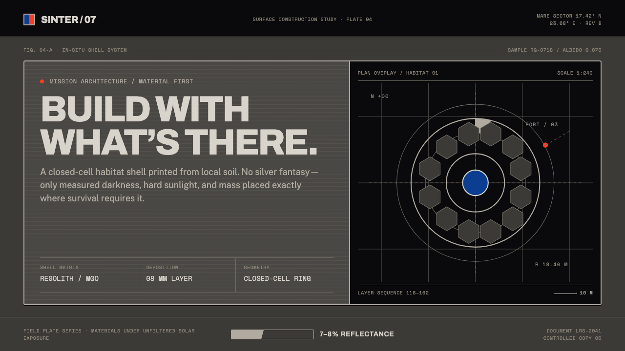 Lunar Regolith SettlementMoonlight without the myth. Regolith gray, hard terminators, and a strict tec…
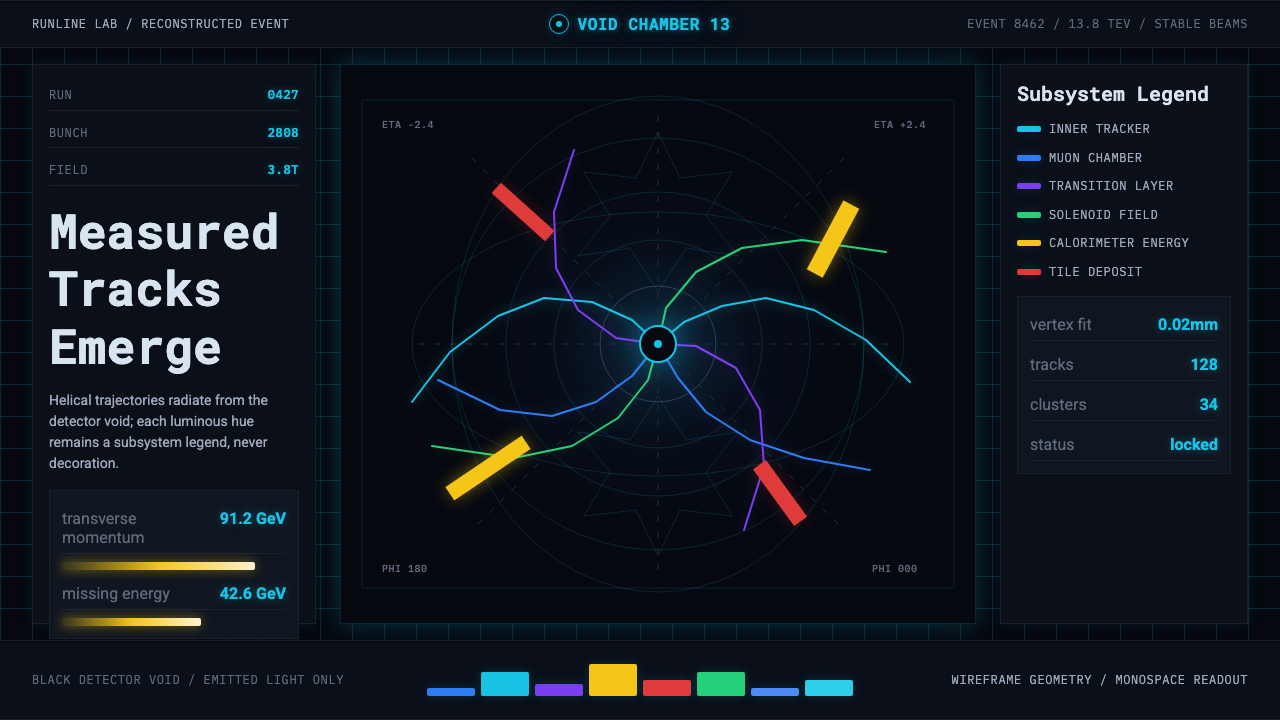 CERN CollisionData, not spectacle. Cyan tracks on black wireframes make every subsystem col…
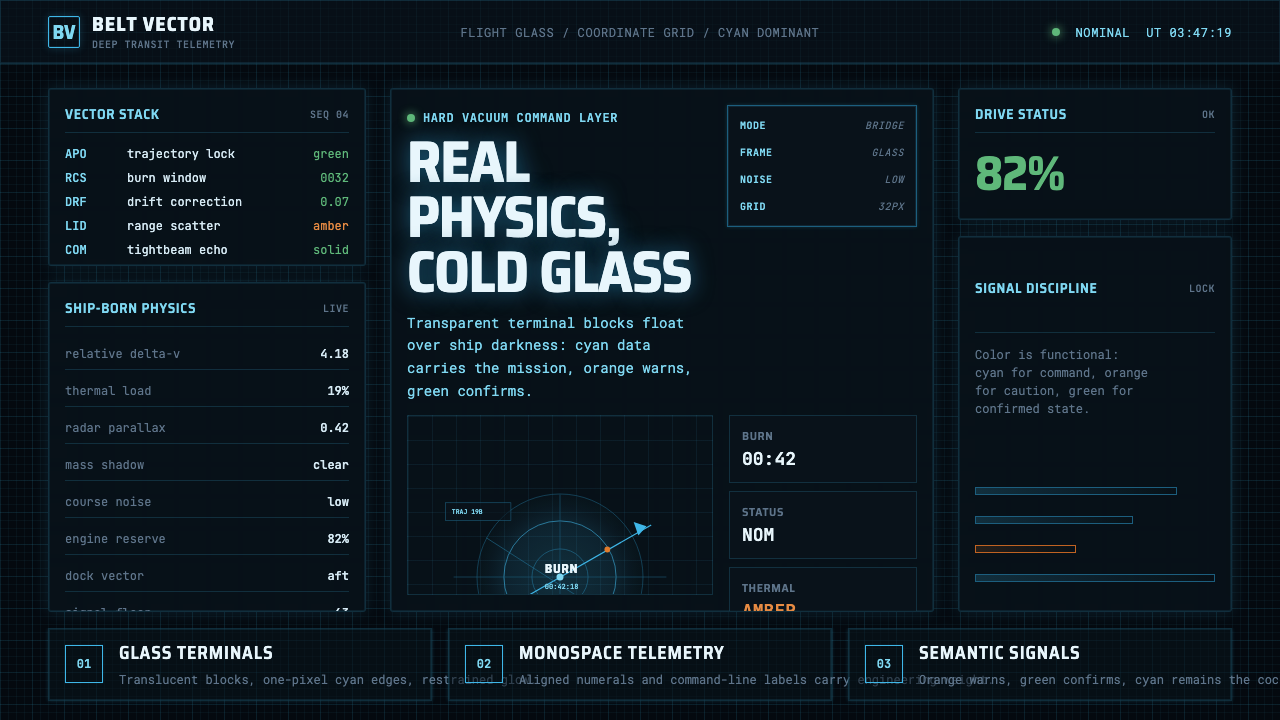 The Expanse Belter UIEngineering, not neon. Cyan glass panels, mono data, orange warnings on ship-…
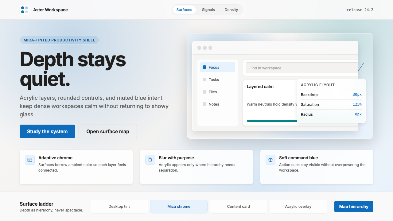 Microsoft Fluent 2Disciplined translucency. Warm Mica neutrals, acrylic blur, and muted blue cr…
 NASA EMU SpacesuitEngineered white, never warm. Quilt seams, blue ID stripes and worm red mark…
 Apple Fitness Rings Closed (2024)Midnight feels exact. Magenta, green, and cyan rings lock onto OLED black.