What is Mardi Gras New Orleans?
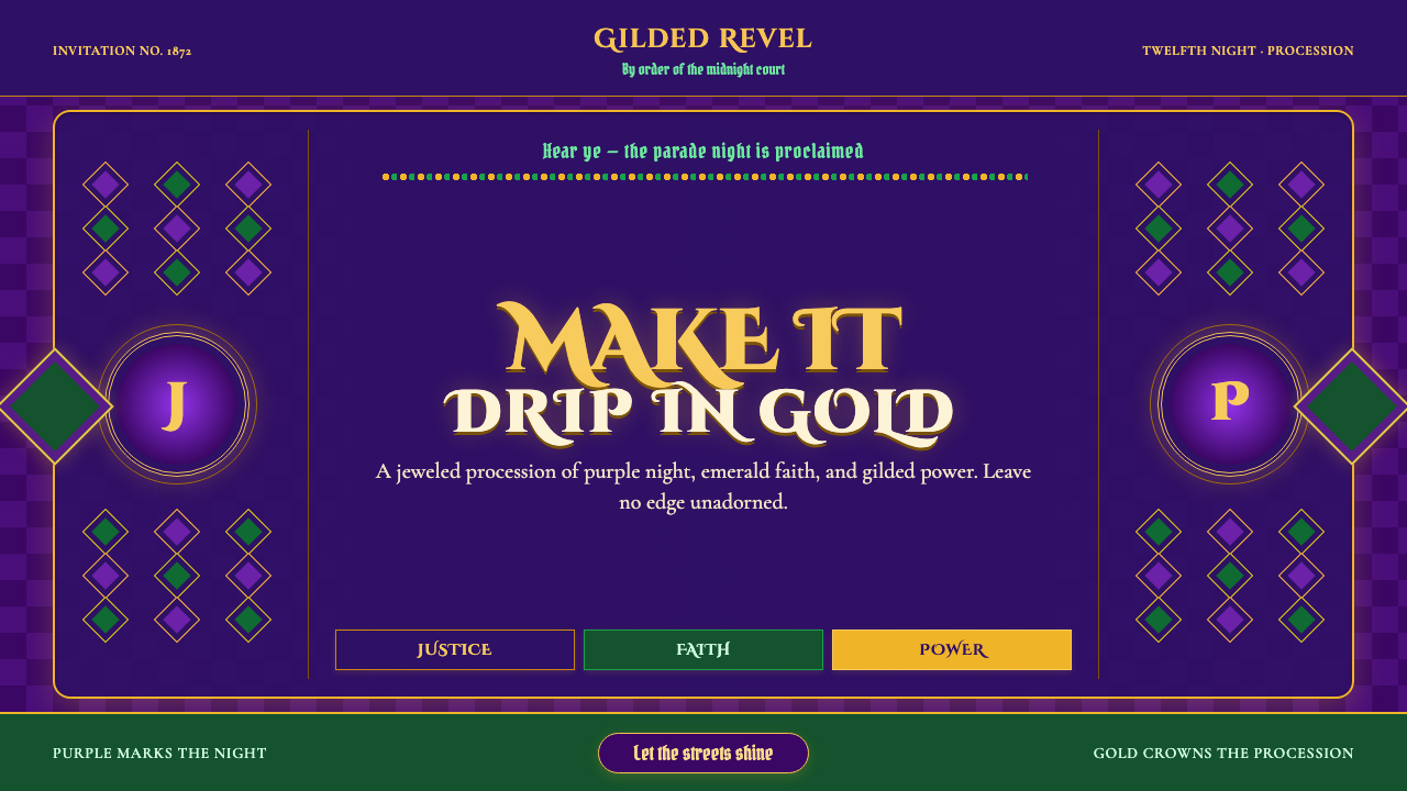
Mardi Gras New Orleans is Carnival turned up past good taste on purpose — jewel purple and gilded scrollwork under a decree that has never been renegotiated since 1872.
Mardi Gras New Orleans in brief
Mardi Gras New Orleans is the loudest, gaudiest, most joyfully excessive folk-design tradition in America — a Catholic-Carnival street festival that turned the French Quarter into a papier-mâché opera. Its color trinity is not a stylistic preference but a civic decree: purple for justice, green for faith, and gold for power, fixed in 1872 and never renegotiated since.
The system paints rolling cathedrals of gilded scrollwork against a deep royal-purple night. Every surface wants ornament: filigree cartouches frame lettering the way a theater proscenium frames a stage, harlequin diamonds tile flat fields with alternating jewel tones, and bead-strand borders — modeled on the plastic throws crowds beg for — crowd every edge of the composition rather than leaving it open.
Nothing here apologizes for excess. Where other festival styles use restraint to signal taste, this one uses density and gilding to signal generosity — the aesthetic's entire attitude is captured by the parade crowd's own chant: throw me something, mister, and make it drip in gold.
Where does Mardi Gras New Orleans come from?
Mardi Gras — French for 'Fat Tuesday' — is the culmination of the pre-Lenten Catholic Carnival season, a final day of sanctioned excess before the fasting of Lent begins. French colonial settlers carried this Catholic carnival calendar across the Atlantic to Louisiana, where New Orleans grew into its American epicenter, eventually developing a homegrown parade culture distinct from anything in Europe.
The defining act of design codification came in 1872, when the Krewe of Rex — the parade organization that crowned itself 'King of Carnival' — fixed the holiday's palette by decree: purple for justice, green for faith, gold for power. Unlike an informally adopted festival scheme, this was an official proclamation, and every krewe founded afterward, whatever its own theme, still nods back to this founding trinity.
The golden age of krewe float design, spanning roughly the 1880s through the 1910s, established the visual vocabulary now recognized as classic Mardi Gras: elaborate tableau floats built around mythological or exotic themes, papier-mâché sculpture finished in gilded scrollwork, moving through the streets on mule-drawn carriages like processions of temporary cathedrals. Bror Anders Wikstrom, a Swedish-American artist, became one of the era's defining designers for the Krewe of Proteus, while Carlotta Bonnecaze worked alongside him as one of the few women credited by name for elaborate tableau design in a field otherwise dominated by men.
The twentieth century brought industrial scale. Blaine Kern transformed krewe float construction at mid-century, introducing large-scale fiberglass sculpture and multi-story float techniques through his own studio and mechanizing what had been a hand-built craft into a year-round production industry — a shift that earned him the popular nickname 'Mr. Mardi Gras.' Later, the historian and designer Henri Schindler devoted himself to reviving and documenting the nineteenth-century golden-age aesthetic that Wikstrom and Bonnecaze had established, making sure that older, more painterly look survived alongside the flashier commercial float style Kern's era had introduced.
What defines the Mardi Gras New Orleans look?
Color Trinity
Purple, green, and gold are used in fixed symbolic roles — justice, faith, power — rather than as an interchangeable palette. All three typically appear together rather than one dominating, since the trinity itself, not any single hue, is the recognizable signal.
Gilded Scrollwork
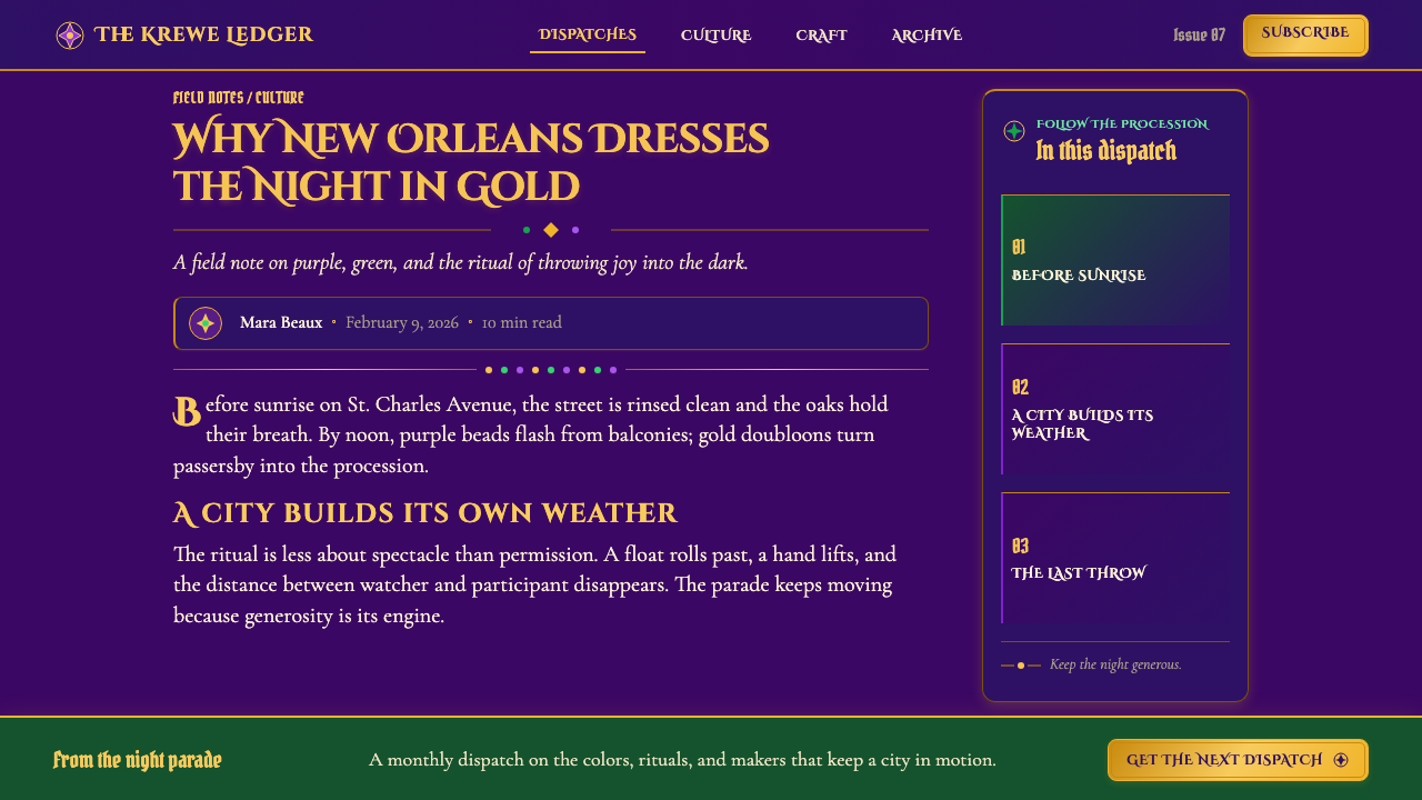
Sweeping, curling ornament rendered in gold covers structural edges, frames, and lettering the way carved ornament covers a theater proscenium. The gilding is meant to look raised and dimensional, echoing the sculpted papier-mâché of a parade float rather than a flat printed pattern.
Bead-Strand Borders
Borders are built from repeating strands of round beads rather than a plain rule or line, modeled directly on the plastic throw necklaces crowds catch during a parade. The motif crowds every edge of a composition instead of leaving it open, which is the visual signature of throw culture translated into layout.
Filigree Cartouches
Ornate scrollwork frames, or cartouches, enclose important text or emblems the way a coat of arms encloses a family crest. They give even a short line of copy the weight of a theatrical announcement.
Harlequin Diamonds
Flat fields are sometimes tiled with alternating jewel-toned diamonds, borrowed from theatrical costume and masquerade tradition, giving a surface rhythmic energy without relying on gilded ornament alone.
Density Over Restraint
Nearly every surface carries ornament; negative space is treated as an opportunity rather than a virtue. The system's generosity is expressed through how much a composition can hold while still reading clearly, not through how little it includes.

Who shaped Mardi Gras New Orleans?
A Swedish-American artist who became one of the defining float and tableau designers for the Krewe of Proteus during the golden age of krewe design in the late nineteenth and early twentieth centuries, known for elaborate, mythologically themed parade sequences rendered as moving papier-mâché sculpture.
One of the few women credited by name for elaborate tableau float design in nineteenth-century New Orleans, working in a field otherwise dominated by men. Her contributions helped define the ornate, theatrical look of the golden-age krewe parades.
A twentieth-century float builder who introduced large-scale fiberglass sculpture and multi-story float construction, mechanizing krewe float-building into a year-round industry through his own studio. His influence on scale and technique earned him the nickname 'Mr. Mardi Gras.'
A historian and designer who dedicated himself to reviving and documenting the ornate, painterly look of the golden-age krewe floats established by designers like Wikstrom and Bonnecaze, helping preserve that nineteenth-century visual tradition alongside more modern commercial float styles.
How do you use Mardi Gras New Orleans today?
This system rewards contexts that want to feel generous, theatrical, and unmistakably festive rather than tasteful and restrained — entertainment brands, event marketing, hospitality, and any product that wants to signal celebration rather than sobriety.
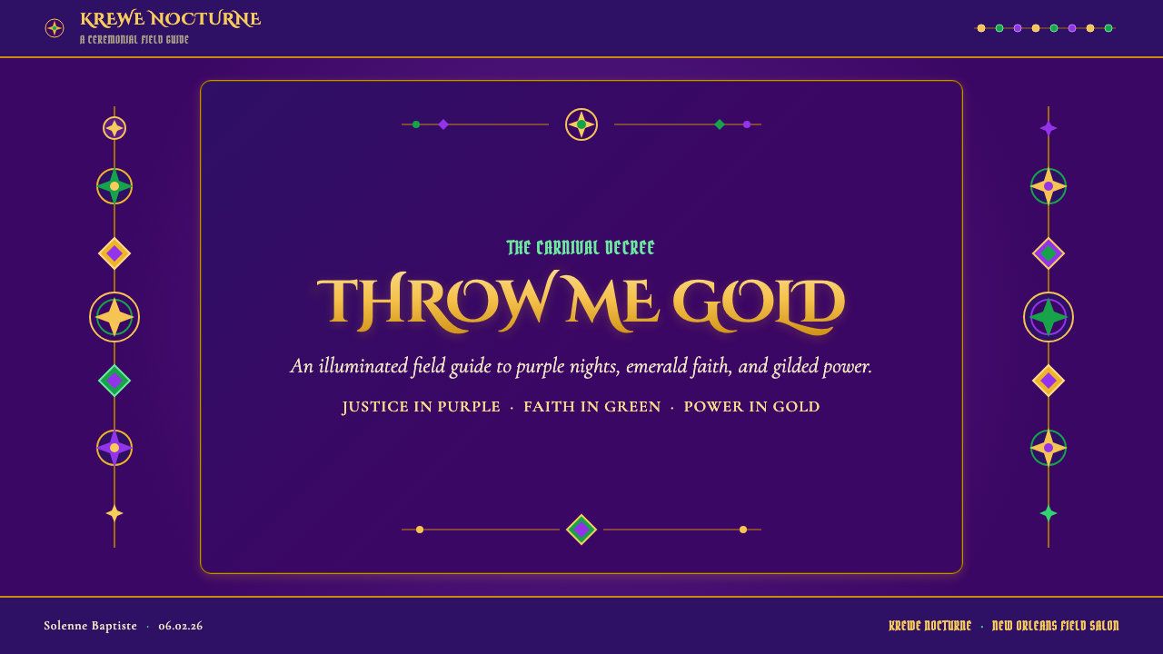
For presentation slides, a cover works well with a royal-purple field, a gilded filigree cartouche framing the title, and a bead-strand border running along one edge. Content slides can use harlequin diamonds sparingly as a section-divider motif; data visuals should keep the purple-green-gold trinity present but let one color lead per chart so the data itself stays legible against so much ornament.
For web interfaces, the trinity works best concentrated at structural edges — headers, footers, card borders — done in bead-strand or filigree motifs, while the main content field stays a calmer, flatter purple or cream so body text remains readable. Buttons and calls to action are a natural home for gilded cartouche framing, since they are meant to draw the eye the way a float's centerpiece does.
For editorial and marketing work, the style supports bold, celebratory headlines and full-bleed feature blocks alternating between deep purple and gilded ornament. Because the palette is fixed and symbolic, marketing copy can lean into the justice-faith-power meanings directly, giving the color choices narrative weight rather than treating them as decoration.
The most common mistake is softening the palette into pastel purple and green to make it feel more 'tasteful' — this defeats the entire point. The system's identity depends on jewel-toned saturation and unapologetic density; diluting either one produces something that reads as generic party decor rather than an authentic Mardi Gras statement.
Mardi Gras New Orleans — FAQ
Why exactly purple, green, and gold — and why can't they be swapped for a different palette?
Because those three colors are not a stylistic choice but a formal civic decree: the Krewe of Rex fixed them in 1872 as symbols of justice, faith, and power, and no krewe founded since has replaced them. Swapping the palette for something else — even a similarly festive combination — breaks the specific historical claim this style makes; the recognizability depends on that exact trinity.
Is this style only suitable for literal Mardi Gras or Carnival content?
No — its underlying values, generosity, theatricality, and unapologetic celebration, transfer well to any entertainment, hospitality, or event brand that wants to feel festive rather than restrained. The literal parade imagery can be dialed back while keeping the color trinity and gilded-ornament density that make the system recognizable.
What separates this from generic 'carnival' clip art?
Generic carnival clip art tends to use a rainbow of festival colors and scattered, unrelated icons — masks, confetti, balloons — without any organizing structure. This system is disciplined around one fixed color trinity, ornament that behaves like sculpted gilding rather than flat clip art, and structural motifs like bead-strand borders and filigree cartouches that echo the actual construction of a parade float. The discipline is what separates a considered design system from a generic party theme.
Does the design have to sit on a dark background?
The style is built around a deep royal-purple night sky as its canonical ground, because that darkness is what makes gilded scrollwork read as luminous rather than flat, the way gilt catches torchlight during an actual night parade. A lighter version is possible but loses much of that theatrical glow; the dark ground is doing real optical work, not just setting a mood.
Related design styles
 Chinese New Year Spring FestivalThe new year arrives at full volume. Lantern red glows through lacquer night…
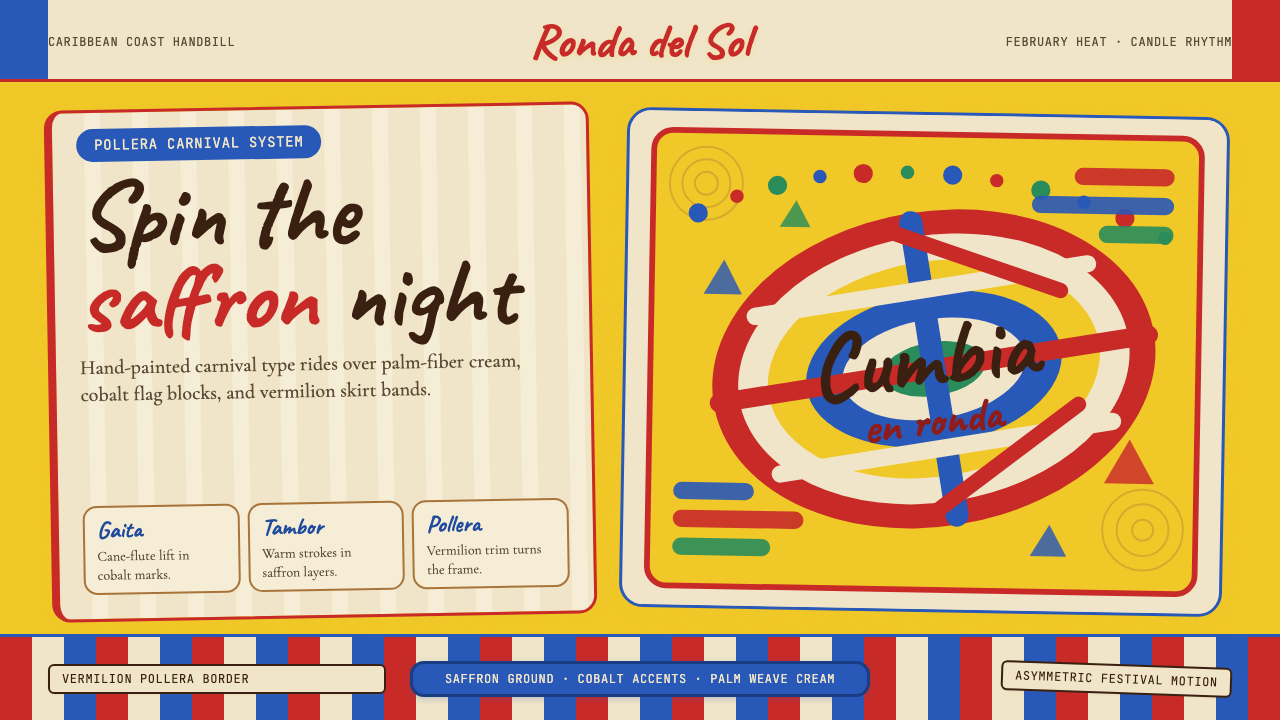 Colombian Cumbia (Pollera Carnival)Carnival heat spins. Saffron ground, Caveat script, vermilion stripes, cobalt…
 Commemorative CoinAuthority struck in metal. Old-gold relief, denticled rims, and Cinzel capita…
 Día de los MuertosRemembrance glows. Marigold orange, magenta papel picado, and cream altar tie…
 Monopoly (1935)Everything is ownable. Candy-bright deed bands snap across a calm sage board.
 Poster Stamp (Cinderella)Blazes in miniature. Vermilion stamps, chrome keylines, and toothed edges on…