What is Marc Newson?
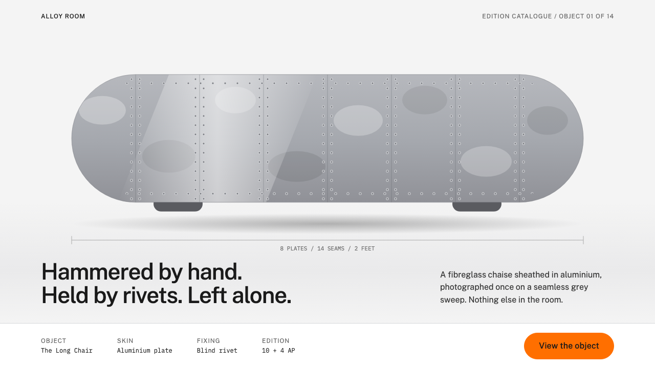
Marc Newson's Lockheed Lounge turned a single hand-beaten aluminium object into a whole visual language: polished metal, long fat curves, a row of rivets, and one drop of orange.
Marc Newson in brief
The Marc Newson look takes its name and its logic from one object: the Lockheed Lounge, a chaise longue made in 1986 in Sydney. Its core is a sculpted fibreglass form, close in profile to an unfinished surfboard blank, and its skin is a patchwork of hand-hammered aluminium panels fixed with blind rivets. As a style, it means polished metal surfaces, long unbroken curves that end in fat rounded tips, seams marked by evenly spaced dots, and a pale studio setting that lets the form do all the talking.
What separates this style from generic 'chrome futurism' is restraint. The object is alone. The background is a seamless, softly lit grey sweep with generous empty space around it. Type is plain and humanist, set in ordinary weights, and captions stay quiet. Colour is almost absent: the metal is neutral and reflective, so a single saturated orange accent becomes the only element that raises its voice, and it is spent where attention is actually needed.
Translated into an interface, the language reads as industrial craft rather than science fiction. Panels feel like sheets of brushed or polished metal, buttons and tags have the soft, rounded ends of a streamlined aircraft part, and small rivet-like dots turn up as separators and bullets. It suits products that want to feel precise, physical and expensive without becoming cold.

Where does Marc Newson come from?
Marc Newson was born in Sydney in 1963, and the Lockheed Lounge belongs to the late-1980s Australian design scene in which he first made his name. The piece dates from 1986 and is usually described as the LC1 prototype. It was built almost entirely by hand: a form was shaped first, then clad in aluminium sheet that was beaten into shape and riveted in place, so every seam and every dent is visible. Nothing about it was meant to hide how it was made.
Its name points to the Lockheed aircraft company, and the reference is deliberate. Newson was drawn to the language of aviation and mid-century streamlining, the moment when engineers rounded off every corner to cut through air and designers adopted the same softened shapes for toasters and trains. In the lounge, that history is compressed into a domestic object. It sits at the junction of two traditions the source material names directly: biomorphic streamlining, with its blobby, organic, aerodynamic outlines, and the craft of limited-edition design-art, where a chair is sold and collected more like a sculpture than a mass-produced product.
The piece did not stay a one-off. Newson went on to work internationally, and the source places his later activity in the late 1980s through the 2000s, with the Embryo chair, work with aviation themes and watch design as the natural continuations of the same instincts. Institutions took notice early: the Art Gallery of South Australia is listed among the key names attached to the story, and the manufacturer Vitra is another. Those two names mark the two worlds the lounge lives in, the museum and the production line.
That double life is what makes the aesthetic travel so well. A hand-riveted prototype is, in principle, the opposite of an industrial product, yet its surfaces and curves look like something a factory could have extruded. The style borrows that tension. It feels handmade and engineered at the same time, which is why it has become a convenient shorthand for premium hardware, audio equipment, automotive interiors and luxury objects shot against a pale backdrop.
What defines the Marc Newson look?
Material
Polished aluminium is the defining surface. It reads as a cool, slightly dented, hand-finished metal rather than a flawless mirror, so panels and cards are filled with silvery grey tones that catch light along their edges. The effect is tactile and physical, closer to a sheet of metal than to a flat colour swatch.
Curves
Edges are long, flowing curves that end in fat, fully rounded tips. There are no sharp corners and no abrupt changes of direction. Buttons, tags and containers all borrow this streamlined silhouette, the way a wing tip or a surfboard nose tapers into a generous round.
Rivets
Seams are marked by small, evenly spaced dots that recall blind rivets. They work as the style's only ornament, and they are functional ornament: they show how the surface is held together. In an interface they become dividers, list markers and edge details that add rhythm without adding clutter.
Studio sweep
Everything sits on a seamless pale-grey studio sweep, the kind of backdrop used in product photography, with no horizon line and no texture. Generous empty space surrounds the subject. The page behaves like a photographed object on a plinth, which keeps attention on form and makes even small elements feel considered.
Typography
Type is set in Public Sans, a plain, even-tempered sans serif, in ordinary weights. Headlines are not shouted and captions stay quiet. The typeface behaves like a gallery label next to a sculpture: clear, neutral and deliberately secondary to the object.
Single accent
Colour is rationed to one saturated orange, applied as a small tile or dot. Because the metal and the background are both neutral, that single warm note is the only thing that pulls the eye, and it is reserved for the action or detail that matters most. Using it more than once on a screen dilutes the whole idea.

Who shaped Marc Newson?
Australian industrial designer, born in Sydney in 1963, who made the Lockheed Lounge in 1986. His work moves between furniture, aviation-inspired objects and watches, and is defined by smooth, continuous surfaces and rounded, streamlined forms. The lounge is still the piece most people picture when they hear his name.
The furniture manufacturer associated with Newson's work. Vitra represents the production-line side of the story: the process of taking a form that began as a studio object and making it repeatable, which is part of why the look translates so easily from sculpture to product.
A museum named among the institutions connected to the lounge's story. Its presence is a reminder that the piece was treated as art from early on, collected and displayed rather than simply used, which shaped how its austere, gallery-like presentation became part of the style.
How do you use Marc Newson today?
In slide decks, the style works best for product launches and design-led pitches. A cover slide can show a single object or a single headline on the pale grey sweep, with plenty of air and one orange tile carrying the only call to action. Content slides keep to a calm grid of metallic-grey panels with rounded ends, and the small rivet dots can mark list items or separate sections. The deck should feel like a well-lit showroom, never like a crowded dashboard.
For data slides, resist the urge to colour every series. Use tonal steps of grey and silver for most of the chart, and let the single orange accent highlight the one number the audience must remember. A chart labelled in quiet, even type, with generous margins, matches the gallery-label tone of the whole system and makes the highlighted value land with real force.
On the web and in product UI, the language suits hardware landing pages, audio and wearable products, configurators and portfolio sites where one object deserves the spotlight. Dashboards can adopt the metal-panel surfaces and long rounded controls for a tactile, instrument-like feel. Pricing pages can mark the recommended plan with the orange tile and keep the others in plain grey, which turns the accent into a quiet but unmistakable signal.
In editorial and marketing work, think of a product photograph shot on a seamless backdrop. Layouts should centre one hero image, set short copy beside it in the neutral humanist type, and avoid decorative clutter. Because the system is so sparing, it also pairs well with long white margins and large, unhurried spacing between sections.
The most common mistake is over-using the accent or over-using the metal. If every button is orange the point is lost, and if every surface is shiny the interface becomes heavy and hard to read. Keep the metal as a supporting surface, keep the orange to a single moment per screen, and let empty space do the work that effects and gradients would otherwise do.

Marc Newson — FAQ
What is the Lockheed Lounge?
It is a chaise longue designed by Marc Newson in Sydney in 1986. It has a sculpted fibreglass core covered in hand-hammered aluminium panels fixed with blind rivets, and its profile resembles an unfinished surfboard blank. It is the single object on which this visual style is built.
Why does the style use only one accent colour?
Because the metal and the pale studio background are both neutral, a single saturated orange becomes the only warm note and instantly marks what matters. Adding more colours would compete with the reflective surfaces and weaken that signal. The rule is to spend the accent once per screen, on the most important action or detail.
Is this a dark or a light style?
It is a light style. The ground is a seamless pale grey, the panels are silvery metal tones and the type is quiet and dark on top. The effect is closer to a well-lit photography studio than to a night-time interface.
What kinds of products suit this look?
It suits products that want to feel precise, physical and premium: hardware, audio and wearable launches, configurators, portfolio pages and design-led brand sites. It is less suited to dense, data-heavy tools with many colour-coded states, since the palette is deliberately sparing.
How is it different from generic chrome or metallic styles?
Generic metallic styles pile on gradients, glows and reflections on every element. This one is built around a single hand-made object, keeps the background calm and empty, uses plain typography, and limits colour to one accent. The metal is a material reference to a real riveted surface, not a decorative effect applied everywhere.
Related design styles
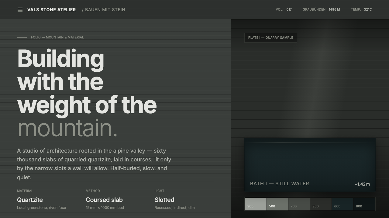 Zumthor Thermal BathsArchitecture as atmosphere. Greenish-slate stone, stratified courses, dim lig…
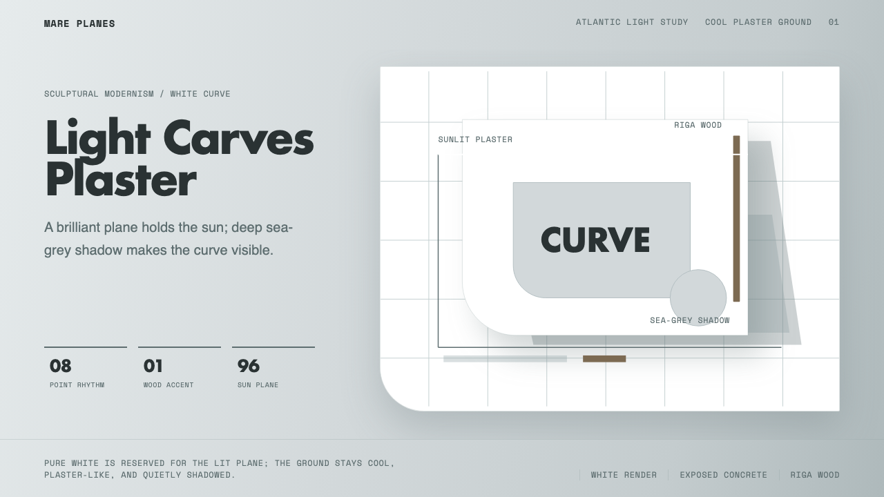 Alvaro Siza WhiteLight makes the form. White planes on cool plaster throw sea-grey shadow and…
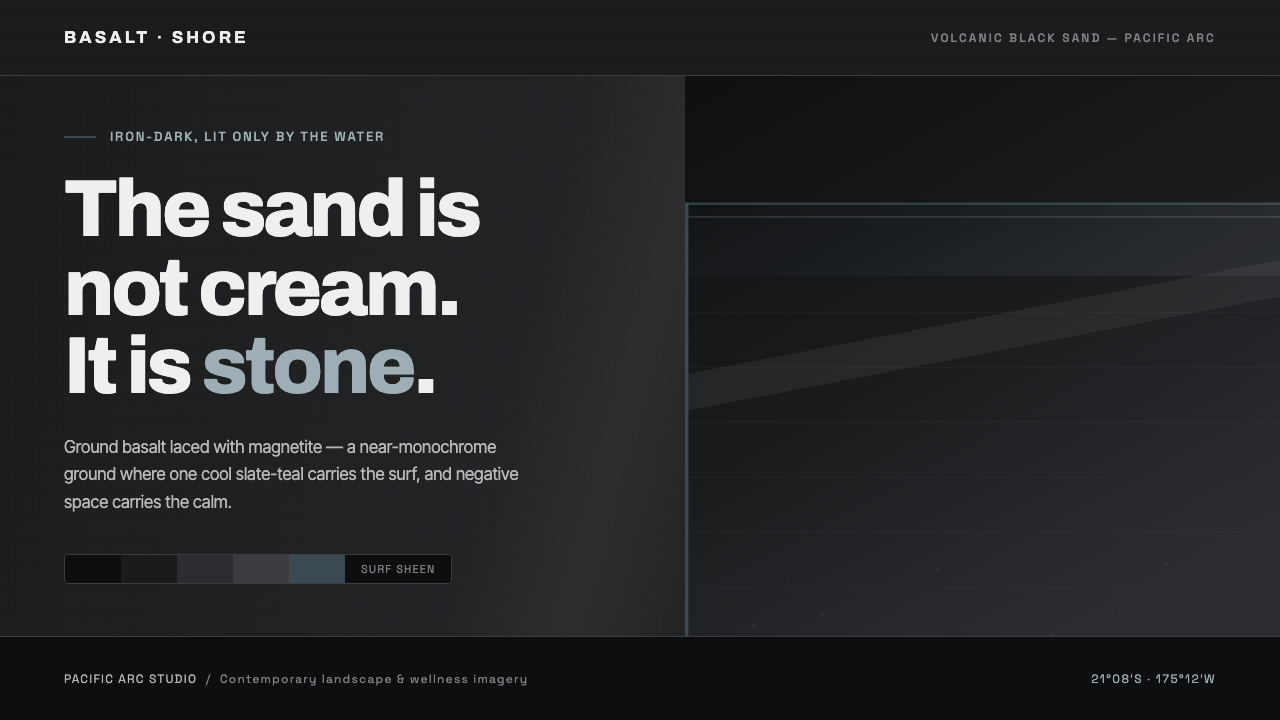 Tongan Black SandThe sand is stone, not cream. Iron-dark basalt grays with one cool slate-teal…
 Brâncuși SculptureLight is rationed. Brass ovoids glow against oak-brown space and geometric ty…
 Helmut Lang MinimalismNothing to prove. Cool gallery white, 1px black hairlines, lowercase Archivo…
 Glacial Teal LagoonQuiet feels elemental. Basalt darks and milky silica blue drift in a low-cont…