What is Māori Korowai Feather Cloak?
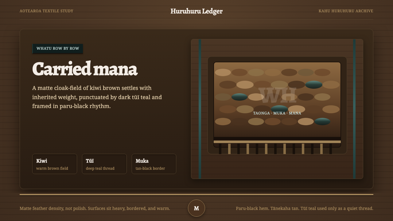
The Māori korowai carries inherited weight through a dark field of kiwi brown, interrupted by tūī teal and the quiet border rhythm of dyed muka.
Māori Korowai Feather Cloak in brief
A kahu kiwi feather cloak is a Māori taonga: a treasured heirloom whose surface is entirely covered in the soft, warm-brown feathers of the kiwi, with the dark iridescent green-blue plumage of the tūī interwoven through the field. Its visual character is not light, decorative, or costume-like. It is dense, grounded, and visibly made to carry the mana of its wearer and lineage.
The cloak begins with a twined muka foundation made from flax and is built row upon row by hand through the whatu twining technique. Each feather becomes part of a continuous textile surface rather than an applied ornament. The labor is measured in hundreds of hours, and that labor should remain perceptible in any design language derived from it: repetition is deliberate, density is meaningful, and the whole surface feels assembled rather than rendered.
This system translates the cloak's weighty, matte drape into a dark visual field. Kiwi brown establishes the ground, tūī teal appears as a sparse and concentrated shimmer, and paru- and tānekaha-dyed muka create a tan-black border rhythm. Nothing should feel glossy, thin, or weightless. The intended impression is of a garment with inherited presence, where every edge and interruption has been held in place by craft.

Where does Māori Korowai Feather Cloak come from?
The Māori korowai belongs to the kākahu, or feather-cloak, tradition of Aotearoa / New Zealand in Oceania. The kahu huruhuru tradition is continuous from the pre-contact era, so the cloak is understood here not as an isolated historical costume but as a living textile practice with inherited forms, techniques, and responsibilities.
The visual reference centers on the kahu kiwi: a flax-based cloak covered in kiwi feathers and interwoven with tūī plumage. Its structure is inseparable from its making. Muka provides the foundation, while whatu twining organizes the textile row by row. The result is a surface in which material, labor, and pattern are bound together rather than separated into a base, an image, and an applied finish.
The source period identified for this reference is 1900–1950. That period provides the historical frame for the particular visual vocabulary presented here, while the broader kahu huruhuru tradition extends continuously back to the pre-contact era. The relationship between a dated reference and a continuous practice matters: the design should feel historically situated without implying that the tradition began or ended within a single period.
The named guardians of this knowledge are Māori master weavers, practitioners of whatu twining, and the kaitiaki of Te Papa Tongarewa, the collection guardians associated with its preservation. Together, these roles point toward a design ethic of care. The cloak is not merely a surface to imitate; it is a taonga whose density, inherited weight, and material discipline should be approached with respect.
What defines the Māori Korowai Feather Cloak look?
Dark Feathered Field
The ground is a deep, warm kiwi brown rather than cream, white, or an airy neutral. It should feel enclosed and substantial, like a dense textile seen at close range. Large areas remain quiet so that the cloak's accumulated weight is legible before accents appear. The darkness is not theatrical blackness; it is the brown depth of feathers gathered into a continuous surface.
Matte Density
Surfaces are soft-looking, matte, and materially dense. Avoid the visual language of polished leather, glass, silk, or thin digital panels. Even when the system is used for a flat interface, blocks should appear settled and substantial, with restrained contrast between adjacent areas. Texture is suggested through layering and repetition, not through glossy effects or simulated shine.
Sparse Tūī Teal
Tūī teal is a dark green-blue shimmer used sparingly against the brown field. Its role is interruption, not coverage. A concentrated teal mark can suggest the iridescent plumage woven through the cloak, while broad teal expanses would flatten the hierarchy and make the system feel decorative. Let the accent arrive as a glint held inside a heavier composition.
Dyed Muka Borders
Borders carry the tan-black rhythm of muka dyed with paru and tānekaha. They are not ornamental frames added around otherwise neutral content. They establish where the textile begins and ends, giving the dense field a held edge. Use them as quiet bands, seams, or repeated boundary signals that organize information while preserving the feeling of hand-built material.
Rowed Repetition
The cloak is read through row upon row of accumulated work. Repetition should therefore feel measured and tactile rather than mechanically tiled. Repeated labels, rules, cards, or image treatments can echo the textile logic when their differences remain subtle. The pattern is strongest when it gives structure to content without becoming a separate graphic spectacle.
Weighty Drape
Composition should appear to hang, settle, and carry weight. Elements benefit from close grouping, firm anchoring, and generous but controlled intervals of darkness. Avoid floating pills, delicate hairlines, weightless gradients, and overly bright surfaces. The system communicates presence through gravity: content feels placed into a garment-like field, not scattered across an empty screen.

Who shaped Māori Korowai Feather Cloak?
Māori master weavers embody the knowledge behind the cloak's inherited density. Their role in this reference is not to provide a decorative signature but to represent the patient continuity of making: feather selection, material handling, rowed construction, and the responsibility carried by a taonga. Any adaptation should preserve that sense of care and accumulated labor.
Practitioners of whatu twining define the cloak's structural logic. Their work explains why the visual language favors rows, interweaving, firm edges, and surfaces whose richness comes from construction rather than effects. In a digital interpretation, their influence appears as disciplined repetition and material continuity, not as a literal attempt to draw every feather.
The kaitiaki of Te Papa Tongarewa are named as collection guardians within the source material. They represent stewardship: keeping the cloak understood as a treasured object with lineage and mana, rather than reducing it to a palette or texture. Their presence asks designers to treat reference, preservation, and cultural weight as part of the system's meaning.
How do you use Māori Korowai Feather Cloak today?
The Māori Korowai Feather Cloak is best applied when a product needs gravity, heritage, and a tactile sense of continuity. Its principles are structural: a dark brown field establishes presence, teal provides rare emphasis, dyed-muka borders organize edges, and repetition makes labor visible. The style should be adapted with restraint and cultural awareness, allowing the material story to guide the composition rather than using feathers as a decorative motif.
For presentation slides, the cover should feel like a substantial textile surface: a deep kiwi-brown field, a quiet border treatment, and a title placed with firm authority rather than airy minimalism. Content slides can use repeated bands, seams, or row-like groupings to establish rhythm. Data slides should keep the visual field dark and let teal mark the most important movement or comparison, while tan-black boundaries separate sections without becoming ornamental frames.
For web interfaces, the system suits dashboards and pricing pages that need to feel grounded, premium, and deliberate. Use brown as the dominant environment, keep panels dense and matte, and reserve tūī teal for selected states, active paths, or a small number of meaningful calls to action. Borders should feel woven into the interface's structure. Cards should sit firmly in the composition, with enough darkness around them to preserve the cloak's sense of depth and weight.
For editorial and marketing work, the style supports stories about heritage, craft, stewardship, material culture, and products that want to communicate continuity. A feature page can alternate dense brown fields with quieter tan-black boundary bands, while a campaign can use close-cropped feather imagery as a tactile interval rather than a repeated background. Headlines should feel settled and substantial; supporting text should remain calm so the material atmosphere does not overwhelm the information.
The common mistake is to turn the reference into a generic luxury palette: dark brown everywhere, bright teal highlights, and glossy surfaces that suggest polished fashion packaging. That approach loses the cloak's meaning. Another mistake is covering every surface with feather imagery, which replaces rowed construction with visual noise. Keep the field matte, accents sparse, borders purposeful, and repetition tied to information or structure.

Māori Korowai Feather Cloak — FAQ
Is this simply a dark brown luxury style?
No. Dark brown is only the ground. The identity comes from the relationship between dense kiwi feathers, sparse tūī teal, dyed-muka borders, rowed repetition, and weighty drape. If the surface becomes glossy, thin, or fashion-oriented, it has moved away from the cloak's material logic. The design should communicate inherited presence and careful construction, not luxury through polish alone.
Can the system use a pale background?
A pale background would weaken the reference because the source specifically defines the cloak through a deep feathered field and rejects a pale ground. A lighter supporting surface may appear in a limited editorial context, but the principal composition should remain dark and substantial. The important thing is not darkness for its own sake; it is preserving the visual density that allows brown, teal, and dyed borders to carry weight.
How much tūī teal should be used?
Use it as a sparse interruption. Tūī plumage is described as interwoven through the kiwi-brown field, so teal works best as a concentrated shimmer, selected signal, or narrow moment of contrast. If it spreads across the composition, it stops behaving like an iridescent feather accent and begins to compete with the ground. The brown field should remain visually dominant.
How can a digital interface suggest feathers without becoming literal?
Translate the construction rather than drawing feathers everywhere. Use rowed repetition, layered surfaces, quiet seams, firm borders, and restrained variation between neighboring areas. Keep the finish matte and let density do the work. A few carefully chosen feather details can establish the material reference, but the broader interface should feel woven through its rhythm and organization.
What should designers remember when adapting this cultural reference?
Remember that the cloak is a taonga, not a surface effect. Its meaning includes inherited lineage, the mana of its wearer, hundreds of hours of hand labor, and the stewardship associated with Māori master weavers and collection guardians. A responsible adaptation keeps those qualities visible through restraint, material honesty, and purposeful structure instead of extracting only the colors.
Related design styles
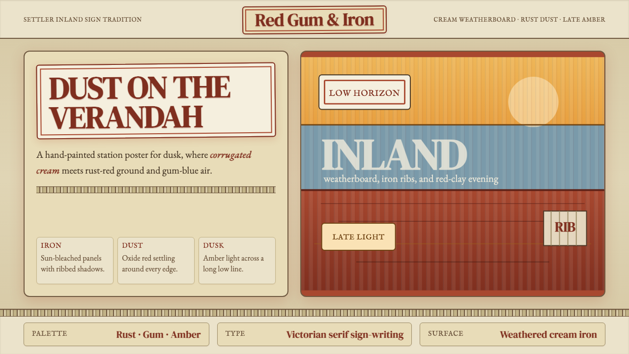 Australian Outback VernacularWeather is the voice. Rust dust, gum-blue bands, and serif sign-writing age t…
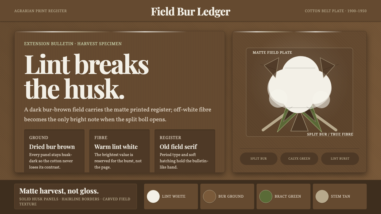 Cotton Boll HarvestHarvest contrast made matte. Off-white lint bursts from husk brown with field…
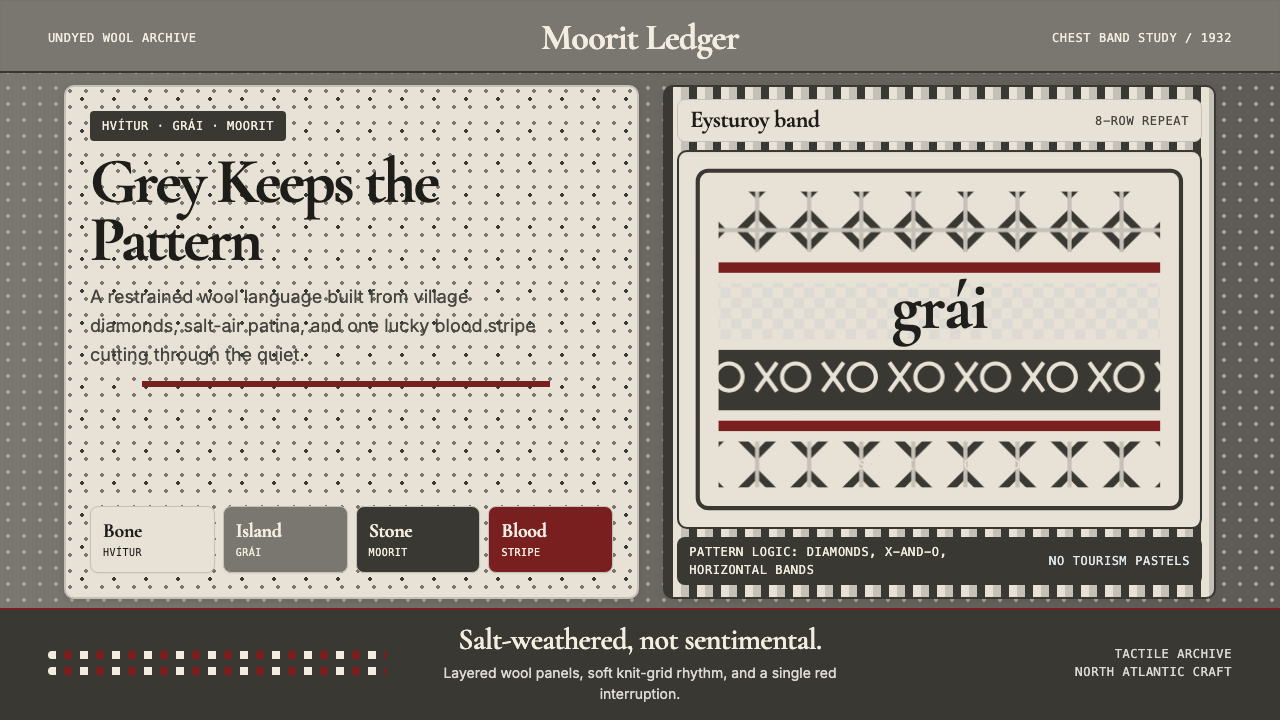 Faroese Knit Pattern Island GreyWeathered wool, not cozy kitsch. Island greys, Cormorant serif, one blood-red…
 Fulani Milk CalabashMatte craft burns bright. Oiled gourd tan meets charred concentric linework.
 Kuba Calabash BrownPrestige in dark wood. Calabash brown ground, dense incisions, tukula red rel…
 Undyed Khadi WhiteModest, never cream. Greige homespun cotton with gray slub flecks and plain h…