What is The Mandalorian Beskar?
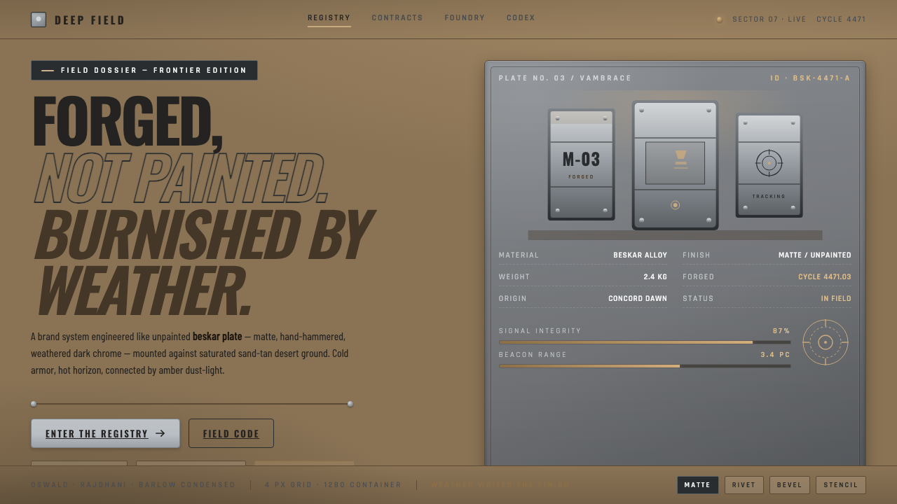
The Mandalorian Beskar is forged frontier design: weathered dark-chrome armor, saturated desert warmth, and industrial lettering held in a tense collision.
The Mandalorian Beskar in brief
The Mandalorian Beskar is the visual language of a lone gunslinger moving through a hard, sun-blasted frontier. Its central material is beskar plate: matte, weathered dark-chrome steel that looks hand-forged and unpainted rather than polished, coated, or manufactured for display. Brown-bronze grime settles into its recesses, making wear part of the object’s identity.
Against that cold armored surface, the desert supplies heat. Sand-tan earth, warm adobe brown, and amber dust-light haze create a saturated environment that feels dry, physical, and exposed. The style depends on this collision of temperatures: beskar feels cold and disciplined, while the surrounding landscape feels baked, dusty, and unstable.
The result is neither generic science fiction nor simple western nostalgia. Hard industrial geometry, riveted keylines, and condensed utilitarian lettering give the system its structure. Its governing idea is forged, not painted: surfaces should appear shaped by labor, weather, and use, while every graphic element should feel functional enough to survive on armor, equipment, or a frontier outpost.

Where does The Mandalorian Beskar come from?
The Mandalorian entered public view in 2019 as an ongoing Disney+ series produced within the Lucasfilm and Disney framework in North America. Its visual identity belongs to the post-Empire New Republic period of Star Wars, but it is expressed through a deliberately grounded material vocabulary rather than a clean futuristic one.
Its strongest historical and cinematic lineage is the space western. The lone traveler, exposed terrain, scarce shelter, and practical equipment all support a frontier reading. Yet the style does not treat the frontier as a romantic empty landscape. Dust, grime, heat, and battered metal remain visible, giving the world a sense of labor and consequence.
A second foundation is practical StageCraft-driven realism. The desert is not merely a decorative backdrop, and the armor is not a glossy symbol floating above it. Sand-tan ground, adobe brown, amber haze, and dark beskar belong to the same physical atmosphere. Their contrast feels environmental: light catches dust, grime gathers in recesses, and metal carries evidence of handling.
The third foundation is industrial sci-fi craft. Riveted keylines, hard geometry, and restrained lettering make the visual system feel assembled, repaired, and maintained. Jon Favreau and Dave Filoni are the key figures attached to this visual world. Together with the series’ space-western foundation and production realism, they anchor a style that treats design as something forged under pressure.
What defines the The Mandalorian Beskar look?
Beskar Surface
The signature surface is matte dark-chrome steel with visible weathering. It should feel forged rather than coated, with brown-bronze grime settled into seams and recesses. The material is imposing because it is restrained: no mirror polish, decorative paint, or showroom perfection.
Temperature Collision
The system is organized around the tension between cool beskar and hot desert color. Dark metal carries discipline and weight, while sand-tan earth, adobe brown, and amber haze carry heat and exposure. Neither side should erase the other; the contrast is the visual engine.
Desert Grounding
The background environment is saturated but dusty rather than cleanly bright. Sand-tan and adobe brown establish a tactile ground for the colder armor, while amber haze softens the distance without making the scene feel delicate. The palette should suggest heat, wind, and grit.
Industrial Geometry
Forms are hard, assembled, and purposeful. Panels, seams, riveted keylines, and angular divisions create an engineered rhythm. Geometry should communicate construction and protection, not decorative futurism; each edge feels like part of a working object.
Stenciled Utility Type
Condensed Oswald lettering gives the style its verbal equipment: narrow, forceful, and easy to read at a glance. A stenciled treatment reinforces the sense of field markings and maintained hardware. Type should behave like labeling on gear, not like a luxurious editorial voice.
Forged Restraint
The style gains authority by refusing surface excess. Its richness comes from material contrast, accumulated wear, and the meeting of cold metal with warm dust. Adding shine, ornamental graphics, or overly polished surfaces weakens the central fiction that every element has survived real use.

Who shaped The Mandalorian Beskar?
Din Djarin is the visual center of the style. His beskar plate embodies the system’s central contradiction: armor that is cold, disciplined, and industrial, yet visibly marked by travel, impact, and accumulated grime. He gives the aesthetic its human scale and its frontier tension.
Jon Favreau is one of the key figures attached to The Mandalorian Beskar visual world. His name belongs alongside the style’s space-western atmosphere, grounded material treatment, and emphasis on a frontier that feels made, worn, and physically inhabited.
Dave Filoni is another key figure associated with the visual language. His place in the style’s authorship is reflected through the larger Star Wars setting, where industrial sci-fi craft, desert exposure, and the post-Empire New Republic period meet in a coherent visual world.
How do you use The Mandalorian Beskar today?
For presentation covers, let the material collision do the work. Use a warm sand-tan or adobe-brown field as the environmental ground, then place a dark beskar-like panel, helmet silhouette, or angular plate form against it. The title should use condensed, stenciled Oswald lettering with a firm utilitarian presence. The cover should feel like a piece of equipment recovered from a dusty frontier, not a polished entertainment poster.
For content and data slides, treat the layout as an equipment board. Use hard divisions, compact labels, dark metal blocks, and warm desert fields to separate information. Data can appear as structural markings, status panels, or measured field notes, but the hierarchy must remain clear. Reserve the strongest contrast for the main fact, and let weathering or haze remain atmospheric rather than obscure the reading.
For web dashboards and pricing pages, the style is useful when the product wants to signal durability, operational clarity, or rugged expertise. Use a light desert ground, dark beskar-like cards, riveted borders, and condensed labels. Pricing tiers can be distinguished through material emphasis and warm-versus-cool contrast rather than ornamental badges. Buttons and states should look like functional controls built into equipment.
For editorial and marketing work, build a frontier narrative through juxtaposition. Pair wide desert fields with narrow armored modules, place metadata in compact stencil-like labels, and use angular rules to divide sections. Campaign pages can alternate between dusty warmth and dark industrial surfaces, allowing a single strong image or statement to carry the emotional weight while the surrounding system remains disciplined.
The common mistake is treating the style as a generic chrome theme. Mirror-bright metal, excessive gloss, decorative sci-fi lines, and perfectly clean surfaces all move away from the source language. The key is weathered matte beskar against saturated desert warmth. If every surface is equally dark, equally polished, or equally dramatic, the temperature collision disappears and the design loses its frontier logic.

The Mandalorian Beskar — FAQ
Is The Mandalorian Beskar simply a metallic science-fiction style?
No. Metal is only one half of the system. The defining relationship is between weathered matte beskar and saturated desert warmth. Without sand-tan ground, adobe brown, amber haze, and the sense of physical exposure, the result becomes generic chrome science fiction rather than a frontier language.
Can this style use a light background?
Yes. The source identity is not built around a permanently dark interface. A light sand-tan or dusty adobe ground is essential because it gives the dark beskar surface a hot environmental counterpoint. The background should feel sunlit and weathered, not sterile or softly decorative.
What makes the typography feel authentic?
Use condensed Oswald lettering with a stenciled, utilitarian attitude. It should read like field labeling on equipment: compact, forceful, and immediately legible. Avoid elegant display treatment or multiple competing type voices, because the style depends on the feeling of one durable working system.
How should the cold and warm colors be balanced?
Let one side establish the ground and the other create the counterforce. Sand-tan, adobe brown, and amber haze can form the environmental field, while dark beskar supplies structure and focus. The palette works when both temperatures remain legible; making everything metallic removes heat, while making everything dusty removes discipline.
What is the fastest way to make the style feel wrong?
Make the metal mirror-bright, perfectly clean, or heavily ornamented. The source language depends on matte weathering, hand-forged irregularity, brown-bronze grime, and hard industrial construction. The design should look used and maintained, not newly polished for display.
Related design styles
 Basecamp / 37signalsQuiet craft, strong opinions. Cream paper, tight sans type, yellow and coral…
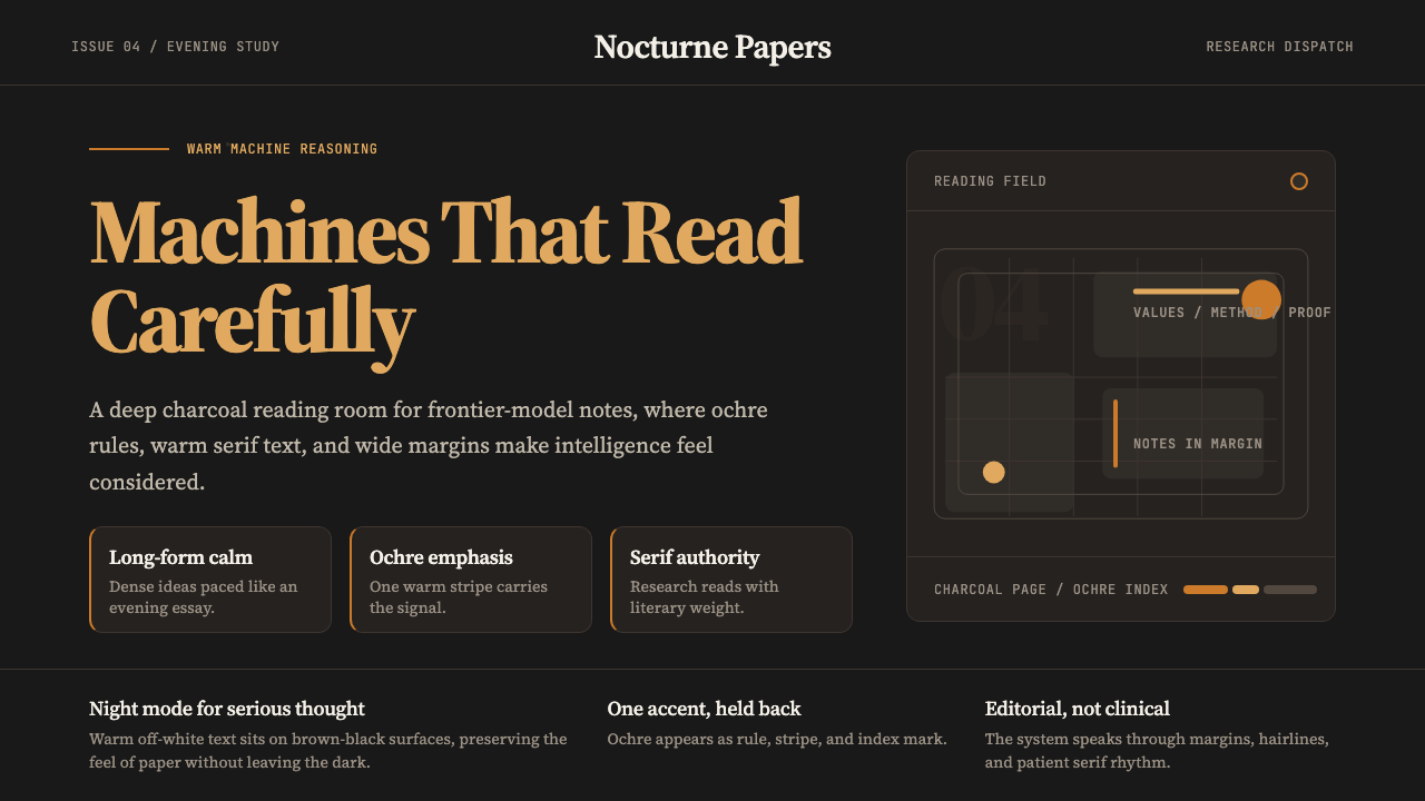 Claude / Anthropic Warm 2024Warm intelligence at night. Ochre rules and Source Serif glow on deep charcoa…
 Obsidian Knowledge GraphNetworked thought glows at midnight. Purple nodes and silver hairlines map a…
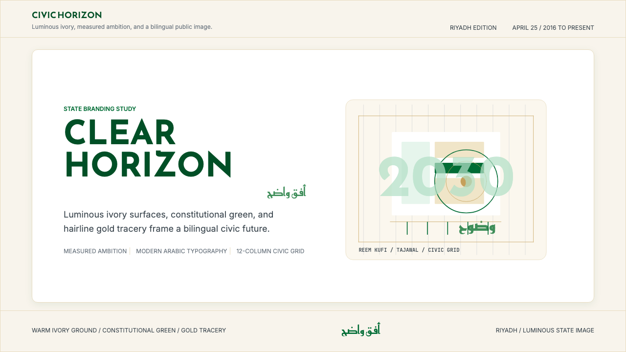 Saudi Vision 2030Measured ambition, made luminous. Ivory, green, and gold tracery on a civic g…
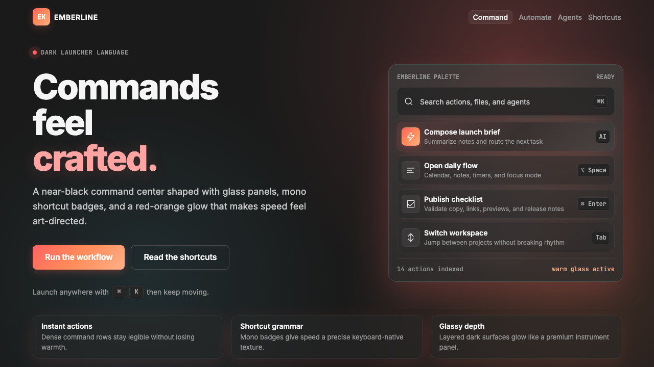 Raycast 2024Productivity feels art-directed. Red-orange glow, glass cards, and mono badge…
 AsanaCalm productivity breathes. Cream canvas, lavender panels, coral-blue-yellow…